.png)
iPhone Lock Screen Ideas: Aesthetic Customization Tips for iOS 18
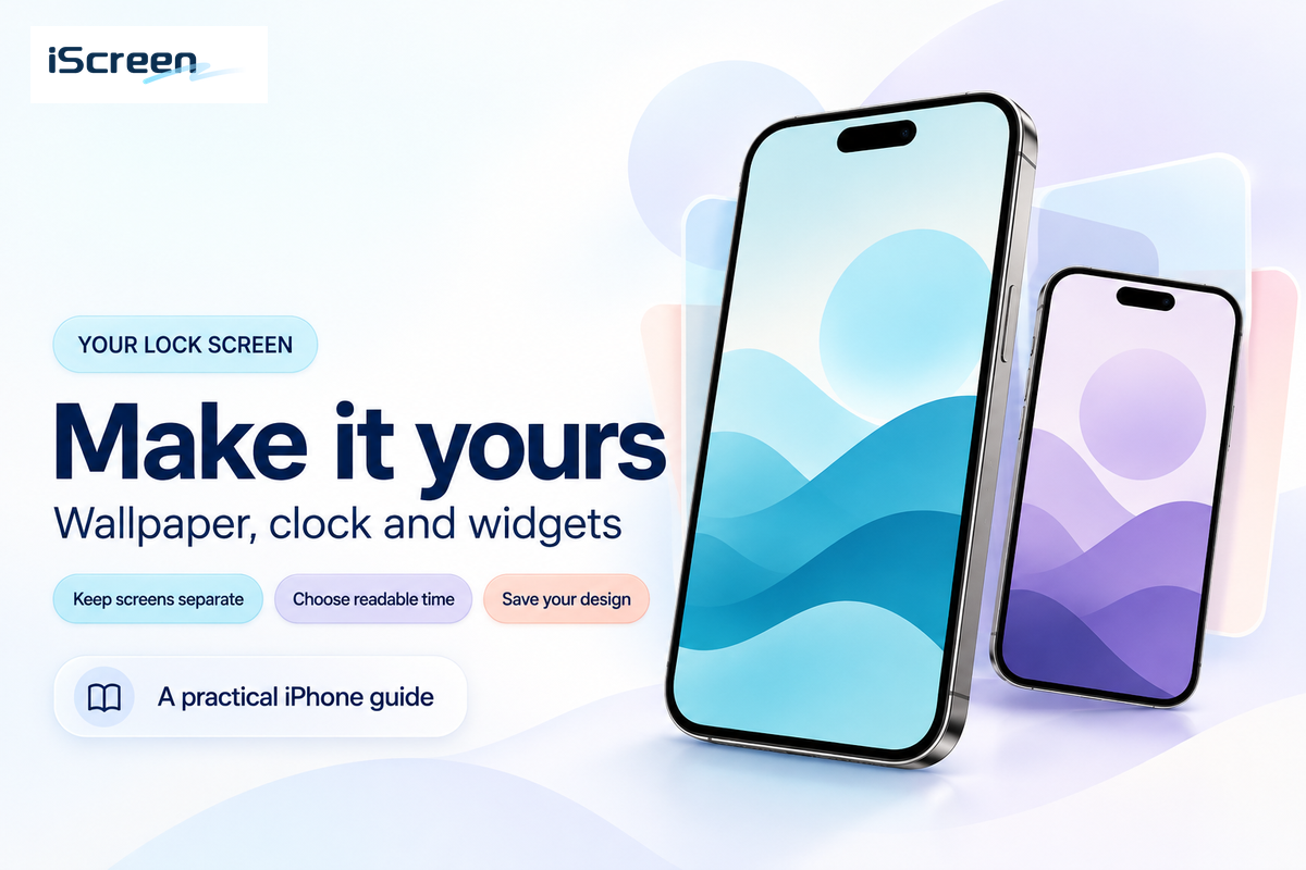
iPhone lock screen ideas are practical visual setups for an iOS Lock Screen: choose wallpaper first, then the clock style, then only the widgets that deserve space. Use them to personalize your Lock Screen without sacrificing readability; aesthetic lock screen ideas should still pass a quick glance test before you tap Customize, add emoji details, try a 3D-style image, or test a newer Spatial Scene effect on supported iOS versions.
This guide is intentionally scoped to iOS 18 because that’s the search topic. Apple now tells iPhone users to check Settings > General > Software Update for the latest iOS version, and Apple’s own update guide shows iOS 26 as an upgrade option. If your phone is already on a newer iOS release, keep the same wallpaper, contrast, privacy, and widget rules, then check your device for newer Lock Screen effects.
- Start with a clean wallpaper, then add widgets only when they improve the screen.
- Use an iOS 18-paired color palette between the Lock Screen theme and an iPhone home screen icon tint.
- Aim for an average widget count: use no more than 2 widgets on visually-focused screens or 3-4 only for more functionally-driven screens.
- Look through available iPhone lock screen widget settings and then the broader range of personalization options available before completing with iPhone wallpaper for visual cohesion.
Quick Answer: The Best iPhone Lock Screen Ideas for iOS 18
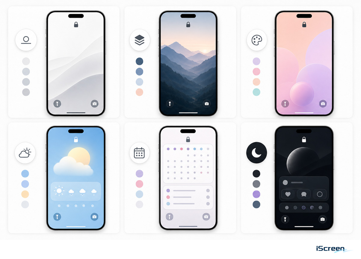
Effective iPhone Lock Screen setups are built around a single theme, whether that is minimalist photography, subtle pastels, dramatic dark mode, vibrant anime, practical calendar management, Photo Shuffle, the Depth Effect, or a complete alignment of wallpapers and icons. As Apple’s Lock Screen guide notes, customization extends to wallpaper, cherished photos, clock appearance, widgets, multiple screens, and Focus integration, so the strongest configuration harmonizes all these elements.
Simplify with a guideline: the more detailed your wallpaper, the fewer widgets you should include; conversely, a plain background can benefit from one or two widgets for character. Often, a stunning Lock Screen falls apart when every widget clamors for attention.
Choose a Lock Screen Style Before Choosing Widgets
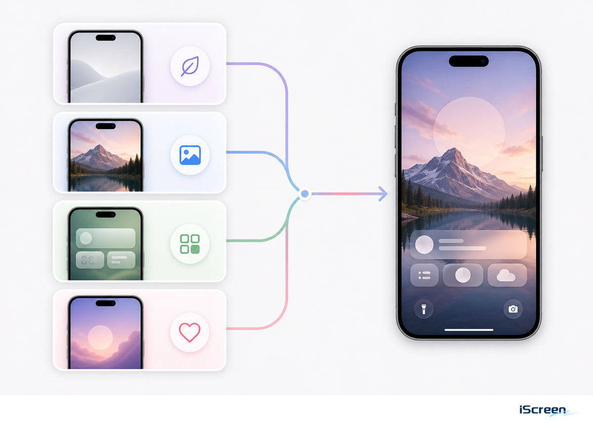
Many users start with widgets due to their perceived utility. However, a cleaner approach begins by establishing the desired mood and then selecting the minimum number of widgets to support that atmosphere. Apple’s own customization flow starts with the wallpaper and Lock Screen canvas before widget decisions, which supports a visual-first setup for aesthetic screens.
| Setup Type | Wallpaper Choice | Widget Rule | 10-Second Check |
|---|---|---|---|
| Minimal | One subject, lots of empty space | 0-1 widget | Readable after a 10 sec glance |
| Dark aesthetic | Low-brightness photo or black gradient | Battery or weather only | Comfortable for 12 hours of night use |
| Cute pastel | Soft illustration, plush, flowers, or sky | One photo or memo widget | Still clear at 30% brightness |
| Utility | Plain color or blurred photo | Calendar, weather, reminders | Useful in the first 5 sec |
| Photo Shuffle | 5-10 photos with the same color tone | 0-2 widgets | Works for 7 days without feeling random |
| Focus mode | Separate work, sleep, and weekend wallpapers | 1 practical widget per Focus | Reset in under 2 min when routines change |
| 4K wallpaper | High-resolution image with a clear subject | Skip widgets while cropping | No blur at 100% preview size |
| Pattern background | Repeating shapes, grid, fabric, or texture | Use thicker clock text | Readable after 24 hours of normal use |
| Widget-first | Solid color, blur, or very simple gradient | 3-4 widgets only when utility matters | Review every 30 days and remove dead widgets |
Consider every lock screen choice a draft rather than a final product. Treat a saved Lock Screen as provisional: it should pass a 5 sec glance test, a 20 sec edit check, a review after 24 hours, another after 7 days, and a cleanup after 30 days if widgets stop earning space. Consistent elements can appear sophisticated, but they require greater clock contrast than a simple photograph, and a high-resolution wallpaper needs to be cropped to match the iPhone’s narrower aspect ratio.
10 Aesthetic iPhone Lock Screen Ideas
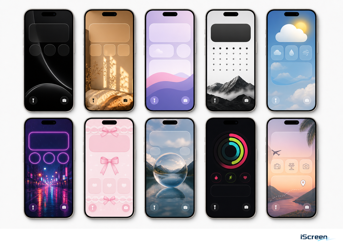
Use these as starting points, then test each one against Apple’s documented options for photos, Photo Shuffle, widgets, Focus linking, and clock styling.
- A minimal portrait lock screen features a single subject (person, pet, flower) positioned behind the clock, without any widget row.
- Dark photo: use a black, navy, or charcoal image with white clock text and one compact weather widget.
- Pastel calendar: combine soft wallpaper, a delicate clock font, and a calendar widget for a tidy and focused workspace.
- An anime or illustration lock screen places the character clear of the clock and notification areas.
- Clean gradient: use a smooth, unadorned gradient background with no widgets for a serene daily experience.
- Photo Shuffle works best when the selected photos share similar color tones.
- Focus screens allow you to personalize one Lock Screen for work, another for sleep, and a separate one for weekends.
- Depth Effect: select a clear subject and leave open background around the clock so the subject can overlap the time without covering it.
- Matching icons: pair the Lock Screen with a compatible theme so the Home Screen does not feel like a different phone.
- Widget-first functionality: Choose simple wallpaper and use your calendar, battery and reminder widget to do the talking.
How to Customize Your iPhone Lock Screen in iOS 18
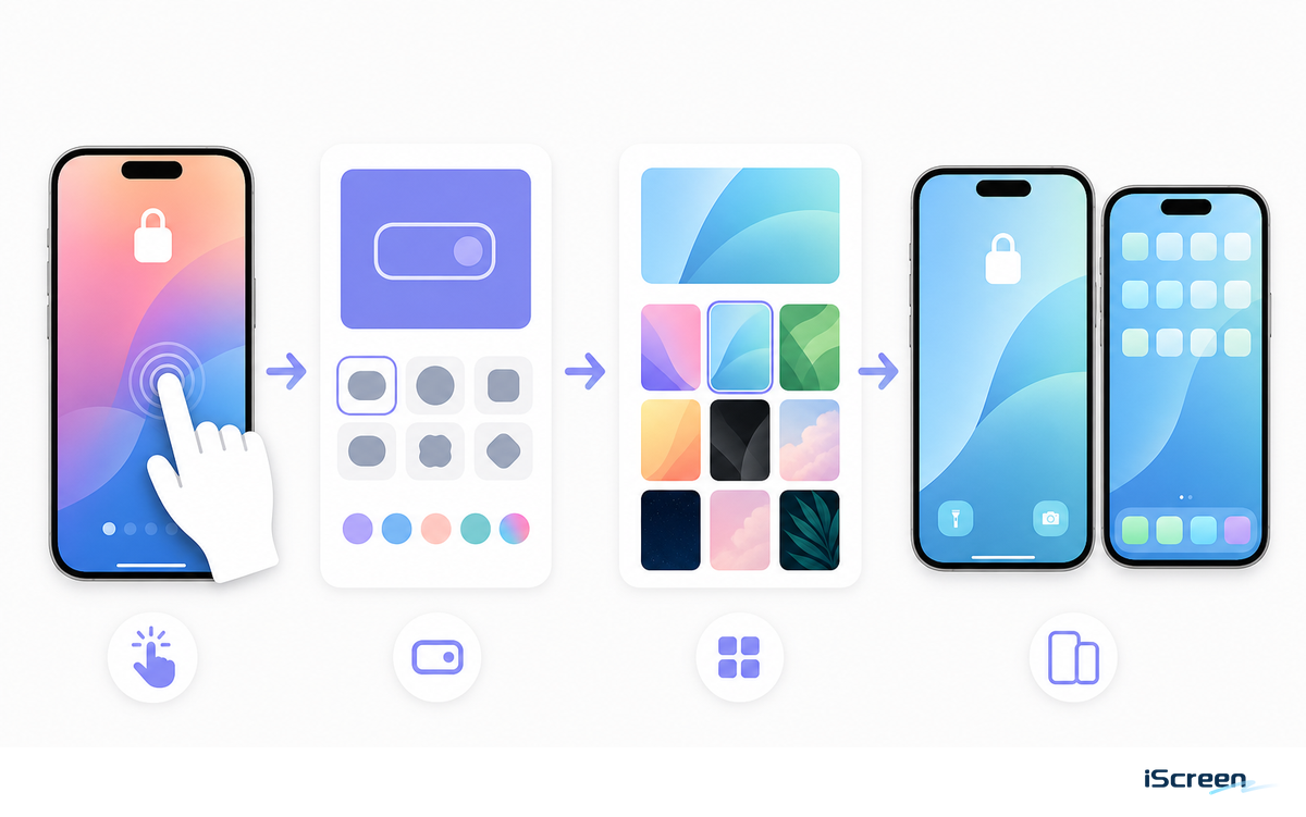
Apple’s current instructions say to touch and hold the Lock Screen, create a new Lock Screen or customize the current one, then change the wallpaper, clock display, widgets, and related controls. Depending on the wallpaper you choose, some additional controls may also be customizable.
- Press and hold the Lock Screen, then tap and choose a wallpaper you’ll be able to read with just one glance.
- Tap on the clock and choose font style, color, and weight so the time remains visible over the image.
- Add widgets only after the wallpaper and clock look good without them.
- Save the matched Home Screen, then adjust icon size, spacing, and widget placement for the final design.
Best Widget Types for an Aesthetic Lock Screen
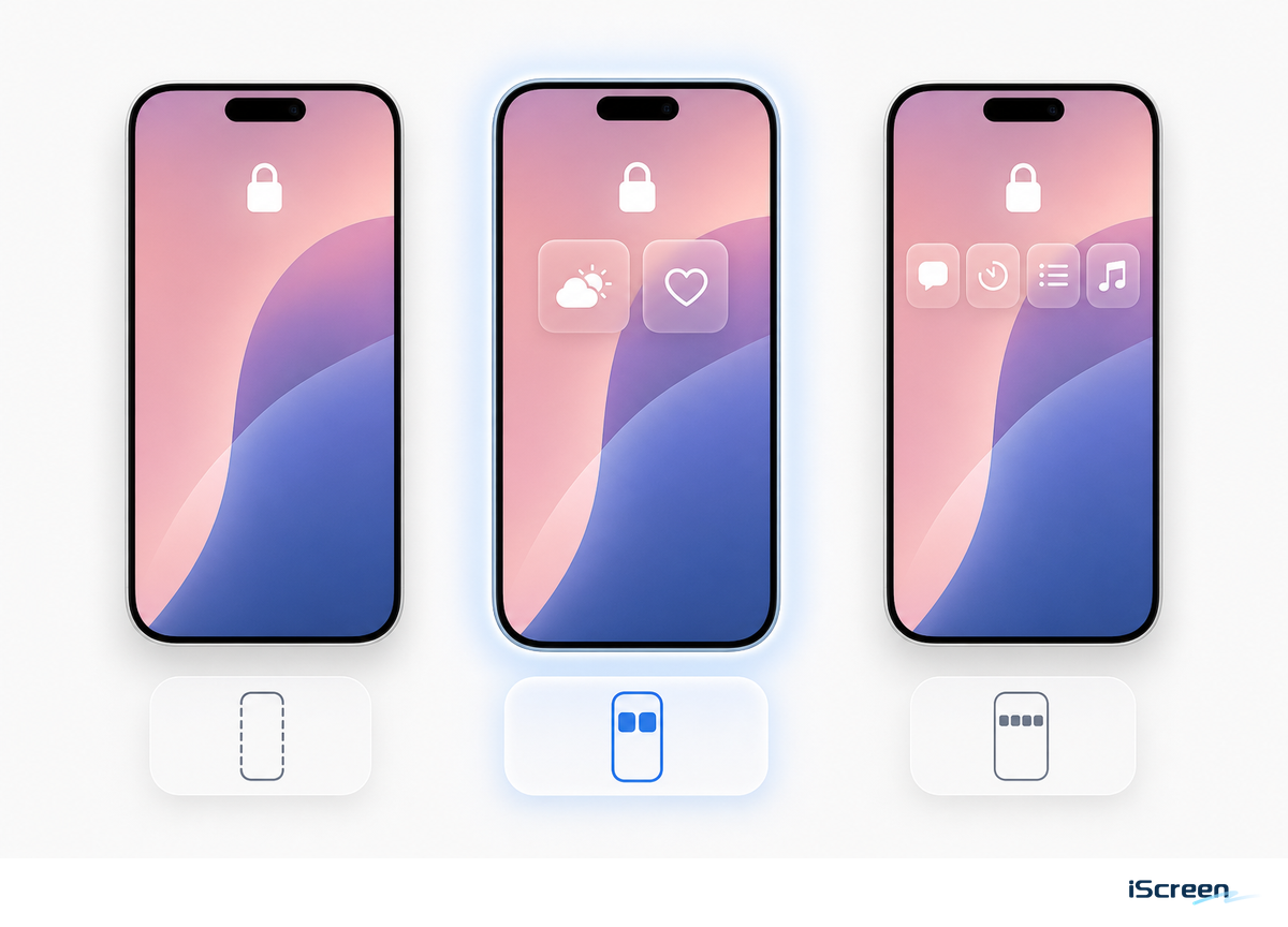
Apple says Lock Screen widgets can display glanceable information like weather, air quality, battery level, calendar events, and more. Its guide also notes that users may need to remove a widget when there isn’t enough room for a new one. That’s the right way to view Lock Screen widgets: not decorative items, but answers to things you check frequently.
For an in-depth list, check out the iScreen Lock Screen Widget Guide. In short, the best Lock Screen widgets for iPhone usually fall into a few useful categories: weather for day planning, calendar for schedule management, battery for Apple devices, and personal photo or memo widgets for a warmer touch.
If the primary subject of your wallpaper happens to land in the same vertical space as the clock, then skip placing widgets. Subjects at the bottom of your frame can typically hold a row of widgets without issues. If your wallpaper has a lot of text, it’s generally better to forgo the widgets altogether or switch to an image with a more muted background.
Make the Lock Screen and Home Screen Match
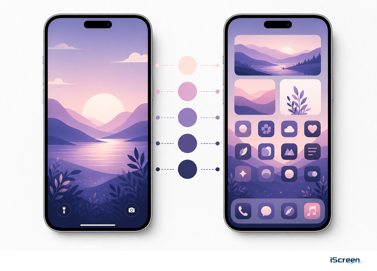
iOS 18 Home Screen coverage shows that Home Screen design belongs in the same aesthetic plan, with flexible layout options, customizable icon size, icon tinting, and Lock Screen button swaps. Since Apple’s current Home Screen guide now includes Dark, Clear, and Tinted appearances, newer versions of iOS may display more appearance labels than the initial iOS 18 release.
This makes your Lock Screen part of a larger visual pair, not a standalone design choice. A soft pink rose wallpaper will feel unfinished beside a blue icon system on the Home Screen. Instead, aim for a unified aesthetic by using consistent themes, icons, and widgets across both screens.
Run the Contrast, Privacy, and Attention Check Before Saving
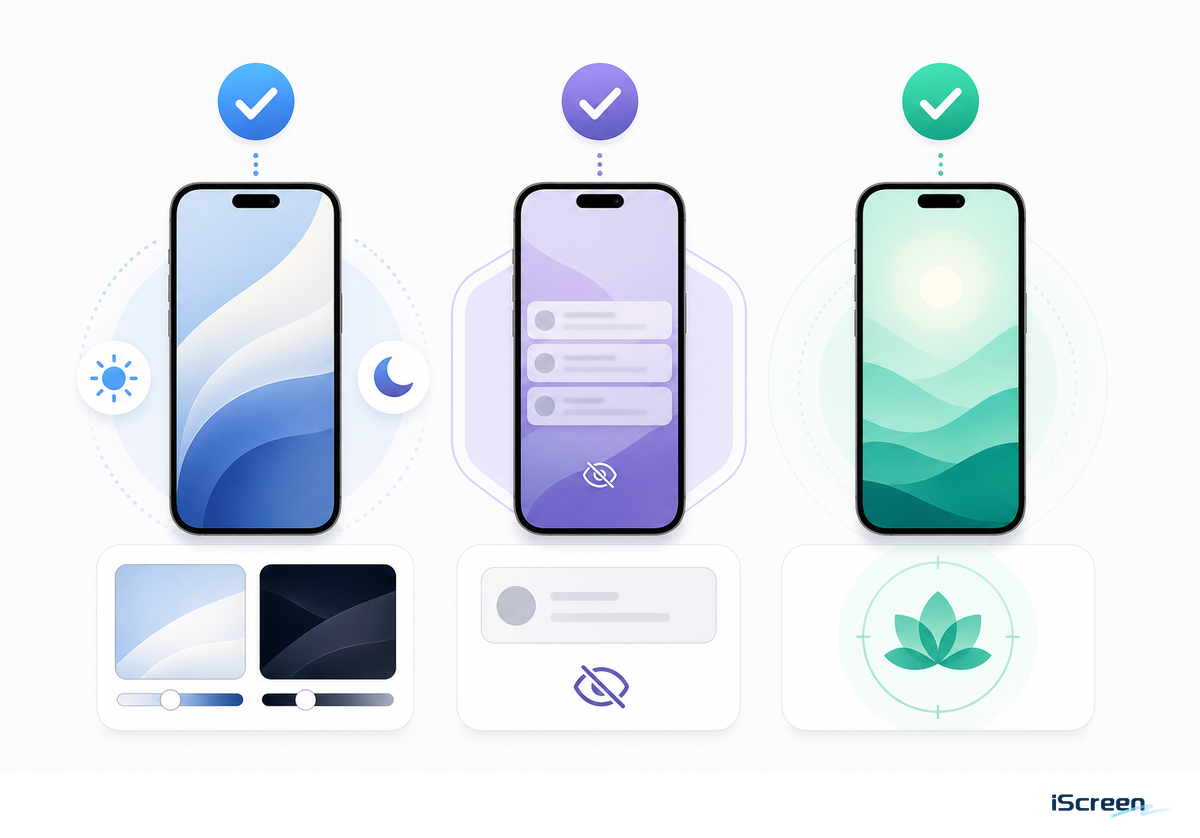
While Wallpaper First is the theme of the day, readability can’t take a back seat. Taking cues from WCAG 2.2 contrast and perceivable-text guidance, the Lock Screen isn’t complete if the clock, date, or widgets disappear into the background image.
A lockscreen that fails the 5 sec readability test is not aesthetic yet; it is only a good wallpaper waiting for a better crop.
- Contrast check: at arm’s length, read the time and next widget within five seconds. If there’s hesitation, consider using a bold font for the clock, a darker image crop, or a background with less distracting detail for your date.
- Privacy check: On phones that will be used face-up in public, omit any widgets related to your calendar, reminders, Home app, Wallet app, or Messages.
- Attention check: research on phone notifications has shown that alerts can pull people away from tasks that require concentration even when no one picks up the device. For a work, school, or sleep screen, a setup with fewer widgets plus the Focus feature generally feels less stressful than a full house of icons.
Common Mistakes That Make a Lock Screen Look Messy
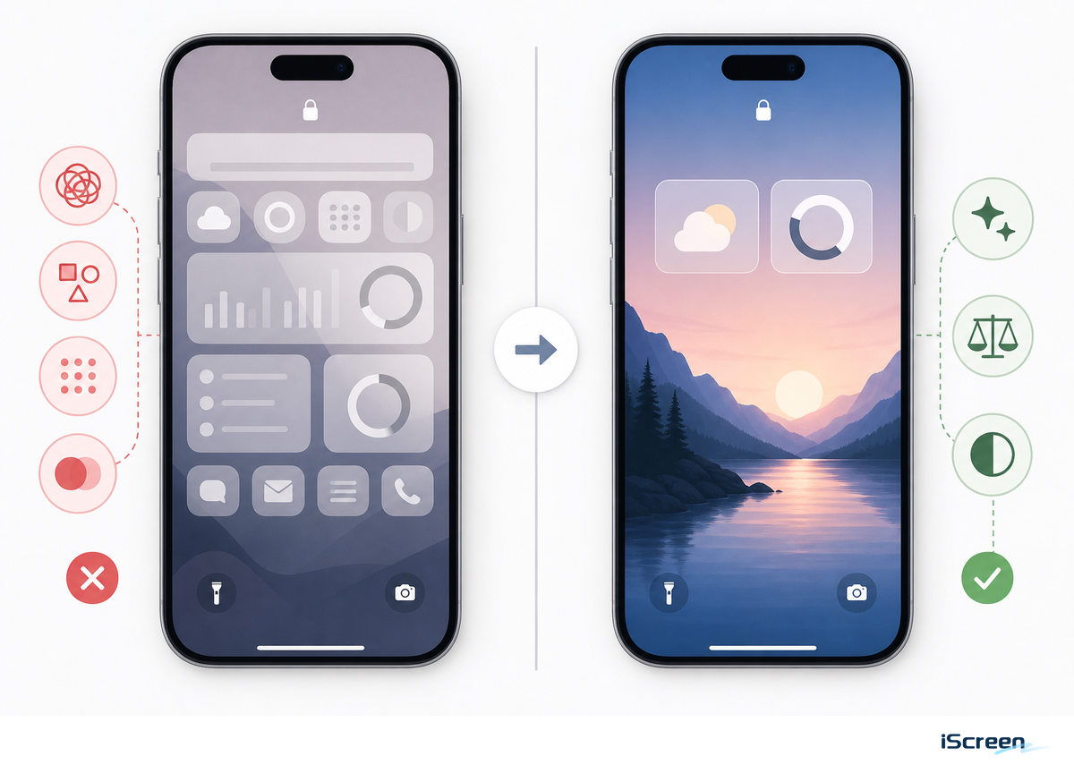
Mistake number one is assuming every customizable slot must be filled. Because Apple’s Lock Screen editor combines the clock, date, widgets, controls, notifications, wallpaper image, and sometimes the Depth Effect, every added element has to earn its place during the first glance.
- Avoid a busy photo behind a thin clock font.
- When one widget is useful, there’s no need to include the other four.
- Keep important wallpaper details away from notification areas.
- Only use the Depth Effect when the image keeps the time and widgets legible.
FAQ
How do I make my iPhone Lock Screen aesthetic?
Start with one clean wallpaper, choose a readable clock color, then add no more than one or two widgets unless the screen is meant for utility.
What are the best widgets for an iPhone Lock Screen?
Weather, calendar, battery, reminders, and simple photo or memo widgets are usually best because they give quick value without pulling attention away from the wallpaper.
Why is Depth Effect not working on my iPhone Lock Screen?
Depth Effect often fails when the subject is not clearly separated, the crop does not overlap the clock correctly, or widgets take up the area that the effect needs.
iScreen Editorial Framing
Lock Screen ideas, wallpaper, widgets, and customization for iOS 18 make up the basis of this tutorial because a GSC 28-day pull for https://www.iscreenapp.com/ showed existing clicks around best widgets for iPhone, best iPhone widgets, and home screen idea terms, while direct lock-screen idea coverage was thin. A site inventory also showed iScreen already has /lock-screen, /blog/lock-screen-widgets, and /blog/depth-effect-wallpaper-iphone; all three pages already exist, giving this article a defined support-content role. That role lets the internal link route send style/setup readers to /lock-screen, wallpaper readers to /wallpaper, widget readers to the blog guide, and Depth Effect readers to the dedicated article.
Related iScreen Guides
- iPhone lock screen widgets and customization
- Aesthetic iPhone wallpapers
- Best lock screen widgets for iPhone
- Depth Effect wallpapers
- Matching iPhone themes
References & Sources
- Create a custom iPhone Lock Screen – Apple Support
- How to add and edit widgets on your iPhone – Apple Support
- Customize apps and widgets on the iPhone Home Screen – Apple Support
- iOS 18: 10 New Home Screen and Lock Screen Features – MacRumors
- iOS and iPadOS 18 Review – MacStories
- iOS 18 Home Screen icon color guide – Macworld
- Update your iPhone or iPad – Apple Support
- Web Content Accessibility Guidelines 2.2 – W3C
- The attentional cost of receiving a cell phone notification – PubMed