Photo Shuffle Wallpaper on iPhone: iOS Lock & Home Screen Setup Guide
Photo Shuffle Wallpaper iPhone: iOS Lock Screen Setup

Setting up a photo shuffle wallpaper allows your Lock Screen to cycle through your photos automatically. When setting up a photo shuffle wallpaper on iPhone, iOS cycles your portraits using four triggers: On Tap, On Lock, Hourly, or Daily. A portrait that’s close to your Super Retina XDR display’s native 9:19.5 aspect ratio reduces the likelihood of the camera automatically zooming. You can, however, crop each frame to your liking using the editor. You can choose to use the 50-photo manual picker or dynamic album sync (iOS 17.1 or later). This guide outlines the album sync setup, OLED battery data, framing rules, and how to get a clear Home Screen widget.

How to Set Up a New Wallpaper With the iOS Photo Shuffle Feature on iPhone Lock Screen
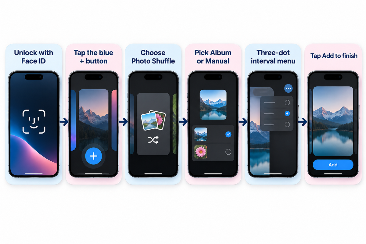
Six-step iOS Lock Screen setup flow for creating a Photo Shuffle wallpaper on iPhone (Apple Support 102638).

To set up a Photo Shuffle wallpaper on iPhone, unlock with Face ID, and long press your Lock Screen. Tap the blue + button and choose Photo Shuffle from the top row. Pick Featured Photos, an Album (requires iOS 17.1 or later), or Select Photos Manually, adjust the interval using the three-dot menu, and tap Add, per Apple Support (102638). For more details on setting up Album, see Apple Support (102638).

Apple introduced the modern Lock Screen gallery in iOS 16 and expanded it through iOS 17, iOS 18, and iOS 26. You can initiate a new wallpaper from three official entry points on your device. If your iPhone uses a passcode or Touch ID instead of Face ID, authenticate first then press the Lock Screen. Otherwise, the gallery button stays locked for privacy.

3 Official iOS Entry Points to Create a Photo Shuffle Lock Screen
Setup Entry Point Navigation Path in iOS Tap Count Pre-Selected Photo Support Best Use Case
Lock Screen Long-Press Gallery Unlock > Long-press Lock Screen > Tap + > Photo Shuffle 4 taps Opens smart categories, Album picker, or manual grid Fastest daily setup with live clock and widget preview
Settings Wallpaper Menu Settings > Wallpaper > Add New Wallpaper > Photo Shuffle 5 taps Full access to People, Pets, Nature, Cities, and Albums Managing multiple Lock Screen and Home Screen pairs at once
Apple Photos Share Sheet Photos app > Select images > Share > Use as Wallpaper 4 taps Pre-loads your highlighted camera roll selection directly Building a quick pack right after editing vertical portraits

The six steps below outline how to set up the photo shuffle feature without losing your framing:

  1. First use Face ID or your passcode to unlock your iPhone, and then press and hold the Lock Screen.
  2. Tap the blue add new (+) button in the bottom-right corner of the gallery.
  3. Select the Photo Shuffle button in the top row of wallpaper options.
  4. Choose your source, set the frequency of shuffle, and select either Use Featured Photos or Use Album.
  5. To crop a specific frame, tap the four-square grid in the bottom left corner.
  6. Tap Add, and then customize your Home Screen pair.

A common mistake happens when users want to remove one awkward picture later. Tapping the blue (+) button creates a brand new Lock Screen from scratch. Instead, long-press the Lock Screen and tap Customize under your active wallpaper card. In a Featured Photos shuffle, display the unwanted photo in the wallpaper editor, tap the three-dot menu, and choose Don’t Feature Photo. For a manual shuffle, use the trash icon or Add Photos; for an Album shuffle, add or remove photos inside that album in the Apple Photos app. You can see 4K and live wallpaper collections to build fresh packs. For faster daily swaps, read our guide on switching between saved iPhone Lock Screen pairs.

Manual Selection vs Album Sync: Best Setting to Customize Shuffle Wallpaper on iPhone
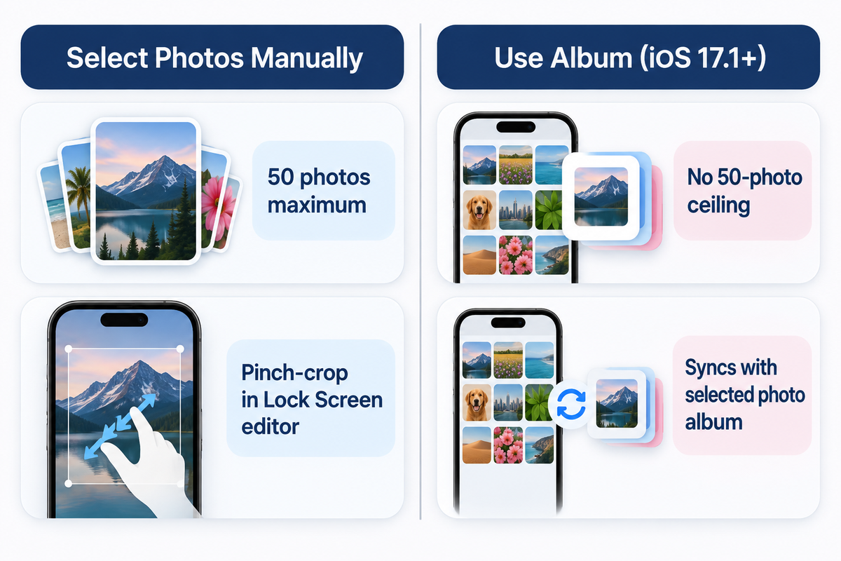
Comparison between Select Photos Manually (50 photos maximum with per-frame crop) and Use Album mode in iOS 17.1 or later.

Select Photos Manually limits your iPhone Photo Shuffle pool to 50 images and lets you pinch-crop pictures individually in the Lock Screen editor. The Album option, added in iOS 17.1, rotates an Apple Photos album automatically and doesn’t have the 50-photo ceiling.

In the initial iOS 16 release, users could only pick smart categories or tap Select Photos Manually at the bottom of the screen. Apple added the Album setting in iOS 17.1, as reported by 9to5Mac’s iOS 17.1 Photo Shuffle analysis. The source mode decides how easily your pack updates when you customize a shuffle wallpaper on iPhone.

4 iOS Photo Shuffle Source Modes Compared (iOS 16 Through iOS 26)
Selection Mode Photo Count Limit Dynamic Auto-Update iCloud Local Cache Requirement Ideal Curation Scenario
Select Photos Manually 50 photos maximum No (static selection) Saved into the Lock Screen pair when you tap Add Curated sets up to 50 individually framed portraits
Use Album (iOS 17.1+) No 50-photo ceiling Yes (syncs with selected photo album) Requires local originals when cloud space-saving mode is on Growing Favorites or seasonal wallpaper folders
Featured Photos Categories System-curated pool Yes (iOS neural indexing) Uses locally indexed People, Pets, Nature, or Cities Zero-effort family, pet, or travel highlights
Apple Shortcuts Automation Unlimited album size Yes (via Find Photos action) Must be downloaded locally to avoid action timeout Custom time-of-day or Focus-triggered wallpaper swaps

If you like algorithmic curation, check People, Pets, Nature, and Cities from the category menu and tap the Use Featured Photos button. Users can also select photos of one specific person or pet from their photo library to keep their photo shuffle focused on that subject. Total visual control is also possible when you choose photos manually if your pack is small.

How Do You Shuffle More Than 50 Photos on an iPhone Lock Screen?

To rotate more than 50 images, choose the Album option (iOS 17.1+) instead of Select Photos Manually in Photo Shuffle, per MacRumors. First, open the Apple Photos app and group your favorite photos into a dedicated photo album. Then open Lock Screen customization, select Photo Shuffle, check Album, and pick your folder. Users on Reddit’s r/ios community also use Apple Shortcuts automations to pull images from large albums at a set time.

Keep one community-reported caveat in mind when using large albums with Apple iCloud space-saving photo storage (Support 105061). When full-resolution originals stay in iCloud, users report that Photo Shuffle may repeat a small locally cached subset of 12 to 16 pictures. Browsing an album on Wi-Fi can load previews without downloading every full-resolution original. Enabling Download and Keep Originals downloads full-resolution files for your entire iCloud Photos library, which requires enough local device storage.

Choosing Your Photo Shuffle Wallpaper Frequency: On Tap, On Lock, Hourly, or Daily
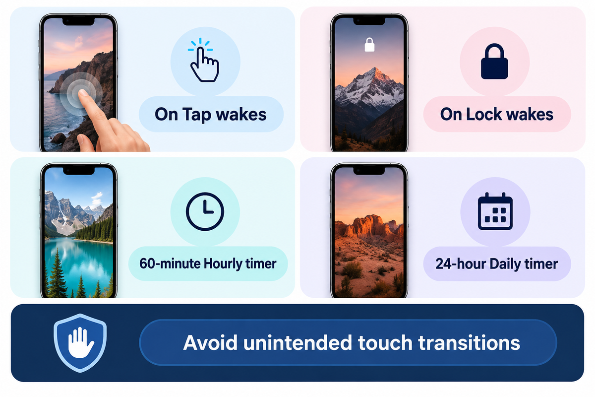
The four iPhone Photo Shuffle frequencies—On Tap, On Lock, 60-minute Hourly timer, and 24-hour Daily timer (Apple Support).

There are four rotation triggers in iOS Photo Shuffle. The first two can be accessed under the On tap and On Lock options, and the last two can be found under Hourly and Daily, respectively, in the bottom-right three-dot ellipsis menu (Apple Support 102638). On Tap and On Lock respond to screen wakes, and Hourly and Daily rotate on a 60-minute and 24-hour timer, respectively.

Your daily notification habits will help determine your ideal choice of shuffle frequency. On Tap changes the background whenever you touch the awake Lock Screen, so tapping notification banners can trigger unintended wallpaper swaps. Using On Lock, Hourly, and Daily avoids touch transitions. Use The 4-Trigger Shuffle Frequency Matrix below to compare how each trigger behaves across nine practical Lock Screen setups.

The 4-Trigger Shuffle Frequency Matrix & 9-Scenario Rotation Guide
Scenario / Cluster Type Shuffle Frequency Option Exact iOS Trigger Event Notification Touch Behavior Supported Source Mode Best Practical Use Case
Type 1: Two-Frame Interactive Flip On Tap Every finger tap on the awake Lock Screen Tapping empty screen areas swaps frames Select Photos Manually (2 aligned photos) Day/night scenes or car headlights on/off illusions
Type 2: Rapid Micro-Gallery On Tap Wake tap or deliberate screen touch Can advance while clearing notifications Select Photos Manually (up to 50 photos) Showcasing a cohesive color-graded mini collection
Type 3: Standard Wake Rotation On Lock Side button lock followed by screen wake Safe while tapping notification banners Manual (up to 50) or Album (iOS 17.1+) Fresh wallpaper every time you unlock your phone
Type 4: Notification-Safe Rotation On Lock Display sleep-to-wake cycle only Does not swap while reading awake screen Featured Photos, Manual, or Album Prevents accidental background skips while tapping banners
Type 5: Workday Paced Rotation Hourly 60-minute system clock interval Unaffected by screen taps or lock count Select Photos Manually (up to 50 photos) Steady hourly transitions during the workday
Type 6: Large Album Paced Rotation Hourly 60-minute system clock interval Unaffected by screen taps or lock count Use Album (iOS 17.1+, no 50-photo ceiling) Changing scenery from time to time throughout the day
Type 7: Calendar Daily Refresh Daily 24-hour cycle Holds one image all day Select Photos Manually (up to 50 photos) Minimalist users who want one stable look per day
Type 8: Archive Slideshow Rotation Daily 24-hour cycle Holds one image all day Use Album or Featured Photos Long-term travel or family slideshow on the Lock Screen
Type 9: Focus-Linked Schedule Hourly or On Lock Focus mode activation + shuffle trigger Follows active Focus Lock Screen pair Dedicated Work vs Personal Lock Screens Separate Work and Personal shuffle packs via iOS Focus

Worked Example (24-Photo Pack Rotation Math): Suppose you have a 24-photo 4K album and wake your iPhone 72 times across a 16-hour waking day (4.5 wakes per hour). In this example, On Lock provides 72 swap opportunities per day if each wake is followed by a lock, Hourly provides 16 per waking day, and Daily provides 24 over 24 days. However, since iOS picks images randomly rather than sequentially, those counts don’t necessarily mean complete coverage of a 24-photo pool.

Does Photo Shuffle Wallpaper Drain Battery on iPhone?

Swapping a locally cached wallpaper image in iOS SpringBoard on On Lock or Hourly uses negligible CPU power. Real Lock Screen power draw comes from OLED display luminance, Always-On Display illumination, and background iCloud downloads. In Purdue University’s OLED study (ACM MobiSys 2021), dark interfaces saved 3% to 9% total phone power indoors and 39% to 47% total phone power at 100% brightness.

Purdue’s benchmark tested six apps on Android OLED panels rather than iOS Photo Shuffle triggers directly. However, the same emissive sub-pixel physics govern Apple’s Super Retina XDR displays (USPTO Patent US8711136B2). Dark-toned shuffle packs save far more battery than switching from Hourly to Daily.

Portrait Aspect Ratio, Native Resolutions, and Depth Effect Filter Rules for iOS Lock Screens
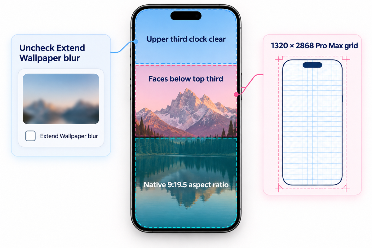
iPhone Lock Screen 9:19.5 portrait framing blueprint showing upper-third clock headroom and lower subject placement.

Using vertical portrait images close to your Super Retina XDR display resolution, like 1320 × 2868 pixels on iPhone 16 Pro Max (Apple Support 121032), will help avoid automatic cropping. Leave the upper third of the frame clear to keep the Lock Screen clock legible.

Standard iPhone camera photos shoot in a 3:4 vertical aspect ratio (3024 × 4032 pixels). Photos with a 3:4 or horizontal 4:3 aspect ratio can be cropped to fill the Lock Screen or padded at the top using Extend Wallpaper. You should still inspect each frame in the grid editor. Applying The Upper-Third Portrait Framing Rule keeps faces below the top third of the canvas so you can uncheck Extend Wallpaper blur.

Native Super Retina XDR Pixel Resolutions Across 9 iPhone Tiers (460 ppi / 458 ppi)
iPhone Model Tier Display Size Native Portrait Resolution (px) Pixel Density Peak Outdoor Brightness Upper-Third Clock Headroom (1/3 Height)
iPhone 17 Pro Max 6.9-inch OLED 1320 × 2868 px 460 ppi 3000 nits Top 956 px clear
iPhone 16 Pro Max 6.9-inch OLED 1320 × 2868 px 460 ppi 2000 nits Top 956 px clear
iPhone 17 & iPhone 17 Pro 6.3-inch OLED 1206 × 2622 px 460 ppi 3000 nits Top 874 px clear
iPhone 16 Pro 6.3-inch OLED 1206 × 2622 px 460 ppi 2000 nits Top 874 px clear
iPhone 16 Plus & iPhone 15 Pro Max 6.7-inch OLED 1290 × 2796 px 460 ppi 2000 nits Top 932 px clear
iPhone 15 Plus & iPhone 14 Pro Max 6.7-inch OLED 1290 × 2796 px 460 ppi 2000 nits Top 932 px clear
iPhone 16, iPhone 15 Pro & iPhone 15 6.1-inch OLED 1179 × 2556 px 460 ppi 2000 nits Top 852 px clear
iPhone 14, iPhone 13 & iPhone 13 Pro 6.1-inch OLED 1170 × 2532 px 460 ppi 1200 nits HDR Top 844 px clear
iPhone 14 Plus & iPhone 13 Pro Max 6.7-inch OLED 1284 × 2778 px 458 ppi 1200 nits HDR Top 926 px clear

In the Photo Shuffle editor, you can swipe left across four built-in filters: Natural, Black & White, Duotone, and Color Wash. When you edit a frame, preview how the selected filter looks on the other photos in your pack. Check our full breakdown of native 4K iPhone wallpaper dimensions if you export custom PNGs from Photoshop, Figma, or an iPad.

How Do You Make a 3D Wallpaper for iPhone in Photo Shuffle?

Two features create a layered 3D effect: iOS Depth Effect (iPhone XS+, no below-clock widgets) and iOS 26 Spatial Scene (iPhone 12+, Apple Support 102638). Placing even one widget row below the clock disables Depth Effect across the entire shuffle. In iOS 26, tapping the Spatial Scene icon in the Lock Screen editor adds a 3D parallax effect that shifts with device tilt.

Where to Download Free 4K Photo Shuffle Wallpapers vs Curated App Packs
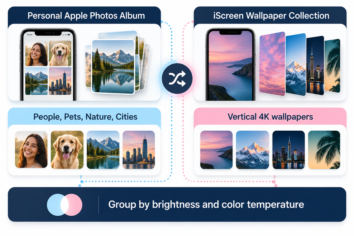
Comparing personal Apple Photos categories with vertical 4K packs from the iScreen Wallpaper Collection.

You can build a high-quality photo shuffle pack from your personal Apple Photos library using People, Pets, Nature, Cities, or an Album. You can also use a wallpaper and widget app like iScreen (iScreen Wallpaper Collection).

Every user has experienced the visual jar of a poorly matched shuffle selection. If frame one is a warm, golden-hour, beach shot, and frame two is a blinding, white, snow photo, your Lock Screen clock color becomes unreadable on the second wake. A tip would be to group photos by background brightness and color temperature before adding them to your album.

Comparing iPhone Photo Shuffle Wallpaper Sources
Wallpaper Source Access Model Portrait Framing Workflow Palette & Clock Cohesion Coordinated Widgets Included
Personal Apple Photos Album Built into iOS Framing available in the Lock Screen editor; pre-cropping optional Varies unless manually sorted by lighting Native iOS Lock Screen widgets
iOS Featured Photos (People, Pets, Nature, Cities) Built into iOS System auto-selects vertical shots from your photo library Mixed lighting across different dates Native iOS Lock Screen widgets
iScreen Wallpaper & Widget App Free tier & Pro options Vertical 4K wallpapers and live wallpaper collections Curated aesthetic themes with clear upper clock zones Yes (500+ Lock & Home Screen widgets)

To ensure your Lock Screen rotation aligns with your desired aesthetic, we have a selection of curated aesthetic iPhone wallpaper themes. Popular choices include dark cyber minimalism, pastel auras, and monochromatic architecture. For a single frame with continuous, kinetic movement, rather than a frame with multiple photos, check out our resource on Animated and Live iPhone wallpaper options.

Pairing Photo Shuffle With a Clean Home Screen, Widget Layout, and App Icons
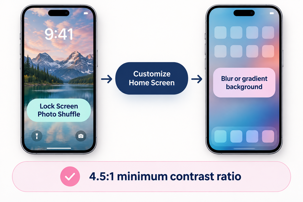
Pairing a rotating Lock Screen Photo Shuffle with a blur or gradient Home Screen via Customize Home Screen for 4.5:1 contrast.

Avoid using Set as Wallpaper Pair to mirror busy, rotating photos behind your app icons; use the Customize Home Screen (or Customise Home Screen in the UK English menu) option and select a blur or gradient background instead.

Once you build the pack, tapping Add will provide two options: Set as Wallpaper Pair and Customize Home Screen. Choosing Set as Wallpaper Pair places the Lock Screen photo behind your Home Screen folders and widgets. In brightly lit areas, white text can be hard to read. Using a Home Screen background with adequate dark luminance will meet the 4.5:1 minimum contrast ratio (7:1 for small text) in the Apple Human Interface Guidelines.

Blurring or darkening a background doesn’t guarantee a 4.5:1 contrast ratio across the entire image (W3C WCAG 2.2 Failure F83). Final readability on your iPhone’s Home Screen and Lock Screen depends on sufficient contrast between white text and the background directly behind it. Users can also switch to label-free Large icons in iOS 18 and 26. That’s why we suggest The Split-Pair Lock & Home Screen Architecture.

The Split-Pair Lock & Home Screen Architecture Comparison
Home Screen Pairing Mode How Home Screen Reacts on Shuffle White App Label Contrast Widget Backdrop Stability Recommended Setup
Set as Wallpaper Pair (Unblurred) Rotates unblurred photos behind icons Low on bright or high-detail frames Backdrop changes on every shuffle swap Avoid unless every photo is dark minimal
Paired Shuffle + Home Screen Blur Shifts ambient color mood softly on each swap Good on mid-to-dark palettes; verify bright shots Works with frosted glass widget cards Best for dynamic ambient color transitions
Split-Pair: Lock Shuffle + Solid Dark Home Lock Screen rotates; Home Screen stays constant Consistent high contrast on dark charcoal (#242424) Stable backdrop; screenshot-style transparent widgets need a matching background and placement Gold standard for clean daily usability

With a dark or blurred Home Screen in place, you can add matching Lock Screen and Home Screen widgets in iScreen. Adding a few weather or battery rings or a calendar gives your screens a beautiful, native iOS user interface (UI) resembling a fully customizable Android launcher.

2026 iOS 26 Trends: 3D Spatial Scenes, Two-Photo Tap Flips, and Setup Checklist
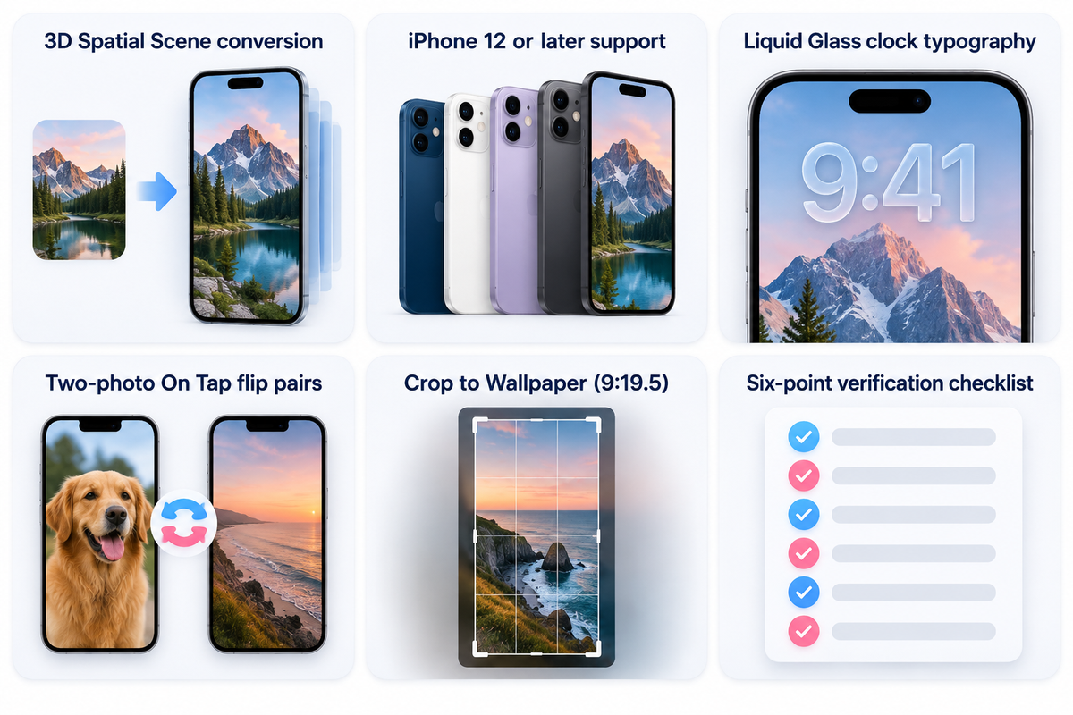
2026 iOS 26 Photo Shuffle upgrades—3D Spatial Scenes, Liquid Glass clock typography, two-photo On Tap flips, and setup checklist.

In iOS 26, Lock Screen Photo Shuffle adds 3D Spatial Scene conversion to iPhone 12 or later (Apple Support 102638). It also adds stretchy Liquid Glass clock typography. Meanwhile, interactive two-photo On Tap flip pairs have risen in popularity as a Lock Screen customization style.

See AppleInsider’s review of iOS 26 Lock Screen for more details. As detailed in AppleInsider’s iOS 26 Lock Screen review, stretchy Liquid Glass clock numerals expand into open upper-third sky areas. Viral two-photo On Tap flips use two almost identical frames. For example, a tap flips the visual state of a car headlight turning on and off. Each tap toggles the visual state in place. Make sure you’ve completed the six-point verification checklist before you exit the editor.

6-Point iPhone Photo Shuffle Pre-Flight Verification Checklist
Verification Step Exact iOS Path Target Setting / Guideline Symptom if Misconfigured Immediate Fix
1. Aspect Ratio & Resolution Photos App > Crop > Wallpaper (9:19.5) Native portrait resolution with ~9:19.5 ratio (e.g., 1320 × 2868 px on 16/17 Pro Max) iOS crops in tightly or pads the top with blur Crop images to vertical Wallpaper ratio or adjust in the grid editor
2. Extend Wallpaper Blur Shuffle Grid Editor > Three-Dot Menu (…) Unchecked on every frame Washed-out fog appears behind the Lock Screen clock Inspect each frame in the grid and uncheck Extend Wallpaper
3. Upper-Third Clock Headroom Shuffle Grid Editor > Two-Finger Pinch Clean upper-third negative space (curation guideline) Clock digits cover eyes or Depth Effect turns off Drag subject slightly lower so only the top edge touches the time
4. iCloud Album Local Files Settings > Photos or On-Device Album Full-resolution files stored on-device Album shuffle repeats a small subset of cached photos Browsing on Wi-Fi loads previews without guaranteeing every original stays cached; keep shuffle originals downloaded locally
5. Depth Effect vs Widgets Lock Screen Customize > Below-Clock Row No widgets below clock if Depth Effect is desired Depth Effect toggle stays greyed out across all frames Remove the widget row below the clock or use iOS 26 Spatial Scene
6. Home Screen Legibility Tap Add > Customize Home Screen Solid Dark (#242424 / #1C1C1E), or Blur On with label readability checked across every photo White app icon titles disappear on bright shuffle frames Assign a dedicated solid dark background or verify contrast across all blurred frames

All iOS 16 through iOS 26 navigation paths, Super Retina XDR specifications, and Lock Screen rules were verified against Apple Support documentation.

Frequently Asked Questions About Photo Shuffle Wallpaper on iPhone

How do I edit a Photo Shuffle wallpaper on iPhone or remove one specific picture?

Wake your iPhone with Face ID/Touch ID. Long-press the Lock Screen Photo Shuffle pair and tap the Customize option on your active pair. From the Lock Screen preview, select the bottom-left photo grid. For a Featured Photos shuffle, tap the three-dot menu on an unwanted photo and select ‘Don’t Feature Photo’. For a manual shuffle, tap the trash icon to remove selected photos or the ‘Add Photos’ button to add more. For Album shuffle (iOS 17.1+), open the album and remove or add photos inside that album in Apple Photos.

Why is my iPhone Photo Shuffle wallpaper not showing all the photos in my album?

iOS skips or repeats pictures for two main reasons: full-resolution Album originals remain uncached in iCloud, or Featured Photos bypasses horizontal 4:3 shots that cut off faces. In iCloud space-saving mode, cloud-only originals won’t load instantly on the Lock Screen. Manual and Album shuffles still allow you to crop 3:4 or 4:3 pics on the Lock Screen editor.

Can you set a Photo Shuffle wallpaper for the iPhone Home Screen only, or pair it with a solid background?

You can’t run Photo Shuffle on the Home Screen alone with a static Lock Screen, though Customize Home Screen pairs a Lock Screen shuffle with a solid backdrop. After you configure Photo Shuffle and tap Add, choosing Set as Wallpaper Pair rotates both screens together. Tapping Customize Home Screen lets you choose a solid color, gradient, or a blurred background.

Does iOS still support Live Wallpaper alongside Photo Shuffle on iPhone?

Yes. In iOS 17-26, you can select a single Live Photo in the Wallpaper gallery and enable the Live Photo motion button. However, Live Photo motion and multi-image Photo Shuffle can’t be used together.

How do I find which album or photos my current iPhone shuffle wallpaper uses?

Long-press your Lock Screen and tap Customize on the Lock Screen card. Look in the bottom-left for the Album name button or a thumbnail stack icon to show selected pictures.

References & Sources

  1. Apple Official Support (102638) – Change your iPhone wallpaper (Photo Shuffle frequencies, Album mode & iOS 26 3D Spatial Scenes)
  2. Apple iPhone User Guide – Create a Custom Lock Screen on iPhone
  3. Apple Developer – Human Interface Guidelines: Dark Mode (4.5:1 and 7:1 Contrast Ratios)
  4. Purdue University (ACM MobiSys 2021), Dark mode may not save your phone’s battery life as much as you think
  5. ACM Digital Library (MobiSys 2021), How Much Battery Does Dark Mode Save? An Accurate OLED Display Power Profiler for Modern Smartphones
  6. Apple Official Support (121032), iPhone 16 Pro Max Technical Specifications (Super Retina XDR OLED)
  7. Apple Official Support (125091), iPhone 17 Pro Max Technical Specifications (Super Retina XDR OLED)
  8. Apple Official Support (125089), iPhone 17 Technical Specifications
  9. Apple Official Support (105061), Manage your photo and video storage on iPhone and iCloud
  10. AppleInsider, Lock Screen customization in iOS 26 is both stretchy and 3D
  11. 9to5Mac, iOS 17.1 lets you choose a specific album for Lock Screen Photo Shuffle
  12. MacRumors – How to Shuffle between Photos in a Particular Album on your iPhone Lock Screen
  13. The Verge – How to use iOS Lock Screen Photo Shuffle on iPhone
  14. Gadget Hacks – Rotate Wallpapers on Your iPhone with Photo Shuffle
  15. United States Patent US8711136B2 – Electronic device having display with power management
Recent articles

iScreen Rolls Out Major iPhone Duo Update with Dual-Screen Themes, Liquid Glass Visuals, and Extra-Large Widgets

iScreen Rolls Out Major iPhone Duo Update with Dual-Screen Themes, Liquid Glass Visuals, and Extra-Large Widgets

2026/10/30 16:23
The update brings coordinated themes for both displays, Liquid Glass-inspired visuals, and expanded widget layouts. XIAMEN, China — October 30, 2026 — iScreen, a mobile customization app offering themes, widgets, and wallpapers, has introduced a major update tailored for iPhone Duo. Designed to take advantage of the device’s foldable, dual-screen design, the update brings coordinated theme packs for both displays, enhanced widget layouts, and a Liquid Glass-inspired aesthetic featuring translucent surfaces and light-reflective effects. It also adds support for iOS 27 Extra-Large Widgets, giving users more ways to personalize their device and make the most of its expanded screen space.   A MORE SEAMLESS DUAL-SCREEN EXPERIENCE FOR IPHONE DUO To better accommodate iPhone Duo‘s foldable design, iScreen has refined its layout system to help their themes and widgets display consistently across both screens, with improved scaling and fewer visual disruptions. Themes Designed for Dual-Screen: The update introduces multi-style theme packs precisely calibrated for the iPhone Duo screen aspect ratio. From lighting transitions in wallpapers to widget layout rhythm, visuals extend naturally across both displays. Widgets for the Expanded Display: Interactive widgets and larger information panels make better use of the available screen space, presenting more information while maintaining visual clarity. Liquid Glass-Inspired Visuals: The theme aligns with the Liquid Glass design language introduced in iOS 27. Featuring translucent frosted textures and dynamic light refraction, widgets seamlessly blend across the dual screens of the iPhone Duo. These enhancements are designed to make the foldable interface feel effortless, helping users check key information at a glance and move between tasks across both displays.   A GROWING THEME LIBRARY INSPIRED BY USER PREFERENCES iScreen continues to expand its theme library based on user preferences and data insights, bringing more diverse customization options to iPhone Duo users. The latest update introduces a range of themed setups, including Cool Dark, Retro Skeuomorphic, and Minimalist Gloss, offering distinct visual styles to suit different tastes. From bold, dark aesthetics to nostalgic interface designs and sleek, glossy finishes, these themes give users more ways to personalize their dual-screen experience. Cool Dark features a darker palette and high contrast, while Retro Skeuomorphic draws inspiration from familiar, tactile interface elements. Minimalist Gloss combines clean layouts with polished surfaces and subtle highlights, offering a more understated visual option. Looking ahead, iScreen will use user feedback, theme engagement, and community suggestions to guide future updates and keep its theme collection aligned with users’ evolving interests.   SUPPORT FOR IOS 27 EXTRA-LARGE WIDGETS Alongside its dual-screen enhancements, iScreen is expanding its support for iOS 27 Extra-Large widgets, giving users more flexibility to organize information across the expanded display. Enhanced Existing Widgets: Popular fan-favorite widgets—such as Control Panel, Quick Launch Folder, Typewriter, and Polaroid Camera —have been adapted for Extra-Large layouts, providing more room for information, a clearer visual hierarchy, and greater customization flexibility. A New Collection of Extra-Large Widgets: New multi-function widgets bring related information and controls together in a larger, customizable layout, helping users make more effective use of the iPhone Duo‘s expanded These layouts give users more space to display frequently checked information and personalize the arrangement of their widgets. By combining practical information with visual elements, users can create a home screen that is both functional and visually consistent.   The updated version of iScreen with full iPhone Duo adaptation is available globally on the App Store starting October 30, 2026. Download/Update: Search “iScreen” on the App Store to update to the latest version. Learn More: Visit the official website at iScreen.com for setup inspiration and guides.   【ABOUT ISCREEN】 iScreen is a powerful home screen customization app for Android and iOS, offering widgets, wallpapers, themes, and dynamic island features.   Media Contact iScreen Official Team Email: iscreenofficial@gmail.com Official Website:iScreen – Phone Style, iScreen it! iOS Download:‎‎iScreen – Widgets & Wallpaper Android Download:‎‎iScreen – Widgets & Wallpaper
2026/10/30 16:23
Plain iPhone Wallpaper: Solid Colors for a Cleaner Home Screen

Plain iPhone Wallpaper: Solid Colors for a Cleaner Home Screen

2026/10/29 15:47
A solid color iPhone wallpaper clears up busy photo details. App icons, widgets, and notification badges become clear and easy to read. You can get a flat single-color background directly inside the built-in iOS picker. No external image download is needed. Selecting the Solid style filter in Settings prevents the top gradient fade. White status bar text stays sharp against the flat fill. This guide covers native setup steps, eight tested hex codes (including dock-blending #242424 and #F4F4F4), OLED power benchmarks, and native screen resolutions. How to Set a Solid Color Wallpaper on iPhone in iOS Without Top Fade To set a flat solid color iPhone wallpaper as your home screen background, go to iOS Wallpaper Settings and follow these steps: Add New Wallpaper > Color. Go to the style previews at the bottom of the screen and swipe left until you see the Solid preset. Users setting a flat plain background on a device running iOS 16, iOS 17, iOS 18, or iOS 26 quickly notice a milky wash across the top of the screen. If you’re attempting to set a flat wallpaper on my iPhone for the first time, that milky wash is probably due to the built-in Color picker defaulting to the Vibrant filter, which produces a gradient background instead of a true flat fill. Swipe left past the Vibrant preset, then Tone, Deep, Vapor, and Bright filters to get to the Solid preset. The 3-Cause Top-Fade Triage The top fade comes from the Color picker defaulting to Vibrant instead of Solid. Extend Wallpaper crop padding and Home Screen Blur toggle cause the remaining washout symptoms. Each visual symptom traces back to a different control in the iOS wallpaper editor. The 3-Cause Top-Fade Triage for iOS 16 Through iOS 26 Fade or Blur Symptom Root iOS Trigger Where It Appears Exact Fix in iOS Settings Upper portion of the screen looks lighter or tinted Built-in Color picker defaults to Vibrant, Tone, or Deep filter Both Lock Screen and Home Screen Swipe left in the Color editor until the bottom pill reads Solid Top edge blurs into a soft gradient on an imported image Extend Wallpaper crop padding triggered by pinch-to-zoom out Lock Screen and paired Home Screen Tap the three-dot menu button in the bottom-right corner and uncheck Extend Wallpaper Entire background looks frosted behind app icons Explicit Home Screen Blur toggle left active Home Screen only Tap Customize on the Home Screen preview and tap the Blur button on the far right to turn it off To set a clean background color on your iPhone, do the following: Open Settings, tap Wallpaper, and tap Add New Wallpaper. Select the Color button in the top row of the gallery. Tap the color button to select a swatch, or in the Sliders tab, enter a hex code. Close the palette panel and swipe left across style previews to change the style name from Vibrant to Solid. In the upper right, tap Add. Choose Customize Home Screen and turn off Home Screen Blur, then tap Done. Pairing a flat Home Screen background with a graphic Lock Screen is also an option. In our gallery, you can find lock screen wallpapers and pair them to Focus modes. We have a tutorial on switching between multiple iPhone lock screen pairs to automate daily background changes. Solid Color iPhone Wallpaper Hex Codes for White Labels and Hidden Docks Hex code #242424 in iOS Dark Mode softens the translucent Home Screen dock border when Reduce Transparency and Home Screen Dim are turned off. It delivers a 15.5:1 sRGB luminance contrast ratio (often cited as 15.3:1) against white app icon labels. The contrast ratio for #242424 against white exceeds WCAG 2.1’s 4.5:1 threshold for normal text. The Apple Human Interface Guidelines for Color recommend at least a 4.5:1 contrast ratio for standard text. Small labels benefit from a 7:1 ratio. Raw W3C contrast ratios measure the uncomposited hex background against pure white (#FFFFFF) text. On an actual iPhone Home Screen, icon label rendering and dock visibility depend on Apple’s translucent material compositing, Reduce Transparency being off in Accessibility, and the Home Screen Dim toggle staying disabled. The 8-Shade Legibility & Dock-Blend Matrix Use #242424 for a hidden dock and high contrast white labels, or #F4F4F4 for a soft daylight look. Actual dock and folder blending depends on iOS’s translucent materials, with Reduce Transparency turned off and Home Screen Dim toggled off. The 8-Shade Legibility & Dock-Blend Matrix Shade Type & Name Hex Code RGB Values W3C Contrast vs #FFFFFF Home Screen Dock & Folder Behavior Recommended iOS Appearance When Not to Use OLED Pitch Black #000000 0, 0, 0 21.0:1 (AAA) Dock container stays visible as a dark gray bar Dark Mode Skip if you want the dock bar to blend into the background Dark Mode Dock Charcoal #242424 36, 36, 36 15.5:1 (AAA) Softens the Dark Mode dock border when Reduce Transparency is off (dock-blending hex method) Dark Mode Does not blend the dock if Light Mode or Reduce Transparency is active Deep Midnight Navy #1E293B 30, 41, 59 14.6:1 (AAA) Subtle dark blue dock separation with crisp white text Dark Mode or Auto Avoid pairing with neon yellow or lime app icons Muted Forest Green #1F3A2E 31, 58, 46 12.4:1 (AAA) High white-label contrast with low blue-light glare Dark Mode or Auto Can clash with bright red notification badges Deep Plum Purple #2E1F3A 46, 31, 58 15.4:1 (AAA) Rich dark backdrop for tinted or monochrome icons Dark Mode May look nearly black at very low indoor brightness Crimson Burgundy Red #4A1C24 74, 28, 36 14.2:1 (AAA) Warm dark red tone that keeps white text sharp Dark Mode Red subpixels draw slightly more power than dark gray Warm Taupe Slate #3A3532 58, 53, 50 12.0:1 (AAA) Neutral earthy tone for minimalist wood or beige themes Dark Mode or Light Mode Shows a faint dock outline in both appearance modes Light Mode Dock Gray #F4F4F4 244, 244, 244 1.1:1 vs white (17.4:1 vs dark text) Makes the Light Mode dock and closed folder containers less prominent when Reduce Transparency is off Light Mode only Bright at night; label contrast depends on iOS switching labels to dark text Entering any of these shades in the built-in iOS solid color picker is quick. To change the colors, open the color selector, choose Sliders at the top, and enter the six-character code in the Display P3 Hex Color # field. While customizing your iPhone Home Screen layout, you can set folder and dock tones to match and compare pre-made black, white, and gray iPhone wallpaper packs. Pure Black vs Dark Gray Solid Color Wallpaper on Apple OLED Displays On tested Android OLED smartphone panels, switching from a bright light interface to pure black (#000000) cuts display power draw by 39% to 47% at 100% brightness and 3% to 9% at 30% to 50% indoor auto-brightness. At typical indoor brightness, the display power difference between pure black (#000000) and dark charcoal (#242424) stays below 1% to 2%. Because those measurements were taken on Android OLED phones, not iPhones, they show the general behavior of OLED subpixels rather than a fixed iPhone battery percentage. The Apple Super Retina XDR OLED Displays are able to independently control the intensity of each of the three subpixels (i.e. red, green, and blue) to create a lit pixel. Outdoor viewing up to 2,000 nits peak brightness (1,000 nits typical max and 1,600 nits HDR peak on an iPhone 16 Pro 120 Hz ProMotion display) widens the display power gap between bright and dark backgrounds. As Apple’s Dark Mode Human Interface Guidelines and Nielsen Norman Group’s dark mode usability research suggest, using an elevated dark gray background reduces harsh contrast halation. A solid black background turns off black pixel drive entirely. A low state subpixel charge of dark charcoal (#242424) prevents scroll smearing when swiping between home screen pages. Pure Black (#000000) vs Dark Charcoal (#242424) vs Bright Photo Wallpaper on OLED Comparison Metric Pure Black (#000000) Dark Charcoal (#242424) Bright Stock Photo (#FFFFFF / Multi-Color) OLED Subpixel State Unlit subpixels (no drive current on black pixels) Low-luminance subpixel drive (RGB 36, 36, 36) High-current emission across red, green, and blue subpixels Indoor Auto-Brightness Display Power 3%–9% display power reduction at 30%–50% brightness on tested Android OLED panels Nearly identical to pure black indoors (under 1%–2% display power difference) Higher indoor display power draw across lit pixels Outdoor Peak Brightness Display Power 39%–47% display power reduction at full brightness on tested Android OLED panels Substantial outdoor display power reduction with slightly higher subpixel drive than #000000 Highest outdoor display power draw (up to 2,000 nits on Super Retina XDR) Home Screen Dock Appearance Dock bar remains visible in Dark Mode Dock border softens in Dark Mode when Reduce Transparency is off Frosted translucent dock bar stays visible OLED Scroll Smearing & Halation Can show brief pixel wake-up trails when swiping fast Subpixels stay pre-charged, reducing scroll trails No black smearing, but causes higher night eye glare Worked Example: Luminance Contrast & Pixel Density Verification: Let’s take a look at pure black (#000000) and dark charcoal (#242424) against white app labels (#FFFFFF). Pure black has 0.0 relative luminance, yielding the maximum 21.0:1 W3C contrast ratio against white (luminance 1.0). Dark charcoal (#242424, RGB 36, 36, 36) has a relative luminance of 0.0176, which produces a 15.5:1 contrast ratio against white, still more than double the 7:1 enhanced legibility target while keeping subpixels faintly lit to prevent scroll trails and scrolling artifacts. Does a Pure Black iPhone Wallpaper Prevent or Cause OLED Burn-In? A pure black (#000000) wallpaper turns off OLED subpixel drive for black pixels, but it doesn’t prevent overall panel aging and can increase differential wear around static white status bar icons. Periodically switching between #000000 and a dark gray shade like #242424 helps reduce uneven subpixel exposure across the screen. Free 4K Solid Color Wallpaper Download vs Native iOS Color Picker Paid “4K solid color wallpaper” packs provide no edge sharpness advantage for the uniform color itself over the free, built-in iOS Color Picker or a lossless PNG. A uniform single color background has identical RGB values across all pixels. Native iOS rendering fills your exact screen canvas at full resolution, for free. Online marketplaces list paid digital bundles of plain color wallpaper photos, with pricing that varies by seller and bundle size. Some vendors promote HD, 4K and 8K resolution. On a detailed photograph, higher pixel counts preserve fine textures. Each pixel on a single-color image board stores the same color value. A large file size won’t make a flat color image sharper. Use a lossless PNG when saving a free iPhone background from an image board. Many free stock photos distribute solid backgrounds as compressed JPEG files rather than lossless PNGs. Comparison of Solid Color Wallpaper Sources for iPhone Source Method Cost File Format & Color Depth Banding & Artifact Risk Extend Wallpaper Blur Risk Best Use Case Built-in iOS Color Picker (Solid filter) Free (built into iOS) Procedural system render (Display P3 / sRGB) None (no file compression) None when set to the Solid style filter Any single-color setup or dock-hiding hex code Custom Native-Resolution 24-Bit PNG Free (via Shortcuts or design app) Lossless 24-bit PNG None on flat colors Low when exported at your model’s native pixel dimensions Adding a custom dock-hiding overlay or subtle border Free Image Board / Stock Photo Download Free download Often 8-bit lossy JPEG High risk of compression artifacts on dark tones High if aspect ratio is 16:9 (1080×1920) Avoid for dark solid shades; choose lossless PNG instead Paid Marketplace Minimalist Color Pack Paid per bundle (varies by seller) ZIP bundle of PNG or JPEG files Varies by seller export settings Triggers crop fade if sized for older iPhones Only worthwhile if the bundle includes custom icons or widgets Looking for more than a single flat shade? Check out curated minimalist aesthetic iPhone wallpaper ideas. Those designs use clean geometry and lossless image exports. Why Do Downloaded Dark Solid Wallpapers Show Color Banding on iPhone? Downloaded dark solid wallpapers show visible color banding when websites save them as compressed 8-bit JPEG files. JPEG 4:2:0 reduces chroma resolution, while JPEG quantization and limited tonal precision can make subtle dark shades appear as visible bands. Using the built-in iOS Color picker or exporting an uncompressed 24-bit PNG avoids JPEG compression block artifacts. Pairing a Plain iPhone Color Wallpaper With Widgets and App Icons Hex codes can be adjusted via the color wheel to alter lightness or darkness. A lighter shade of your plain wallpaper can be used on your widget card to achieve a clean, visual hierarchy. You can further achieve this visual hierarchy with an icon pack and iScreen widgets that separate borders without reintroducing visual clutter. It’s instantly noticeable when you switch from a busy photo to a simple solid color wallpaper, thanks to those embarrassing default app icons. The same is true for your white widget boxes. In iOS 18 and 26 Home Screen Customization, you can access the Customize option by long pressing on the Home Screen, selecting Edit, and choosing Customize. From here, you can turn on Large Icons to remove label text, or use Dark or Tinted to change the icons’ appearance. For more advanced features like changing widget backgrounds or app icon sets, you’ll have to look to apps like iScreen. iPhone Home Screen Customization Approaches for Solid Color Setups Customization Method Custom Widget Background Control Coordinated App Icon Support Label & Dock Styling Capabilities Best Fit iScreen App (Widgets, Icons & Themes) Custom hex color picker and transparent widget backgrounds Coordinated aesthetic icon packs with profile installation Matched wallpaper, widget, and Dynamic Island theme sets All-in-one minimalist Home Screen pairing Native iOS 18 / iOS 26 Customize Sheet System tinting applied across standard widgets Built-in Dark, Clear, and Tinted icon appearance modes Large icon mode removes text labels underneath app icons Quick built-in icon tinting and label removal iOS Shortcuts + Built-In Color Picker None (relies on native widget styles) Manual per-app custom icon bookmark creation Automates wallpaper switching across Focus modes Users replacing only a few primary dock icons Custom Native-Resolution PNG + iOS Color Picker Pairs flat or framed PNG backgrounds with native widgets Compatible with both stock iOS icons and Shortcut icons Avoids Extend Wallpaper crop blur when sized to model dimensions Users creating custom color layouts without extra apps The 4-Step Solid Pairing Workflow Minimalists will be happy to know that you can create a minimalist Home Screen in five minutes or less by adjusting just a few settings: Lock the base hex: You can use the Solid style filter to change the color of your solid color wallpaper to #242424 to make your dock’s Dark Mode hidden or to #1E293B for a deep navy color. Offset widget surfaces: Open customizable iPhone Home Screen Widgets in iScreen. Set each widget background slightly lighter (#292929 on #242424) to achieve a subtle elevation effect, or match #242424 for a floating effect. Unify icon chrome: Install coordinated aesthetic app icon sets in monochrome white, matte charcoal, or pastel tones. Matching icon packs stop third-party app logos from clashing with your background color. Choose label visibility: Keep standard icon size to use high-contrast white app labels or use Large Icons to remove text labels. Can You Set Different Solid Colors for the iPhone Lock Screen and Home Screen? Yes, you can place a solid color on your lock screen, and a separate solid color on your home screen. The majority of users like to pair a colorful lockscreen with a dark charcoal home screen to make notifications stand out. After tapping Add on your lock screen color, select Customize Home Screen, tap Color at the bottom, and choose another color. Native iPhone Screen Resolutions for Custom Solid Color Backgrounds You can export a solid-color PNG at your iPhone model’s native pixel dimensions, and avoid pinching or zooming, to minimize Extend Wallpaper crop blur. Use 1320 x 2868 pixels for an iPhone 16 Pro Max, or 1179 x 2556 pixels for an iPhone 16 and 15. Generally, wallpaper generator exports are in the old format of 1080×1920 pixels at 16:9 aspect ratio. The super retina XDR displays on the iPhones range from 6.1 inches (1179×2556) at 460ppi, 6.3 inches (1206×2622) at 460ppi, 6.7 inches (1290×2796) at 460ppi, and 6.9 inches (1320×2868) at 460ppi, as stated in the iPhone 16 Pro specifications and iPhone 16 specifications. Importing a 1080 x 1920 px image on a 1320 x 2868 px display screen leaves a 948 px vertical shortfall and 240 px horizontal shortfall, which forces iOS to scale and pad the top edge when creating a high-quality PNG. Native Pixel Resolutions for Custom iPhone Solid Color PNGs iPhone Model Group Native Resolution (Width x Height in Pixels) Display Size & Pixel Density Aspect Ratio Recommended Export Format iPhone 16 Pro Max 1320 x 2868 px 6.9-inch OLED at 460 ppi 19.5:9 24-bit lossless PNG (Display P3 or sRGB) iPhone 16 Pro 1206 x 2622 px 6.3-inch OLED at 460 ppi 19.5:9 24-bit lossless PNG (Display P3 or sRGB) iPhone 16 Plus, 15 Plus, 15 Pro Max, 14 Pro Max 1290 x 2796 px 6.7-inch OLED at 460 ppi 19.5:9 24-bit lossless PNG (Display P3 or sRGB) iPhone 16, 15, 15 Pro, 14 Pro 1179 x 2556 px 6.1-inch OLED at 460 ppi 19.5:9 24-bit lossless PNG (Display P3 or sRGB) iPhone 14, 13, 13 Pro, 12, 12 Pro 1170 x 2532 px 6.1-inch OLED at 460 ppi 19.5:9 24-bit lossless PNG (Display P3 or sRGB) iPhone 14 Plus & 13 Pro Max / 12 Pro Max 1284 x 2778 px 6.7-inch OLED at 458 ppi 19.5:9 24-bit lossless PNG (Display P3 or sRGB) iPhone 13 mini & 12 mini 1080 x 2340 px 5.4-inch OLED at 476 ppi 19.5:9 24-bit lossless PNG (Display P3 or sRGB) iPhone 11 Pro Max & XS Max 1242 x 2688 px 6.5-inch OLED at 458 ppi 19.5:9 24-bit lossless PNG (Display P3 or sRGB) Solid Color Wallpaper Selection & Pairing Checklist for iOS Home Screens Turn off both Reduce Transparency and Home Screen Dim, and account for True Tone, Night Shift, Dim Flashing Lights and Reduce White Point before taking your wallpaper picture. Turning off these settings stops iOS accessibility or display filters from changing your hex value or exposing the dock border. 6-Point iOS Solid Color Wallpaper Verification Checklist Check Item iOS Menu Location Target Setting Symptom if Misconfigured Immediate Fix 1. Color Style Filter Settings > Wallpaper > Add New Wallpaper > Color Solid filter Upper section of the wallpaper looks lighter than the bottom Swipe left from Vibrant until the bottom label reads Solid 2. Extend Wallpaper Crop Lock Screen Editor > Three-Dot Menu (…) Unchecked (Off) Imported PNG blurs or fades near the status bar clock Tap the three-dot icon and tap Extend Wallpaper to uncheck it when shown 3. Home Screen Blur Wallpaper Pair Preview > Customize Home Screen Blur Off Custom shade turns muted or frosty behind app icons Tap the Blur pill in the bottom-right corner so the checkmark disappears 4. Reduce Transparency Settings > Accessibility > Display & Text Size Off (Disabled) Reduce Transparency and Increase Contrast can change the dock’s appearance; they do not guarantee that a solid wallpaper will hide the Home Screen dock Keep Reduce Transparency and Increase Contrast off when testing #242424 or #F4F4F4 dock blending 5. Dark Mode Dimming Settings > Wallpaper > Customize Home Screen Sun/Dim Icon Off Bright or pastel solid colors look muddy and gray Tap the dimming icon in the corner of the Home Screen editor to restore full brightness 6. True Tone & Night Shift Settings > Display & Brightness Temporarily Off during hex calibration Neutral gray or white wallpaper looks warm yellow or orange Turn off True Tone while picking your hex code, then re-enable if desired Frequently Asked Questions About Solid Color iPhone Wallpapers How do I get a plain black or white screen on my iPhone without downloading an image? Go to Settings > Wallpaper and tap Add New Wallpaper. Choose Color at the top of the gallery and pick either black (#000000) or white (#FFFFFF) in the color picker. Close the picker and swipe left across the previews until it says Solid. Tap Add and select Set as Wallpaper Pair and turn off Home Screen Blur. Why does my solid color iPhone wallpaper look lighter or darker than the hex code I entered? Three things affect the custom Hex code after it’s entered. First, the Color wallpaper picker defaults to Vibrant or Tone, adding a gradient until it’s swiped to Solid. Second, True Tone and Night Shift adjust the white point of the display. Third, reducing white point in Accessibility diminishes the peak luminance of the display. Can I hide folder backgrounds on my iPhone Home Screen using a solid color wallpaper? In Dark Mode, a solid hex wallpaper on its own doesn’t always make iOS folder containers on the home screen fully translucent because iOS renders folder containers with a lighter translucent material compared to the Home Screen dock. In Light Mode, a solid wallpaper may decrease the prominence of the dock and folder containers, but they may still be rendered by iOS as translucent surfaces. Where does iOS keep the built-in solid color wallpaper picker on iPhone? Press and hold your Lock Screen, tap the blue plus button and select Color to add it as a new Wallpaper. You may also go to Settings and select Wallpaper. Do solid color wallpapers work with iOS Depth Effect on the Lock Screen? Flat single-color wallpapers keep the Lock Screen clock fully visible above the background. References & Sources Apple iPhone User Guide: Change the wallpaper on iPhone (iOS Wallpaper Settings & Built-in Color Picker) Apple Developer: Human Interface Guidelines: Dark Mode Apple Developer: Human Interface Guidelines: Color & Contrast Ratios Apple Developer: Human Interface Guidelines: Translucent Materials & Vibrancy World Wide Web Consortium (W3C), WCAG 2.1 Understanding Success Criteria 1.4.3: Contrast (Minimum) Purdue University (ACM MobiSys 2021), Dark mode may not save your phone’s battery life as much as you think Apple Support, About the Super Retina display and Super Retina XDR display on your iPhone Apple Support, iPhone 16 Pro and iPhone 16 Pro Max Technical Specifications (Super Retina XDR OLED) Apple Support, iPhone 16 and iPhone 16 Plus Technical Specifications Nielsen Norman Group, Dark Mode vs Light Mode: Which Is Better? Engadget, How to customize your iPhone Home Screen iDownloadBlog, How to set a solid color wallpaper on iPhone or iPad Digital Minimalist, How to Hide Your iPhone Dock Using Solid Color Hex Codes iOSHacker, Download Solid Color Wallpapers for iPhone (Black, White, and Grey)
2026/10/29 15:47
Gradient Wallpaper iPhone Guide: Six Color Pairings

Gradient Wallpaper iPhone Guide: Six Color Pairings

2026/10/27 16:25
/* Table component reused from the existing iPhone Home Screen Wallpaper article. */ .seo-blog-content table{width:100%;min-width:640px;border-collapse:collapse;margin:0;font-size:15px;line-height:1.6;letter-spacing:normal;border:1px solid #e0e0e0;color:#2d2d2d;font-variant-numeric:tabular-nums;} .seo-blog-content table tr{border:none!important;} .seo-blog-content table th{background:#2d2d2d!important;color:#fff!important;font-weight:600;text-align:left;padding:12px 16px!important;border:none!important;vertical-align:top;} .seo-blog-content table td{padding:11px 16px!important;border:none!important;border-top:1px solid #e0e0e0!important;background:#fff;vertical-align:top;text-align:left;} .seo-blog-content table tbody tr:nth-child(even) td{background:#f5f5f5;} .seo-blog-content table tbody td:first-child{font-weight:600;} .seo-blog-content table caption{caption-side:top;text-align:left;font-weight:600;padding:0 0 12px;color:#2d2d2d;} @media(max-width:767px){.seo-blog-content table{font-size:14px;}.seo-blog-content table th,.seo-blog-content table td{padding:10px 12px!important;}} A blue-to-teal background can look lovely in Photos, then put its brightest patch directly behind your clock. There’s more to choosing the colors than that. The direction of the fade and the crop and text already on your screen determine whether the finished layout feels calm or awkward. Gradient wallpaper for iPhone blends colors across the screen. Start with navy and teal for light text, or cream and lilac for dark text. Place a contrasting area behind the clock, then set the Home Screen separately if its widgets need a quieter background. Before you choose A dark background can still hide dark text. The Lock Screen and Home Screen can use different treatments. Image dimensions and smooth color transitions are separate quality checks. Six gradient wallpaper color pairings for iPhone Start with navy and teal if your clock is pale, or cream and lilac if you prefer dark lettering. Both of these color combinations give you a good place to position text. The six pairs below are starting designs: choose the mood first, then move the lighter or darker area to suit your layout. Six palette recipes Pair Color stops Starting layout Midnight teal Navy #14243B → teal #387F86 Keep navy behind a light clock; let teal gather lower down. Soft lilac Cream #F3EDE2 → lilac #C8B8DE Put dark lettering over the cream area. Peach dusk Peach #F4BEA8 → mauve #875C83 Try a diagonal fade, with pale text over the mauve corner. Blue hour Ink #192A56 → blue #5E8DB8 Keep the upper clock area in ink; use blue near the bottom. Sage mist Ivory #E9E8DC → sage #A5B8A3 Use dark text and a gentle fade behind sparse widgets. Berry night Plum #39233F → berry #8C456D Place light text over plum; keep berry beside the widget column. Hex codes specify the source colors when you make your own file. They aren’t settings you must enter in Apple’s wallpaper picker. A pale pair can feel soft without being washed out; a darker pair can add depth without a bright central glow. For more style directions, browse our aesthetic iPhone wallpaper ideas. Place light and dark areas around your text If your text is light, you should have a darker area behind it; if your text is dark, you should have a lighter area behind it. The relevant area is the one immediately behind the letters, not the average color of the whole photo. A fade that crosses through the clock can change contrast halfway across a word, even when both ends look attractive. Apple’s color guidance makes the underlying problem clear: Avoid using colors that make it hard to perceive content in your app. Apple, Human Interface Guidelines: Color Color-Stop Placement Map Match the fade to what is actually visible What is on screen? Try this placement Change it when… Light clock near the top Dark stop behind the clock A pale edge crosses the digits. Dark clock near the top Light stop behind the clock A dark corner touches the lettering. Light labels across the app grid Broad, darker middle Labels disappear over the bright center. Dark text on a clear widget Paler region under that widget The widget overlaps a dark stop. Widget with its own opaque card Place the accent beside the card The card and wallpaper compete visually. Large colorful app icons Low-contrast fade behind the grid The background draws attention before the icons. Mostly empty lower screen Put the stronger color low down New widgets occupy that space. Crop shifts the fade Reposition before saving The preview moves the contrast boundary. No useful crop fits Choose a wider calm area or solid fill Moving the image fixes one label but hides another. For midnight teal, place the navy region behind the white clock and let teal flow toward the lower right corner. With a black clock, the cream region of soft lilac is probably the better starting point. W3C’s contrast examples use both light-on-dark and dark-on-light arrangements. You can judge the final text, including any outlines and widget backings, in the wallpaper preview. Dark gradient wallpaper or a solid background? A solid background is a good starting point for a crowded Home Screen because its luminance is uniform. A dark gradient wallpaper adds a subdued color fade across most of the Home Screen. A solid background works if text spans the entire width of the screen, and a gradient works if there’s ample space for an accent. Subtle gradient Adds color without a detailed scene. Gives empty space a focal area. Needs care where the fade crosses labels. Solid fill Keeps the background brightness uniform. Leaves attention on apps and widgets. Still needs contrast with the chosen text. An example in dark-on-dark from W3C describes text disappearing into the background. Nor should we rely on battery savings to choose our palette. The Purdue study found brightness-dependent results in Android apps; it didn’t test iPhone gradient wallpapers. Make a simple gradient with iPhone wallpaper settings How do I make a gradient wallpaper on iPhone? You can find the starting point in Settings > Wallpaper > Add New Wallpaper > Color. You can preview different styles. To customize the Home Screen, choose your existing wallpaper, and look for its gradient option. You can save a gradient image to Photos and use it as a photo wallpaper. Open Wallpaper settings. Tap Add New Wallpaper and choose Color for the built-in route, or Photos for a saved design. Adjust the preview. Set the available color and style controls; with a photo, position the fade before saving. Choose the screen treatment. Tap Add, then Set as Wallpaper Pair to use the selection on both screens, or Customize Home Screen for a separate background. Check the actual layout. Return to the Lock Screen and Home Screen to inspect the clock, labels and widgets together. Apple’s wallpaper instructions include Color and the pair-versus-separate choice. The Home Screen Gradient label appears in 9to5Mac’s iOS 16 walkthrough; older screenshots may differ from your menus. For changing the clock and widgets beyond the background, see our Lock Screen customization guide. Save a sharp gradient without paying for a wallpaper app You can start with Apple’s built-in Color choices for free. For a particular blend, use the creator’s original image instead of the preview screenshot. Check the download or export terms and conditions to see if you can browse phone wallpapers or have permission to save a particular design. The two can be separate. An image route without the app gives you a chance to edit individual images. iDownloadBlog’s AR72014 gradient collection provides direct downloads to originals. For a particular image, open its download link, not the gallery’s thumbnails. Most of the images in the collection were made for older iPhones, so you may want to check the image dimensions, and crop for your model. Source-to-Screen Choice Table Choose the shortest route to the finish you want Route What you control Before spending money Native Color Available system colors and styles Try the built-in preview first; no third-party app purchase is needed. Original image File choice and wallpaper crop Check dimensions and personal-use permission at the download source. Wallpaper app The designs and export options it offers Check whether that design needs a subscription, payment or unlock. What ratio should an iPhone wallpaper be? Use your model’s portrait proportions: for iPhone 13, start with a 1170 × 2532 canvas based on Apple’s published display resolution. Allow room to reposition the fade around the clock. Check the dimensions for your particular model before exporting a custom image, especially when you move a design between phones. Crop presets are available in Photos including 9:16 and Wallpaper. Preserve the original before cropping and check the wallpaper preview afterward. Images labeled “4K” can still have a poorly positioned fade or look uneven after compression. Match the background to your widgets Decide which widgets you want to keep and pick a background. Use the Sage pair and place its strongest color next to the calendar card. With small light labels over the wallpaper, start with the darker middle of the Blue hour palette. Keep the app grid fixed while comparing both looks. Our iScreen wallpaper collection is where you can see colors and styles. For a more coordinated layout, our matching phone-theme guide takes a wider perspective. Applying the wallpaper and rearranging widgets are two different steps. A new background doesn’t always mean widgets get recolored. Apple’s Home Screen customization guide is a good resource to learn how to control widgets. However, keep in mind that widget choices differ among apps. If your Home Screen already has a strong, dominant widget, like a photo widget, consider using a simple, lower-contrast fade to create more space and give it a softer look; adding a strong accent makes the layout harder to read. Fix blur, banding and awkward cropping To see if the image edges are soft, compare the image in the Photos app with the Home screen. For visible color steps, try exporting the image with a different compression setting. For the bright patch, try cropping the image slightly differently. Keep the original image open when comparing settings so you can tell if the problem is with the setting or the image. Only the Home Screen looks blurred: check Customize Home Screen. Apple includes a Blur option intended to help apps stand out; turn it off if you want the original finish. The saved image is already soft: return to the source and save the original file instead of a thumbnail or screenshot. The fade has visible steps: try a different original export. Tu and colleagues’ Adaptive Debanding Filter research describes compression-related bands in smooth image regions. A larger pixel count alone doesn’t resolve that mechanism. The bright area moved: reopen the wallpaper preview and adjust the crop. If every useful crop crosses the clock, choose a design with a broader quiet area. Keep one original image while comparing exports. Repeatedly saving a screenshot of a screenshot can make it hard to identify which file showed the problem. Choose your first gradient Try midnight teal with light lettering or soft lilac with dark lettering. Keep your current widgets, apply the background, and change only the fade’s position first. For better app labels, try using a separate Home Screen background. If the clock improves but the app labels get worse, you might need a different background. Place the busiest colors in empty space. Browse more wallpaper styles for a different mood; keep this placement method when you switch from a quiet gradient to a more abstract design. Frequently asked questions Are gradient wallpapers good for iPhone? Yes, gradient wallpapers are a useful choice when you want color without a detailed photograph behind your apps. A gentle fade can leave broad areas for the clock and widgets. Choose a contrasting area for the actual text, and simplify the Home Screen background if the fade crosses too many labels. Are gradient wallpaper downloads safe? A trustworthy creator’s image download is a better starting point than an unfamiliar installer or configuration profile. Save the image through the stated download route and check its personal-use terms. A static wallpaper does not need a configuration profile; leave a page that asks for unrelated permissions or account details. Is gradient wallpaper on iPhone free? You can use the built-in Color wallpaper route without buying a separate wallpaper app. Downloaded designs have their own access and licensing terms, and an app may charge for particular collections or exports. Try the native options first, then check the price of the exact design you want to save. What does a rainbow iPhone wallpaper mean? A rainbow background can be a personal color preference or a deliberate symbol, depending on the design and its creator. The colors alone don’t establish one meaning. Look at the collection’s title and description if that meaning matters to you. Why is my gradient wallpaper not working? Cropping, Home Screen Blur or a linked Focus selecting another Lock Screen may be the cause. Reopen Wallpaper settings and inspect the selected pair to see which screen changed. If the image itself is damaged or missing, choose another saved original before adjusting the layout again. Can I use a gradient wallpaper on iPhone 15? Yes. You can use a saved gradient image as a photo wallpaper on iPhone 15, or start with the Color choices in Wallpaper settings. Inspect the framing around the clock and Dynamic Island, then customize the Home Screen separately if its app layout needs a different finish. How do I remove a gradient wallpaper? Touch and hold the unlocked Lock Screen to open the wallpaper gallery, swipe to the wallpaper you want to remove, then swipe upward on it and tap the trash icon. Confirm the deletion. Apple documents this gallery route; our wallpaper removal guide covers the process in more detail. The examples of placement and color palette recipes were created just for this guide. They’re illustrations of designs, not screenshots of a test device. The menus can look a little different depending on the operating system version. References & Sources Color guidance — Apple Human Interface Guidelines G18: Text and background contrast — World Wide Web Consortium F83: Background-image contrast failure — World Wide Web Consortium Dark mode and battery life — Purdue University, 2021 Change your iPhone wallpaper — Apple Support Separate Home Screen and Lock Screen wallpapers — Benjamin Mayo, 9to5Mac, 2022 iPhone 13 technical specifications — Apple Support Crop, rotate, flip or straighten photos — Apple iPhone User Guide Customize apps and widgets — Apple iPhone User Guide Change the wallpaper — Apple iPhone User Guide Adaptive Debanding Filter — Zhengzhong Tu and colleagues, 2020
2026/10/27 16:25
Back to top