
.png)
This guide will introduce all 8 sub-styles, explain the eight color palettes of aesthetic for iphone wallpapers, and walk you through creating a complete aesthetic iPhone wallpaper for iOS 18 as well as the new iOS 26.
What Makes a Wallpaper Truly Y2K?
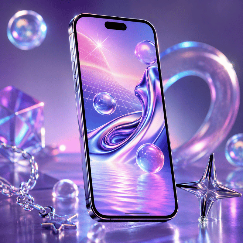
Y2K aesthetic takes its name from the Year 2000 computer panic – the shared fear of whether machines would survive the Calendar flip to 01/01/2000. Cultural dread about the event intersected with an excitement for early internet tech, creating a visual speech that felt at once optimal and deranged: chrome textures, corrupted computer graphics, holographic foil, and type that looked like it belonged to a spaceship.
Eponym “Y2K aesthetic” was recorded and ascribed to in 2016 by Evan Collins from the Consumer Aesthetics Research Institute (CARI), the organized effort to survey internet-era visual cultures. In the CARI taxonomy, Y2K aesthetic lasts roughly from 1997 and 2004–from Windows98’s default font to the slow drip of Web 2.0 minimalism.
5 visual features distinguish true Y2K background from the rest:
- chrome or metallic finishes – shiny metallic surfaces, liquid-metal textures, translucent gradient overlays
- holographic or iridescent effects – rainbow-shift foil, oil-slick textures, pearl glaze
- Pixel art or digital glitch signs – small-res icon aesthetics, scanlines, intentionally “messed-up” graphics
- High-concept typography – thick rounded letter shapes, shiny extruded fonts, bright neon high-lights
- Period motifs – stars, hearts, insects, flip phones, vintage emoticons, circuit-y back drops
For best effect on an iphone, Y2K wallpapers should be native resolution. The iphone 16 Pro Max display reads 2868 1320 pixels (460 ppi), the iPhone 15 Pro Max 1290 2796px. A smaller image–say, a 500pxPinterest saved one–will look pixel-y enlarged on a modern Retina i screen. We recommend a minimum of 1290 2796px, or else an app like i screen will store your designs at the necessary dimensions for each device.
One last calibration: “Y2K” and “aesthetic” have become so fused on social media that the label gets applied to anything vaguely retro. The best test is still the date. If the visual language is from a time period after 2004 – shiny gradients, blue skies, nature-tech idealism – then chances are good you’re looking at frutiger aero not Y2K. We thoroughly cover that distinction in Section 4.
The 8 Y2K Aesthetic Styles — A Decision Framework
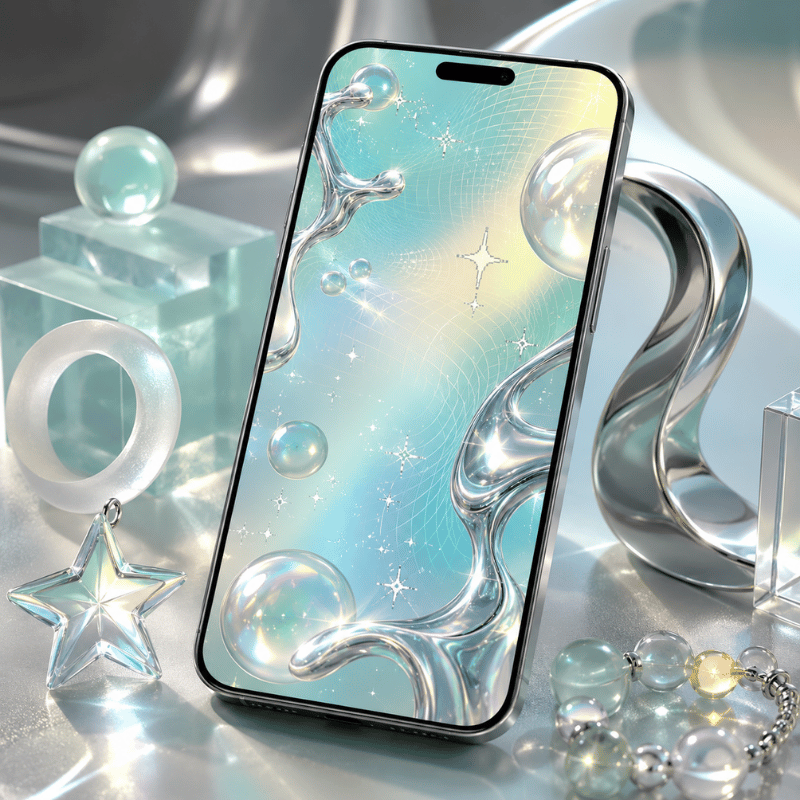
Most people searching for Y2K phone wallpaper end up with a few get-rich-quick pink collages and assume that covers the entire range. It doesn’t. The Aesthetics Wiki – an open source guide to internet aesthetic subcultures – identifies no less than eight different sub-styles in the Y2K family, each one created in a specific cultural context with its own visual language.
The table below defines each style according to its originating time period, general visual characteristics, and lock i screen personality. Think of it as a decision guide: find the row that most closely matches the iphone aesthetic you want when you whip it out of your pocket.
| Style | Original Era | Visual Signature | Lock i screen Energy | Key Colors |
|---|---|---|---|---|
| Y2K Futurism | 1997–2004 | Chrome robots, space imagery, Matrix-style code, metallic silver | Bold, tech-forward, slightly cold | Silver, black, matrix green |
| McBling | 2000–2008 | Rhinestones, hot pink, animal print, Juicy Couture maximalism | Loud, glamorous, unapologetically maximalist | Hot pink, gold, black |
| Metalheart | 2002–2008 | Chrome hearts, dark metal textures, gothic-adjacent accents | Dark, romantic, edge | Dark silver, deep red, black |
| Chromecore | 2000–2006 | Liquid metal surfaces, all-chrome everything, mirror finishes | Cool, luxe, futuristic minimalism | Silver, mirror white, pale gray |
| Vectorheart | 1999–2005 | Flat bubbly vector shapes, bold primary colors, no gradients | Playful, graphic, pop-art energy | Bright red, yellow, cobalt, lime green |
| Gen X Soft Club | 2001–2007 | Soft Y2K meets feminine futurism, gentle metallics, pastel gloss | Delicate, dreamy, subtly futuristic | Lavender, sky blue, pearl white |
| FantasY2K | 2000–2008 | Fantasy imagery fused with Y2K tech — fairies, sparkles, chrome wings | Magical, whimsical, otherworldly | Lilac, gold, sparkle white |
| Y2K Grunge | 2001–2008 | Dark Y2K, punk-inflected chrome, distressed textures | Aggressive, dark, alt-aesthetic | Black, raw chrome, dirty silver |
Jake is 22 and has been using the same grey minimal wallpaper ever since freshman. He is hoping for a more Y2K style, but every example feels either too pink or too aggressive. The likely solution is Chromecore or Y2K Futurism. Both read as refined rather than maximalist, both lean gender-neutral, and the silver-on-dark coloration works well with iOS 26’s Liquid Glass clock overlay. Start with a dark chrome background – the kind that looks like a shiny metal surface – and see if that does the trick before adding motifs.
If none of these eight sub-styles feel right, you may actually want frutiger aero – the aesthetic style that replaced Y2K between 2004 and 2013 and has now entered its own massive comeback. Section 4 has a full break down of how they are different.
iScreen stocks over 500 Y2K wallpapers across all eight sub-styles, pre-sized for every current iPhone model.
Pink Y2K & McBling: The Statement Aesthetic
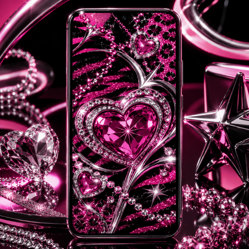
Of the eight sub-styles, mcbling is the one most people have in mind when they search for “Y2K wallpaper” – and that effort is confirmed by search trends. pink Y2K wallpaper garners 1,300 searches a month; hello kitty Y2K wallpaper accounts for an additional 4,400. That is a significant market, which means the Y2K wallpaper style must adhere to certain visual standards.
mcbling was introduced just after primary Y2K Futurism. While early Y2K had been stark and concerns over technology, McBling turned the maximumism up to 11, making it more bombastic, more personal, and clear-marker high-end. As one popular Lemon8 post described it: “McBling came a little later in the mid-2000s, bringing more Y2K excess and more ‘baddie’ energy.”
Visual indicators are specific enough to recognize on sight:
- Hot pink as default, not accent but the framework for a aesthetic. backgrounds, text, and details all in one intense fuchsia.
- Rhinestones and glitter overlays, especially rhinestone skulls and the word ‘Juicy’
- Leopard or zebra print in pink-and-black combo’s – at times both in one piece
- hello kitty, Playboy bunny, butterflies, and chrome hearts, mostly all layered in one design
- Fractal flower or whirling pattern backgrounds in pink and gold
aesthetic currently has traction. As of 2025, over 3,000 active mcbling products show up for sale on Etsy, and Lemon8 Mc Baling uploads often get four-figure engagements- a one-room-aesthetic outfit framing as “Paris Hilton closet meets MySpace baddie” gained 4,129 likes. Paris Hilton is still the point-of-reference for all aesthetic culture. If a wallpaper could belong in her early-2000s pink aesthetic, it is a McBling aesthetic.
Sophie is 17 and building a Y2K iPhone setup for the first day of school. She wants it “pink and in your face.” The McBling playbook: hot-pink leopard-print wallpaper on the lock screen, rhinestone-skull wallpaper on the home screen, matching pink app icons with gold accents, and a Hello Kitty widget in the corner. The key is commitment — a half-hearted McBling setup reads as just “pink phone” rather than the full aesthetic statement.
One real tip: the blurriness problem hits McBling more than most sub-styles. McBling images spread fast on Pinterest but are more often than not saved at 750 × 1334 px — the iPhone 6 resolution of 2014. On a new Retina display, those material look like you smeared on a specific blurred focus filter. Source at 1290 2796 px minimum, or use a dedicated wallpaper app that masters assets at the right resolution.
Frutiger Aero vs. Y2K: The Post-Millennium Split
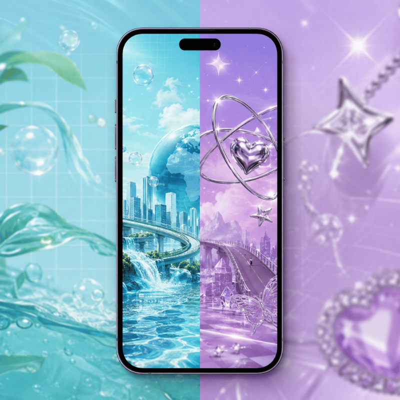
Scroll through “Y2K wallpaper” long enough and you will start viewing images that seem different- calmer, somehow. Blue skies. Mirror-like droplets of water. White interface design elements up against tropical fish. Bokeh-lit plains. These are not Y2K. These are frutiger aero, and the difference matters if you want to construct a coherent aesthetic not a hodgepodge of retro art.
frutiger aero was the main aesthetic style from around 2004 through 2013. It was initially in interface design- most visibly in Windows Vista and Windows7- and although it traveled out into advertising, graphics, and architecture. The term was came up in 2017 by Sofi Xian in the Consumer Aesthetics Research Institute (the same body that ran down the Y2K aesthetic only a year before). The term is a mixture of the Frutiger typeface, designed by Adrian Frutiger, and Window Aero, Windows’ window glass look.
The key divergence between the two aesthetics is emotional. Y2K is reactive, metallic, hits you with technology dread. Frutiger Aero is up-beat — the natural world and technology show up together instead of feeling set against one another. Amanda Brennan, talking to Dazed in 2023, summed it up: “There’s a lot of hopefulness in this aesthetic that Y2K doesn’t have.”
In iPhone wallpaper terms, here is the side-by-side:
| Element | Y2K (1997–2004) | Frutiger Aero (2004–2013) |
|---|---|---|
| Primary palette | Silver, hot pink, electric blue, black | Sky blue, grass green, white, soft yellow |
| Key textures | Chrome, metallic, holographic foil, pixel art | Glossy smooth, lens flare, bokeh, water drops |
| Era motifs | Stars, hearts, robots, flip phones, glitch effects | Blue sky, rolling grass, aurora, tropical fish, bubbles |
| Lock i screen mood | Edgy, attention-grabbing, nostalgic-bold | Calm, utopian, clean but warm |
| iOS 26 compatibility | Good on dark/chrome; harder on bright backgrounds | Excellent — sky backgrounds have natural contrast for clock text |
frutiger aero went viral on TikTok and YouTube within the Y2K landscape in 2023. Hashtags #frutiger aero and the r/FrutigerAero subforum amassed hundreds of thousands of subscribers in under half a year, as Gen Z users with deep nostalgia for a very young planetk promised but never actualized as “the universe we were tricked into trusting.” Frutiger Aero wallpapers cost 22,200 queries a month, and now generate electric equivalents of this query for two dozen core Y2K substylings.
Apple’s iOS 26 Liquid Glass design language, released in 2025, is widely understood as Frutiger Aero’s spiritual successor on iPhone. TechRadar noted in June 2025 that Liquid Glass “brings back a much-loved iOS trend from years past” — referring to the glossy, translucent, skeuomorphic design that defined the first iPhone era. Running a Frutiger Aero wallpaper on iOS 26 creates a setup where the UI and the background feel like they belong to the same design period.
If your lock screen feels too calm for Y2K but too ornate for minimalism, Frutiger Aero is likely the right middle ground. Search “frutiger aero” in iScreen to see both aesthetics side by side and compare directly.
Y2K Color Palette Deep Dive for iPhone Wallpapers
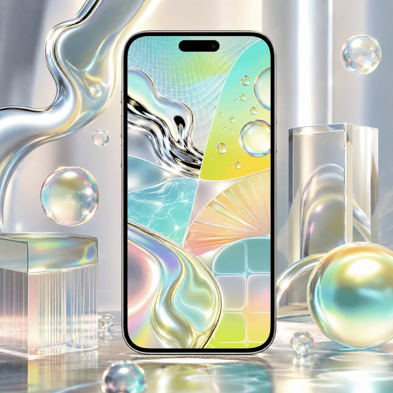
Emma is 19 and building a complete Y2K iPhone aesthetic before school starts. She has the outfit sorted — white cargo pants, chrome accessories, chunky metallic platform shoes — but her phone is still the default. She knows she wants “Y2K colors” but the options feel either too pale or too overwhelming. Here is the map:
Hot Pink / Magenta — McBling’s signature. Hot pink reads as confident and attention-commanding. On a lock screen, it pairs cleanly with black and white clock text and makes the time and date immediately legible. The one complication: if your phone case is also pink, the total setup blurs together visually. A black case with a hot-pink wallpaper creates much better contrast.
Chrome Silver — the Y2K Futurism and Chromecore default. Chrome backgrounds read as colder and more architectural than pink. The Liquid Glass clock effect in iOS 26 feels particularly intentional on a dark chrome background, where the translucency complements rather than competes with the wallpaper design.
Electric Blue — the classic Y2K Futurism choice. Think early-2000s screensavers, Windows XP startup screens, Nokia interfaces. Electric blue is rare enough on modern phones that it stands out without requiring anything else in the composition. Both iOS light and dark clock text reads clearly against a saturated blue field.
Black with Chrome Accents — Y2K Grunge. Black wallpapers have the best battery efficiency on OLED iPhones, since true-black pixels are physically off. A black Y2K wallpaper with chrome detail elements combines aesthetic authenticity with a practical advantage most setup guides skip over.
Purple – softer Y2K, sits just between mcbling and Metalheart. Purple Y2K wallpapers pull 390 monthly searches – a smaller but steady audience. Purple is especially effective in FantasY2K compositions, where it feels more dreamlike than threatening. Also excels with iOS 26 Glass clock option.
pastel + Holographic Blends – Vectorheart and Gen X Soft Club. Colors are trickier to locate in high res wallpaper collections as they are less dramatic but they are often the best choice for a lock i screen you see you see dozens of times daily. Holographic foil effects that reflect how it looks in changing light is a true technical achievement in wallpaper design; the Y2K i screen collection features numerous holographic options that maintain their chroma in Retina displays.
Before settling on a color check your phone by holding it at arm’s length with the lock i screen activated and monitor that the time/date remains clearly visible. Bright backgrounds and white iOS clock text can get lost into pastel. Changing to a Glass or some other darker Solid clock option in iOS 26 lock i screen settings fixes this with most color schemes.
How to Set Y2K Wallpaper on iPhone: iOS 18 & iOS 26 Guide
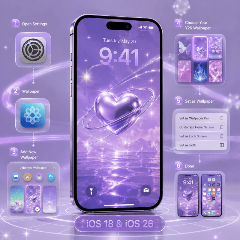
Apple has transformed iPhone lock screen customization over the last three iOS releases; iOS 26 introduced features Y2K and Frutiger Aero wallpapers can genuinely take advantage of. Here is how to set it all up:
Setting Your Lock i screen Wallpaper (iOS 18 & iOS 26)
- Tap the side button twice to turn on your i screen but not unlock it.
- Press and hold the lock i screen until the customize button appears.
- Touch and hold the + icon to generate a fresh wallpaper or tap customize to edit an existing one.
- Choose your wallpaper source – Photos, a wallpaper app, or the iOS 26 built-in gallery (which now features a tab specifically for iOS 26 with dynamic Liquid Glass wallpapers).
- Set your clock font, resize the image by pinching and dragging, and integrate widgets.
- Tap Add or Done, then assign Set as wallpaper Pair to use it on both lock and home screens, or tap customize home i screen for customization on only one.
iOS 26-Specific Features That Pair Well With Y2K Wallpapers
iOS 26 debuted the Liquid Glass aesthetic – a visually significant redesign of iOS not seen in over ten years. Multiple new options are best enjoyed with Y2K and frutiger aero aesthetics:
- Glass Clock Option – During your lock i screen customization, pick “Glass” over “Solid.” This transparent appearance complements the spacey feel of frutiger aero’s mockups and Y2K Futurism’s chrome textures. Adjust how transparent it appears by adjusting your background.
- Resizeable Clock – Extend the dark chrome background by maneuvering the bottom right corner of the clock for an even greater bit of graphic pop. Note: resize functionality is disabled if you choose a non-default font.
- 3D Spatial Scenes – iOS 26 deconstructs a photo into foreground and background layers, causing them to shift separately when tilting your phone. For Y2K wallpapers with a prominent subject against a dark field – a chrome robot, star cluster, holographic surface – the 3D adds an air of realism you can never achieve with a static wallpaper. Access it by tapping the Spatial icon when creating a new wallpaper from your photo library.
- Clear App Icons – In home iScreen Edit customize, the new “Clear” button converts app icons into the Liquid Glass translucent style. For a Y2K wallpaper background, Clear icons keep the background theme intact rather than cramming it behind solid-color tiles.
- Tinted Icons – The color picker allows you to match the app icon tint to a sampled color from your wallpaper. If your Y2K background is chrome-and-hot-pink, tinting your icons to pink makes a unified setup rather than the usual rainbow of multi-color app icons.
Home iScreen Setup Tips
Lock iScreen and home iScreen are two separate choices – which is fine, because they should be on a Y2K aesthetics. A high-contrast chrome or mcbling lock iScreen provides a dramatic note; paired with a lighter, softer version of the same color on the home iScreen, it’s a manageable livable look. Choose customize Home iScreen after you’ve saved your lock iScreen.
For a complete Y2K home screen, combine your wallpaper with up-to-date custom app icons and matching widgets. See our guide to depth effect wallpapers for iPhone for fresh techniques, or browse live wallpaper options if you want your Y2K background to animate. iScreen bundles wallpaper, icons, and widgets together — all matched to a single sub-style palette.
Create your full Y2K iphone aesthetic in no time flat – iScreen is free to download.
Y2K Wallpaper Trends: What Is Actually Rising in 2025–2026
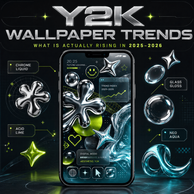
Y2K aesthetic search volume has been steady at about 27,100 per month for all of 2025 so far, with a bump in late summer – August and September, when back-to-school aesthetic resets among college students. The evidence suggests Y2K is not a passing fad that recedes and resurges, but a steady category with seasonal ebbs and flows.
A more revealing signal is Frutiger Aero. At 22,200 monthly searches, FA wallpaper is only a few thousand behind the overall Y2K term – and it has ticked up while other sub-style Y2K search volume remains constant. Much of the online momentum can be attributed to two factors: authentic Gen Z nostalgia nostalgia for the early days of the internet (much of which is far before their time!) and a reaction Dazed’s Laura Holliday identified against the relentless sterility of current app UI’s. Where all current screens are exactly alike and all UI’s are monotone flat grey, the glossy cynicism of Frutiger Aero makes a significant statement.
iOS 26’s Liquid Glass design adds another dimension. Apple’s 2025 UI overhaul — with its translucent, glossy, depth-layered surfaces — is the first iOS aesthetic in over a decade that feels visually aligned with Frutiger Aero rather than in opposition to it. A Frutiger Aero wallpaper running on iOS 26 now creates a setup where the UI and the background feel like they belong to the same design era. That specific coherence was not possible in iOS 17 or iOS 18.
aesthetics with the most current pulse on Y2K:
- frutiger aero–shooting up quickly, 22,200 SV, in match with iOS 26 Liquid Glass
- mcbling/Hot pink Y2K–stable, seasonally popular, hello kitty crossover maintains interest year-round
- Chromecore–growing consistently, carried by a wide-ranging fashion-boom where chrome has shifted from icon to neutral
- FantasY2K–appearing more and more in cottagecore and faerie Y2K Ufanep communities now overlapping with Y2K
What is waning: dark Y2K Grunge wallpapers–peaking mid-2020s alt-aesthetic; and straight Vectorheart–absorbed into the general broad-dimension tropes of graphic illustration aesthetic. Neither in decline, neither that popular.
For an iPhone setup that feels current through 2026, the most defensible approach is a Frutiger Aero-forward home screen with Y2K accents on the lock screen — calm sky and bokeh on the home, chrome or metallic on the lock, with an iOS 26 Glass clock tying the two together.
Get wallpapers, icons, and widgets matched to your Y2K or Frutiger Aero style — sized for every iPhone model.
Frequently Asked Questions
What are popular Y2K aesthetics?
Eight main Y2K sub-aesthetics exist: Y2K Futurism (chrome and space motifs, 1997–2004), McBling (rhinestones and hot pink, 2000–2008), Metalheart (dark chrome and metal textures), Chromecore (liquid silver and mirror surfaces), Vectorheart (bubbly flat vector graphics), Gen X Soft Club (soft pastel futurism), FantasY2K (magical elements merged with Y2K tech), and Y2K Grunge (dark punk-inflected chrome). Each reads differently on an iPhone lock screen — the decision framework table in Section 2 maps them side by side.
How do you get special wallpaper on an iPhone?
To activate a setup, quickly tap the side button twice, then select and hold a lock screen until the customize icon appears. Select the + icon to add a new wallpaper; choose Customise to alter your current one. On iOS 26, you can toggle the newest dynamic iOS 26 wallpapers, turn on 3D Spatial Scenes at any depth photo, or find an image saved to your device. For all-Y2K wallpapers, iScreen offers 500+ designs scaled to every current iphone. Also explore our complete aesthetic iphone wallpaper setup.
What makes a wallpaper Y2K?
But, a wallpaper is Y2K if it speaks the visual language of 1997-2004: a hybrid of chrome or metallic finishes, holographic or iridescent textures, pixel art or digital glitch elements, early internet-inspired rounded digital typefaces, and period motifs like stars, hearts, butterflies, computers, or robots. Its color often mixes silver, hot pink, electric blue, or a combination of all three. If the background appears more subdued Blue skies, bokeh, big nature shots – you probably have a frutiger aero image rather than pure Y2K.
How do I get the iPhone 17 Pro Max wallpaper?
iPhone 17 Pro Max ships preloaded with exclusive default wallpapers in the Photos app. To browse more, go to Settings → Wallpaper → Add New Wallpaper. In iOS 26, there is a dedicated section for the new Liquid Glass wallpapers: Dusk, Halo, Sky, Shadow, and Dynamic. For Y2K wallpapers at native 17 Pro Max resolution, a dedicated wallpaper app is the most reliable source. Check out our live wallpapers guide for additional animated options.
Is Frutiger Aero the same as Y2K?
No – they are related but very different aesthetics. For example, Y2K covers 1997 to 2004 — chrome, pixel art, and the slow buildup of digital tension. Frutiger Aero runs from around 2004 to 2013 with a lighter, brighter tone: blue skies, bokeh, lens flares, and the idea that technology and nature can coexist. Amanda Brennan put it plainly in Dazed in 2023: “There’s a lot of hopefulness in this aesthetic that Y2K doesn’t have.” On iPhone wallpapers, the visual cues make the split clear — chrome robots and rhinestones are Y2K. Rolling hills and water droplets point to Frutiger Aero.
What is the best Y2K color for an iPhone wallpaper?
Hot pink dominates mcbling and FantasY2K. Chrome silver belongs to Y2K Futurism and Chromecore. Electric blue is the archetype Y2K Futurism option. Fully black with chrome detailing suggests Y2K Grunge style – with the added positive perk that this screens to the best battery life for OLED displays. Lavender and pastel blends are signals from Gen X Soft Club and FantasY2K. For a lock screen that reads with clarity every where, deep chrome-on-black or hot-pink-on-white tends to manage to the iOS clock overlay most reliably independent of font choice.
