
.png)
Aesthetic iPhone Home Screen: The Ultimate Design Guide
An aesthetic iPhone home screen isn’t about adding more stuff. It’s about three things agreeing with each other: the wallpaper, the app icons, and the widgets. Get those three to share one mood and a tight color story, and almost any layout looks intentional. This guide walks you through eight aesthetic styles, shows you how to assemble each one, and then covers the new iOS 26 icon looks that landed in 2026.
Most of the “aesthetic home screen” tutorials still floating around were shot on iOS 14 back in 2020. Buttons moved, icon options changed, and Apple now lets you recolor icons without a single workaround. So we rebuilt the whole process for the current iPhone, kept what still works, and flagged the parts that quietly broke.
What you’ll set up in this guide
- A wallpaper that anchors your color palette
- App icons that match (the native iOS 26 way and the custom-image way)
- Two or three widgets that look good without crowding the grid
- A layout with breathing room instead of clutter
What Actually Makes a Home Screen Look “Aesthetic”?
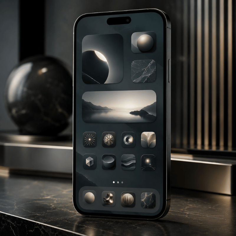
A home screen reads as aesthetic when every element look like it was chosen by the same person on the same afternoon. There are only four levers you control: the wallpaper (your background), the app icons, the widgets, and the layout. Everything else is noise.
So why do some setups look styled and yours looks busy? Usually it’s color. Our eyes read a cohesive palette as “designed” and a rainbow of default icons as “default.” That single insight is doing most of the work in every Pinterest screenshot you’ve ever saved.
Pick no more than three colors for the entire home screen — usually one background tone and two accents. Your wallpaper, icons, and widgets all pull from that set. Once a fourth bright color sneaks in, the screen starts to look cluttered instead of curated. It is the fastest fix for a screen that feels “off” but you can’t say why.
Here’s the trap nobody mentions: chasing looks at the expense of use. A popular sentiment in the iPhone setup community sums it up well.
“Functionality beats aesthetics. People clutter the home screen with custom icons and widgets, then can’t find the app they actually open twenty times a day.”
Takeaway: beauty and usability aren’t enemies. Decide your three colors first, keep the apps you use daily on page one, and let the design serve the way you already use your phone.
8 Aesthetic Styles to Choose From (Find Your Vibe)
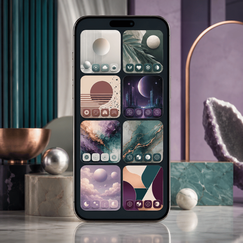
Before you touch a single setting, choose one vibe and commit to it. A minimalist home screen and a Y2K home screen pull from opposite ends of the design world, and mixing them is exactly what makes a screen look unfinished. Explore the eight styles below, each consistently look good on iPhone, with the palette and wallpaper type that defines it.
| Aesthetic | Core palette | Wallpaper type | Best if you want… |
|---|---|---|---|
| Minimalist | Off-white, grey, black | Solid or soft gradient | A calm, clutter-free phone |
| Pastel / soft | Cream, blush, sage | Gradient or watercolor | A cute, gentle look |
| Y2K | Hot pink, lime, chrome | Glossy, sticker-style | A bold, nostalgic 2000s feel |
| Preppy | Bright multicolor, white | Pattern or collage | A fun, energetic grid |
| Dark / moody | Charcoal, deep blue, plum | Dark photo or solid black | An OLED-friendly, sleek look |
| Coquette | Pink, ivory, red bows | Soft, ribbon motifs | A romantic, girly theme |
| Cottagecore / natural | Moss, tan, terracotta | Nature photo or illustration | A warm, earthy mood |
| Cyberpunk / neon | Black, neon cyan, magenta | Dark city or glow art | A high-contrast, techy edge |
If you can’t decide, default to minimalist. It’s the most forgiving aesthetic on iPhone because a neutral palette hides mismatched icons better than a loud one, and it ages well when the trend cycle move on. Whatever you pick, write your three colors down before the next step, they’re the rule everything else follows. Need more inspiration first? Our roundup of iPhone home screen ideas shows full setups for each of these styles.
Start With the Wallpaper (Your Aesthetic Foundation)
Pick the wallpaper first, then build everything else to match it. Your background covers the most screen area, so it sets the palette your icons and widgets have to live inside. Choosing icons before the wallpaper is the most common reason a setup feel disjointed halfway through.
For a clean, minimalist look, a solid color or a soft gradient keep icons readable and never fights with your widgets. For pastel, Y2K, or coquette, a patterned aesthetic wallpaper carries more of the personality, just keep the busiest part of the image away from the top two rows where your widgets and clock sit. iScreen’s aesthetic iPhone wallpapers are sorted by exactly these styles, including 4K and depth-effect backgrounds.
Can you have multiple home screen wallpapers on an iPhone?
Yes. Each Lock Screen you create can be paired with its own Home Screen background, and you can switch between them by long-pressing the Lock Screen and swiping. That means you can keep a pastel setup for daytime and a dark, moody one for night, and flip between them in two seconds. On iOS 26, the Lock Screen also moves the clock so it never hides the subject of your photo, and tilting the phone give the image a subtle 3D depth effect. Apple’s Lock Screen guide covers the setup.
Customize App Icons to Match
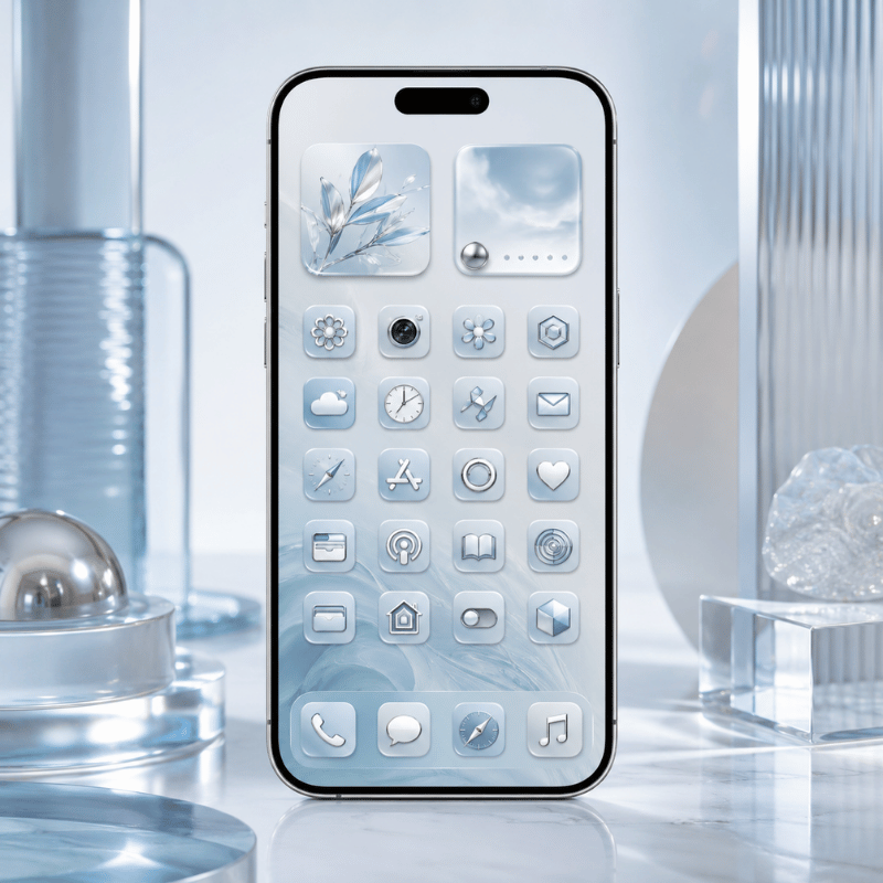
App icons are where a home screen go from “nice wallpaper” to “fully themed.” There are two routes, and picking the right one for your style saves a lot of frustration. Route one is native and fast; route two is unlimited but fussier.
Route 1, native iOS 26 tinting (fast, no apps). On iOS 26, Apple added a real icon makeover: you can tint every icon a single color, or switch the whole grid to light, dark, or clear. The clear, color-matched icons are the signature 2026 look. To do it, long-press an empty spot to enter edit mode, tap Edit then Customize, and select Light, Dark, Tinted, or Clear. According to Apple’s official guide to customizing apps and widgets, the change apply to your whole layout at once. It’s the cleanest way to get a cohesive grid in under a minute.
Route 2, custom image icons (unlimited, via Shortcuts). Here’s the catch most guides skip: iOS 26 tinting recolors Apple’s icons, but it can’t replace them with a custom picture. If you want hand-drawn or themed icons, you still build them through the Shortcuts app, create a shortcut that open the app, then assign your own image. iScreen’s aesthetic app icons packs do this assembly for you so you don’t make each one by hand.
Shortcut-based icons come with three real trade-offs that users report constantly: a brief loading flash when you tap one (the screen flickers before the app opens), the loss of red notification badges, and occasional style inconsistency under iOS 26. If badges and instant launching matter to you, the native tinted or clear icons are the safer choice.
Can you change the font on an iPhone home screen?
Not the app-label font directly, iOS uses the system typeface for icon names and doesn’t expose a font picker for them. What you can change is the font inside your widgets. Widget apps let you choose typefaces for clock, date, and text widgets, so you get a custom-font feel up top even though the labels below stay standard. A common workaround for a true text-free look is to rename Shortcut icons with a single blank space, which hides the label entirely.
Add Aesthetic Widgets (Beauty Plus Function)
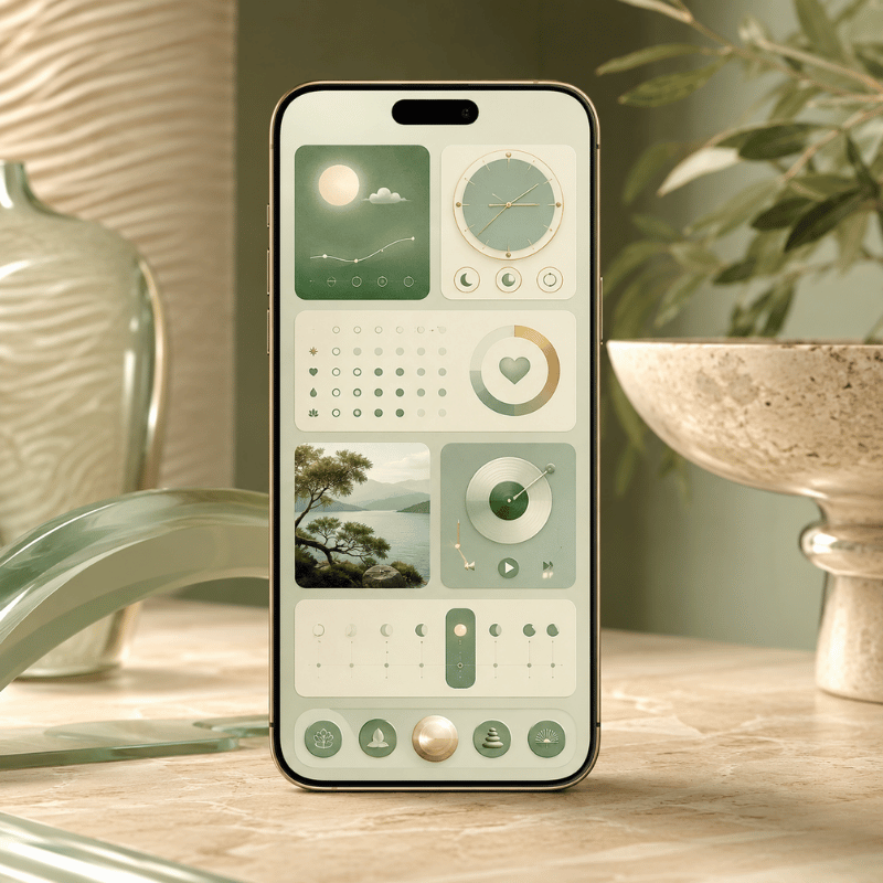
Widgets are the fastest way to make a home screen feel personal, and the easiest way to wreck it if you overdo them. Aim for one or two widgets that earn their space, something useful that also happens to match your palette. A wall of decorative widgets is just clutter with rounded corners.
The aesthetic widgets that actually get used tend to fall into a few buckets: a photo widget for a favorite picture, a clock or weather widget styled in your accent color, a Smart Stack that rotates through a few at once to save space. Dedicated widget apps like Widgetsmith and iScreen make these stylish, color-matched widgets without any design skill, and the fun ones, distance widgets for couples or a desktop pet that lives on your screen. iScreen’s custom iPhone widgets include all of these, and the couple distance widgets are a popular starting point.
- ✔ Match the widget’s accent color to one of your three palette colors.
- ✔ Use one large widget as a focal point, not three competing for attention.
- ✔ A Smart Stack lets you keep several widgets in one slot and swipe between them, pin your favorite to the top.
Takeaway: aim for a rhythm of sizes, one medium or large widget paired with a tidy grid of icons reads far better than widgets stacked top to bottom.
Nail the Layout (Grid, Spacing, and Blank Space)
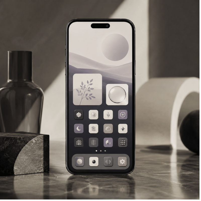
Layout is the difference between “themed apps” and a home screen that actually look designed. It borrows a principle interior designers lean on: empty space is a feature, not wasted room. A few open slots make the icons you do keep feel deliberate.
Build it around one idea per page. Page one is your daily drivers, the six to eight apps you open without thinking, plus a widget. Push everything else to a second page or, better, into the App Library by removing it from the home screen (long-press the app, tap Remove from Home Screen, and it stays installed, just hidden). This is the single biggest fix for a cluttered phone, and it directly answers the complaint behind half the “help, my screen is a mess” posts online.
✔ Do
- Leave a blank row or column for breathing room
- Keep one aesthetic per page
- Use the dock for your four most-used apps
✘ Avoid
- Filling every grid slot
- More than two widgets per page
- A fourth accent color sneaking in
For more arrangement patterns, split layouts, single-app pages, and dock-only setups, our guide to aesthetic iPhone home screen layout ideas goes deeper on the grid itself.
Put It All Together: Step-by-Step Setup
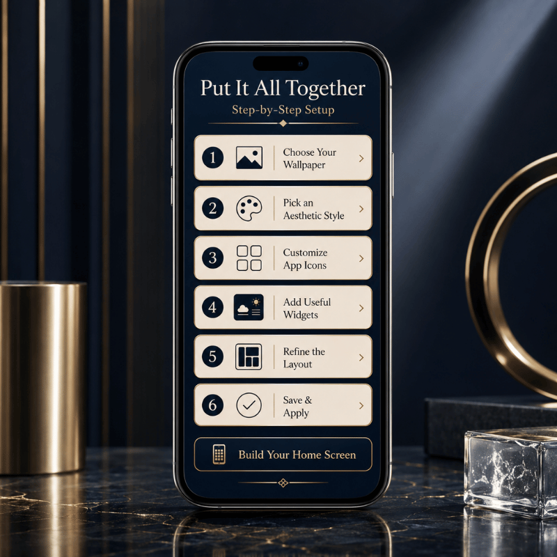
Here’s the full sequence from a default iPhone to a finished aesthetic home screen. Following this order matters, each step set up the next, and doing it backward is why so many people give up halfway.
How to make your iPhone aesthetic, step by step
- Pick a vibe from the eight styles above and lock in your three colors.
- Set the wallpaper that anchors that palette (Settings > Wallpaper, or long-press the Lock Screen).
- Style the iconstint or clear them in iOS 26, or apply a custom icon pack via Shortcuts.
- Add one or two widgets in a matching accent color.
- Clean the layoutdaily apps on page one, the rest to the App Library, a blank row for space.
- Review at arm’s lengthif anything jumps out as a clashing color, fix that one thing.
Done manually, this takes most people thirty to sixty minutes the first time, mostly spent finding and assigning matching icons. The shortcut, if you would rather not build every icon by hand, is a one-tap theme kit. Apps like iScreen package a matching wallpaper, icon set, and widgets as a single theme, so step three through five collapse into one tap. iScreen lists more than 10,000 themes, 5,000 app icons, and 500 widgets across iPhone and iPad, which is what makes the assembled-kit route practical on any device instead of a weekend project. You can browse the full aesthetic iPhone theme library or follow the in-app how to customize your iPhone walkthrough.
Skip the manual work, apply a full aesthetic theme in one tap.
What’s New and Trending for 2026 (iOS 26 and Beyond)
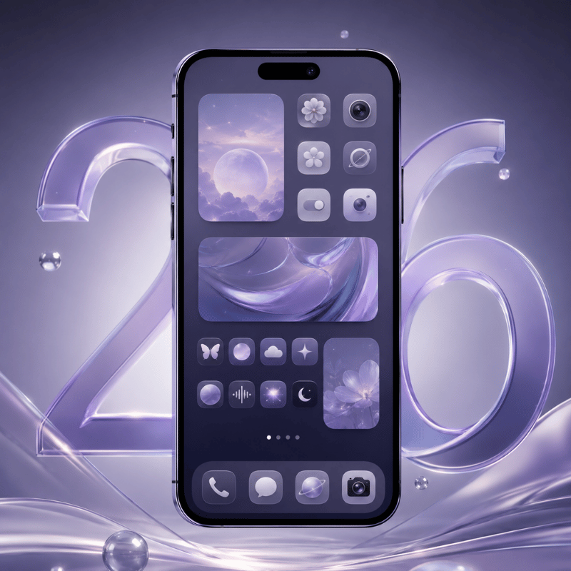
This year’s biggest shift in aesthetic home screens came straight from Apple. the iOS 26 update, released in late 2025, rebuilt how icons look and pushed customization that used to need third-party apps into the operating system itself. If your reference photos are from 2023, they’re already a generation behind.
Three iOS 26 changes are driving the 2026 look. First, icon tinting and the new clear, “Liquid Glass” icons, a translucent, color-matched grid is now the most-requested aesthetic, and Pinterest searches for “iOS 26 aesthetic” have climbed into the tens of thousands. Second, the smarter Lock Screen, where the clock repositions itself around your photo’s subject and tilts into a 3D effect. Third, beyond the home screen, the Dynamic Island and StandBy mode have become design surfaces of their own.
The trend itself is splitting in two directions. One camp is going ultra-minimal, clear icons, a single solid wallpaper, no widgets at all. The other is going maximalist with animated Dynamic Island pets and a styled StandBy mode nightstand clock. Both are valid; pick the one that matches how you actually use your phone. Engadget’s iOS 26 customization walkthrough is a solid reference for the new icon control.
If you’re refreshing your setup in 2026: start with the native iOS 26 clear or tinted icons before reaching for custom packs. It costs nothing, takes a minute, and gives you a current look you can build on later.
Frequently Asked Questions
How do you get an aesthetic iPhone home screen?
View Answer
Can you change the font on an iPhone home screen?
View Answer
Do custom icons slow down or drain my iPhone?
View Answer
How do I reset my iPhone home screen?
View Answer
How do I add an app back to my home screen?
View Answer
Is iScreen free to use?
View Answer
Why We Wrote This Guide
We rebuilt this aesthetic iPhone home screen walkthrough specifically for iOS 26, because most tutorials still demonstrate the old iOS 14 steps where icon tinting and clear icons didn’t exist yet. Every setting path here was checked against the current iPhone, and the trade-offs of custom icons come from real iScreen users and the wider iPhone setup community, not a sales pitch.
References & Sources
- What’s new in iOS 26Apple Support
- Customize apps and widgets on the Home ScreenApple Support
- Create a custom iPhone Lock ScreenApple Support
- How to customize your iPhone home screen with iOS 26Engadget
