12 Best Widgets for iPhone in 2026: Aesthetic, Productive & Fun

The best widgets for iPhone do more than fill empty space on your Home Screen, they put the one thing you’d normally unlock your phone and dig through an app to find right where you can glance at it. What matters isn’t piling on as many as possible. It’s choosing a few that earn their spot, then placing each one where it actually helps: the Lock Screen, the Home Screen, or StandBy.

This guide is organized by what you want a widget to docheck the weather, see your day, watch a battery level, count down to a date, and then by the apps that do each job well. You’ll get 17 picks across seven categories, a quick way to decide where each widget belongs, and a plain answer to the question everyone asks: do widgets wreck your battery? (Short version: mostly no, with one real exception.)

Quick Setup: iPhone Widgets at a Glance

Where widgets go Home Screen · Lock Screen · StandBy · Today View
Sizes Small · Medium · Large · Extra-Large (iPad)
Add one Tap and hold the Home Screen → tap EditAdd Widget → search → choose size → Add Widget
Version needed Home Screen widgets (iOS 14) · Lock Screen widgets (iOS 16) · StandBy (iOS 17) · Liquid Glass look (iOS 26)

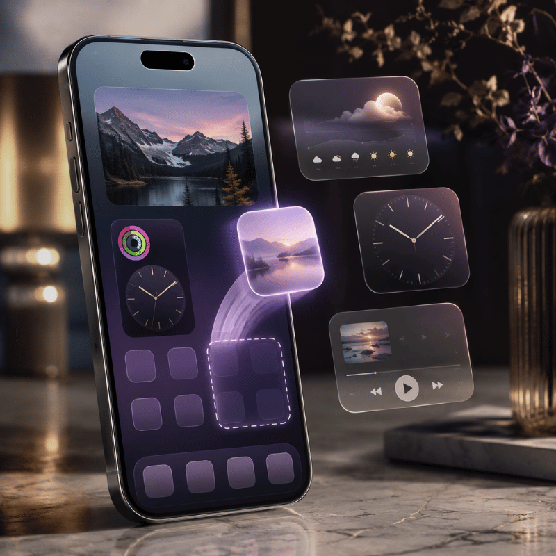
How iPhone Widgets Actually Work, and How to Add One
How iPhone Widgets Actually Work, and How to Add One

A widget is a small, glanceable view of an app that live outside the app itself. Tap it and it opens the app; left alone, it quietly shows the information you care about. Since iOS 14 you can place them on the Home Screen, since iOS 16 on the Lock Screen, and since iOS 17 inside StandBy, the full-screen view that appears when your iPhone is charging on its side. Each surface show a different size and amount of detail, which is why the same widget can feel essential in one spot and pointless in another.

Apple gives you four sizes on the Home Screen, Small, Medium, Large, and (on iPad) Extra-Large. A Small weather widget shows the current temperature; a Large one shows an hourly and daily forecast. Worth knowing too is the Smart Stack: a stack of widgets you swipe through, which can also rotate automatically to surface the right one, your alarm in the morning, your commute later, based on time and routine.

How do I add a widget to my iPhone?

It takes about ten seconds, and the steps are the same whether you’re on iOS 18 or iOS 26:

  1. Touch and hold an empty area of the Home Screen until the apps jiggle.
  2. Tap Edit in the top-left corner, then tap Add Widget.
  3. Search or scroll to the app, swipe to pick a size, then tap Add Widget.
  4. Drag it where you want it and tap Done. To build a Smart Stack, drag one widget on top of another of the same size.

For the Lock Screen, touch and hold the Lock Screen, tap Customize, choose Lock Screen, then tap the box below the time to add widgets there. Apple’s official guide to adding widgets walks through every surface if you get stuck.

💡 Key takeaway

Pick the widget size to match the surface: small, single-number widgets shine on the Lock Screen; larger, detailed ones belong on the Home Screen or in StandBy.

How We Chose: The Glance Test
How We Chose: The Glance Test

There are thousands of widgets in the App Store, and most of them are decorative. To cut the list down, every pick here had to pass one rule we call the Glance Test: a widget earns a spot on your Home Screen only if it shows you something you’d otherwise unlock your phone and open an app to check. If you still end up tapping in to get the real answer, it isn’t a widget you need, it’s an app, and it belongs in your App Library.

That single question quietly solves the clutter problem. A weather widget passes because the temperature and rain chance are the whole answer. A “motivational quote” widget usually fails, it’s nice to look at, but it didn’t save you a tap. One first-time user described adding a single stack widget and suddenly feeling like the phone was a “mini command center” rather than a wall of icons . That shift, from launching apps to glancing at answers, is the entire point.

“A widget’s job is to surface a small amount of timely, personally relevant information, glanceability is the whole design goal, not feature density.”

Apple Human Interface Guidelines, WidgetKit

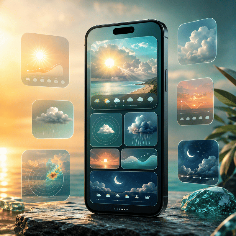
Best Weather Widgets

Best Weather Widgets

Weather is the widget almost everyone keeps, because the answer, what’s it doing outside, and when will it change, is pure glance value. Two picks cover most people.

Apple Weather (free, built in) is better than it used to be. The Large widget shows current conditions plus an hourly and ten-day forecast, and the Lock Screen version can show sunrise, sunset, and precipitation chance in a single line. For most people it’s all the weather widget they need, and it costs nothing. Carrot Weather (free tier, with a paid upgrade as of 2026) is the pick for people who want more: highly configurable layouts, multiple data sources, and notoriously snarky commentary. A power user on a popular setups forum summed up the split well, native widgets are “decent,” but a dedicated weather app gives you layers you can actually tune .

If you only care about the forecast on your Lock Screen, start with Apple Weather and turn on precise location only if you need rain-by-the-minute. For a deeper look at the options, see our guide to the best weather widget for iPhone.

Best Calendar & Productivity Widgets
Best Calendar & Productivity Widgets

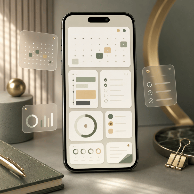
If your day lives in a calendar, a widget that show your next few events without opening an app is the single biggest time-saver here. Fantastical is the standout: its Medium and Large widgets show an agenda view that’s easier to read at a glance than the stock app, and you can point it at a specific calendar set. It’s repeatedly the app people name when asked which has the best calendar widget . Apple Calendar and Apple Reminders are free and worth stacking together, your next meeting and your next task, side by side.

On the productivity side, the Google app’s search-bar widget is a quiet favorite: one tap drop you straight into search or voice search, which is faster than opening Safari and typing. Stack a calendar, a reminders list, and a search bar and you’ve rebuilt the most useful third of your phone into a screen you never have to dig through.

💡 Pro Tip

Build a single “today” Smart Stack — calendar on top, reminders and weather beneath — and let it auto-rotate. You get three answers in one widget slot.

Best Battery Widgets (and the Battery Myth)
Best Battery Widgets (and the Battery Myth)

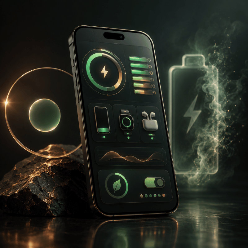
If you carry an iPhone, AirPods, and an Apple Watch, the free Apple Batteries widget is the one to add: a single Medium widget shows the charge level of every connected device at once, so you find out your AirPods are at 9% before a call, not during it. Third-party battery widgets add ring-style graphics and per-device history if you want them, but the built-in option cover the core job for free.

Do widgets drain your iPhone battery?

This is the most common worry about widgets, and the honest answer is: mostly no, with one real exception. Widgets don’t run constantly. iOS gives each one a refresh budget through WidgetKit and updates it on a schedule, and as users on Apple’s own forums point out, a widget largely sips power only when you’re actually looking at the Home Screen . One exception stands outlocation-based widgets such as weather, maps, and anything tracking your position, which can drain noticeably because of continuous Location Services, not because they’re widgets. Outlets like CNET flag Lock Screen weather widgets as a battery cost for exactly this reason.

So the fix isn’t “use fewer widgets” — it’s to set location to “While Using” (not “Always”) for your weather widget and skip live, location-tracking widgets you don’t read. A claim floating around, that widgets cut battery by 20% — doesn’t hold up; it’s the location access behind a couple of them that matters.

⚠️ Common mistake

Setting a weather widget’s location to “Always” is the real battery drain — not the widget count. Switch it to “While Using the App” and the cost mostly disappears.

Best Time, Countdown & Clock Widgets
Best Time, Countdown & Clock Widgets

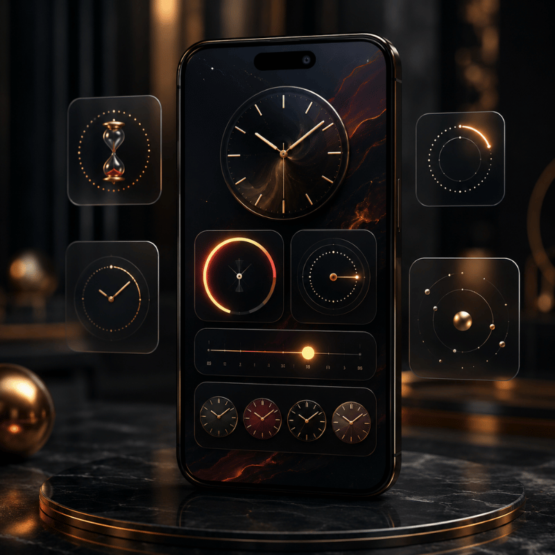
Time widgets are about anticipation, how long until something, or what time it’s somewhere else. A countdown widget that shows the days left to a trip, a birthday, or a deadline is one of the most-used widget types on iPhone, and it’s pure glance value: the number is the whole answer. The Apple Clock app’s World Clock widget is the free pick for anyone juggling time zones, showing two or four cities at once so you’re not doing math before a call. For people who plan around daylight, a sun-and-daylight widget (such as Lumy) shows sunrise, sunset, and golden hour at a glance.

Countdowns are popular enough to deserve their own setup, including how to put one on the Lock Screen and in StandBy, we cover that in our guide to the best countdown widget for iPhone.

Best Photo & Aesthetic Widgets
Best Photo & Aesthetic Widgets

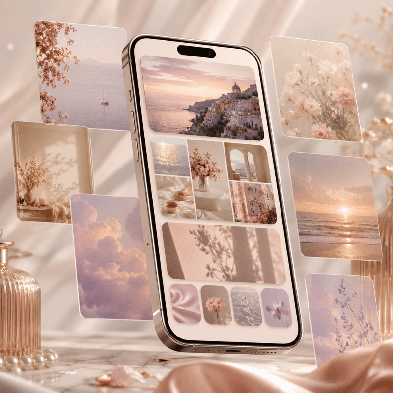
Not every widget has to be useful, some just make the screen feel like yours. The free Apple Photos widget rotates through your library or a chosen album, so a favorite picture quietly cycles on your Home Screen. Beyond that, aesthetic widgetscustom fonts, colors, themed clocks, and photo frames that match your wallpaper, are where customization apps come in. iScreen, for example, offers themed widget packs you can color-match to a wallpaper, which is handy when you’re building a coordinated look rather than a random grid.

If a matching, styled Home Screen is the goal, the widgets are only half of it, the wallpaper and icons have to agree too. Our walkthrough on building an aesthetic iPhone Home Screen shows how to make all three line up.

Best All-in-One Widget Apps: Widgetsmith vs Widgetable vs iScreen
Best All-in-One Widget Apps: Widgetsmith vs Widgetable vs iScreen

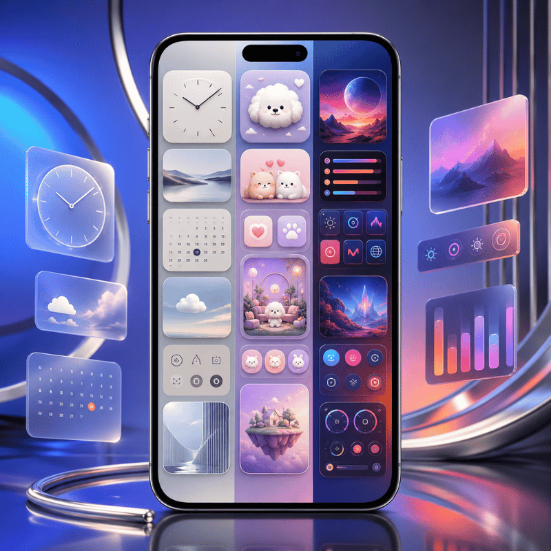
If you’d rather get a whole kit of customizable widgets from one place instead of installing a separate app per category, an all-in-one widget app is the move. These let you design widgets, pick the data, the font, the color, the background, and place them anywhere. Here’s how the most popular options compare as of 2026.

App Best for Free tier Standout
Widgetsmith Broad, flexible customization Yes (most features free) Home + Lock Screen, huge style range
Widgetable Playful, social & “pet” widgets Yes (in-app purchases) Shared widgets with friends
iScreen Themed, color-matched looks Yes (premium upgrade) Coordinated widget + wallpaper + icon themes

What is the best free widget app for iPhone?

Most people will land on Widgetsmith. It remains the default recommendation when someone wants broad, flexible customization, it works on both the Home and Lock Screen, and the bulk of its features are free . If your goal is a themed look where widgets, wallpaper, and icons all match, a customization app like iScreen is built around that coordination instead. You can see iScreen’s widget options on the custom iPhone widgets page.

✔ Advantages of all-in-one apps

  • One app, dozens of widget styles
  • Match colors and fonts across your screen
  • Most offer a usable free tier

⚠ Limitations to know

  • Deep features often need a subscription
  • Custom widgets can show ads or refresh slower
  • For live data (calendar, weather) the native app’s own widget is often better

Lock Screen vs Home Screen vs StandBy: Where Each Widget Belongs
Lock Screen vs Home Screen vs StandBy: Where Each Widget Belongs

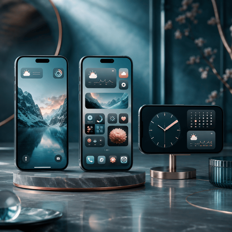
Picking good widgets is only half the job; the other half is putting each one on the right surface. That same battery widget feels essential on the Home Screen and wasted on the Lock Screen. Here’s a simple way to decide, based on how each surface is built and what Apple designed it for.

Surface Best for Put here
Lock Screen One-line, time-sensitive info you check without unlocking Temperature, next event, battery, countdown
Home Screen Daily-use widgets and Smart Stacks you interact with Calendar, reminders, photos, multi-device battery
StandBy Nightstand / desk view while charging on its side Clock, weather, large photo, world clock
Today View Overflow — useful but not daily News, sports, screen-time, anything secondary

Rule of thumb: if the answer is a single number or line and you want it without unlocking, it goes on the Lock Screen; if you tap or swipe it during the day, it belongs in a Smart Stack on the Home Screen; if it’s something you watch while the phone charges by your bed, set it up in StandBy. Apple’s notes on using StandBy and customizing the Lock Screen cover the setup for each. To arrange it all into a screen that work, our iPhone Home Screen ideas are a good next step.

What iOS 26 Changes for Widgets in 2026
What iOS 26 Changes for Widgets in 2026

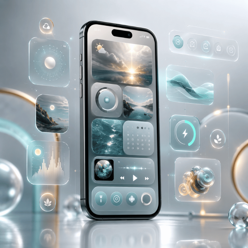
Right now, the biggest shift for widgets is visual. With iOS 26, released in September 2025, Apple introduced Liquid Glassa translucent design that flows across the system and give widgets a glassy, see-through background that morphs with what’s behind it. Widgets with a transparent background now pick up that layered, refractive look, which is why a lot of the “best 2026 setups” people are sharing lean into matching wallpapers that show through. Apple’s own iOS 26 feature list describes Liquid Glass surfaces that “fluidly morph” as you use them.

Two practical things follow from this. First, if you want the glassy effect, choose widgets that support a transparent or tinted background and pair them with a wallpaper that has some contrast, and know that turning on Settings → Accessibility → Display & Text Size → Reduce Transparency will flatten the look if you find it distracting. Second, the surfaces keep expanding: StandBy and CarPlay widgets have grown across iOS 17 through 26, and Apple’s WidgetKit documentation shows interactive and Live Activity widgets becoming more capable.

If you’re refreshing your setup in 2026, it’s worth redoing your widgets after you settle on a wallpaper, not before, the Liquid Glass look only pays off when the layer behind the glass is one you actually like. Search interest in iPhone widgets jumped sharply around the iOS 26 launch, so this is the moment a lot of people are rebuilding their screens.

Build a Home Screen worth glancing at

Mix the free built-in widgets above with a themed set, match them to your wallpaper, and you’ve got a screen that earns its space.

Explore iScreen widgets →

FAQ: Best Widgets for iPhone

Q: What are the most useful iPhone widgets?

View Answer
The widgets people keep longest are weather, calendar, reminders, and a multi-device battery widget — each one answers a question you’d otherwise unlock your phone and dig through an app to check. Start with those four, give each its own surface, and you’ve covered the daily essentials. From there, add a countdown, a world clock, or a photo widget only when it earns the space by passing the same glance test. Quality beats quantity every single time.

Q: How do I get cool widgets on my iPhone?

View Answer
Install a customization app such as Widgetsmith or iScreen, design a widget with your chosen font, color, and background, then add it from the widget gallery like any other. For a coordinated look, match the widget colors to your wallpaper.

Q: What apps have the coolest widgets?

View Answer
Function-first picks are Fantastical for calendars, Carrot Weather for forecasts, and the Apple Batteries widget. Style-first picks are Widgetsmith, Widgetable, and iScreen.

Q: What is the best all-in-one widget?

View Answer
A Smart Stack — several widgets in one slot that rotates to show the right one automatically.

Q: Are iPhone widgets worth it, or do they slow your phone down?

View Answer
Yes, they’re worth it, and no, a sensible set won’t slow your phone down. Widgets update on a refresh budget through WidgetKit rather than running every second, so a handful of them costs almost nothing in performance. The only real drain comes from location-based widgets like weather and maps — and you fix that by setting their location access to “While Using” instead of “Always,” which most people never think to change.

Q: How many widgets can you add to an iPhone?

View Answer
There’s no fixed limit. You can fill several Home Screen pages and bundle widgets into Smart Stacks. But more isn’t better — a handful that each pass the glance test will serve you far better than a screen crammed with widgets you never actually look at.

About This Roundup

We chose these iPhone widgets against one rule, the glance test, and checked the how-to and battery details against Apple’s own documentation rather than app-store marketing. App pricing and free-tier notes reflect what was available as of 2026 and can change; the Liquid Glass behavior described is from Apple’s iOS 26 feature list.

Recent articles

iOS 27 Wallpapers for iPhone: Downloads & Matching Setups

iOS 27 Wallpapers for iPhone: Downloads & Matching Setups

2026/9/9 18:17
Updated September 9, 2026 · download sources and Apple guidance checked An iOS 27 wallpaper is a background design for your iPhone. Start with the iClarified “Download the Official iOS 27 Wallpaper” collection for the stock design in light, dark and blue versions. You can save a still image without installing the beta. Native dynamic effects are a separate feature; downloading a JPG doesn’t install them. The background is the important part, but to use it well you need to make the rest of the screen work with it. Below are source linked files, a way to download or use the built-in options, and three matching setups using separate iScreen widgets and icons. The setups are suggestions, not screenshots of tested phones or promises of a fully free theme. Download iOS 27 wallpapers from traceable sources The easiest way is to open a full size file from its publisher, then save the image. These three iPhone Lock Screen files were available when checked on September 9. Their image headers each read 1320 × 2868 pixels, matching the resolution listed by iClarified. That check confirms the files’ dimensions and availability; it doesn’t authenticate an unmodified chain of ownership from Apple. Publisher-hosted iPhone downloads Wallpaper type Open download File note Light Lock Screen Light JPG 419 KiB Dark Lock Screen Dark JPG 179 KiB Blue Lock Screen Blue JPG 378 KiB Light Home Screen Light Home JPG Publisher’s separate Home Screen file Dark Home Screen Dark Home JPG Publisher’s separate Home Screen file Blue Home Screen Blue Home JPG Coordinate with the blue Lock Screen “Dynamic” capture Static JPG capture A still image despite the source label “Dynamic2” capture Second static JPG capture No native dynamic controls included Complete publisher set Collection ZIP Extract the archive to choose an image The credit for the downloads, from hosting to organizing, goes to iClarified. The article calls the collection Celosia and says the files were obtained from the first developer beta. This page offers separate Home Screen versions and a ZIP file of the collection. We direct readers to that source rather than show the images as iScreen originals. “Official iOS 27 wallpapers” and “new official wallpapers” are how publishers describe the new default design. By downloading from their pages, you get the published files. Our checks don’t verify that each image is unchanged from Apple’s release. File sizes shown are rounded to the nearest KiB, and aren’t a metric of image quality. For a tablet, go to the iOS 27 and iPadOS 27 galleries at 9to5Mac. Its iPad section separates portrait and landscape images. Select the device section before saving; an iPhone portrait crop and a landscape iPad background serve different layouts. Choose a light, dark or color variant The abstract default wallpapers have light and dark versions. Light artwork leaves a brighter background, while dark artwork gives you a quieter background for light text. Blue can be a unifying color for icons and widgets without overpowering and overwhelming the design. The iDownloadBlog wallpaper collection also lists gold, ink and brown variations. It credits additional red, purple and teal versions to a separate creator, so those shouldn’t all be described as unmodified official Apple wallpapers. For the source’s own light and dark groupings, compare the published iPhone previews before choosing. Static downloads and dynamic wallpapers are different A name can be deceiving. Publishers may call one download “Dynamic” and then have a static JPG linked. You saved one appearance of that wallpaper, not its native configuration. In their June report, 9to5Mac explicitly separates downloadable static versions from motion-enabled versions. Think of that distinction as an image file versus software behavior. Before troubleshooting an effect that didn’t come with the file, check the Download or Built-In? table. What you want Start with Boundary to check The stock visual design A source-hosted JPG or PNG Still image; no native dynamic controls included A native changing or motion effect A supported option in the system wallpaper gallery Availability depends on the installed software and wallpaper A personal photo that plays on wake An eligible Live Photo Check the play control in the wallpaper editor A spatial effect from a photo An eligible photo and supported iPhone The phone creates the effect; the download does not guarantee it Apple documents Live Photo playback for Lock Screen wallpapers in iOS 17 and later. That’s a different image type, with a play button during setup. Apple’s instructions for Spatial Scene also specify photos that are eligible, iPhone 12 or later and iOS 26. An ordinary downloaded photo may receive a supported system effect, but its filename can’t guarantee that it’s eligible. Saving both light and dark files doesn’t, on its own, make them automatically switch. Select the appearance you would like now or use the built-in behavior of your device when it’s available. Pick the right file and check the crop Searching for labels such as “iOS 27 wallpaper 4K,” “HD” and “Ultra HD” doesn’t answer how the image will look on your device. The three JPG downloads checked above are 1320 pixels wide by 2868 pixels high. Use those actual dimensions when comparing files; don’t call every download 4K just because the search contains the term. Before setting the image as wallpaper, open the saved file at full resolution. If you have a preview, a screenshot or an image with website control elements, go back to the download page of the publisher. When you’re in the wallpaper editor, check the crop. Refer to Apple’s customization guide to learn how to zoom and move the photo. Keep what you like at a distance from busy clock and widget zones. The final outcome should be reviewed on your iPhone, whether it’s the iPhone 17 Pro or Pro Max or any other model. An oversized display wouldn’t eliminate the necessity to assess the composition. A high resolution file still needs the right crop. For details on resolution and image compression and portrait cropping, see our iPhone wallpaper 4K guide. Save and apply your iOS 27 wallpaper Click the link and save the image to your photos. If the browser saves the image to Files, open that file and use the provided share or save-image option. Open Settings > Wallpaper > Add New Wallpaper > Photos > select your new background. Position the image and check the clock. Tap Add. Select Set as Wallpaper Pair for both screens or Customize Home Screen to make the Home Screen unique. This sequence follows Apple’s wallpaper setup instructions. Check your new wallpaper in the Photos app before setting it. If you want a more detailed explanation, including how to change an existing selection, check out our guide for changing wallpaper on iPhone. You can have different background images on the Lock Screen and Home Screen. App icons can also have a simple Home Screen background behind them. Three matching iScreen setups to build Start with information, then choose its style. The following recipes use three design decisions: a background palette, a widget, and an icon family. iScreen has separate selections of widgets and styles of application icons. These suggestions were created by combining several catalog elements. Warm gold with a simple calendar Try the publisher’s gold wallpaper with a Calendar widget on a calm background. Browse Brown or Ins white icon styles as starting points. Let the wallpaper supply most of the warmth, leaving small dates and app names readable. When the calendar gets lost against a bright background, move the image or change the widget background before adding decorations. Blue with a restrained information row Use the blue download, a Calendar or Text widget and an Ins blue or gray icon family. Keep the widget text neutral instead of tinting every label blue. A blue accent can connect the pieces while different foreground and background tones keep the information readable. If icons are blending into the wallpaper, choose a more distinct icon surface or simplify the Home Screen background. Dark ink with a readable clock Start with an ink variation, an iOS Clock-style widget, and a black or gray icon family that uses restraint. Take a look at your widget labels at your typical screen brightness. Dark-on-dark elements can be difficult to distinguish even when the palette looks coordinated. Choose this setup for its appearance. No battery-saving result is implied. The catalog may not have all app icons, and availability or pricing can vary. Check the availability before using. Apple’s Lock Screen customization options are separate from these third-party Home Screen elements. Build and preview each screen in its own editor instead of thinking one download can configure both. Fix blur, awkward cropping and missing effects Check the saved file. If it’s blurry in Photos, check the source and save the full-resolution image. If it looks sharp there but soft after setting, inspect how far you enlarged it and check the Home Screen customization. Apple’s wallpaper guide separates selecting a picture from customizing the Home Screen. To fix an awkward crop, move the image before zooming in further. Wallpaper that looks too busy behind a widget can sometimes be handled by using another variant or by selecting a simpler background for the Home Screen. You don’t have to replace the Lock Screen image to make the app labels readable. To deal with a missing animation, check the Download or Built-In table above. An image isn’t broken just because it’s still. If you did choose to use a Live Photo, check its play control using Apple’s Live Photo instructions. Avoid applying an old beta workaround unless it actually matches your software version and symptom. What to watch before the public release As of September 9, 2026, according to Apple’s iOS 27 overview, the update is still coming this fall. Apple developer release notes cite beta software. Public-facing downloads, developer betas and the general software launch are distinct stages with different availability. New iOS 27 and iPadOS 27 wallpapers appeared in publishers’ download galleries after WWDC. This doesn’t make a file a software upgrade. New features for iOS 27 beta shouldn’t be confused with the downloads mentioned. A saved background doesn’t add Image Playground, native motion controls or new clock designs. For the visual design you prefer, save the photo and keep your current software. Check Apple’s latest availability for a system update. If you want something new after trying the stock design, go to the iScreen wallpaper library. In this library, you can pick your own background and choose to add useful widgets and screen icons. Frequently Asked Questions How do I get the new iOS 27 wallpaper? Open the iClarified download page and choose the iPhone version. After choosing it, open the full-size image and save it. Then select the saved image through Settings, Wallpaper and Add New Wallpaper. When you use this downloaded image, you get the design without having to install the beta. The image doesn’t install iOS 27 or add the operating system’s native dynamic wallpaper controls. How does dynamic wallpaper work on iOS 27? To begin, determine if you selected an option from the wallpaper gallery or saved a static image from a website. A PNG or JPG will only be a single still image; motion, animation, or behavior will depend on the wallpaper and software on your device. Downloading light and dark pictures won’t make them alternate automatically. Eligible photos may receive separate system effects, so check the options offered in your editor. For a personal Live Photo, Apple describes a play control that lets the image play when the phone wakes in iOS 17 or later. That option requires the appropriate photo type; an ordinary JPG from a download page does not become a Live Photo. Can I match the wallpaper with iScreen widgets and icons? Yes. Choose a background, then select widget and icon styles that are in the same palette. Start with small important widgets and preview the final Home Screen. The options here are editorial recipes using different elements. They don’t mean iScreen offers each exact arrangement as a single free package, or that every app has an icon in your chosen style. Will the download work on an older iPhone? A static image file and an operating system update have different needs. Save the image and preview it with the wallpaper tools provided on your device. You may have to crop it. Don’t think an older device has native effects and eligibility for iOS 27 just because it can display downloaded pictures. Are iOS 27 and iPadOS 27 wallpapers the same file? No. Collections separate iPhone and iPad files, sometimes with portrait and landscape tablet versions. Preview and download the version intended for your device and orientation. References & Sources iClarified: publisher-hosted wallpaper variants and download files, linked in the download section. 9to5Mac: static versus dynamic distinction and separate iPad orientations. Apple Support: wallpaper pairing, photo positioning, Live Photos and eligible spatial effects. Apple: current iOS overview and developer beta release notes. iScreen: current wallpaper, widget and icon catalogs. Matching advice is editorial; no hands-on phone testing is claimed.
2026/9/9 18:17
Halloween Backgrounds for iPhone: Ideas by Style, from Cute to Creepy

Halloween Backgrounds for iPhone: Ideas by Style, from Cute to Creepy

2026/8/26 04:18
Updated August 2026 · Reviewed by the iScreen team Halloween backgrounds for iPhone are available in more ways than a cheesy Halloween landscape with pumpkins and bats: packs of soft, colorful cutes, spooky poster art styles, gothic mansion settings, and full horror scenes each render differently on a Lock Screen. This guide classifies the entire range of available art by look before explaining what the gallery pages omit: the file size that will match your iPhone model, scheduling the swap to match demand, understanding legally free backgrounds, and making sure the time stays visible over spooky images. Halloween backgrounds for iPhone peak as a search on a strict calendar: US demand climbs from 12,100 queries in August to 110,000 in October, then collapses to 1,900 by November. Set yours in early September, pick a style lane before you scroll, and match the file to your model’s resolution, such as 2622×1206 px on iPhone 17. 💡 TL;DR A dark wallpaper isn’t a battery plan: according to Purdue University research, switching to dark mode saves only 3-9% at 30-50% brightness, and that tested whole interfaces, not wallpapers. 89% of the year’s searches for this term land between September 1 and October 31, so a late start wastes most of the season. No single file size fits every iPhone: recent models span 2556×1179 to 2868×1320 px, all at 460 ppi. Free download and free reuse are different rights; CC0 collections allow both, most galleries allow only the first. Photo Shuffle can rotate a whole spooky set for you: On Tap, On Lock, Hourly, or Daily. The 61-Day Window: When Halloween Wallpapers Pay Off The 61-Day Window is the stretch from September 1 to October 31 when 89% of the year’s US searches for Halloween backgrounds happen, a share derived from bucketed monthly ad-platform volumes and best read as an estimate rather than a census. Demand data from this run’s Google Ads dataset puts October at 110,000 monthly queries against 390 in February, a 282x swing that makes timing the single cheapest decision in this whole topic. 110,000 October US searches 89% of annual demand in 61 days 282x October vs February swing Worried that late August is too early to go spooky? The numbers say the opposite. Spooky season, as the search graph defines it, opens in August: the month already carries 12,100 searches, September jumps to 60,500, and the crowd you would be “too early” for is measurably already there. The real mistake sits at the other end: after October 31 the audience vanishes within days, and a jack-o-lantern Lock Screen in mid-November reads as neglect, not festivity. Swap on September 1, retire it November 1, and queue a fall backgrounds for iPhone set for the shoulder weeks. Monthly US search volume for Halloween backgrounds for iPhone: 110,000 in October vs 390 in February (Google Ads data, 12-month series) Month US searches What it means August 2025 12,100 Early adopters start September 2025 60,500 The window opens October 2025 110,000 Peak month November 2025 1,900 Collapse after the 31st December 2025 720 Holiday sets take over January 2026 590 Off-season floor February 2026 390 Annual low March 2026 590 Flat April 2026 590 Flat May 2026 480 Flat June 2026 720 First stirrings July 2026 2,900 Planners arrive The phone screen rides a wider wave of seasonal decorating. The National Retail Federation’s 2025 consumer survey of 8,045 people projects a record $13.1 billion in Halloween spending, with 73% of consumers celebrating and $4.2 billion going to decorations alone. A wallpaper is the zero-dollar corner of that budget, and the platform is leaning in: MacRumors reports that iOS 27 is expected to generate wallpapers with AI through Image Playground, so the find-a-file era is slowly turning into a make-your-own era. If you’re reading this in season, act inside the window; the calendar doesn’t wait for perfectionists. Across the twelve months in the table above, the phrase averages about 15,960 searches a month, against 28,100 three years ago in the same dataset, a drop of roughly 43%. It still spikes greatly every October; the wedge is just moving toward newer phrasings, one more reason to ride the peak rather than the tail. The Scare Scale: Pick Your Style Lane Before You Scroll The Scare Scale represents a five-notch axis to classify each style of Halloween wallpaper by scariness: 1 pastel-cute, 2 whimsical, 3 vintage-retro, 4 gothic-dark, 5 horror. Search volume is quite unevenly distributed across it, with just cute terms alone pulling in 27,100 monthly searches, so knowing your notch before starting a Halloween-ready iPhone wallpaper collection saves lots of time scrolling through galleries. Pinterest boards related to this topic extend to over 900 pins apiece, with titles such as “88 Top Halloween wallpaper iPhone ideas”, endless itemized listings in the board footer suggesting there are even more ideas to explore for Halloween screens, and the #1 board answers no questions at all except “do you like this one.” A notch number allows for sorting where a gallery can’t: select 1-2 if you plan to use your phone as a work tool during meetings, 3 if you want the aesthetic without the scare, 4-5 if you’re actually after the scare. Each row of styles below carries a clock-zone risk column, because the most visually pleasing pieces in the set can still bury your Lock Screen clock, a dark-style problem addressed in the dark-styles category. Treat the table as an exploratory tool, not a list of rankings. The Scare Scale: 10 Halloween background styles for iPhone ranked across 5 intensity notches Style Notch Palette Signature motifs Clock-zone risk Best screen Pastel pumpkin patch 1 Peach, cream, sage Cute pumpkins, bows Low Lock or Home Friendly ghost 1 White on lavender Smiling ghost, stars Low Lock Candy kawaii 1 Pink, orange pops Candy corn, hearts Medium, busy print Home Whimsical witchy 2 Plum, moon gold Witch hats, cats, moons Medium Lock Preppy pattern 2 Pink, lime grid Smiley ghosts, checker Medium, busy print Home Vintage poster 3 Burnt orange, black 1950s cats, paper grain Medium Lock or Home Retro film 3 Faded teal, rust VHS grain, moon titles Medium Lock Purple neon 4 Violet, electric green Neon skulls, fog Low on dark base Lock Gothic manor 4 Charcoal, candle amber Manor, ravens, gates High near sky areas Lock Horror silhouette 5 Black, blood red Silhouettes, creepy forest High Lock, dark base Search habits agree with the division: 27,100 monthly US searches for the cute term by itself, against 4,400 monthly scary searches for a cluster of terms and 8,100 monthly aesthetic searches for a different cluster of terms, so just search demand for notch 1 by itself surpasses all the search demand for notches 4 and 5 combined. Cute Halloween Backgrounds for iPhone: Pastel Pumpkins, Friendly Ghosts and Candy Palettes Adorable Halloween wallpaper is the dominant style lane, with the head term counting 27,100 monthly US searches, and the broader cute grouping peaking at 201,000 in October 2025. Anyone abstaining because a pumpkin is too juvenile is fighting against the largest bloc of adult searchers in the category. Three sub-directions cover most of notch 1, and each one is its own well of inspiration. Soft pastel pumpkin scenes leave a gentle space in the saturation spectrum, somewhere around soft peach and sage, while friendly ghost graphics give one mascot image with wide margins, the easiest kind of image to crop. Candy kawaii cute prints fill every edge of the frame with candy corn and hearts, and look fabulous on the Home Screen grid, but battle Lock Screen widgets for viewer attention. When searching, skip the general head term, and type the sub-style plus a color word, “pastel ghost lavender” style. Broad searches for “halloween wallpaper cute” or “cute Halloween iPhone wallpaper” bring up the same 30 crowded boards every year. A boundary worth remembering: busy kawaii prints lose their charm behind app icons once icon labels overlap the pattern. Save cute images for the Lock Screen, or combine them with a quieter Home Screen base, the split covered in the setup section. Cute sets also age fastest socially; a bow-scarfed pumpkin in mid-November screams more off-season than any plain darker scene, so cute notch 1 users gain the most from the November 1st retirement day. Lost in the delightful spooky-cute mash-up? Just one note: spooky cute Halloween wallpaper terms get only 880 monthly queries, but see a spike of 6,600 queries in October, the steepest rise in the cluster. A ghost with tiny fangs covers both moods in one image. Scary and Dark Halloween Backgrounds That Stay Readable Looking for dark wallpapers? Choose by appearance and contrast, not hope of battery life. Scary Halloween wallpaper terms, with autocomplete cousins like “scary backgrounds for iPhone”, gather an average of 4,400 monthly queries, reaching 40,500 in October, and all of those downloads run into the same two physics issues: the readability of the clock, and the myth that black pixels truly extend battery life. Start with the battery issue, since it rules out nothing yet shapes many downloads. Research on OLED screens tested entire interfaces going from light to dark, not individual wallpapers, and the result certainly undercuts common wisdom: “At 30%-50% brightness, Purdue researchers found that switching from light mode to dark mode saves only 3%-9% power on average.” — Purdue University, dark-mode battery research, 2021 Those phones were Android models, the savings only reached 39-47% at full outdoor brightness, and a static wallpaper occupies a fraction of the pixels a full dark interface does. So a gothic manor scene earns its spot on mood alone, which is a good enough reason. Readability is the half that actually bites, and the trap is judging a wallpaper by its average darkness. What matters is local contrast exactly where the clock, date and widgets land, not the overall tone. A mostly-black manor with one pale moonlit sky patch behind the clock digits fails harder than a mid-gray fog scene with even texture. One Apple forum poster described a bad pairing bluntly: “the lock screen is literally unusable”. Check the actual screen, not the thumbnail: apply the image, look at the clock digits and each widget slot, and if any sits over busy texture, drag the crop or pick again. Note that iOS 26 also blurs wallpapers by default when the Always-On Display dims; 9to5Mac documents the Always-On Display blur toggle under Settings, so your creepy forest may look softer on the dimmed screen than you expect. Contrary to the “darker saves more” instinct, brightness habits set the ceiling: with indoor auto-brightness hovering near 30-40%, the measured dark-mode saving stays in that 3-9% band, thinner than one screen-on hour of normal usage. Choose notch 4-5 art for the eerie look; keep charging habits for the battery. Aesthetic Halloween iPhone Wallpapers: Vintage, Preppy, Pink and Gothic Substyles An aesthetic Halloween wallpaper differs from a random spooky image by holding one consistent visual language across color, motif and texture. The lane draws 8,100 monthly searches and hides six named substyles, each with its own precise search string that beats the generic term every time. Use the substyle vocabulary as your search syntax and the results improve immediately. Vintage Halloween iPhone wallpaper, 720 monthly queries, gets you 1950s poster cats and paper grain. Pink Halloween aesthetic, 880 queries, is the kawaii-horror crossover that spiked 5,400 in October 2025. Preppy Halloween wallpaper iPhone, 110 queries, means smiley ghosts on checker grids. Purple Halloween aesthetic, 260 queries, delivers neon-on-violet. Dark academia Halloween, 40 queries, is candlelit-library moodiness, and retro film rounds out the set with VHS grain and faded teal. On Pinterest these travel as run-on tag chains, boards labeled “aesthetic Halloween wallpaper iPhone wallpaper spooky wallpaper fall wallpaper” style, with the same grids filed under Halloween wallpaper backgrounds one week and Halloween wallpaper iPhone backgrounds the next, which is why typing the named substyle into a wallpaper styles gallery finds in seconds what the tag soup buries. Scroll any lane long enough and you discover the repeat rhythm, the same 20 pins circulating, which is the strongest argument for the named search. Design-side consensus for 2026 leans orange-black-purple as the core palette, with celestial and minimal variants rising, and OLED screens reward deep saturated bases with defined light zones. The visual approach you want should still be able to pass the same clock check as any dark piece – a few squares of cream on an old movie poster where the numerals are would put it in the same failure category as a gloomy graveyard. If you’re getting meager results when searching for that subtype that’s actually kind of the idea – there’s still opportunity at 110-query subcategories like “preppy” as of early October. What Size Halloween Background Fits Your iPhone Wallpaper sizing has no universal answer: recent iPhones span four different resolutions across five models, from 2556×1179 px on the 6.1-inch iPhone 16 to 2868×1320 px on the 6.9-inch 16 Pro Max, every one at 460 ppi. Match or exceed your own model’s pixel grid and let iOS handle the crop. iPhone display resolutions for wallpaper sizing: five recent models, four resolutions, one shared 460 ppi density (Apple official specs) Model Resolution Screen Density iPhone 17 2622×1206 px 6.3 in 460 ppi iPhone 16 Pro Max 2868×1320 px 6.9 in 460 ppi iPhone 16 Plus 2796×1290 px 6.7 in 460 ppi iPhone 15 Plus 2796×1290 px 6.7 in 460 ppi iPhone 16 2556×1179 px 6.1 in 460 ppi Worked example, iPhone 17: Apple’s iPhone 17 tech specs list a 2622-by-1206-pixel display at 460 ppi. A 2622×1206 px file maps one image pixel to one screen pixel; a 3000×1380 px file downscales cleanly; a 1440×2560 px gallery file falls 62 px short on the long axis and gets stretched. Two models sharing 2796×1290 px, the 16 Plus and 15 Plus, is the one overlap in this set, which still leaves four distinct grids and zero universal size. Find your own model’s line on Apple’s spec pages, such as the iPhone 16 Pro Max specifications or the iPhone 16 and 16 Plus specs, before trusting any download button. Shape beats pixel count, which surprises people chasing 4K files. A 3840×2160 px “4K” image is a 16:9 landscape; an iPhone screen is roughly 1:2.17 portrait, so setting that landscape file means cropping away close to two thirds of its width and the phone shows fewer than 1,210 of those 3,840 horizontal pixels. Third-party size charts add their own noise; two of the 2026 size guides checked for this article list iPhone 17 at 2778×1284 px, a figure that appears on zero Apple pages. High quality here means the right shape at native resolution or above, saved as a clean image without recompression, not the biggest number in the filename. Set It Up: Apply, Pair and Shuffle Halloween Wallpapers in iOS 26 If setup anxiety has stopped you from touching a working Home Screen arrangement, iOS removes the risk: each new wallpaper becomes a separate saved Lock Screen you can switch away from or delete, with the old one untouched. Apple’s own change your iPhone wallpaper guide documents both entry paths. Apply a Halloween background in under 2 minutes: Open Settings, tap Wallpaper, then tap Add New Wallpaper. Pick your saved Halloween image from Photos, or choose Photo Shuffle to select several. Pinch to adjust the crop until the clock sits over quiet texture. Tap Add, then choose Set as Wallpaper Pair or Customize Home Screen. Check the clock and widgets on the real Lock Screen, not the preview thumbnail. The second route runs from the Lock Screen itself: touch and hold the screen to open your wallpaper gallery, swipe to any saved design, or tap the plus button for a new one. That gallery model is what makes the season easily reversible; on November 1 you swipe back to your regular set in about 5 seconds. For the full tour of crop, depth effect and per-screen options, the step-by-step in our guide to change your iPhone wallpaper goes deeper than this seasonal page needs to. The pair choice is where one quiet rule earns its keep: put the loud art on the Lock Screen and a calm base behind your apps. The split works because app icons and their labels already crowd the Home Screen, so Customize Home Screen with a plain dark gradient keeps icons legible while the horror scene lives where nothing overlaps it. Screens serve different jobs; decorate them differently. How Do I Make My Halloween Wallpaper Change Automatically? Photo Shuffle rotates a set of images on a schedule you pick: On Tap, On Lock, Hourly, or Daily, per Apple’s iOS 26 wallpaper guide. Choose Photo Shuffle when adding a new wallpaper, select 5-10 Halloween images across your chosen notch, and set the frequency. Daily gives each image about 3 days of screen time across October; Hourly cycles the full set before lunch. On iPhone 12 or later with iOS 26 you can also promote one favorite photo into a Spatial Scene, a depth effect that separates the subject from the background and shifts as you tilt the phone; Apple notes only certain photos qualify, and MacRumors’ Spatial Scenes walkthrough finds photos with one clear foreground subject convert best. A carved pumpkin at 1-2 m distance makes a perfect candidate; a busy group costume shot doesn’t. Prefer moving art instead? Animated options behave differently from static files, and our live wallpapers for iPhone guide covers that lane separately. Free Halloween Backgrounds: Sources and What the License Lets You Do Free to download and free to reuse are two different permissions, and mixing them up is the one genuinely expensive mistake in this hobby. The U.S. Copyright Office states that “Copyright exists automatically in an original work of authorship once it is fixed”, and the owner keeps the rights to reproduce, adapt and distribute it. Where Can I Find Free Halloween Backgrounds? Three source lanes cover the free market, each with a different rights profile: wallpaper apps with built-in libraries, stock galleries with personal-use downloads, and public-domain collections with no strings attached. Wallpaper apps like iScreen’s 10,000+ theme catalog hands you images sized for phones with in-app use already covered. Stock galleries promising you can download free graphic resources, the stock photo platforms and wallpaper aggregators built desktop-first, mostly grant personal use only, and several of the largest galleries gate their better files behind a free account or a trial tier; roundups of free Halloween iPhone wallpapers on lifestyle blogs draw from the same pool. Public-domain collections are the sleeper option: CC0-designated works allow anyone to copy, modify and distribute them, even commercially, without asking permission, and the Smithsonian alone released 2.8 million images under CC0, including eerie vintage art strange enough to inspire a whole matched setup. Search any collection for “hallowe’en” with the old apostrophe spelling to surface century-old poster art most galleries never index. Use the three tiers of permission types in less than a minute. Personal use is just set it as your wallpaper and stop, no re-upload of your edit, no reselling a pack of 3 on a marketplace, no printing merch. Attribution licenses add a single responsibility, credit the artist where you share. CC0 and public domain remove the duties entirely. Watermarked previews denote a fourth category: the file is being promoted as a paid product, cropping the watermark off of a 99-cent artist pack violates the exact exclusive rights enumerated above. When a gallery page fails to post any license text, take it for personal-use-only; silence grants nothing. Icons and Widgets That Match Your Halloween Background Once the background sticks, mismatched app icons become the loose thread: the Halloween spirit stops at the wallpaper when stock-blue icons sit over a gothic manor scene. Full coordination requires just one rule: wallpaper sets the palette, icons take its two dominant colors, widgets go transparent or matching-dark. Doing that by hand means editing icons one at a time. A theme engine collapses it to one tap: iScreen ships 10,000+ themes, 5,000+ icons and 500+ widgets as matched sets, so a notch-4 gothic background arrives with its own icon pack and widget skins instead of a solo image file. Browse the iPhone theme packs for full coordinated sets, or start smaller with Halloween-ready widgets, a countdown widget over a spooky base being the classic October move. Whether one month of festivity justifies a full setup rebuild is a fair question; a ready-made set answers it by cutting the rebuild to minutes, and everything reverses on November 1 alongside the wallpaper swipe. The whole guide in four movesSwitch on September 1 and retire on November 1, because 89% of the season’s interest lives inside those 61 days. Pick a Scare Scale notch before scrolling. Match your model’s exact resolution, 2622×1206 px on iPhone 17. Let Photo Shuffle rotate 5-10 images Daily so one background never goes stale. Want just the background, or the whole coordinated look? Browse Halloween Wallpapers → Get a Full Theme Pack → FAQ: Halloween Backgrounds for iPhone Q: What size should a Halloween wallpaper be for my iPhone? Wallpaper size depends on your exact iPhone model, because recent models use four different screen resolutions, from 2556×1179 px up to 2868×1320 px, all of them at 460 ppi. Check your model on Apple’s tech specs pages and match or exceed that pixel grid: 2622×1206 px for iPhone 17, 2868×1320 px for 16 Pro Max, 2796×1290 px for 16 Plus and 15 Plus, 2556×1179 px for iPhone 16. Portrait orientation matters more than raw pixel count; a 16:9 landscape 4K file loses about two thirds of its width to the crop, while a native-shape file at or above your resolution sets cleanly with room to reposition. Q: Where can I find free Halloween backgrounds for iPhone? Free sources fall into three lanes: wallpaper apps with built-in libraries, stock galleries with personal-use downloads, and CC0 public-domain collections with no restrictions at all. Apps like iScreen bundle sized-for-phone art inside theme sets, so a download instantly fits without cropping surgery. Stock galleries carry huge selections but read the fine print, since most grant personal use only and some gate standard quality behind account signup. Public-domain collections such as the Smithsonian’s 2.8 million CC0 images hide outstanding vintage Halloween poster art; search “hallowe’en” with the apostrophe to find pieces the regular galleries never surface. Q: Are free Halloween wallpapers really free to use anywhere? Free downloads normally cover personal use on your own device only; reposting, selling or editing the file requires whatever extra rights the source license actually grants you in writing. Copyright attaches to an image automatically the moment it is created, per the U.S. Copyright Office, and a download link is a permission, not a transfer of those rights. Personal-use terms stop at your own screen. Attribution licenses ask you to credit the artist when sharing. Only CC0 and public-domain marks remove the limits, allowing copying, modification and redistribution without asking. A watermark means the file is a paid product’s preview, and cropping it out is the one move that reliably crosses the legal line. Q: Can I use the same Halloween wallpaper on iPhone and Android? Image files work across both platforms without conversion; only the fit differs, since Android screens use different resolutions and aspect ratios than the iPhone panels listed above. Save the same file to either device and set it normally. Recheck the crop on each phone, because a composition centered for a 2622×1206 px iPhone 17 panel can sit off-center on a taller Android display. Q: How do I make my iPhone Halloween wallpaper change by itself? Photo Shuffle handles wallpaper rotation natively on iPhone: pick several images while adding a new wallpaper, then choose a rotation pace anywhere from every tap to once a day. Build a set of 5-10 images inside one Scare Scale notch so the rotation feels curated rather than random. Daily suits a full-October run, giving each image roughly 3 days of screen time; On Lock turns every phone check into a small reveal. The set stays saved as its own Lock Screen, so your regular wallpaper survives untouched until you swipe back. Q: When should I put Halloween wallpaper on my phone, and when should I take it off? September 1 to November 1 is the window that matters: data from this run’s Google Ads keyword pull puts 89% of the year’s search interest in Halloween backgrounds for iPhone inside that 61-day span. August already shows 12,100 US searches, so an early switch puts you ahead of a real crowd rather than alone. September climbs to 60,500 and October peaks at 110,000 before the November collapse to 1,900, per this run’s Google Ads dataset. The retirement date matters as much as the start: after October 31 the shared moment ends within days, and swapping to an autumn set keeps the phone seasonal without the stale-costume effect. Put both dates in your calendar and the whole ritual costs 5 minutes a year. How This Guide Was Put Together The style demand numbers come from a 12-month Google Ads keyword dataset pulled for this article, and every iPhone resolution cited was checked against Apple’s own spec pages rather than third-party size charts, two of which listed a phantom 2778×1284 px iPhone 17. The Scare Scale notches grew out of sorting the Halloween backgrounds people actually search for, cute through horror, against how each style behaves behind a Lock Screen clock. Reviewed by the iScreen team. References & Sources NRF Consumer Survey: Halloween Spending to Reach Record $13.1 Billion — National Retail Federation iOS 27 to Let Users Generate Wallpapers With AI — MacRumors Dark Mode May Not Save Your Phone’s Battery Life as Much as You Think — Purdue University iOS 26 Tweaks iPhone Always-On Display Wallpaper Blur — 9to5Mac iPhone 17 Technical Specifications — Apple iPhone 16 Pro Max Tech Specs — Apple Support iPhone 16 and iPhone 16 Plus Technical Specifications — Apple Change Your iPhone Wallpaper — Apple Support iOS 26: Turn Photos Into 3D Spatial Scenes — MacRumors What Is Copyright? — U.S. Copyright Office CC0 1.0 Universal Public Domain Dedication — Creative Commons Smithsonian Releases 2.8 Million Images Into the Public Domain Using CC0 — Creative Commons Related Articles Fall Backgrounds for iPhone — the shoulder-season set for early September and November Christmas Backgrounds for iPhone — the next seasonal window after this one closes
2026/8/26 04:18
4K iPhone Wallpaper: What Resolution You Need and Where Detail Matters

4K iPhone Wallpaper: What Resolution You Need and Where Detail Matters

2026/8/24 15:59
Updated August 2026 · Checked against current iOS 26 guidance iPhone wallpaper 4K refers to a wallpaper source labeled 4K, not one universal iPhone display grid. It tells you the source file may contain plenty of pixels, but it doesn’t promise that the image will look sharp after a portrait crop, survive repeated exports, or leave the clock and icons readable. The dependable choice is a clean original that still has enough real pixels after cropping, plus a final check on your own Lock Screen and Home Screen. Quick Verdict: What Should You Download? Source type Likely result Best next move Original portrait photo Best starting point Keep extra room around the subject Original landscape UHD 4K photo Can work, but crop loss may be large Run the Pixel Sufficiency Check Original digital art Usually clean if exported once Use a portrait canvas and protect quiet zones Upscaled small image Large dimensions, limited real detail Find the original instead of enlarging again Social-media save May contain resize or compression damage Download from the creator or source page Messaging-app export Quality depends on the send mode Transfer as a file or use the original link Screenshot Already limited to the captured screen Avoid unless no original exists Minimal gradient Forgiving of modest detail Check banding and icon contrast Live or depth-effect design Static resolution is only one requirement Use the format-specific guide and preview If you want to browse and download a style first, use iScreen’s wallpaper collection. Return to this guide when you need to decide between two files, fix a blurry result, or plan a crop around the interface. Does an iPhone Actually Display Wallpaper in 4K? Not in the simple way the filename suggests. In this guide, UHD 4K means a landscape raster of 3840 × 2160 pixels. Other professional “4K” conventions exist, so the label isn’t one universal grid. More importantly, an iPhone uses its own display resolution and a tall portrait shape. The phone shows a crop of the source, not a miniature certificate proving that every one of those 8.3 million source pixels survived. The International Telecommunication Union’s consumer UHD reference supplies the 3840 × 2160 definition. Apple lists the iPhone 17 display at 2622 × 1206 pixels and 460 pixels per inch. Those numbers describe two different things: a landscape source convention and a device display. They’re useful inputs, not a universal wallpaper prescription. According to those source dimensions, an iPhone wallpaper resolution check prevents a common failure: choosing a landscape file by its headline label while ignoring the pixels left after the portrait crop. Even a portrait source that’s only moderately larger than your screen can beat a landscape file with a bigger headline number. It wastes fewer pixels outside the final crop. Carefully made minimal backgrounds may also look cleaner than detailed 4K images that have been enlarged, sharpened, and exported several times. Treat “4K” as a useful source-size clue. Treat the final portrait crop as the actual file you are asking the phone to display. The Pixel Sufficiency Check The Pixel Sufficiency Check is a three-step editorial test. First, note the source width and height. Second, estimate the portrait crop you’ll keep. Third, compare the retained width and height with your iPhone display. It isn’t an Apple certification and it can’t measure artistic quality. It simply prevents the uncropped dimensions from hiding a severe crop loss. Record the original. Use the true downloaded file, not the dimensions written in a post caption. Sketch the intended portrait crop. Keep the focal subject and enough breathing room for interface elements. Compare both retained dimensions. If either side falls below the target display, expect less freedom to zoom or reposition. Then verify on the phone. Worked example. Start with a 3840 × 2160 landscape UHD source. To match the tall shape of an iPhone 17 while keeping all 2160 source pixels of height, the crop retains about 994 pixels of width: 2160 × 1206 ÷ 2622 ≈ 994. The resulting 994 × 2160 crop is below the phone’s 1206 × 2622 display grid in both dimensions. That doesn’t guarantee visible blur, but it proves the original 4K label didn’t survive the portrait crop intact. Worked-example audit trail Source width: 3,840 pixels Source height: 2,160 pixels Target width: 1,206 pixels Target height: 2,622 pixels Display density: 460 pixels per inch Retained width: about 994 pixels Retained height: 2,160 pixels Width shortfall: about 212 pixels Height shortfall: 462 pixels Retained source width: about 25.9% Retained crop area: about 2.15 megapixels Target display area: about 3.16 megapixels What the same crop means in percentage terms (rounded to 0.1%) Checkpoint Result Original width retained 25.9% Original width removed 74.1% Original height retained 100% Original pixel area retained 25.9% Target width covered 82.4% Target height covered 82.4% Target pixel area covered 67.9% Target width deficit 17.6% Target height deficit 17.6% Nine outcomes from the Pixel Sufficiency Check Check result What it means Action Both sides well above target Good crop flexibility Reframe gently; still inspect real detail Width just above target Limited horizontal movement Avoid extra zoom Height just above target Limited vertical movement Place the subject before adding overlays Width below target Potential softness after scaling Find a wider or portrait original Height below target Potential softness and no zoom margin Use a taller source Both sides below target File relies on enlargement Replace it rather than sharpen harder Dimensions pass, edges look smeared Pixel count hides weak provenance Locate the original export Dimensions pass, blocks or halos appear Compression or oversharpening damage Use a cleaner export Everything passes on paper Still not a rendering guarantee Complete the actual phone preview Crop estimates are most useful when choosing between files. They do not replace your eyes. Viewing distance, system rendering, antialiasing, and the image’s processing history can change the final impression even when the retained grid looks adequate. Why a 4K Wallpaper Can Still Look Blurry Dimensions describe the container, not the history of the picture inside it. A small image can be enlarged to 3840 pixels wide without gaining new leaf texture, hair detail, or clean type edges. A screenshot starts with the limits of the screen it captured. A file sent through social or messaging services may be resized or encoded again. Aggressive sharpening can create bright halos that look crisp in a thumbnail and brittle on the phone. The Library of Congress describes JPEG lossy compression as variable and notes that typical settings may reduce file size by roughly 10:1 to 20:1. That range concerns file-size reduction; it isn’t a threshold for acceptable wallpaper quality. Visible damage depends on the encoder, settings, content, and prior exports. Nine blur and quality symptoms, checked in a useful order Symptom Likely cause First repair Fine detail is smooth everywhere Upscaled or blurred original Find the source capture Block patterns around gradients Heavy JPEG compression Use a cleaner export Bright outlines around edges Oversharpening Return to an unsharpened original Image looks fine until portrait crop Too few retained pixels Choose a portrait source Only the top appears extended or soft Crop/interface behavior Reposition or use a taller composition Text in the art looks fuzzy Raster type or repeated export Re-export from the design file One copy is worse than another Different transfer path Compare file size and dimensions Lock Screen is fine, Home Screen is muddy Separate appearance or blur treatment Customize the Home Screen separately Only close inspection reveals softness Normal display/perception limit Judge at normal viewing distance Diagnose in this order: original file, retained crop, processing or transfer path, and final device preview. That sequence avoids wasting time on repeated sharpening when the real problem is a screenshot or narrow crop. The Crop-Safe 3-Zone Map The Crop-Safe 3-Zone Map is a composition checklist, not a set of fixed pixel bands. Current iPhone layouts can change with widgets, controls, notifications, wallpaper mode, clock treatment, and the position you choose. Use the zones to ask where visual pressure will occur, then test the exact configuration on your device. Top pressure area, clock and date. Keep faces, type, horizon lines, and high-contrast detail away from the clock’s likely footprint. If the clock adapts or moves, recheck rather than treating the first preview as permanent. Middle focal area, subject and depth. Protect the main face, object, or abstract focal point. Leave enough room to drag the image without cutting through the subject when the crop changes. Bottom pressure area, notifications, controls, icons, and widgets. Avoid small text and essential detail here. A quieter Home Screen version often works better behind app icons. Apple’s current iOS 26 Lock Screen guide documents pinch-to-zoom and two-finger drag for photo positioning, alongside configurable clocks, widgets, notifications, and eligible depth or spatial effects. That flexibility is why the map uses pressure areas. The cited Apple guide doesn’t provide one fixed “safe-zone” template for every user layout. Three practical scenarios show how to apply it: Portrait photo: keep the eyes and face in the middle, with clean space above the hair and below the shoulders. Mountain or city scene: place the horizon away from the clock and keep the brightest lights out from behind Home Screen icons. Minimal gradient: use a smooth tonal field at the top and bottom; inspect for banding before you save. For a composition that interacts with the system’s subject treatment, see iScreen’s depth-effect wallpaper guide. If your design needs motion rather than a static crop, the live wallpaper guide covers that separate format. When Extra Resolution Helps, and When It Does Not Extra source pixels help when they’re genuine. They provide room to reframe a landscape photograph, reuse an original across different models, make a moderate zoom, or preserve fine lines in original artwork. They’re most valuable before you make the final portrait crop. They don’t reverse damage already in the picture. An 8K export of a soft 900-pixel social save still contains the same weak evidence, only distributed across more pixels. The same applies to motion blur, missed focus, repeated JPEG encoding, sharpening halos, or a subject placed where the clock must go. Use more resolution when… the original camera or design file contains real fine detail; you need significant portrait reframing; one source must support several display shapes; you want modest zoom freedom without immediate enlargement. Do not expect it to fix… blur in the capture; a screenshot or tiny download; compression blocks or color banding; a composition that fights the clock, icons, or widgets. A dark background can improve the appearance of bright text and icons in some layouts, but this article doesn’t treat wallpaper color as a battery-saving guarantee. Choose dark, light, abstract, nature, or minimal art for readability and style; verify power claims separately for the exact device and display behavior. The 100% Preview Test Before You Save The 100% Preview Test has two distinct stages. On a computer or image viewer, 100% means one image pixel is shown as one preview pixel. Use that view to find baked-in defects: smeared texture, block boundaries, banding, jagged type, or sharpening halos. Return to 100% before judging those baked-in defects. Don’t treat it as a simulation of how the wallpaper will look on an iPhone. The decisive stage happens on the phone. Set the candidate, look at the Lock Screen from a normal distance, unlock to the Home Screen, and check the exact arrangement of icons and widgets. If the Home Screen is too busy, use a separate treatment instead of forcing one image to do two jobs. Inspect genuine fine edges at 100% file view. Reject obvious capture blur, export blocks, banding, or halos. Apply the intended portrait crop without unnecessary zoom. Preview the Lock Screen with your clock and widgets. Preview the Home Screen with the real icon pages you use. Fix in order: stronger original → safer crop → less zoom → quieter overlays → separate Home Screen. This order matters. Repeated resizing and sharpening can make a problem harder to diagnose. When a cleaner original fixes the result, stop there. When the source is clean but the focal point is covered, change the composition rather than the pixel count. How to Set a 4K Wallpaper on iPhone As checked in Apple’s iPhone User Guide for iOS 26 in August 2026, open Settings → Wallpaper → Add New Wallpaper. Choose the photo, position it, and review the available appearance controls. You can then choose Set as Wallpaper Pair or Customize Home Screen. Download the original image rather than a screenshot of the gallery. Open Settings and select Wallpaper. Choose Add New Wallpaper and select the photo. Pinch to zoom only as much as the composition requires, then drag to position. Check the clock, widgets, subject, and lower interface area. Set a pair, or customize the Home Screen with a separate photo, color, or blur treatment. Complete the 100% Preview Test on both final surfaces. Interface labels and effects can change in later iOS releases, so use Apple’s current guide when your screen differs. For a broader walkthrough, open iScreen’s iPhone customization guide. For visual inspiration after the technical check, compare an aesthetic wallpaper layout or a more detailed cyberpunk wallpaper composition. Frequently Asked Questions Is 4K good for iPhone wallpaper? Yes, when the source is clean and the portrait crop retains enough real detail. A genuine 4K source also gives you more room to reframe landscape photography or make a modest zoom. The label alone isn’t a sharpness guarantee, so compare the retained crop with your display and confirm the result on the phone. What resolution should an iPhone wallpaper be? Use a source that meets or exceeds your iPhone display dimensions after the intended crop. There’s no one pixel size for every model because both resolution and shape vary. A portrait image with breathing room around the subject is often easier to position than a tightly framed landscape image with a larger uncropped resolution. If two files pass the pixel check, choose the cleaner original and the composition that needs less zoom. The iPhone 17 display is 1206 px wide. Why does my 4K wallpaper look blurry on iPhone? The file may be upscaled, out of focus, repeatedly compressed, or cropped too narrowly. A large filename cannot restore detail lost in a screenshot or an earlier export. Start with the original, estimate the pixels left after the portrait crop, reduce unnecessary zoom, and inspect the actual Lock Screen and Home Screen. Is 8K better than 4K for iPhone wallpaper? Only when the extra pixels contain genuine detail or give you useful crop freedom. An 8K filename can’t restore texture removed before export, repair missed focus, or undo repeated compression. Compare the originals at 100% file view, estimate the same portrait crop for both, and then preview each candidate on the device. When both exceed the retained pixels you need, prefer the cleaner composition instead of the larger number. That extra room matters most before a portrait crop or zoom. Can I use different wallpapers for the Lock Screen and Home Screen? Yes. Apple guidance supports a wallpaper pair or a separately customized Home Screen. Use a quieter second treatment on the Home Screen to keep app icons readable. Preview both surfaces because the clock, widgets, and icon overlays create different readability pressures. Where can I download free 4K iPhone wallpapers? Browse iScreen’s current collection for available wallpaper options. Before saving, open the original item rather than taking a screenshot; check the displayed dimensions, format, source quality, and any reuse terms shown with it. After download, run the crop and preview checks in this article. The collection page remains the place to browse styles, while this technical guide helps you reject a weak file before it becomes your background. Use the collection page to compare styles and available formats. Choose the File, Then Prove the Crop A reliable 4K wallpaper decision comes down to three questions: Are enough genuine pixels left after the portrait crop? Is the source free from baked-in blur and export damage? Do the clock, subject, notifications, icons, and widgets remain readable on the final device? Use the Pixel Sufficiency Check to compare files, the Crop-Safe 3-Zone Map to place the composition, and the 100% Preview Test to separate source defects from phone layout issues. Then find matching Lock Screen wallpapers and apply the checks to the style you actually want. References & Sources International Telecommunication Union, Recommendation BT.2020-2 International Telecommunication Union, Report BT.2246-8 Apple, iPhone 17 Technical Specifications Apple, Change the Wallpaper on iPhone Apple, Create a Custom Lock Screen Library of Congress, JPEG Image Encoding Family
2026/8/24 15:59
Back to top