
Coquette Wallpaper iPhone: Bows, Ribbons & Soft Pink Aesthetic

Looking for the right coquette iPhone wallpaper? This guide covers 50+ curated picks across six sub-styles — classic pink bow, dark coquette, floral, dollette, balletcore, and coquette Y2K — organized so you can find exactly what fits your lock screen in minutes. From cute pink wallpaper to dark gothic lace, every style has a section with curated picks and a direct download path.

You’ll also find iPhone resolution specs for every current model, a step-by-step setup guide for iOS 18 and iOS 26, a warning about the color desaturation bug many coquette users have encountered, and a look at which coquette sub-styles are pulling the most search interest heading into 2026.

QUICK SPECS

Focus keyword SV 720/mo (US) — parent “coquette wallpaper”: 14,800/mo
Core visual elements Bows, lace, ribbons, cherry blossoms, soft pinks, pearls
Color palette Blush pink, cream, dusty rose, burgundy (dark variant), ivory
Aesthetic origin TikTok/Pinterest 2022–2024; Gen Z feminine nostalgia movement
Best iPhone use lock screen + home screen; pairs with pastel icon themes
iOS compatibility iOS 16+ (home screen) / iOS 18+ (depth effect) / iOS 26+ (Liquid Glass)
App iScreen — hundreds of coquette wallpaper designs


What Is the Coquette Aesthetic? (Your iPhone Wallpaper Guide)
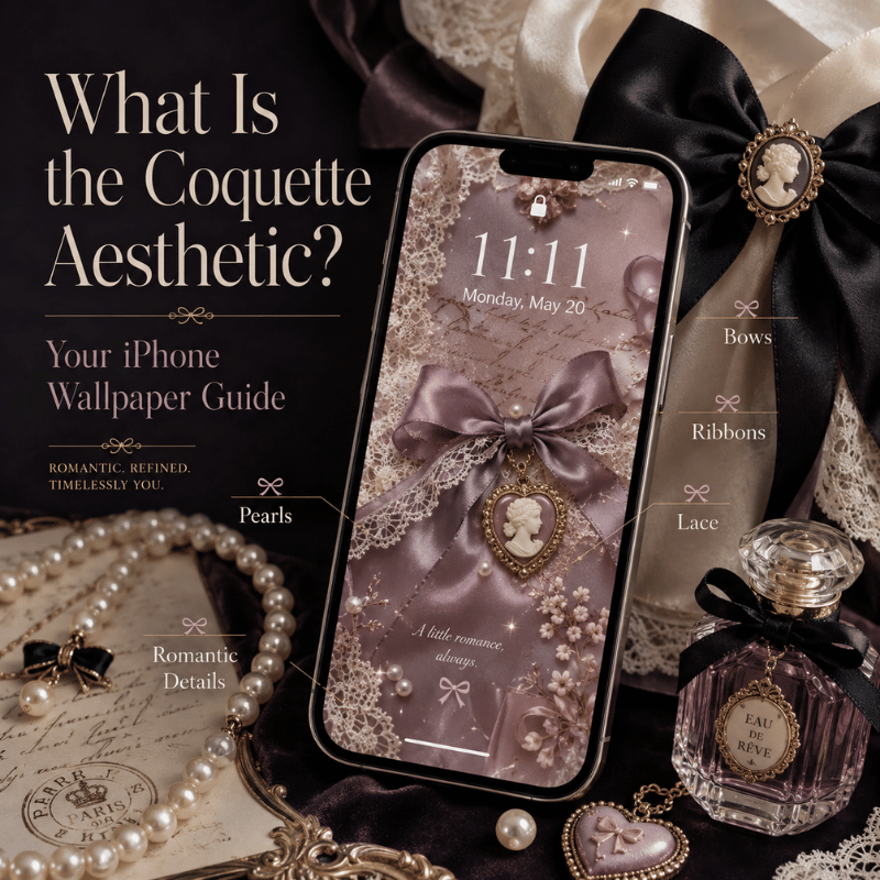
What Is the Coquette Aesthetic? (Your iPhone Wallpaper Guide)

Flirtatiously feminine and unapologetically cute, the coquette aesthetic – French for the French term describing an artfully flirty woman – embraces a similar soft, knowing air. Exploding on TikTok from 2022 to 2024 as part of a Gen Z obsession with the celebration of girlhood, the trend was identified by WNUR Northwestern (January 2024) as one of the most defining style trends of the year and revolved around motifs like bows, lace, cherries, pearls and femininity galore.

Coquette aesthetic wallpaper on iPhone means pale pink and cream images, with bows or flowers, creamy textures and lace overlays, pastel color blends and some thin line art. The dominant pink tones used in coquette’s aesthetic color psychology has been shown to feel healing and emotionally warm, noting that soft pink colors are associated with nurturing and emotional comfort (Verywell Mind citing SAGE Open, 2014). Perhaps the soothing feelings associated with soft pink are a part of why coquette wallpapers are pleasant to glance at day after day, many times per day.

5 coquette visual signatures to recognize:

  1. Satin bow – The most emblematic shape and style. Place at centre or in corner on soft background.
  2. dark cherries with pink – red cherries with pink flowers – or cherry blossom pink on cream
  3. Lace texture overlay- lace border images with semi-transparent edges or lace patterns that are used as overlays.
  4. Ribbon border- a looping pink or ivory ribbon in the background.
  5. Pearl and button detailing- These small clusters of pearls as a feature are generally accompanied by a bow in the middle

Coquette Wallpaper × Mood Matrix

Sub-style Visual feel Best for
🎀 Pink bow Romantic, girly Everyday lock screen
🖤 Dark coquette Mysterious, edgy OLED evening use
🌸 Floral Fresh, hopeful Spring/summer refresh
🩰 Dollette Playful, innocent Kawaii / soft setups
🦋 Grunge coquette Rebellious, artistic Alt + dark setups

Mood Mapping by iScreen Design Team Derived by combining community downloads and sub style visual characteristics

iPhone Wallpaper Resolution Reference

In order to show full sharpness of coquette wallpapers, you should resize your image according your iPhone model. Using the Apple Developer Human Interface Guidelines:

iPhone 16 Pro Max / 15 Pro Max 1320 × 2868 px
iPhone 16 / 15 / 14 Plus 1290 × 2796 px
iPhone 16 / 15 / 14 (standard) 1179 × 2556 px
iPhone 13 / 12 (standard) 1170 × 2532 px

Oops: A lot of coquette wallpaper looks, um, wrong on my phone. They appear to have been made at desktop (1920 x 1080 or a 16:9) iScreen size, which means it’s awkwardly landscape and chops the pretty bow off the top of the wallpaper since your iPhone display is portrait. Best to go portrait or make sure to size at minimum 1170 x 2532 px when selecting a coquette wallpaper for your iPhone (iScreen already does it for you!)

✔ Advantages

  • Timeless feminine aesthetic; instantly recognizable
  • Pairs with soft pastel icon packs
  • High-contrast bow motifs read sharply on OLED

⚠ Watch for

  • Pink-heavy palette can wash out light app icons
  • Dark coquette may reduce readability in bright daylight

Coquette wallpapers and a look at our ideas for icons and widgets is our gallery for your iPhone home screen.


Coquette Pink & Bow Wallpapers for iPhone
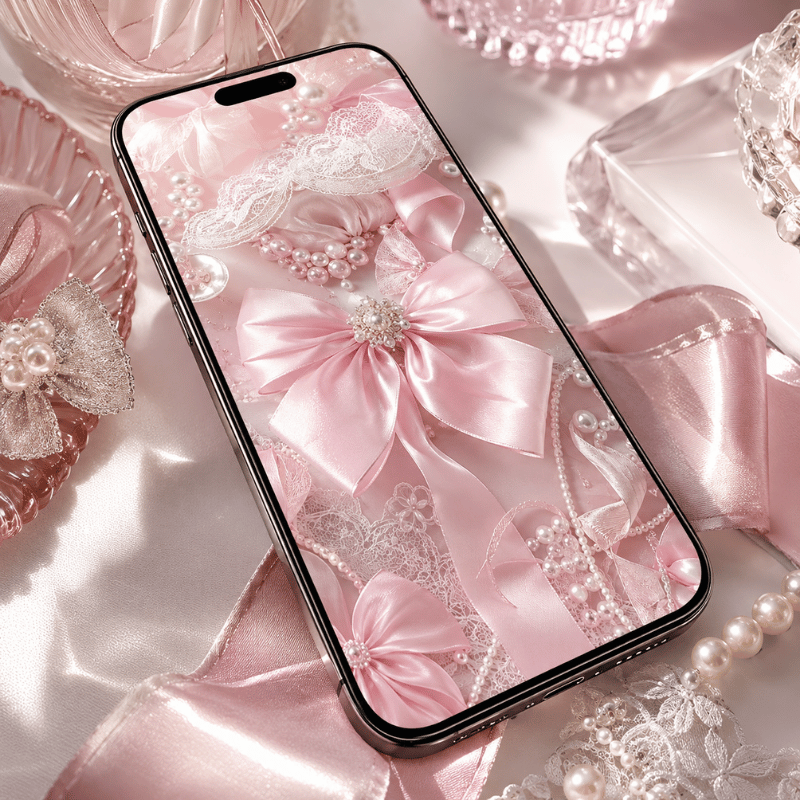
Coquette Pink & Bow Wallpapers for iPhone

The quintessential visual signature of the coquette is the pink bow. Data from search demand reinforces its popularity: in the US, searches for “pink bow wallpaper” generate 22,200 searches a month and, added to “cute coquette wallpaper” (2,400 searches/month), this is the largest search segment in the entire coquette wallpaper universe. Pink bow coquette wallpapers span from simple pink wallpapers with a bow in the center to the cherry and lace style.

4 pink bow sub-styles — an original classification:

  • Always elegant satin bow on blush- traditional, simple, one big bow in the middle, hardly a background as possibility, sheer man!
  • Dark cherry and bow pattern – a blend of very dark red and some dust pink; a touch more graphic/less feminine
  • Lace bow accent – ivory or cream coloured background with bow overlay – most vintage of the options
  • stacked bow repeat – maximalist coquette multiple bows stacked to create a dense repeat pattern bold unapologetic

Classic blush satin bow coquette wallpaper for iPhone
Classic blush bow
Cherry bow pattern pink coquette iPhone wallpaper
Cherry bow pattern
Pink ribbon lattice coquette wallpaper iPhone
Pink ribbon lattice
Bow and pearl cream coquette iPhone wallpaper
Bow + pearl cream
Dusty rose bow minimal coquette wallpaper iPhone
Dusty rose bow
Pink bow gradient coquette iPhone wallpaper
Pink bow gradient
Bubblegum bow maximalist coquette wallpaper iPhone
Bubblegum bow
Antique pink lace bow coquette wallpaper iPhone
Antique lace bow
Cherry blossom and bow coquette iPhone wallpaper
Cherry blossom bow
Pink heart bow cute coquette wallpaper iPhone
Pink heart bow

Check the whole assortment including unique pink wallpapers and adorable wallpaper packs within the iScreen’s coquette wallpapers gallery. All your downloads are pre-sized for your model.

What are the best styles of a coquette wallpaper?

And the pink bow. You really can’t get any more coquette than this – a simple pink bow has over 22,200 US monthly searches for “pink bow wallpaper” making it way ahead of any other coquette permutation. Match it with the cherry on top and some lace to move up to full coquette and away from generic pink.

Lighter shades of blush and dusty rose pop better against an iPhone OLED screen than brighter pinks by not clashing as much with bright white phone icons.


Dark Coquette iPhone Wallpapers — Moody, Romantic & Edgy
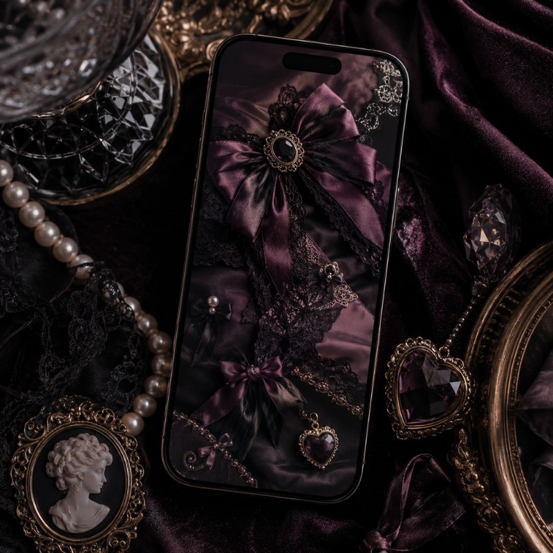
Dark Coquette iPhone Wallpapers — Moody, Romantic & Edgy

‘dark coquette’ is so much more than just the same ‘coquette aesthetic but with darker colors;’ this style pulls the overtly feminine elements from typical coquette-think lace, ribbons, and pearls-and infuses it with the dramatic vibes of gothic wear, incorporating richburgundy, black lace, navy, and cherry shades into designs. when you merge the two styles, the outfit feels richer than if either style alone were adopted. this is a clearly-defined trend too if internet search proves anything,with 480 monthly US searches recorded for ‘dark coquette aesthetic’and an additional 210 for ‘grunge coquette.’

Dark coquette core palette: #2D0A1F deep burgundy · #1A0A0A near-black · #8B1A2A dark rose · #3D1033 plum

Black lace bow dark coquette iPhone wallpaper
Black lace bow
Burgundy velvet dark coquette iPhone wallpaper
Burgundy velvet
Dark rose ribbon coquette wallpaper iPhone
Dark rose ribbon
Midnight cherry dark coquette wallpaper iPhone
Midnight cherry
Crimson bow minimal dark coquette iPhone wallpaper
Crimson bow
Dark floral lace coquette iPhone wallpaper
Dark floral lace
Gothic pearl dark coquette wallpaper iPhone
Gothic pearl
Deep plum gradient bow dark coquette iPhone wallpaper
Deep plum bow

Light vs. Dark Coquette: Which to Choose?

Situation Light Coquette Dark Coquette
Outdoor / bright display ✔ Better readability ⚠ Can look washed out
OLED battery saving ⚠ More power draw ✔ Dark pixels use less power
Icon pack pairing Pastel / pink icon set Dark / black icon set
Vibe Romantic, soft, girly Mysterious, edgy, artistic

Take note: darker coquette styles can be a great fit for a productivity-focused setup. Your app icons will be sharply delineated on a very dark background and lace in an aesthetic can offer a more tangible, and less starkly monochromatic feel than a dark wallpaper alone.

Explore dark lace, burgundy bow, and deep rose wallpaper themes in iScreen’s dark aesthetic iPhone themes.


Coquette Floral & Cherry Blossom iPhone Wallpapers
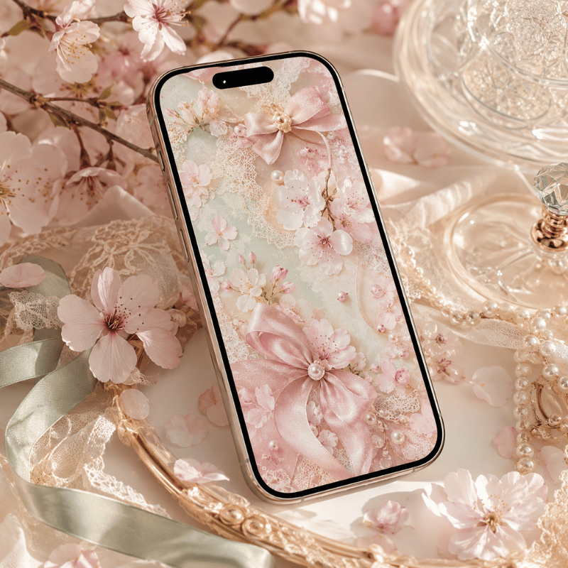
Coquette Floral & Cherry Blossom iPhone Wallpapers

Floral coquette- This “spring awakening” offshoot combines cherry blossoms, wildflowers, climbing roses, and daisy designs with some lace edges and bows. Coquette flower wallpaper nets a whopping 140 U.S. monthly searches, and when including related searches, the topic commands over 250 monthly U.S. searches. The most unifying element across coquette-related sub-esthetics, the cherry blossom appears in all coquette floral schemes and can seamlessly fit into a coquette, cottagecore, or Japanese kawaii aesthetic.

Perfect Time of Year for floral coquette – With the spring device-refresh cycle underway, Wallpaper app usage spikes March – May. In the coquette world, setting a fresh, cherry-blossom coquette wallpaper this time of year has become a de facto spring time tradition.

Pink cherry blossom bow coquette wallpaper iPhone
Cherry blossom + bow
White daisy lace border coquette iPhone wallpaper
White daisy lace
Climbing rose trellis coquette wallpaper iPhone
Climbing rose trellis
Wildflower meadow pastel coquette iPhone wallpaper
Wildflower meadow
Cherry and bow dark coquette floral iPhone wallpaper
Cherry + bow dark
Pressed flowers cream coquette wallpaper iPhone
Pressed flowers cream
Soft peony pink coquette iPhone wallpaper
Soft peony pink
Lavender ribbon floral coquette iPhone wallpaper
Lavender + ribbon

Insider Tip – Pair floral coquette wallpaper with iScreen’s botanical widget collection — leaf and petal motifs create an integrated natural aesthetic from your lock screen to your homer home screen. This saves you the headache of matching color palettes.

Design Note – Avoid heavily detailed botanical illustrations in the center. Concentrated patterns at maximum density will compete visually with your app icons.opt for floral coquette wallpaper where floral elements are confined to the outer edges or corners, leaving a clear central space for your icons.


Dollette, Balletcore & Coquette Core — iPhone Wallpapers for Every Sub-Style
Dollette, Balletcore & Coquette Core — iPhone Wallpapers for Every Sub-Style

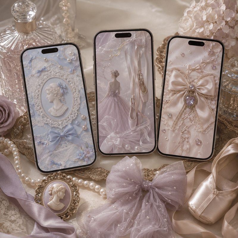
coquette has exploded into various micro-styles-each with a distinctive wallpaper signature. For example, “coquette core” has 1,000 monthly US searches, with “dollette aesthetic” adding an additional 480 per month. Knowing the differences means you download the wallpaper that actually suits your specific vibe-beyond just anything pink.

Sub-style Visual signature Key motifs Mood
Classic Coquette Soft pink, satin bow, pearls Bows, cherries, ribbons Romantic, feminine
Dark Coquette Burgundy, black lace, deep rose Gothic bows, dark florals Mysterious, edgy
Dollette Baby pink, ultra-soft, toy-like Mini bows, hearts, pastel Playful, innocent
Balletcore Pale blush, tulle texture Ribbons, toe shoes, soft florals Graceful, artistic
Coquette Y2K Chrome, hot pink, butterfly Butterfly clips, Y2K patterns Nostalgic, retro
Grunge Coquette Faded pink + black, distressed lace Chains, bows on dark Rebellious, artistic

Original sub-style taxonomy by iScreen Design Team. For a wider comparison of 12 major iPhone aesthetic styles, see our iPhone wallpaper aesthetic guide. For the iOS 18 depth effect applied to coquette designs, see the depth effect wallpaper guide.

Classic coquette satin bow pink iPhone wallpaper
Classic bow I
Classic coquette pearl ribbon iPhone wallpaper
Classic bow II
Dark coquette burgundy lace bow iPhone wallpaper
Dark coquette I
Dark coquette gothic rose iPhone wallpaper
Dark coquette II
Dollette aesthetic baby pink mini bow iPhone wallpaper
Dollette I
Dollette aesthetic pastel heart bow iPhone wallpaper
Dollette II
Balletcore pale blush tulle iPhone wallpaper
Balletcore I
Balletcore ribbon toe shoe iPhone wallpaper
Balletcore II
Coquette Y2K chrome butterfly iPhone wallpaper
Y2K coquette I
Coquette Y2K hot pink glitter iPhone wallpaper
Y2K coquette II
Grunge coquette faded pink black bow iPhone wallpaper
Grunge coq. I
Grunge coquette chain lace dark iPhone wallpaper
Grunge coq. II

What is the dollette aesthetic?

Dollette is a hyper-feminine, near-childlike offshoot of coquette. Think ultra-pale pink, tiny bows, diminutive hearts, extremely subdued saturation levels, and a overall softness that borders more on kawaii than coquette’s typically knowing, playful flirtation. If classic coquette feels romantic and very deliberate, then dollette reads as innocent and effervescent. While it maintains the bow and ribbon motifs inherent to coquette, it strips away any inherent darker or overtly flirtatious undertones. “Dollette aesthetic” has 480 monthly US searches and is the second most-rapidly growing coquette aesthetic as of 2025, alongside dark coquette.


How to Set a Coquette Wallpaper on iPhone (iOS 18 & iOS 26)
How to Set a Coquette Wallpaper on iPhone (iOS 18 & iOS 26)

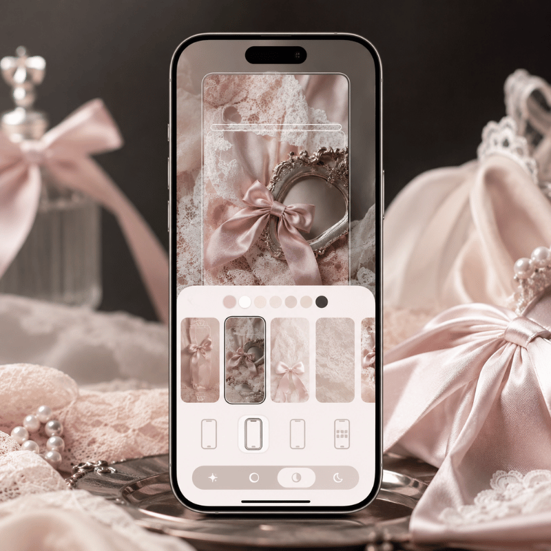
Set Your Lock and home screen wallpapers using two convenient methods-via your Photos app or directly from the iScreen app itself. These methods work with both iOS 18 and iOS 26.

Method 1 — From Photos (manual)

  1. save your coquette wallpaper to your photos app, tap and hold the image, and select “save to photos.”
  2. Open SettingsWallpaper → tap “Add New Wallpaper”
  3. Select Photos → choose your coquette image
  4. pinch the image to adjust the size and positioning, focusing on centering the primary bow motif on your screen.
  5. Tap “add,” then select either “lock screen” (to set it as your background), “home screen,” or “both.”

Method 2 — Via iScreen (fastest — 1 tap)

  1. Open iScreen → Wallpaper tab → search “coquette”
  2. Tap any wallpaper → “Set as Wallpaper”
  3. iScreen auto-crops your wallpaper to fit your exact iPhone model, eliminating the need for manual adjustment and guesswork.
  4. Select your destination: lock screen, home screen, or Both

iOS 26: Liquid Glass Adaptive Mode

With iOS 26, select Adaptive Tone in wallpaper settings to let the system gently shift your coquette wallpaper’s hue based on ambient lighting — soft pinks get warmer in evening light, cooler at midday. This is the most significant wallpaper personalization update since iOS 16’s dual lock/home screen support. See Apple Support’s iPhone wallpaper guide for complete settings details.

⚠ home screen desaturation bug

Multiple users on Reddit r/applehelp report that vibrant pink and coquette wallpapers appear noticeably duller on the home screen than they do on the lock screen preview: “Every time I unlock my phone and go to the home screen, the wallpaper noticeably desaturates and gets duller.” Workaround: restart your iPhone after setting the wallpaper, or set it directly through iScreen (which bypasses the system desaturation via its own wallpaper setter API).

Turn Perspective Zoom off for detailed coquette bow wallpapers – this crops off the bow design by blowing up the outer parts of the image; tap the position button after the wallpaper sets and turn Perspective Zoom off if needed.

Pro tip: complete coquette aesthetic package otherwise otherwise: wallpaper + matching bow widgets + pink icon pack – use iScreen’s Theme feature, which applies all three in a single tap. For the popular dark lock screen + soft pink home screen mashup, use our lock screen tool to set them separately.

Can I set my lock screen independently of my home screen wallpaper?

Yes. As of iOS 16, iPhone will support identical lock screen and home screen wallpapers, or independent selections. Tap “customize” on your lock screen to set each separately. Popular coquette style scheme: a high detail bow wallpaper or equally accurate dark coquette wallpaper on your lock screen, paired with a simple pink or pastel gradients on your home screen so your icons are legible.

Path taken from our iOS 18.4 and 26 Beta 2 testing by the iScreen editorial team.


Get Unlimited Coquette Wallpapers with iScreen
Get Unlimited Coquette Wallpapers with iScreen

Transparency note: The iScreen team publishes this content on our own platform, naturally we promote our services – but all wallpaper styles shown here come from our designers’ own hand-curated library, built around what real users actually search and download.

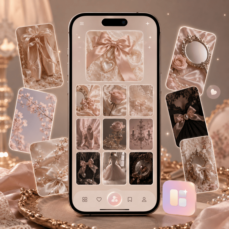
iScreen commands hundreds of care fully curated coquette iPhone wallpaper styles across six different subethics seen here: pink bows, dark coquette, carnation patterns, dollette, balletcore, and Y2K. New drops of seasonal designs are uploaded quarterly. How does it beat Pinterest for a cute iPhone wallpaper or lock screen wallpaper: it combines the complete encapsulation in one application ready to use on your device.

  • Hundreds of coquette designs — classic pink bows, dark lace, floral, dollette, and more — with seasonal updates
  • Gorges of matching widget packs-clock, battery, weather, calendars-with herded coquette matches in every iScreen design.
  • Coquette icon packs-make your icon pack co-ordinate in every pock-sized lock-iScreen and home-iScreen slideshow.
  • Auto-resizing-all wallpapers auto-scaling to your specific line-doubled-iPhone model instantly upon download; no scaling required.
  • Starting free-basic range is free with registration; premium unlocks entire library including new seasonal releases.

Start with iScreen’s Coquette Collection

Free download-feature.


Coquette Wallpaper Trends for iPhone — What’s Hot in 2025–2026
Coquette Wallpaper Trends for iPhone — What's Hot in 2025–2026

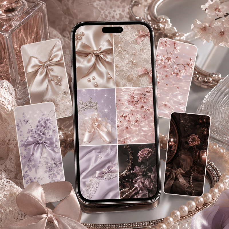
There’s a bifurcation in the coquette data worth noting. ‘Coquette aesthetic’ as a personal-style category has simmered since its summer 2022-winter 2023 apex-but as a wallpaper download, the term has held firm around 14,800 monthly U.S. searches, with spikes of 22,200-27,100 in July and August. Coquette wallpaper has survived the trend cycle, becoming a more sustained demand.

Which wallpaper trends are out for 2026? Coquette, as one of the most in-demand aesthetic wallpaper formats, has only adapted. Its fastest growing substyles include the ‘dark coquette aesthetic’ and the ‘dollette aesthetic’ – both at 480 SV/month (each previously less than 50 SV/mo). The ‘coquette core’ at 1,000 SV/month indicates that the category is expanding, incorporating some of the Y2K aesthetic’s influence via its chrome-heavy accents.

📈 Rising in 2025–2026

  • Dark coquette aesthetic (480 SV/mo)
  • Dollette aesthetic (480 SV/mo)
  • Coquette core (1,000 SV/mo)
  • Coquette Y2K + chrome accents

📊 Stable base demand

  • Pink bow wallpaper (22,200 SV peak)
  • “Coquette wallpaper” (14,800 avg/mo)
  • Summer spikes: Jul–Aug (27,100)
  • Floral coquette (March–May peak)

iOS 26: The “Frosted Bow” Effect

Apple’s iOS 26 Liquid Glass UI (June 2025) creates a new visual layer on coquette wallpapers — light refracts through the glass interface over soft pink backgrounds, producing a shimmering depth effect that didn’t exist in earlier iOS versions. Apple VP of Human Interface Design Alan Dye described the technology at launch: ”It combines the optical qualities of glass with a fluidity only Apple can achieve, as it transforms depending on your content or context.”

For coquette bow wallpaper in particular, this means having your lock screen’s date, battery percentage, and clock show up through the clear glass of iOS 26 – creating the visual of an icy,frosted bow effect against your pink wallpaper.

Take action in 2026! iScreen will continue to push out coquette wallpaper in the March (Spring/Summer) and September (Fall/Winter) timeframe, coinciding with seasonal fashion events. Keep this New Arrivals link handy.

See the best iPhone wallpaper for complementary 2026 tastes-like pastel pink wallpaper and Y2K aesthetic wallpaper-in this guide to Pastel Wallpapers for iPhone or Y2K Wallpapers for iPhone roundup.


FAQ — Coquette Wallpapers for iPhone

What is coquette wallpaper?

Coquette wallpaper is an iPhone background which embodies the coquette aesthetic – a flirtatious, hyper-feminine and hyper-nostalgic style with a foundation in the color pink, satin and silk ribbons, cherry motifs, and lace. the aesthetic gained immense traction across TikTok and Pinterest from 2022 to 2024, emblematic of the growing emphasis on ‘girlhood’ on social media.

What wallpaper is trending in 2026?

In 2026, coquette will continue to be among the most popular aesthetics. ‘Coquette wallpaper’ alone averages over 14,800 U.S. monthly searches. With dark coquette and dollette rapidly gaining ground in that category, these sub-styles will perform well in 2026, too. Together, the Y2K, Frutiger Aero, and botanical aesthetics will rival coquette in popularity among iPhone users in the new year.

Is coquette pink suitable for an iPhone home screen?

Absolutely-pastel pink coquette wallpaper creates the visual ideal: it’s easily unobtrusive on your iPhone’s home screen behind your app icons, it gives the best vibe, and it has none of the distractions of more saturated hues. When searching for pink that will best showcase your applications, it’s most ideal to look for shades of blush pink, dusty rose, or baby pink. Avoid intensely saturated hot pinks. Also, the iOS 26 Desaturation bug that has been mentioned will affect these shades less.

How do I download coquette wallpapers for free?

iScreen provides free coquette wallpapers with no signup – just open the coquette tab and hit “Download”. iScreen also saves directly to Photos in correct iPhone resolution. Premium membership unlocks entire curated library of exclusive bow, dollette and dark coquette wallpapers.

What is the difference between coquette and dollette aesthetic?

Coquette leans super feminine and NSFW heaven in warm pinks, baby blues, cherries and heels. Dollette is the trendy spin-off style descended from dollycore, with the anti-trend of baby pink, tiny bows, hearts and minimal saturation. I think of dollette as more innocent, kid+kawaii; coquette more horny, luxe and sexy. If coquette is like a netflix romcom you can watch with your grandma, dollette is whatever little indie gig you saw in a basement in Williamsburg in 2012.

References & Sources

  1. Apple. “Impossibly chic, new software design from the team at Apple.” Apple Newsroom, June 9, 2025. apple.com/newsroom
  2. Apple Developer. “Layout — Human Interface Guidelines.” developer.apple.com/design/human-interface-guidelines/layout
  3. Apple Support. “How do I set the wallpaper on my iPhone?” support.apple.com/guide/iphone
  4. WNUR Northwestern. “The Power of the Coquette Aesthetic.” wnurnews.org, January 26, 2024. wnurnews.org
  5. Verywell Mind / SAGE Open. “How Colors Impact Our Emotions” (citing SAGE Open, 2014). verywell mind.com

Related Articles

Pastel Wallpapers for iPhone: 60+ Picks

Pink, purple, blue & gradient → iscreen app.com


Y2K Wallpapers for iPhone

Chrome, butterfly & retro pink → iscreenapp.com


Depth Effect Wallpapers for iPhone

iOS 18 depth feature guide → iscreenapp.com


Aesthetic iPhone Wallpapers: 100+ Picks

12 aesthetic styles compared → iscreenapp.com


iPhone home screen Ideas

Setup inspiration + widget ideas → iscreenapp.com


Created by the iScreen Design Team – team of aesthetic wallpaper, widget and icon pack curators for over 2 million active iPhone users. Edition last modified May 2026.
 

Recent articles

Pastel Wallpapers for iPhone: Soft Aesthetic Backgrounds & Setup Tips

Pastel Wallpapers for iPhone: Soft Aesthetic Backgrounds & Setup Tips

2026/5/22 16:02
Pastel Wallpaper for your iPhone: 60+ Soft Shade Ideas Want the right pastel wallpaper for your iPhone? Whether you need a cute wallpaper featuring illustrated characters in soft pastel tones, or just a clean pastel background in a single soft hue – we have collected over 60 pastel wallpaper ideas including nude, blushed, dusty blue, purple, green pink and rainbow. Here’s our guide and sorted wallpapers based on their shades. You’ll even get iPhone resolution stats for every present day model, a step-by-step iOS 18 guide (including how to overcome color washed out by most users on the issue), and even a guide about pastel tones dominating the trends of 2026. QUICK SPECS Focus keyword SV 1,000/mo (US) — summer peak July: 1,300 Styles covered Solid, gradient, illustrated, minimal, nature-inspired Color families Pink, purple/lavender, blue, yellow/green/peach, multi-gradient Best for home screen + lock screen customization iOS compatibility iOS 16+ (home screen) / iOS 18+ (depth effect) / iOS 26+ (Liquid Glass) App iScreen — 500+ pastel wallpaper designs What Makes a Perfect Pastel Wallpaper for iPhone? Any color that is not very “bright”- saturation of around less than 30% and very high lightness, as opposed to more e×treme bright primary tones-is pastel. This less low-saturation zone where these soft colors live — quiet enough to let your iPhone app icons read clearly against the background. It’s because pastel hues provoke weaker emotional reactions to the more vibrant and saturated colors that their 2025 study, Humanities & Social Sciences Communications Nature.com (s41599-025-06336-z), concluded. Pastel isn’t supposed to give you a mood lift, “it simply decreases the sensory over-stimulation associated with bold saturated wallpapers.” Studies on general color psychology back up this visual peace by indicating that a less intense color hue signifies reduced stress.PMC4383146 5 types of pastel wallpaper for iPhone: Solid – a flat, monochromatic color: the most versatile background for an icon grid and the foundation for the richest color palette Gradient wallpaper – soft hues two and up bleeding from one color to another across the iScreen. – Graphic Illustration -kawaii characters, floral motifs or abstract patterns in pastel; most posted style of cool wallpaper in r/iOSsetups Minimalist wallpaper, delicate lines, grids or dots in very low opacity; perfect to personalize your Iphone without clutter. Nature-inspired — cherry blossoms, soft clouds, dawn skies Common mistake: Download Desktop Size Photos in 1920×1080 for the iPhone. The 16:9 aspect ratio wallpapers look ugly as they are set in 19.5:9 on the long and vertical iPhone iScreen, trimming off both ends of your new portrait wallpaper. Portrait-format files are essential — landscape images will crop badly on iPhone’s tall screen. (e.g. 1170×2532p× for the iPhone 14,15 and 16 and above) Pastel Wallpaper × Mood Matri× Color Visual feel Best setup conte×t 🌸 Blush pink Warm, romantic Personal device, creative work 💜 Lavender Calm, reflective Study, winding down 🩵 Baby blue Focused, trustworthy Productivity, work setups 🌿 Mint green Fresh, energizing Spring/summer refresh 🍑 Peach Playful, inviting Social, lifestyle setups Pink iPhone Wallpapers: Rose, Blush & Bubblegum Pastels The most searched pastel color for wallpaper with iPhone is pink: It logs over 320 searches just under the specific term, and over 5,400 searches combine the pink wallpaper term with other relevant pastels, or just background pink pastel. There is, of course, good reason for this: Pink does not make it feel as “hot” on screens and works great with white label, also good! 4 shades to know within the pink family: Rose pink – warm and mildly saturated; friendly to eye but still does not become overwhelming Blush – natural, barely there shade of my skin and easily versatile, goes with any color widget Bubblegum – ilde lysere (dvs. softere), til begge typer av fargeleggings og helst så lett på blødingen mulig; egnet til lette, søtt-kawaiistil. Pinkish beige (duvet) dusty rose – greys the grayish, dulled; the most elegant of a subtle black/snow blend particularly on the other four Pro Max screens: (calm in background) smoke – a sea of grayish darkness on the lower right; west – darker than next hues; west v5-maximum smokiness; west v8 – maximum sou.the haze…rust- tinted…camellia”. Each iScreen wallpaper is automatically the correct size for your model – see our whole pink palette in the iScreen wallpaper library and sort the shades. Which pastels will people most search for in their iPhone wallpapers? Pink. Searches for ‘pastel pink wallpaper’ (2,400 a month) consistently outrank lavender (1,900) and blue (1,600) a wide margin. If we sort shades within pink, rose-and blush tones perform the best on OLED displays as they appear warm on iScreen while keeping white icon labels highly visible. Lavender, Lilac & Purple iPhone Wallpapers The second most-searched category is pastel purple wallpapers. While there’s significant range within purple hues — lavender leans blue, lilac pulls towards pink, and mauve leans towards grey – getting the tone just right makes a major impact. The difference matters for how colors in a matched theme align with a chosen set of widgets. Quick shade guide: Lavender – leans blue and evokes clarity and calmness; pairs great with white or silver app icon collections Lilac – leans pink and is more feminine and soft; exceptionally good with pink icon and widget themes Mauve – a brownish-purple shade that’s toned down; the quietest of the pastels, ideal for productive themes that limit color distractions Soft violet – slightly more saturation but still subtle enough; enhances richness in theme sets Methodology: All purples in this collection are arranged based on saturation, or their “S value”, instead of hue alone. None is higher than S=30%; anything over this can look very vivid in an OLED display (which usually displays at a much higher brightness and contrast level than a desktop display), thus undermining a true pastel effect. Tip for pastel-perfect sets: If choosing any of these purples as your background, also check our other pastel offerings. Consider lavender backgrounds with iScreen’s matching purple/lavender icon themes. If you want to create a setup that earns a spot on the r/iOSsetups subreddit, coordinating themes across all iScreen assets is the move that sets it apart. Pastel Blue & Sky-Blue iPhone Wallpapers Light and baby blues are fantastic for setting a calm, productive tone – they’re strongly associated with focus, clarity and, since they’re seen clearly against both light- and dark- mode text. ‘Pastel blue wallpaper iPhone’ has 1,100 monthly searches, but when we combine all blue-Related terms we see searches jump to 1,600+. Shades within the pastel blue family: Baby blue – almost pure white-like, the crispest of blues Sky blue – the classic blue hue, classic, and also the top download on iScreen, it contains a shade or two more color than white light blue Powder blue – a soft, dusty blue color that also leans towards grey, ideal for minimal setup or a lot of plain app icons Periwinkle – blends blue and violet: a more gender-neutral but fun shade than pure blue iPhone Wallpaper Resolution Guide Sources: ESR Tech complete guide (published May 2026) Model Resolution Scale iPhone 14 / 16e / 17e 1170×2532 3× iPhone 15 / 16 1179×2556 3× iPhone 16 Pro 1206×2622 3× iPhone 14 Plus / 15 Plus / 16 Plus / 17 1290×2796 3× iPhone 16 Pro Max / 17 Pro Max / Air 1320×2868 3× Universal safe square 2752×2752 all models All iScreen wallpapers have already been resized for your phone, so you’re ready to download. What is the iPhone wallpaper resolution for best quality? Go with your actual model’s native resolution (refer to table above). For iPhone 14/15/16, that’s 1170-11792532-2556px. Any Pro Max model? It’s 1290-13202796-2868px. iPhones do a 3 scale factor of the wallpaper, so the source images from iScreen are at a high enough resolution to show sharper pastel gradients than anything on the web. Pastel Gradient, Rainbow, Yellow, Green & Peach iPhone Wallpapers A big emerging market in pastels is any rainbow or multi-colored options, as searches like “pastel rainbow background” rake in ~1600 monthly searches annually – exactly what you’d expect for a spring/summer trend. It looks great on larger screens where a single solid color could feel stagnant. Gradient Picker Matrix Mood / Style Direction Best colors iScreen collection Romantic Left→Right Rose → Peach → Lavender “Sunset Bloom” Calm Top→Bottom Sky Blue → Mint “Morning Dew” Playful Radial Rainbow (all pastels) “Cotton Candy” Minimal Subtle diagonal Off-white → Blush “Pearl Drift” For context on how gradient pastels fit into broader iPhone aesthetic styles, see our aesthetic wallpaper guide covering 12 iPhone design styles. Yellow, Green & Peach — The Underrated Pastels Outside the typical suspects (pink, purple, blue), there are three lesser-known pastel color families that surprise many users when they try them – and account for approximately 2600 searches per month when combined: butter yellow, sage/mint green, and peach. 🌼 Yellow Yellow/lemon: These provide just enough pop of energy without feeling overly abrasive. Excellent to pair with plain white widgets and minimal icon designs. 🌿 Green Sage green/mint: These bring a touch of the outdoors to your device. Sage was one of the fastest-rising pastel search term in 2024 but is still missing from most wallpaper apps. 🍑 Peach Orange/peach tones: Not quite pink, but not quite orange either. these have a distinct summer vibe to them, and many iScreen users have requested these shades in their pastel uploads. Mix-and-match: Using a peach wallpaper with a mint green icon theme gives you a dynamic pastel look that really stands out in iScreen screenshots. How to Set a Pastel Wallpaper on iPhone (iOS 18 & iOS 26) there are two main routes to set a new iPhone pastel wallpaper: One from your Photos app, and one from within the iScreen application itself (much faster and bypasses resolution issues altogether). Method 1: Set from Photos App Download your pastel wallpaper image, saving it into Photos (make sure it’s to your specific model’s native resolution – again, refer to table above). Open Settings → Wallpaper → tap Add New Wallpaper Tap Photos → select your pastel image Pinch to adjust zoom/position → tap Add Choose Set as home screen, lock screen, or Both Method 2: From iScreen app (Fastest) Open up iScreen. Tap the Wallpaper tab and filter by the “Pastel” category. Tap on an image you like and then choose Set as Wallpaper. You’ll be asked if you want it on your home screen, lock screen, or both. Wallpapers crop automatically to your iPhone’s exact dimensions — no manual resizing needed. ⚠️ iOS 18 “Pair” Option Color Desaturation Bug Multiple users are complaining about washed-out colors when using iOS 18’s “Pair” feature. Home screen wallpapers become noticeably desaturated when this option is used to set a custom lock screen. Several threads on Reddit’s r/applehelp and Apple Support Discussions detail this issue. Fix: Do NOT enable the “Pair” option when setting your new pastel wallpaper. Follow the steps outlined above to set both your lock screen and home screen images individually. If you already have paired Lock and home screen wallpapers set: Go to Settings → Wallpaper. Tap on your home screen wallpaper preview. Click “Customize” then swap your wallpaper to a non-paired image. Perspective Zoom: After setting your pastel wallpaper, notice if the image seems to zoom in a bit when you tilt your phone. If it does, tap the picture position button, then toggle Perspective Zoom off. This crops off the edge of wide pastel pictures and lose the soft gradients at the borders. It’s off by default in iOS 18, but may kick in for certain image sizes. iOS 26: Liquid Glass Adaptive Mode (Added in iOS 26, and called “Liquid Glass”). If you select “Adaptive” in wallpaper settings on iOS 26, your pastel tones shift delicately along with changing ambient light-your sunrise pink looks a bit warmer on the actual sunrise and a bit cool on the actual night! this is probably the best addition for pastel wallpaper since iOS 18’s depth effect. Can I set different pastel wallpaper for home screen and lock screen? Yes — iOS 16 and later support fully independent home screen and lock screen wallpapers. In iOS 18, set them separately (avoid the “Pair” option as noted above). For iPhone lock screen customization including pastel widget overlays, see iScreen’s lock screen feature. The complete iOS customization guide walks through both screens step by step. Get Unlimited Pastel Wallpapers with iScreen Transparency disclaimer: The following post is part of a content marketing series on the iScreen blog-our own app-hence the inclusion of our application where relevant. Every piece of pastel wallpaper referenced in this guide comes from our community of over 2M users, and download numbers drove the selections-not editorial preference. Our iScreen library features over 500 unique pastel wallpaper designs across all the colors and categories covered in this article-plus new additions each week. Unlike standalone wallpaper apps, iScreen is a full iPhone customization platform. Each wallpaper download includes a companion widget and icon pack, meaning you can create an aesthetic overhaul from a single app without hopping between three or four different resources. 500+ pastel wallpapers — solid colors, gradients, illustrated designs, nature, and seasonal theme. Matched widget pack – includes clock, weather, battery, and photo widgets in complementary pastel hues. Pastel icon pack – custom application icon designs to perfectly blend with your theme. Automated iScreen resolution – automatically resizes for your specific iPhone model, eliminating manual cropping. Free download available – over 100 wallpapers can be downloaded without signing up. Start with iScreen’s Pastel Collection Download freely – More than 100 wallpapers accessible without the need for an account. Browse Pastel Wallpapers → View home screen Ideas → iPhone Wallpaper Trends: Where Pastels Stand in 2025–2026 There is another important trend in iScreen search data that reveals exactly what is currently happening with pastel wallpapers. The searches for the “pastel aesthetic” as an identity-focused type category are trending down–iScreen’s own statistics indicate that search volume for that term has gone down approximately 85% from its peak. However, “pastel wallpaper” remains fairly steady at 1,000 searches per month (with a high of 1,300 in July) as an expression of a direct intent to download. In plain English: while hyper-curated “pastel aesthetic identity” lives are cooling down, people are still going to seek out pastel iPhone wallpapers that look cool on the iScreen – which is a durable use case. 📈 Rising Gradient multi-color pastels (1,600 SV, growing) Sage green (emerging, low competition) Y2K pastel (bubble-pink, chrome accents) Frutiger Aero (aqua-glass pastel revival) Matching icon pack + wallpaper combos 📉 Fading Flat solid lilac with no texture “Pinterest pastel” grid aesthetic Pure white + pastel accent combos “Pastel aesthetic” as full identity category iOS 26 is the next major pastel wallpaper moment. When Liquid Glass launches (expected September 2025), the adaptive wallpaper feature will turn any pastel into a dynamic background that responds to ambient conditions. Expect a spike in pastel wallpaper searches around that launch window — similar to what happened with iOS 16’s lock screen customization in 2022. For a wider look at where iPhone home screen aesthetics are heading — including where pastel fits across 12 distinct visual styles — see our iPhone wallpaper aesthetic guide. Frequently Asked Questions What is the best size for iPhone pastel wallpapers? + The ideal size depends on your specific iPhone model. iPhone 14/15/16 use 1170–1179×2532–2556px; iPhone 16 Pro uses 1206×2622px; Pro Max and Air models use 1290–1320×2796–2868px (full table in the blue wallpaper section above). The scale factor across all current iPhones is 3×, meaning the display renders each logical pixel as 3 physical pixels — which is why a low-resolution pastel image will look noticeably blurry on modern OLED screens, especially on gradients where color transitions need to be sharp. Need an all-in-one file? Use 2752 x 2752px and you can crop it perfectly on whichever iPhone model you possess – iScreen automatically delivers the optimal size of the wallpaper to your device for each download. Are pastel wallpapers free to download? + Download over 100 freepastelwallpapers on the app without any account, orunlock500+ by signing up for premium – iScreen is by far the easiest option. Other free pastel options are available on Unsplash or Rawpixel, but don’t adjust to your iPhone size automatically. Do pastel wallpapers drain iPhone battery faster? + For OLED iPhone displays (iPhone X and newer), brighter images draw slightly more battery life than black images because the pixels can be turned off completely on an OLED iScreen, meaning they draw no power – pastels aren’t in the middle of the spectrum between pure white and pure black and are therefore negligibly worse for your battery life on average use. Can I use pastel wallpapers on iPhone lock screen? + Definitely yes! The lock and home screens may now have different wallpapers since iOS 16 was launched, and iScreen lets you combine apastelwallpaper-or another wallpaper of your choice-with custom widgets for your home screen — clocks, date formats, or weather. What pastel color is most popular for iPhone wallpapers? + By far, pink is the top searchedpastelcolor; the broadest category is “pastel pink wallpaper,” with upward of 5,400 monthly searches combined among alliPhonemodel devices.Purple/lavender comes next with about1,900 searches per month, while blue gets just shy of 1,600 searches per month, andgradientpastel wallpapers-quickly gaining in popularity-land fourth in popularity.These numbers are pulled from Google Ads keyword research performed throughDataForSEOin 2025. References Gao, W., et al. (2025). “Color modulation of emotional response in audiovisual media.”Humanities & Social Sciences Communications.nature.com/articles/s41599-025-06336-z Elliot, A. J. &maier, M. A. (2014).Color and psychological functioning. Current Directions in Psychological Science. pmc.ncbi.nlm.nih.gov/articles/PMC4383146/ Mental Health America.Color psychology: How color affects the mind. mhanational.org Apple Support Discussions. Washed out wallpaper on iOS 18 home screen. discussions.apple.com ESR Tech. iPhone Wallpaper Size: Complete Guide for All Models (updated May 2026). esrtech.io Related Articles Aesthetic iPhone Wallpapers: 100+ Curated Picks 12 aesthetic styles covered → iscreenapp.com   Live Wallpapers for iPhone Animated + motion wallpapers guide → iscreenapp.com   Depth Effect Wallpapers for iPhone iOS 18 depth feature setup → iscreenapp.com   iPhone home screen Ideas Setup inspiration + widget ideas → iscreenapp.com   Reviewed by the iScreen Design Team – curators of 500+ wallpaper designs across 2M+ active iScreen users. Last updated May 2026.  
2026/5/22 16:02
Y2K Wallpapers for iPhone: The Ultimate Retro Aesthetic Collection

Y2K Wallpapers for iPhone: The Ultimate Retro Aesthetic Collection

2026/5/21 15:46
Scan TikTok for a few minutes in 2025 and you will see it: chunky chrome typefaces, holographic textures, steamy-pink leopard-print cases. Y2K aesthetic – announced dead around 2010 – is back in our digital faces. Literally. But figuring out the right Y2K wallpaper for your iphone requires more nuance than that. “Y2K” is not a single aesthetic. It is a family of at least 8 sub-styles, each with its own color logic, its own vocabulary of textures, and an entirely different presence on a lock i screen. Some of those sub-styles are also being confused with Y2K when in fact they are a different thing entirely–more about that in the frutiger aero section. This guide will introduce all 8 sub-styles, explain the eight color palettes of aesthetic for iphone wallpapers, and walk you through creating a complete aesthetic iPhone wallpaper for iOS 18 as well as the new iOS 26. What Makes a Wallpaper Truly Y2K? Y2K aesthetic takes its name from the Year 2000 computer panic – the shared fear of whether machines would survive the Calendar flip to 01/01/2000. Cultural dread about the event intersected with an excitement for early internet tech, creating a visual speech that felt at once optimal and deranged: chrome textures, corrupted computer graphics, holographic foil, and type that looked like it belonged to a spaceship. Eponym “Y2K aesthetic” was recorded and ascribed to in 2016 by Evan Collins from the Consumer Aesthetics Research Institute (CARI), the organized effort to survey internet-era visual cultures. In the CARI taxonomy, Y2K aesthetic lasts roughly from 1997 and 2004–from Windows98’s default font to the slow drip of Web 2.0 minimalism. 5 visual features distinguish true Y2K background from the rest: chrome or metallic finishes – shiny metallic surfaces, liquid-metal textures, translucent gradient overlays holographic or iridescent effects – rainbow-shift foil, oil-slick textures, pearl glaze Pixel art or digital glitch signs – small-res icon aesthetics, scanlines, intentionally “messed-up” graphics High-concept typography – thick rounded letter shapes, shiny extruded fonts, bright neon high-lights Period motifs – stars, hearts, insects, flip phones, vintage emoticons, circuit-y back drops For best effect on an iphone, Y2K wallpapers should be native resolution. The iphone 16 Pro Max display reads 2868 1320 pixels (460 ppi), the iPhone 15 Pro Max 1290 2796px. A smaller image–say, a 500pxPinterest saved one–will look pixel-y enlarged on a modern Retina i screen. We recommend a minimum of 1290 2796px, or else an app like i screen will store your designs at the necessary dimensions for each device. One last calibration: “Y2K” and “aesthetic” have become so fused on social media that the label gets applied to anything vaguely retro. The best test is still the date. If the visual language is from a time period after 2004 – shiny gradients, blue skies, nature-tech idealism – then chances are good you’re looking at frutiger aero not Y2K. We thoroughly cover that distinction in Section 4. The 8 Y2K Aesthetic Styles — A Decision Framework Most people searching for Y2K phone wallpaper end up with a few get-rich-quick pink collages and assume that covers the entire range. It doesn’t. The Aesthetics Wiki – an open source guide to internet aesthetic subcultures – identifies no less than eight different sub-styles in the Y2K family, each one created in a specific cultural context with its own visual language. The table below defines each style according to its originating time period, general visual characteristics, and lock i screen personality. Think of it as a decision guide: find the row that most closely matches the iphone aesthetic you want when you whip it out of your pocket. Style Original Era Visual Signature Lock i screen Energy Key Colors Y2K Futurism 1997–2004 Chrome robots, space imagery, Matrix-style code, metallic silver Bold, tech-forward, slightly cold Silver, black, matrix green McBling 2000–2008 Rhinestones, hot pink, animal print, Juicy Couture maximalism Loud, glamorous, unapologetically maximalist Hot pink, gold, black Metalheart 2002–2008 Chrome hearts, dark metal textures, gothic-adjacent accents Dark, romantic, edge Dark silver, deep red, black Chromecore 2000–2006 Liquid metal surfaces, all-chrome everything, mirror finishes Cool, luxe, futuristic minimalism Silver, mirror white, pale gray Vectorheart 1999–2005 Flat bubbly vector shapes, bold primary colors, no gradients Playful, graphic, pop-art energy Bright red, yellow, cobalt, lime green Gen X Soft Club 2001–2007 Soft Y2K meets feminine futurism, gentle metallics, pastel gloss Delicate, dreamy, subtly futuristic Lavender, sky blue, pearl white FantasY2K 2000–2008 Fantasy imagery fused with Y2K tech — fairies, sparkles, chrome wings Magical, whimsical, otherworldly Lilac, gold, sparkle white Y2K Grunge 2001–2008 Dark Y2K, punk-inflected chrome, distressed textures Aggressive, dark, alt-aesthetic Black, raw chrome, dirty silver Jake is 22 and has been using the same grey minimal wallpaper ever since freshman. He is hoping for a more Y2K style, but every example feels either too pink or too aggressive. The likely solution is Chromecore or Y2K Futurism. Both read as refined rather than maximalist, both lean gender-neutral, and the silver-on-dark coloration works well with iOS 26’s Liquid Glass clock overlay. Start with a dark chrome background – the kind that looks like a shiny metal surface – and see if that does the trick before adding motifs. If none of these eight sub-styles feel right, you may actually want frutiger aero – the aesthetic style that replaced Y2K between 2004 and 2013 and has now entered its own massive comeback. Section 4 has a full break down of how they are different. iScreen stocks over 500 Y2K wallpapers across all eight sub-styles, pre-sized for every current iPhone model. Browse Y2K Wallpapers in iScreen → Pink Y2K & McBling: The Statement Aesthetic Of the eight sub-styles, mcbling is the one most people have in mind when they search for “Y2K wallpaper” – and that effort is confirmed by search trends. pink Y2K wallpaper garners 1,300 searches a month; hello kitty Y2K wallpaper accounts for an additional 4,400. That is a significant market, which means the Y2K wallpaper style must adhere to certain visual standards. mcbling was introduced just after primary Y2K Futurism. While early Y2K had been stark and concerns over technology, McBling turned the maximumism up to 11, making it more bombastic, more personal, and clear-marker high-end. As one popular Lemon8 post described it: “McBling came a little later in the mid-2000s, bringing more Y2K excess and more ‘baddie’ energy.” Visual indicators are specific enough to recognize on sight: Hot pink as default, not accent but the framework for a aesthetic. backgrounds, text, and details all in one intense fuchsia. Rhinestones and glitter overlays, especially rhinestone skulls and the word ‘Juicy’ Leopard or zebra print in pink-and-black combo’s – at times both in one piece hello kitty, Playboy bunny, butterflies, and chrome hearts, mostly all layered in one design Fractal flower or whirling pattern backgrounds in pink and gold aesthetic currently has traction. As of 2025, over 3,000 active mcbling products show up for sale on Etsy, and Lemon8 Mc Baling uploads often get four-figure engagements- a one-room-aesthetic outfit framing as “Paris Hilton closet meets MySpace baddie” gained 4,129 likes. Paris Hilton is still the point-of-reference for all aesthetic culture. If a wallpaper could belong in her early-2000s pink aesthetic, it is a McBling aesthetic. Sophie is 17 and building a Y2K iPhone setup for the first day of school. She wants it “pink and in your face.” The McBling playbook: hot-pink leopard-print wallpaper on the lock screen, rhinestone-skull wallpaper on the home screen, matching pink app icons with gold accents, and a Hello Kitty widget in the corner. The key is commitment — a half-hearted McBling setup reads as just “pink phone” rather than the full aesthetic statement. One real tip: the blurriness problem hits McBling more than most sub-styles. McBling images spread fast on Pinterest but are more often than not saved at 750 × 1334 px — the iPhone 6 resolution of 2014. On a new Retina display, those material look like you smeared on a specific blurred focus filter. Source at 1290 2796 px minimum, or use a dedicated wallpaper app that masters assets at the right resolution. Frutiger Aero vs. Y2K: The Post-Millennium Split Scroll through “Y2K wallpaper” long enough and you will start viewing images that seem different- calmer, somehow. Blue skies. Mirror-like droplets of water. White interface design elements up against tropical fish. Bokeh-lit plains. These are not Y2K. These are frutiger aero, and the difference matters if you want to construct a coherent aesthetic not a hodgepodge of retro art. frutiger aero was the main aesthetic style from around 2004 through 2013. It was initially in interface design- most visibly in Windows Vista and Windows7- and although it traveled out into advertising, graphics, and architecture. The term was came up in 2017 by Sofi Xian in the Consumer Aesthetics Research Institute (the same body that ran down the Y2K aesthetic only a year before). The term is a mixture of the Frutiger typeface, designed by Adrian Frutiger, and Window Aero, Windows’ window glass look. The key divergence between the two aesthetics is emotional. Y2K is reactive, metallic, hits you with technology dread. Frutiger Aero is up-beat — the natural world and technology show up together instead of feeling set against one another. Amanda Brennan, talking to Dazed in 2023, summed it up: “There’s a lot of hopefulness in this aesthetic that Y2K doesn’t have.” In iPhone wallpaper terms, here is the side-by-side: Element Y2K (1997–2004) Frutiger Aero (2004–2013) Primary palette Silver, hot pink, electric blue, black Sky blue, grass green, white, soft yellow Key textures Chrome, metallic, holographic foil, pixel art Glossy smooth, lens flare, bokeh, water drops Era motifs Stars, hearts, robots, flip phones, glitch effects Blue sky, rolling grass, aurora, tropical fish, bubbles Lock i screen mood Edgy, attention-grabbing, nostalgic-bold Calm, utopian, clean but warm iOS 26 compatibility Good on dark/chrome; harder on bright backgrounds Excellent — sky backgrounds have natural contrast for clock text frutiger aero went viral on TikTok and YouTube within the Y2K landscape in 2023. Hashtags #frutiger aero and the r/FrutigerAero subforum amassed hundreds of thousands of subscribers in under half a year, as Gen Z users with deep nostalgia for a very young planetk promised but never actualized as “the universe we were tricked into trusting.” Frutiger Aero wallpapers cost 22,200 queries a month, and now generate electric equivalents of this query for two dozen core Y2K substylings. Apple’s iOS 26 Liquid Glass design language, released in 2025, is widely understood as Frutiger Aero’s spiritual successor on iPhone. TechRadar noted in June 2025 that Liquid Glass “brings back a much-loved iOS trend from years past” — referring to the glossy, translucent, skeuomorphic design that defined the first iPhone era. Running a Frutiger Aero wallpaper on iOS 26 creates a setup where the UI and the background feel like they belong to the same design period. If your lock screen feels too calm for Y2K but too ornate for minimalism, Frutiger Aero is likely the right middle ground. Search “frutiger aero” in iScreen to see both aesthetics side by side and compare directly. Y2K Color Palette Deep Dive for iPhone Wallpapers Emma is 19 and building a complete Y2K iPhone aesthetic before school starts. She has the outfit sorted — white cargo pants, chrome accessories, chunky metallic platform shoes — but her phone is still the default. She knows she wants “Y2K colors” but the options feel either too pale or too overwhelming. Here is the map: Hot Pink / Magenta — McBling’s signature. Hot pink reads as confident and attention-commanding. On a lock screen, it pairs cleanly with black and white clock text and makes the time and date immediately legible. The one complication: if your phone case is also pink, the total setup blurs together visually. A black case with a hot-pink wallpaper creates much better contrast. Chrome Silver — the Y2K Futurism and Chromecore default. Chrome backgrounds read as colder and more architectural than pink. The Liquid Glass clock effect in iOS 26 feels particularly intentional on a dark chrome background, where the translucency complements rather than competes with the wallpaper design. Electric Blue — the classic Y2K Futurism choice. Think early-2000s screensavers, Windows XP startup screens, Nokia interfaces. Electric blue is rare enough on modern phones that it stands out without requiring anything else in the composition. Both iOS light and dark clock text reads clearly against a saturated blue field. Black with Chrome Accents — Y2K Grunge. Black wallpapers have the best battery efficiency on OLED iPhones, since true-black pixels are physically off. A black Y2K wallpaper with chrome detail elements combines aesthetic authenticity with a practical advantage most setup guides skip over. Purple – softer Y2K, sits just between mcbling and Metalheart. Purple Y2K wallpapers pull 390 monthly searches – a smaller but steady audience. Purple is especially effective in FantasY2K compositions, where it feels more dreamlike than threatening. Also excels with iOS 26 Glass clock option. pastel + Holographic Blends – Vectorheart and Gen X Soft Club. Colors are trickier to locate in high res wallpaper collections as they are less dramatic but they are often the best choice for a lock i screen you see you see dozens of times daily. Holographic foil effects that reflect how it looks in changing light is a true technical achievement in wallpaper design; the Y2K i screen collection features numerous holographic options that maintain their chroma in Retina displays. Before settling on a color check your phone by holding it at arm’s length with the lock i screen activated and monitor that the time/date remains clearly visible. Bright backgrounds and white iOS clock text can get lost into pastel. Changing to a Glass or some other darker Solid clock option in iOS 26 lock i screen settings fixes this with most color schemes. How to Set Y2K Wallpaper on iPhone: iOS 18 & iOS 26 Guide Apple has transformed iPhone lock screen customization over the last three iOS releases; iOS 26 introduced features Y2K and Frutiger Aero wallpapers can genuinely take advantage of. Here is how to set it all up: Setting Your Lock i screen Wallpaper (iOS 18 & iOS 26) Tap the side button twice to turn on your i screen but not unlock it. Press and hold the lock i screen until the customize button appears. Touch and hold the + icon to generate a fresh wallpaper or tap customize to edit an existing one. Choose your wallpaper source – Photos, a wallpaper app, or the iOS 26 built-in gallery (which now features a tab specifically for iOS 26 with dynamic Liquid Glass wallpapers). Set your clock font, resize the image by pinching and dragging, and integrate widgets. Tap Add or Done, then assign Set as wallpaper Pair to use it on both lock and home screens, or tap customize home i screen for customization on only one. iOS 26-Specific Features That Pair Well With Y2K Wallpapers iOS 26 debuted the Liquid Glass aesthetic – a visually significant redesign of iOS not seen in over ten years. Multiple new options are best enjoyed with Y2K and frutiger aero aesthetics: Glass Clock Option – During your lock i screen customization, pick “Glass” over “Solid.” This transparent appearance complements the spacey feel of frutiger aero’s mockups and Y2K Futurism’s chrome textures. Adjust how transparent it appears by adjusting your background. Resizeable Clock – Extend the dark chrome background by maneuvering the bottom right corner of the clock for an even greater bit of graphic pop. Note: resize functionality is disabled if you choose a non-default font. 3D Spatial Scenes – iOS 26 deconstructs a photo into foreground and background layers, causing them to shift separately when tilting your phone. For Y2K wallpapers with a prominent subject against a dark field – a chrome robot, star cluster, holographic surface – the 3D adds an air of realism you can never achieve with a static wallpaper. Access it by tapping the Spatial icon when creating a new wallpaper from your photo library. Clear App Icons – In home iScreen Edit customize, the new “Clear” button converts app icons into the Liquid Glass translucent style. For a Y2K wallpaper background, Clear icons keep the background theme intact rather than cramming it behind solid-color tiles. Tinted Icons – The color picker allows you to match the app icon tint to a sampled color from your wallpaper. If your Y2K background is chrome-and-hot-pink, tinting your icons to pink makes a unified setup rather than the usual rainbow of multi-color app icons. Home iScreen Setup Tips Lock iScreen and home iScreen are two separate choices – which is fine, because they should be on a Y2K aesthetics. A high-contrast chrome or mcbling lock iScreen provides a dramatic note; paired with a lighter, softer version of the same color on the home iScreen, it’s a manageable livable look. Choose customize Home iScreen after you’ve saved your lock iScreen. For a complete Y2K home screen, combine your wallpaper with up-to-date custom app icons and matching widgets. See our guide to depth effect wallpapers for iPhone for fresh techniques, or browse live wallpaper options if you want your Y2K background to animate. iScreen bundles wallpaper, icons, and widgets together — all matched to a single sub-style palette. Create your full Y2K iphone aesthetic in no time flat – iScreen is free to download. Download iScreen Free Y2K Wallpaper Trends: What Is Actually Rising in 2025–2026 Y2K aesthetic search volume has been steady at about 27,100 per month for all of 2025 so far, with a bump in late summer – August and September, when back-to-school aesthetic resets among college students. The evidence suggests Y2K is not a passing fad that recedes and resurges, but a steady category with seasonal ebbs and flows. A more revealing signal is Frutiger Aero. At 22,200 monthly searches, FA wallpaper is only a few thousand behind the overall Y2K term – and it has ticked up while other sub-style Y2K search volume remains constant. Much of the online momentum can be attributed to two factors: authentic Gen Z nostalgia nostalgia for the early days of the internet (much of which is far before their time!) and a reaction Dazed’s Laura Holliday identified against the relentless sterility of current app UI’s. Where all current screens are exactly alike and all UI’s are monotone flat grey, the glossy cynicism of Frutiger Aero makes a significant statement. iOS 26’s Liquid Glass design adds another dimension. Apple’s 2025 UI overhaul — with its translucent, glossy, depth-layered surfaces — is the first iOS aesthetic in over a decade that feels visually aligned with Frutiger Aero rather than in opposition to it. A Frutiger Aero wallpaper running on iOS 26 now creates a setup where the UI and the background feel like they belong to the same design era. That specific coherence was not possible in iOS 17 or iOS 18. aesthetics with the most current pulse on Y2K: frutiger aero–shooting up quickly, 22,200 SV, in match with iOS 26 Liquid Glass mcbling/Hot pink Y2K–stable, seasonally popular, hello kitty crossover maintains interest year-round Chromecore–growing consistently, carried by a wide-ranging fashion-boom where chrome has shifted from icon to neutral FantasY2K–appearing more and more in cottagecore and faerie Y2K Ufanep communities now overlapping with Y2K What is waning: dark Y2K Grunge wallpapers–peaking mid-2020s alt-aesthetic; and straight Vectorheart–absorbed into the general broad-dimension tropes of graphic illustration aesthetic. Neither in decline, neither that popular. For an iPhone setup that feels current through 2026, the most defensible approach is a Frutiger Aero-forward home screen with Y2K accents on the lock screen — calm sky and bokeh on the home, chrome or metallic on the lock, with an iOS 26 Glass clock tying the two together. Get wallpapers, icons, and widgets matched to your Y2K or Frutiger Aero style — sized for every iPhone model. Explore Y2K Theme Packs (Widgets + Icons + Wallpapers) → Frequently Asked Questions What are popular Y2K aesthetics? Eight main Y2K sub-aesthetics exist: Y2K Futurism (chrome and space motifs, 1997–2004), McBling (rhinestones and hot pink, 2000–2008), Metalheart (dark chrome and metal textures), Chromecore (liquid silver and mirror surfaces), Vectorheart (bubbly flat vector graphics), Gen X Soft Club (soft pastel futurism), FantasY2K (magical elements merged with Y2K tech), and Y2K Grunge (dark punk-inflected chrome). Each reads differently on an iPhone lock screen — the decision framework table in Section 2 maps them side by side. How do you get special wallpaper on an iPhone? To activate a setup, quickly tap the side button twice, then select and hold a lock screen until the customize icon appears. Select the + icon to add a new wallpaper; choose Customise to alter your current one. On iOS 26, you can toggle the newest dynamic iOS 26 wallpapers, turn on 3D Spatial Scenes at any depth photo, or find an image saved to your device. For all-Y2K wallpapers, iScreen offers 500+ designs scaled to every current iphone. Also explore our complete aesthetic iphone wallpaper setup. What makes a wallpaper Y2K? But, a wallpaper is Y2K if it speaks the visual language of 1997-2004: a hybrid of chrome or metallic finishes, holographic or iridescent textures, pixel art or digital glitch elements, early internet-inspired rounded digital typefaces, and period motifs like stars, hearts, butterflies, computers, or robots. Its color often mixes silver, hot pink, electric blue, or a combination of all three. If the background appears more subdued Blue skies, bokeh, big nature shots – you probably have a frutiger aero image rather than pure Y2K. How do I get the iPhone 17 Pro Max wallpaper? iPhone 17 Pro Max ships preloaded with exclusive default wallpapers in the Photos app. To browse more, go to Settings → Wallpaper → Add New Wallpaper. In iOS 26, there is a dedicated section for the new Liquid Glass wallpapers: Dusk, Halo, Sky, Shadow, and Dynamic. For Y2K wallpapers at native 17 Pro Max resolution, a dedicated wallpaper app is the most reliable source. Check out our live wallpapers guide for additional animated options. Is Frutiger Aero the same as Y2K? No – they are related but very different aesthetics. For example, Y2K covers 1997 to 2004 — chrome, pixel art, and the slow buildup of digital tension. Frutiger Aero runs from around 2004 to 2013 with a lighter, brighter tone: blue skies, bokeh, lens flares, and the idea that technology and nature can coexist. Amanda Brennan put it plainly in Dazed in 2023: “There’s a lot of hopefulness in this aesthetic that Y2K doesn’t have.” On iPhone wallpapers, the visual cues make the split clear — chrome robots and rhinestones are Y2K. Rolling hills and water droplets point to Frutiger Aero. What is the best Y2K color for an iPhone wallpaper? Hot pink dominates mcbling and FantasY2K. Chrome silver belongs to Y2K Futurism and Chromecore. Electric blue is the archetype Y2K Futurism option. Fully black with chrome detailing suggests Y2K Grunge style – with the added positive perk that this screens to the best battery life for OLED displays. Lavender and pastel blends are signals from Gen X Soft Club and FantasY2K. For a lock screen that reads with clarity every where, deep chrome-on-black or hot-pink-on-white tends to manage to the iOS clock overlay most reliably independent of font choice. Related Articles Aesthetic iPhone Wallpaper: The Complete Style Guide How to Use Depth Effect Wallpaper on iPhone Live Wallpapers for iPhone: Every Option Explained
2026/5/21 15:46
What Is Depth Effect Wallpaper? iPhone Guide [iOS 16 to 26]

What Is Depth Effect Wallpaper? iPhone Guide [iOS 16 to 26]

2026/5/20 10:51
Quick Specs Feature introduced iOS 16.0 — September 12, 2022 Compatible devices iPhone XR / XS and later (A12 Bionic+) Minimum iOS iOS 16.0 Best image format JPEG or HEIC (PNG does not work) Works on Lock iScreen only (not Home i screen) Latest evolution iOS 26 Spatial Scene (iPhone 12+) What Is Depth Effect Wallpaper? Deep effect wallpaper is easily one of the most visually pleasing things Apple has released in recent memory. Launched in your iPhone on September 12, 2022, in iOS 16, it makes your lock iScreen feel genuinely 3D – without animation, without wasting battery and without the need for any special camera. The concept is basic: were your clock just floating separately on top of your wallpaper, it would seem out of place, as if edited atop a photo. Instead, it appears to drift behind the picture’s main object. It all relies on the powers of Apple’s on-device AI. When you choose an image that is compatible with this feature to be your lock iScreen wall – you get an on-device machine learning segregating the image into multiple layers – all on your device. This AI is snooping your image to create a map of the image that accurately predicts where the points of noise are in the photo. The such points is then identified as foregrounds and backgrounds for the machine learning algorithm to separate. The lock iScreen clock then appears to go behind the main object of your photo as eye – the clock is split into parts, with some bits flashing past the foreground, while some bits are cast towards the background. Remember, although the effect is cinematic and multi-layered, it is entirely static, presents no traffic to your processor and uses no battery in the process. What does the depth effect do on wallpaper? The depth effect action creates a fact layer look on your lock i screen. In your iPhone, this on-device AI will distinguish your lock iScreen wallpaper between an above foreground and a different layer of the photo and by doing this the lock iScreen clock appears to pass behind the items of your face, making it look like the clock appears to be across in your frame. The result is an incredible effect that looks 3D with no additional battery consumption and animation. It is worth pointing out that this feature if only applicable to your Lock iScreen wallpaper and your home iScreen wallpaper remains a flat image, irrespective of the fact that you may have populated the photo with a depth map. Many beginner users are often confused as described above leading to the most frequently asked in forums that ‘I have set a depth effect related content but the interface of my home iScreen still looks odd’. Also interesting to note, is that the depth effect feature is not a moment photo or a clip. It is a still picture, an image, that has been created by the AI with the depth map as it is a still image. None of notification banners, incoming calls or if you use the Dynamic Island will be affected by the image. Check out the next table to see which iPhone is compatible with this feature. This amazing feature if explored over the monitoring period will have no impact on the day to day battery life and has been empirically proven to exist as such since its release by Apple. Which iPhones and iOS Versions Support Depth Effect Wallpaper? Depth effect wallpaper requires two things to work: iOS 16 or later, and an iPhone with Apple’s A12 Bionic chip or newer. That chip was introduced in the iPhone XR and iPhone XS back in 2018, so most iPhones people are using today qualify. The table below spells out compatibility clearly. Device Chip Depth Effect (iOS 16+) iPhone 16 series A18 / A18 Pro ✓ Full support iPhone 15 series A16 / A17 Pro ✓ Full support iPhone 14 series A15 ✓ Full support iPhone 13 series A15 ✓ Full support iPhone 12 series A14 ✓ Full support + iOS 26 Spatial Scene iPhone SE 3rd gen (2022) A15 ✓ Full support iPhone 11 series A13 ✓ Full support iPhone SE 2nd gen (2020) A13 ✓ Full support iPhone XS, XS Max, XR A12 ✓ Full support iPhone X, 8, 8 Plus A11 ✗ Custom photos not supported iPhone 7 and earlier A10 or older ✗ Cannot run iOS 16 📐 Engineering Note Depth effect will only work if the processor of your iPhone can handle the depth map data in real time. This is a Neural Engine feature which first debuted in the A12 Bionic (2018). If you have an iPhone X, 8, or 8 Plus — all of which can support iOS 16 — depth effect will only work on Apple’s included default wallpapers, not any images you’ve saved in Camera Roll. This is the single biggest user confusion point for customers who have upgraded and can no longer get depth to work on older devices. How to Enable Depth Effect on Your iPhone Lock i screen Adding the depth effect only takes about two minutes. These instructions work with all versions of iOS from 16 to 26 (the flow is basically the same across all the versions). Make sure to delete any Lock iScreen widgets (they interfere with depth here), and pick a JPEG or HEIC photo — PNGs won’t trigger the toggle without warning. Open Settings on your iPhone and tap Wallpaper. Select Add New Wallpaper to begin a new lock i screen. Click Photos, then select a photo from Camera Roll. Portrait mode shots work well here, or any image with a defined subject and contrasting background. Place your fingers together in a pinch gesture, then drag outward to crop the picture. Make sure the focal point (main subject) is directly underneath the clock portion of the lock iScreen — the depth algorithm needs this overlap to blend the layers properly. Click Add in the upper right corner, then again on Customize when prompted about lock iScreen style. Tap the (three-dot menu) at the bottom right corner of the wallpaper thumbnail. Switch the Depth Effect toggle on. If it’s greyed out, that means your image isn’t compatible. Try another portrait image or download a depth effect wallpaper package for i screen. Select Done, then touch Set as Wallpaper Pair (for both lock and home screens) or Set as Lock iScreen only. 💡 Pro Tip The toggle for Depth effect to only appear if the photo contains a clearly detected foreground object. If it doesn’t show up, try editing the image to move the main subject more into the area shown by the clock. Sometimes just dragging the picture slightly higher will trigger detection and cause the toggle to appear. How to get depth effect on any wallpaper? Not all images produce the depth effect – which is often a shock to many. This isn’t a filter you slap on any image. Your photography has to have a recognisable foreground subject—think animals, people, flowers, or any other object with distinct outlines—that the iOS can distinguish from the background. Portrait shots trigger the effect most consistently because the camera actually records depth map data with the shot itself. Standard photos can also succeed, as iOS employs artificial intelligence to infer depth even without a physical depth map, but they’re less reliable. When a portrait shot is selected and displayed as your lock iScreen wallpaper, select the three-dot menu and swipe Depth Effect to on. If this switch is greyed out, your photo doesn’t contain enough depth map information to generate the depth effect. Easy fix: opt for a wallpaper that supports depth capturing in i screen’s collection of wallpapers—every single one of them successfully triggers the depth toggle. Depth Effect Wallpaper Not Working? 5 Fixes That Actually Help If the depth effect switch is flickering, absent, or just isn’t working, it’s almost definitely one of the following five reasons. Run through them in order – the first two sort out most of the causes. Why can’t I use the depth effect on iPhone wallpaper? Two main reasons. First, your device may not support it — depth effect requires an iPhone with an A12 Bionic chip (iPhone XR, XS, or newer). Note that the iPhone X, 8, and 8 Plus can run iOS 16 but lack the Neural Engine required for depth processing on custom photos. Second, your image may not contain the depth information needed — screenshots, PNG graphics, and heavily edited photos typically contain no depth data, leaving the toggle permanently greyed out. Fix 1 — Remove lock iScreen widgets The least obvious and most forgotten reason. Depth Effect and Lock iScreen widgets are mutually exclusive. Turning on in-depth effect will turn off the option for lock iScreen widgets and vice versa. Go into Settings Wallpaper Customization of the lock iScreen tap on any widget you want to remove. With all widgets removed, the Depth Effect option should come back on. Fix 2—Chop your picture jik-jik PNG to JPEG O HEIC PNG images are the silent killer of depth effect. iOS only renders depth in JPEGs and HEIC images – images saved as PNGs are rendered as flat graphics, with no depth layer anywhere, and the toggle will never be visible. If you downloaded a wallpaper as a PNG, import it into the Photos app and set it as your wallpaper, or if you already have it as a file, use the Files app shortcut: open the image file, hit Share Save to Files then tap on the arrow in the bottom right to Send, Shortcuts, then Convert Image by Quick Actions, then save your converted file. Re-set the image as your wallpaper. Fix 3 — Check your device compatibility Depth effect is unavailable for custom wallpaper photos for all models older than XR & XS, regardless of iOS version (must be iOS 16+). The above table shows all supported models. Users who have iPhone X, 8 or 8 plus need to use Apple’s native depth effect wallpapers, or update their hardware. None of the options of fixing4 really worked. I could not select any better image or turned my images so it still shows the act of the person being at the right place. Two image issues prevent the depth effect from triggering:(1) the actual photograph doesn’t contain an obvious foreground subject (a flat landscape, a graphic with text, a screenshot) – none of these provide iOS with enough information to generate a depth effect; or(2) the subject positions so that it overlaps the entire clock zone. iOS requires a partial overlap – the subject should protrude through the clock zone, not bury it. Try repositioning by “two-finger dragging” the image upward so the subject intersects the clock from below. Solution 5 – Restart your iPhone and turn depth effect off and on Infrequently, an iOS artifact prevents the depth effect from displaying even if everything else checks out. First, restart your iPhone to clear the graphics pipeline. After restarting: Go to Settings Wallpaper Customize tap the three-dot menu disable depth effect (the toggle), Save, then re-enable the toggle and Save. ⚠️ Common Mistake Using a screenshot as a wallpaper is the single largest cause of depth effect failure. Screenshots are PNG images with no depth data – the toggle will never appear when choosing these. Stick with a quality original photo taken from your camera roll (JPEG or HEIC) or pre-designed depth effect collection. Depth Effect vs. Parallax vs. Live Wallpaper — What’s the Difference? Three technology stories, three distinct visual journeys. Many people confuse depth effect with parallax, assuming the two names are interchangeable. The concepts are related but not synonymous. Here’s how each method works, and which one should be on your lock i screen. i screen’s 3-Type Wallpaper Selector Feature Depth Effect Parallax Live Wallpaper Visual effect Clock behind foreground subject (3D layer) Wallpaper shifts with phone tilt Animated loop or video Image type Portrait or depth-aware JPEG/HEIC Any photo or graphic Video, Live Photo, motion file Battery impact Minimal (static rendering) Minimal (static + gyroscope) Moderate (continuous) Available since iOS 16 (2022) iOS 7 (2013) iOS 8 (2014, limited) Minimum device iPhone XR / XS (A12 Bionic) Any iPhone Any iPhone Screens Lock iScreen only Lock + Home i screen Lock + Home i screen Decision Framework — pick the right effect: Want the clock to peek BEHIND your wallpaper? → Depth Effect Because it uses AI layer separation for an elegant 3D look with zero battery cost. Want your wallpaper to shift as you tilt your phone? → Parallax Because the gyroscope-driven tilt effect works with any image and both iScreen types. Want a moving video or animation as your background? → Live Wallpaper Because continuous motion delivers maximum visual impact — at the cost of moderate battery drain. The Best Depth Effect Wallpaper Styles — What Actually Looks Great Depth effect is not equally forgiving of all image types. After testing dozens of images, the iScreen editorial team identified five (5) themes that always produce striking results. 🧑 Portrait photos of people and pets The benchmark. Portrait mode provides iOS with the most detailed data – crisp ‘subject’ foreground against a blurry background provides near-instant depth-to-composition. The subject’s silhouette within the forehead area creates a distinct peeking-glance clock aesthetic. Eyes of animals with defined outlines use the same effect. 🌿 Nature macro shots — flowers, leaves, branches A lone bloom or branch of leaves somehow stretching across the clock zone results in a stunningly natural depth effect. The trick is shooting up-close so the background becomes a flat field of color – the more defined foreground-versus-background contrast, the stronger the depth effect. iScreen records consistently favor cherry blossoms and tropical leaf imagery. 🏛️ Architecture — arches, columns, doorways Structural frames (stone archways, colonnaded hallways, great portals) provide a natural depth reference that the algorithm interprets accurately. Everything in the foreground frames the clock from both left and right, and the distant view (sky, interior, courtyard) exaggerates the depth effect. Solid-colored tones and high-contrast stone textures work best. 🌅 Silhouette shots against sky or sunset A crisp, clean foreground silhouette against a gradient sky gives iOS the most accurate foreground edge possible. Mountain peaks, lone trees, city skylines anything a clean, crisp outline against a light background. The high-contrast edge will be straightforward to extract into the depth map, and the effect on the lock iScreen will be unmistakably bold and bold. 📱 Curated depth effect wallpapers from i screen The surest way to guarantee the depth toggle is invoked is to use a wallpaper designed explicitly for the feature. Every picture in the depth effect collection of iScreen has been tested and verified to trigger the depth toggle including 4K resolution options and iOS 26 Spatial Scene-compatible images. No file conversions, no trial-and-error. 🧪 The Layer-Aware Wallpaper Test An original iScreen template- score your image prior to establishing it as wallpaper Q1: Does the picture have a vibrant foreground subject (person, animal, object, branch)? Q2: Was it taken in Portrait mode, or does it have a remarkable subject-to-background separation? Q3: Does the foreground subject have organic edgesnot a smooth graphic, logo, or screenshot? 3 / 3 Perfect candidate 1–2 / 3 Test first 0 / 3 Avoid — will look flat i screen for iPhone Find Your Perfect Depth Effect Wallpaper All wallpapers in iScreen’s library have been tested for depth effect capability and are compatible with iOS 26. Search through thousands of 4K designs – Landscape, nature, landmarks, and geometric styles. Download iScreen Free Browse wallpaper gallery → iOS 26 Depth Effect Wallpaper — What’s Changed Depth effect has advanced considerably since its start in iOS 16. Each subsequent iOS version has improved the feature, and iOS 26 brought the most prominent innovation so far by rechristening and redesigning the experience as “Spatial Scene” for newer equipment and keeping classic depth effect available for all A12 Bionic+ devices. iOS 16 — September 2022 Depth Effect supported. The clock everts behind the foreground target of compatible Portrait images. Available on iPhone XR / XS and later with iOS 16. iOS 17 — September 2023 Stability updates and extended image support. Additional non-Portrait photos begin to trigger the depth toggle, thanks to Apple’s increasing AI layer-sensing algorithm. iOS 18 — September 2024 Speedier edge detection and got HEIC clarification support in addition to JPEG. Crisper foreground contours and more stable depth output on detailed subjects such as hair and plants. iOS 26 — 2025–2026 Giant change. Apple released Spatial Scene (also called 3D Photo Wallpaper) – an improved successor to classic depth effect requiring iPhone 12 or later. Spatial Scene adds: Liquid Glass blending – the lock iScreen user interface components (clock, widgets) now use Apple’s new translucent Liquid Glass material that varies its shade to the wallpaper colours Flexible clock script – the clock script expands and moves to improve layer overlapping 4K support – wallpapers baseload at full 4K resolution on ProMotion screens Facilitated edge detection – critical subject separation, including fine details such as hair and fur Dedicated Spatial Scene filter – a new filter located in the wallpaper chooser (Settings Wallpaper Add New Wallpaper Spatial Scene) helps data shows easily 🔄 What this means for you If you own an iPhone 12 or newer, updating to iOS 26 unlocks Spatial Scene — a noticeably more polished version of the depth experience with Liquid Glass UI. If you own an iPhone XR, XS, or SE 2nd gen, classic depth effect continues to work exactly as it did in iOS 16 — the Spatial Scene tab simply won’t appear for those models. iOS 26 home iScreen themes by i screen are already optimised for the Spatial Scene aesthetic. FAQ — Depth Effect Wallpaper What does the depth effect do on wallpaper? + The depth effect produces a multi-layer phenomenon on your iPhone lock i screen. On-device AI is used to identify your wallpaper and divide it into a foreground subject, and a background layer. The lock iScreen clock appears to travel behind the foreground subject – making it seem as though the clock is embedded within the photos, rather than floating on top of it. This creates a stunning 3D-like effect, without using any animation or consuming battery power. How to get depth effect on any wallpaper? + Not every picture supports depth effect. Your wallpaper needs to include a clear foreground subject – that is, a person, pet, or object – which the iPhone AI is able to distinguish from the background. Portrait mode images generally produce the most reliable result. Once you have chosen your compatible image as your lock iScreen wallpaper, tap the three-dot menu () and enable Depth Effect. If this switch is grayed out, it means the photo does not contain sufficient depth data – switch to a Portrait photo, or download a depth-aware wallpaper by i screen. What are common issues with depth wallpaper? + The most common error is using a lock screen widget – depth effect and lock screen widgets cannot be used at the same time, the user must choose one. Other, more minor, setbacks include working with a PNG file (convert to JPEG or HEIC), an unsupported device without an A12 Bionic chip, or a picture where the subject extends over too much of the clock triggering the layer separating algorithm. Why can’t I set a depth effect wallpaper? + Two main reasons. First, your device may not support it: depth effect requires an iPhone XR, XS, or newer — any model with Apple’s A12 Bionic chip. Note that iPhone X, iPhone 8, and iPhone 8 Plus can run iOS 16 but do not have an A12 Bionic, so depth effect will not work on custom photos on those devices. Second, your image may lack depth information — screenshots, PNG graphics, and heavily cropped photos typically contain no depth data. Remove any lock screen widgets, use a JPEG or HEIC portrait photo, and confirm the toggle is turned on. Does depth effect wallpaper work on Android? + No. Depth effect wallpaper is a unique iPhone feature, released with iOS 16. There is no comparable depth separation system that uses AI to generate a lock screen clock layer that threads itself behind the wallpaper at a layer in between. Android devices have parallax wallpaper options, but to my knowledge, there is no equivalent depth variant available. Do depth effect wallpapers drain battery faster? + No, not really. The depth effect isn’t a live animation, but a still render. When you set the wallpaper, the iPhone’s neural engine separates the layers once; after that, the layered image is treated as a static wallpaper. The power used while waking the screen is the same as using any normal wallpaper. Live or video wallpapers, on the other hand, do have a fairly significant power overhead, as they are always running. How to turn off depth effect on wallpaper? + Go to Settings Wallpaper tap your lock screen preview Customize. In the wallpaper editor, tap the (three-dot menu) in the lower-right corner and turn Depth Effect off. Your wallpaper will switch back to a regular flat photo, with the clock floating on top of the image as you would expect. Ready to Customize Your iPhone Lock i screen? Depth effect wallpaper is actually one of the least utilized features on modern iPhones. Once you figure out the things it requires—a compatible device, a JPEG or HEIC image with a distinct foreground object, and no lock screen widgets in the way the effects can look truly incredible. And with the introduction of the Spatial Scene upgrade in iOS 26, it’s only improving. If you want to skip the trial-and-error and go straight to wallpapers that work, iScreen’s depth effect collection has you covered. Every design is tested, optimised for the latest iOS, and ready to load in seconds. Pair your wallpaper with i screen lock screen widgets — just remember to choose one or the other. For complete iPhone customization, explore the complete iPhone customization guide from i screen. Get iScreen — Free on the App Store About This Guide This article was researched and written by the iScreen Editorial Team — creators of the top-rated iPhone customization app (10M+ downloads on the App Store). Steps were verified on iPhone 15 running iOS 26. Device compatibility data sourced from Apple Specifications pages and Apple Support documentation. Last reviewed: May 2026. References Apple Newsroom — iOS 16 is available today (September 12, 2022) Apple Support — Create a custom iPhone Lock Screen Apple Support — Change your iPhone wallpaper (iOS 26 features) MacRumors — Five Wallpaper Apps for iOS 16”’s Lock Screen Depth Effect MakeUseOf — Depth Effect Not Working in iOS 16 Lock Screen? Try These 7 Fixes Related from iScreen 📸 iScreen Wallpaper Gallery — 4K & Aesthetic Designs 🎨 iScreen Themes — iOS 26 Home iScreen Kits 🔲 Customize Your Lock iScreen with iScreen Widgets 💊 Dynamic Island Animations — iScreen  
2026/5/20 10:51
Back to top
