.png)
Summer Backgrounds for iPhone: 12 Fresh Wallpaper Ideas
Summer backgrounds for iPhone are seasonal wallpapers with vibrant designs that evoke warm feelings and sweet summer memories. Explore this selection of portrait designs. Pair your favorite with a calm Home screen to create a beautiful accent.
This collection of summer iPhone backgrounds changes the mood of your screen. To save a design to your device, simply add it to the Photos app. This collection uses original, AI-created designs; iScreen’s app catalog employs a separate download flow. Preview your Home Screen and device widgets before choosing a design.
A few choices make the whole setup feel finished:
- Pick one motif first: water, palms, fruit, flowers or a soft gradient.
- Keep important details away from the area occupied by your clock.
- Repeat one accent color across both screens; the pictures can differ.
- Save the actual portrait file, then adjust its crop on your phone.
Beach and Ocean Summer Backgrounds
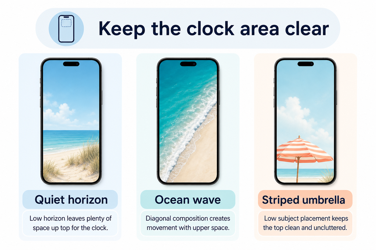
Because you can personalize your wallpapers, consider displaying a scene or carrying its colors onto your Home Screen. Each design represents a distinct artistic style.
1. Quiet horizon and blue skies

Open skies give this calm and serene seascape a tranquil basis for the design. Try cool aqua tones with sandy shades of brown for a lovely, easy and beachy color scheme. Leave space in your design to give the lower portion of the composition a calming effect.
The screen uses empty space as part of the design for relaxed summer vibes. Leave spaces on your Home Screen rather than adding stickers and quotes.
2. An overhead ocean wave
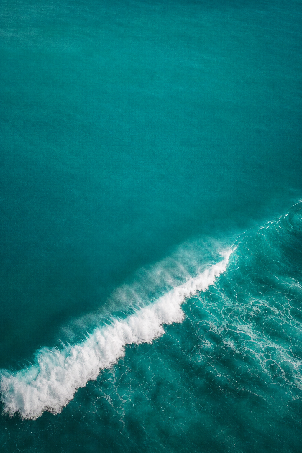
“White surf crossing turquoise water” makes for good scene division. Pick the wave and keep the rest of the elements simple. Preview the small white foam details and move the brightest splash away from small white labels.
An ocean wave iPhone wallpaper partners well with dazzling teals. For the same picture on both screens, experiment with the Home Screen’s Blur feature and evaluate the result against the unaltered wave.
3. A striped umbrella on sand
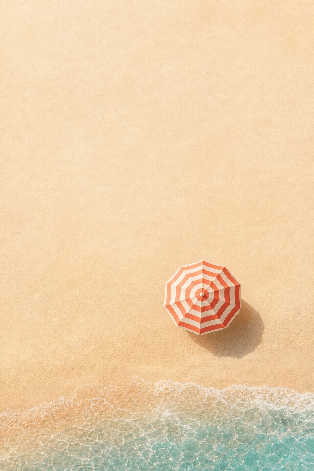
A coral-and-cream striped umbrella against the ocean adds a playful resort touch to an already pleasant scene. Placing the subject near the bottom of the image leaves the top of the image empty. You can use a coral or orange widget accent and a sand-colored Home Screen companion. Keep coastal items simple.
Tropical Palm Trees and Poolside Wallpaper
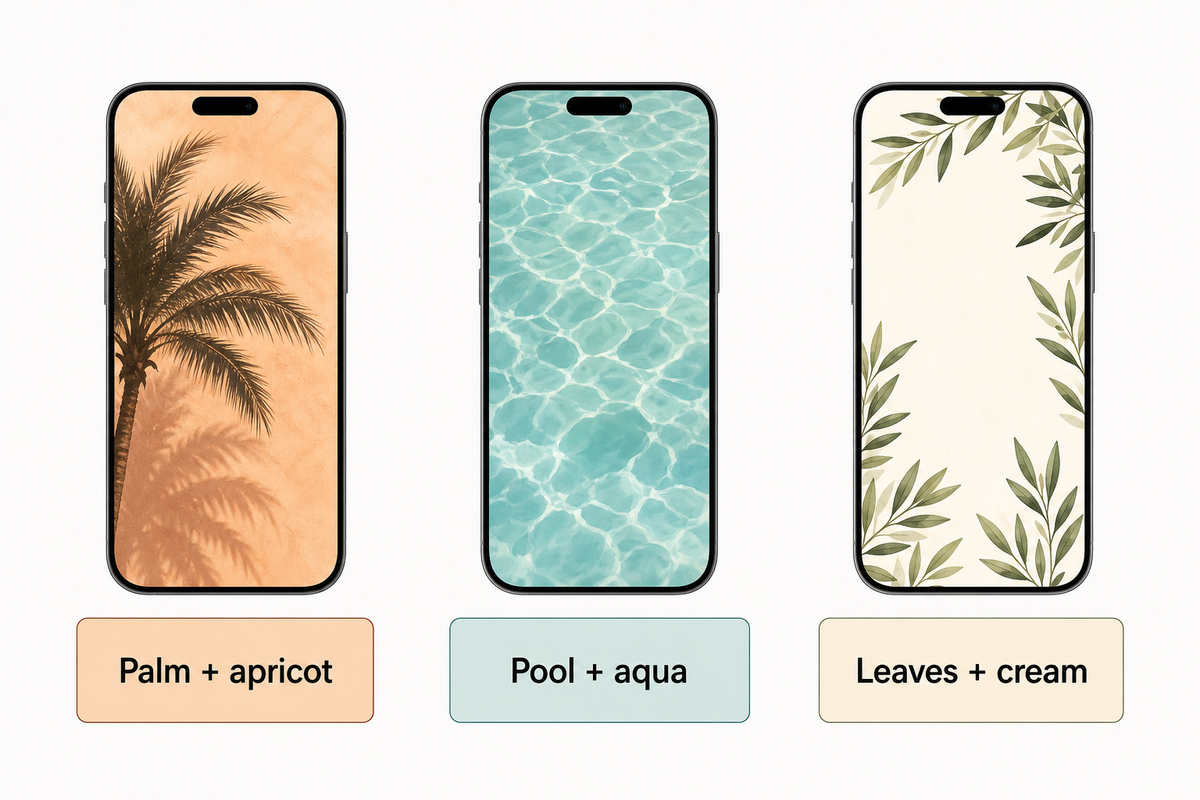
A warm afternoon can be represented with a few palm fronds or water ripples. For a more abstract summer aesthetic, use water ripples or surf reflections; a palm frond gives the design a clear shape.
4. A palm tree against apricot light
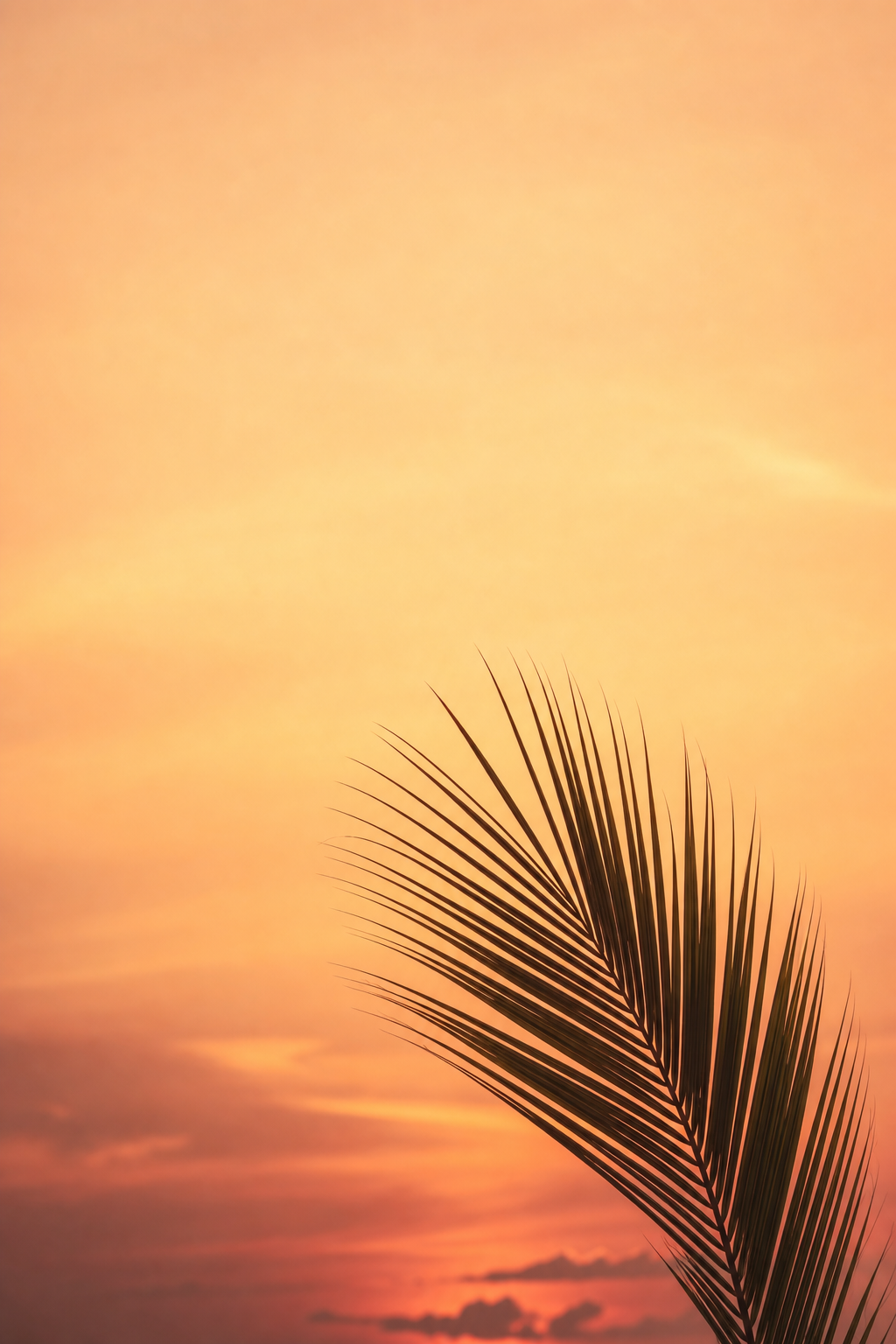
For an easy, yet pleasing division of the design, use fronds from one side of a palm tree. Keep the center empty for the clock and use Apricot or Terra Cotta to add warm colors to the adjacent screen, checking contrast between the text and background in your preview.
5. Poolside ripples in aqua
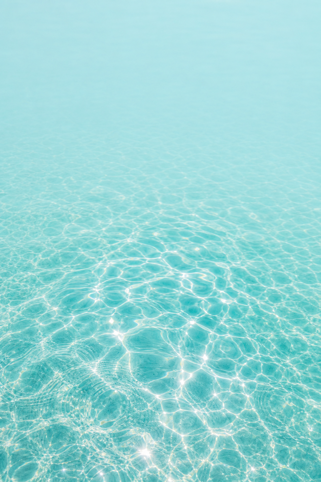
Water with sunlight reflection creates an abstract backdrop. Look for larger, smoother reflections, and avoid the busy effect of lots of thin, bright lines. Cool-toned colors of water make for pretty, colorful abstract designs. Keep patterns pretty much the same across both screens if you prefer a matching pair. A plain aqua design remains relaxing when vibrant reflections feel busy behind a folder.
6. Botanical greenery at the edges
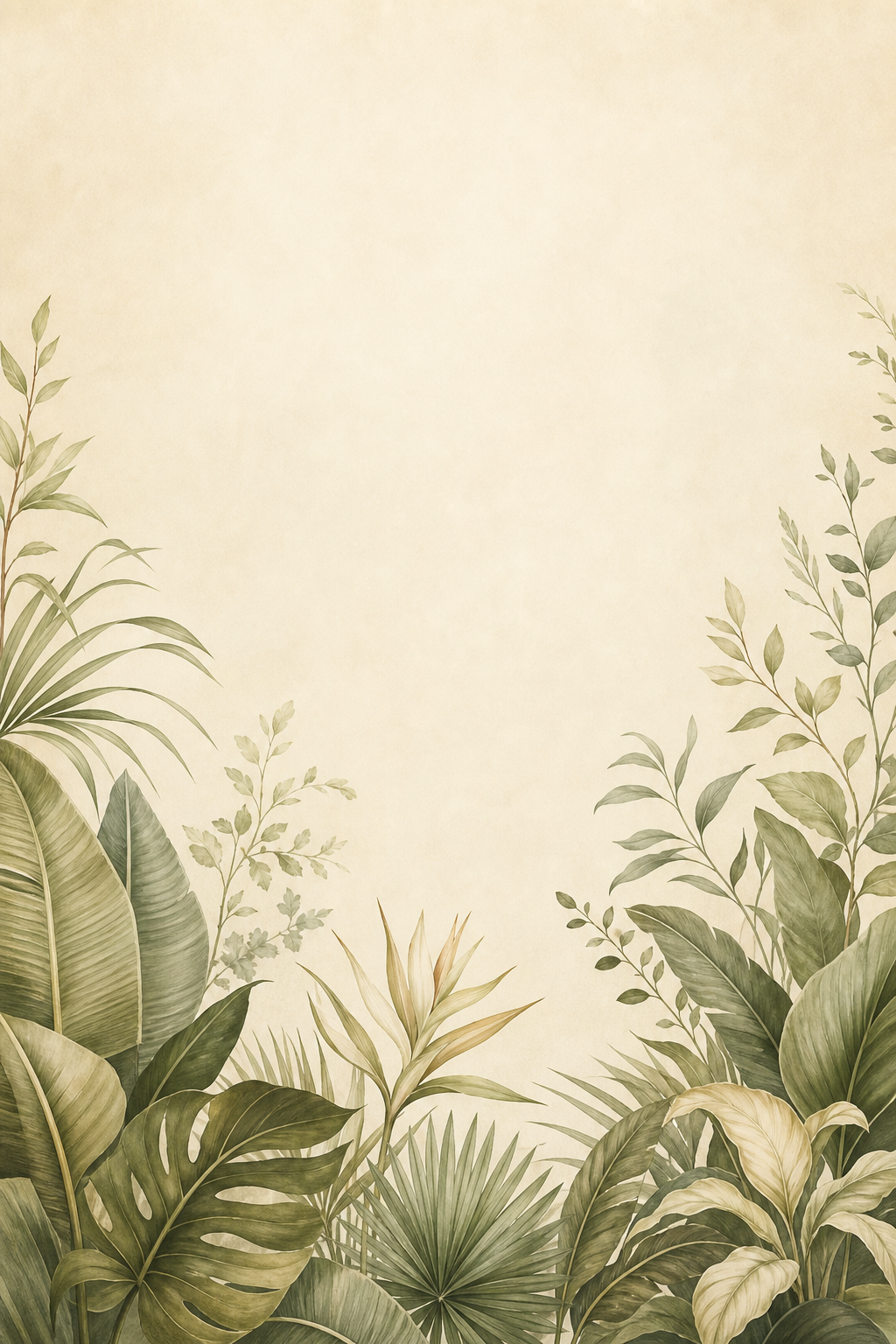
Softer and more muted tropical designs leave more cream space if you want to incorporate more foliage. For this style, arrange leaves around the border space. Leaf shapes repeat across the design, but when you fill the entire space with many leaves the design quickly becomes more busy. Once again, warm cream fills the void between the leaves.
Cute Citrus, Fruit and Floral Wallpaper
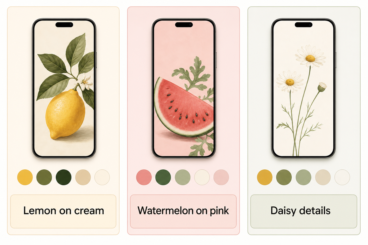
When doing cute summer wallpapers, use larger shapes to represent flowers and fruits. One large fruit or flower represents a graphic design, and many small fruits or flowers create a repeating pattern.
7. Lemon and citrus on cream
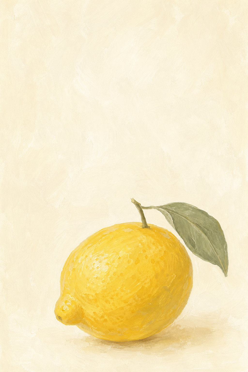
Lively shades of lemon give this classic citrus design a pop against the warm, ivory background. In this wallpaper, the lemon can be positioned towards the bottom to draw more attention to it beside a simple widget. For a matching Home Screen wallpaper, cream pairs with the yellow lemon. To achieve this, you can choose the cream color, rather than selecting a bright yellow for each of the icons.
For a more vibrant look, choose bright yellow for one widget and select muted colors for the other widgets.
8. Watermelon with a pink background
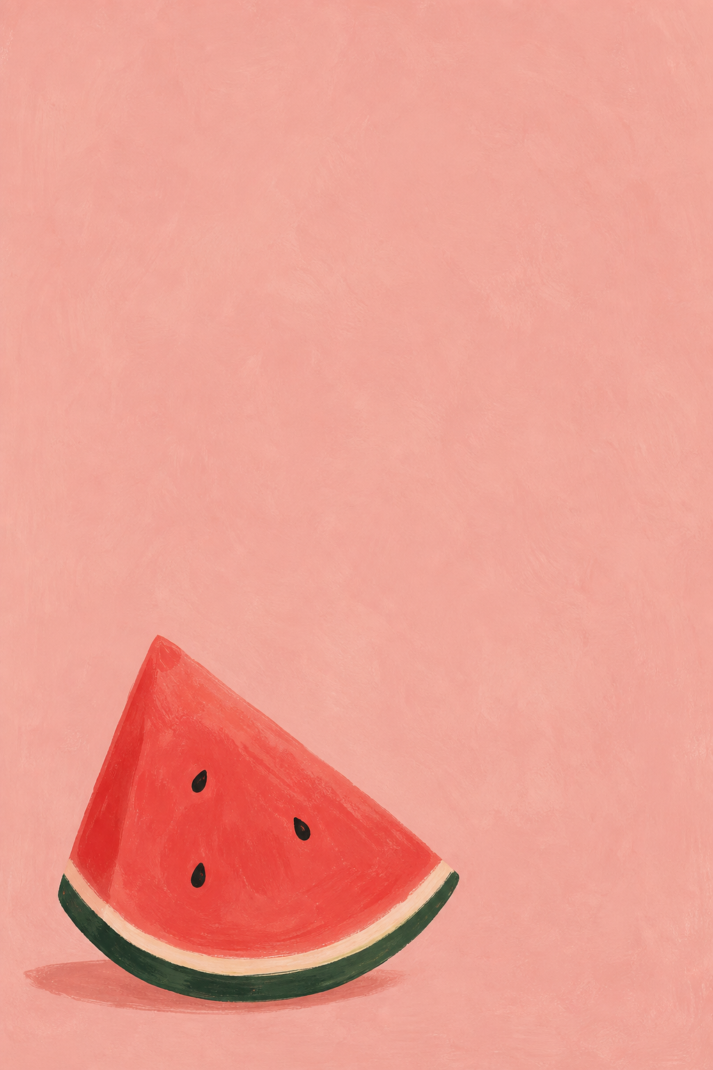
The watermelon wallpaper offers a combination of pink, red and green to echo in a widget. To make a setup more summery, select a complementary color from its existing pink, red and green palette. For a more muted color scheme, choose a dusty pink and dark green to accessorize.
If a more playful look is desired, choose the watermelon wallpaper with a matching widget. Another option is to use a flamingo design. Preview larger simpler designs and busier more detailed designs to achieve the kind of variation you want.
9. Daisy and wildflower details
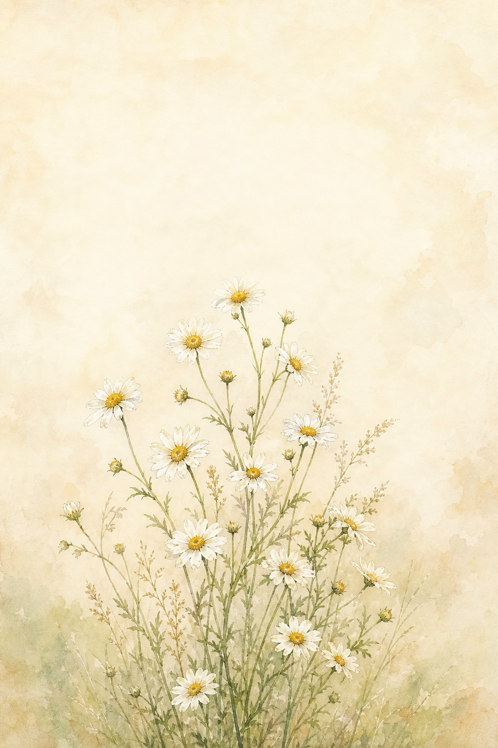
Flowers tend to work best when they’re not crowded, like the cottagecore floral phone designs here. A sunflower is more bold than a daisy. Cherry blossom art is bold and beautiful, but yellow flowers can add a nice touch of seasonal beauty as well. Regardless of which you choose, they look best if they’re located below or to the side of the clock; check text-to-background contrast in your preview.
Pink Sunsets, Pastels and Minimal Summer Colors
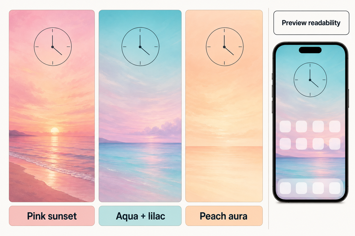
An aesthetic summer design requires no motif, but an aesthetic iPhone arrangement can flourish with the aid of color. Various hues of the spectrum can be employed for broad strokes to provide an aesthetic wallpaper that soothes. This is especially useful to provide an aesthetic wallpaper when paired with photos or widgets.
10. Pink sunset over the sea
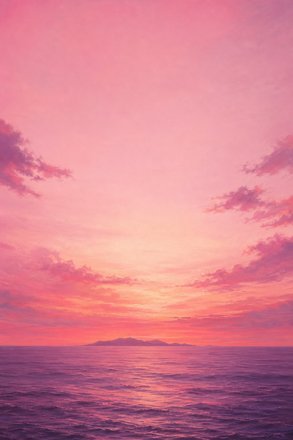
A broad, horizontal wash of pink light above a low horizon gives the pastel scene a sun-kissed finish. Peach can act as a background bridge. Clock color choices should be checked against the lightest clouds as a readability guide.
11. Pastel aqua and lilac
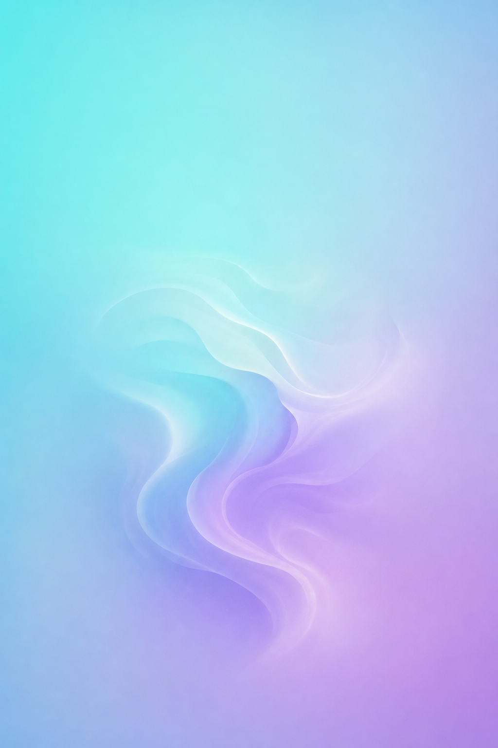
Aqua transitioning to lilac provides a comfortable, soft pastel summer palette. Keep the width of the transition broad. This can be utilized to create a pastel summer phone background. If your widgets contain photographs, this design would be particularly suitable to use.
12. A peach aura gradient
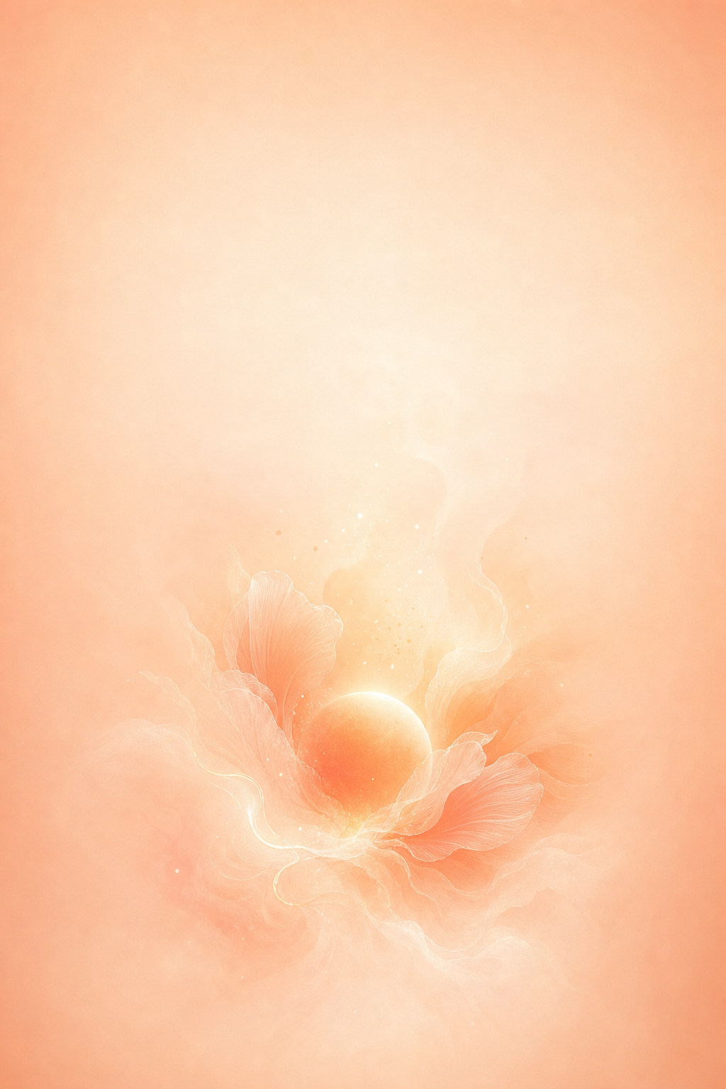
Peach fading into cream feels warm without depending on a beach or flower. Try a deeper outer edge if a very pale version makes the clock difficult to see. Minimal artwork still needs a readability check: the W3C’s contrast guidance explains why text and icons need enough contrast against the background immediately behind them.
One Accent, Two Moods: Match Your Home Screen
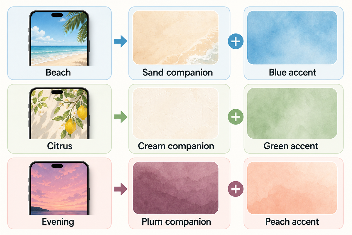
One Accent, Two Moods is a straightforward way to create a coordinated set. Let a Lock screen with a horizontally calm background set the tone and serve as the star of the set, and then choose a companion that features the same color as the Lock screen. Check the companions against your actual clocks, labels and open folders. Keep in mind that the elements you choose may not always work well with others.
| Lock Screen motif | Shared accent | Quieter Home Screen | Preview check |
|---|---|---|---|
| Quiet horizon | Sky blue | Warm sand | Clock against the sky |
| Ocean wave | Turquoise | Deep teal | White foam behind labels |
| Striped umbrella | Coral | Soft cream | Stripes behind widgets |
| Palm silhouette | Apricot | Muted terracotta | Fronds beside the clock |
| Pool ripples | Aqua | Plain pale blue | Reflections inside folders |
| Leaf border | Olive | Warm cream | Leaves near edge icons |
| Lemon illustration | Yellow | Light sage | Pale labels on yellow |
| Watermelon | Dusty pink | Muted green | Red around app badges |
| Pink sunset | Peach | Soft plum | Clock on bright clouds |
Beach recipe: To create a calm horizon, find a sand-colored companion, and a blue widget. Citrus recipe: To create a citrus design, look for a lemon and a cream companion, and a green widget. Evening recipe: To create a design for an evening horizon, look for a plum companion, a peach widget, and a picture of a pink, orange, or red sky.
Should I use the same wallpaper on both screens?
You can use the same wallpaper on both screens if its composition works with your icons. Matching doesn’t require two different pictures. If the scene becomes distracting behind apps, try a separate color, a different photo or Blur through Customize Home Screen. Apple documents those choices in its wallpaper guide.
Where to Find Summer Wallpapers to Download
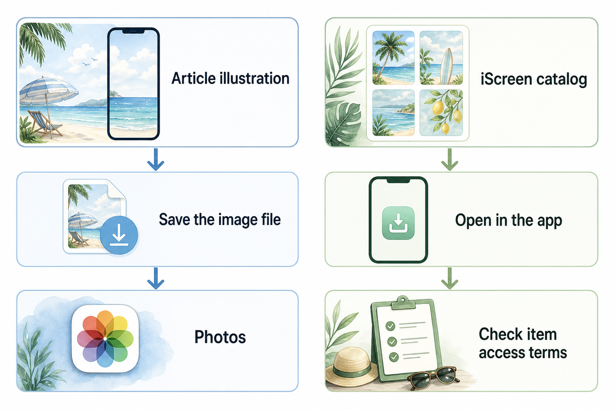
If you need a starting point, refer to the twelve examples in this article. Open the image and save its file for your phone screen before closing the app. Keep the picture in the Photos app so you can crop it later.
For more choices, browse iScreen’s wallpaper collection. Its summer-tagged green landscape is an example of a catalog item with an app-based download route: the page directs visitors to iScreen to unlock HD. Check the app’s current item details for access terms. That catalog route is separate from saving an illustration displayed here.
The creator’s page is a better source to start than a search result page. If you found an image via a Pinterest page, it’s best practice to check the original page to see if there are higher quality or alternate versions of the image. Phone wallpapers, tablet layouts and desktop artwork sometimes use different crops. What works best on a tablet or as computer desktop wallpaper may not work well on a narrow phone screen.
Set and Crop Your Summer iPhone Wallpaper
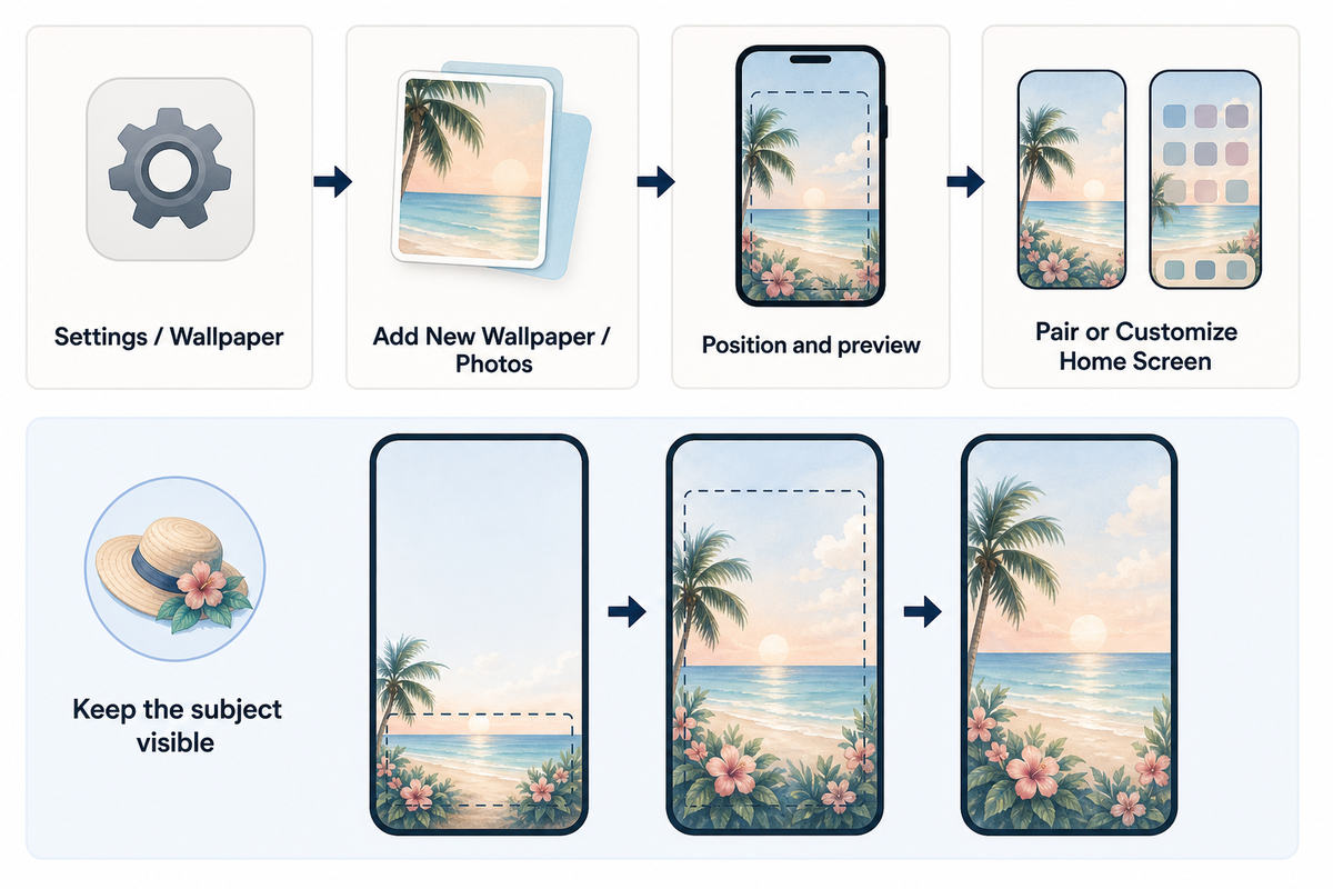
Save your chosen summer wallpaper for iPhone to Photos first. You don’t need specialist tech tools: open the saved file through Wallpaper in Settings, position it around your clock, then decide whether to repeat it on both screens. Apple’s current wallpaper instructions use this path:
- Open Settings, then Wallpaper.
- Tap Add New Wallpaper, choose Photos, and select the saved picture.
- Adjust its position in the preview. Keep your main subject visible and check the clock area.
- Tap Add, then choose Set as Wallpaper Pair or Customize Home Screen.
Starting with a high-quality file helps, but resolution doesn’t fix an awkward crop. Apple lists different pixel dimensions for different models: iPhone 15 is 2556 by 1179 pixels, while iPhone 13 is 2532 by 1170 pixels. Those are display specifications, not one required download size for every model.
Leaving a little extra space around your subject will give you more options when cropping. If you crop too closely you could end up losing important details about the subject. Make sure you’re happy with your crop before removing other versions of the photo. The menu options may vary between iOS devices. You can find more information about adjusting iPhone wallpaper in our iPhone wallpaper guide.
Keep a Summer Look Beyond the Peak Season
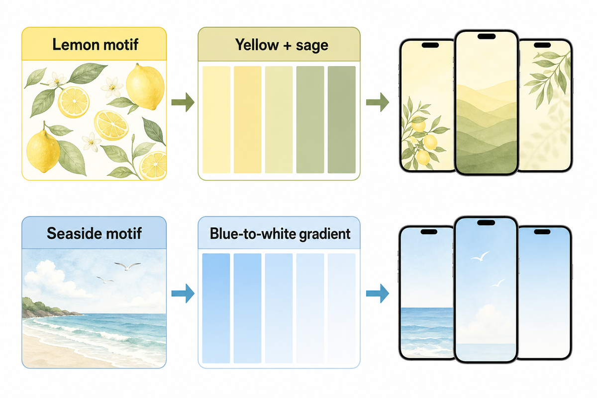
Your summer wallpaper can be used outside of the holiday season. One way to update the palette would be to choose a deeper or lighter tone of the existing colors. For example, holiday colors like yellow could be updated to a quieter cream companion. This could be done using the existing colors in the image. Playing around with different companion colors can be a fun way to adjust the mood of the image.
Another option is to move from a motif to its swatch. A lemon can be a yellow-sage combo. A seaside scene can become a blue-to-white gradient. If the rest of the setup follows along, explore iScreen themes or use a few cute aesthetic widgets. Start with an element and let it serve the rest of the design.
FAQs: Summer Background Questions
Where can I find free summer backgrounds?
For free summer iPhone designs, start with a creator’s clearly marked downloads or an app’s free collection. Check the individual item’s access terms before saving the original file.
Open the original file rather than saving a small search thumbnail. Check whether that particular item downloads free or requires an account or subscription. Pictures shown in a gallery aren’t automatically free downloads, and an HD label doesn’t tell you its price or access terms. Save any instructions supplied with the file, especially if you plan to use it somewhere beyond your own phone. If the download button takes you into an app, inspect the individual item’s terms there before choosing it.
Where can I get good iPhone backgrounds?
Choose a source that lets you inspect the full picture before saving it. Look for a sharp portrait composition with enough room around the subject to adjust the crop.
Look for a sharp portrait file, room around the subject and a calm area where the clock will sit. Quality depends on the crop as well as resolution. Even a beautiful wide landscape can lose its main subject when it fills a narrow phone display, even if the original is detailed.
Where can I find minimalist summer wallpapers?
Look for simple ocean gradients, single palm silhouettes, pale citrus illustrations or uncluttered sunsets in a wallpaper collection. Search by mood and color, then preview the result with your icons.
Try a creator’s collection or a wallpaper app, and search by both mood and palette, such as soft blue beach or peach summer gradient. Preview the result with your actual icons; minimalist artwork can still clash with a crowded layout or make pale labels difficult to read. A plain companion color is another option when you like the original art but want less detail behind apps.
What are the best summer wallpaper colors?
Aqua, sky blue, sand, coral and lemon yellow all suggest summer. Choose a shade you enjoy and check the clock against its local background, especially over bright clouds or reflections.
Try a favorite shade, then check the clock and icons. Palette names alone don’t guarantee readability.
What size should a summer iPhone wallpaper be?
Use a sharp portrait image and check it in your device’s wallpaper preview. Display dimensions vary across models, and a high-resolution label alone does not guarantee that the subject will fit.
There’s no universal exact size. Check actual dimensions, even when a file is labeled 4K.
References & Sources
- Apple Support: Change your iPhone wallpaper offers details regarding your setup and wallpaper pairing.
- Apple iPhone User Guide: Change wallpaper covers Home Screen settings and options for photo and Blur.
- Apple: iPhone 15 technical specifications and iPhone 13 technical specifications model-specific display resolutions.
- W3C Web Accessibility Initiative: Colors with Good Contrast provides information about the contrast between text, icons, and other controls.
-1.png)