
.png)
Fall Wallpaper for iPhone: Cozy Autumn Lock Screen Ideas
Updated August 2026 · Practical autumn wallpaper ideas for iPhone Lock and Home Screens
Fall backgrounds for iPhone are vertical autumn images chosen and cropped for the Lock or Home Screen. They work best when the scene leaves room for the real interface: use a calm clock zone, move the main subject away from notifications, and preview it with the widgets you actually use. Even a cozy picture can look beautiful in a gallery and still feel crowded on a Lock Screen.
The fast answer
For a Lock Screen: use a detailed fall scene with open space behind the clock and room below for notifications.
For a Home Screen: use the same palette with fewer edges behind app icons and widgets.
Before saving: check the active screen, dimmed screen, clock style, widgets, and a sample notification. The configured phone is the decision surface.
This guide gives you 12 composition ideas, a mood-to-screen-fit table, current iPhone setup steps, and a practical way to reject a wallpaper before it becomes annoying. These are design ideas rather than promises that all 12 files already exist in iScreen. For ready-to-use choices, you can browse iPhone wallpapers.
The Clock-First Crop: A First-Pass Fall Wallpaper Check
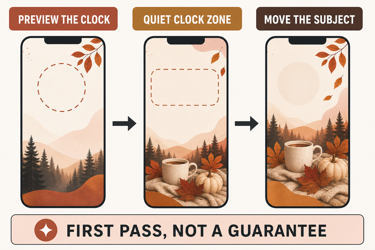
The Clock-First Crop is a quick first-pass check: preview the clock before judging the art, keep its immediate background relatively quiet, and move the main object away from the notification stack. It does not guarantee readability. Brightness, color, visual clutter, room lighting, widgets, notifications, and your chosen clock treatment can all change the final result.
That screen-fit problem is why mood comes before placement, not instead of it. A rusty forest path can carry more edge detail than a cream flat lay, but the path’s vanishing point should not disappear under the time. Pink pumpkins can preserve a soft fall aesthetic if their strongest shapes sit in the lower half. The goal is not to make every iPhone background empty. It is to give the interface somewhere to live.
| Mood | Palette | Best focal placement | Widget tolerance | Home Screen companion |
|---|---|---|---|---|
| Warm and cozy | Amber, cream, walnut | Lamp, mug, or book below center | Medium | Cream-to-amber blur |
| Colorful leaves | Rust, gold, red | Canopy at edges; open sky above | Low to medium | One enlarged leaf |
| Soft and cute | Blush, peach, cinnamon | One doodle group in lower third | High | Wide gingham or tiny corner motif |
| Dark and moody | Charcoal, brown, muted orange | Porch or moon below the clock | Medium | Low-detail charcoal gradient |
| Pumpkin harvest | Pumpkin, oat, olive | Still life across the bottom | Medium | Single pumpkin silhouette |
| Minimal neutral | Oat, cocoa, black | Small line art off center | High | Paper texture or flat color |
Current search demand helped allocate space among cozy, cute, aesthetic, leaves, and holiday variations, but it does not prove a universal taste hierarchy. Use the table as a screen-fit decision, not a rule about which autumn style is “best.”
12 Cozy Fall Wallpaper Ideas for iPhone
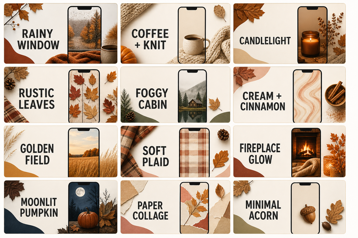
The 12 fall wallpaper ideas cover indoor warmth, outdoor color, texture, and minimal art. Each includes a clock-zone direction and a Home Screen pairing, so you can compare daily usability instead of choosing from mood alone. Keep the art original and generic: no copied commercial illustration, protected character, celebrity, team mark, or branded object is needed to make autumn recognizable.
| Idea category | Clock zone | Widget tolerance | Home Screen pair |
|---|---|---|---|
| 1. Rainy window and warm lamp | Keep the lamp low; use the dim window above. | Medium | Amber rain blur |
| 2. Coffee, knit blanket, and book | Place the flat lay below the clock. | Low | Close crop of cream knit |
| 3. Amber candlelight still life | Move flame away from the digits. | Medium | Brown-to-amber gradient |
| 4. Rustic wood and dried leaves | Leave a bare wood panel at top. | High | Wood grain with one corner leaf |
| 5. Foggy cabin morning | Use fog for time; cabin sits low. | High | Fog and pine color field |
| 6. Cream and cinnamon flat lay | Push spices to lower corners. | High | Warm cream paper texture |
| 7. Golden-hour field | Put the horizon below center. | High | Soft gold sky crop |
| 8. Soft plaid texture | Lower contrast behind the time. | Medium | Enlarged, quieter plaid |
| 9. Fireplace glow | Frame the fire below notifications. | Low | Charcoal wall with soft glow |
| 10. Moonlit pumpkin porch | Separate the moon from the clock. | Medium | Midnight blue with one leaf |
| 11. Brown-paper autumn collage | Build the collage around blank center space. | Medium | Plain kraft paper grain |
| 12. Minimal acorn and leaf line art | Place one motif below the time. | High | Matching micro-motif at one edge |
Autumn Leaves and Forest Backgrounds
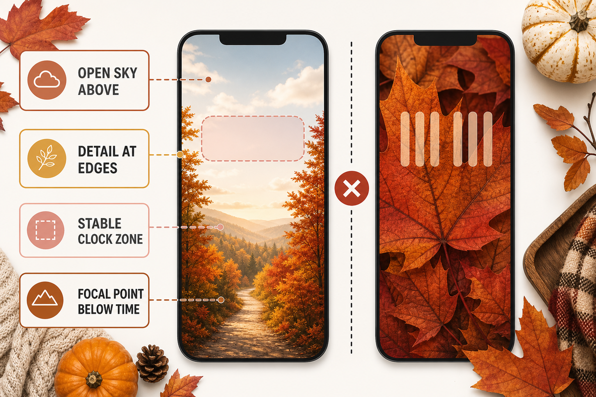
For leaf and forest fall backgrounds for iPhone, choose a composition with one stable region rather than equal detail everywhere. An open sky above red maples, fog above a golden aspen path, or dark water above a reflection gives the clock a usable field while keeping the scene unmistakably autumnal.
A leaf close-up can work if the main vein runs beside the clock instead of through it. A falling-leaf pattern is more forgiving at the edges than in the center. Yellow autumn backgrounds—or iPhone wallpapers featuring autumn leaves—still need a stable clock zone. For a forest trail, place the brightest vanishing point below the time; otherwise the clock and path compete for the same focal role. Misty evergreens suit more widgets because fog reduces local edge detail, while a crisp red canopy needs a cleaner crop.
The useful distinction is not “photo versus illustration.” It is edge distribution. Fine detail around the perimeter can frame the interface. Fine detail directly under digits and small widget text makes the phone harder to scan.
Cute, Pink, and Soft Fall Backgrounds
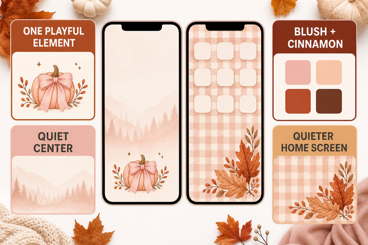
Cute fall wallpaper stays readable when one playful element gets priority. Try blush pumpkins below the clock, cream-and-peach leaf doodles around the border, a warm gingham field with one large bow, or a soft digital graphic of tiny acorns spaced widely around the edges. Keep the center quieter than the corners.
Pink does not have to mean low contrast. A deep cinnamon clock over pale blush can be clearer than white digits over a busy orange photograph. Soft styles also adapt well to a matching Home Screen: enlarge the gingham, remove most doodles, or isolate one peach leaf in a corner. If the Lock Screen already has widgets, skip decorative phrases and let shape and color carry the theme.
Pumpkin, Halloween, and Thanksgiving Styles
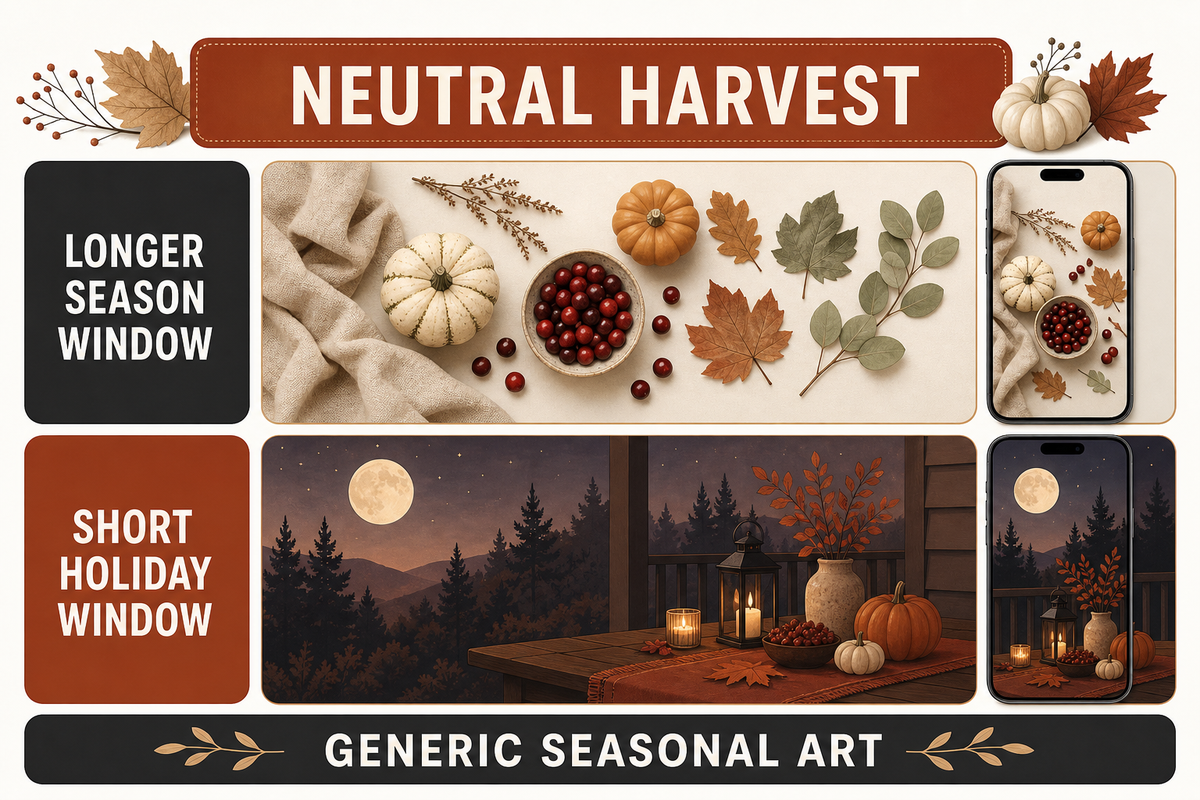
Holiday-specific fall wallpaper works best when you decide how long it should stay on the phone. Neutral pumpkins, cranberries, dried leaves, harvest linen, and a late-autumn sky can run from September through November. Jack-o’-lantern faces, bats, or a dinner-table message create a shorter Halloween or Thanksgiving window.
Build a curated shortlist of neutral harvest images and shorter-window holiday styles before saving one. For a versatile pumpkin Lock Screen, use three or fewer large forms across the bottom and leave the upper wall, sky, or paper field open. Pumpkin iPhone wallpapers can stay on your phone into November, while an early Christmas motif changes the seasonal message. For subtle spooky mood, try a moonlit porch, bare branch silhouette, or black cat-shaped shadow created as original art. A harvest table should be cropped low enough that dishes do not sit under notification banners. For a Home Screen companion, reduce the scene to one pumpkin or a broad linen texture so icons stay easy to find. Avoid copying protected characters or franchise-specific artwork; generic seasonal objects provide more freedom to coordinate the rest of the screen.
Keep the Clock and Widgets Readable
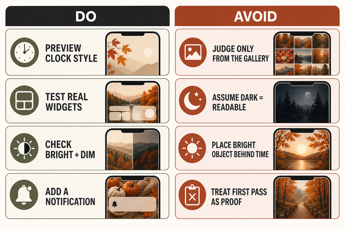
A readable fall Lock Screen needs local separation behind every foreground element, not merely a “light” or “dark” wallpaper label. Check the clock, each widget, the notification area, the focal subject, the active screen, and the dimmed screen. Recheck after changing clock color or widget load, because the same source image can behave differently in another configuration.
W3C Technique G18 supports the general principle that text must remain distinguishable over solid, varying, and patterned backgrounds. Here, that principle is a practical design lens, not a claim that your iPhone wallpaper must meet a particular web-compliance ratio.
Apple’s system editor is why The Clock-First Crop starts with the interface. Apple’s current Lock Screen guide documents photo repositioning, clock appearance, and widgets.
“You can personalize your Lock Screen by choosing a wallpaper, showcasing a favorite photo, changing the font of the time.”
Those controls mean a gallery thumbnail cannot prove final readability.
Do
- Preview the actual clock color and font.
- Test with the widgets you really keep.
- Wake the screen in bright and dim surroundings.
- Recheck after a notification appears.
Don’t
- Judge only from the uncropped gallery image.
- Assume dark automatically means readable.
- Place the brightest object behind the time.
- Treat The Clock-First Crop as a guarantee.
How to Set and Crop a Fall Wallpaper on iPhone
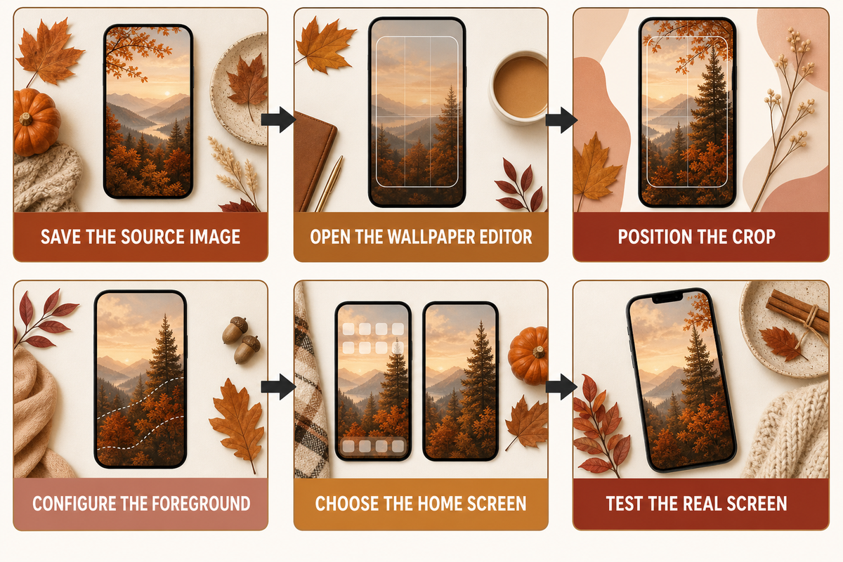
Save an original or properly licensed vertical image, open the iPhone wallpaper editor, position the subject around the clock and widgets, then choose whether the Home Screen uses the same image or a quieter companion. iScreen can help you discover wallpapers and coordinated themes; iOS controls the final system wallpaper setting.
- Save the source image — use the largest clean vertical version the creator or license legitimately offers.
- Open the wallpaper editor — use Settings > Wallpaper > Add New Wallpaper, or touch and hold the Lock Screen and choose the add control.
- Position the crop — pinch and drag until the subject clears the clock, widgets, and expected notification area.
- Configure the foreground — choose the clock treatment and add only widgets you will use.
- Choose the Home Screen — set a pair or select a separate, lower-detail companion.
- Test the real screen — wake the phone, check active and dimmed states, then revise the crop if scanning feels slow.
Apple Support documents the current Settings path, photo selection, Wallpaper Pair option, and separate Home Screen customization. Menu wording and available effects can vary by system version, model, and selected image, so use the controls you see on your phone.
There is no single pixel-perfect size for every iPhone. Apple lists the iPhone 16 Pro Max display at 2868 × 1320 pixels, while the iPhone 15 Pro Max is listed at 2796 × 1290 pixels; both are 460 ppi, but the resolutions differ. Files labeled HD may still crop poorly, and an Android-oriented crop may place its subject in the wrong zone. Use a high-resolution vertical image with room around its subject, then let the on-device crop settle the final composition.
When a Beautiful Fall Wallpaper Fails on a Real Screen
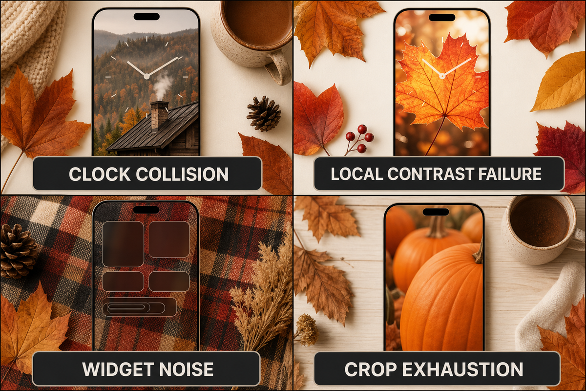
A beautiful image fails as fall wallpaper when the focal subject collides with the clock, the brightest edge breaks through the digits, fine detail sits behind widgets, or a landscape photograph needs an extreme vertical crop. Reverse-test those four failures before you keep the wallpaper for a full day.
- Clock collision: the cabin roof, leaf vein, lamp, or moon sits directly behind the time.
- Local contrast failure: most of the image is dark, but one bright patch cuts through two digits.
- Widget noise: plaid, twigs, or tiny leaves make small foreground labels slow to read.
- Crop exhaustion: there is no spare scenery around the subject, so every zoom cuts off something important.
A 2022 Apple Community report described a Lock Screen whose time and date looked acceptable in preview but became difficult to read after application. That is one person’s experience, not current Apple policy, yet it illustrates the reason to test the configured screen rather than rely on the source image alone.
Rights can fail too. “Free to download” does not automatically mean free to republish, sell, or edit. Search labels such as “free fall iPhone wallpapers” or “download free” are not licenses. Pinterest pins can help with visual discovery, but follow them to the original creator and terms before saving a file. The U.S. Copyright Office explains that permission is generally obtained from the owner and that changing another person’s work does not by itself create ownership. Creative Commons recommends identifying the creator, source, and license when attribution is required. Check the exact source terms; this is general information, not legal advice.
Pair a Fall Lock Screen With a Quieter Home Screen
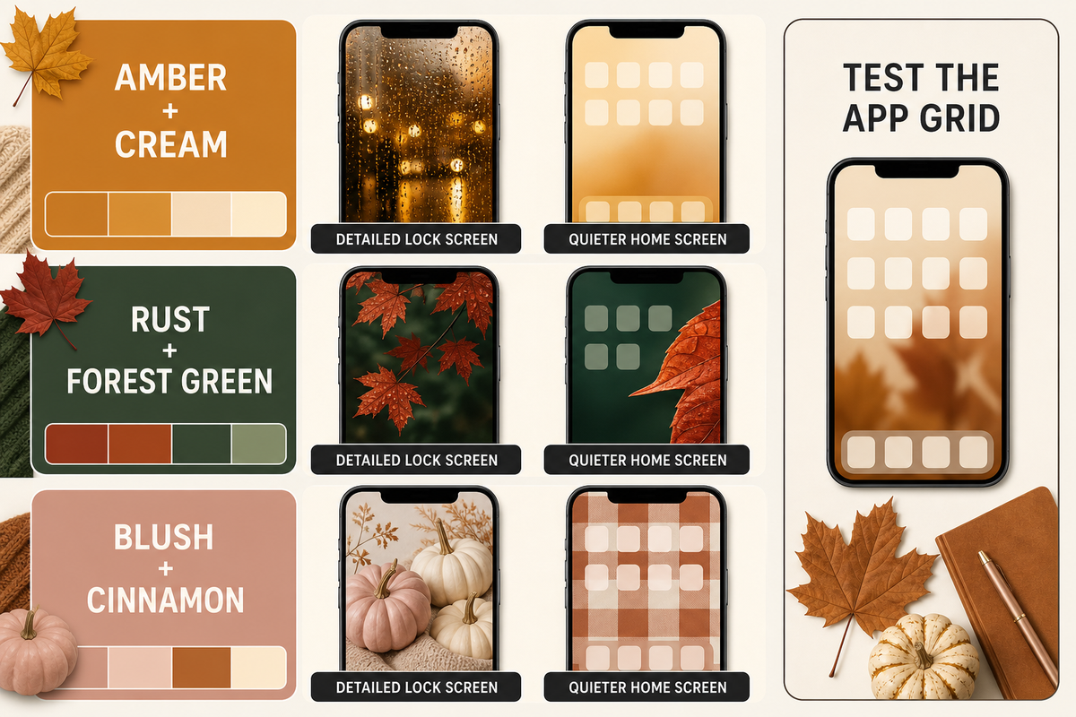
Use the same palette on both screens, then reduce Home Screen detail until icons and widgets are easy to find. “Quieter” is a starting direction, not proof of usability: open the real app grid, locate three everyday apps, scan two widget labels, and check whether the wallpaper pulls your eye away from them.
Three dependable pair recipes are amber and cream, rust and forest green, and blush and cinnamon. Pair a rainy amber Lock Screen with a cream-to-amber blur. Pair red leaves over forest green with one enlarged leaf along the Home Screen edge. Pair blush pumpkins with a cinnamon gingham that is broader and lower in contrast.
Apple allows a separate Home Screen wallpaper, so the pair does not need to be the exact same crop. If you want a full coordinated look, explore matching iPhone themes and compare them with these iPhone Home Screen ideas. Keep this article’s role clear: it helps choose a fall image and make it fit; the gallery and theme pages own browsing.
Browse More Fall Wallpapers in iScreen
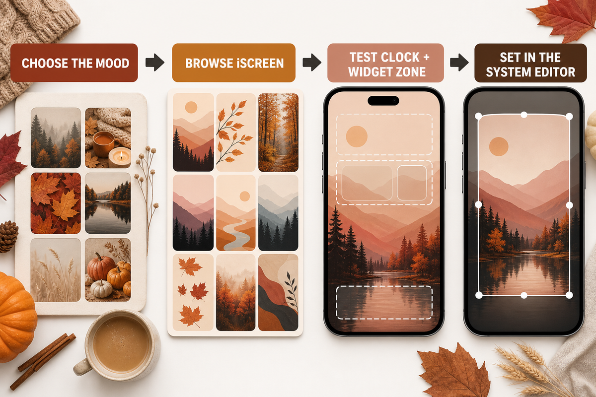
When you know the mood and screen fit you want, move from inspiration to selection. Browse iScreen’s wallpaper library, compare each phone wallpaper on your own Lock Screen, and use the clock, widget, and notification checks above before settling on the crop.
A warm latte scene or cozy iPhone background still needs the same test. The goal is an autumn-themed iPhone that remains usable; iScreen is the discovery route, and the system editor completes the setup.
For a broader visual baseline, compare this fall palette with the examples in our guide to aesthetic iPhone wallpaper, then return to the autumn-specific clock and crop checks here.
Key takeaway
Choose fall backgrounds for iPhone with one calm clock zone, one clear focal subject, and enough crop reserve to test the actual clock, widgets, notifications, and dimmed screen.
Browse iPhone wallpapers in iScreen
Frequently Asked Questions
What are some good wallpapers for autumn?
Good autumn wallpapers include cozy indoor scenes, colorful leaves and forests, and minimal harvest palettes, provided the main subject does not compete with the clock.
Where can I find free fall wallpaper images?
Look for creator-owned collections, app-owned artwork, or stock images with a clear license, then verify on the original source page what “free” allows before downloading.
How do I make fall wallpaper readable on my iPhone Lock Screen?
Use The Clock-First Crop as a first pass: protect a calm area behind the time, move the subject away from notifications, and preview the configured Lock Screen.
What size should a fall iPhone wallpaper be?
Use a high-resolution vertical image at least as large as your device display, but do not rely on one universal iPhone wallpaper size or exact crop.
Is a dark fall wallpaper better for iPhone?
A dark fall wallpaper is better only when it supports your mood and keeps the clock, widgets, and icons distinct; darkness alone does not guarantee readability.
Should my fall Lock Screen and Home Screen use the same image?
Usually, a complementary pair works better: keep the same colors and texture, then use a quieter crop or companion image behind Home Screen icons and widgets.
About This Guide
This guide combines current Apple wallpaper controls, two model-specific Apple display specifications, general foreground-background readability guidance, current fall-gallery format research, and image-rights sources. The 12 ideas and The Clock-First Crop are editorial tools used in this guide, not a claim that every composition has been device-tested or is already available in the iScreen library.
References & Sources
- Create a custom iPhone Lock Screen — Apple Support
- Change your iPhone wallpaper — Apple Support
- iPhone 16 Pro Max technical specifications — Apple Support
- iPhone 15 Pro Max technical specifications — Apple Support
- Technique G18: foreground-background separation — W3C
- Fair Use and Permission FAQ — U.S. Copyright Office
- Recommended practices for attribution — Creative Commons
