
.png)
Spring Backgrounds for iPhone: 12 Looks and Screen Pairings
Spring backgrounds for iPhone are seasonal wallpapers whose designs range from simple florals to colorful wildflower meadows. The twelve examples in this guide help you choose a wallpaper and a matching Home Screen. Start with your favorite flower, then consider where the clock, widgets and app shortcuts will be located.
The styles below are AI-generated examples from this style guide. To see the full-size image, open the corresponding image link below its numbered style. More designs are available from the spring wallpaper catalog. You can browse the spring wallpaper collection for more designs. The download route is described below.
Spring Backgrounds at a Glance
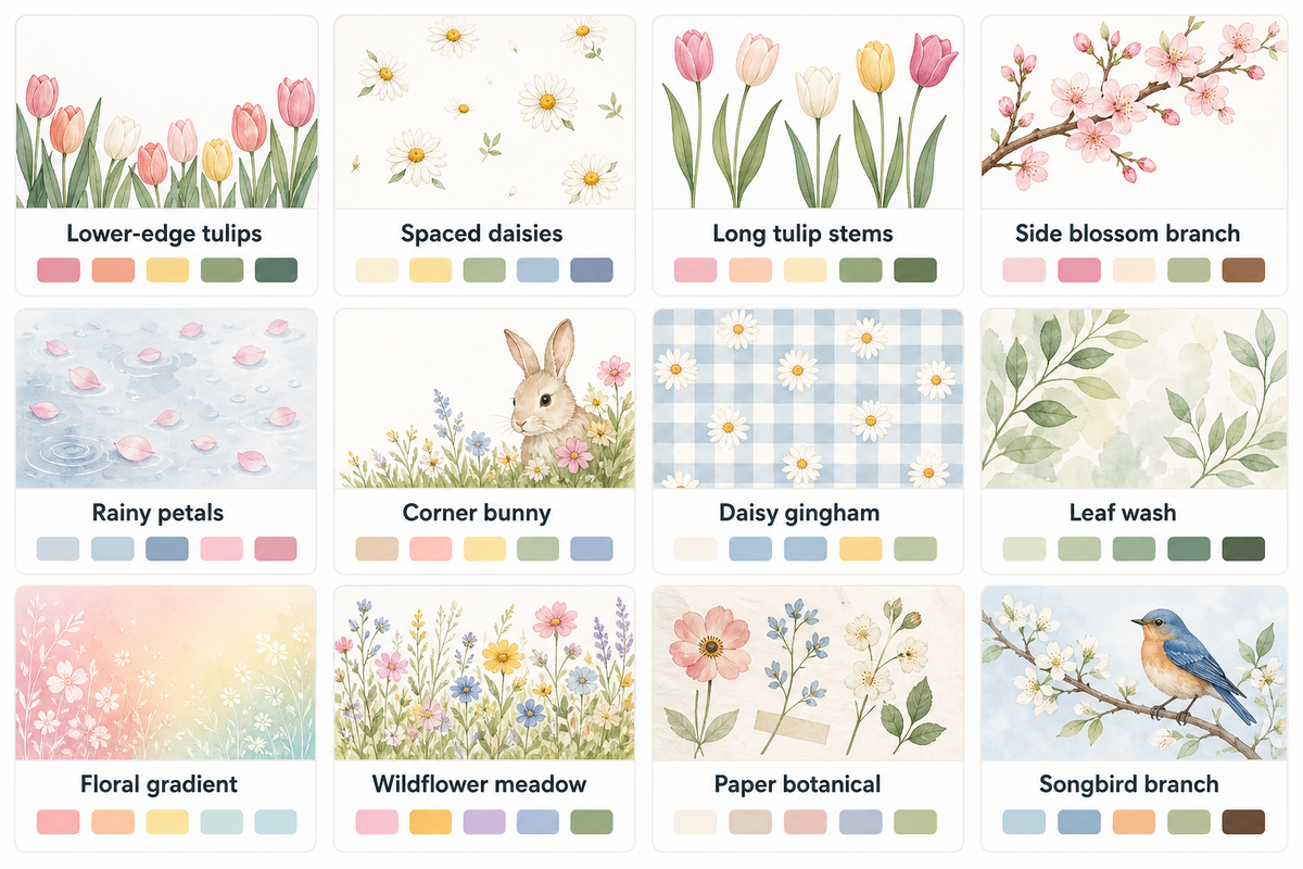
Both the subject and the layout of a spring aesthetic should be considered when choosing a design for your spring wallpaper aesthetic. For example, a design with a single daisy is smaller and leaves more empty space than a design showing a larger, more full, yellow bouquet. The companion designs shown with the spring iPhone wallpapers that follow offer suggestions for a spring iPhone wallpaper aesthetic.
| Style category | Main colors | Home Screen idea |
|---|---|---|
| 1. Lower-edge tulips | Blush and stem green | Muted green |
| 2. Spaced daisies | Butter yellow and white | Plain cream |
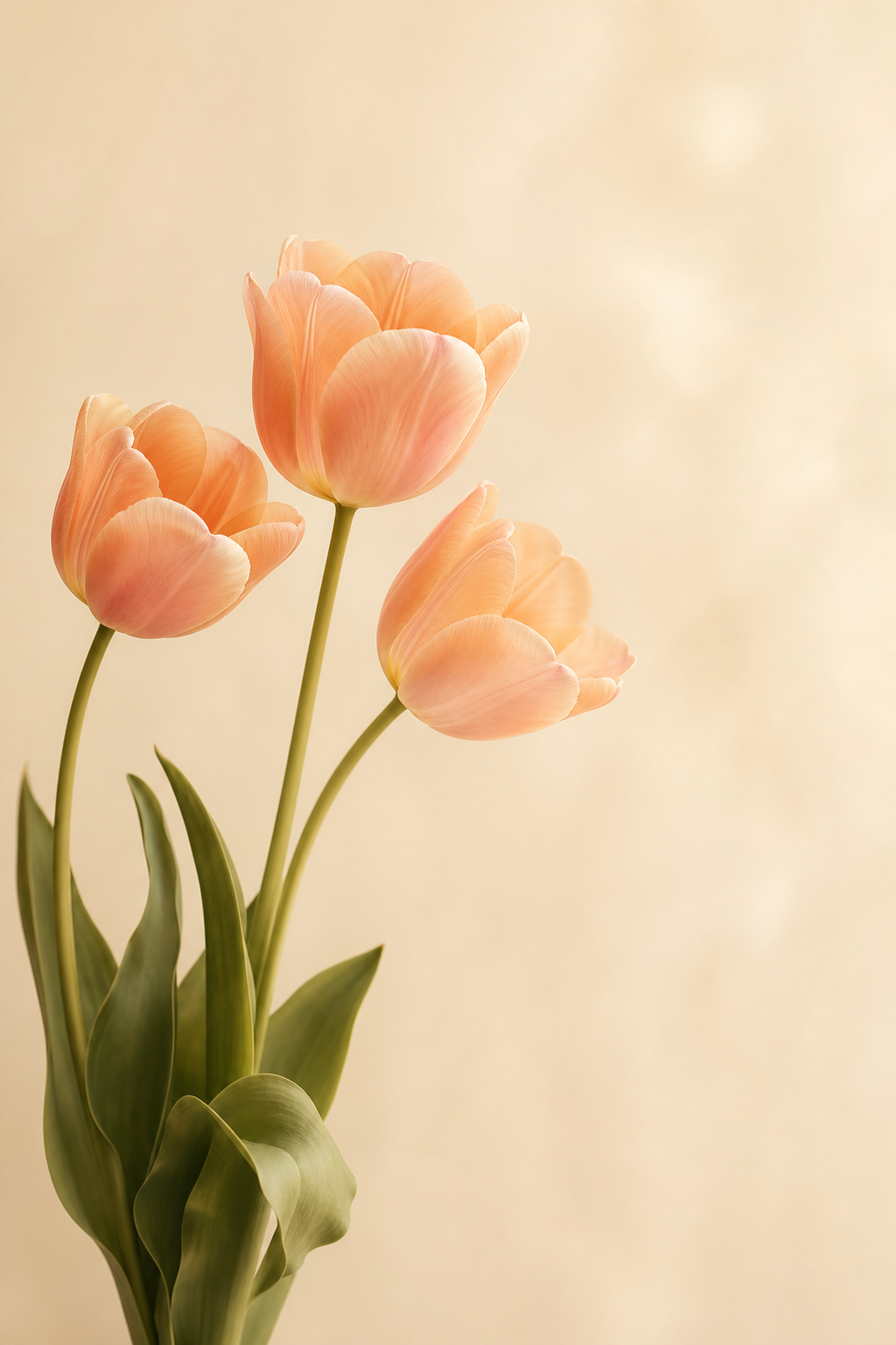
| 3. Long tulip stems | Peach and cream | Warm cream |
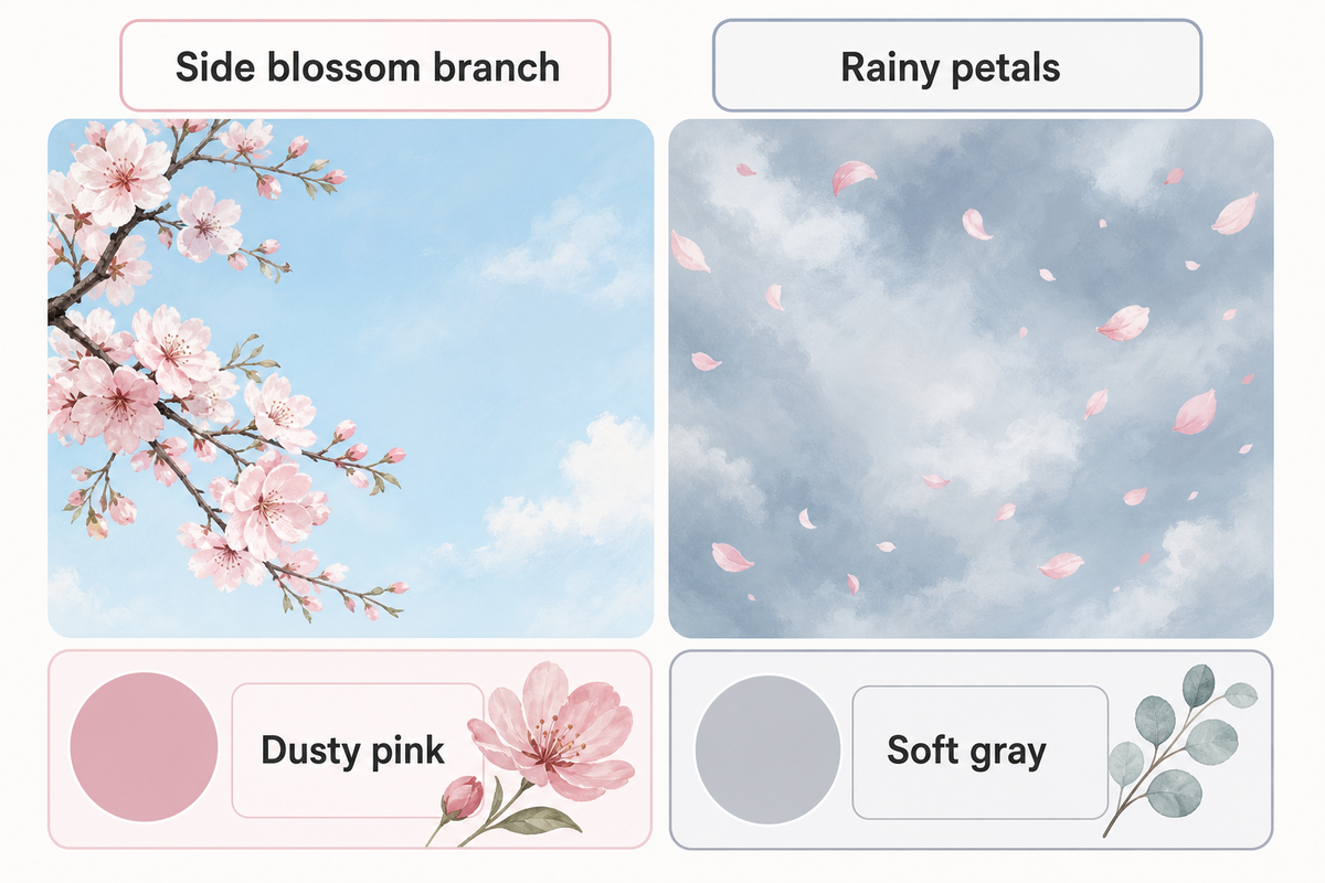
| 4. Side blossom branch | Pink and pale blue | Dusty pink |
| 5. Rainy petals | Pink and blue-gray | Soft gray |
| 6. Corner bunny | Cream and sage | Plain sage |
| 7. Daisy gingham | Cream and yellow | Cream from the checks |
| 8. Leaf wash | Sage and cream | The same wash if labels are clear |
| 9. Floral gradient | Butter yellow | The same gradient after previewing |
| 10. Wildflower meadow | Sky blue and green | Blue-gray |
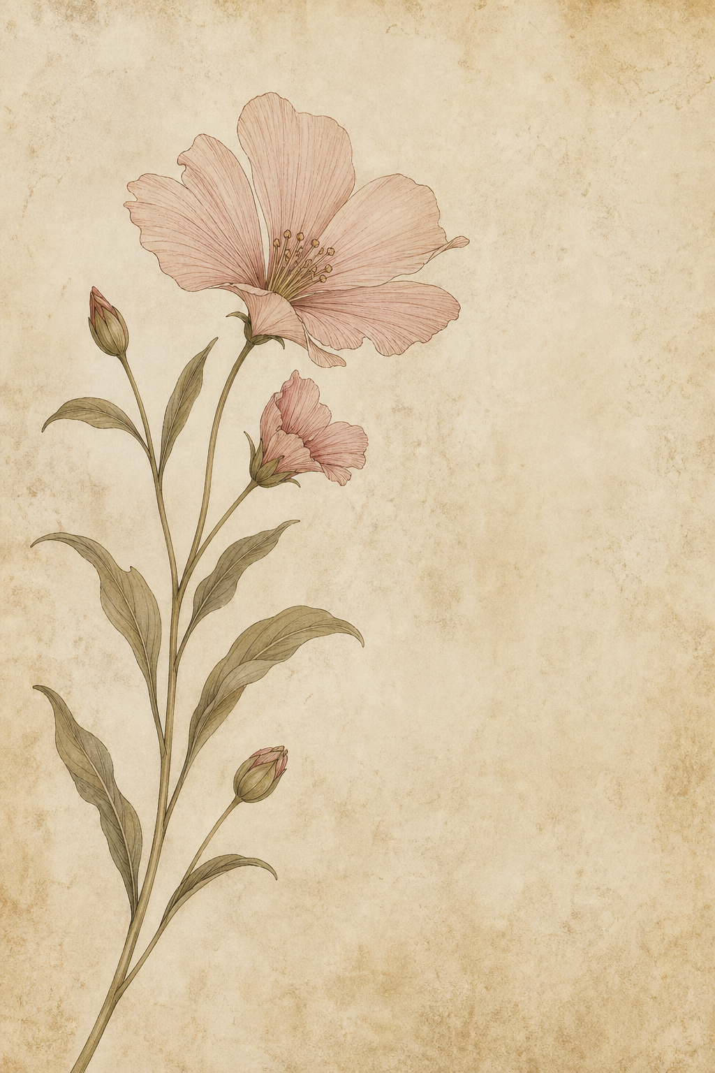
| 11. Paper botanical | Paper cream and muted ink | Paper cream |
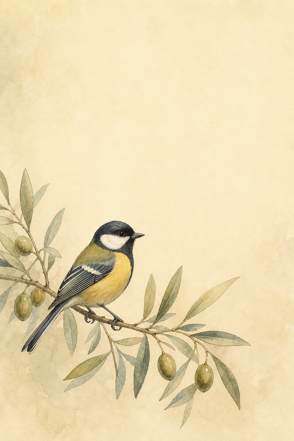
| 12. Songbird branch | Olive and cream | Plain olive |
When you select a design based on the small image in the preview, check the full image before deciding. The full design provides information about where its busiest details sit. To see the full image, open it before selecting it for your phone.
Tulips and Daisies: Fresh Spring Florals
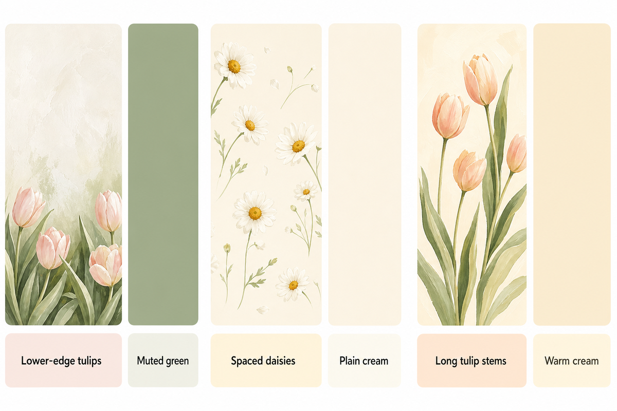
The designs showing arrangements of tulips show how different flower placements can be used to create different layouts. Daisies can be used for minor layout details. In a design showing a single flower, empty space can leave room for a widget.
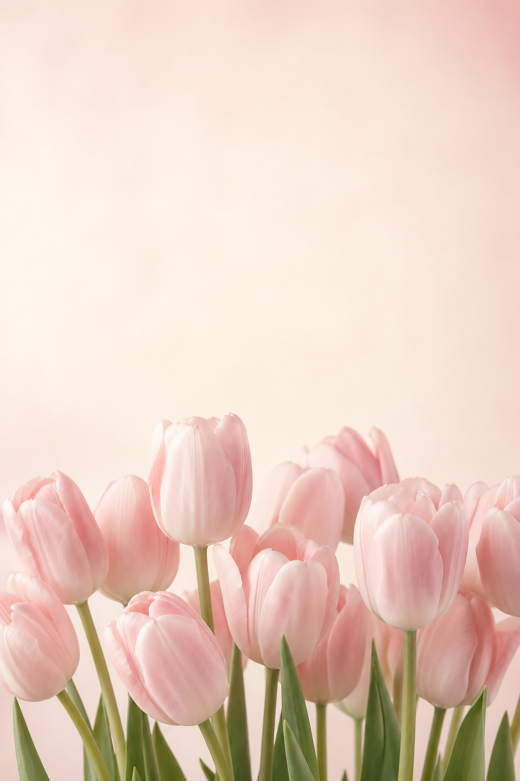
1. Blush tulips along the lower edge
Pink tulips in a low cluster leave the top portion of this iPhone background open. Use it on your iPhone Lock Screen for flowers without a branch crossing the time. For an attractive two-tone scheme, pick a muted green background to complement the stem color. Check the bottom controls too: Look around the controls to see where the stems are placed, as they can be located behind the flashlight or camera.
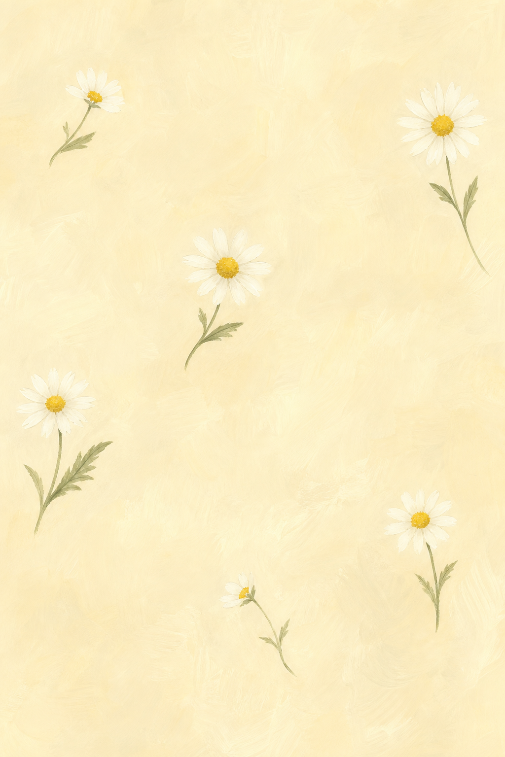
2. Butter-yellow daisies with space between them
With a scattered daisy design, empty space gives a screen a relaxed feel. Small white petals can sit behind pale labels, so check the app layout instead of assuming a light background will be clear. Remove the clutter from your Home Screen by displaying daisies on your lock screen. Cream is a good background color to use if your Home Screen is busy.
3. Peach tulip stems on cream
The design of this wallpaper allows for good vertical alignment of flowers. An uneven, narrow arrangement can be balanced by wider widgets like a large clock or calendar. For a good color scheme and a minimalist layout, consider this peach-and-cream design with a plain cream Home Screen. Make sure the flower stays in the frame, as neatly placed stems won’t help if the petals are out of view.
Cherry Blossoms and Dreamy Pink Skies
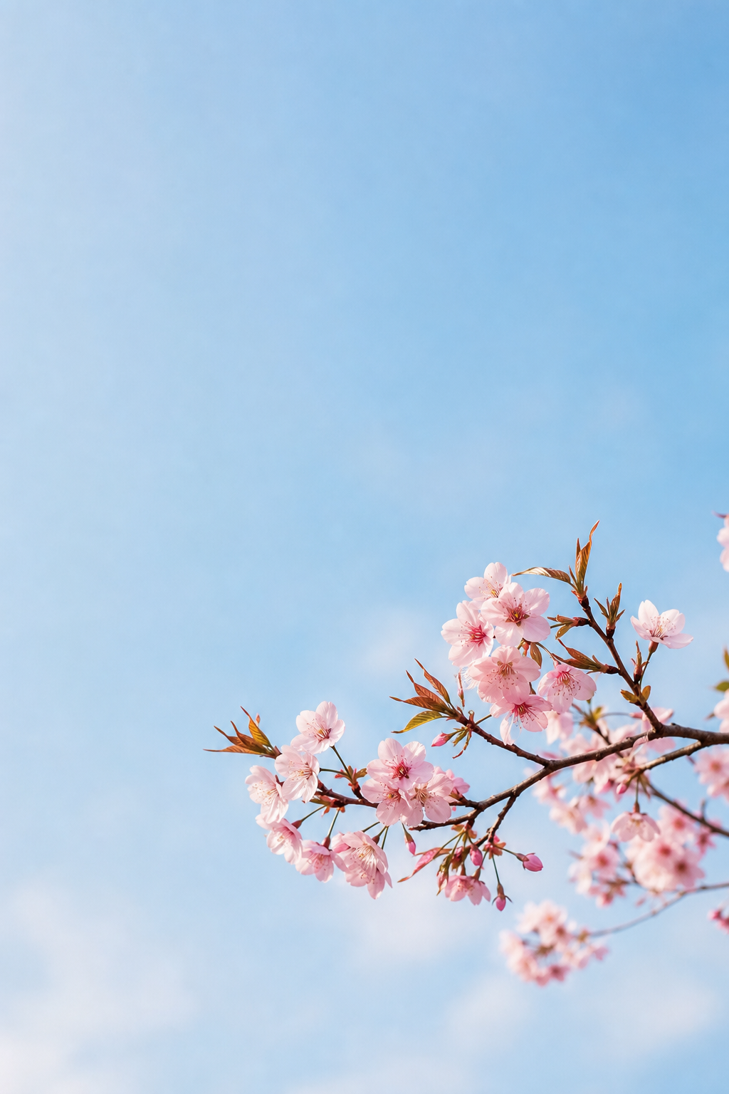
Depending on how much sky surrounds a branch of cherry blossoms, the design feels airy or moody. Pay attention to the negative space and carefully place your branch to avoid covering the time. Consider the color of the clock you use and the sky behind it to judge contrast, keeping the time clear of the branch.
4. A blossom branch entering from one side
This blossoms wallpaper places branches near the edge of the frame, with a lot of empty space beside them. This is a lovely choice if you want to add a floral element without a repetitive pattern to your wallpaper. Consider using the same color as the sky or try a subtle pink. Keep some space when the wallpaper preview is active, as a top-heavy crop could place flowers in the clock area.
5. Pink petals against a rainy sky
This pink spring artwork combines light pink with a grayish-blue hue. Use a predominantly gray-blue background with a few pink petals. The rest can be taken up by the cloudy background. Even the pale sky in this dreamy spring design needs contrast with the time; darker rose or charcoal is a starting point to try for the clock.

Cute Spring Illustrations and Easter Details
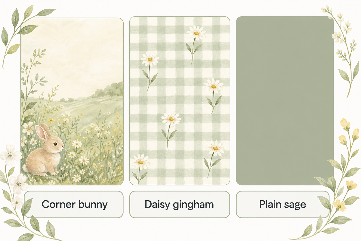
These cute spring phone wallpapers use simple characters or familiar designs. This pattern gives an illustration of a bunny. The design can include gingham and daisies, which can remain after the holiday. Keep decorative text out of the phone design to leave more freedom for the clock and your layout.
6. A little bunny in the lower corner
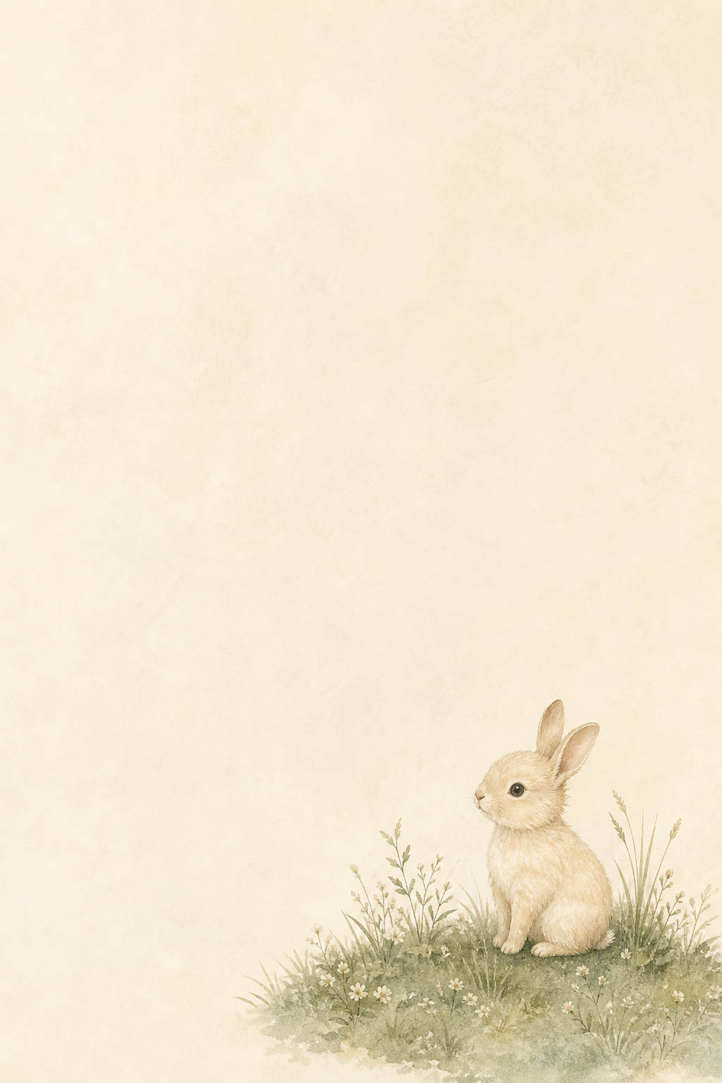
This illustration shows a bunny on the grass. The colors complement each other and make a nice Easter wallpaper. If a large music player or a large notification stack covers the design, try a different crop or screen. On the Home Screen, a complementary color widget can be placed to match.
7. Daisies over a soft gingham pattern
The checks and daisies give this spring flower illustration a picnic feeling. The design is good, but the lines can look busy, especially with a lot of apps on the phone. This design can remain on your phone Lock Screen, while the Home Screen uses different colors to complement it.
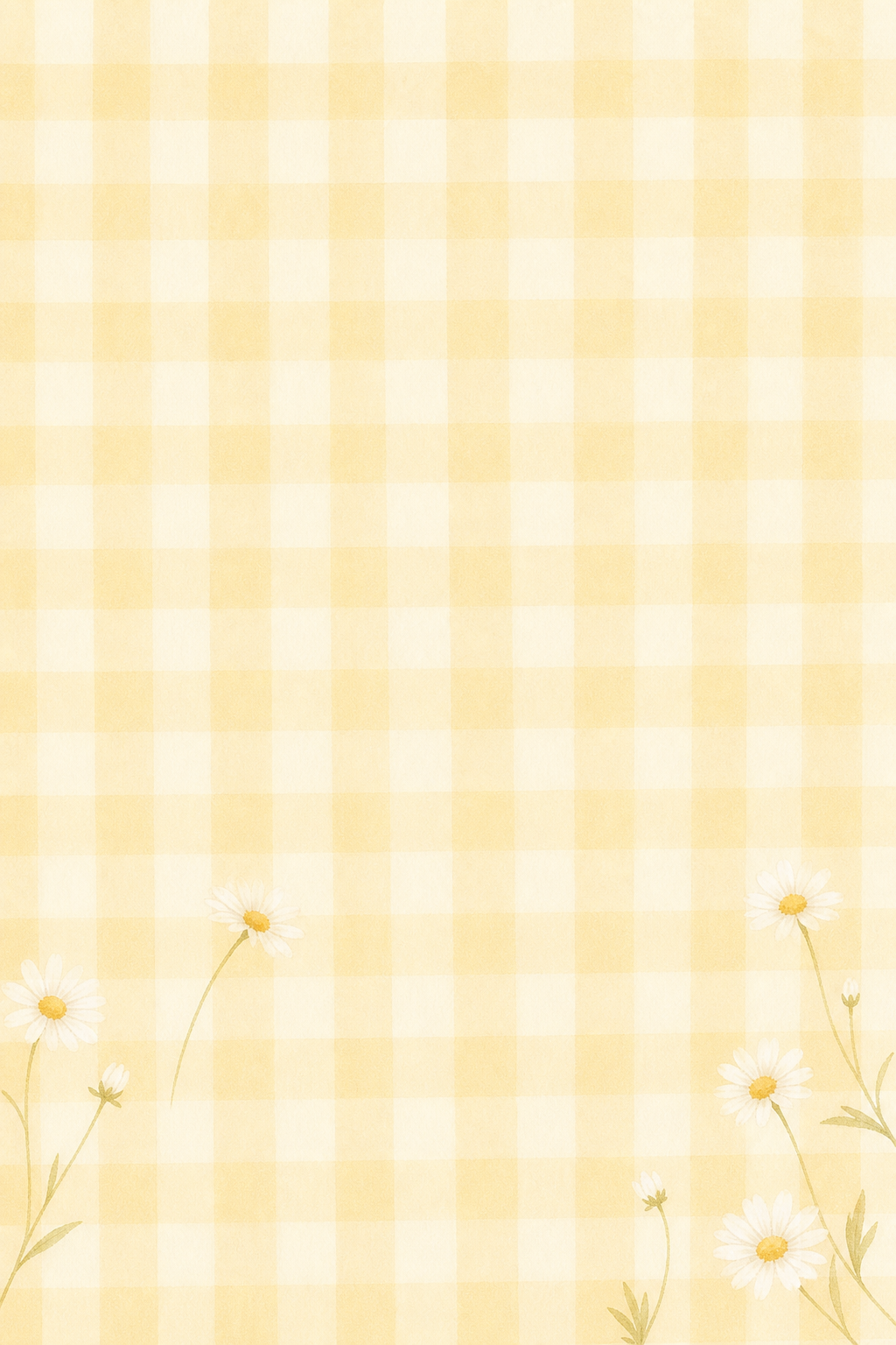
Imagine the iPhone Home Screen with a large calendar at the top of your display and your favorite apps below it. The gingham print is gorgeous, but using it around your calendar can leave little quiet space. Try the bunny or gingham print on your Lock Screen instead. For the calendar display, you can use a sage background with a small pop of yellow if the widget settings allow it. Check the label for each day of the week before keeping the yellow accent. Simpler designs can help you achieve a toned down version of the style you like.
Sage Green, Butter Yellow and Quiet Spring Colors
Sage or butter-yellow color can also be used to incorporate the spring style into your display. These minimal spring designs focus on solid colors with little detail. The actual foreground colors still determine whether your display is easy to read. Check your display to see if a pale wallpaper is really easier to read than a busy or detailed one.
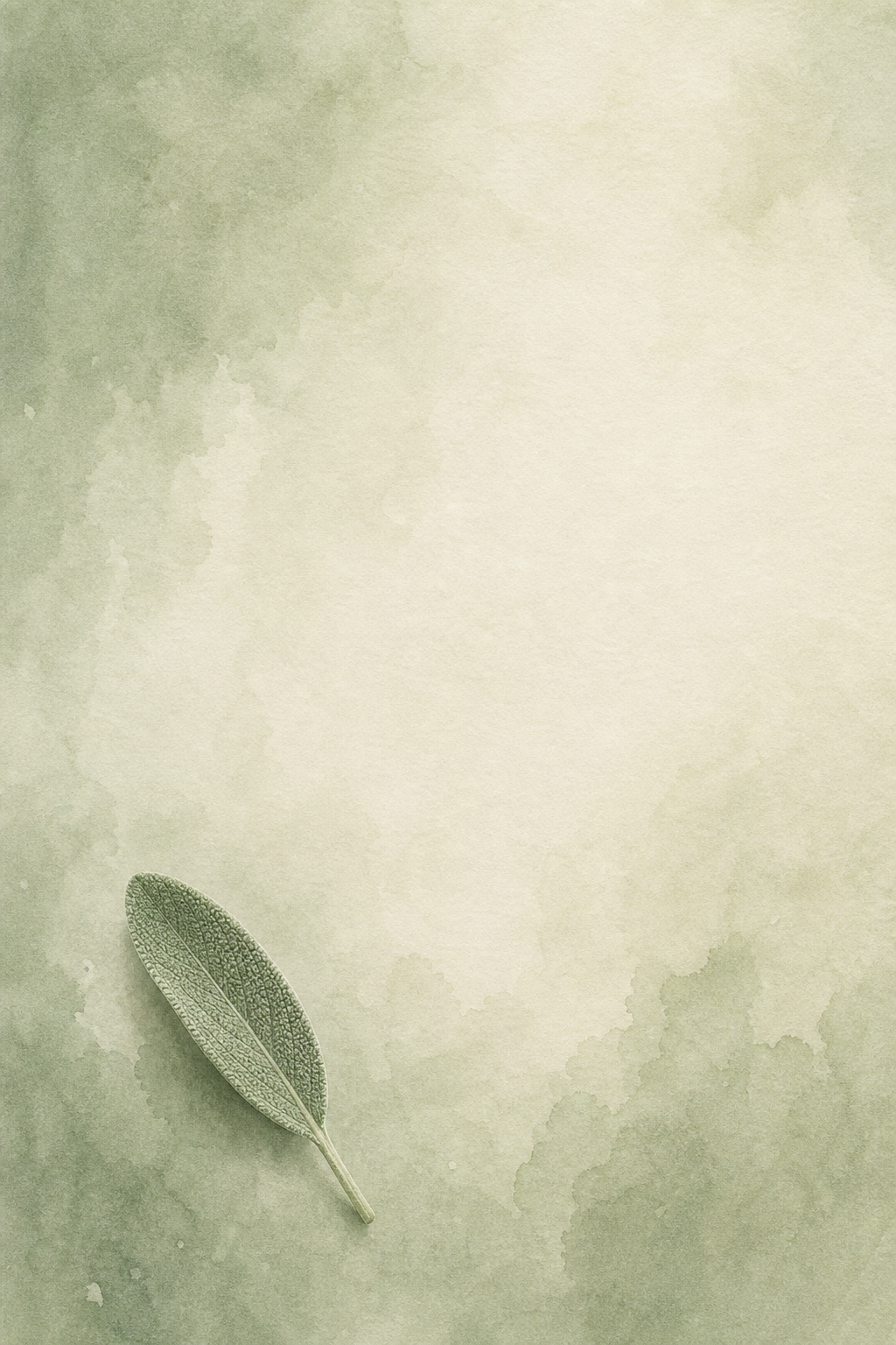
8. A sage-to-cream wash with one leaf
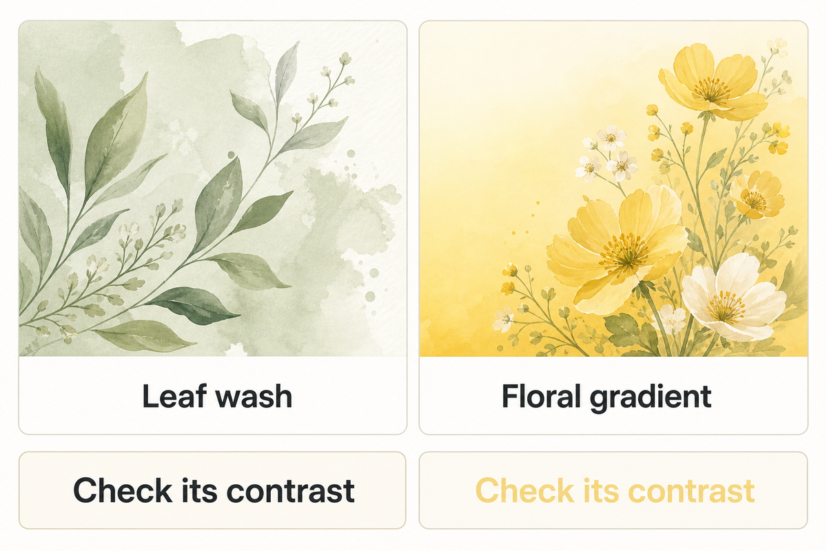
To give your display a pretty pastel color, use a detailed leaf wallpaper. This aesthetic wallpaper leaves a lot of blank space for app icons. If you use a dark clock or a detailed widget, check its contrast against the pastel color of the background at your usual brightness. A plain pastel background can give photos in your widgets a less busy setting.
9. A butter-yellow gradient with a tiny floral accent
On your mobile phone screen, a warm gradient can evoke a sunny feeling. The graphic features a small floral accent. It complements the other graphics in this collection of spring looks. The gradient can also be used on its own. Pay attention to the icons. Less detail in the graphic doesn’t automatically mean enough contrast with the icon labels.

“Select colors that provide sufficient contrast.”
This guidance discusses the use of foregrounds in conjunction with backgrounds. The wallpaper presents an opportunity to analyze the label and clock elements, and shouldn’t be used as an indicator that the palette used in the background satisfies accessibility requirements.
Wildflower Meadows and Vintage Botanicals
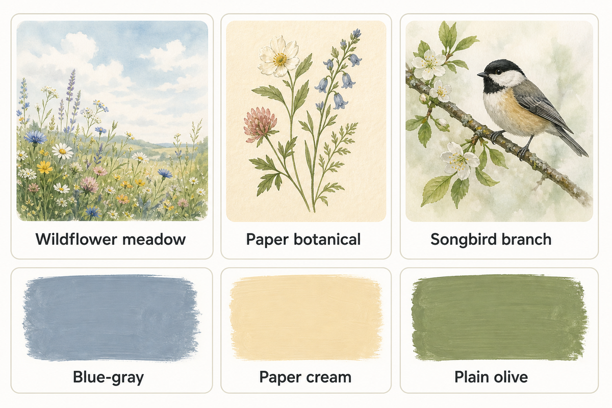
Meadows give spring iPhone wallpaper a sense of distance; vintage floral illustrations bring the detail closer. Use your discretion to determine what best suits your purpose. The sample Lock Screen designs demonstrate the use of an open space and a side branch to separate the foreground from the background.
10. A wildflower meadow under open sky
The use of negative space above the meadow and distant forest edges in this design helps create a sense of distance. This tranquil scene can help achieve the effect of a calm Lock Screen. Plain blue-gray on the Home Screen can help carry over the calm effect of the blue-sky Lock Screen. Check the horizon after cropping: Keep in mind the focal point of the design may also be the location of the time.

11. A botanical drawing on warm paper
For a vintage aesthetic, muted ink colors on lightly textured paper can work. They’re not prints from old books. Digital illustrations can look old by simulating worn out paper. With a light background, elements can connect without being distracting. Don’t let the paper texture become more prominent than the illustration.
12. A little songbird on a side branch
The collection has a flower theme, but the addition of birds helps bring another subject into focus. With a branch at the side, the space occupied by the clock stays unobstructed, with the bird visible below it. Home screens can be colored olive or paper cream. The image should be cropped to include the space surrounding the bird. Tail feathers should be left unobstructed.
Petal Placement: Choose Your Lock and Home Screen Pair
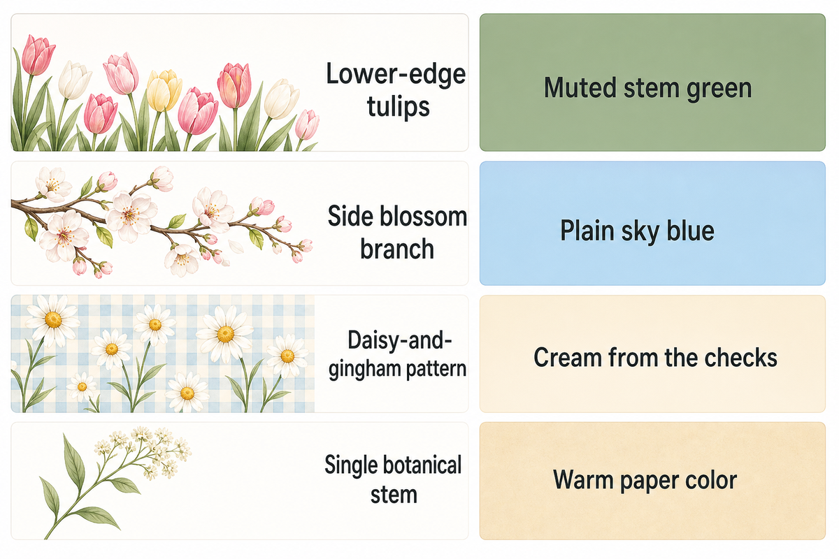
Petal Placement is a comparison method for spring backgrounds: place the busiest part of the artwork around the elements you need to read, then choose a less detailed Home Screen companion if needed. This styling method is not an element of Apple’s operating system. To make your first selection, use the table. To finalize your selection, use the real preview.
| Composition | Check on the Lock Screen | Check behind apps | Companion to try |
|---|---|---|---|
| Lower-edge tulips | Blooms near bottom controls or notifications | Flowers behind the dock | Muted stem green |
| Side blossom branch | Twigs crossing the time after cropping | Petals behind edge-column labels | Plain sky blue |
| Daisy-and-gingham pattern | Checks visible through the clock | Repeated detail across the app grid | Cream from the checks |
| Single botanical stem | Flower head cut off near an edge | Stem passing through a large widget | Warm paper color |
For a busy app grid, start with the blush tulips on your Lock Screen and a plain green Home Screen. Open the folder you use most, because its labels and background may look different from the main grid. If the tulips also work behind your apps, keeping the same picture is fine. If petals compete with labels, switch only the Home Screen to the companion. You don’t need to rebuild the whole setup to personalize it. Apple’s wallpaper guide documents separate color, photo and Blur choices; compare those options in the preview.
For a Lock Screen with a focus on wallpaper, the meadow is a good option. Leaving the sky visible gives you more space to work with and shows the image better. Initially, leave only the widgets you want, then inspect the wallpaper again when your normal notifications appear. The way a scene looks on an empty preview is often different from the way it looks during normal use. You may need to change the clock appearance to make it stand out against the sky, or crop the image if notifications hide the flowers. Keep your Home Screen simple while you figure out which picture to use on the Lock Screen. Once you find the picture you like most, explore matching widgets and add them one at a time.
Find a Spring Wallpaper You Can Actually Download
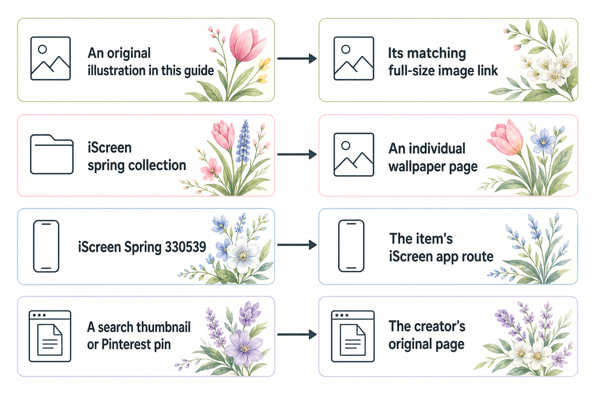
The original images featured in this post can be saved by opening the original image in a new tab, and then saving it using your browser’s tools. Don’t take a screenshot of the entire webpage. The iScreen catalog is a separate collection with its own download route. You may need to use the catalog item’s app download route to access its full-size image.
| Starting point | What to open | What to check |
|---|---|---|
| An original illustration in this guide | Its matching full-size image link | The opened artwork matches your chosen number |
| iScreen spring collection | An individual wallpaper page | The item’s own download instructions |
| iScreen Spring 330539 | The item’s iScreen app route | Current in-app access terms for HD |
| A search thumbnail or Pinterest pin | The creator’s original page | Available file, saving route and permitted use |
The inspected Spring 330539 catalog page displays a preview and directs visitors to iScreen to unlock HD. That message doesn’t establish that every image is free. Check the selected item’s current terms before assuming a “download free” search result describes its full-size file. The app catalog route isn’t the download link for the original illustrations in this article.
You can also create your own wallpaper images using stock photos, as long as you find a reliable source to verify the license. Save the image after following the source’s download and attribution instructions. A wide screen wallpaper for a desktop or laptop may require a different aspect ratio crop from a phone screen. A tablet preview or Android tutorial may display a different wallpaper configuration from your iPhone.
Save and Set Your Spring Wallpaper
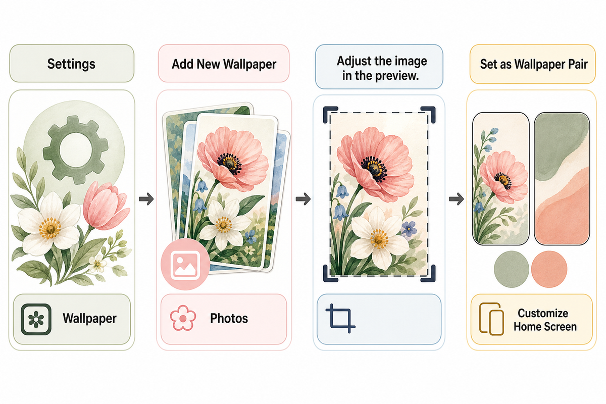
Save your chosen picture to Photos, then use Apple’s current wallpaper instructions. The Settings route lets you choose the image and decide whether both screens should share it. Adjust the preview before confirming, especially when the artwork has a flower or bird close to an edge.
- Open Settings and tap Wallpaper.
- Tap Add New Wallpaper, choose Photos, and select the saved image.
- Adjust the image in the preview. Apple’s Lock Screen guide describes pinch zoom and moving the photo with two fingers.
- Tap Add, then choose Set as Wallpaper Pair or Customize Home Screen.
Resolution helps preserve detail, but it doesn’t choose the crop for you. Apple lists the iPhone 13 display at 2532 by 1170 pixels and the iPhone 15 display at 2556 by 1179 pixels. Those are model-specific display specifications, not one wallpaper download size for every iPhone. A 4K label alone tells you little about where the petals will land.
For the longer walkthrough, see how to change your iPhone wallpaper. Check your own device’s options; this collection doesn’t promise Depth Effect or spatial compatibility.
Keep the Spring Mood After the Blossom Season
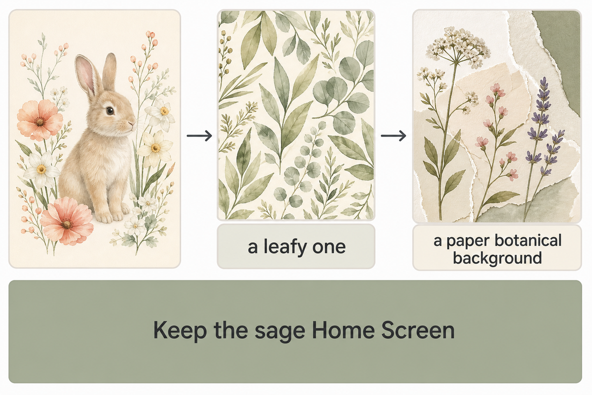
Spring wallpaper collected around Easter can stay on your phone over time, even after the seasonal detail feels finished. Keep the sage Home Screen while the bunny design is swapped for a leafy one. Other variations include using a paper botanical background or a simple gradient when a patterned background feels busy. Different textures can be used as long as they stick to a similar color palette.
Not every widget has to be changed at the same time. The background you see most often is the part to consider replacing first. Keeping the parts of the screen pair that function well gives you variety without changing every widget while you curate a collection of beautiful wallpapers.
Spring Wallpaper Questions
What are some good spring wallpapers for iPhone?
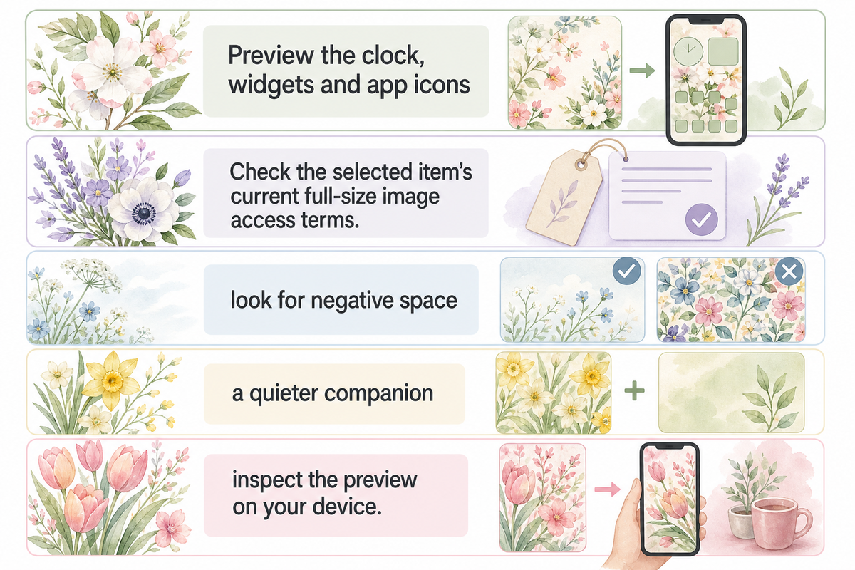
For cute spring backgrounds for iPhone, experiment with images of branches, stems, and leaves based on the layout of your screen. Preview the clock, widgets and app icons before finalizing the image. A small character near the lower edge can keep a playful detail away from the time, while a plain companion color gives a busy Home Screen less to compete with. Compare the open areas around a cherry blossom branch with those around low tulips before choosing your crop.
Where can I get spring backgrounds for my iPhone?
Open the original illustrations here or iScreen’s spring wallpaper pages. Some pages offer direct images; others use an app. Check the selected item’s current full-size image access terms. Searching for spring backgrounds for iPhone free does not establish free access.
How do I keep a floral wallpaper from looking too busy?
Place the flowers before picking their colors. Look for negative space, like positioning branches or stems along one side, or leaves or petals near the bottom, to leave room for the clock. On the Home Screen, check or compare other available color options. Preview widgets and check the labels; just because the background is light, it doesn’t mean the text is easy to read.
Should my Lock Screen and Home Screen use the same spring image?
No. For the Home Screen, you can use the same image or select a different one. Compare a plain color, another photo or Blur in Apple’s customization preview, then check the labels behind your apps. Keeping the floral image on the Lock Screen and a quieter companion on the Home Screen is one option.
Does a 4K spring wallpaper fit every iPhone?
No. The resolution label may not give you the crop you want. Use the original portrait file, then inspect the preview on your device. The display shape and your chosen framing can cut away petals, branches or useful empty space, even when the file has plenty of pixels.
References & Sources
- Apple Support: Change your iPhone wallpaper Settings route and pairing choices.
- Apple iPhone User Guide: Change the wallpaper separate Home Screen color, photo and Blur options.
- Apple iPhone User Guide: Create a custom Lock Screen photo repositioning controls.
- Apple iPhone 13 specifications and iPhone 15 specifications model-specific display dimensions.
- W3C: Colors with Good Contrast foreground and background contrast principle.
