
.png)
Aesthetic App Icons for iPhone: Free & Premium Packs (2026)
Updated July 2026. Applicable to iOS 26 and iOS 18.
Aesthetic app icons are custom-designed images that replace an iPhone’s default app icons with a single coordinated visual style – pastel, dark, kawaii, or somewhere in between. This guide skips the install tutorial for readers who already know how to customize their icons, and focuses instead on the part most roundups skip: which style to pick, when a pack is actually worth paying for, and why a “500+ icons” pack still leaves gaps.
Nine style categories, one honest coverage number, zero affiliate link walls, and enough ideas to personalize a unique, customizable, stylish setup you’ll actually want to transform every season.
Quick Picks
| Best overall style | Pastel or Neutral/Beige — highest cross-app pairing flexibility |
| Best free option | iOS 26’s native tint/clear appearance (Settings, no download) |
| Best paid option | A library-style app with 1,000+ icons across style families, not a single 30-icon pack |
| Best for 40+ apps | A pack that keeps some color variation by category, not one flat color |
| Watch out for | Packs that only cover your 10 most common apps and leave the rest as generic placeholders |
What Makes an App Icon Pack Actually “Aesthetic”?
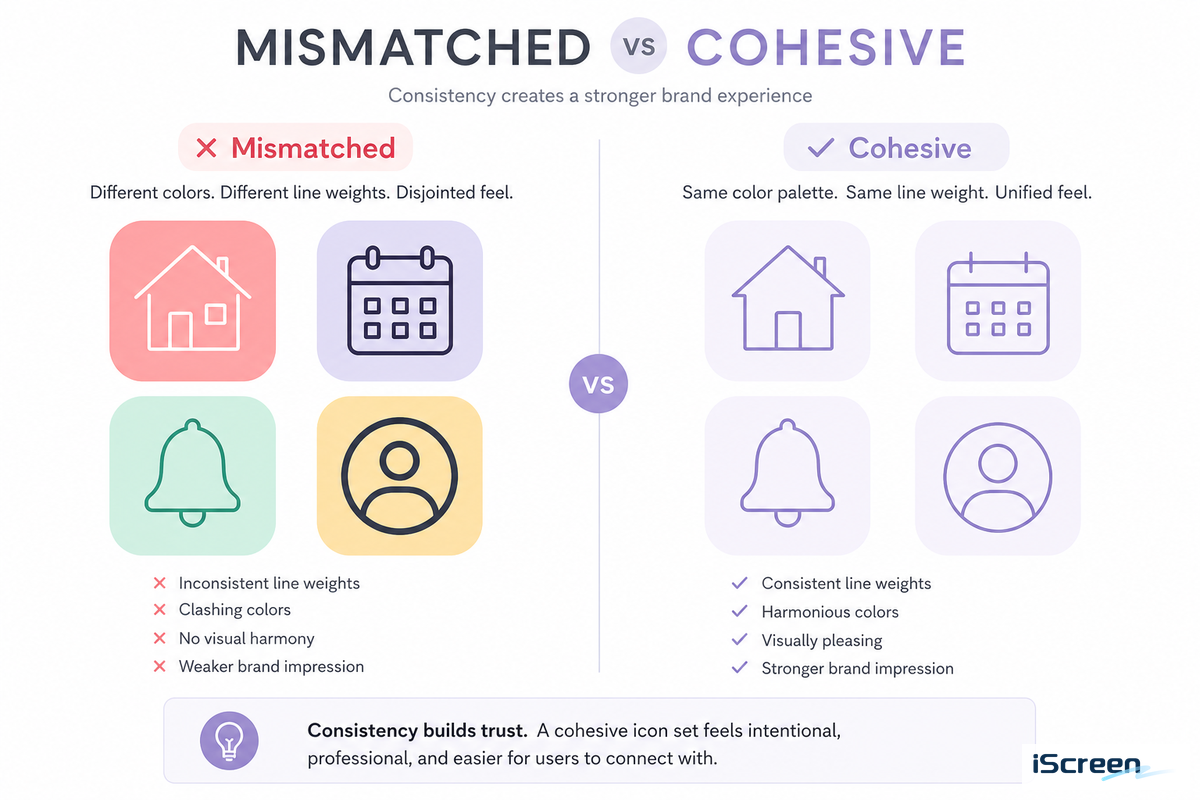
An aesthetic icon pack is a set of custom app icons designed with one consistent visual language – the same line weight, the same handful of colors, the same corner treatment – instead of the mismatched logos apps ship with by default.
Apple’s own Human Interface Guidelines for app icons describe this consistency as the baseline for any iOS icon system: a single grid, a single corner radius, no competing styles fighting for attention on the same screen. The same rule applies whether you’re picking a single iOS app icon or building out a full aesthetic home screen from scratch.
You can judge a pack’s cohesion in about ten seconds without installing anything: look at a screenshot of the finished Home Screen, not the individual icon thumbnails.
Your eye settling on one color story and one line style across every row means it passes. Three icons that look hand-drawn next to two flat vector logos and one photo icon means it doesn’t – no matter how good any single icon looks on its own.
This is the mistake that trips up most first-time pack shoppers: grabbing five different “cute” icons from five different Etsy sellers because each one looked good in its own preview image, then installing all five only to find the Home Screen reads as cluttered rather than curated. One seller’s line weight rarely matches another’s, and the mismatch is obvious the moment the icons sit side by side on an actual phone instead of a product photo.
Screenshot your current Home Screen before you start swapping icons. It’s the fastest way to compare “does this new pack actually look more cohesive” instead of judging icons one at a time.
The 9-Style Aesthetic Icon Spectrum
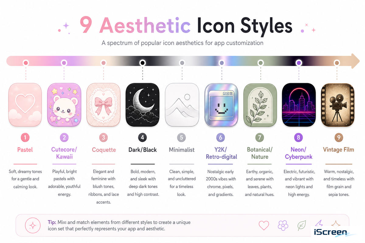
Nine style families cover almost every aesthetic icon pack you’ll find in 2026. Apple’s WWDC25 session on the new look of app icons introduced Liquid Glass layers as the underlying shape language this year, and every style below has to work within that same rounded-square canvas.
| Style | Color palette | Typical price tier | Pairs best with |
|---|---|---|---|
| Pastel | Soft pink, lilac, mint | Free–$4 | Soft-focus wallpapers |
| Cutecore / Kawaii | Bright pastel + character motifs | Free–$5 | Illustrated wallpapers |
| Coquette | Blush pink, cream, bow motifs | $2–$6 | Textured pastel wallpapers |
| Dark / Black | Black, charcoal, single accent | Free–$4 | Dark or moody wallpapers |
| Minimalist / Line | White, gray, one outline weight | Free–$3 | Plain or gradient wallpapers |
| Y2K / Retro-digital | Chrome, gradient, neon accents | $2–$7 | Gradient or chrome wallpapers |
| Botanical / Nature | Sage, terracotta, cream | Free–$5 | Plant or landscape wallpapers |
| Neon / Cyberpunk | Black base, neon accent colors | $2–$6 | Dark neon-lit wallpapers |
| Vintage Film | Sepia, faded color, grain texture | Free–$5 | Film-grain or sepia wallpapers |
Browsing styles inside one library beats piecing together packs from several sellers: iScreen ships 5,000+ ready-made icons spanning most of the families above, applied as a full set rather than one purchase per style.
- A single-palette icon set reads as intentional in seconds, even from across a room
- Easier to pair with one wallpaper mood instead of fighting default app-logo colors
- Not suitable if you rely on icon color to tell apps apart, a NIH-hosted visual-search study found icons sharing the same color are measurably harder to tell apart, slowing down search
- Past roughly 40-50 apps on one screen, an all-one-color pack can cost you a beat of hunting time you didn’t have with the varied default icons
Free vs Premium Aesthetic Icon Packs: Which One Should You Actually Buy
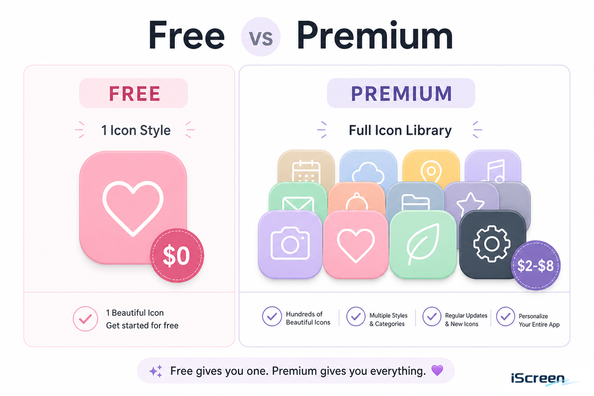
You won’t find the cheapest option in the table below at all: iOS 26’s built-in appearance settings can already tint every icon to match your wallpaper or device color, for free, with no download.
Apple’s own description of the feature covers “colorful new light and dark tints, as well as an elegant new clear look” – worth trying before you buy anything.
- iOS 26 native tint/clear appearance (Settings, no install)
- App Store customization apps with a free starter set
- Independent designers’ free packs (single-artist, usually 20-40 icons)
- Free templates from design tools like Canva, if you want to build free aesthetic app icons yourself
- Library-style apps (1,000+ icons, multiple style families in one subscription)
- Paid single-artist packs (usually a one-time $2-$8 purchase)
- Custom-commissioned icon sets (highest cost, exact-match coverage)
If you change the look of your Home Screen once or twice a year-to match the seasons or to dress up a new phone-a free single-artist pack or iOS’s built-in appearance settings will likely be more than you need. You won’t use the vast majority of icons from a large paid library before you change it up again. Re-theming every few weeks, or chasing the latest trend as it lands, changes the math: a subscription service for a large library pays for itself much more quickly than repeatedly buying a $2-$8 single pack of icons that only addresses one look.
The Icon Pack Longevity Filter
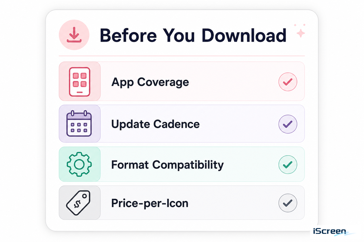
Before downloading, ask yourself four questions. The answers will help determine whether a pack will live on your phone for months or just a few weeks. Picture a $6 pack bought on impulse during a late-night Etsy scroll: it usually gets deleted within days once the excitement wears off and three of your most-used apps still show generic default icons.
| Check | What to look for | Why it matters |
|---|---|---|
| App coverage | Screenshots showing your actual most-used apps, not just social media icons | See H2 below — marketed pack size rarely maps to your real app list |
| Update cadence | A changelog or “last updated” date within the past few months | New apps and app icon redesigns outdate a pack fast; abandoned packs stop covering new apps |
| Format compatibility | Native theme-app install vs. manual Shortcuts-per-icon | Shortcuts-built icons can lose notification badges; a native app avoids that trade-off |
| Price-per-icon | Total price ÷ icons you’ll actually use, not total icons in the pack | A “500-icon” pack you use 40 icons from costs more per icon than a focused 60-icon pack |
One other minor tip is that if you opt for a pack that’s very light in color, uses very bright backgrounds, or depends heavily on your wallpaper, preview the icons against your background before you install. A low-contrast icon may become unreadable when placed on top of an image instead of a flat background. Update cadence matters more than it sounds, too, because Apple redesigns app icons and ships new system apps with each iOS release, and a pack that stopped updating two years ago will have visible gaps for anything released since.
The Coverage Illusion: Why a “500+ Icons” Pack Still Leaves Gaps
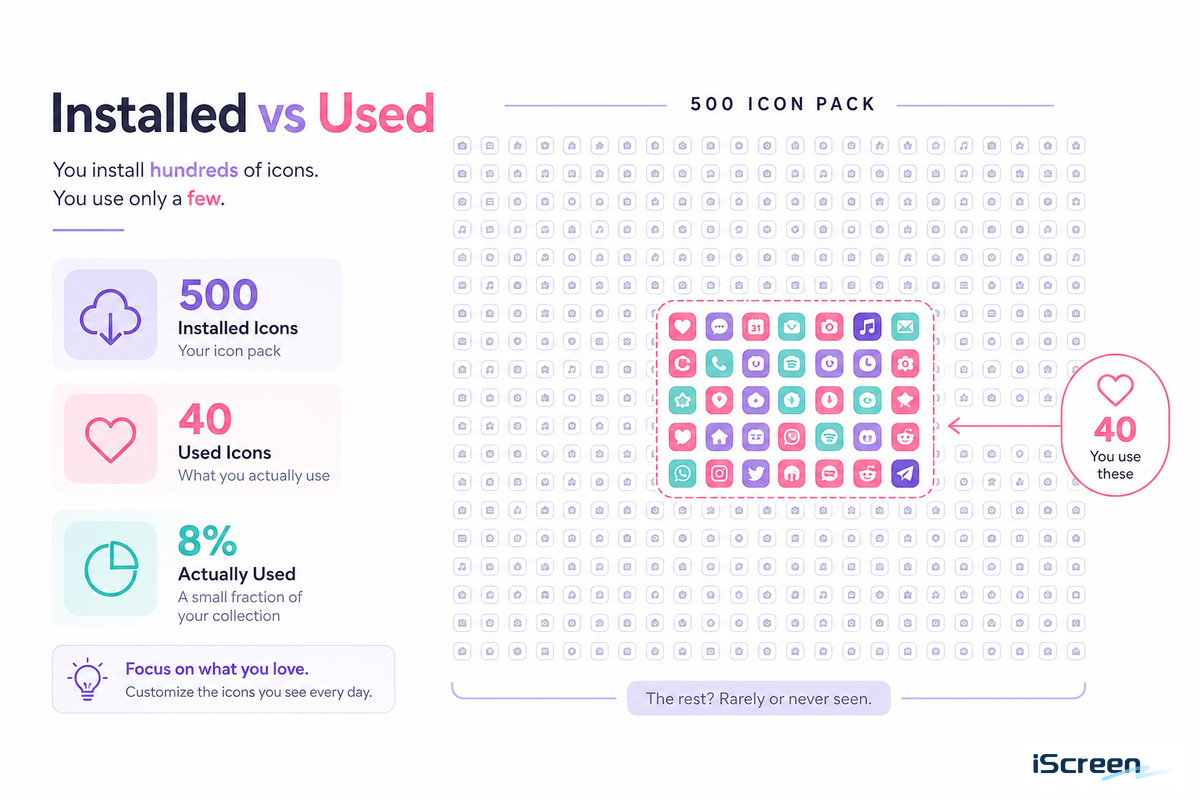
Most icon-pack listings boast about the number of icons included: “500 icons,” “1,200 icons,” or “2,000 icons.” But this number doesn’t indicate the icons that actually make it onto your Home Screen.
Compiled industry estimates for the average smartphone user, while varying based on study year and research, consistently put the number of installed apps at about 40, of which nine or 10 – roughly 25% – are actually opened frequently. That difference between “apps installed” and “apps opened” is what’s relevant: even a relatively small pack of 40 or 50 icons can technically cover all the apps most people use on a regular basis. A 500-icon pack is purchasing you more coverage of others’ devices, not yours.
This problem isn’t specific to iPhones; designers creating custom icon packs for individual apps face the same challenge. For example, one maintainer of a pack for an open-source app stated that their set had “covered most of the popular services”, but it still didn’t encompass every possible application that a user might have installed. Even in other fields, such as when designers are creating large libraries of UI icons for a profession, they often note that having more icons doesn’t automatically equate to more real-world applicability. This is because only a small fraction of the icons in any sizable set will likely be used for a specific project.
Count your own Home Screen icons before you even begin looking at pack size. If your phone has around 25-35 apps, a 60-icon pack that has icons for all the apps you actually use is a far better choice than an 800-icon pack in which half of the icons represent apps you’ve never used.
Coordinating Icons With the Rest of Your Home Screen
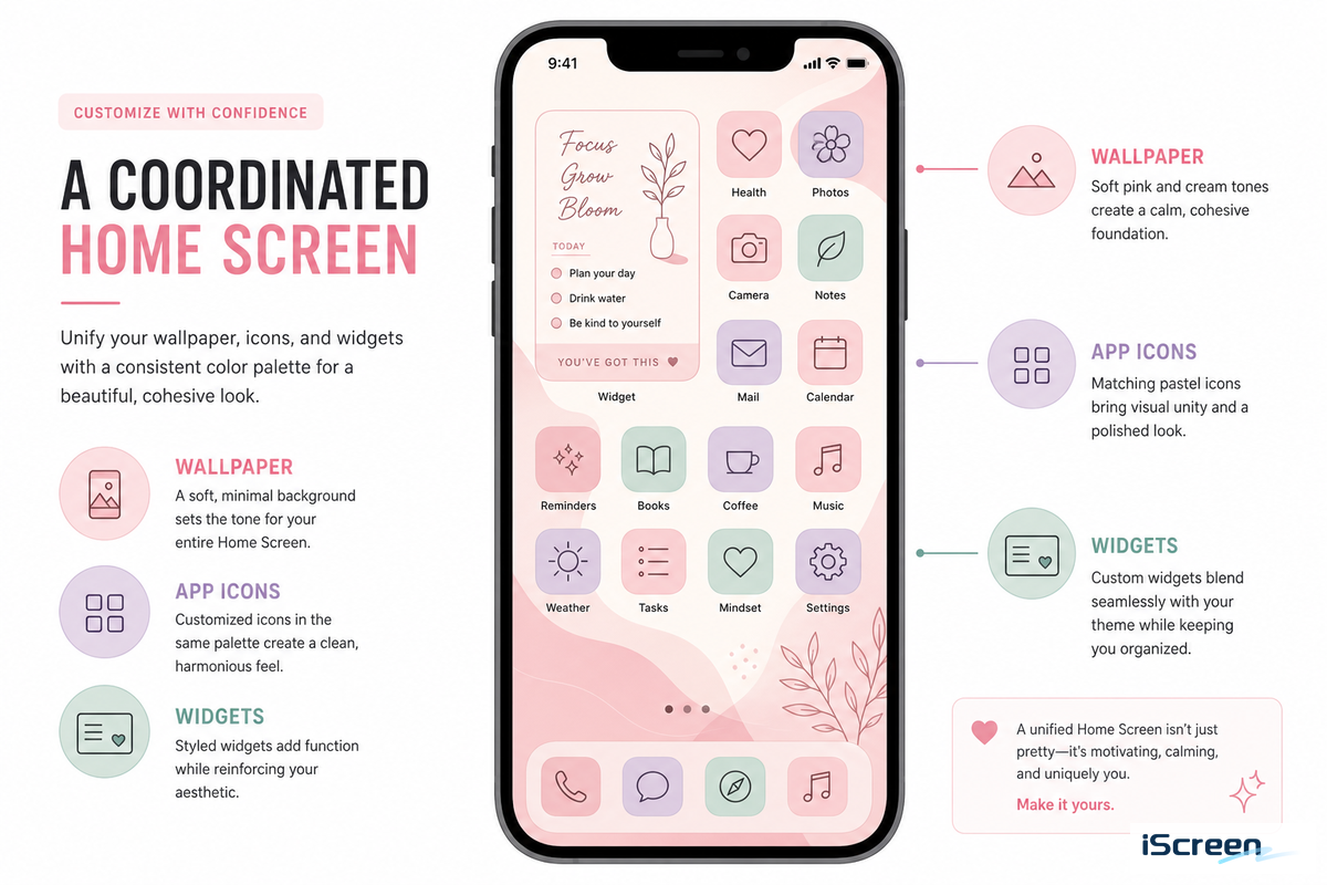
Icons are the last part of a coordinated Home Screen, not the first. iOS 26’s new tint setting can already automatically match your icon’s color to your iPhone’s or case’s color.
“Apple knows that lots of users simply want a consistent aesthetic for their iPhone, with color theming that carries across hardware and software.”
Ryan Christoffel, 9to5Mac
That native tinting is app-wide, though, and can’t be narrowed to specific apps or light-mode only – the exact gap where a curated icon pack still earns a spot on your Home Screen. If you want to learn how to get wallpaper, widgets, and icons working in tandem, consult our guide to cute aesthetic widgets, which covers the necessary pairings in detail, whether your homescreen runs Widgetsmith-style widgets or a full theming app. If you want more wallpaper-specific recommendations, peruse our iPhone aesthetic wallpaper guide.
Where to Actually Get These Packs
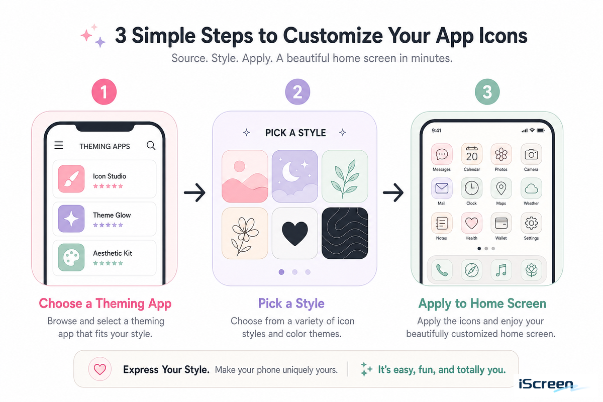
You get these icons for iPhone through either a dedicated theming app or by manually installing them one at a time, icon by icon, with the Shortcuts app, and we’ve already mapped every legitimate source for aesthetic app icons ideas beyond the nine styles covered above.
Our 4-Tier Icon Source Ladder ranks theming apps against individual marketplaces, and our icon customization walkthrough covers the installation steps for both. If you’d rather sync icons, wallpaper, widgets, and keyboard color into one cohesive theme instead of assembling the pieces yourself, our full guide to iPhone themes covers all four layers.
A single application with 5,000+ icons, such as the iScreen icon library, eliminates the need to purchase pack after pack. The reason a fragmented multi-seller approach gets expensive fast: every new style means another $2-$8 purchase, instead of a swap inside a library you already own.
Frequently Asked Questions
Q: How do you get aesthetic app icons?
You get aesthetic app icons through a dedicated icon/theming app that applies a full matched set at once, a downloaded icon pack you apply icon-by-icon through the Shortcuts app, or iOS 26’s native tint and clear appearance settings if you’d rather skip downloads entirely.
Q: Which app is best for aesthetic app icons?
No single app wins outright — the best one covers the specific apps you use daily, in a style you’ll still like in six months, and library size alone doesn’t determine that fit; run any candidate through the four-point Longevity Filter below before you commit to it.
Q: Do aesthetic app icons drain battery?
No — a custom icon is just an image file; it doesn’t run in the background, check for updates, or draw extra power once it’s set, regardless of how many icons across your Home Screen you’ve replaced.
Q: Where can I get icons for apps I use that aren’t in a pack?
Most theming apps let you generate a custom icon from any photo or color for apps a pack doesn’t cover, filling the exact gap the Coverage Illusion describes.
Q: Are paid icon packs worth it over free ones?
Paid packs pay off if you re-theme often or need broad app coverage; otherwise, a free pack or iOS 26’s native tinting covers most people’s needs just fine.
Our Perspective
Since we develop iScreen’s own icon library, we know which of the options actually stick around past week one versus which tend to get thrown out really quickly: pastel and neutral palettes do (even a minimal, low-key set holds up), while high-contrast neons and Y2K styles built purely on short-lived creativity fade fast once the dynamic trend of the month moves on. The coverage rate figures throughout this article are from app-usage studies in the field and not iScreen’s install data, and we’ve made sure to note as such instead of passing them off as if they’re ours.
References & Sources
- Apple Human Interface Guidelines, App Icons — Apple Inc.
- WWDC25: Say Hello to the New Look of App Icons — Apple Inc.
- Apple Introduces a Delightful and Elegant New Software Design — Apple Newsroom, June 2025
- App Icon Similarity and Its Impact on Visual Search Efficiency — PMC / National Institutes of Health
- How Many Apps Are There in the World — BankMyCell
- iOS 26 Has a New Home Screen Setting for App Icons — 9to5Mac
Related Articles
- iPhone Icon Packs: Where to Find and Install — the install walkthrough this guide skips
- Cute Aesthetic Widgets for iPhone — pairing icons with widgets and wallpaper
- The Complete iPhone Themes Guide — icons as one of four theme layers
- Aesthetic iPhone Wallpaper: 100+ Curated Backgrounds — the wallpaper half of a matched Home Screen
-1.png)
