How to Customize App Icons on iPhone: Step-by-Step Guide (2026)

Updated June 2026 · A practical, no-jailbreak guide for iOS 26 and iOS 18

To customize iPhone app icons means to change how they appear on your Home Screen — their color, a custom image, or a whole matching set. You can do it three ways, and the right one depends on whether you want a quick recolor or a fully custom picture on each app. Since iOS 18 (and now iOS 26’s Liquid Glass look), Apple finally bakes basic icon styling into the Home Screen itself, but a true themed makeover still means assembling icons yourself with the Shortcuts app or a dedicated icon app. This guide walks through all three, with the trade-offs most tutorials skip.

Short answer: To customize iPhone app icons, touch and hold the Home Screen, tap Edit > Customize, and pick Dark, Tinted, or Clear to restyle every icon at once. For a custom image on one app, use the free Shortcuts app; for a whole matching set in a few taps, use an icon-pack app. All three are App Store-safe and need no jailbreak.

Key Takeaways

  • There’s still no native one-tap “apply a custom picture to every icon” button, Apple’s menu only recolors; custom artwork is assembled per app.
  • iOS 26 added a Clear (translucent) icon mode on top of iOS 18’s Dark and Tinted styles.
  • The old Shortcuts “launch banner” is mostly gone, but iOS 26 reintroduced a brief load delay when swiping pages of custom icons.
  • Every method here’s free or freemium, reversible, and needs no jailbreak.

Quick Specs: iPhone App Icon Customization

iOS needed iOS 18+ for Dark/Tinted & Shortcuts icons; iOS 26 for Clear (Liquid Glass)
Tools None (built-in) · Shortcuts app (free) · icon-pack app
Time per icon Built-in: seconds for all · Shortcuts: 5–8 steps each · Icon app: a few taps per set
Reversible Yes — from the same Customize menu or by deleting the shortcut
Jailbreak No — all methods are App Store-safe

What “Customizing App Icons” Actually Means on iPhone (iOS 18 vs iOS 26)
What "Customizing App Icons" Actually Means on iPhone (iOS 18 vs iOS 26)

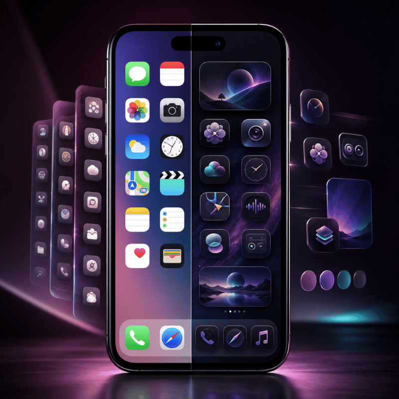
Before you change anything, it helps to know that “customize app icons” covers three different levels of control. First comes recoloring — keeping the real app icon but changing its appearance. Next is replacing an icon with a custom image of your own. Third, applying a whole coordinated icon pack so your Home Screen reads as one theme. Apple’s built-in menu only does the first; the other two need the Shortcuts app or a third-party app.

Picking the wrong level is the usual mistake, and it costs time: a quick recolor takes 30 seconds, while a full custom set can take 30 minutes by hand because every app is done separately.

This matters because Apple changed the rules recently. In iOS 18, the Home Screen gained a real Customize menu with Dark, Tinted, and larger icon options. In iOS 26, Apple’s Liquid Glass design added a Clear (translucent) look, so icons can sit like frosted glass over your iPhone wallpaper. According to Apple’s 2025 software design announcement, these icons render “in light, dark, tinted, or clear looks.” What Apple still does not give you is a single toggle that swaps every icon for a custom picture, that part you assemble yourself, which is why this guide cover all three methods rather than one.

Does iOS 18 have custom icons?

Yes and no. iOS 18 introduced native icon styling — you can tint, darken, or enlarge icons from the Home Screen with no third-party apps. But iOS 18 doesn’t let you point an app at any random photo through that menu; for a fully custom icon image you still use the Shortcuts app, exactly as on iOS 16 and 17.

iOS 26 keeps the same split: more built-in styles (now including Clear), but custom artwork still goes through Shortcuts or an icon app. So “does iOS 18 have custom icons” depends on whether you mean recoloring (built in) or your own images (Shortcuts).

💡 Pro Tip

Decide your goal first. If you only want a cleaner, color-matched Home Screen, the built-in method below is faster and keeps every app behaving normally. If you want a specific picture or a themed set, skip ahead to Method 2 or 3. Pairing icon changes with matching Home Screen widgets ties the whole look together.

The 3 Ways to Customize iPhone App Icons (The Icon Method Matrix)
The 3 Ways to Customize iPhone App Icons (The Icon Method Matrix)

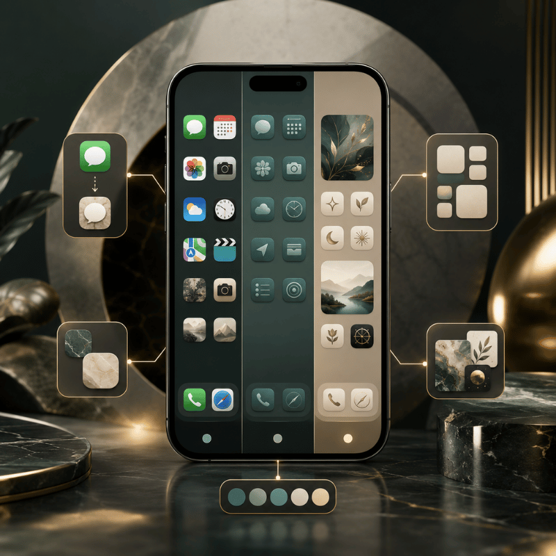
There are three real methods to change app icons on iPhone, and picking the wrong one wastes the most time. Apple’s built-in menu restyles everything in seconds but can’t use your own images. Shortcuts gives total image control but adds friction per app. An icon-pack app sit in the middle: less freedom than Shortcuts, far less effort. That table below, call it the Icon Method Matrixcompares all three across the six things that actually decide which one you’ll be happy with a week later.

The Icon Method Matrix: 3 ways to customize iPhone app icons, compared across 6 decision factors.
Factor 1. Built-in Customize 2. Shortcuts app 3. Icon-pack app
Effort Seconds, all icons at once 5–8 steps per app A few taps per set
What it changes Color/tint, dark, clear, size Any custom image you choose A coordinated icon pack
Launch behavior Normal — real app icons Brief load delay on iOS 26 Same as Shortcuts (uses a profile)
Reversible Instantly (Default) Delete the shortcut Remove the profile/shortcut
Cost Free Free Free / freemium
Best for Fast, tidy recolor One or two custom images A full aesthetic theme

Method steps verified against Apple’s Home Screen customization guide; launch-delay behavior from iOS 26 user reports.

The 4-Question Icon Method Picker

  1. Want to recolor everything in one go? → Built-in Customize (Method 1).
  2. Need a specific picture on one or two apps, for free? → Shortcuts (Method 2).
  3. Want a whole matching set without 30 manual shortcuts? → an icon-pack app (Method 3).
  4. Care most about badges and instant launching? → stay on Method 1; skip custom-image methods for alert-heavy apps.

Can you change app icons on iPhone without using Shortcuts?

Yes. Two of the three methods skip Shortcuts entirely. The built-in Customize menu restyles real icons with no Shortcuts at all, and icon-pack apps apply custom images through an installed profile rather than a Shortcuts redirect. The only reason to use Shortcuts is when you want your own specific image on a single app for free.

If the Shortcuts hassle is what’s putting you off, an icon app is the no-Shortcuts route, see our step-by-step on the iPhone customization walkthrough for a side-by-side.

Method 1: Tint, Darken or Clear Icons with iOS 26’s Built-In Customize Menu
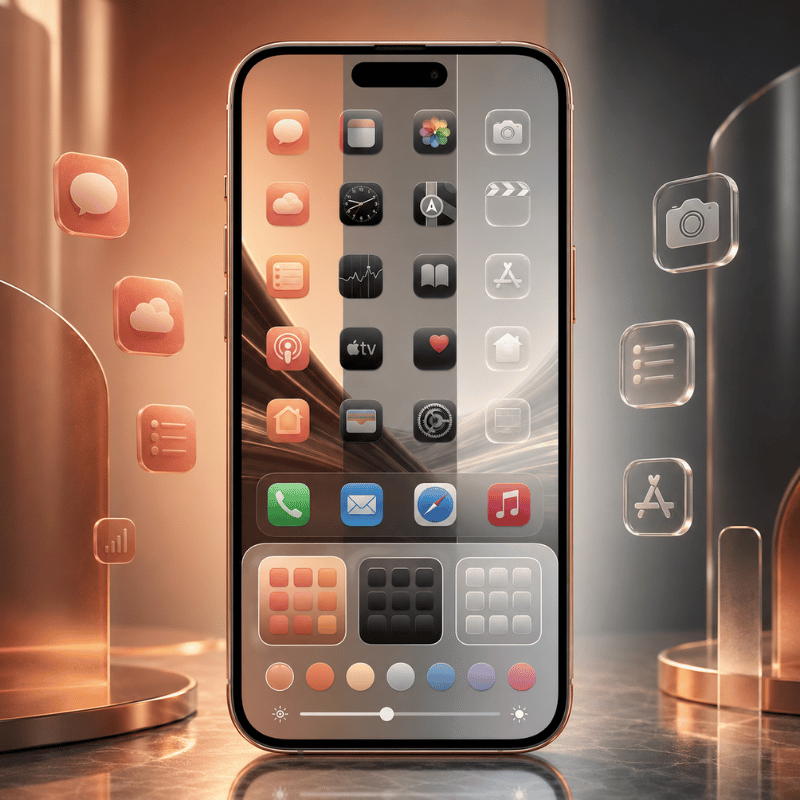
Method 1: Tint, Darken or Clear Icons with iOS 26's Built-In Customize Menu

Apple’s own menu is the fastest way to change app icons, and it restyles every icon at once in about 30 seconds. That speed matter in practice: because these stay real app icons rather than launcher tiles, you avoid the launch delay problem entirely. Touch and hold an empty part of the Home Screen until the icons jiggle, tap Edit at the top, then tap Customize. You’ll see appearance buttons along the bottom. This is the same flow on iOS 18 and iOS 26, with iOS 26 adding the Clear option.

  1. Touch and hold the Home Screen background until icons jiggle.
  2. Tap EditCustomize.
  3. Default keeps original colors; Dark gives a dark mode icon set (tap Auto to switch dark at night, light by day).
  4. Tinted recolors every icon, use the color and saturation sliders, or the eyedropper to pull a color straight from your wallpaper.
  5. Clear (iOS 26) makes icons translucent glass; then choose Light, Dark, or Auto.
  6. Tap the size button for larger icons (app names disappear at large size), then tap an empty area to finish.

Apple’s full reference is the Customize apps and widgets on the iPhone Home Screen guide. Its big advantage is that these stay real app icons, so Mail and Messages badges keep working and apps open instantly. Unlike Android, where a launcher can swap every icon system-wide, your iPhone keeps each change cosmetic and reversible.

⚠️ Common Mistake

Clear icons look great in photos but can vanish against a plain or busy wallpaper. If your Settings, Clock, or App Store icons suddenly look hard to read in Clear or Tinted mode, switch that style’s Light/Dark setting, or pick a calmer wallpaper before you commit to the glass look.

Method 2: Make Fully Custom App Icons with the Shortcuts App (Free)
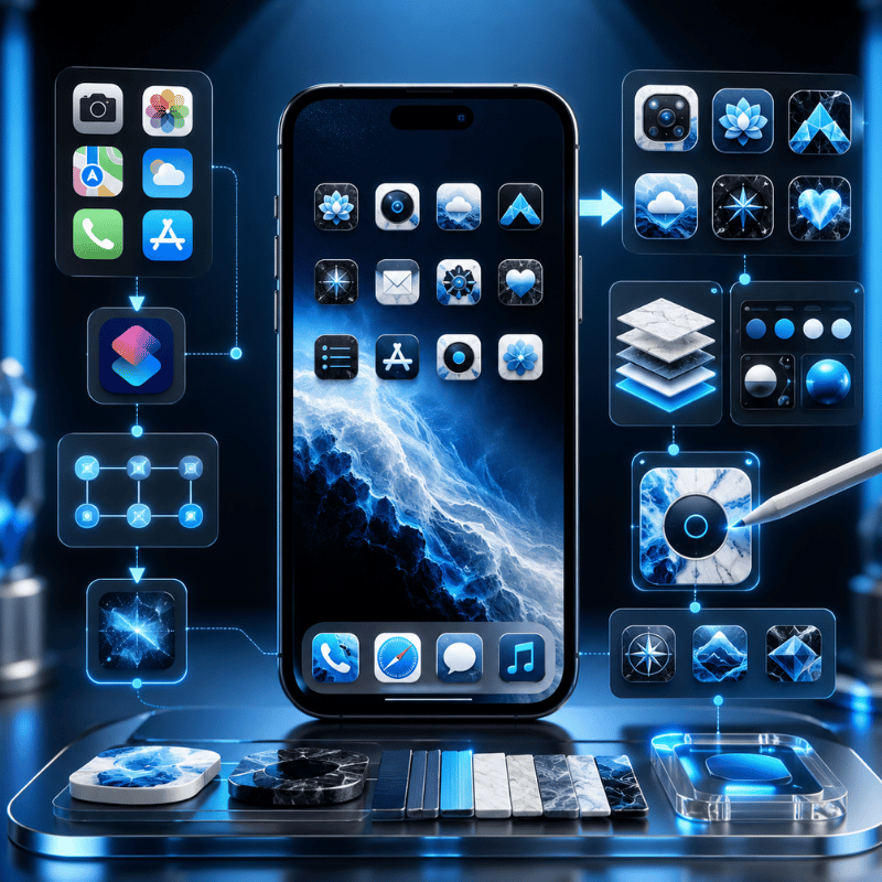
Method 2: Make Fully Custom App Icons with the Shortcuts App (Free)

When you want your own image, a hand-drawn glyph, a monochrome icon pack, or a photo, the free Shortcuts app is the no-cost route. This method create a Home Screen tile that opens the target app, and you give that tile any picture you like. You create a shortcut for the app, choose its icon image, and your new icon appears on the Home Screen. It takes about five to eight steps per app, so it’s ideal for a few key apps rather than all of them, and it’s the same way people personalize icons on iOS today.

  1. Open the Shortcuts app and tap + to create a new shortcut.
  2. Tap Add Action, search for Open App, and select it.
  3. Tap App and choose the app you want this icon to launch.
  4. Open the shortcut’s options and tap Add to Home Screen.
  5. Tap the placeholder icon image, then pick Choose Photo to pull an image from your Photos app, or Choose File for a saved icon.
  6. Rename the shortcut (this becomes the icon label), then tap Add.
  7. Long-press the original app and choose Remove from Home Screen so only your custom icon shows, the real app stays in your App Library.

Your own PNGs work, and so do exported images from a design tool or icon set you saved from Pinterest. Just standardize shape, padding, and background color first, or a random mix from different packs will look messier than the default Home Screen.

How do I change the icon of a specific app?

To change just one app’s icon, make a single Shortcut for that app using the steps above, give it your chosen image, and hide the original from the Home Screen. That custom tile launches the real app, so a custom app icon pack from iScreen or your own photo replaces the look without touching the actual app. Repeat per app, there’s no native “change this one icon” button, which is exactly the friction icon-pack apps remove.

The Shortcuts Tax: the launch delay nobody mentions

Here’s the trade-off thin tutorials skip, call it the Shortcuts Tax. Because a custom icon is a launcher tile, not the real app icon, iOS has historically added friction. On iOS 14 and 15, tapping a custom icon flashed a banner and bounced you through the Shortcuts app first. Around iOS 16 the “Open App” action removed that banner for most users, and apps opened almost directly, the tax nearly disappeared. Then iOS 26 reintroduced a different version: users report a brief load delay when swiping between pages of custom icons, with one iOS 26 thread drawing 154 votes describing icons that “take a long time to load.” That lag is usually only 1 to 2 seconds, but it’s a real trade-off because it repeats every time you open the app. In short, the Shortcuts Tax changed shape across iOS 14 → 16 → 26 but never fully went away.

“After switching to iOS 26 my custom app icons have a slight delay when swiping between pages, it ran perfectly before.”

iPhone user, r/shortcuts (iOS 26 custom-icon delay thread)

So if instant launching and reliable badges matter to you for chat, email, or task apps, leave those on real icons (Method 1) and reserve Shortcuts for the handful of apps where the look matter more than the millisecond. That brief lag is the main downside of custom-image icons, and it’s worth weighing before you convert your whole Home Screen.

Method 3: Use an Icon Changer or Theme App for One-Tap Icon Packs
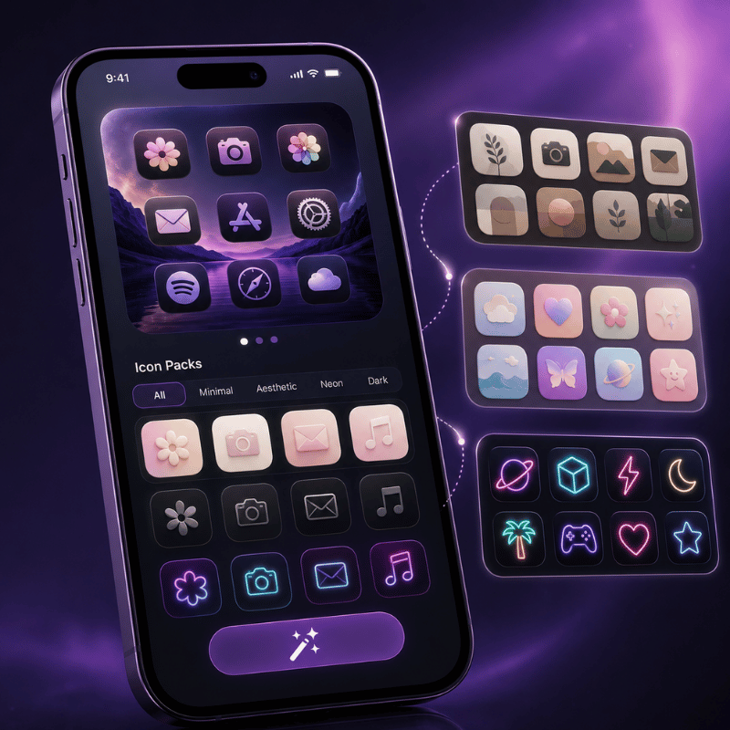
Method 3: Use an Icon Changer or Theme App for One-Tap Icon Packs

An icon-pack app is the answer when you want a whole matching set without building 30 shortcuts by hand, a process that can take 30 minutes or more for a full Home Screen. These apps let you browse coordinated icon packs, pick a style, and apply a 30-icon set in under 2 minutes, far faster than the manual route on your phone. In practice, this is the use case where an app clearly win: the trade-off of doing it by hand is the time, and the risk is an inconsistent result. Under the hood they still rely on a custom-icon mechanism (an installed profile or batch shortcuts), so the launch behavior is similar to Method 2, but you skip nearly all the manual setup, and many apps advertise themselves as needing no Shortcuts steps at all. Some app developers also ship alternate icons inside their own apps, which you switch from the app’s settings, the cleanest option when it’s offered.

This is where a customization app earns its place. iScreen, for example, catalogs 5,000+ icons, 10,000+ themes, and 500+ widgets, with coordinated theme kits so your icons, widgets, and wallpaper share one palette in under 1 minute. This works because the pack enforces one palette for you, which is exactly the consistency a hand-built set struggles to hold. A pack’s payoff over one-off swaps is consistency: a curated set keep shape language and color weight uniform, which is the single biggest reason a custom Home Screen looks intentional rather than chaotic. Browse a custom app icon pack set to see how a unified palette read.

“A pack of 30 icons that share one palette will always beat 30 great icons from different sets. Consistency of shape and tone is what makes a Home Screen feel designed, not downloaded.”

iScreen design team, app icon & theme curation

What to check before installing any icon app: confirm it’s free or clearly priced, review what an installed profile can access, and make sure removing it cleanly restores your original icons. Reputable icon and theme apps from the App Store are App Store-safe and reversible, no jailbreak, no risk to the apps themselves.

How to Design a Cohesive App Icon Look (Aesthetic)
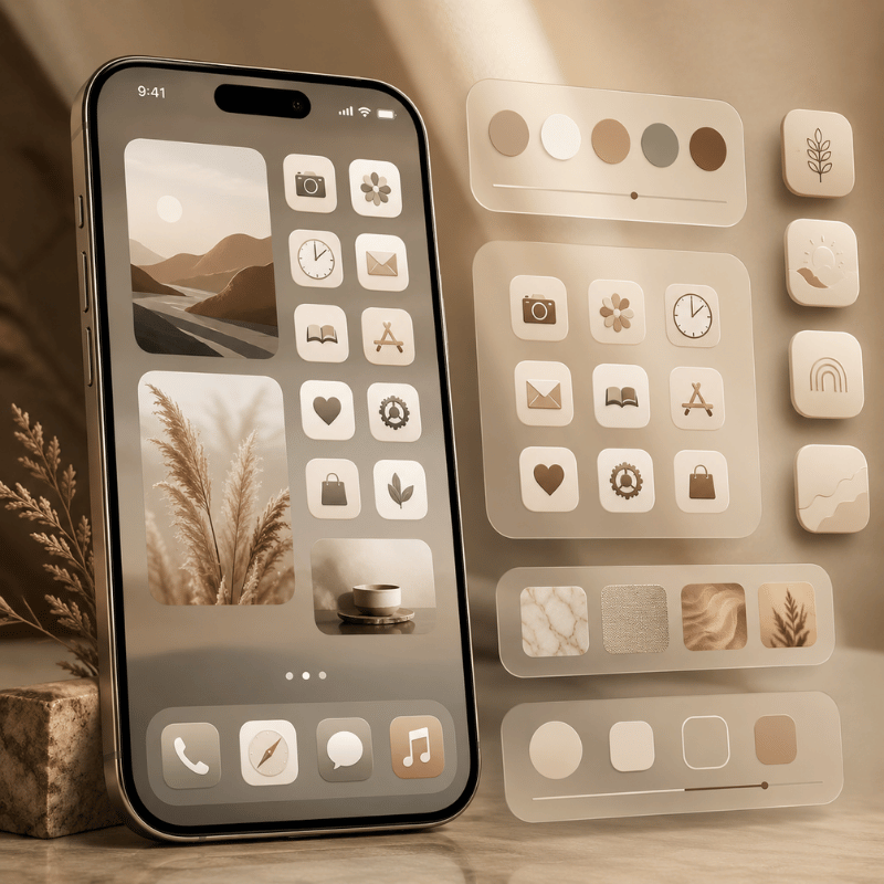
How to Design a Cohesive App Icon Look (Aesthetic)

Honestly, the hardest part of an aesthetic Home Screen isn’t the how, it’s the taste. A custom set look polished when three things stay consistent: one style family (all line icons, all glyphs, or all photo tiles, not a mix), a tight palette of 2 to 3 colors, and a background that frames rather than fights the icons.

In practice, the most common mistake is mixing packs: the problem is that two near-identical pinks rarely match, and the clash is obvious within seconds. That same palette discipline lets you personalize your lock screen to match, so the whole phone read as one look. Most messy makeovers break the first rule by pulling cute icons from several packs at once.

A real example: someone rebuilds a soft pink-and-gray Home Screen, grabs a free pastel set for half the apps, then fills the gaps with leftover icons from an older pack. The shapes don’t match, two pinks clash, and the screen look busier than when they started. That fix is boringly effective, pick one pack, accept that a few apps will use a near-match rather than a perfect one, and let the wallpaper carry the personality. For palette and layout ideas, our roundups of aesthetic iPhone home screen setups and iPhone home screen ideas (linked below) show full themes you can copy. Pulling inspiration from Pinterest or Instagram is fine, just commit to one direction before you start tinting.

💡 Pro Tip

Treat icons as one layer of a bigger look. Truly coordinated screens match icons to a full iPhone theme — wallpaper, widgets, and even a matching font on your widget text — so the eye reads one palette instead of four separate decisions. Apps like Widgetsmith pair custom widgets with your icon set for that finished feel.

Troubleshooting: Launch Delay, Reverting Icons & Missing Apps
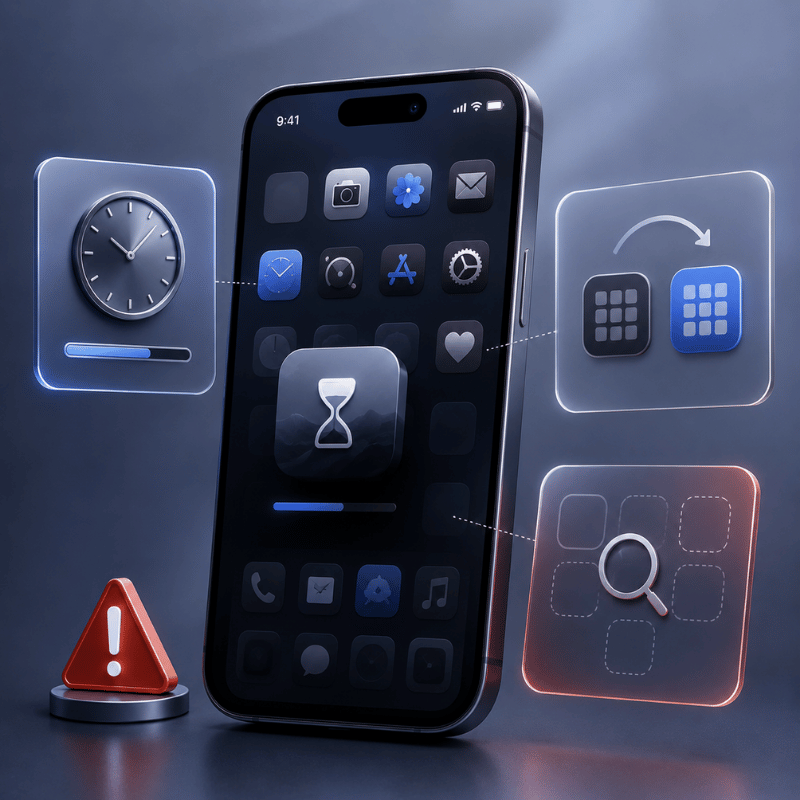
Troubleshooting: Launch Delay, Reverting Icons & Missing Apps

Custom icons are cosmetic and fully reversible, so nothing here’s permanent. In practice, the three problems people hit most each have a fix that take under 1 minute, because nothing here touches the actual app or your data, and none require a jailbreak or a factory reset.

  • Custom icons load slowly (iOS 26): this is the Shortcuts Tax. Reduce how many custom-icon pages you swipe through, keep alert-heavy apps on real icons, or revert those apps to default until Apple tunes the animation.
  • “My app disappeared”: it didn’t. When you hide an original app to show a custom icon, the real app moves to the App Library, swipe to the last Home Screen page or search to find it.
  • Undo everything fast: for built-in styles, reopen Edit > Customize and tap Default. For Shortcuts icons, delete the shortcut tile and unhide the original. For an icon app, remove its profile or shortcuts and your default icons return.

One reassurance worth stating plainly: you’ve never needed to jailbreak to customize iPhone app icons. That old jailbreak-only era ended years ago, today the native menu, Shortcuts, and App Store icon apps cover every level of customization safely. If you want the whole home screen redone rather than just icons, our guide to iPhone themes walks through assembling the full stack.

What’s Changing: iOS 26 Liquid Glass and the Future of iPhone Icons
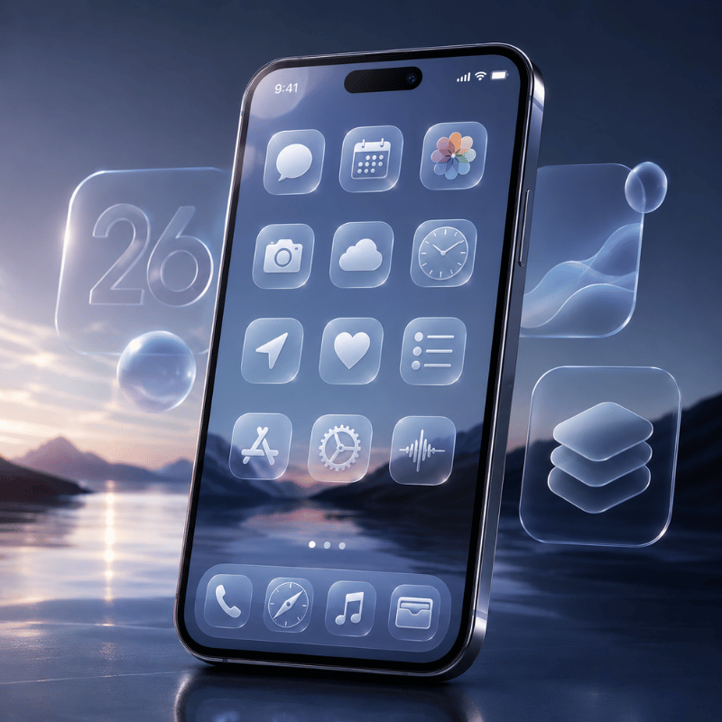
What's Changing: iOS 26 Liquid Glass and the Future of iPhone Icons

A bigger shift is underway: Apple keeps inching toward a system-wide icon look, but the gap that keep third-party packs relevant isn’t closing. iOS 26’s Liquid Glass design and its Clear, Tinted, Dark, and Light modes are Apple’s closest move yet to a one-tap “theme my icons” switch.

Apple even shipped Icon Composer so developers can build icons that adapt to all four looks. Yet the rollout drew real friction: users on r/apple report Liquid Glass making icons look crooked or tilted in Dark, Clear, and Tinted modes against dark backgrounds, and the swipe-load delay above frustrated people who’d built custom layouts. The problem, in practice, is that Apple’s styles still can’t match a specific look, so the trade-off of waiting for a future update is real.

What this means for you in 2026 is practical: if you want a specific aesthetic, a particular pastel set, a monochrome work screen, a seasonal makeover, Apple’s built-in styles still can’t deliver it, so an icon-pack app or Shortcuts remains the only route to true art-direction. Designers are pushing the same way, with 2026 icon design trends split between soft 3D and hyper-minimal, plus a rise in AI-generated icon sets. If you’re planning a refresh now, start from the built-in Clear/Tinted look for speed, then layer a coordinated pack on the apps you care about most, that combination ages better than betting on Apple to ship a full theme engine next cycle.

📐 Action for 2026:

Recolor everything with iOS 26’s Tinted or Clear mode first (30 seconds), live with it for a day, then commit to a custom icon pack only on your most-used apps. You get an instant refresh now and a true theme where it counts, without the full Shortcuts grind.

Want a coordinated icon pack, matching widgets, and wallpaper in one place?

Explore iScreen App Icons →

Frequently Asked Questions

Q: How do I get cute app icons on my iPhone?

View Answer
For cute app icons, download a coordinated icon pack from an icon-changer app, or save individual icon images you like and apply them through the Shortcuts app. Stick to one style family — all pastel, all line-art, all glyph — and a 2–3 color palette so the set looks intentional. Pinterest and Instagram are good places to find a direction before you start, and a theme app bundles cute icons, widgets, and wallpaper that already match.

Q: Can you change app icons on iPhone without Shortcuts?

View Answer
Yes. Apple’s built-in Customize menu (Edit > Customize) restyles every icon — tint, dark, or clear — with no Shortcuts at all. Icon-pack apps also apply custom images through an installed profile rather than a Shortcuts redirect. You only need the Shortcuts app when you want your own specific image on a single app for free. For most people who just want a tidy, color-matched look, the no-Shortcuts built-in method is the easiest route.

Q: Does iOS 18 have custom icons?

View Answer
iOS 18 added native icon styling — you can tint, darken, or enlarge icons straight from the Home Screen without any third-party app. But iOS 18 does not let you set a custom photo as an icon through that menu; for your own images you still use the free Shortcuts app, the same as on iOS 16 and 17. iOS 26 keeps this split and adds a Clear (translucent) style on top of iOS 18’s options.

Q: Why do my custom app icons open slowly?

View Answer
Because a custom icon is a Shortcuts launcher tile, not the real app icon, iOS adds a brief hand-off. iOS 26 specifically reintroduced a load delay when swiping pages of custom icons. Keep heavily used apps on real icons to avoid it.

Q: Are custom app icons free?

View Answer
The built-in Customize menu and the Shortcuts method are completely free. Icon-pack apps are usually freemium: a free starter set of icons plus optional paid premium packs, so you can theme your whole Home Screen at no cost and pay only for a premium pack if one catches your eye.

Q: How do I get my original app icons back?

View Answer
It depends on the method. For built-in styles, open Edit > Customize and tap Default. For a Shortcuts icon, delete the shortcut tile and unhide the real app from the App Library. For an icon-pack app, remove its profile and your default icons reappear.

Why We Tested These Methods

Every step here is cross-checked against Apple’s official Home Screen guide and WWDC25 notes, and the Shortcuts launch-delay timeline is drawn from current iOS 26 user reports. Design guidance in the cohesive-look section reflects iScreen’s icon and theme catalog. Reviewed by the iScreen team.

Recent articles

Dynamic Island Pets: How to Add Cute Pets to Your iPhone

Dynamic Island Pets: How to Add Cute Pets to Your iPhone

2026/7/11 13:26
Updated July 2026 Think of your phone’s status bar as a miniature Tamagotchi. Dynamic island pets are the small, cute animated creatures, often cats, dogs, or stranger things like axolotls, that live in your iPhone’s Dynamic Island cut-out and follow you all around the phone, no matter what app you’re in. You get a Dynamic Island pet via a third-party app, not a system toggle, and it takes a couple of minutes to set up. Quick Specs Setup time Under 2 minutes Compatible iPhones 14 Pro / 14 Pro Max and every non-notch iPhone since (15, 16, 17, Air) — the plain iPhone 16e is the one recent exception Cost Free tier available on every app in this guide How it disappears Apple caps it at 8 hours, but three other things can end it sooner — see below What Is a Dynamic Island Pet, Exactly? A dynamic island pet, sometimes called a virtual pet, or just a way to add a digital pet to your iPhone’s home screen and lock screen, is a small animated character that a third-party app places inside your iPhone’s Dynamic Island using Apple’s Live Activities API, not a feature Apple built or ships itself. The idea started as an accident of sorts: iOS developer Christian Selig, best known for the Reddit client Apollo, added a pixel-art cat to the Apollo app as a small Dynamic Island Easter egg on September 16, 2022, the same week the iPhone 14 Pro’s Dynamic Island itself launched. About a month later he spun it into its own free-standing app, Pixel Pals (originally listed as “Dynamic Zoo”), so anyone could download Pixel Pals and keep an adorable pet in their Dynamic Island without needing Apollo at all. Apollo itself shut down in 2023 after Reddit’s API pricing changes, but Pixel Pals kept going as its own product. Let’s set the record straight: this origin story dates to late 2022, not 2025. This trend, however, has shown staying power – Pixel Pals continued to receive iOS 26 compatibility updates in November 2025 and was even highlighted as an “App of the Month” by a tech site in April 2025 – but the concept of the critter, the API it runs on, and its originator all trace back to the inaugural week of the Dynamic Island. Like many iPhone hacks today, many discover dynamic island pets customization through TikTok videos rather than technology websites; one reviewer mentioned downloading a clone after encountering the “most viral” one on TikTok. Which iPhones Support Dynamic Island Pets? To add a pet to your Dynamic Island using any app listed here, you need two things: the iPhone’s physical Dynamic Island cut-out and iOS 16.1 or later, which is the version of the operating system that granted third-party developers access to the Live Activities API on October 24, 2022. One note: all iPhones that have been released since the 14 Pro come equipped with this cut-out, but double-check before downloading any app. Which iPhones have a Dynamic Island — confirmed against Apple’s own current model list, July 2026 Lineup Dynamic Island? Year iPhone 14, 14 Plus No — notch 2022 iPhone 14 Pro, 14 Pro Max Yes — the original 2022 iPhone 15, 15 Plus, 15 Pro, 15 Pro Max Yes — all four models 2023 iPhone 16, 16 Plus, 16 Pro, 16 Pro Max Yes — all four models 2024 iPhone 16e No — kept the notch 2025 iPhone 17, 17 Pro, 17 Pro Max, iPhone Air Yes — all models 2025 Source: Apple’s Dynamic Island models guide and Apple’s live iPhone comparison tool. On a base iPhone 14 or an iPhone 16e, none of the apps listed below will completely fail (many install and run just fine), but only the pet will be visible as a Lock Screen widget; you won’t see it appear inside the Dynamic Island because the necessary cutout just doesn’t exist there. How to Add a Pet to Your Dynamic Island (Step by Step) The underlying mechanisms for each of these apps are surprisingly similar, and they all run on the same Apple API. Here’s the basic process, using the terms each app is inclined to use for the same settings: Setup Steps Install the app of your choice (Pixel Pals, Pixel Pets, or iScreen’s Pet Island – more on them below), and launch it. Select a starting pet. You get at least one option in each of the apps featured in this roundup without paying anything. In the app settings, turn on the “always show” option (Pixel Pals has a setting labeled “Always Show Pixel Pal”). Allow the app permission to use Live Activity when iOS prompts you — this is the key step that actually makes the pet system-wide. Return to your home screen. You should see the pet appear in the Dynamic Island, which will appear slightly larger when it’s active. Per a Digital Trends hands-on walkthrough of this exact setup flow, once the pet is active, its functionality in the Dynamic Island is somewhat limited by the Apple API rather than the app itself. Tapping the Dynamic Island with the pet will open the full app, and touch-and-hold expands the activity view to display the pet’s name and feeding/playing shortcuts — you can’t feed or play with your pet directly within the Island without that expansion action. Pixel Pals vs Pixel Pets vs iScreen: Which App Should You Use? There are three major apps that serve the bulk of demand in this space, and they aren’t interchangeable. Worth being aware of, too, is a wider range of less-reputable options: the app-directory site AppsHunter currently has more than 217 apps listed under the “Pixel Pals” category, and some have been called out in the App Store as being blatant plagiarism or outright scams, with users complaining the promised pets never appeared. One Redditor, in an Apollo/Pixel Pals community discussion, pointed out one cloned app for “stealing the damn names of some of the animals” and charging about $10 for the privilege. Given the potential for scams, it’s wise to stick with a developer you already know or an app you use for other functions. Dynamic island pet apps compared: Pixel Pals charges a subscription, Pixel Pets is one-time, iScreen bundles the feature into a broader customization app App Free tier Premium price Beyond pets Pixel Pals 2 pets (Hugo the cat, Rupert the dog) $1.99/mo or $14.99/yr — unlocks 16 more pets, including Chortley the hedgehog, + 2 pets at once Nothing — single-purpose pet app Pixel Pets 8 pets included $9.99 one-time lifetime unlock (or $4.99/mo) Nothing — single-purpose pet app iScreen (Pet Island) Included as one of iScreen’s Dynamic Island modes Varies by iScreen subscription tier 9 more Island modes, plus wallpapers/icons/widgets in the same app Prices and ratings as of July 2026, live checked from the App Store. Pixel Pals’ Full Pet Roster, by Type Want to know what you’re actually getting for $14.99 per year? Pixel Pals’ listing on the App Store names every single one of the pets, including their respective animal types: Pixel Pals’ 10+ named pets by type — 2 free, the rest behind the $14.99/year premium tier Type Pet Name Tier Dog Rupert Free Cat Hugo Free Hedgehog Chortley Premium Fox Finnegan Premium Axolotl Mochi Premium Otter Nugget Premium Bat Fu-Fu Premium Parrot Kiwi Premium Tiger Herbert Premium 9 more types Including Platypus, Panda, Raccoon, Butterfly, T-Rex, Bunny, Red Panda, Pet Rock, and Penguin — 18 pets total Premium The only decision worth highlighting here is the single-purpose tax: if you solely want to customize your Dynamic Island with a pet and nothing else, an app like Pixel Pals or Pixel Pets is the more minimalist route. If, however, you’re already using an app to manage wallpapers, icons, or widgets, adding yet another single-purpose app for pets would be an extra subscription, an extra icon and yet another competing feature all crammed into the same area — a combined app, then, is much more integrated into existing infrastructure you’re already paying for or already have installed. iScreen’s own app on the Apple App Store is substantially more popular than the other standalone options — 144,000 reviews and ranked #12 in Graphics & Design vs 36,000 reviews and ranked #128 for Pixel Pals — although to be clear, this includes ratings from users who interact with other features like wallpapers, icons, and widgets in iScreen, and isn’t a pet-specific popularity measurement since the app combines many more features with a pet element. Why Your Dynamic Island Pet Disappears (The Live Activity Timeout) Any Live Activity – a pet included – is automatically limited to 8 hours in the Dynamic Island. Once 8 hours pass, the activity is automatically stopped by iOS and immediately cleared from the island, though it will continue to live on your Lock Screen for up to 4 hours more, 12 hours total, before it’s finally removed. Apple’s own developer forum includes a confirmation from an Apple engineer that the Dynamic Island explicitly removes the activity at that 8-hour mark, independently of the longer Lock Screen period. “The Dynamic Island is cleared as soon as the activity ends after a maximum of 8 hours.” — Argun Tekant, DTS Engineer, Core Technologies, Apple, on Apple’s Developer Forums We’ll call it the Live Activity expiration wall because eight hours is only one of three different reasons your pet might mysteriously disappear from view. The 3-Cause Disappearing-Pet Framework The 8-hour system cap. The hard ceiling discussed previously; no changes to settings will affect this. The app-level toggle for Live Activities has been turned off. If you disabled Live Activities from Settings or toggled “Don’t Allow” when the initial prompt came up, the pet won’t be able to start back up on its own. A higher-relevance activity bumped it. Apple’s ActivityKit lets an app assign a relevanceScore to each Live Activity, and that score, not just arrival order, decides which one actually shows in the Dynamic Island when more than one is active. An incoming call, a running timer, or turn-by-turn navigation can all outrank a pet for that real estate, independent of the 8-hour clock. A fourth and altogether different problem sits outside this framework entirely: a bug, rather than a documented Apple behavior, that’s been widely reported across app reviews. One Pixel Pals user described it starkly: a dead battery or device reboot completely wipes the pet’s entire history — food harvested, forms unlocked, even its name — with no possibility of recovery, a problem reported since 2023 with no fix mentioned in any changelog since. That’s data loss, not a Dynamic Island timeout, and the practical takeaway is the same either way: don’t get attached to your pet’s progress if your phone’s battery habitually dies. Free vs Premium Dynamic Island Pets: Is It Worth Paying? Across all apps, you’ll get a single, or a couple of initial pets on the free tier. Premium unlocks the full roster. When Premium Is Actually Worth It You want more than two pet options. All the apps’ paid tiers allow you to unlock most of the available animals in a single purchase. You want the second-pet premium. Specifically, only Pixel Pals’ premium plan allows you to show more than one pet on the Dynamic Island simultaneously, with no alternative way to enable it in the app. You’d rather buy it once than subscribe monthly. Both Pixel Pets ($9.99) and Pixel Pals ($49.99) offer a one-time lifetime unlock instead of a recurring subscription. That last part isn’t a blind guess either. Searching on Reddit for “free or lifetime purchase, no subscription please” received 198 upvotes on a thread about the latest apps featuring dynamic island pets – clear evidence that subscription exhaustion isn’t just a general Reddit problem but is prevalent within this precise buyer demographic. It also lines up with how The Verge tracked Pixel Pals’ own pricing history: it has only gone up over time, not down. If that’s your sole criterion in choosing between Pixel Pals’ $1.99 monthly subscription and Pixel Pets’ $9.99 one-time purchase, you’re looking at the more casual option. Beyond Pets: What Else You Can Put in Your Dynamic Island But if your query of “most-searched for use of Dynamic Island” yielded pets, be aware it’s only one corner. Beyond the native side of the Dynamic Island as outlined in Apple’s own user guide, including recording a voice memo, sending a file over AirDrop, or receiving navigation instructions from Apple Maps, there are numerous third-party apps, such as Uber, Flighty and Carrot Weather, that use the same Live Activities API to display ongoing information for the ride you’re taking, flight status, or incoming weather conditions. Say you tried a pet app, decided the novelty wore off after a week, and deleted it — that’s a common enough pattern, and a lot of people regret stopping there, because it doesn’t mean the Dynamic Island itself was a disappointment. Per Apple’s official developer documentation, the Dynamic Island and Lock Screen widgets share the same underlying Live Activities framework, so the same real estate that showed your pet can just as easily show something you’ll actually use daily. As far as personalization options go, iScreen’s own Dynamic Island page outlines ten “Island” modes beyond Pet Island — Aquarium, Piano, Photo, DIY, Weather, Barrage, Countdown, Illustration, and Panel — plus 100+ Dynamic Island styles and matching home screen and lock screen wallpapers overall, so a pet was never the only reason to install iScreen in the first place. Weather Island keeps a live, glanceable forecast in view without opening a separate weather app; Countdown Island turns the same cutout into a running clock for an event you’re tracking, the same way a $40/year weather subscription app would, minus the subscription. If the pet gimmick was the entry point but ongoing utility is what actually keeps an app installed on your phone, that’s the practical case for exploring iScreen’s broader home screen and lock screen feature set on the same page before writing off the Dynamic Island as a novelty you’ve already tried and outgrown. Frequently Asked Questions Q: How to get pets on Dynamic Island? Download a dynamic island pet app — Pixel Pals, Pixel Pets, or iScreen’s Pet Island — pick a starter pet, then turn on the app’s “always show” or Live Activity toggle so it stays visible system-wide. Installing from the App Store will only display the pet inside the app; you won’t see it on your Dynamic Island until you toggle the app’s persistent-display setting (Pixel Pals calls it “Always Show Pixel Pal”) and acknowledge the Live Activity permission prompt that iOS will offer immediately after. Failure to do so – and not a corrupted installation – is the primary reason that “nothing happened” after installing one of these. Swipe home and the pet should now be loitering at the top of your screen. Q: What cool things can the Dynamic Island do? Beyond pets, the Dynamic Island tracks Voice Memo recordings, AirDrop transfers, and Maps directions natively, plus third-party Live Activities from apps like Uber, Flighty, and Carrot Weather, and ten separate customization modes inside iScreen alone. It’s an all-purpose Live Activities surface, not a pets-specific thing – the way Apple’s own design docs frame the concept is all about glanceable real-time info – like tracking a food order or sports score, and pets are a cool third-party spin on that same API rather than something that was actually built by or officially blessed by Apple. That’s important to understand going in because that means you’re at the mercy of the app’s developer to provide it to you, not Apple. Q: How to get a pet on your iPhone screen? If your iPhone doesn’t have a Dynamic Island (base 14, 16e, or older), the same apps still work as a Lock Screen widget — long-press the Lock Screen, tap Customize, add the app’s widget, and pick your pet. You sacrifice that global, on-screen presence of a proper Dynamic Island, but the pet still updates as normal in the background, present and visible on your Lock Screen just like any other widget. Setup is just about the same, too. Long-press an empty space, tap ‘Customize’, tap the widget slot, select the app, select a large or small size and tap ‘Add’. The free version of the pet is often the default. After adding it, just tap the widget itself if you’ve unlocked others to switch between them. Q: How do you unlock pets? Every app’s premium tier unlocks its full pet roster in one purchase — Pixel Pals at $1.99/month or $49.99 lifetime, Pixel Pets at a single $9.99 payment. Free tier uses the same one or two starter pets for everybody. In this class, you never have to do any grind or complete any achievements inside the game in order to unlock more. Q: Does a dynamic island pet drain your battery? There’s no official measured battery figure from Apple or any developer, and real user reports range from unnoticeable to mildly noticeable. It’s “a little more of a drain than other stuff in some cases, but still pretty good overall,” said one real user. Consider it small and not excessive and don’t put stock in any blog (even this one!) claiming a precise percentage if it doesn’t cite its source because that data just doesn’t exist. Our Perspective While we build our own Dynamic Island features at iScreen, including Pet Island, so we obviously have a horse in this race, the history, compatibility list and vanishing pets described here rely on Apple’s own developer guidelines and independent App Store research, not our own marketing. If any of our initial attempts at a claim stretched too far — like saying an entire app rating represented the performance of a specific feature — we made sure to pull it back. We also checked how AI assistants currently answer this topic: across 6 buyer-style questions we ran through ChatGPT and Perplexity, 0 responses cited a single dedicated guide to dynamic island pets, only App Store listings and a scatter of near-identical clone apps — which is a decent proxy for just how underserved this specific question still is. References & Sources Displaying live data with Live Activities — Apple Developer Documentation Models with a Dynamic Island — Apple Support Live Activities, Human Interface Guidelines — Apple Developer Reddit may have killed Apollo, but the developer’s new Pixel Pals app has hit 50K subscribers — TechCrunch This app put a kitten on my iPhone 14 Pro and I adore it — Digital Trends Pixel Pals’ latest update adds a language-learning widget — The Verge Related Articles iPhone StandBy Mode: The Complete Guide, another always-on customization layer, separate from the Dynamic Island 12 Best Widgets for iPhone, for the Lock Screen pet setup if your iPhone lacks a Dynamic Island Live Wallpapers for iPhone, coordinate your pet with the rest of your home screen iScreen’s Dynamic Island Tools, Pet Island and 9 more customization modes Reviewed by the iScreen technical team.
2026/7/11 13:26
iPhone StandBy Mode: How to Customize with Themes & Widgets

iPhone StandBy Mode: How to Customize with Themes & Widgets

2026/7/10 15:13
iPhone StandBy mode is a charging-triggered display that turns your phone into a smart display — a bedside clock, a photo frame, or a hands-free widget hub — the moment it’s plugged in and lying on its side, with a smart rotate behavior that flips the layout if you turn the phone the other way. Almost everyone who tries it (sometimes searching for it as standby mode on iPhone) settles for the default appearance. In this guide, you’ll learn what most “how to turn on StandBy” articles overlook: the six clock faces to choose from, why StandBy’s widget grid differs from your Home Screen, how a single iPhone can remember a different look for each charging station around your house, and what that night time red glow is really all about. Quick Specs Requires iOS 17 or later, charging (cable, MagSafe, or Qi), iPhone positioned horizontally Clock styles 6 as of 2026 — Digital, Analog, World, Solar, Float, Minimal Mono Views Clocks, Photos, Widgets — swipe left/right to switch, up/down to cycle options Night Mode On by default; red tint in low ambient light, toggled in Settings Location memory Yes — each MagSafe charging spot keeps its own preferred view What Triggers StandBy Mode (and Which iPhones Support It) StandBy kicks in automatically whenever you put your iPhone down to charge and leave it on its side, no need to unlock it or open an app. Plug in with any charger-Lightning, USB-C, MagSafe, or a Qi pad-set the phone horizontally, and StandBy activates within a few seconds. Devices with an Always-On display show the StandBy view continually while charging; any other model requires a tap, a slight table jiggle, or a Siri command to wake the display back up. Turning on StandBy (Apple’s own steps) Open Settings and tap StandBy — confirm the toggle is on. Connect iPhone to a charger and set it down on its side, keeping it stationary. Press the side button once. Swipe left or right to switch between widgets, photos, and clocks; swipe up or down to scroll through options within each view. Even if your iPhone lacks an Always-On display, StandBy still dims and will eventually go dark after periods of inactivity. This isn’t a glitch; the fix is a simple tap on the screen, a gentle bump to the table, or asking Siri to restart the feature. As Apple details in their official StandBy guide, the feature turns your iPhone into a smart display and is compatible with any charging method — you don’t require a MagSafe charger specifically, although a charging stand can make the horizontal orientation easier to maintain, and setting up a new iPhone with StandBy on by default takes one tap in Settings. Any notification that comes in while StandBy is active still shows up as a banner across the display, the same as it would on a normal charging screen, and Face ID still works normally to unlock the phone if you pick it up. One setup mistake shows up in forum threads over and over: propping the phone upright against a lamp or a stack of books instead of laying it flat on its side. That one detail is the top reason StandBy mode is not working when someone swears everything else is set up correctly — the charging light is on, the toggle in StandBy settings is confirmed on, and it still won’t appear, simply because “on its side” gets interpreted loosely. iPhone StandBy behavior by display type — Always-On models stay lit continuously while charging, others need a wake gesture Display type Typical models StandBy behavior Always-On display iPhone 14 Pro/Pro Max and later Pro-tier models Stays lit continuously while charging, dims only slightly when idle Standard display, StandBy-capable iPhone 12 through 14 and other non-Pro models on iOS 17+ Goes dark after roughly 30 seconds of inactivity; tap, nudge, or Siri wakes it The 6 Clock Faces of StandBy There are six available clock designs to customize your display with in StandBy mode as of 2026: Digital, Analog, World (a map of the world behind the current time), Solar, Float (large clock numerals that double nicely as an alarm clock face), and the most recently introduced, Minimal Mono. The majority of current StandBy instructions were compiled in 2023 following the initial release of iOS 17 and only include the first four or five designs; Minimal Mono is a subsequent addition, and it’s the only clock style systematically omitted from older articles — MacRumors’ clock-style breakdown is one of the few write-ups that tracks the full current lineup. Six iPhone StandBy clock styles available in 2026, what each looks like, and where it works best Style Look Best for Digital Bold numerals, customizable accent color Quick at-a-glance reading from across a room Analog Traditional clock face, customizable accent color Desk or living-room setups that lean classic World Map background with your current location Tracking a second time zone alongside local time Solar Sunburst-style font, customizable color A warmer, decorative bedside look Float Oversized bubble numerals with a per-minute animation Playful setups, kids’ rooms, kitchen counters Minimal Mono Thin single-tone numerals, no color accent A calmer, distraction-free bedside look at night To switch to a different clock, simply long-press anywhere on the screen while in StandBy mode, and then swipe across the displayed carousel — a different motion from opening the built-in Clock app, and separate from any third-party clock widget you might also have. Each clock style stores its own accent color settings independently, meaning if you set the Digital clock to a warm amber for your bedroom and the Solar clock to a cool blue-gray for your kitchen, StandBy will remember both the next time you charge your phone in either location. This feature is closely linked to the per-location memory discussed below. Choosing Widgets for StandBy — The Widget Downgrade Surprisingly to many who expect a larger charging display to offer more personalization, StandBy actually has a more limited range of widget grid layout options compared to your iPhone’s Home Screen. While the Home Screen allows for a flexible arrangement of small, medium, large, and (on iPad) extra-large widgets, StandBy is designed with a fixed, full-screen or stacked configuration optimized for legibility from a distance, so certain widget combinations that work perfectly on your Home Screen might not fit quite the same way here. StandBy widgets vs. Home Screen widgets, side-by-side Home Screen StandBy Small / medium / large / extra-large, placed freely Full-screen single widget or a compact stack, no free placement Grid stays visible whenever the screen is unlocked Only visible while charging and horizontal StandBy’s “live activities,” which consist of real-time updates for things such as a delivery status and the score of a live game, completely take over the StandBy display and make the previous clock, photos or widgets you set disappear temporarily whenever one is active — the same widget grid that a Reminder or to-do widget would normally sit in gets replaced for as long as the live activity is running. For a broader rundown of widget picks across every surface (Home Screen, Lock Screen, and StandBy together), the site’s best widgets for iPhone guide covers the full comparison; this section focuses on what’s specific to StandBy’s widget rules. Turning StandBy into a Photo Frame While charging your iPhone in StandBy, if you slide to the Photos screen, your iPhone acts as a rotating digital photo frame, pulling photos from your featured photos by default, but you can also specify a particular album in your photos library if featured photos are too scattered. This feature comes in very handy for people who find Featured Photos too random for a bedroom setup, since it can draw exclusively from photos in a particular album. For a more designed look than a plain photo rotation, iScreen’s StandBy theme collection packages coordinated clock styles, colors, and backgrounds into ready-made looks, useful if you’d rather pick a finished aesthetic than build the color-matching described earlier from scratch — no Shortcut automation or App Store add-on required, since the packs install straight from the app. 💡 Pro Tip Create a small “StandBy” album with 15-20 photos ahead of time — Featured Photos pulls from your whole library, which means a bedside display can occasionally surface a photo you’d rather not see first thing in the morning. The 3-Room Memory Trick StandBy is capable of remembering a different preferred view, clock, photos, or widgets, depending on the charging spot you use. This is automatically set, so you won’t need to manually switch over to the different setups whenever you place your iPhone down in different places. According to Apple’s official StandBy guide: “at each location where you charge iPhone with MagSafe, StandBy remembers your preferred view, whether that’s a clock, photos, or widgets.” It’s one of the least-mentioned parts of the feature, and that coverage gap is exactly why so many people assume they’d have to reset the clock style or swap widgets by hand every single time they move the phone between chargers — the reason so many give up customizing StandBy altogether comes down to that one wrong assumption, not any real limitation. According to Apple’s own documentation, the memory is tied to the charging location itself, confirmed in the official StandBy guide referenced above. For example, let’s say you have three charging locations around your home: your bedside MagSafe charger is set to display a specific Minimal Mono clock that you like for sleep, a kitchen countertop dock that’s set to show your Family Featured photos, and a desk charger set up to display a weather and calendar combination that works well for your workday. Whenever you charge your phone in each of these three locations throughout the day, the StandBy display returns exactly as it was previously set — Apple’s own documentation confirms this memory is tied to the charging location itself, not to the phone’s last-used state, which is why switching chargers doesn’t reset anything. The phone takes care of it. Red for a Reason: Night Mode and the Red Tint When Night Mode is active, the display turns red to be less distracting when used as a night clock — a similar idea to Nightstand Mode on Apple Watch, just applied to the iPhone’s charging screen; you don’t need to download any special apps or choose a specific theme for this feature, since it happens automatically when your phone’s light sensor detects low ambient light. Brightness is the trigger; so if you dim the room lights, StandBy automatically turns red within seconds and then changes back when you brighten the room again. “If you give that red light in the evening prior to sleep, you’re minimizing the disruption of the circadian system, because disruption of the circadian system occurs with bright or blue light.” Figueiro was careful to draw a line, though: “I would not make the claim that red light promotes sleep” — the tint reduces one specific kind of disruption, it isn’t a sleep aid. Mariana Figueiro, Director, Mount Sinai Light and Health Research Center, via CNN The duration StandBy remains lit after you let go of your phone is managed by one of three options under Settings > StandBy > Display. StandBy display-timing options and when each one makes sense Setting Behavior Good for Automatically Turns off when the room is dark and iPhone isn’t in use Bedrooms — avoids a glowing screen all night After 20 Seconds Always dims 20 seconds after the last touch, regardless of light Shared or bright rooms where “dark enough” is unreliable Never Stays lit continuously while StandBy is active Kitchen counters and desks used as a glanceable display all day Fixing StandBy When It Won’t Turn On (or Feels Like a Battery Drain) iPhone StandBy mode not working almost always traces back to one of three reasons: the charger doesn’t actually power the phone, the iPhone doesn’t lie on its side in a perfectly flat position, or the StandBy option is switched off in iPhone StandBy mode settings. Working down the list below in order should solve almost any “StandBy isn’t appearing” problem without having to reset your device. Troubleshooting iPhone StandBy mode by category — 9 common symptoms, likely causes, and fixes Category Symptom Likely cause Fix Activation Screen stays black while charging StandBy toggle is off, or iPhone is upright rather than on its side Settings > StandBy > confirm toggle is on; lay phone horizontally Activation Charging but StandBy never appears Charger isn’t actually delivering power (loose cable, underpowered pad) Check for the lightning-bolt charging icon in Control Center first Display StandBy turns off after a few seconds Not an Always-On model, and Display is set to Automatically in a bright room Switch Display setting to Never, or tap/nudge to wake it back up Display Red tint stays on even in daylight Night Mode toggle was left on, or the light sensor is covered by a case Settings > StandBy > Night Mode off, or remove a thick case near the sensor Widgets No widgets showing, only clock or photos Widgets view hasn’t been set up yet for this location Swipe to the Widgets view, tap the widget area, add or remove widgets manually (a single widget or a widget stack both work) Widgets A Live Activity won’t clear off the screen The activity (delivery, ride, game) is still actively running Wait for the activity to end, or dismiss it from the Dynamic Island first Clock Wrong clock style shows up at a charging spot A different style was last set there, or the long-press carousel skipped a step Long-press the clock face, swipe to the intended style, wait a beat before releasing Photos Photo view doesn’t rotate through pictures Featured Photos has too few recent images, or a single album is selected with one photo Switch source to a fuller album, or add more images to the current one Memory A charging spot doesn’t remember its usual view Wireless charger isn’t MagSafe-certified, or its position on the pad shifted slightly Re-center the phone on the same spot each time; per-location memory is tied to MagSafe alignment ✔ Advantages Glanceable info without unlocking the phone Per-location memory removes repeat setup Night Mode limits disruptive light near a bed ⚠ Limitations The screen stays on for as long as StandBy is active, which adds some display-on time versus a normal charging screen-off state Fast charging plus an actively lit display can make the phone noticeably warmer than charging screen-down A static clock face left on Never for months is the kind of long-duration static image that OLED burn-in guidance generally cautions against Coordinating StandBy with Your Lock Screen and Home Screen Because StandBy is a third “canvas,” distinct from the Lock Screen and Home Screen, you want to use colors and widgets unique to this display instead of mirroring whatever you’ve put on the other two. Make StandBy its own thing: you don’t need to coordinate clock-style accent colors with your Lock Screen, nor repeat the same Home Screen widgets. Our guides for Lock Screen widgets and the full iPhone theme guide cover how wallpaper, widgets, and icons layer across your other two screens — StandBy is the fourth, and only shows up while charging. Key takeawayStandBy rewards a little setup time in each charging spot — pick a clock style and color per location, build a dedicated photo album instead of relying on Featured Photos, and let the per-location memory handle the rest automatically after that. Frequently Asked Questions Q: What triggers StandBy mode on an iPhone? Charging your iPhone while it’s positioned horizontally activates StandBy automatically, whether the charger is a Lightning cable, USB-C, MagSafe, or a Qi pad. Set the phone upright while it charges and StandBy won’t trigger; lay it flat on its side and it switches on within a couple of seconds. It doesn’t matter whether you’re charging with a Lightning cable, USB-C, a MagSafe stand, or a Qi pad — the two conditions are simply “charging” and “lying on its side.” Set it upright while charging and StandBy won’t trigger; lay it flat and it will, usually within a couple of seconds. Q: Can StandBy mode stay on all night? Yes, on iPhone 14 Pro and later Pro models with an Always-On display, StandBy can stay lit all night while charging. Every other supported model goes dark after roughly 30 seconds of inactivity, though setting Display to Never in StandBy settings keeps the screen active longer on any model. iPhone 14 Pro and later Pro-tier models with an Always-On display can stay lit all night while charging, since the hardware is built to hold a dim image without the same power or burn-in tradeoffs as a full-brightness screen. Every other supported model goes dark after roughly 30 seconds without a touch, tap, or nudge — expected behavior, not a setup mistake. Setting Display to Never in StandBy settings keeps the screen active longer on any model, at the cost of extra display-on time and a bit more warmth while charging. Q: Why is my StandBy mode red? Night Mode is on and the room is dark, so StandBy automatically applies a red tint in low ambient light to make the display less disruptive next to a bed. It’s intentional, not a glitch, and it reverses back to normal color as soon as the room brightens again. Intentional, not a glitch. Night Mode is enabled by default and shifts StandBy to red tones whenever ambient light drops, so it’s less disruptive next to a bed. It’s a separate switch from the Display timing options covered above — turning Night Mode off under Settings > StandBy > Night Mode keeps StandBy in normal color regardless of how dark the room gets, while the Display setting still controls how long the screen stays lit either way. Q: Can I use StandBy mode without charging? No, StandBy requires an active charging connection to activate; laying the phone on its side without power connected won’t trigger it, no matter how still it sits. Apple built the feature around a device that’s charging and parked in place, not one just resting on a table between uses. Trying to use iPhone StandBy mode without charging simply won’t work — charging is a hard requirement, built directly into how the system detects when to switch StandBy on; laying the phone on its side without power connected won’t trigger it, no matter how still it sits. Apple designed the feature around a device that’s parked and plugged in, not one that’s just resting on a table between uses. If a similar glanceable display without charging is the goal, Lock Screen widgets are the closer option — covered in this site’s Lock Screen widget guide, linked above. Q: How do I turn off StandBy mode? Go to Settings, tap StandBy, and switch the main toggle off; your iPhone then shows a normal locked or charging screen instead of switching into StandBy, even while lying flat and charging. None of the saved clock styles, colors, or per-location views are lost while the toggle stays off. None of the saved clock styles, colors, or per-location views are lost while the toggle is off — everything reappears exactly as configured once it’s switched back on. Q: Does StandBy mode drain my iPhone’s battery? StandBy only runs while the phone is already plugged in, so it isn’t pulling from battery charge the way a background app would when unplugged. The real tradeoff is heat and display wear: an actively lit screen during fast charging runs a little warmer than a screen-off charge. Because StandBy only activates during charging, it doesn’t reduce unplugged battery life the way a background app running all day would. Heat and display wear are the more relevant tradeoff: an actively lit screen during fast charging runs a little warmer than a screen-off charge, and leaving one static clock face on Display: Never for months at a time falls into the same long-duration-static-image caution that general OLED care guidance already covers for any app. Switching clock styles or accent colors occasionally, rather than locking in one look forever, sidesteps that concern without giving up the feature. Why We Write This iScreen builds theme, wallpaper, and widget packs for the iPhone home screen, including a dedicated StandBy collection, so we spend a lot of time in the settings menus this guide walks through. Per-location memory and the six 2026 clock styles came from testing our own multi-charger setup, not a single read-through of Apple’s documentation. Like most Apple products, StandBy keeps evolving — this guide gets updated to match. Reviewed by the iScreen team. References & Sources Use StandBy to view information at a distance while iPhone is charging — Apple Support Always-On display supported models — Apple Support WidgetKit Documentation — Apple Developer Change Clock Style in Your iPhone’s StandBy Mode — MacRumors How to Disable the Red Tint in iPhone’s StandBy Mode — MacRumors iOS 17: How to use and customize StandBy on iPhone — 9to5Mac Red light therapy: How it affects sleep — CNN, quoting Mariana Figueiro, Mount Sinai Light and Health Research Center Related Articles Best Widgets for iPhone — the full widget picture across Home Screen, Lock Screen, and StandBy Best Widgets for Your iPhone Lock Screen — the surface StandBy borrows its charging-triggered logic from Cute Aesthetic Widgets for iPhone — coordinating a soft, pastel look across every surface including StandBy iPhone Themes: How to Apply Aesthetic Themes to Your Entire Phone — the 4-layer stack StandBy fits into 20 Best iPhone Home Screen Ideas — mood-first inspiration for the screen StandBy sits alongside Browse StandBy Themes on iScreen →
2026/7/10 15:13
Cyberpunk iPhone Aesthetic: Wallpapers, Widgets & Neon Icon Packs

Cyberpunk iPhone Aesthetic: Wallpapers, Widgets & Neon Icon Packs

2026/7/10 11:06
A cyberpunk wallpaper for iPhone only works as an aesthetic if the widgets on top are still readable and the icons around it stop clashing. Most “cyberpunk wallpaper” pages just hand you a folder of neon city renders and stop there, and you can’t really tell if the widget and icon layer will trial and error its way to work. This guide covers the visual grammar that actually makes a screen read as cyberpunk, the three visual families worth choosing between, and the one technical problem – widget legibility on a dark, glowing background – that every other guide skips. Cyberpunk wallpaper iPhone setups are a dark base wallpaper, one or two bright neon accent colors, and a chrome or glitch-style texture – not just any dark wallpaper will do. The look breaks down fastest at the widget layer, where low contrast between neon backgrounds and Apple’s default widget text makes calendar and weather data unreadable at a glance. Matching wallpaper darkness, widget opacity, and icon pack saturation to the same one or two accent colors is how to get this right. Quick Specs: Cyberpunk iPhone Aesthetic Common resolutions 1170×2532px (standard), 1179×2556px (Pro), 1284×2778px (Pro Max) Physical body size Roughly 147mm tall × 71mm wide on standard models, up to 163mm × 78mm on Pro Max Format support Static (all iOS versions), Live/Depth Effect (iOS 16+), 3D Lock screen photo (iOS 26) Typical price range Free – $6 per wallpaper; $9.99+ for bundled wallpaper + widget packs Visual family count 3 (2077-game, Edgerunners-anime, genre-atmospheric) Live wallpaper refresh Up to 120Hz on ProMotion-equipped Pro models What Makes an iPhone Look “Cyberpunk” (Not Just Dark)? Dark base color layered with one or two saturated neon accents and a chrome, glitch, or scan-line texture, applied consistently across wallpaper, widgets, and icons – that’s what a cyberpunk aesthetic actually is. Any black wallpaper just doesn’t produce the look on its own, since a simple black photo reads as minimalist, not cyberpunk, once it’s missing the accent color and texture layer that signal the genre. Apple’s own Human Interface Guidelines for materials make a similar point for interface design: legibility depends on using vibrant colors intentionally on dark backgrounds, not just lowering brightness across the board. This is where most “cyberpunk wallpaper” collections simply don’t deliver. A quick scan of the top six wallpaper pages for this term show from ten to twenty generic neon-city renders with no visual framework attached – readers are left to guess which images will actually look coherent once icons and widgets sit on top. 9to5mac’s coverage of 2026 accessory design details a “retro cyberpunk aesthetic” the same way: a specific, identifiable visual language, not a synonym for “dark.” A folder of renders can inspire the mood, but it takes the visual grammar above to turn that inspiration into a home screen that actually reads as cyberpunk once icons and widgets are sitting on top of it. 💡 Pro Tip Before downloading any wallpaper, choose your one accent color first – cyan, magenta, or amber are the three most common – and force everything else (widgets, icons, even your keyboard theme) to match that one color. Mixing two or three accent colors across the wallpaper and widgets is the top reason a cyberpunk setup looks busy, rather than integrated. 2077, Edgerunners, or Neither? The 3 Cyberpunk Visual Families Cyberpunk iPhone wallpapers, including searches like Cyberpunk Edgerunners iPhone Wallpaper 4K or Cyberpunk 2077 Wallpaper Phone, fall into three visual families – 2077-game-native, Edgerunners-anime, or genre-atmospheric – and selecting one before downloading saves the trial and error most people experience after downloading twelve mismatched images. Each family has a unique color palette, theme subject matter, and source pool, so the “best” one depends purely on which visual language you want to communicate across your entire home screen, not just the wallpaper. Palette, subject, and source for each of the 3 Cyberpunk Visual Families for iPhone wallpaper Family Palette Typical subject Best fit for 2077-game-native Yellow/amber warning tones + magenta, gritty texture Night City skylines, corporate logos, game characters Readers who want the specific Night City look Edgerunners-anime Hot pink + cyan, higher contrast, anime line art David/Lucy/Rebecca character art, chrome body-mod motifs Readers coming from the Netflix anime, not the game Genre-atmospheric Any single accent (cyan/magenta/green) on near-black Rain-slick streets, glitch texture, no named characters or logos Readers who want the mood without game/franchise branding What’s the difference between Cyberpunk 2077 and Cyberpunk Edgerunners style? Cyberpunk 2077 wallpaper relies on the game’s yellow-and-magenta corporate aesthetic and the distinct cityscape of Night City, while Cyberpunk Edgerunners art taps into the series’ higher-contrast pink-and-cyan color palette and the character-focused linework that defined the original 2022 Netflix anime series. A user on r/cyberpunkgame made their own custom cyberpunk icon set for an iPhone, using Widgetsmith and Apple Shortcuts instead of ready-made downloads from either franchise – a good example of why the genre-atmospheric family (family three) tends to be a useful entry point if you don’t want to strictly adhere to a specific franchise’s colors. Cyberpunk Edgerunners is especially worth your attention in the coming months, given that CD Projekt Red confirmed a large Cyberpunk: Edgerunners 2 panel for Anime Expo 2026, with the season expected to premiere in the fall of 2026. This timeframe aligns with renewed search interest in Edgerunners-specific wallpapers in June 2026, after a lull during the spring – typically, a new season results in an influx of new anime-style wallpapers and icons being created and requested. So, if you’re setting up an Edgerunners family theme now, you can expect more visual resources to become available throughout the rest of the year. Best Cyberpunk Wallpaper Types for iPhone, The 9-Style Cyberpunk Wallpaper Grid With nine styles to choose from, the wallpapers cover most content under the “cyberpunk” umbrella and vary in terms of battery usage and how easy they’re to pair with other widgets and icons. Selecting a style from this grid prior to searching is essential for quickly narrowing down a folder of hundreds of images to a select few that will integrate well with the rest of your setup. Format support, OLED impact, and icon-pairing difficulty across the 9-Style Cyberpunk Wallpaper Grid Wallpaper Type Static/Live OLED battery impact Icon-pairing difficulty Not suitable for City/skyline scene Both High Medium Small-icon-heavy layouts (skyline detail gets lost) 2077-style character art Static High Hard Widget-dense Home Screens (busy subject clashes) Edgerunners character art Static High Hard Same as above; best on Lock screen only Glitch/abstract neon Both Medium Easy Readers who want a specific franchise look Chrome/holographic UI mockup Static Medium Easy Low-vision users (chrome text has low natural contrast) Rain-soaked street Both Medium-high Medium Battery-conscious users (bright reflections raise brightness) Neon-lit vehicle/motorcycle Static Medium Medium Portrait-orientation crops (vehicles are usually landscape source art) Minimal neon-line on black Static Low Easiest Readers who want a busy, detailed scene Named game character (e.g. Johnny Silverhand) Static High Hard Commercial/public-facing use (fan art licensing varies by artist) If you’re new to building a cyberpunk setup, minimal neon-line wallpaper is a great starting point: its largely black appearance means it consumes the least amount of OLED battery life, in line with the pattern Lifehacker’s battery testing found for darker always-on images, and the single accent line provides the maximum amount of open space for your widgets and icons to be placed without competing for visual attention. While character-based wallpapers, from both 2077 and Edgerunners, are striking on their own, they’re generally the most challenging to incorporate into a cohesive setup because of the clutter that can obscure your widget’s legibility, which we’ll address next. Where to Find Cyberpunk Wallpapers That Actually Fit Your Screen Match the wallpaper source to your iPhone’s exact resolution before downloading — a wallpaper sized for a generic “1080×1920” phone will crop unpredictably on a modern iPhone’s 1170×2532 to 1284×2778 range. Free galleries mostly list phone wallpapers by tags like “4K” or “HD” rather than model, so download the largest file and let Apple’s official Lock Screen editor crop it for you, or explore iScreen’s wallpaper library for pre-sized options instead. Most searches for cyberpunk wallpaper iPhone free or Cyberpunk iPhone Wallpaper 4K return more than enough free options that a paid bundle is optional rather than required — the same applies whether you are hunting for an iPhone neon wallpaper specifically or a broader dark neon wallpaper to crop yourself. Most listings let you download for free straight to your phone, though a handful of desktop-first gallery sites still require opening the page on a computer first before the mobile-sized file becomes available. If a page only offers a generic cyberpunk phone background rather than an iPhone-tagged one, double-check the aspect ratio before committing to it, and if you specifically want cyberpunk 2077 iPhone wallpapers rather than the anime-derived look, search that exact phrase to filter out results that are Edgerunners only. Individual wallpapers paired with corresponding widgets (like for iphone-specific bundles) will cost around $2-$6 for a single wallpaper, or a little bundle of four wallpapers and widgets (approx. $9.99). The latter price can act as an indicator when looking on independent markets for that exact configuration – though it will cost you more than cobbling together a set from free items. Whichever source you choose, always review the license for character-based art (like Johnny Silverhand, Lucy, Rebecca), most fan-created material can only be used on your own device. Setting Up Static vs. Live Cyberpunk Wallpapers on iOS 17, 18, and 26 Apply static wallpapers in under a minute by navigating to Settings > Wallpaper > Customize in any recent iOS version. Live-style or depth-effect versions require a Live Photo file and iOS 16 or newer. According to Apple’s iOS 26 update notes, moving your iPhone now triggers a new 3D parallax effect on the Lock screen photo, which complements the layered design of cyberpunk wallpaper art. Follow the steps from Apple’s official Lock screen guide to touch and hold until Customize appears. Touch and hold the Lock screen. Select the Photo icon, then tap on your cyberpunk wallpaper. For a live Photo file, long-press the shutter icon when you tap to set to include motion (iOS 16+ required). Add widgets using Apple’s widget setup guide: tap “Add Widgets” then drag the item onto your Lock screen. Matching Widgets to a Cyberpunk Home Screen — The Neon-on-Black Legibility Threshold If glass widgets appear too faded against a vibrant neon wallpaper, try toggling off the transparency settings under Settings > Accessibility > Display & Text Size > Reduce Transparency in iOS 26. When the bright, saturated hues of the background sit near the colors of a widget’s icons and text, they become hard to read – and it’s something even Apple identifies as an issue they designed their widgets to address. In the Apple Human Interface Guidelines for widgets, the company states, “Offer enough contrast to ensure legibility,” and for bright and vivid images, “The stronger the background’s light or saturation, the greater the intensity of the background blur”. The reality for iOS 26 is that the newly introduced “glass” widgets – described in CNET’s coverage of the Liquid Glass settings – are even more prone to these legibility problems, leading Apple to add the “Reduce Transparency” option. This is not a hypothetical problem — it shows up in real complaints on Apple’s own support channels. “Widgets (like calendar) are now a low contrast grey instead of ‘dark’ in dark mode. I have just updated to the iOS 26 on my iPad Pro…” — User report, Apple Support Communities Key Factors to Consider Position widgets on the darkest, least busy area of the wallpaper – typically near the top or bottom edge on a city-skyline image, never on the brightest neon sign On iOS 26, enable Reduce Transparency if widgets appear washed out; it trades a bit of the glass-like polish for actual readability on high-contrast wallpapers Use widget apps that offer solid or semi-opaque background tints (matching your singular accent color) rather than entirely transparent widgets against a neon image Check readability from arm’s length in direct sunlight, not just in indoor lighting – a low-contrast combination that looks fine on a desk can fall apart outside Community threads confirm this from the inverse angle: on r/widgy, users posting cyberpunk-themed widget arrangements will often rework someone else’s shared layout specifically to correct for contrast before resharing-the legibility issue is common enough that “remixing for readability” has become a standard workflow step there, not an exception. Neon Icon Packs for a Cyberpunk Setup: Sourcing, Installing, Staying Consistent A neon icon pack completes a cyberpunk setup, but only if every icon in the pack uses the same accent color and line weight as the wallpaper and widgets-mixing icon packs from various sources is the quickest way to break the look. Most cyberpunk app icons customization on iPhone follows one of two routes: either a dedicated icon app such as iScreen’s icon pack collection with a carefully selected cyberpunk-style library, or Apple’s built-in Shortcuts method, which allows you to manually designate any custom image as an app icon. Setting up icons with Shortcuts takes more time (several minutes per icon versus nearly instant with an app), but guarantees precise color matching, as you source each icon image yourself rather than choosing from a premade set. On r/cyberpunkgame, one user shared that they created a full custom icon set with Widgetsmith and Apple Shortcuts instead of downloading a premade pack, precisely to ensure consistent color palettes across all their app icons. ⚠️ Common Mistake downloading two or three “neon icon pack” sets from different sources and mixing and matching the ones you like best. Different designers use different accent colors, stroke widths, and glow intensities-even two packs labeled “cyberpunk” seldom match perfectly, and these differences are far more obvious in a 4×6 icon grid than when viewed in isolation. Allocate 15-20 minutes for the first time you create a complete icon set, whether with an app or through Shortcuts-the bulk of this time will be spent renaming icons afterward, as Shortcuts custom icons display a generic label unless you go back and rename each shortcut individually. Will a Cyberpunk Wallpaper Drain Your Battery or Slow Down Your iPhone? A static cyberpunk wallpaper itself has zero battery cost, but a live or Always-On Display one has some, and the impact is much smaller than you’d imagine. The much-cited Lifehacker 24-hour iPhone 14 Pro test found an AOD wallpaper device ended the day at 80% battery compared to the same device at 84% with an AOD showing text only — not exactly the night-and-day drain many fear. Estimates from the r/apple community suggest an AOD, regardless of wallpaper, consumes 15-25% more power than with it disabled — implying that most of the drain comes from the underlying display technology rather than a preference for neon imagery over plain text. The other side of that coin is dark themes: OLED displays only illuminate pixels that are currently active, meaning a mostly black cyberpunk wallpaper (e.g. the minimal neon line art from the above grid) consumes less energy than its brighter counterparts – and in keeping with other research on the power savings of OLED dark mode at moderate brightness levels (30-50%), those gains could be between 3-9%. Live wallpapers add their own costs on top of those factors: their rendering is continuous, and the higher peak brightness many animations need also consumes additional power beyond the presence or absence of an AOD. ✔ Lower battery impact Static, minimal neon-line wallpaper (mostly black) Standard Home Screen use (no Always-On) Solid or semi-opaque widget backgrounds ⚠ Higher battery impact Live or Depth Effect wallpaper on Always-On Display Bright city-skyline or character-art styles at full brightness Fully transparent glass-style widgets on iOS 26 The Wallpaper + Widget + Icon Cohesion Checklist Pick one visual family (2077-game, Edgerunners-anime, or genre-atmospheric) before downloading anything Lock in a single accent color and check every wallpaper, widget, and icon against it Place widgets over the darkest, least busy part of the wallpaper, and toggle Reduce Transparency on iOS 26 if needed Source icons from one pack (or build your own via Shortcuts) instead of mixing packs from different designers Weigh static vs. live/Always-On against your actual battery tolerance before committing to the animated version Frequently Asked Questions Q: What’s the difference between Cyberpunk 2077 wallpaper and Cyberpunk Edgerunners wallpaper? Cyberpunk 2077 wallpaper art uses the game’s yellow-magenta corporate palette and Night City architecture, while Edgerunners wallpaper art uses the 2022 Netflix anime’s higher-contrast pink-cyan palette and named characters like David and Lucy. The two sets of image pools are also distinct, in terms of searchability, though they draw from the same general universe: a search for “cyberpunk 2077 wallpaper” is unlikely to yield the same results as a search for “cyberpunk edgerunners wallpaper”-a slight bummer if you’re not particularly invested in the specifics of each color scheme. The “genre-atmospheric” family (which provides a single accent color on an otherwise dark background without any specific characters or game logos) is another safe choice for color matching. Q: Does a cyberpunk live wallpaper drain my iPhone’s battery faster than a static one? Yes — live wallpapers use more battery than static ones because they render continuously and typically run at higher peak brightness, though the difference is smaller than most people assume. In a 24-hour Always-On Display test, there was only a 4-percentage-point difference in battery between a wallpaper AOD and an AOD showing text only; it seems the real energy hog is the display technology itself rather than the image being displayed. If the display performance is more of a concern than the moving effects, a minimal neon-line wallpaper with a primarily dark background, from the grid above, would likely provide the best experience. Q: Can I use Cyberpunk 2077 or Edgerunners wallpaper without violating copyright? Personal device wallpaper use of fan-made or officially licensed cyberpunk art is generally treated as personal use, but redistribution, resale, or public-facing use of character-specific fan art is usually restricted by the original artist’s license. The specific terms of use are almost always specified for individual wallpaper or icon packs, with the standard disclaimer in place for paid products being “for personal use only, no resale or redistribution”. If you’re planning to display your wallpaper in anything more extensive than your own Lock screen – whether as a livestream overlay, a shared background on social media, or for professional use on a work device – you need to check the terms associated with that specific source first, as the terms of service won’t always extend beyond private use. Q: How do I stop my widgets from disappearing into a dark cyberpunk wallpaper? Place widgets over the darkest, least busy part of the wallpaper, and turn on Reduce Transparency in iOS 26 if the new glass-style widget background washes out against a bright neon area. According to multiple threads on Apple’s community forum discussing widget contrasts following recent iOS updates, this is by far the most common mistake users make. By selecting a widget app that offers the option to fill the element with a solid or partially transparent background of your preferred color, you will solve this problem more effectively than by merely adjusting the brightness of the wallpaper itself. Q: Where can I get 4K cyberpunk wallpapers for iPhone? iScreen’s wallpaper library includes cyberpunk and neon-styled options sized for current iPhone resolutions, alongside free general wallpaper galleries like Pinterest and WallpaperCave and paid marketplace bundles on sites like Etsy. Regardless of your source, aim to find the largest possible resolution for your wallpaper, and let the iOS editor perform the crop to your specific device, instead of relying on a pre-cut file labeled with the name of the model for your device from an unknown source. Q: Is cyberpunk wallpaper free to use on my iPhone? Yes, most cyberpunk wallpapers for personal device use are free, with paid options ($2–$6 per image, or bundles from roughly $9.99) mainly for higher-resolution or wallpaper-plus-widget sets. Resources abound for this specific look due to its high search volume across the wallpaper galleries. About This Analysis This guide draws on Apple’s own Human Interface Guidelines for widget and dark-mode contrast, a real 24-hour Always-On Display battery test, and current iPhone community discussions of cyberpunk home screen setups, rather than treating “cyberpunk wallpaper” as a single downloadable image category. iScreen’s own wallpaper, widget, and icon libraries were cross-checked against the visual families and style grid described above. Reviewed by the iScreen team. References & Sources Widgets, Apple Human Interface Guidelines — Apple Inc. Materials, Apple Human Interface Guidelines — Apple Inc. Create a custom iPhone Lock screen — Apple Support What’s new in iOS 26 — Apple Support How to add and edit widgets on your iPhone — Apple Support You’re Wrong About Your iPhone’s Always-On Wallpaper Drain — Lifehacker iOS 26 Setting to Customize Liquid Glass Design — CNET Do live wallpapers cause noticeable battery drain? — Computerworld Cyberpunk: Edgerunners 2 Getting Major Update at Anime Expo 2026 — What’s on Netflix Favorite Apple charging accessories of 2026 — 9to5Mac Related Articles iPhone Wallpaper Aesthetic: The 12 Aesthetic Vocabularies of 2026 — where cyberpunk sits among the broader aesthetic landscape Studio Ghibli Wallpaper iPhone Guide — the same single-aesthetic deep-dive approach, opposite end of the mood spectrum Cute Aesthetic Widgets Guide — cross-element wallpaper/widget/icon coordination for a very different visual language Aesthetic App Icons for iPhone — more on sourcing and organizing custom icon packs Best Widgets for Your iPhone Lock screen — widget picks and setup beyond the cyberpunk-specific legibility fixes above
2026/7/10 11:06
Back to top