
.png)
How to Customize App Icons on iPhone: Step-by-Step Guide (2026)
Updated June 2026 · A practical, no-jailbreak guide for iOS 26 and iOS 18
To customize iPhone app icons means to change how they appear on your Home Screen — their color, a custom image, or a whole matching set. You can do it three ways, and the right one depends on whether you want a quick recolor or a fully custom picture on each app. Since iOS 18 (and now iOS 26’s Liquid Glass look), Apple finally bakes basic icon styling into the Home Screen itself, but a true themed makeover still means assembling icons yourself with the Shortcuts app or a dedicated icon app. This guide walks through all three, with the trade-offs most tutorials skip.
Short answer: To customize iPhone app icons, touch and hold the Home Screen, tap Edit > Customize, and pick Dark, Tinted, or Clear to restyle every icon at once. For a custom image on one app, use the free Shortcuts app; for a whole matching set in a few taps, use an icon-pack app. All three are App Store-safe and need no jailbreak.
Key Takeaways
- There’s still no native one-tap “apply a custom picture to every icon” button, Apple’s menu only recolors; custom artwork is assembled per app.
- iOS 26 added a Clear (translucent) icon mode on top of iOS 18’s Dark and Tinted styles.
- The old Shortcuts “launch banner” is mostly gone, but iOS 26 reintroduced a brief load delay when swiping pages of custom icons.
- Every method here’s free or freemium, reversible, and needs no jailbreak.
Quick Specs: iPhone App Icon Customization
| iOS needed | iOS 18+ for Dark/Tinted & Shortcuts icons; iOS 26 for Clear (Liquid Glass) |
| Tools | None (built-in) · Shortcuts app (free) · icon-pack app |
| Time per icon | Built-in: seconds for all · Shortcuts: 5–8 steps each · Icon app: a few taps per set |
| Reversible | Yes — from the same Customize menu or by deleting the shortcut |
| Jailbreak | No — all methods are App Store-safe |
What “Customizing App Icons” Actually Means on iPhone (iOS 18 vs iOS 26)
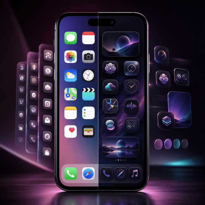
Before you change anything, it helps to know that “customize app icons” covers three different levels of control. First comes recoloring — keeping the real app icon but changing its appearance. Next is replacing an icon with a custom image of your own. Third, applying a whole coordinated icon pack so your Home Screen reads as one theme. Apple’s built-in menu only does the first; the other two need the Shortcuts app or a third-party app.
Picking the wrong level is the usual mistake, and it costs time: a quick recolor takes 30 seconds, while a full custom set can take 30 minutes by hand because every app is done separately.
This matters because Apple changed the rules recently. In iOS 18, the Home Screen gained a real Customize menu with Dark, Tinted, and larger icon options. In iOS 26, Apple’s Liquid Glass design added a Clear (translucent) look, so icons can sit like frosted glass over your iPhone wallpaper. According to Apple’s 2025 software design announcement, these icons render “in light, dark, tinted, or clear looks.” What Apple still does not give you is a single toggle that swaps every icon for a custom picture, that part you assemble yourself, which is why this guide cover all three methods rather than one.
Does iOS 18 have custom icons?
Yes and no. iOS 18 introduced native icon styling — you can tint, darken, or enlarge icons from the Home Screen with no third-party apps. But iOS 18 doesn’t let you point an app at any random photo through that menu; for a fully custom icon image you still use the Shortcuts app, exactly as on iOS 16 and 17.
iOS 26 keeps the same split: more built-in styles (now including Clear), but custom artwork still goes through Shortcuts or an icon app. So “does iOS 18 have custom icons” depends on whether you mean recoloring (built in) or your own images (Shortcuts).
Decide your goal first. If you only want a cleaner, color-matched Home Screen, the built-in method below is faster and keeps every app behaving normally. If you want a specific picture or a themed set, skip ahead to Method 2 or 3. Pairing icon changes with matching Home Screen widgets ties the whole look together.
The 3 Ways to Customize iPhone App Icons (The Icon Method Matrix)
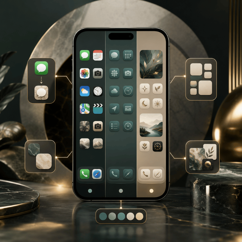
There are three real methods to change app icons on iPhone, and picking the wrong one wastes the most time. Apple’s built-in menu restyles everything in seconds but can’t use your own images. Shortcuts gives total image control but adds friction per app. An icon-pack app sit in the middle: less freedom than Shortcuts, far less effort. That table below, call it the Icon Method Matrixcompares all three across the six things that actually decide which one you’ll be happy with a week later.
| Factor | 1. Built-in Customize | 2. Shortcuts app | 3. Icon-pack app |
|---|---|---|---|
| Effort | Seconds, all icons at once | 5–8 steps per app | A few taps per set |
| What it changes | Color/tint, dark, clear, size | Any custom image you choose | A coordinated icon pack |
| Launch behavior | Normal — real app icons | Brief load delay on iOS 26 | Same as Shortcuts (uses a profile) |
| Reversible | Instantly (Default) | Delete the shortcut | Remove the profile/shortcut |
| Cost | Free | Free | Free / freemium |
| Best for | Fast, tidy recolor | One or two custom images | A full aesthetic theme |
Method steps verified against Apple’s Home Screen customization guide; launch-delay behavior from iOS 26 user reports.
The 4-Question Icon Method Picker
- Want to recolor everything in one go? → Built-in Customize (Method 1).
- Need a specific picture on one or two apps, for free? → Shortcuts (Method 2).
- Want a whole matching set without 30 manual shortcuts? → an icon-pack app (Method 3).
- Care most about badges and instant launching? → stay on Method 1; skip custom-image methods for alert-heavy apps.
Can you change app icons on iPhone without using Shortcuts?
Yes. Two of the three methods skip Shortcuts entirely. The built-in Customize menu restyles real icons with no Shortcuts at all, and icon-pack apps apply custom images through an installed profile rather than a Shortcuts redirect. The only reason to use Shortcuts is when you want your own specific image on a single app for free.
If the Shortcuts hassle is what’s putting you off, an icon app is the no-Shortcuts route, see our step-by-step on the iPhone customization walkthrough for a side-by-side.
Method 1: Tint, Darken or Clear Icons with iOS 26’s Built-In Customize Menu
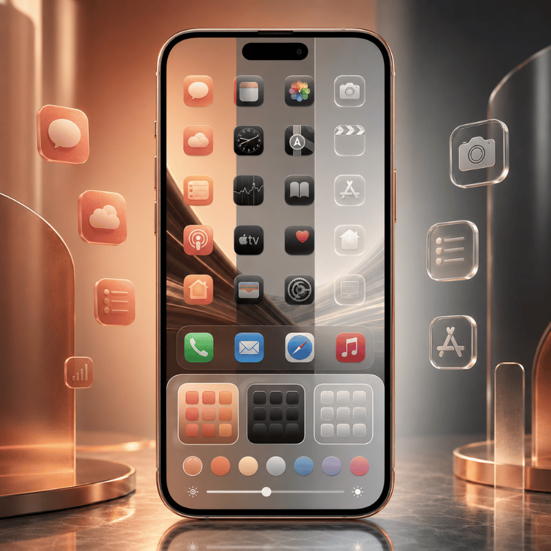
Apple’s own menu is the fastest way to change app icons, and it restyles every icon at once in about 30 seconds. That speed matter in practice: because these stay real app icons rather than launcher tiles, you avoid the launch delay problem entirely. Touch and hold an empty part of the Home Screen until the icons jiggle, tap Edit at the top, then tap Customize. You’ll see appearance buttons along the bottom. This is the same flow on iOS 18 and iOS 26, with iOS 26 adding the Clear option.
- Touch and hold the Home Screen background until icons jiggle.
- Tap Edit → Customize.
- Default keeps original colors; Dark gives a dark mode icon set (tap Auto to switch dark at night, light by day).
- Tinted recolors every icon, use the color and saturation sliders, or the eyedropper to pull a color straight from your wallpaper.
- Clear (iOS 26) makes icons translucent glass; then choose Light, Dark, or Auto.
- Tap the size button for larger icons (app names disappear at large size), then tap an empty area to finish.
Apple’s full reference is the Customize apps and widgets on the iPhone Home Screen guide. Its big advantage is that these stay real app icons, so Mail and Messages badges keep working and apps open instantly. Unlike Android, where a launcher can swap every icon system-wide, your iPhone keeps each change cosmetic and reversible.
Clear icons look great in photos but can vanish against a plain or busy wallpaper. If your Settings, Clock, or App Store icons suddenly look hard to read in Clear or Tinted mode, switch that style’s Light/Dark setting, or pick a calmer wallpaper before you commit to the glass look.
Method 2: Make Fully Custom App Icons with the Shortcuts App (Free)
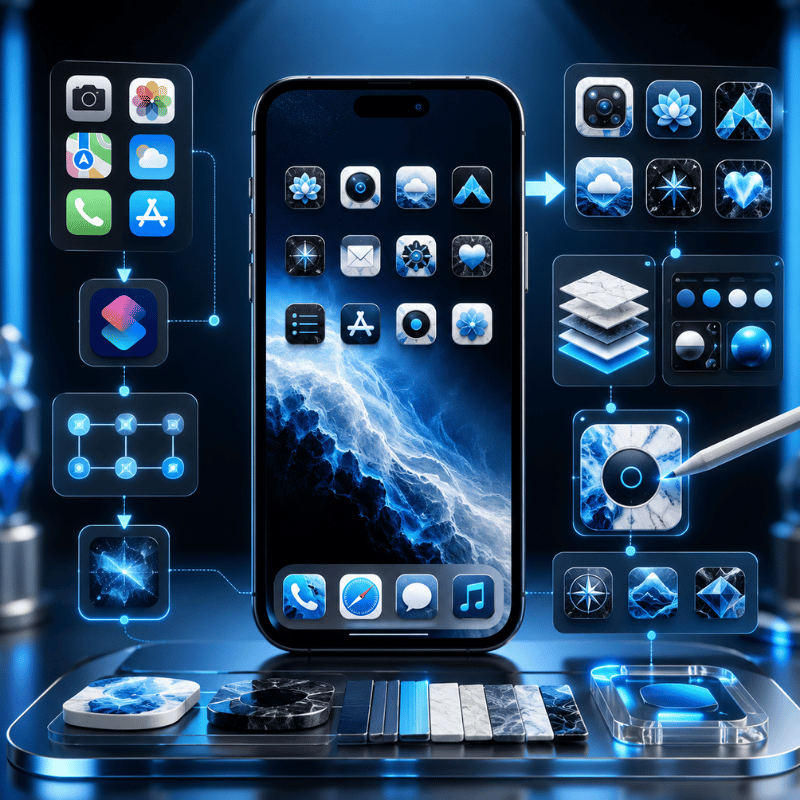
When you want your own image, a hand-drawn glyph, a monochrome icon pack, or a photo, the free Shortcuts app is the no-cost route. This method create a Home Screen tile that opens the target app, and you give that tile any picture you like. You create a shortcut for the app, choose its icon image, and your new icon appears on the Home Screen. It takes about five to eight steps per app, so it’s ideal for a few key apps rather than all of them, and it’s the same way people personalize icons on iOS today.
- Open the Shortcuts app and tap + to create a new shortcut.
- Tap Add Action, search for Open App, and select it.
- Tap App and choose the app you want this icon to launch.
- Open the shortcut’s options and tap Add to Home Screen.
- Tap the placeholder icon image, then pick Choose Photo to pull an image from your Photos app, or Choose File for a saved icon.
- Rename the shortcut (this becomes the icon label), then tap Add.
- Long-press the original app and choose Remove from Home Screen so only your custom icon shows, the real app stays in your App Library.
Your own PNGs work, and so do exported images from a design tool or icon set you saved from Pinterest. Just standardize shape, padding, and background color first, or a random mix from different packs will look messier than the default Home Screen.
How do I change the icon of a specific app?
To change just one app’s icon, make a single Shortcut for that app using the steps above, give it your chosen image, and hide the original from the Home Screen. That custom tile launches the real app, so a custom app icon pack from iScreen or your own photo replaces the look without touching the actual app. Repeat per app, there’s no native “change this one icon” button, which is exactly the friction icon-pack apps remove.
The Shortcuts Tax: the launch delay nobody mentions
Here’s the trade-off thin tutorials skip, call it the Shortcuts Tax. Because a custom icon is a launcher tile, not the real app icon, iOS has historically added friction. On iOS 14 and 15, tapping a custom icon flashed a banner and bounced you through the Shortcuts app first. Around iOS 16 the “Open App” action removed that banner for most users, and apps opened almost directly, the tax nearly disappeared. Then iOS 26 reintroduced a different version: users report a brief load delay when swiping between pages of custom icons, with one iOS 26 thread drawing 154 votes describing icons that “take a long time to load.” That lag is usually only 1 to 2 seconds, but it’s a real trade-off because it repeats every time you open the app. In short, the Shortcuts Tax changed shape across iOS 14 → 16 → 26 but never fully went away.
“After switching to iOS 26 my custom app icons have a slight delay when swiping between pages, it ran perfectly before.”
So if instant launching and reliable badges matter to you for chat, email, or task apps, leave those on real icons (Method 1) and reserve Shortcuts for the handful of apps where the look matter more than the millisecond. That brief lag is the main downside of custom-image icons, and it’s worth weighing before you convert your whole Home Screen.
Method 3: Use an Icon Changer or Theme App for One-Tap Icon Packs
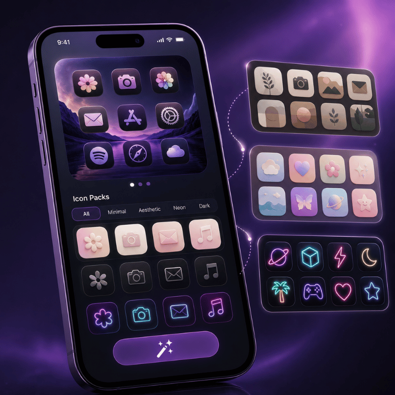
An icon-pack app is the answer when you want a whole matching set without building 30 shortcuts by hand, a process that can take 30 minutes or more for a full Home Screen. These apps let you browse coordinated icon packs, pick a style, and apply a 30-icon set in under 2 minutes, far faster than the manual route on your phone. In practice, this is the use case where an app clearly win: the trade-off of doing it by hand is the time, and the risk is an inconsistent result. Under the hood they still rely on a custom-icon mechanism (an installed profile or batch shortcuts), so the launch behavior is similar to Method 2, but you skip nearly all the manual setup, and many apps advertise themselves as needing no Shortcuts steps at all. Some app developers also ship alternate icons inside their own apps, which you switch from the app’s settings, the cleanest option when it’s offered.
This is where a customization app earns its place. iScreen, for example, catalogs 5,000+ icons, 10,000+ themes, and 500+ widgets, with coordinated theme kits so your icons, widgets, and wallpaper share one palette in under 1 minute. This works because the pack enforces one palette for you, which is exactly the consistency a hand-built set struggles to hold. A pack’s payoff over one-off swaps is consistency: a curated set keep shape language and color weight uniform, which is the single biggest reason a custom Home Screen looks intentional rather than chaotic. Browse a custom app icon pack set to see how a unified palette read.
“A pack of 30 icons that share one palette will always beat 30 great icons from different sets. Consistency of shape and tone is what makes a Home Screen feel designed, not downloaded.”
What to check before installing any icon app: confirm it’s free or clearly priced, review what an installed profile can access, and make sure removing it cleanly restores your original icons. Reputable icon and theme apps from the App Store are App Store-safe and reversible, no jailbreak, no risk to the apps themselves.
How to Design a Cohesive App Icon Look (Aesthetic)
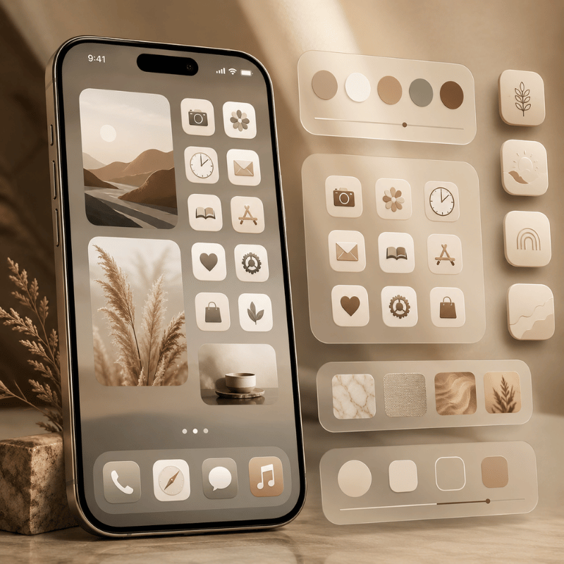
Honestly, the hardest part of an aesthetic Home Screen isn’t the how, it’s the taste. A custom set look polished when three things stay consistent: one style family (all line icons, all glyphs, or all photo tiles, not a mix), a tight palette of 2 to 3 colors, and a background that frames rather than fights the icons.
In practice, the most common mistake is mixing packs: the problem is that two near-identical pinks rarely match, and the clash is obvious within seconds. That same palette discipline lets you personalize your lock screen to match, so the whole phone read as one look. Most messy makeovers break the first rule by pulling cute icons from several packs at once.
A real example: someone rebuilds a soft pink-and-gray Home Screen, grabs a free pastel set for half the apps, then fills the gaps with leftover icons from an older pack. The shapes don’t match, two pinks clash, and the screen look busier than when they started. That fix is boringly effective, pick one pack, accept that a few apps will use a near-match rather than a perfect one, and let the wallpaper carry the personality. For palette and layout ideas, our roundups of aesthetic iPhone home screen setups and iPhone home screen ideas (linked below) show full themes you can copy. Pulling inspiration from Pinterest or Instagram is fine, just commit to one direction before you start tinting.
Treat icons as one layer of a bigger look. Truly coordinated screens match icons to a full iPhone theme — wallpaper, widgets, and even a matching font on your widget text — so the eye reads one palette instead of four separate decisions. Apps like Widgetsmith pair custom widgets with your icon set for that finished feel.
Troubleshooting: Launch Delay, Reverting Icons & Missing Apps
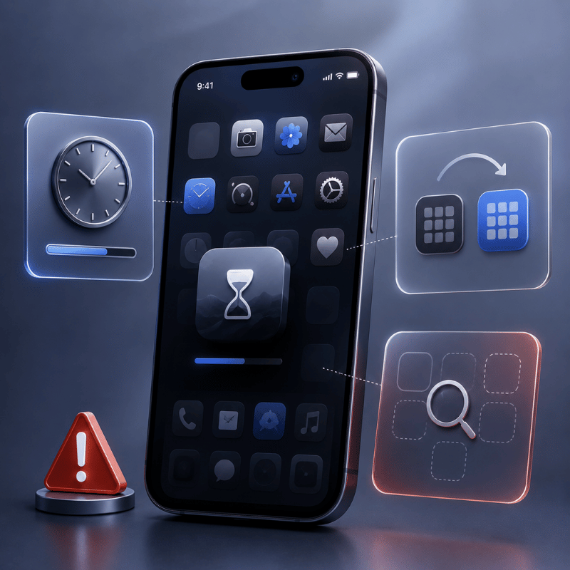
Custom icons are cosmetic and fully reversible, so nothing here’s permanent. In practice, the three problems people hit most each have a fix that take under 1 minute, because nothing here touches the actual app or your data, and none require a jailbreak or a factory reset.
- ✔Custom icons load slowly (iOS 26): this is the Shortcuts Tax. Reduce how many custom-icon pages you swipe through, keep alert-heavy apps on real icons, or revert those apps to default until Apple tunes the animation.
- ✔“My app disappeared”: it didn’t. When you hide an original app to show a custom icon, the real app moves to the App Library, swipe to the last Home Screen page or search to find it.
- ✔Undo everything fast: for built-in styles, reopen Edit > Customize and tap Default. For Shortcuts icons, delete the shortcut tile and unhide the original. For an icon app, remove its profile or shortcuts and your default icons return.
One reassurance worth stating plainly: you’ve never needed to jailbreak to customize iPhone app icons. That old jailbreak-only era ended years ago, today the native menu, Shortcuts, and App Store icon apps cover every level of customization safely. If you want the whole home screen redone rather than just icons, our guide to iPhone themes walks through assembling the full stack.
What’s Changing: iOS 26 Liquid Glass and the Future of iPhone Icons
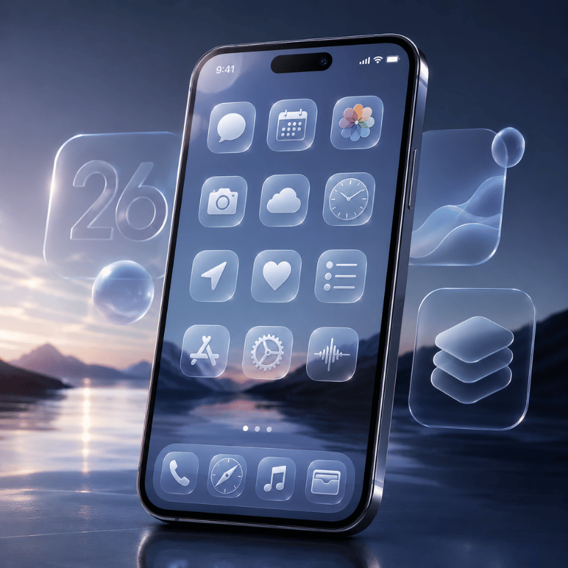
A bigger shift is underway: Apple keeps inching toward a system-wide icon look, but the gap that keep third-party packs relevant isn’t closing. iOS 26’s Liquid Glass design and its Clear, Tinted, Dark, and Light modes are Apple’s closest move yet to a one-tap “theme my icons” switch.
Apple even shipped Icon Composer so developers can build icons that adapt to all four looks. Yet the rollout drew real friction: users on r/apple report Liquid Glass making icons look crooked or tilted in Dark, Clear, and Tinted modes against dark backgrounds, and the swipe-load delay above frustrated people who’d built custom layouts. The problem, in practice, is that Apple’s styles still can’t match a specific look, so the trade-off of waiting for a future update is real.
What this means for you in 2026 is practical: if you want a specific aesthetic, a particular pastel set, a monochrome work screen, a seasonal makeover, Apple’s built-in styles still can’t deliver it, so an icon-pack app or Shortcuts remains the only route to true art-direction. Designers are pushing the same way, with 2026 icon design trends split between soft 3D and hyper-minimal, plus a rise in AI-generated icon sets. If you’re planning a refresh now, start from the built-in Clear/Tinted look for speed, then layer a coordinated pack on the apps you care about most, that combination ages better than betting on Apple to ship a full theme engine next cycle.
📐 Action for 2026:
Recolor everything with iOS 26’s Tinted or Clear mode first (30 seconds), live with it for a day, then commit to a custom icon pack only on your most-used apps. You get an instant refresh now and a true theme where it counts, without the full Shortcuts grind.
Want a coordinated icon pack, matching widgets, and wallpaper in one place?
Frequently Asked Questions
Q: How do I get cute app icons on my iPhone?
View Answer
Q: Can you change app icons on iPhone without Shortcuts?
View Answer
Q: Does iOS 18 have custom icons?
View Answer
Q: Why do my custom app icons open slowly?
View Answer
Q: Are custom app icons free?
View Answer
Q: How do I get my original app icons back?
View Answer
Why We Tested These Methods
Every step here is cross-checked against Apple’s official Home Screen guide and WWDC25 notes, and the Shortcuts launch-delay timeline is drawn from current iOS 26 user reports. Design guidance in the cohesive-look section reflects iScreen’s icon and theme catalog. Reviewed by the iScreen team.
References & Sources
- Customize apps and widgets on the iPhone Home ScreenApple Support
- Apple introduces a delightful and elegant new software designApple Newsroom (2025)
- Say hello to the new look of app icons (WWDC25, session 220)Apple Developer
- Icon design trends 2026 — Envato
- How to customize your iPhone’s app icons — The Verge
