
.png)
iPhone Home Screen Layout Ideas: 30+ Aesthetic Setups to Copy
You’ve heard it before: your iphone home screen layout is used more frequently than anything else you own. (More than 80 times a day on average, give or take). What the heck?
So it pays to invest a little time. The gap between a jumbled grid and an iOS configuration you truly covet the creative layout idea, is enormous. Here: 30+ aesthetic layout ideas to try, the new iOS 26 customization interfaces Apple introduced last fall, and what not to do.
All that you see below is based around Apple’s launch and shipment with the iOS 26 Liquid Glass design language and also a test run against r/iOSsetups community patterns through out 2025 and 2026.
Quick Stats — iPhone Home Screen Customization 2026
| iOS 26 release window | Fall 2025 (previewed June 9, 2025) |
| New customization layer | Liquid Glass design system |
| Icon style options | 4 modes (Default / Dark / Tinted / Clear — Clear is new) |
| Apple Smart Stack widget limit | Up to 10 widgets per stack |
| iPhone home screen grid | 6 rows × 4 columns + 4-slot Dock |
| Top 5 widget apps install rate (US) | ~15% of iPhones (Sensor Tower) |
| Widget-driven battery impact | ~15% of total battery use (typical) |
| Apple HIG icon assets resolution | 180×180 px @3x (60×60 pt logical) |
| Style families in this guide | 6 (Minimalist / Pastel / Dark / Glassy / Cottagecore / Vibrant) |
| Last updated | 2026-05-26 |
What Makes a Great iPhone Home Screen Layout in 2026?
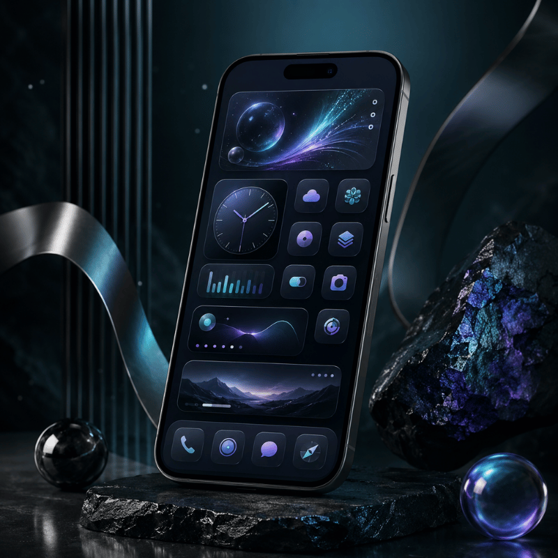
You don’t just come up with the ultimate iphone home screen layout once – you figure out four levels of layered decisions and then bring it all into sync with itself. Once you see the pile, you’ll get rid of the urge to wrestle with your phone and begin shaping it.
The 4-Layer Layout Stack
- wallpaper layer- the most base visual layer. Controls tone and feel of the artwork as a whole, including color scheme.
- widget layer – informational layer. Time, weather, calendar, activity – everything you see it without opening application
- This is the official stock icon set icons used for some apps and iOS 26 introduced the official visual cohesion with 4 styles plus tinting.
- Folder & page logic – navigation tier. Dock, first page, additional pages, App Library overflow.
The layout’s iPhone home screen: each one is a rigid 6-by-4 grid and a 4-cell dock, using 180180 p× icon images at 3×. You can’t drag icon where you please – in fact, every layout decision is an answer to which one of those 28 places to fill. Which sounds like an annoyance – but is actually a feature: it keeps people from defaulting to “more apps”.
The most powerful layout signal is opening your phone and seeing that what’s on screen aligns perfectly with why you’re picking it up. Open calendar widget six times day, it should be in page 1. Open App Store twice a month and no way it should be in the dock.
Bad layouts aren’t ugly, they’re mistaken about what the user really cares about.
The iOS 26 Customization Revolution — What’s New in Liquid Glass
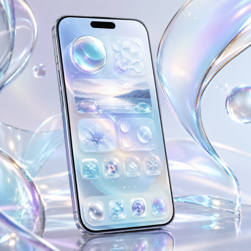
iOS 26, previewed by Apple on June 9, 2025 and released as a free update for iPhone 11 and later in fall 2025, is the biggest home screen customization shift since iOS 14 introduced widgets. The headline change is a new visual material called Liquid Glass — a translucent layer that reflects and refracts whatever sits behind it. Apple describes it as the design system extending across iOS 26, iPadOS 26, macOS Tahoe 26, watchOS 26, and tvOS 26.
In particular, four things about the home screen are different, so far as those trying to design any layout might be concerned.
- The fourth icon type — Clear. With the recent iOS 26, Clear was introduced to the bunch of Default, Dark and Tinted icon styles. The Clear icon is a fully transparent version which takes on the color from your wallpaper while the white text and shapes remains visible.The four styles were photographed by MacRumors inside the customization panel.
- Tinted icons took on a totally new dimension In iOS 18, a tinted icon was a black background with coloured graphic details. In iOS 26, the colour icon matches the color you picked with white details in Light Mode, or a more obscure nuance of that same color in Dark Mode. It’s the same setting that looks very different indeed.
- Set icons match a given color. The all-new feature can set icons automatically match their physical iphone color. Case-users with dark blue iPhones17 Pros will be able to choose for all of their icon set colors to be changed automatically to the color of their physical iphone
- Place on widget bottom or edit on wallpaper. The clocks can hold Widgets under it now, and I placed them there. Placing them on the widget bottom is a new feature.Or make the editing direct on the wallpaper through the home screen with no need for any more sisfug’s
There’s also a new “Always” and “Auto” toggle in the new customization settings to allow for a constant Light or Dark mode, or the automatic switching based on time and the old Small/Large icon sized buttons now appear in the upper right corner of the interface. Apple themselves stated in June 2025 this was a series of “new customization options to app icons and widgets, including a stunning clear look.”
“The new design extends across iOS 26, iPadOS 26, macOS Tahoe 26, watchOS 26 and tvOS 26 — crafted with a new material called Liquid Glass that reflects and refracts its surroundings, while dynamically transforming to help bring greater focus to content.”
— Apple Newsroom, June 9, 2025
layout implication: If you’re using iOS 26, most of the aesthetic designs listed here will appear very different (many of them improved!) compared to how the identical design appears in iOS 18, solely because the icon framework is entirely new. On iOS 18, ‘Clear’ or ‘Matched’ setting in each of the steps will automatically revert to the Default or Tinted – we point these out in the customization walkthrough below.
30+ Aesthetic Home Screen Setups — 6 Style Families to Copy
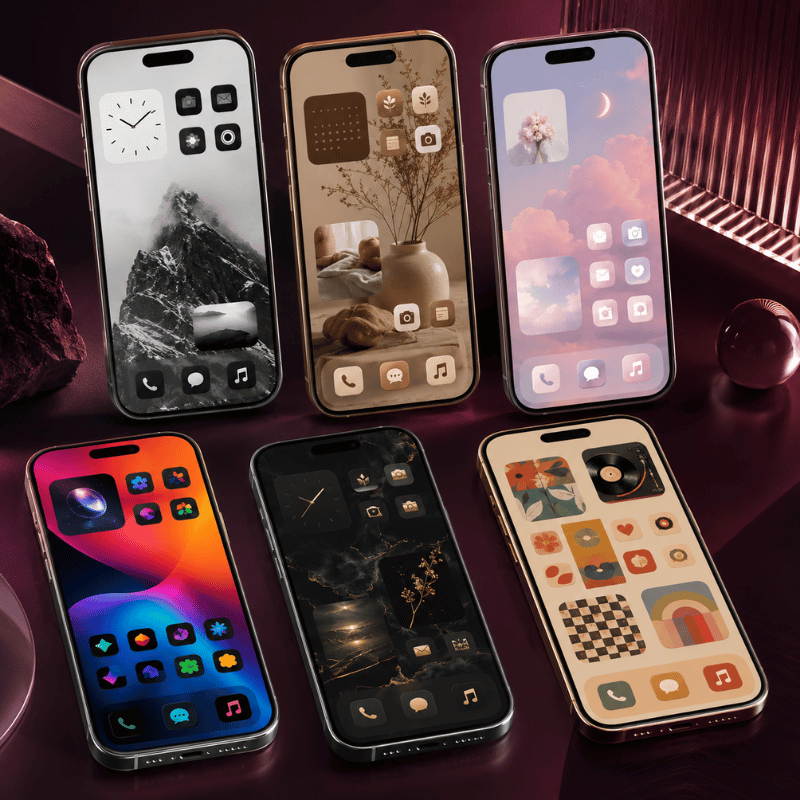
Instead of a list of 30 non-sequitur examples, I’ve organized the 31 creative ios home screen ideas into 6 style families. First select the family of your preference, then borrow any one of the 5 starting point setup variation. In the beginning, I show every setup setup listing the wallpaper feel, the widget count, icon style, and the vibe, just one line for copying: Each iphone wallpaper selected was the element of the group, though an alternate can be inserted for your own personal photo if the atmosphere corresponds.
Family 1 — Minimalist & Clean
Restraint as the design decision. One-pager, mono or near-monochrome, breathing room over density. At its best, really, when you have and *use* fewer than 15 apps and want to feel more zen in your pocket.
- One Page-dock of four essentials, one home screen for 8-10 apps I open frequently, other stuff handled by App Library. Off white/warm gray wallpaper.Default icons.
- The Dark Void – pure black wallpaper, Dark icon mode, 6-8 often used apps, no widgets. Made with OLED battery life in mind on iphone 12 Pro and later.
- The Margin Master – Center-aligned single column of icons, plenty of negative space, and an abstract gradient wallpaper to ground the visual elements. Use a single time widget if desired.
- The Two-Row Wonder – Only the top two rows of icons are used; the bottom part of the grid is left empty to reveal the wallpaper below. Abstract or photographic wallpapers add significant visual impact.
- The Subtle Tint – default icons paired with colors sampled from the wallpaper using iOS 26’seyedropper Tool ( Tinted Mode ). Minimal deviation from defaults, subtle uniformity without going for all out Clear .
Family 2 — Pastel & Soft
Low-saturation, warm color palettes that evoke a sense of calm rather than being strictly sterile. iOS 26’sTinted Mode is key here to apply a unifying color to all icons within the same scheme. Works best with one or two small widgets; an excess breaks the peaceful atmosphere.
- Lavender Dream – Lavender gradient wallpaper, all icons tinted the same lavender color, and a single, small calendar widget in matching hues. Cream Dock background created with a crop of the same wallpaper design.
- Peach Sunrise – Gradient shifting from peach to cream colors, with Tinted peach icons. Include a two-widget stack (weather information overlaying time) in similar colors.
- Sage Botanical – A soft sage green wallpaper, complemented by a botanical or illustrated leaf variant and sage-tinted icons. Display a favorite plant photo within a widget for personalization.
- Mint Modern – Primarily mint green, featuring Clear (iOS 26 only) icons that reveal the underlying mint green, with a restricted number of frequently used apps.
- Cream & Coffee – Cream wallpaper, Tinted icons in warm brown, and a single weather widget in complementary shades, giving off a journal-like aesthetic.
Family 3 — Dark Mode & OLED
Beneficial for OLED devices (e.g., iphone X and subsequent models), as perfectly black pixels are switched off, saving energy. Using a single accent color against black provides sufficient visual interest without being overly vibrant, which can appear overwhelming against dark backgrounds.
- Pure Black OLED – Pure black wallpaper, Dark icon style, and one single tinted widget. Offers the best battery efficiency and highest contrast.
- Cyber Neon – A black wallpaper highlighted by a single neon color accent (such as electric pink or purple). Tinted icons should match the accent color, and use two glow-effect widgets for dynamic flair.
- Carbon Fiber – Dark gray wallpaper with a carbon pattern pattern, gray Tinted icons, and monochrome widgets, delivering an industrial look without clichés.
- Midnight Blue – Deep navy wallpaper, blue Tinted icons (adjusted to match your wallpaper via Match Wallpaper), and one weather widget, striking a balance between formality and accessibility.
- Matrix Green – Black wallpaper with a faint green coding rain texture, Tinted green icons using the predefined iOS 26 palette. A niche yet decidedly iconic choice.
Family 4 — Glassy & Liquid Glass (iOS 26 only)
Introducing the new aesthetic family, only available in iOS 26. Clear icons allow your wallpaper to shine through, turning the layout into a single layered image. This works best with photographic or gradient wallpapers, as solid colors don’t offer much refraction for Clear icons.
- Clear Cascade – Utilizing a cherished photo wallpaper and Clear icons, augmented with three translucent widgets that adopt the wallpaper’s color tones. The result is a unified image across the screen, with icons appearing to float on top.
- Frosted Pane – A wallpaper with a subtle gradient effect (such as a deep teal to navy gradient), paired with Clear icons and a single glass-like weather widget, resembling frosted window glass.
- Aurora Glass – Aurora photograph wallpaper, Clear icons, a single Smart Stack widget cycling through info. The aurora colors show through every icon.
- Matched Glass – Wallpaper-matched Tinted icons via the Auto option, so icons automatically pull from the dominant wallpaper hue. Re-sets when you change wallpaper.
- Pure Translucent – Single solid color wallpaper (deep emerald or burgundy), Clear icons, no widgets. Severe but striking.
Family 5 — Cottagecore & Earthy
Warm naturalistic palettes – paper, wood, soil, plants. Pair with sepia or warm-tinted icons. Resists the cold tech feel that pure dark or pure pastel layouts can have.
Reads as cozy.
- Forest Floor – Forest floor photograph wallpaper, warm earth-tinted icons, brown weather widget.Smells like petrichor.
- Vintage Paper – Aged paper texture wallpaper, sepia widgets, default icons (the contrast works).Reads like an old journal.
- Garden Path – Garden or wildflower photograph wallpaper, soft botanical illustration variants for widgets, light green tinted icons.
- Cabin Coziness – Wood grain texture wallpaper, warm amber Tinted icons, a single calendar widget styled with handwritten font apps if possible.
- Botanical Library – Plant illustration wallpaper from a vintage botanical print, brown widget stack. Folders named for plant types (Succulents, Ferns) instead of generic categories.
Family 6 — Vibrant & Maximalist
For people who actually want a busy phone. Every-corner-used, multiple widgets, photo or illustration wallpapers with full saturation. The “lots of apps and I like seeing them” approach.
Works best when you actually open most of what’s on screen.
- Color Explosion – Bright multi-color gradient wallpaper, Default icons in full color, four widgets across two rows.Loud, alive.
- Sunset Pop – Sunset photograph wallpaper (warm pink-orange-yellow), warm Tinted icons, three widgets at the bottom (a Liquid Glass placement).
- Tropical Burst – Tropical leaf or beach wallpaper, Default icons for full color punch, five-plus widgets spanning the layout.
- Retro 80s – Synthwave grid wallpaper, pink-and-purple Tinted icons, two widgets styled in the same neon palette. Big “Stranger Things” energy.
- Bookshelf Maximalist – Bookshelf or library wallpaper, folders named like book genres, multiple widgets stacked like decorations.
- Mood Board – Photo collage wallpaper showing personal photos, a large Photos widget centerpiece, two Smart Stacks at the bottom.The phone as scrapbook.
Save your finished layout as a screenshot before experimenting with the next one.
If you decide to go back, having the photo means you can rebuild the original layout in 5 minutes instead of half an hour of trial-and-error.
How to Choose Your Layout Style — The 3-Question Style Picker
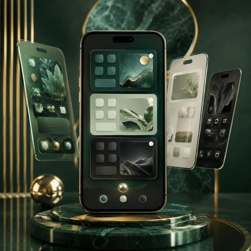
Looking at 30+ setups is fun for inspiration but useless for actually deciding.
This three-question filter narrows down to one or two families based on how you use your phone, not which screenshot you liked. Answer honestly – the picker is only useful if the answers are about your actual habits, not your aspirational ones.
| Question | Answer A | Answer B | Answer C |
|---|---|---|---|
| Q1. Apps you open daily? | Fewer than 12 | 12 to 25 | More than 25 |
| Q2. Color preference? | Muted / neutral | Warm / earthy | High contrast / vivid |
| Q3. How do you use your phone? | Focused, one task at a time | Browse and graze | Multitask all the time |
Now match your three answers to the recommended family:
- A A A Minimalist & clean (Family 1). Few apps, muted, focused – restraint is the entire point.
- A B A Pastel & Soft (Family 2). Few apps, warm palette, focused – soft minimalism with warmth.
- A C A Dark Mode & OLED (Family 3). Few apps, high-contrast, focused – accent-on-black discipline.
- B A B or B A C Glassy & Liquid Glass (Family 4, iOS 26 only). Moderate apps, muted, multi-tasking – Clear icons let the photo show through.
- B B B Cottagecore & Earthy (Family 5). Moderate apps, warm earthy, browse pattern – cozy without clutter.
- C C C Vibrant & Maximalist (Family 6). Many apps, vivid, multitask – embrace the busy.
If your answers cross categories (A-B-C), pick the family that matches Q1 (app count) – that constraint matters most. Color preference and usage pattern adjust the variant within the family.
How to Customize Your iPhone Home Screen — Step-by-Step (iOS 26 + iOS 18 Fallback)
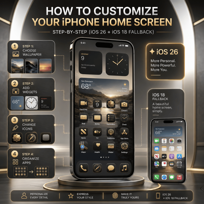
There are exactly four layers to touch, in this order: wallpaper, widgets, icons, folders. Doing them out of order is why most attempts end up cluttered – you cannot pick an icon tint until you know what color your wallpaper actually is, and you cannot decide widget placement until you know what apps are landing on the first page. Allow about 15 minutes start to finish.
Step 1: Set the wallpaper (the foundation layer)
- iOS 26: Long-press an empty area of the home screen tap the wallpaper picker icon. (New: you no longer have to go through settings.)
- iOS 18 fallback: settings wallpaper Add New Wallpaper.
- Pick from Photos, Apple’s built-in collections, or a solid color. For Family 4 (Liquid Glass), avoid pure solid colors – they leave Clear icons nothing to refract.
- Apply to home screen specifically (not just Lock Screen). Many “messy looking” layouts are caused by accidentally only changing the lock screen.
Step 2: Place widgets (the information layer)
- Long-press the home screen until icons jiggle tap Edit in the upper left Add widget.
- Pick widgets first by what you actually check often (calendar, weather, activity rings, time), then by what they look like. Function before form.
- Stack related widgets: drag one widget on top of another to create a stack. Apple supports up to 10 widgets per stack per Apple Support’s widget documentation, with Smart Stack rotating automatically based on time and usage.
- iOS 26 new placement: widgets are no longer locked to the top of the screen. Drag a widget to the bottom rows if you prefer a Liquid Glass look with information closer to your thumb.
Step 3: Theme the icons (the cohesion layer)
- Long-press an empty area tap customize in the lower right (iOS 26) or use settings Display & Brightness (iOS 18 partial fallback).
- iOS 26 shows four icon styles – Default, Dark, Tinted, Clear. Pick one. If you choose Tinted, you also choose a color: preset palette, eyedropper from wallpaper, or Auto (matches device case color).
- The Small / Large size buttons are now in the upper right of the customization panel (relocated from iOS 18). Large icons remove labels and expand each icon to fill more of the grid – cleaner look, easier to tap.
- Toggle Always / Auto for permanent style versus time-based switching.
Step 4: Arrange folders and pages (the navigation layer)
- Drag any icon on top of another to make a folder. To rename the folder, tap the name field once.
- If you need to reduce clutter, then you can hide pages you don’t use much. Long-press an empty spot on the page, tap the group of small page dots at the bottom, and uncheck the pages you want to hide. They’re not deleted; they just move to the App Library (located beyond your last home page on the left).
- Consider using App Library for anything you touch less than once a week. You don’t want more than 3 folders on your actual home screen anyway.
- More than 3 folders means the folders themselves become a new kind of visual clutter, which is exactly what we’re trying to avoid with the folder system.
Q: How do I get my iPhone home screen back to normal?
If you feel you’ve gone too far and want to start over, Apple provides a couple of options: settings General Transfer OR Reset iphone Reset Reset home screen layout. Both will reset your screen to Apple’s original state for page 1, moving all other apps into the App Library. wallpapers, widgets, focus modes, and icon tinting are not affected by these resets; undo these changes individually. This process does not delete any applications or data, it simply reverts their placement. Afterward, you may wish to rebuild your home screen from one of the 31 configurations outlined above.
App Icon Themes — iOS 26 Native Tint vs Custom Shortcuts Method
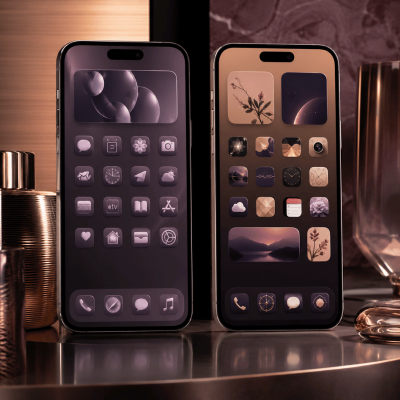
By 2026, there are really two paths toward a themed home screen and they serve distinct purposes: the native iOS 26 Tint or Clear option applies a system-wide visual style across all of your icons, while the Shortcuts trick replaces individual icons with your own custom images. Which route you choose depends on whether you’re aiming for a consistent atmosphere or per-app custom icons.
| Method | iOS 26 Native Tint / Clear | Shortcuts Custom Icons |
|---|---|---|
| Visual scope | All app icons system-wide | Per-icon, one at a time |
| Setup time | Under a minute | 2-3 minutes per icon |
| iOS version | iOS 26 only (Clear); Tinted available iOS 18+ but behaves differently | iOS 14 onwards |
| Loading behavior | Opens app directly | Brief Shortcuts flash before app loads (annoying for daily-use apps) |
| Original app icon | Recolored / transparent but recognizable | Hidden — original goes to App Library |
| Best for | Whole-screen aesthetic shifts | A handful of feature icons in a curated theme pack |
The Tint route: Go to your home screen, long-press an empty spot to enter the Jiggle mode, then long-press on the icon of your choice to make it highlightable. Or long-press and then tap “iconize”. From there, tap Tinted, select from one of the preset palettes, use the eyedropper for custom colors, or enable Auto for a color balance based on your device’s wallpaper. For a visual guide to all tint settings, refer to MacObserver’s complete guide.
Q: What app are you using for the icons?
While an iOS 26 native tint option exists, most people will probably skip it. If you still want a unified color palette across all of your icons on your iOS device and aren’t using Shortcuts, the native Tint feature is the way to go. For custom images per application (or full theme packs for cottagecore icons, minimal line icons, and so on), Apple Shortcuts are the primary method in 2026, supplemented by Widgetsmith for matching widgets and specialized icon apps like iScreen or Widgetable for curator icon packs.
It’s important to note that using Shorts-as custom icons is technically-will break Spotlight search image recognition on many occasions, so you won’t see the custom icon in search results, which could be confusing with an abstract theme. Therefore, this setup is not ideal if your primary way of launching apps is through Search.
The Core 6 Widget Stack — Which Widgets Actually Earn Their Spot
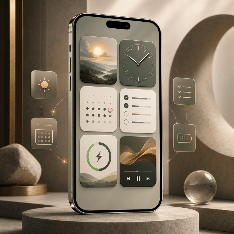
The reality ofaddWidget-ing is way less widespread than you probably imagine. A 2024 TidBITS reader survey of iphone-users revealed nearly 50 percent never cracked open widgets and a lot of other users just had a few widgets they barely used. Widget tracker Sensor Tower says top-5 widget apps barely make it to 15% of iPhones in the US. In short, most people who installed any widgets, installed too many widgets and never actually glanced at them until they grew to resent them as visual clutter.
Widget-adoption in the wild.
A better widget strategy involves starting with a six-widget “core” and only moving up from there if the seventh widget would reduce your overall daily app opens by at least one.
What to include in your widget core, Part 1.
| Widget | Recommended size | Why it earns its spot |
|---|---|---|
| 1. Time / clock | Small (2×2) | Glanceable, replaces lock-screen check |
| 2. Weather | Small (2×2) | High check frequency, low cognitive cost |
| 3. Calendar (next event) | Medium (4×2) | Reduces app-opens to check “what’s next” |
| 4. Activity rings / fitness | Small (2×2) | Behavior nudge — visible goal = more motion |
| 5. Notes (pinned) | Medium (4×2) | Quick capture without app load |
| 6. Smart Stack (rotating) | Large (4×4) or Medium | Replaces 3-4 single widgets in one slot |
Smart Stack is our Workhorse for the Core 6 widgets because it swallows up widgets that don’t merit a devoted chunk of real estate. You can cram as many as 10 widgets into a Smart Stack, and the system intelligently rotates between them based on time, location and usage. (Maybe the calendar at morning; at afternoon exercise; at evening weather, for example.) Many field reports fromr/iOSsetupsand analyses of widget-impacton battery life have arrived at the same conclusion: two or three Smart Stacks with carefully selected content inside work better than 6 stand-alone widgets cluttered up your iPhone home screen.
What to include in your widget core, Part 2.
Q: What is this calendar widget?
The default Apple Calendar (Up Next, Day, List) is your top choice if you can spare no energy beyond simply enabling a widget because the default widget automatically syncs with your Apple Calendar entries without any further configuration. Third-party Calendar widgets, such as Fantastical and Structured, or widgets for specific date types from Widgetsmith, exist too. One reason for its nearly constant presence in ‘best customization widget‘ screenshotsm is that your calendar is one of the most information-rich data you view on your iphone, since this datum dictates your next action.
Smart Augments and Batter Life
Widgets use about 15% of a iphone’s battery throughout a normal day, and that percentage can grow much more quickly once you start using live-data customization widgets (weather updates by location, dynamic exercise tracking, stock prices in real time, for example). If battery usage is a primary consideration for you, give static customization widgets or less frequently refreshing customization widgets the nod over live data-or just put the less time-critical widgets inside Smart Stacks to space them out through time, instead of laying them all out to get the iphone charged every second.
Third-party tools Augments and apps.
Best Apps for Home Screen Customization — Compared (Honest Trade-offs)
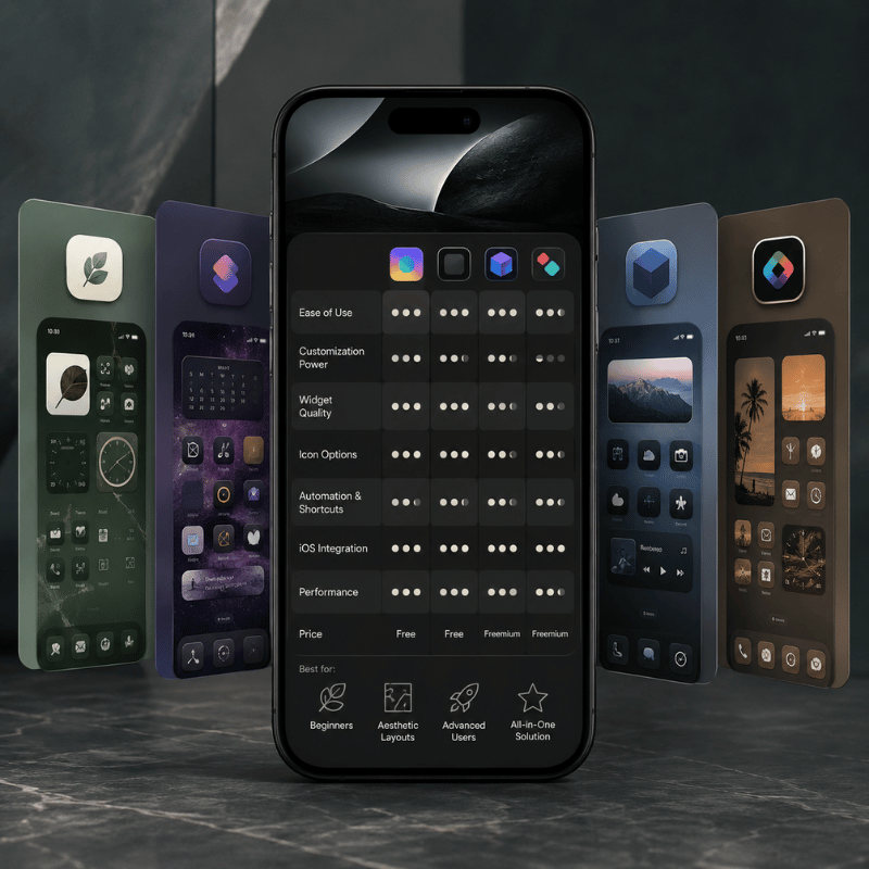
iOS 26 built in a good deal of what previous generations of customization third-party apps helped you accomplish-built-in Tint and Clear tools allow you to eliminate individual apps just to change icon colors. customization still has room for some non-system apps when you need preset icon bundles, interactive elements, lock-screen widgets or icon pack libraries you would not otherwise be able to access.
Anhonest widget’-ing approach.
| App | Core strength | Limitation to know |
|---|---|---|
| Widgetsmith | Deepest widget customization library, mature iOS 26 support, Focus Mode scheduling | Widget-focused — does not theme icons themselves |
| Color Widgets | Pre-made theme packs (apply look + matching widgets in one tap) | Less granular control if you want to tweak individual elements |
| Widgy | “Photoshop for widgets” — layers, transparency, data sources, live info | Steep learning curve; overkill unless you actually design widgets |
| Apple Shortcuts | Free, built-in, full control over custom-icon replacement | Brief Shortcuts flash when opening apps; breaks Spotlight visual recognition |
| Widgetable | Interactive sharing widgets, lock-screen tools, anniversary/birthday reminders | Social-feature focus narrows utility for solo users |
| iScreen | All-in-one aesthetic ecosystem (wallpaper + widgets + icon packs together); currently the #1 ranked app in Apple’s App Store Graphics & Design category for iOS 26 | Single-app ecosystem — best if you want curated cohesion, less flexible if you mix multiple sources |
The honest take: if you only want to change icon color, use the iOS 26 native Tint or Clear option and stop there. If you want a cohesive curated aesthetic where wallpaper, widgets, and icon pack come pre-matched, an ecosystem app like iScreen saves the hours you’d otherwise spend hunting matching assets across separate apps. If you enjoy the design process itself and want maximum control, Widgy is the deep end and Widgetsmith is the comfortable middle. Pick based on whether you value the result or the process.
How to Reset or Restore Your iPhone Home Screen
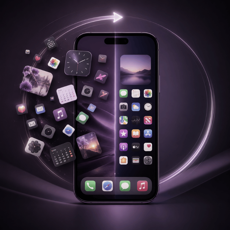
If your layout experiment went badly, the easiest cure is the built-in Apple reset “Reset home screen Layout”-which shoves apps to App Library while re-arranging the originals to the first screen. Your data and apps are saved-but some things change:
- Open Settings.
- Tap General → Transfer or Reset iPhone.
- Tap Reset.
- Choose Reset Home Screen Layout.
- Click “Confirm” now to revert to default Apple screen; your third-party apps go onto new screens in alphabetical order or App Library.
The icon tints and style, the widgets, wallpapers and custom Shortcuts replaced-app icons, and the folder name “ custom “ are left untouched by layout. Reclaim a clear slate by individually reverting those; plan 5-10 minutes after the main part to finish up.
Q: How do I get my home screen layout back to normal?
Use Reset Home Screen to revert to defaults for icons and then-manually-select “wallpapers” from the list (hold down the home screen icon and choose “wallpaper”). To select the defaults “Default for icon” for icon’s styling, hold “Default”. Swipe individual widgets to “Remove”. Total time for reset including clean up: 5-10 minutes; no data lost.
7 Common Home Screen Layout Mistakes That Make Your Phone Look Cluttered
You’ll spot all of these common mistakes on r/iOSsetups and in battery impact reports; these issues aren’t personal -they’re simply those traps anyone running into customization runs into.
- 1. Mismatched widget colors fighting the wallpaper.
To put it plainly: don’t pick the two most visual elements on your screen (a widget and wallpaper) in warring colors. If your widget and wallpaper conflict, your choice either drowns in “visual noise”; or pick gray widgets to contrast sharply with photos. Luckily iOS 26 automates matching wallpaper and widget colors: “Auto-tint” in settings for the selected wallpaper changes the widget tint in sync with the wallpaper’s chosen tone. - 2. More than three folders on the home screen.
When you tap folders twice or thrice, just to locate the app within, you start to avoid even those apps you most often need-better yet keep only essential apps visible and rely on App Library for everything else. - 3. Smart Stacks with conflicting categories.
A Smart Stack could seem efficient if filled with calendar, weather forecasts and stock prices – but in this case, items randomly come to the surface because they are irrelevant to each other. Group items that seem to make sense together, e.g. “Morning routine”: Weather, Calendar, activity summary; “ evening routine ” : screen time , Notes , reminders . - 4. Themed icons that break Spotlight search.
themed icons take place of the default app identity for Spotlight. This disorients for results when searching in Spotlight by tapping in your keywords. themed icons are for when you open apps manually instead. - 5. Wallpapers that hide the dock.
Avoid placing busy or very dark wallpaper behind your Dock. As Apple’s own layout guidelines suggest- “ The area of interaction needs to be more contrasty in respect to elements of background .” -a Dock should therefore always be distinguishable from the backdrop. - 6. Designing for landscape when you use portrait.
iphone home screens appear vertically. If you set landscape photo as wallpaper, the image’s visual focus will often end up in the far corners – your sunset is now clouds only, cropped into portrait orientation; pick wallpapers with composition well-suited for portrait . - 7. Notification badges every where.
The red dot stands out on any color; five and the whole layout looks like the wailing of alarms. For the notifications that are not critical, turn them off (settings > Notifications > Allow Notifications > Badges off, per app).
FAQ
Q: How do I change my iPhone home screen layout?
View Answer
Q: Can you change the font on an iPhone home screen?
View Answer
Apple restricts access to system-level fonts on the home screen without jailbreak. You can alter text size overall (Settings > Display & Brightness > Text Size) and the lock screen (settings > wallpaper > customize > lock screen > tap clock), but system default type, including icon label style, remains unchangeable through OS means alone.
However, individual widget apps might support font-selection for content within the widget itself.
Q: What app are you using for the icons?
View Answer
In iOS 26, most icon style changes occur through Apple’s native customize menus long-press on an empty space on home screen and pick the desired setting (Default, Dark, Tinted, Clear).
custom images replace individual icons using Apple Shortcuts. Apps such as iScreen (pre-paired themes), widgetsmith (customization depth), and widgetable (social interaction focus) offers bundles where elements come together as coordinated units, varying greatly in how each treats components. Choose depending on speed or your desired depth.
Q: Can you have multiple home screen wallpapers on an iPhone?
View Answer
Yes. Focus modes (introduced in iOS 16) let you assign a different wallpaper to each Focus, so your home screen changes automatically when you switch between Work, Personal, Sleep, or any custom Focus you create.
Find it under Settings → Focus → tap a Focus → Customize Screens. This is the cleanest way to swap home screens for different contexts without doing any reset work.
Q: How do I reset my iPhone home screen?
View Answer
Go to settings > General > Transfer or Reset > Reset > Reset home screen layout. This reestablishes the native placement of apps on page 1 of your home screen, shunting everything else to either the App Library or to subsequent alphabetical pages. Rest assured, no applications or data are removed; it is purely a reorganization.
This action, however, does not alter the appearance of your wallpapers, widgets, icon tint settings, or Focus Modes, which must be managed individually should you wish to achieve a fully clean setup.
Q: What is the best iPhone home screen layout?
View Answer
Your ideal layout comes down to a combination of your app count, stylistic leanings, and usage habits, all addressed by the 3-Question Style Picker in this guide.
There’s no universal ‘best’, only the appropriate family for your distinct patterns.
Q: How do I get my home screen back to its default Apple layout?
View Answer
References & Sources
- Apple Newsroom — Apple elevates the iPhone experience with iOS 26 — Apple Inc. (June 9, 2025)
- Apple Human Interface Guidelines — Layout — Apple Developer Documentation
- How to add and edit widgets on your iPhone — Apple Support
- iOS 26: What’s Changed With the iPhone’s Home Screen — MacRumors
- How to customize your iPhone home screen with iOS 26 — Engadget
- How to Change App / Icon Color in iOS 26 (Complete Guide) — MacObserver
- Do You Use It? Widgets See Middling Adoption — TidBITS (January 2024)
- Top Homescreen Widget Apps Have Reached 1 in 7 U.S. iPhones — Sensor Tower
About This Guide
This iphone home screen layout guide is constructed using customization’s iOS 26 Liquid Glass Design System, Apple Support documentation, Apple Human Interface Guidelines, and 2025-2026 r/iOSsetups community patterns. Six style families and 31 setups are presented alongside six widget recommendations, based on real-world builds rather than theoretical hypotheticals. Last updated: 2026-05-26.
Related Articles
- More iScreen iOS 26 customization guides coming soon
-1.png)
