Cyberpunk iPhone Aesthetic: Wallpapers, Widgets & Neon Icon Packs

A cyberpunk wallpaper for iPhone only works as an aesthetic if the widgets on top are still readable and the icons around it stop clashing. Most “cyberpunk wallpaper” pages just hand you a folder of neon city renders and stop there, and you can’t really tell if the widget and icon layer will trial and error its way to work. This guide covers the visual grammar that actually makes a screen read as cyberpunk, the three visual families worth choosing between, and the one technical problem – widget legibility on a dark, glowing background – that every other guide skips.

Cyberpunk wallpaper iPhone setups are a dark base wallpaper, one or two bright neon accent colors, and a chrome or glitch-style texture – not just any dark wallpaper will do. The look breaks down fastest at the widget layer, where low contrast between neon backgrounds and Apple’s default widget text makes calendar and weather data unreadable at a glance. Matching wallpaper darkness, widget opacity, and icon pack saturation to the same one or two accent colors is how to get this right.

Quick Specs: Cyberpunk iPhone Aesthetic

Common resolutions 1170×2532px (standard), 1179×2556px (Pro), 1284×2778px (Pro Max)
Physical body size Roughly 147mm tall × 71mm wide on standard models, up to 163mm × 78mm on Pro Max
Format support Static (all iOS versions), Live/Depth Effect (iOS 16+), 3D Lock screen photo (iOS 26)
Typical price range Free – $6 per wallpaper; $9.99+ for bundled wallpaper + widget packs
Visual family count 3 (2077-game, Edgerunners-anime, genre-atmospheric)
Live wallpaper refresh Up to 120Hz on ProMotion-equipped Pro models

What Makes an iPhone Look “Cyberpunk” (Not Just Dark)?
What Makes an iPhone Look

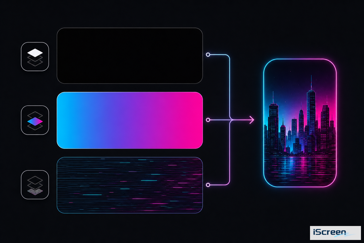
Dark base color layered with one or two saturated neon accents and a chrome, glitch, or scan-line texture, applied consistently across wallpaper, widgets, and icons – that’s what a cyberpunk aesthetic actually is. Any black wallpaper just doesn’t produce the look on its own, since a simple black photo reads as minimalist, not cyberpunk, once it’s missing the accent color and texture layer that signal the genre.

Apple’s own Human Interface Guidelines for materials make a similar point for interface design: legibility depends on using vibrant colors intentionally on dark backgrounds, not just lowering brightness across the board.

This is where most “cyberpunk wallpaper” collections simply don’t deliver. A quick scan of the top six wallpaper pages for this term show from ten to twenty generic neon-city renders with no visual framework attached – readers are left to guess which images will actually look coherent once icons and widgets sit on top. 9to5mac’s coverage of 2026 accessory design details a “retro cyberpunk aesthetic” the same way: a specific, identifiable visual language, not a synonym for “dark.” A folder of renders can inspire the mood, but it takes the visual grammar above to turn that inspiration into a home screen that actually reads as cyberpunk once icons and widgets are sitting on top of it.

💡 Pro Tip

Before downloading any wallpaper, choose your one accent color first – cyan, magenta, or amber are the three most common – and force everything else (widgets, icons, even your keyboard theme) to match that one color. Mixing two or three accent colors across the wallpaper and widgets is the top reason a cyberpunk setup looks busy, rather than integrated.

2077, Edgerunners, or Neither? The 3 Cyberpunk Visual Families
2077, Edgerunners, or Neither? The 3 Cyberpunk Visual Families — iScreen

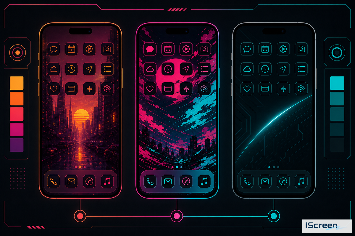
Cyberpunk iPhone wallpapers, including searches like Cyberpunk Edgerunners iPhone Wallpaper 4K or Cyberpunk 2077 Wallpaper Phone, fall into three visual families – 2077-game-native, Edgerunners-anime, or genre-atmospheric – and selecting one before downloading saves the trial and error most people experience after downloading twelve mismatched images. Each family has a unique color palette, theme subject matter, and source pool, so the “best” one depends purely on which visual language you want to communicate across your entire home screen, not just the wallpaper.

Palette, subject, and source for each of the 3 Cyberpunk Visual Families for iPhone wallpaper
Family Palette Typical subject Best fit for
2077-game-native Yellow/amber warning tones + magenta, gritty texture Night City skylines, corporate logos, game characters Readers who want the specific Night City look
Edgerunners-anime Hot pink + cyan, higher contrast, anime line art David/Lucy/Rebecca character art, chrome body-mod motifs Readers coming from the Netflix anime, not the game
Genre-atmospheric Any single accent (cyan/magenta/green) on near-black Rain-slick streets, glitch texture, no named characters or logos Readers who want the mood without game/franchise branding

What’s the difference between Cyberpunk 2077 and Cyberpunk Edgerunners style?

Cyberpunk 2077 wallpaper relies on the game’s yellow-and-magenta corporate aesthetic and the distinct cityscape of Night City, while Cyberpunk Edgerunners art taps into the series’ higher-contrast pink-and-cyan color palette and the character-focused linework that defined the original 2022 Netflix anime series.

A user on r/cyberpunkgame made their own custom cyberpunk icon set for an iPhone, using Widgetsmith and Apple Shortcuts instead of ready-made downloads from either franchise – a good example of why the genre-atmospheric family (family three) tends to be a useful entry point if you don’t want to strictly adhere to a specific franchise’s colors.

Cyberpunk Edgerunners is especially worth your attention in the coming months, given that CD Projekt Red confirmed a large Cyberpunk: Edgerunners 2 panel for Anime Expo 2026, with the season expected to premiere in the fall of 2026. This timeframe aligns with renewed search interest in Edgerunners-specific wallpapers in June 2026, after a lull during the spring – typically, a new season results in an influx of new anime-style wallpapers and icons being created and requested. So, if you’re setting up an Edgerunners family theme now, you can expect more visual resources to become available throughout the rest of the year.

Best Cyberpunk Wallpaper Types for iPhone, The 9-Style Cyberpunk Wallpaper Grid
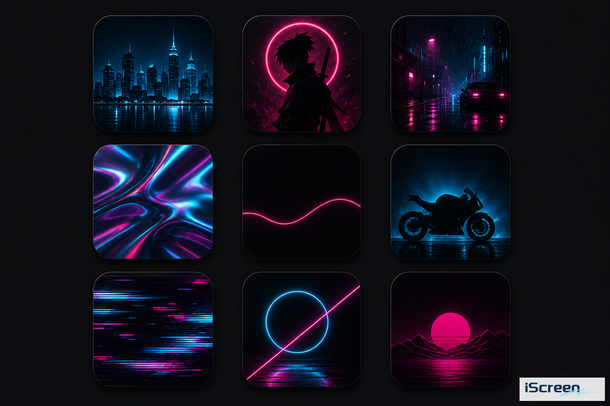
Best Cyberpunk Wallpaper Types for iPhone, The 9-Style Cyberpunk Wallpaper Grid — iScreen

With nine styles to choose from, the wallpapers cover most content under the “cyberpunk” umbrella and vary in terms of battery usage and how easy they’re to pair with other widgets and icons. Selecting a style from this grid prior to searching is essential for quickly narrowing down a folder of hundreds of images to a select few that will integrate well with the rest of your setup.

Format support, OLED impact, and icon-pairing difficulty across the 9-Style Cyberpunk Wallpaper Grid
Wallpaper Type Static/Live OLED battery impact Icon-pairing difficulty Not suitable for
City/skyline scene Both High Medium Small-icon-heavy layouts (skyline detail gets lost)
2077-style character art Static High Hard Widget-dense Home Screens (busy subject clashes)
Edgerunners character art Static High Hard Same as above; best on Lock screen only
Glitch/abstract neon Both Medium Easy Readers who want a specific franchise look
Chrome/holographic UI mockup Static Medium Easy Low-vision users (chrome text has low natural contrast)
Rain-soaked street Both Medium-high Medium Battery-conscious users (bright reflections raise brightness)
Neon-lit vehicle/motorcycle Static Medium Medium Portrait-orientation crops (vehicles are usually landscape source art)
Minimal neon-line on black Static Low Easiest Readers who want a busy, detailed scene
Named game character (e.g. Johnny Silverhand) Static High Hard Commercial/public-facing use (fan art licensing varies by artist)

If you’re new to building a cyberpunk setup, minimal neon-line wallpaper is a great starting point: its largely black appearance means it consumes the least amount of OLED battery life, in line with the pattern Lifehacker’s battery testing found for darker always-on images, and the single accent line provides the maximum amount of open space for your widgets and icons to be placed without competing for visual attention. While character-based wallpapers, from both 2077 and Edgerunners, are striking on their own, they’re generally the most challenging to incorporate into a cohesive setup because of the clutter that can obscure your widget’s legibility, which we’ll address next.

Where to Find Cyberpunk Wallpapers That Actually Fit Your Screen
Where to Find Cyberpunk Wallpapers That Actually Fit Your Screen — iScreen

Match the wallpaper source to your iPhone’s exact resolution before downloading — a wallpaper sized for a generic “1080×1920” phone will crop unpredictably on a modern iPhone’s 1170×2532 to 1284×2778 range. Free galleries mostly list phone wallpapers by tags like “4K” or “HD” rather than model, so download the largest file and let Apple’s official Lock Screen editor crop it for you, or explore iScreen’s wallpaper library for pre-sized options instead.

Most searches for cyberpunk wallpaper iPhone free or Cyberpunk iPhone Wallpaper 4K return more than enough free options that a paid bundle is optional rather than required — the same applies whether you are hunting for an iPhone neon wallpaper specifically or a broader dark neon wallpaper to crop yourself. Most listings let you download for free straight to your phone, though a handful of desktop-first gallery sites still require opening the page on a computer first before the mobile-sized file becomes available. If a page only offers a generic cyberpunk phone background rather than an iPhone-tagged one, double-check the aspect ratio before committing to it, and if you specifically want cyberpunk 2077 iPhone wallpapers rather than the anime-derived look, search that exact phrase to filter out results that are Edgerunners only.

Individual wallpapers paired with corresponding widgets (like for iphone-specific bundles) will cost around $2-$6 for a single wallpaper, or a little bundle of four wallpapers and widgets (approx. $9.99). The latter price can act as an indicator when looking on independent markets for that exact configuration – though it will cost you more than cobbling together a set from free items. Whichever source you choose, always review the license for character-based art (like Johnny Silverhand, Lucy, Rebecca), most fan-created material can only be used on your own device.

Setting Up Static vs. Live Cyberpunk Wallpapers on iOS 17, 18, and 26
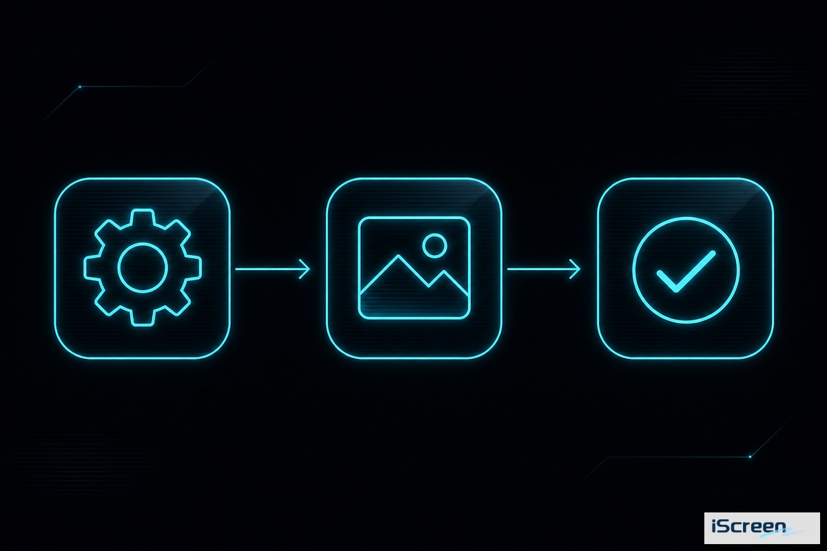
Setting Up Static vs. Live Cyberpunk Wallpapers on iOS 17, 18, and 26 — iScreen

Apply static wallpapers in under a minute by navigating to Settings > Wallpaper > Customize in any recent iOS version. Live-style or depth-effect versions require a Live Photo file and iOS 16 or newer. According to Apple’s iOS 26 update notes, moving your iPhone now triggers a new 3D parallax effect on the Lock screen photo, which complements the layered design of cyberpunk wallpaper art.

  • Follow the steps from Apple’s official Lock screen guide to touch and hold until Customize appears.
  • Touch and hold the Lock screen.
  • Select the Photo icon, then tap on your cyberpunk wallpaper.
  • For a live Photo file, long-press the shutter icon when you tap to set to include motion (iOS 16+ required).
  • Add widgets using Apple’s widget setup guide: tap “Add Widgets” then drag the item onto your Lock screen.

Matching Widgets to a Cyberpunk Home Screen — The Neon-on-Black Legibility Threshold
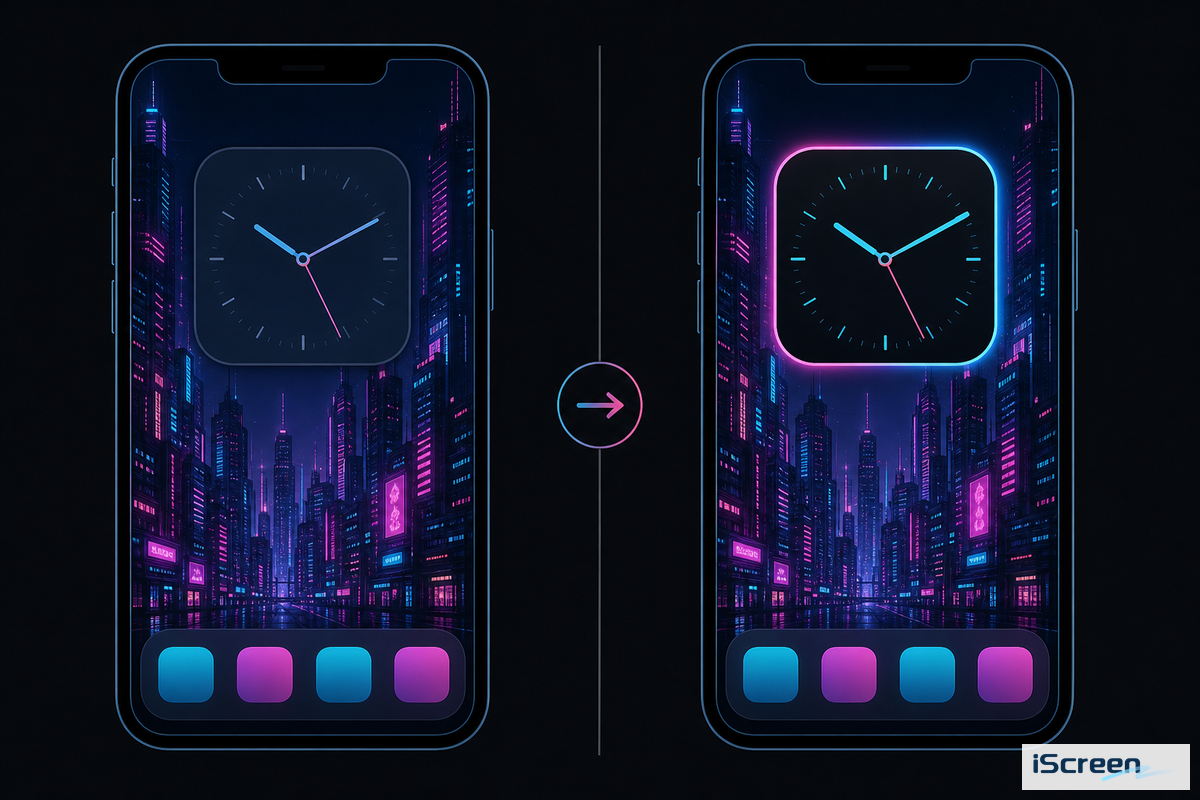
Matching Widgets to a Cyberpunk Home Screen — The Neon-on-Black Legibility Threshold — iScreen

If glass widgets appear too faded against a vibrant neon wallpaper, try toggling off the transparency settings under Settings > Accessibility > Display & Text Size > Reduce Transparency in iOS 26.

When the bright, saturated hues of the background sit near the colors of a widget’s icons and text, they become hard to read – and it’s something even Apple identifies as an issue they designed their widgets to address. In the Apple Human Interface Guidelines for widgets, the company states, “Offer enough contrast to ensure legibility,” and for bright and vivid images, “The stronger the background’s light or saturation, the greater the intensity of the background blur”. The reality for iOS 26 is that the newly introduced “glass” widgets – described in CNET’s coverage of the Liquid Glass settings – are even more prone to these legibility problems, leading Apple to add the “Reduce Transparency” option. This is not a hypothetical problem — it shows up in real complaints on Apple’s own support channels.

“Widgets (like calendar) are now a low contrast grey instead of ‘dark’ in dark mode. I have just updated to the iOS 26 on my iPad Pro…”

Key Factors to Consider

  1. Position widgets on the darkest, least busy area of the wallpaper – typically near the top or bottom edge on a city-skyline image, never on the brightest neon sign
  2. On iOS 26, enable Reduce Transparency if widgets appear washed out; it trades a bit of the glass-like polish for actual readability on high-contrast wallpapers
  3. Use widget apps that offer solid or semi-opaque background tints (matching your singular accent color) rather than entirely transparent widgets against a neon image
  4. Check readability from arm’s length in direct sunlight, not just in indoor lighting – a low-contrast combination that looks fine on a desk can fall apart outside

Community threads confirm this from the inverse angle: on r/widgy, users posting cyberpunk-themed widget arrangements will often rework someone else’s shared layout specifically to correct for contrast before resharing-the legibility issue is common enough that “remixing for readability” has become a standard workflow step there, not an exception.

Neon Icon Packs for a Cyberpunk Setup: Sourcing, Installing, Staying Consistent
Neon Icon Packs for a Cyberpunk Setup: Sourcing, Installing, Staying Consistent — iScreen

A neon icon pack completes a cyberpunk setup, but only if every icon in the pack uses the same accent color and line weight as the wallpaper and widgets-mixing icon packs from various sources is the quickest way to break the look. Most cyberpunk app icons customization on iPhone follows one of two routes: either a dedicated icon app such as iScreen’s icon pack collection with a carefully selected cyberpunk-style library, or Apple’s built-in Shortcuts method, which allows you to manually designate any custom image as an app icon.

Setting up icons with Shortcuts takes more time (several minutes per icon versus nearly instant with an app), but guarantees precise color matching, as you source each icon image yourself rather than choosing from a premade set. On r/cyberpunkgame, one user shared that they created a full custom icon set with Widgetsmith and Apple Shortcuts instead of downloading a premade pack, precisely to ensure consistent color palettes across all their app icons.

⚠️ Common Mistake

downloading two or three “neon icon pack” sets from different sources and mixing and matching the ones you like best. Different designers use different accent colors, stroke widths, and glow intensities-even two packs labeled “cyberpunk” seldom match perfectly, and these differences are far more obvious in a 4×6 icon grid than when viewed in isolation.

Allocate 15-20 minutes for the first time you create a complete icon set, whether with an app or through Shortcuts-the bulk of this time will be spent renaming icons afterward, as Shortcuts custom icons display a generic label unless you go back and rename each shortcut individually.

Will a Cyberpunk Wallpaper Drain Your Battery or Slow Down Your iPhone?
Will a Cyberpunk Wallpaper Drain Your Battery or Slow Down Your iPhone? — iScreen

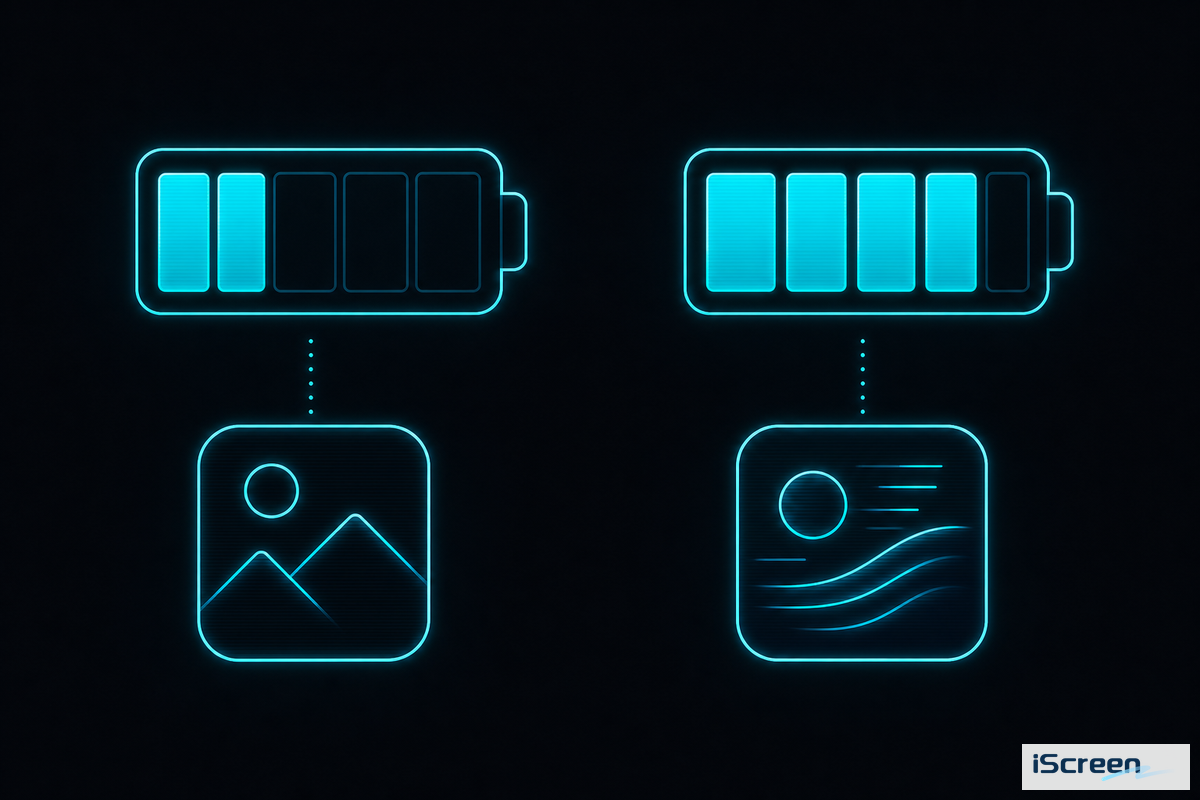
A static cyberpunk wallpaper itself has zero battery cost, but a live or Always-On Display one has some, and the impact is much smaller than you’d imagine. The much-cited Lifehacker 24-hour iPhone 14 Pro test found an AOD wallpaper device ended the day at 80% battery compared to the same device at 84% with an AOD showing text only — not exactly the night-and-day drain many fear.

Estimates from the r/apple community suggest an AOD, regardless of wallpaper, consumes 15-25% more power than with it disabled — implying that most of the drain comes from the underlying display technology rather than a preference for neon imagery over plain text.

The other side of that coin is dark themes: OLED displays only illuminate pixels that are currently active, meaning a mostly black cyberpunk wallpaper (e.g. the minimal neon line art from the above grid) consumes less energy than its brighter counterparts – and in keeping with other research on the power savings of OLED dark mode at moderate brightness levels (30-50%), those gains could be between 3-9%. Live wallpapers add their own costs on top of those factors: their rendering is continuous, and the higher peak brightness many animations need also consumes additional power beyond the presence or absence of an AOD.

✔ Lower battery impact

  • Static, minimal neon-line wallpaper (mostly black)
  • Standard Home Screen use (no Always-On)
  • Solid or semi-opaque widget backgrounds
⚠ Higher battery impact

  • Live or Depth Effect wallpaper on Always-On Display
  • Bright city-skyline or character-art styles at full brightness
  • Fully transparent glass-style widgets on iOS 26
The Wallpaper + Widget + Icon Cohesion Checklist

  1. Pick one visual family (2077-game, Edgerunners-anime, or genre-atmospheric) before downloading anything
  2. Lock in a single accent color and check every wallpaper, widget, and icon against it
  3. Place widgets over the darkest, least busy part of the wallpaper, and toggle Reduce Transparency on iOS 26 if needed
  4. Source icons from one pack (or build your own via Shortcuts) instead of mixing packs from different designers
  5. Weigh static vs. live/Always-On against your actual battery tolerance before committing to the animated version

Frequently Asked Questions

Q: What’s the difference between Cyberpunk 2077 wallpaper and Cyberpunk Edgerunners wallpaper?

Cyberpunk 2077 wallpaper art uses the game’s yellow-magenta corporate palette and Night City architecture, while Edgerunners wallpaper art uses the 2022 Netflix anime’s higher-contrast pink-cyan palette and named characters like David and Lucy.
The two sets of image pools are also distinct, in terms of searchability, though they draw from the same general universe: a search for “cyberpunk 2077 wallpaper” is unlikely to yield the same results as a search for “cyberpunk edgerunners wallpaper”-a slight bummer if you’re not particularly invested in the specifics of each color scheme. The “genre-atmospheric” family (which provides a single accent color on an otherwise dark background without any specific characters or game logos) is another safe choice for color matching.

Q: Does a cyberpunk live wallpaper drain my iPhone’s battery faster than a static one?

Yes — live wallpapers use more battery than static ones because they render continuously and typically run at higher peak brightness, though the difference is smaller than most people assume.
In a 24-hour Always-On Display test, there was only a 4-percentage-point difference in battery between a wallpaper AOD and an AOD showing text only; it seems the real energy hog is the display technology itself rather than the image being displayed. If the display performance is more of a concern than the moving effects, a minimal neon-line wallpaper with a primarily dark background, from the grid above, would likely provide the best experience.

Q: Can I use Cyberpunk 2077 or Edgerunners wallpaper without violating copyright?

Personal device wallpaper use of fan-made or officially licensed cyberpunk art is generally treated as personal use, but redistribution, resale, or public-facing use of character-specific fan art is usually restricted by the original artist’s license.
The specific terms of use are almost always specified for individual wallpaper or icon packs, with the standard disclaimer in place for paid products being “for personal use only, no resale or redistribution”. If you’re planning to display your wallpaper in anything more extensive than your own Lock screen – whether as a livestream overlay, a shared background on social media, or for professional use on a work device – you need to check the terms associated with that specific source first, as the terms of service won’t always extend beyond private use.

Q: How do I stop my widgets from disappearing into a dark cyberpunk wallpaper?

Place widgets over the darkest, least busy part of the wallpaper, and turn on Reduce Transparency in iOS 26 if the new glass-style widget background washes out against a bright neon area.
According to multiple threads on Apple’s community forum discussing widget contrasts following recent iOS updates, this is by far the most common mistake users make. By selecting a widget app that offers the option to fill the element with a solid or partially transparent background of your preferred color, you will solve this problem more effectively than by merely adjusting the brightness of the wallpaper itself.

Q: Where can I get 4K cyberpunk wallpapers for iPhone?

iScreen’s wallpaper library includes cyberpunk and neon-styled options sized for current iPhone resolutions, alongside free general wallpaper galleries like Pinterest and WallpaperCave and paid marketplace bundles on sites like Etsy.
Regardless of your source, aim to find the largest possible resolution for your wallpaper, and let the iOS editor perform the crop to your specific device, instead of relying on a pre-cut file labeled with the name of the model for your device from an unknown source.

Q: Is cyberpunk wallpaper free to use on my iPhone?

Yes, most cyberpunk wallpapers for personal device use are free, with paid options ($2–$6 per image, or bundles from roughly $9.99) mainly for higher-resolution or wallpaper-plus-widget sets.
Resources abound for this specific look due to its high search volume across the wallpaper galleries.

About This Analysis

This guide draws on Apple’s own Human Interface Guidelines for widget and dark-mode contrast, a real 24-hour Always-On Display battery test, and current iPhone community discussions of cyberpunk home screen setups, rather than treating “cyberpunk wallpaper” as a single downloadable image category. iScreen’s own wallpaper, widget, and icon libraries were cross-checked against the visual families and style grid described above. Reviewed by the iScreen team.

Related Articles

Artículos recientes

Studio Ghibli Wallpaper iPhone: 40+ Picks for 2026

Studio Ghibli Wallpaper iPhone: 40+ Picks for 2026

2026/7/7 16:47
Studio ghibli wallpaper iphone results are abundant but scarce on selection tips. When you type it into the search bar, you’ll be bombarded by pinterest boards, Reddit discussions, and download grid sites that lack details on whether the photos are in high definition, how they relate to live wallpaper, and their origins, the majority treat ghibli phone wallpapers as ordinary anime wallpaper instead of a specific style with its own rules. This walkthrough helps you explore all of it: the five most-searched Studio Ghibli films worth starting with, setting a wallpaper as a live photo instead of a still image, the actual impact on your battery, where Studio Ghibli directly releases its free images, and where current AI images made to mimic Ghibli’s aesthetic fit into all of this. (Updated July 2026) Quick Specs Recommended resolution (iPhone 15/16) 1179 x 2556 px, 19.5:9 Live wallpaper battery cost ~0.8% extra per hour with Always-On Display Live Photo wallpaper placement Lock Screen only, not Home Screen Official Ghibli source Yes — ghibli.jp releases free scene stills Most-searched film (US wallpaper demand) Howl’s Moving Castle Which Studio Ghibli Aesthetic Actually Fits Your Home Screen? Most of studio ghibli’s filmography has four main moods-light, pastel and often pink (Kiki’s Delivery Service, Ponyo), brown earth, cool-toned forest(My Neighbor Totoro, as well as Princess Mononoke’s wolf-god forest), theatrical sky(Howl’s Moving Castle), and lanterned night(Spirited Away). The key to a look and feel that appears designed, not assembled, is to pair a mood with your current icon and widget colors, instead of grabbing any scene with recognizable ghibli characters at random. Anyone running a broader studio ghibli iphone or ghibli iphone wallpaper search will find that most studio ghibli phone wallpapers fall into one of these same four moods. The Ghibli Mood Compass — 4 visual moods for Studio Ghibli wallpaper on iPhone, matched to icon style and screen placement Mood Representative Film(s) Pairs Best With Works Best On Pastel-soft Kiki’s Delivery Service, Ponyo Rounded, cream or white icon packs Home Screen Earth-toned forest My Neighbor Totoro, Princess Mononoke Muted green, outline icons Home Screen Dramatic sky Howl’s Moving Castle Minimal, light-colored icons Lock Screen Lantern-lit night Spirited Away Dark-mode, warm-accent icons Lock Screen (AMOLED-style panels) A dramatic-sky ghibli iphone setup built around Howl’s blue cloud scenes reads very differently from a lantern-lit Spirited Away pick, which is exactly why matching mood to film matters before browsing further. Princess Mononoke rarely shows up in wallpaper search data on its own, but its forest-and-wolf imagery reads as a natural extension of the Totoro earth-tone mood rather than a separate category, a pairing worth keeping in rotation for anyone who wants a calmer, nature-first home screen. For a broader look at aesthetic vocabularies beyond ghibli specifically, see our iPhone wallpaper aesthetic guide, which maps twelve style categories and their color anchors. The 5 Studio Ghibli Films People Actually Search For Of studio ghibli movies, the highest iphone-wallpaper searches in the U.S. go to Howl’s Moving Castle, at 2,400 searches per month (Spirited Away and My Neighbor Totoro each clock in at 1,900 searches; Ponyo’s just at 210). That U.S. wallpaper-search order doesn’t have much to do with Box Office results in ghibli’s native country-in fact, Spirited Away is the highest-grossing Japanese movie of all time, taking in 31.7 billion domestically. While those are two figures from different countries and not exactly equal, it points to movies that play well as a phone background-think big, bold silhouettes, wide, endless skies-rather than those that simply did the best at the movies. The Ghibli Wallpaper Type Matrix — 5 film types + 4 style types for Studio Ghibli wallpaper on iPhone, ranked by monthly US search volume where available Type Category Search Volume / Signature Trait Best Screen Film Howl’s Moving Castle 2,400/mo — golden-hour clouds with castle silhouette Lock Screen Film Spirited Away 1,900/mo — night train over dark water Lock Screen (AMOLED-style) Film My Neighbor Totoro 1,900/mo — rain-soaked bus stop Home Screen Film Princess Mononoke Niche standalone term — San and the forest wolf god Home Screen, earth tones Film Ponyo 210/mo — ocean wave chase Home Screen, pastel Style Aesthetic / mood-board 140/mo — curated color-and-composition sets Home Screen Style Minimalist 110/mo — single-subject, high negative space Home Screen Style Landscape 110/mo — wide scenery, minimal characters Lock Screen Style Cute / character close-up 110/mo — Totoro, Jiji, or Calcifer front and center Home Screen Which Studio Ghibli movie has the most iPhone wallpapers? According to search volume, “Howl’s Moving Castle” takes the crown for most-searched Studio Ghibli wallpaper, though “most wallpapers available” isn’t the same signal as “most searched”: searching a specific character name, such as Totoro or Calcifer — both anime characters instantly recognizable outside Japan — brings back a very different result than searching the film title itself. A Spirited Away iPhone wallpaper search and a Totoro one turn up very different crops, but both — the bus stop and the night train — lend themselves well to iPhone’s tall 19.5:9 screen ratio without losing any sense of composition and have been shared widely for years by Reddit communities devoted to those movies. The best material from Howl’s Moving Castle, on the other hand, is often a vast expanse of sky that will take much less trimming, but offers much less space to place additional icons. Static or Live? Setting Ghibli Wallpaper the Right Way The cost if battery is the only consideration is far less than it may sound – according to one 2023 independent study, an iphone 14 Pro using Always-On Display along with the Live Photo wallpaper lost about 0.8 percent of its charge each hour – noticeable over a full day, not dramatic, though you might find the number slightly higher (or lower) on other hardware or newer iOS releases. Still, one drawback will be in place regardless of battery drain – Apple explicitly labels the Live Photo wallpaper feature for the Lock Screen and notes that the movement begins “whenever you tap and hold to wake up or activate your screen” rather than animating in a constant loop like some live-wallpaper apps do on Android. A ghibli live wallpaper iphone setup follows the exact same tap-to-wake behavior described above. Configure it on your Lock Screen, but that’s it: Your Home Screen will be static no matter which wallpaper type you choose. ✔ Live Photo Wallpaper — Advantages Gives the scene a tiny jolt when you come back to it – ideal when there’s wind/rain/floating castle. Less used than static wallpaper, makes it stand out in any default build. battery cost small enough to be negligible for typical use (~0.8%/hr) ⚠ Live Photo Wallpaper — Limitations Lock Screen only – not supported by Apple on Home Screen You’ll need a Live Photo or a short clip – not just a flat photo. Wake on motion, won’t stay active constantly at the background. If you want to get a fuller analysis of live-wallpaper formats, other sourcing than ghibli, consult our live wallpapers for iphone, decision matrix of the four live wallpaper formats compared one by one. Both formats can be set up using iScreen’s full customization guide, which walks through both the Lock Screen and Home Screen setup flow in detail. Turn Your Own Photos Into Ghibli-Style Art (Then Set Them as Wallpaper) An AI Ghibli-style photo isn’t just turning your favorite snap into a Hayao Miyazaki cartoon via an image-generation model – which is a completely different process from downloading a premade studio ghibli wallpaper, and you should know about it honestly before jumping in. OpenAI’s ChatGPT photo generator blew up in March 2025 because of exactly that – transforming personal photos, memes and portraits into Ghibli images seemingly over night – sparking ongoing questions around AI and copyright. While Studio Ghibli itself has made no official public statement about the trend, its fanbase was quick to weigh in, with r/ghibli implementing a long-standing policy banning AI-generated art which members loudly reinforced. As of November 2025, the dispute had evolved far beyond stills, with Japanese CODA (content industry association, with members like Studio Ghibli, Bandai Namco, and Square Enix) lodging a written appeal to OpenAI on Oct 27, 2025, requesting that they refrain from using their members’ content for training new Sora video generation models without permission – a separate and later development related to video, not the March photos. “In cases, as with Sora 2, where specific copyrighted works are reproduced or similarly generated as outputs, CODA considers that the act of replication during the machine learning process may constitute copyright infringement.” — CODA (Content Overseas Distribution Association), written request to OpenAI, October 27, 2025 ⚠️ Important There’s also a second important aspect beyond the specific claims made by studio ghibli about the trend: The U.S. Copyright Office guidance on AI and copyright notes that images generated solely by prompts are not eligible for copyright protection at all – meaning your AI-ghibli-style photo may not legally be yours as a protected work if you were considering licensing or selling it rather than simply using it as your own wallpaper. If you’ve already got a ghibli-style image that’s been created with AI and you just want to use it as your phone Lock Screen or Home Screen, the process is exactly the same as it’s for any personal photo: simply save the image to your phone’s camera roll, then go to Photos > Photo Shuffle in iScreen’s wallpaper library settings, or directly via iphone wallpaper settings. Where to Find Free, High-Quality Ghibli Wallpaper (Without the Sketchy Downloads) Ghibli wallpaper sources split into three tiers: unlicensed screenshot sites with no source information, Studio Ghibli’s own official scene-photo library published on its own website, and paid fan art on Etsy. Most fans default to the first tier without knowing the second exists — check the source before you check the resolution. Many of the sites that offer “free Ghibli wallpaper” actually offer curated screenshots with no information about the source or license – this isn’t necessarily illegal but is a different thing than what studio ghibli itself offers. Studio Ghibli has also published hundreds of official scene photos from a number of films on its own website, with broad “common sense” personal-use permissions for many, and also offers a more limited release specifically for video-conference backgrounds. Most fans have no idea these resources exist – a Reddit post to the official page still elicits gasps years after it was first published. A third tier sits in between: individual artists on Etsy sell curated Ghibli-inspired wallpaper sets for $1.20 to $5.00 each, which is at least transparent about being paid fan art rather than official material. Whether you’re chasing a studio ghibli wallpaper free download, a Studio Ghibli Wallpaper phone upload in hd, or comparing studio ghibli wallpaper reddit threads against the official releases above, the pattern holds across all three tiers. ✔ studio ghibli’s own scene photos (ghibli.jp) – for personal use with permission, according to studio terms. ✔ Fan art or curated sites which clearly state the source movie and frame without claiming it as their own original artwork. ⚠ Anonymous “Free wallpaper” Download-Grids – Treat as Fan Content Only; Unverified Sources – 12. Studio Ghibli Wallpaper Sizes: What Actually Fits Your iPhone iphone 15 and iPhone 16 use a 2,556-by-1,179-pixel display at 460 ppi, a 19.5:9 iphone ratio, according to Apple’s published specifications — the number to check before downloading anything labeled “4K” or “HD” without a stated resolution. The larger iPhone 16 Pro Max steps up to 2,868-by-1,320 pixels on its 6.9-inch panel, still at 460 ppi, so a wallpaper sized for the base model will crop differently on the Pro Max rather than simply stretching to fit. Check Settings > General > About on your device for the precise figure before tightly cropping a picture. A file marketed as ghibli wallpaper 4k or a plain studio ghibli wallpaper download link should still be checked against your model’s actual pixel count — a Studio Ghibli Wallpaper 4K phone image built for a Pro Max will look oversized and soft on a base model instead of sharp. 📐 Engineering Note A wallpaper that appears blurry on iphone is more likely a settings problem than a resolution one. A common pattern in Apple’s own support threads: someone downloads a properly-sized Ghibli image, sets it, notices a blurry strip at the top of the screen, assumes the file was low quality, deletes it, and re-downloads a supposedly sharper version — only to see the exact same blur again. Two causes turn up again and again in those same discussions: the Reduce Motion accessibility setting can create that blurry crop at the top of the screen, and a bug that first appeared in iOS 17 “extend wallpaper” can produce the identical result regardless of image quality. Going to Settings > Accessibility > Motion before concluding a download was poor quality resolves the problem far more often than re-downloading a higher-resolution version of the same file. Build a Full Ghibli Theme, Wallpaper + Icons + Widgets Together A wallpaper on its own serves as decoration, and the mismatch shows fast: a soft, hand-painted Ghibli scene sitting behind sharp neon or glossy 3D icons looks jarring within seconds of unlocking the phone, which is the single most common way a Ghibli-themed setup ends up feeling unfinished rather than intentional. Pairing the wallpaper with matching icons and widgets instead creates a cohesive theme where nothing fights for attention. Four steps apply no matter which Ghibli film or mood you start from: Select one of the ghibli Mood Compass modes from above and make it your Lock Screen or Home Screen wallpaper. Browse iScreen’s icon library for a pack that complements your wallpaper’s color palette, such as Ponyo’s rounded, pastel icons or Totoro’s muted, outline icons. Incorporate a matching widget or two, for weather, perhaps, or the time, instead of cluttering every available slot; a busy screen defeats the clean, calming aesthetic ghibli’s art is famous for. Live with the combination for at least a week before judging it — a scene that looks too plain on day one often becomes the favorite after 7 days of daily use — then save it as a theme you can reapply later, and check Dynamic Island styles if your phone supports it. How Long Will the Ghibli Wallpaper Trend Last? (Lock Screen + Outlook) Interest in the term studio ghibli wallpaper increased by 80% in September 2025, before stabilizing in a 590-880 average from October 2025 through mid-2026 — a pattern that looks like persistent fan interest rather than a one-off fad, even as the wider ghibli-wallpaper category has pulled back 59% compared with its level 2-3 years earlier. Both of these developments are possible: a former wave of general ghibli-wallpaper interest has passed its high point, while a more recent and narrowly focused wave (partly fueled by the AI filter trend above) adds fresh searches to a smaller, still active base. Keeping a Ghibli scene on rotation with one or two others for your Lock Screen (rather than selecting a single favorite permanently) generally keeps your look current no matter where broader trends go. Key Factors to Consider Make your wallpaper mood fit the icon and widget colors before you choose a specific film Live Photo wallpaper only works on the Lock Screen and will use a bit of battery (~0.8%/hour). studio ghibli releases its own art; don’t assume all the download results you find online are unlicensed fan work. Make sure you know the exact resolution of your iphone before you trust a “4K” listing. Q: How do you convert a photo into Ghibli style on iPhone? AI image-generation apps and tools like ChatGPT’s image feature can restyle a personal photo as Ghibli-inspired art directly on iPhone, then save the result as a wallpaper file. In practice, this means: You’ll upload a photo to an AI-image tool, ask it to describe what you want in terms of a ghibli look, save that image and apply it as a wallpaper. However, most guides to this trend leave out the honest part of the bargain: you’re not making actual studio ghibli art, the studio hasn’t endorsed this, and if you made it by just writing a prompt to an AI, you may not even have any rights to the output, as U.S. Copyright Office policy currently does not consider purely AI-generated images copyrightable. Q: Is Ghibli wallpaper free to use, or does it violate copyright? Studio Ghibli releases some official scene photos for personal use, but most “free Ghibli wallpaper” sites are unlicensed fan screenshots with no stated source or permission. According to Studio Ghibli’s own terms, its official scene photos are generally permitted for personal use only, not commercial projects. For one specific release batch, Studio Ghibli goes further and explicitly asks that the image files not be redistributed elsewhere, even for free. Most download-grid sites, by contrast, don’t bother telling you anything about where their content came from or what usage rights actually apply to it — which is exactly the gap this guide tries to close. Q: Can iOS have a moving or live Ghibli wallpaper? Yes, as a Lock Screen Live Photo that animates when you wake the device, not as a continuously looping Home Screen animation, since Apple treats the two screens differently. This animated wallpaper effect only works on Apple’s Lock Screen, and setting it up involves the same steps as a static wallpaper — except that instead of a regular still image, the source file needs to be a short video clip or a Live Photo. Apple does not currently extend this behavior to the Home Screen, so the two screens will always look and behave differently once you’ve set one up as live. Q: What’s the best app for Ghibli-style wallpaper? Your best option depends on whether you want to download existing fan-made art or generate a new AI-styled image, not a single universal answer for every use case. An app for collecting and organizing existing wallpaper images by mood and enabling live wallpaper on your device would have to integrate with a platform to facilitate this process. For this guide, the app we recommend is iScreen. It not only provides collections of both static and live wallpaper, but it also enables the easy setup of live wallpaper. AI-generated images like ghibli need a completely separate category of software entirely. Q: Which Studio Ghibli movie has the most searched wallpaper? Howl’s Moving Castle leads at roughly 2,400 monthly US searches, narrowly ahead of Spirited Away and My Neighbor Totoro at about 1,900 each in our tracked data. Ponyo only accounts for 210 monthly searches. That demand is influenced more by a film’s photographic potential as a phone background than its overall box office performance. Q: How long will the Ghibli wallpaper trend last? Search data suggests durable long-tail interest rather than a short-lived fad, despite a broader multi-year cooldown across the wider wallpaper-trend category seen in search volume overall. Even though there was a significant spike in searches related to this phenomenon in 2025, it appears to have maintained a steady level and is now supplemented by a growing, but distinct, interest in the AI-filter trend itself. References & Sources Change your iPhone wallpaperApple Support Create a custom iPhone Lock ScreenApple Support iPhone 16 Technical SpecificationsApple Support iPhone 16 product specifications pageApple Studio Ghibli scene photo releaseStudio Ghibli official site Studio Ghibli web-meeting wallpaper releaseStudio Ghibli official site Test Shows How Much Battery Drain Your Wallpaper CausesMacRumors OpenAI’s viral Studio Ghibli moment highlights AI copyright concernsTechCrunch CODA Issues Written Request to OpenAI Regarding Sora 2Content Overseas Distribution Association (primary source) Studio Ghibli and other Japanese publishers want OpenAI to stop training on their workTechCrunch Chihiro Leads the Way: A Box Office Ranking of Studio Ghibli FilmsNippon.com About This Analysis To arrive at the search-volume comparison and trend data for this article, we used our in-house keyword-research tools. This data was supplemented by information found on Apple’s public specifications page, the studio ghibli website, and reporting in the press about the 2025 ghibli filter story. When an aspect of this trend couldn’t be verified by an external source (e.g., searches specifically for desktop Ghibli wallpaper), we didn’t include it in this article. Related Articles Pastel Wallpaper for iPhonea softer aesthetic pairing for Ponyo and Kiki’s Delivery Service moods Y2K Wallpaper for iPhonea contrasting style if Ghibli’s calm palette isn’t the right fit Coquette Wallpaper for iPhoneanother pastel-adjacent aesthetic worth comparing against the Mood Compass above Aesthetic iPhone Home Screen Ideasbroader home screen inspiration beyond a single film aesthetic
2026/7/7 16:47
Aesthetic App Icons for iPhone: Free & Premium Packs (2026)

Aesthetic App Icons for iPhone: Free & Premium Packs (2026)

2026/7/6 17:07
Updated July 2026. Applicable to iOS 26 and iOS 18. Aesthetic app icons are custom-designed images that replace an iPhone’s default app icons with a single coordinated visual style – pastel, dark, kawaii, or somewhere in between. This guide skips the install tutorial for readers who already know how to customize their icons, and focuses instead on the part most roundups skip: which style to pick, when a pack is actually worth paying for, and why a “500+ icons” pack still leaves gaps. Nine style categories, one honest coverage number, zero affiliate link walls, and enough ideas to personalize a unique, customizable, stylish setup you’ll actually want to transform every season. Quick Picks Best overall style Pastel or Neutral/Beige — highest cross-app pairing flexibility Best free option iOS 26’s native tint/clear appearance (Settings, no download) Best paid option A library-style app with 1,000+ icons across style families, not a single 30-icon pack Best for 40+ apps A pack that keeps some color variation by category, not one flat color Watch out for Packs that only cover your 10 most common apps and leave the rest as generic placeholders What Makes an App Icon Pack Actually “Aesthetic”? An aesthetic icon pack is a set of custom app icons designed with one consistent visual language – the same line weight, the same handful of colors, the same corner treatment – instead of the mismatched logos apps ship with by default. Apple’s own Human Interface Guidelines for app icons describe this consistency as the baseline for any iOS icon system: a single grid, a single corner radius, no competing styles fighting for attention on the same screen. The same rule applies whether you’re picking a single iOS app icon or building out a full aesthetic home screen from scratch. You can judge a pack’s cohesion in about ten seconds without installing anything: look at a screenshot of the finished Home Screen, not the individual icon thumbnails. Your eye settling on one color story and one line style across every row means it passes. Three icons that look hand-drawn next to two flat vector logos and one photo icon means it doesn’t – no matter how good any single icon looks on its own. This is the mistake that trips up most first-time pack shoppers: grabbing five different “cute” icons from five different Etsy sellers because each one looked good in its own preview image, then installing all five only to find the Home Screen reads as cluttered rather than curated. One seller’s line weight rarely matches another’s, and the mismatch is obvious the moment the icons sit side by side on an actual phone instead of a product photo. 💡 Pro Tip Screenshot your current Home Screen before you start swapping icons. It’s the fastest way to compare “does this new pack actually look more cohesive” instead of judging icons one at a time. The 9-Style Aesthetic Icon Spectrum Nine style families cover almost every aesthetic icon pack you’ll find in 2026. Apple’s WWDC25 session on the new look of app icons introduced Liquid Glass layers as the underlying shape language this year, and every style below has to work within that same rounded-square canvas. The 9-Style Aesthetic Icon Spectrum — palette, price tier, and wallpaper pairing for each aesthetic app icon style Style Color palette Typical price tier Pairs best with Pastel Soft pink, lilac, mint Free–$4 Soft-focus wallpapers Cutecore / Kawaii Bright pastel + character motifs Free–$5 Illustrated wallpapers Coquette Blush pink, cream, bow motifs $2–$6 Textured pastel wallpapers Dark / Black Black, charcoal, single accent Free–$4 Dark or moody wallpapers Minimalist / Line White, gray, one outline weight Free–$3 Plain or gradient wallpapers Y2K / Retro-digital Chrome, gradient, neon accents $2–$7 Gradient or chrome wallpapers Botanical / Nature Sage, terracotta, cream Free–$5 Plant or landscape wallpapers Neon / Cyberpunk Black base, neon accent colors $2–$6 Dark neon-lit wallpapers Vintage Film Sepia, faded color, grain texture Free–$5 Film-grain or sepia wallpapers Browsing styles inside one library beats piecing together packs from several sellers: iScreen ships 5,000+ ready-made icons spanning most of the families above, applied as a full set rather than one purchase per style. ✔ Advantages A single-palette icon set reads as intentional in seconds, even from across a room Easier to pair with one wallpaper mood instead of fighting default app-logo colors ⚠ Limitations Not suitable if you rely on icon color to tell apps apart, a NIH-hosted visual-search study found icons sharing the same color are measurably harder to tell apart, slowing down search Past roughly 40-50 apps on one screen, an all-one-color pack can cost you a beat of hunting time you didn’t have with the varied default icons Free vs Premium Aesthetic Icon Packs: Which One Should You Actually Buy You won’t find the cheapest option in the table below at all: iOS 26’s built-in appearance settings can already tint every icon to match your wallpaper or device color, for free, with no download. Apple’s own description of the feature covers “colorful new light and dark tints, as well as an elegant new clear look” – worth trying before you buy anything. Free tier iOS 26 native tint/clear appearance (Settings, no install) App Store customization apps with a free starter set Independent designers’ free packs (single-artist, usually 20-40 icons) Free templates from design tools like Canva, if you want to build free aesthetic app icons yourself Premium tier Library-style apps (1,000+ icons, multiple style families in one subscription) Paid single-artist packs (usually a one-time $2-$8 purchase) Custom-commissioned icon sets (highest cost, exact-match coverage) The decision rule If you change the look of your Home Screen once or twice a year-to match the seasons or to dress up a new phone-a free single-artist pack or iOS’s built-in appearance settings will likely be more than you need. You won’t use the vast majority of icons from a large paid library before you change it up again. Re-theming every few weeks, or chasing the latest trend as it lands, changes the math: a subscription service for a large library pays for itself much more quickly than repeatedly buying a $2-$8 single pack of icons that only addresses one look. The Icon Pack Longevity Filter Before downloading, ask yourself four questions. The answers will help determine whether a pack will live on your phone for months or just a few weeks. Picture a $6 pack bought on impulse during a late-night Etsy scroll: it usually gets deleted within days once the excitement wears off and three of your most-used apps still show generic default icons. The Icon Pack Longevity Filter — four checks before you download an aesthetic icon pack Check What to look for Why it matters App coverage Screenshots showing your actual most-used apps, not just social media icons See H2 below — marketed pack size rarely maps to your real app list Update cadence A changelog or “last updated” date within the past few months New apps and app icon redesigns outdate a pack fast; abandoned packs stop covering new apps Format compatibility Native theme-app install vs. manual Shortcuts-per-icon Shortcuts-built icons can lose notification badges; a native app avoids that trade-off Price-per-icon Total price ÷ icons you’ll actually use, not total icons in the pack A “500-icon” pack you use 40 icons from costs more per icon than a focused 60-icon pack One other minor tip is that if you opt for a pack that’s very light in color, uses very bright backgrounds, or depends heavily on your wallpaper, preview the icons against your background before you install. A low-contrast icon may become unreadable when placed on top of an image instead of a flat background. Update cadence matters more than it sounds, too, because Apple redesigns app icons and ships new system apps with each iOS release, and a pack that stopped updating two years ago will have visible gaps for anything released since. The Coverage Illusion: Why a “500+ Icons” Pack Still Leaves Gaps Most icon-pack listings boast about the number of icons included: “500 icons,” “1,200 icons,” or “2,000 icons.” But this number doesn’t indicate the icons that actually make it onto your Home Screen. Compiled industry estimates for the average smartphone user, while varying based on study year and research, consistently put the number of installed apps at about 40, of which nine or 10 – roughly 25% – are actually opened frequently. That difference between “apps installed” and “apps opened” is what’s relevant: even a relatively small pack of 40 or 50 icons can technically cover all the apps most people use on a regular basis. A 500-icon pack is purchasing you more coverage of others’ devices, not yours. This problem isn’t specific to iPhones; designers creating custom icon packs for individual apps face the same challenge. For example, one maintainer of a pack for an open-source app stated that their set had “covered most of the popular services”, but it still didn’t encompass every possible application that a user might have installed. Even in other fields, such as when designers are creating large libraries of UI icons for a profession, they often note that having more icons doesn’t automatically equate to more real-world applicability. This is because only a small fraction of the icons in any sizable set will likely be used for a specific project. ⚠️ Important Count your own Home Screen icons before you even begin looking at pack size. If your phone has around 25-35 apps, a 60-icon pack that has icons for all the apps you actually use is a far better choice than an 800-icon pack in which half of the icons represent apps you’ve never used. Coordinating Icons With the Rest of Your Home Screen Icons are the last part of a coordinated Home Screen, not the first. iOS 26’s new tint setting can already automatically match your icon’s color to your iPhone’s or case’s color. “Apple knows that lots of users simply want a consistent aesthetic for their iPhone, with color theming that carries across hardware and software.” Ryan Christoffel, 9to5Mac That native tinting is app-wide, though, and can’t be narrowed to specific apps or light-mode only – the exact gap where a curated icon pack still earns a spot on your Home Screen. If you want to learn how to get wallpaper, widgets, and icons working in tandem, consult our guide to cute aesthetic widgets, which covers the necessary pairings in detail, whether your homescreen runs Widgetsmith-style widgets or a full theming app. If you want more wallpaper-specific recommendations, peruse our iPhone aesthetic wallpaper guide. Where to Actually Get These Packs You get these icons for iPhone through either a dedicated theming app or by manually installing them one at a time, icon by icon, with the Shortcuts app, and we’ve already mapped every legitimate source for aesthetic app icons ideas beyond the nine styles covered above. Our 4-Tier Icon Source Ladder ranks theming apps against individual marketplaces, and our icon customization walkthrough covers the installation steps for both. If you’d rather sync icons, wallpaper, widgets, and keyboard color into one cohesive theme instead of assembling the pieces yourself, our full guide to iPhone themes covers all four layers. A single application with 5,000+ icons, such as the iScreen icon library, eliminates the need to purchase pack after pack. The reason a fragmented multi-seller approach gets expensive fast: every new style means another $2-$8 purchase, instead of a swap inside a library you already own. Frequently Asked Questions Q: How do you get aesthetic app icons? You get aesthetic app icons through a dedicated icon/theming app that applies a full matched set at once, a downloaded icon pack you apply icon-by-icon through the Shortcuts app, or iOS 26’s native tint and clear appearance settings if you’d rather skip downloads entirely. While theming applications like iScreen allow you to install a full matching set in just a few taps (making them quicker than swapping out icons one by one in Shortcuts, even though the visual outcome is the same), there’s another approach that requires zero download: You can use iOS 26’s Settings > Home Screen Customization to tint all of your icons to match in just a few seconds, and for free, without downloading any extra software. Our detailed install guide covers screenshots for the exact steps of each method. Q: Which app is best for aesthetic app icons? No single app wins outright — the best one covers the specific apps you use daily, in a style you’ll still like in six months, and library size alone doesn’t determine that fit; run any candidate through the four-point Longevity Filter below before you commit to it. Apply the Longevity Filter from the previous section to test its validity. Is there a full selection of your commonly used apps, have the icons been updated recently, are they native to iOS (rather than relying solely on Shortcuts), and is the price-per-icon reasonable? An app with a large collection of included icons-such as iScreen’s library of more than 5,000 icons-eliminates the tediousness of browsing various individual style providers when you want a new aesthetic, and such apps are typically updated more frequently because a single team maintains the entire collection rather than a solitary developer struggling to keep a small pack up to date. Q: Do aesthetic app icons drain battery? No — a custom icon is just an image file; it doesn’t run in the background, check for updates, or draw extra power once it’s set, regardless of how many icons across your Home Screen you’ve replaced. An exception to this rule is when Shortcuts-based icons in very old versions of iOS momentarily launch the Shortcuts app before opening the actual target application; however, this redirect only occurs once per app session and doesn’t consume battery over time. Icons that are applied using either the Shortcuts method or through a dedicated theming app-as well as the tinted icons from iOS 26’s new system-all bypass this initial redirect. Therefore, if you experience slowdowns on your device after applying an icon pack, it’s unlikely to be the cause; try checking your background app refresh settings instead. Q: Where can I get icons for apps I use that aren’t in a pack? Most theming apps let you generate a custom icon from any photo or color for apps a pack doesn’t cover, filling the exact gap the Coverage Illusion describes. The latter is also the primary argument for choosing an app that provides a library rather than a single set pack. If a curated pack is missing an app that you regularly use, a custom icon generator within a theming application (such as iScreen) will allow you to create icons for those missing apps without compromising your color scheme. Q: Are paid icon packs worth it over free ones? Paid packs pay off if you re-theme often or need broad app coverage; otherwise, a free pack or iOS 26’s native tinting covers most people’s needs just fine. Use the decision rule above: frequency versus price-per-icon. Our Perspective Since we develop iScreen’s own icon library, we know which of the options actually stick around past week one versus which tend to get thrown out really quickly: pastel and neutral palettes do (even a minimal, low-key set holds up), while high-contrast neons and Y2K styles built purely on short-lived creativity fade fast once the dynamic trend of the month moves on. The coverage rate figures throughout this article are from app-usage studies in the field and not iScreen’s install data, and we’ve made sure to note as such instead of passing them off as if they’re ours. References & Sources Apple Human Interface Guidelines, App Icons — Apple Inc. WWDC25: Say Hello to the New Look of App Icons — Apple Inc. Apple Introduces a Delightful and Elegant New Software Design — Apple Newsroom, June 2025 App Icon Similarity and Its Impact on Visual Search Efficiency — PMC / National Institutes of Health How Many Apps Are There in the World — BankMyCell iOS 26 Has a New Home Screen Setting for App Icons — 9to5Mac Related Articles iPhone Icon Packs: Where to Find and Install — the install walkthrough this guide skips Cute Aesthetic Widgets for iPhone — pairing icons with widgets and wallpaper The Complete iPhone Themes Guide — icons as one of four theme layers Aesthetic iPhone Wallpaper: 100+ Curated Backgrounds — the wallpaper half of a matched Home Screen
2026/7/6 17:07
iPhone Icon Packs: Where to Find and Install (2026 Guide)

iPhone Icon Packs: Where to Find and Install (2026 Guide)

2026/7/1 15:05
Updated July 2026. iPhone icon packs are matching sets of custom app-icon images you swap onto your Home Screen so every app shares one look. They are how millions of people turn a stock iPhone into something that looks like theirs, and the way you find, install, and live with a pack has changed a lot since the iOS 14 craze of 2020, and in 2026, a few of the “rules” everyone repeats are simply wrong. This guide covers where to find icon packs (free and paid), the two ways to install custom app icons on your iPhone, the one trade-off that makes people quietly revert, and how iOS 18 and iOS 26 quietly changed the whole game. Quick Specs Home Screen icon size 180 × 180 px (60 pt @3x) Design/source size 1024 × 1024 px master (system scales the rest) Shape Squircle — supply a square, iOS applies the mask Install methods 2 — Shortcuts app (free) or an icon app Native option iOS 18 Dark/Tinted, iOS 26 Clear (no app needed) Works on iPhone + iPad (many apps ship Android too) What iPhone Icon Packs Actually Are (and Why “Packs” Are Becoming Themes) An iPhone icon pack is a set of matching custom app-icon images you apply to your Home Screen so every app shares one look. In 2026 it comes in three forms: a downloadable image set you apply one icon at a time, a Shortcuts-applied set, and an app-based theme that installs icons, widgets, and a matching wallpaper together in a couple of taps. Whether people search for iOS icon packs, iOS icons, or a whole homescreen theme, the goal is the same: one coherent look across every custom iOS app icon on the screen, a color, a shape language, or a mood. Here’s the shift most tutorials miss: the word “pack” is fading. Across iOS 17, 18, and 26 Apple has folded more recoloring into the system itself, iOS 18 added dark and tinted icons and iOS 26 pushed further with translucent “Clear” icons. According to Apple’s Human Interface Guidelines, the Home Screen can now render icons in six variants, default, dark, clear light, clear dark, tinted light, and tinted dark, and the system generate any variant you don’t provide. You can even hide app labels for an icon-only grid. So the modern goal isn’t a one-off pack; it’s a coherent theme. That’s exactly what an all-in-one app like iScreen’s icon library is built to deliver. Where to Find iPhone Icon Packs: The 4-Tier Icon Source Ladder Every source falls onto one of four rungs, and the right rung depend on how much effort you want to spend. Tier 1 is free and native (iOS 18/26 tinting, plus free gallery sites). Tier 2 is marketplaces where independent designers sell packs (Etsy, Gumroad). Tier 3 is icon libraries you pull individual icons from (Icons8, Iconscout, Flaticon). Tier 4 is all-in-one customization apps that apply a whole themed set at once. The table below is the fast way to choose. Ten places to find iPhone icon packs in 2026, from free iOS 26 tinting to full app themes. Source Type Price Install Best for iScreen All-in-one app Free + premium One-tap in app A full themed Home Screen fast ScreenKit / Themify Icon + widget app Free + premium One-tap in app App-based bulk apply Widgetsmith Widget-first app Free + premium In app + Shortcuts Widget-led layouts Etsy shops Marketplace ~$1–$8 / pack Manual (Shortcuts) Unique indie designs Gumroad creators Marketplace from ~$3 Manual (Shortcuts) Designer premium sets Icons8 / Flaticon Icon library Free + paid Manual (Shortcuts) Pulling individual icons Free designer packs Curated free Free Manual (Shortcuts) Minimalist free sets Canva Design tool Free + Pro Manual (Shortcuts) Designing your own iOS 18/26 built-in tint Native (Apple) Free Settings, no Shortcuts Keep badges, instant recolor Pinterest / galleries Inspiration + free Free Manual Ideas and free downloads Prices are reported ranges as of Q2 2026 and vary by seller. Native app-icon variant support per Apple HIG. Are icon packs free on iPhone? Yes, plenty are. iOS 18 and iOS 26 recolor every icon at once for free with no download at all, and libraries like Icons8, Flaticon, and curated designer sets give away free aesthetic app icon packs, typically 35 to 150 icons. Many of the best iOS icon packs are available at no cost. What you pay for is completeness and convenience: a paid or app-delivered set covers all your apps in a matching style and applies in one tap, while free packs usually leave a few apps unmatched. A common real-world tip from customizers is to run one default pack and keep a second color pack on hand, because a single pack almost never covers every app you own. How to Install Custom App Icons on iPhone (2 Methods) Short answer: either build each icon by hand with the free Shortcuts app, or let an icon app apply a whole pack at once. Both are App Store-safe, reversible, and need no jailbreak. Method 1, The Shortcuts app (free, manual). Per Apple’s Shortcuts guide: Open Shortcuts, create a new shortcut, and include the Open App action. Choose the app you wish to launch. Find your shortcut, press its “Options” button, then tap “Add to Home Screen“. Click on the icon photo, and select “Choose Photo” or “Choose File”. Now, select your custom icon image. Rename it to match the app, then tap Add. Long-press on the app to hide it and then select Remove from Home Screen, which won’t remove the app itself, but stash it into your App Library. ⚠️ Common mistake create one for each app. if you re-use the same one and just change the app, each custom icon will open whichever app you last assigned. i tap kindle, and notes opens. Method 2, An icon app (one-tap themes). Apps like iScreen skip the per-app grind: pick a themed set, tap apply, and install one profile, your device shows the standard privacy prompt, and your whole Home Screen updates on any modern smartphone in about a minute. It’s the low-effort route, and it’s why app-based packs have largely replaced hand-built ones. Once you land on a look you like, you can share the setup with friends or re-apply it after a reset. For a full step-by-step of every method, see our companion guide on how to customize iPhone app icons. Do you need the Shortcuts app to change app icons? No. Shortcuts is the most common route, but it is not the only one. On iOS 18 and iOS 26 you can recolor your icons natively with no Shortcuts at all, which we cover in the next section, and that route keeps your notification badges intact. There is also a more technical Web Clip method: a small local-HTML file on your device can jump straight to an app’s URL scheme, opening the app quickly without bouncing through the Shortcuts app. And icon apps handle the whole thing for you. So “you must use Shortcuts” is another myth this guide puts to rest. The Badge Blackout: The Real Cost of Shortcuts-Based Icons The Badge Blackout: only a real app (left) shows the red notification badge; a Shortcuts custom icon (right) loses it. This is the almost untold trade-off, the one which causes people to quietly turn back to their original. When you hide an app behind a Shortcuts image icon, you conceal the original app, and only original apps display notification badges. Apple’s own community forum is very clear that you can’t add the red badge to a shortcut icon. We call this The Badge Blackout, and on r/iOSsetups it’s the most commonly cited reason that people abandon icons. “every time I use custom icons for a few days I go back to the stock icons because of the badges.” The other half of the old complaint, the launch delay, is mostly history, and this is where the internet is out of date. In iOS 14 (September 2020), tapping a Shortcuts icon opened the Shortcuts app first, adding a second or two. According to MacRumors, iOS 14.3 (December 2020) cut that full redirect, leaving only a brief banner at the top. Contrary to a claim you’ll see every where, iOS 15 did not remove that banner: The Verge confirmed that the iOS 15.4 “notify when run” toggle silences automations only, not custom-icon shortcuts. So in 2026 the residual cost is a small banner plus the permanent Badge Blackout, not a slow phone. ✔ Shortcuts / image icons Any custom picture you want Fully free with the built-in app Reversible anytime ⚠ No notification badges (Badge Blackout) ⚠ Brief banner on tap ✔ Native tint (iOS 18/26) Keeps the real app + its badges No banner, no delay Recolors every icon in ~30 seconds ⚠ Recolor only, no custom pictures ⚠ Complex logos can look flat A practical rule: if you can’t live without badge counts, use native tinting (or an icon app that keeps the app live); if you want fully custom artwork and can glance at a widget or the Lock Screen for alerts, the Shortcuts route is fine. Apple Community moderators give the same advice, customize the Home Screen natively when badges matter to you. Choosing an Icon Style: Palettes, Dark, Minimalist & iOS 26 Round Popular iPhone icon styles, from warm beige to neon and minimalist line art. A pack only look good when it agrees with your wallpaper and your Lock Screen. Pick a palette first, then a shape language. The table pairs each popular style with the background that flatters it. If you’re also updating your background, our guides on iPhone wallpaper aesthetics and live wallpapers pair well here, or browse ready-made kits on the iScreen theme gallery. Ten iPhone icon styles and the wallpaper each pairs with, match your pack to your Home Screen. Style Look Pairs with When to use Beige / neutral Warm muted tones Cream / linen wallpaper Calm, minimal look Pastel Soft pink / blue / lilac Gradient pastel Soft, cute vibe Dark / black Black icons, dark base Dark / OLED wallpaper Sleek, battery-friendly Neon Glowing accents Dark city wallpaper Bold, high-contrast Minimalist line Thin monochrome outlines Solid / simple background Clean, distraction-free Colorful gradient Vivid multi-color Abstract gradient Playful, energetic Retro / Y2K Chrome, bubble, pixel Y2K collage Nostalgic Native tint (iOS 18/26) System recolor of stock Any — auto color-matches Zero effort, keeps badges Clay / 3D Soft rounded 3D Soft-shadow wallpaper Tactile, modern Cute / kawaii Characters, sanrio Character wallpaper Fun, expressive Color is where most people start. Warm neutrals, beige, brown, and muted orange, read calm; a purple, green, or yellow palette feels playful; and a neon icon glow against black looks bold and stylish. Whatever you pick, keep it consistent: a coherent set of aesthetic iOS app icon packs looks far more intentional than a cool-but-random mix. If you want to design your own, no real design skills are needed, a template tool handle the layout, and it’s worth scanning a pack’s screenshots before you commit. iOS 26 adds a wrinkle worth knowing. Its “Clear” Liquid Glass icons are translucent, and the system can auto-tint every icon to match your iPhone’s color, or even your case color. “This gets especially fun if you like to swap out cases based on what you’re wearing, as you can quickly get a Home Screen aesthetic that complements your outfit.” Ryan Christoffel, 9to5Mac One catch worth setting expectations on: case-color matching only works with Apple’s MagSafe cases and some third-party ones, and packs with busy logos may not separate cleanly from a dark or clear background. Free vs Paid Icon Packs: What You Actually Pay For Free packs are genuinely good now, so the honest question is what money buys. Indie digital sets on Etsy run roughly $1 to $8 and typically bundle 20 to 80 icons; premium designer sets on marketplaces have gone for around $6 for 35 icons up to $28 for an 80-icon set with light and dark versions and lifetime updates. App-based packs usually run a small subscription or one-time unlock. What free really costs you is threefold: time (applying icons one at a time via Shortcuts), completeness (free packs rarely cover every app), and updates (a static free pack won’t add icons for new apps). Paying, especially for an app, buys full coverage, one-tap apply, and ongoing additions. Before you subscribe, check the app’s rating and recent reviews; scale is a decent signal, and the leading customization apps count users in the millions (ScreenKit alone lists ten million). If you just want a quick recolor and nothing custom, stay free with native tinting. Icon Specs That Matter: Size, Shape, Folders & Consistency iOS masks a square into a ‘squircle’ — design one 1024×1024 master and let it scale down to 180 px. Getting the specs right is the difference between crisp icons and a blurry Home Screen. Two numbers matter, and one habit will save you. 📐 Engineering Note iPhone Home Screen icons render at 60 pt. On a @3x Super Retina display that’s 60 × 3 = 180 px, so your icon shows as 180 × 180 px. But you do not export a 180 px file: per Apple’s guidelines you design one 1024 × 1024 px master and let iOS scale it down to every size it needs, 180, 120, 80, 58 px and so on. Supply a square image and let the system apply the squircle mask; pre-rounding the corners yourself make edges look jagged and breaks the new Liquid Glass highlights. Export as PNG in RGB, not CMYK. Folders are the one thing you can’t re-skin. iOS has no native option to put a custom picture on a Home Screen folder, so themers who want a fully custom grid skip folders entirely and replace them with Shortcuts tiles, or, on iOS 26, let folders inherit the clear/tinted Liquid Glass look. For a consistent set, decide your palette and icon shape before you download anything, and pull from one source where you can so the style hold together across every app. Where iPhone Customization Is Headed: The Icon-Pack-to-Theme Migration The biggest 2026 story isn’t a new pack; it’s that Apple is absorbing the simple version of what packs used to do, and demand is following. As the OS makes recoloring free and system-wide, the reason to hunt down a static “pack” shrinks, and the reason to install a coordinated theme of icons plus widgets plus wallpaper grows. That shift is concrete. iOS 18 introduced native dark and tinted icons; iOS 26 added translucent Clear icons and automatic color-matching to your phone or case, what 9to5Mac describes as color theming that “carries across hardware and software.” Our own search-demand data backs up the pivot. Over the trailing twelve months, searches for “icon packs iphone” were down about 61% year over year, whereas “iphone icon themes” were up around 184%, “iphone shortcuts icons” climbed by about 20 times, and “ios round icons” grew by close to three times. In other words, people are still customizing just as much as ever – home-screen personalization has been a mass habit since the iOS 14 boom of 2020, when the top customization apps amassed 13.7 million installs in one week – they’re just searching for “themes” and “how to change icons,” rather than “packs.” The takeaway for 2026: Don’t chase a one-off pack a system update could restyle. Instead, build a reusable theme, and then rely on an app to keep your look coherent as iOS updates underneath you. That’s exactly what iScreen’s icon packs and themes were designed to do. Skip the per-app Shortcuts grind. Get a matching set of icons, widgets, and a wallpaper in one place. Explore iScreen Icon Packs → Frequently Asked Questions Q: What are the best free iPhone icon packs? View Answer The best free options split into two kinds. For zero effort, iOS 18 and iOS 26 recolor every icon natively at no cost and keep your notification badges. For custom artwork, free curated sets from designers and libraries like Icons8 and Flaticon give away packs of roughly 35 to 150 icons, and apps like iScreen offer a free tier before any premium unlock. Expect free packs to leave a few apps unmatched, which is the main reason people upgrade. Q: How do I change app icons on iPhone without Shortcuts? View Answer You’ve two no-Shortcuts routes. The native one: touch and hold the Home Screen, tap Edit, then Customize, and choose Dark, Clear, or Tinted to recolor every icon, no app and no Shortcuts required, and your badges stay. The other route is an icon app that installs a themed set for you. A more technical Web Clip method also exists, but for most people native tinting or an app is simpler and keeps the real apps live. Q: Do custom app icons slow down your iPhone? View Answer Not really, that claim is out of date. In iOS 14 a Shortcuts icon opened the Shortcuts app first, adding a second or two, but iOS 14.3 (December 2020) removed that full redirect. Today the only residual is a brief banner on tap, not a genuine slowdown, and native tinting has no delay at all. The real cost of the Shortcuts method is losing notification badges, not speed. Q: Why do my custom icons open the Shortcuts app first? View Answer You’re on an old iOS version. The full redirect through the Shortcuts app was removed in iOS 14.3; on current iOS a shortcut icon opens the app directly, with at most a small banner. Update your iPhone to stop the bounce. Q: What size are iPhone app icons? View Answer The Home Screen renders icons at 180 × 180 px (60 pt @3x). Design a 1024 × 1024 px master and let iOS scale it; keep the artwork square so the system can apply the squircle mask. Q: Do custom icons remove notification badges? View Answer Shortcuts image icons do, that’s the Badge Blackout. Because you hide the real app, the red badge count disappears, and only real apps can show badges. Native tinting on iOS 18/26 avoids this entirely because it recolors the real app instead of replacing it, so your badges keep working. Q: How do I keep custom icons after an app updates? View Answer A Shortcuts custom icon survives app updates because it points to the app, not to a version of it, an app update won’t reset it. What can change your look is a major iOS update: iOS 26, for example, may restyle icons toward the clear Liquid Glass appearance. If that happens, go to Edit, then Customize, and choose Default to restore your set. Why We Wrote This Guide We build iScreen, an iPhone and Android home-screen customization app with a library of 5,000+ app icons, so we spend our days watching how people actually apply icon packs, and where they get stuck. This guide reflects that, plus the real iOS 14.3, iOS 18, and iOS 26 behavior verified against Apple’s own documentation, so you get the trade-offs (like the Badge Blackout) that most icon-pack roundups leave out. Reviewed by the iScreen team. References & Sources App Icons, Human Interface GuidelinesApple Developer Customize apps and widgets on the Home ScreenApple Support Add a shortcut to the Home ScreenApple Support (Shortcuts) Custom App Icons Simplified in iOS 14.3MacRumors iOS 15.4 shortcut notification bannersThe Verge iOS 26 Home Screen icon color-matching9to5Mac iOS 14 home-screen customization installsTechCrunch Related Articles How to Customize iPhone App Icons, full step-by-step for all three methods iPhone Wallpaper Aesthetic, pair your icons with the right background Live Wallpapers for iPhone, animate your Home Screen How to Customize Your iPhone, widgets, themes, and Dynamic Island
2026/7/1 15:05
Volver arriba