
.png)
iPhone Icon Packs: Where to Find and Install (2026 Guide)
Updated July 2026.
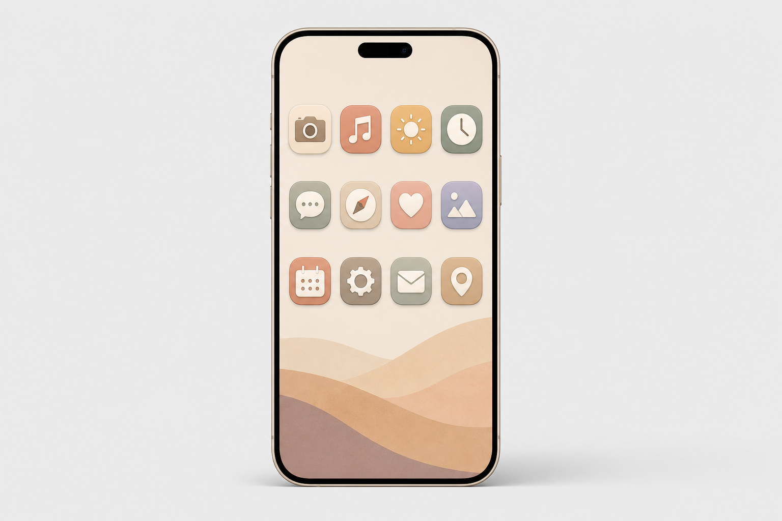
iPhone icon packs are matching sets of custom app-icon images you swap onto your Home Screen so every app shares one look. They are how millions of people turn a stock iPhone into something that looks like theirs, and the way you find, install, and live with a pack has changed a lot since the iOS 14 craze of 2020, and in 2026, a few of the “rules” everyone repeats are simply wrong. This guide covers where to find icon packs (free and paid), the two ways to install custom app icons on your iPhone, the one trade-off that makes people quietly revert, and how iOS 18 and iOS 26 quietly changed the whole game.
Quick Specs
| Home Screen icon size | 180 × 180 px (60 pt @3x) |
| Design/source size | 1024 × 1024 px master (system scales the rest) |
| Shape | Squircle — supply a square, iOS applies the mask |
| Install methods | 2 — Shortcuts app (free) or an icon app |
| Native option | iOS 18 Dark/Tinted, iOS 26 Clear (no app needed) |
| Works on | iPhone + iPad (many apps ship Android too) |
What iPhone Icon Packs Actually Are (and Why “Packs” Are Becoming Themes)
An iPhone icon pack is a set of matching custom app-icon images you apply to your Home Screen so every app shares one look. In 2026 it comes in three forms: a downloadable image set you apply one icon at a time, a Shortcuts-applied set, and an app-based theme that installs icons, widgets, and a matching wallpaper together in a couple of taps.
Whether people search for iOS icon packs, iOS icons, or a whole homescreen theme, the goal is the same: one coherent look across every custom iOS app icon on the screen, a color, a shape language, or a mood.
Here’s the shift most tutorials miss: the word “pack” is fading. Across iOS 17, 18, and 26 Apple has folded more recoloring into the system itself, iOS 18 added dark and tinted icons and iOS 26 pushed further with translucent “Clear” icons. According to Apple’s Human Interface Guidelines, the Home Screen can now render icons in six variants, default, dark, clear light, clear dark, tinted light, and tinted dark, and the system generate any variant you don’t provide. You can even hide app labels for an icon-only grid. So the modern goal isn’t a one-off pack; it’s a coherent theme. That’s exactly what an all-in-one app like iScreen’s icon library is built to deliver.
Where to Find iPhone Icon Packs: The 4-Tier Icon Source Ladder
Every source falls onto one of four rungs, and the right rung depend on how much effort you want to spend. Tier 1 is free and native (iOS 18/26 tinting, plus free gallery sites). Tier 2 is marketplaces where independent designers sell packs (Etsy, Gumroad). Tier 3 is icon libraries you pull individual icons from (Icons8, Iconscout, Flaticon). Tier 4 is all-in-one customization apps that apply a whole themed set at once. The table below is the fast way to choose.
| Source | Type | Price | Install | Best for |
|---|---|---|---|---|
| iScreen | All-in-one app | Free + premium | One-tap in app | A full themed Home Screen fast |
| ScreenKit / Themify | Icon + widget app | Free + premium | One-tap in app | App-based bulk apply |
| Widgetsmith | Widget-first app | Free + premium | In app + Shortcuts | Widget-led layouts |
| Etsy shops | Marketplace | ~$1–$8 / pack | Manual (Shortcuts) | Unique indie designs |
| Gumroad creators | Marketplace | from ~$3 | Manual (Shortcuts) | Designer premium sets |
| Icons8 / Flaticon | Icon library | Free + paid | Manual (Shortcuts) | Pulling individual icons |
| Free designer packs | Curated free | Free | Manual (Shortcuts) | Minimalist free sets |
| Canva | Design tool | Free + Pro | Manual (Shortcuts) | Designing your own |
| iOS 18/26 built-in tint | Native (Apple) | Free | Settings, no Shortcuts | Keep badges, instant recolor |
| Pinterest / galleries | Inspiration + free | Free | Manual | Ideas and free downloads |
Prices are reported ranges as of Q2 2026 and vary by seller. Native app-icon variant support per Apple HIG.
Are icon packs free on iPhone?
Yes, plenty are. iOS 18 and iOS 26 recolor every icon at once for free with no download at all, and libraries like Icons8, Flaticon, and curated designer sets give away free aesthetic app icon packs, typically 35 to 150 icons. Many of the best iOS icon packs are available at no cost.
What you pay for is completeness and convenience: a paid or app-delivered set covers all your apps in a matching style and applies in one tap, while free packs usually leave a few apps unmatched. A common real-world tip from customizers is to run one default pack and keep a second color pack on hand, because a single pack almost never covers every app you own.
How to Install Custom App Icons on iPhone (2 Methods)
Short answer: either build each icon by hand with the free Shortcuts app, or let an icon app apply a whole pack at once. Both are App Store-safe, reversible, and need no jailbreak.
Method 1, The Shortcuts app (free, manual). Per Apple’s Shortcuts guide:
- Open Shortcuts, create a new shortcut, and include the Open App action. Choose the app you wish to launch.
- Find your shortcut, press its “Options” button, then tap “Add to Home Screen“.
- Click on the icon photo, and select “Choose Photo” or “Choose File”. Now, select your custom icon image.
- Rename it to match the app, then tap Add.
- Long-press on the app to hide it and then select Remove from Home Screen, which won’t remove the app itself, but stash it into your App Library.
create one for each app. if you re-use the same one and just change the app, each custom icon will open whichever app you last assigned. i tap kindle, and notes opens.
Method 2, An icon app (one-tap themes). Apps like iScreen skip the per-app grind: pick a themed set, tap apply, and install one profile, your device shows the standard privacy prompt, and your whole Home Screen updates on any modern smartphone in about a minute. It’s the low-effort route, and it’s why app-based packs have largely replaced hand-built ones. Once you land on a look you like, you can share the setup with friends or re-apply it after a reset. For a full step-by-step of every method, see our companion guide on how to customize iPhone app icons.
Do you need the Shortcuts app to change app icons?
No. Shortcuts is the most common route, but it is not the only one. On iOS 18 and iOS 26 you can recolor your icons natively with no Shortcuts at all, which we cover in the next section, and that route keeps your notification badges intact.
There is also a more technical Web Clip method: a small local-HTML file on your device can jump straight to an app’s URL scheme, opening the app quickly without bouncing through the Shortcuts app. And icon apps handle the whole thing for you. So “you must use Shortcuts” is another myth this guide puts to rest.
The Badge Blackout: The Real Cost of Shortcuts-Based Icons
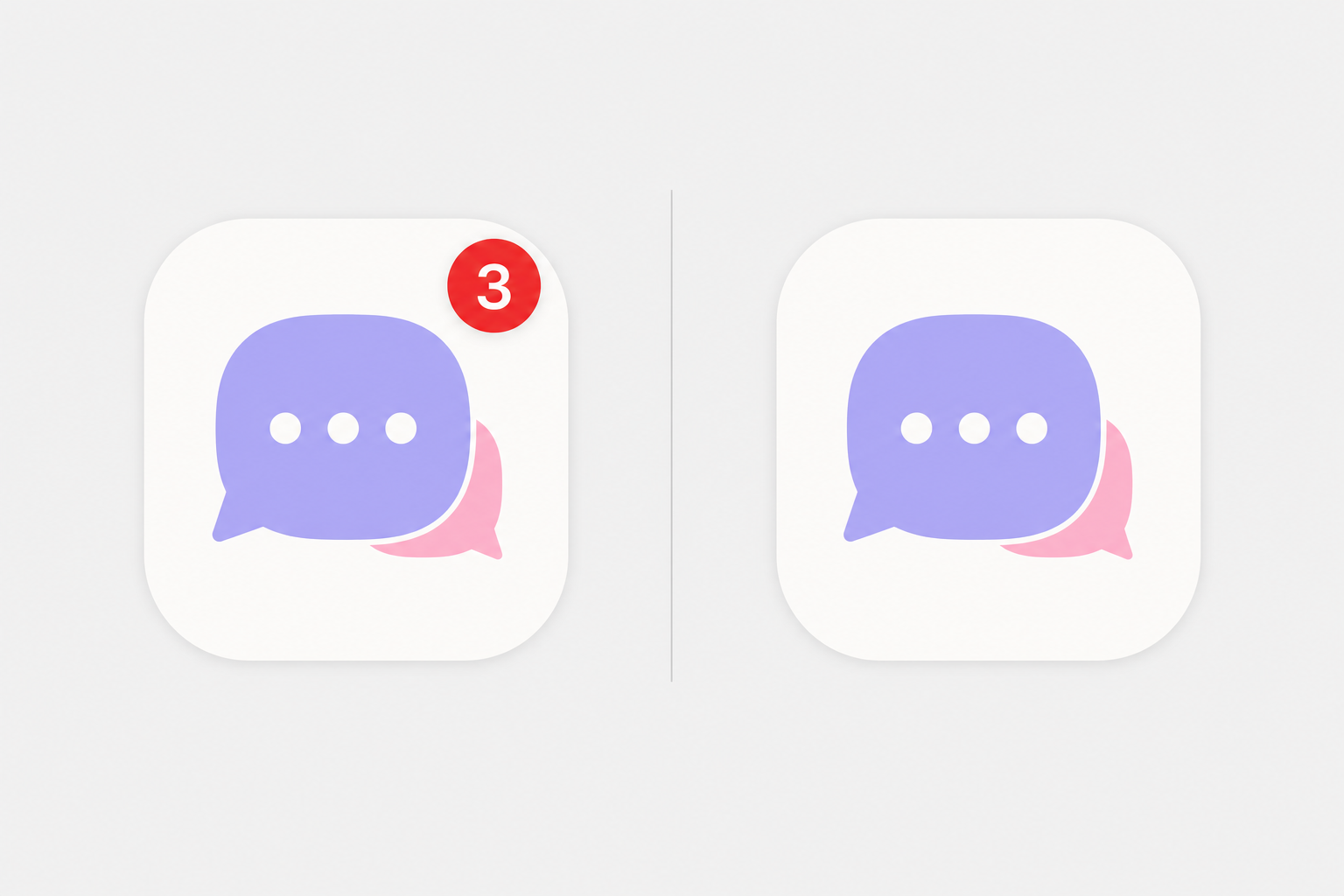
This is the almost untold trade-off, the one which causes people to quietly turn back to their original. When you hide an app behind a Shortcuts image icon, you conceal the original app, and only original apps display notification badges. Apple’s own community forum is very clear that you can’t add the red badge to a shortcut icon.
We call this The Badge Blackout, and on r/iOSsetups it’s the most commonly cited reason that people abandon icons. “every time I use custom icons for a few days I go back to the stock icons because of the badges.”
The other half of the old complaint, the launch delay, is mostly history, and this is where the internet is out of date. In iOS 14 (September 2020), tapping a Shortcuts icon opened the Shortcuts app first, adding a second or two. According to MacRumors, iOS 14.3 (December 2020) cut that full redirect, leaving only a brief banner at the top. Contrary to a claim you’ll see every where, iOS 15 did not remove that banner: The Verge confirmed that the iOS 15.4 “notify when run” toggle silences automations only, not custom-icon shortcuts. So in 2026 the residual cost is a small banner plus the permanent Badge Blackout, not a slow phone.
- Any custom picture you want
- Fully free with the built-in app
- Reversible anytime
- ⚠ No notification badges (Badge Blackout)
- ⚠ Brief banner on tap
- Keeps the real app + its badges
- No banner, no delay
- Recolors every icon in ~30 seconds
- ⚠ Recolor only, no custom pictures
- ⚠ Complex logos can look flat
A practical rule: if you can’t live without badge counts, use native tinting (or an icon app that keeps the app live); if you want fully custom artwork and can glance at a widget or the Lock Screen for alerts, the Shortcuts route is fine. Apple Community moderators give the same advice, customize the Home Screen natively when badges matter to you.
Choosing an Icon Style: Palettes, Dark, Minimalist & iOS 26 Round
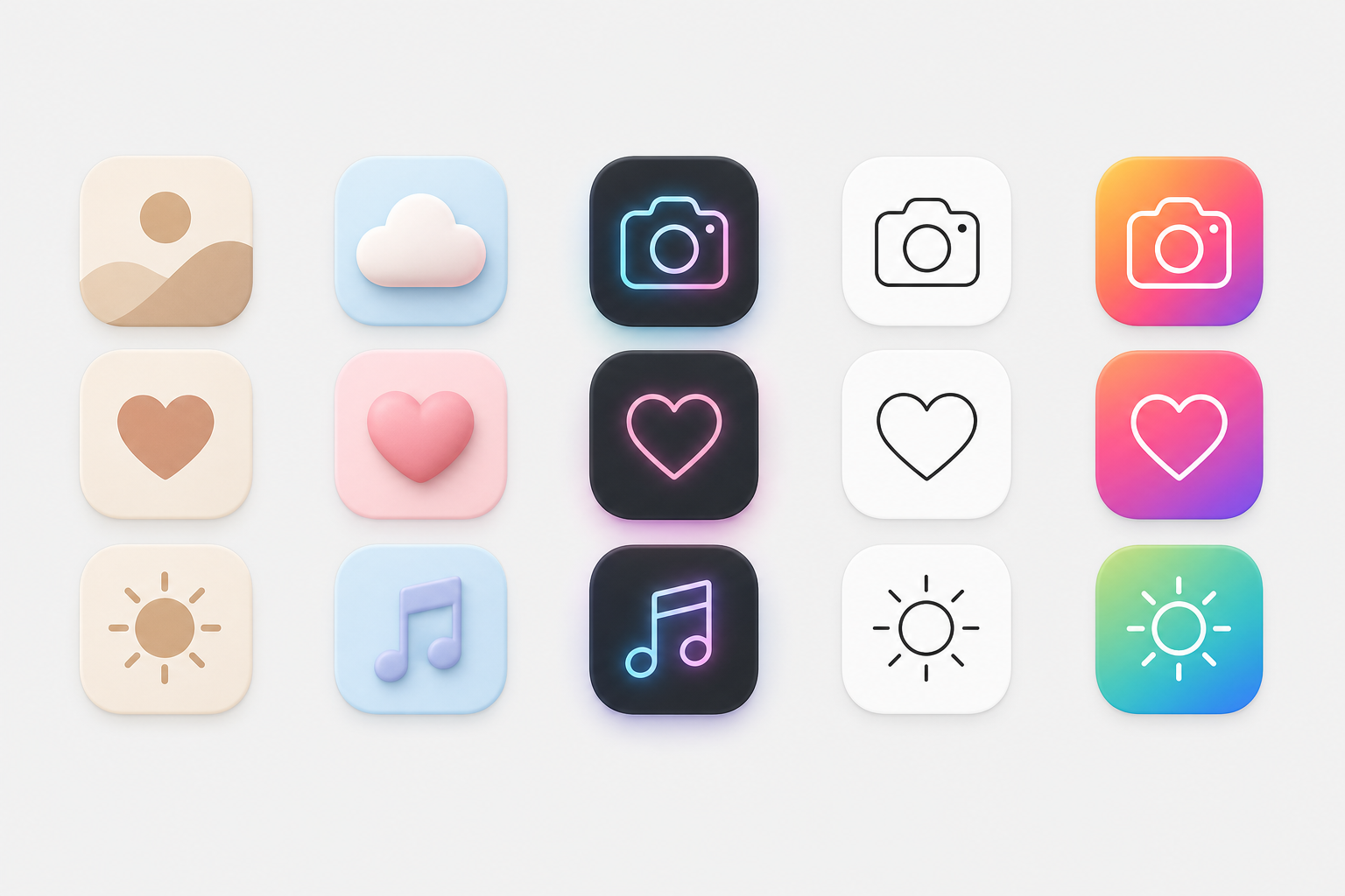
A pack only look good when it agrees with your wallpaper and your Lock Screen. Pick a palette first, then a shape language. The table pairs each popular style with the background that flatters it. If you’re also updating your background, our guides on iPhone wallpaper aesthetics and live wallpapers pair well here, or browse ready-made kits on the iScreen theme gallery.
| Style | Look | Pairs with | When to use |
|---|---|---|---|
| Beige / neutral | Warm muted tones | Cream / linen wallpaper | Calm, minimal look |
| Pastel | Soft pink / blue / lilac | Gradient pastel | Soft, cute vibe |
| Dark / black | Black icons, dark base | Dark / OLED wallpaper | Sleek, battery-friendly |
| Neon | Glowing accents | Dark city wallpaper | Bold, high-contrast |
| Minimalist line | Thin monochrome outlines | Solid / simple background | Clean, distraction-free |
| Colorful gradient | Vivid multi-color | Abstract gradient | Playful, energetic |
| Retro / Y2K | Chrome, bubble, pixel | Y2K collage | Nostalgic |
| Native tint (iOS 18/26) | System recolor of stock | Any — auto color-matches | Zero effort, keeps badges |
| Clay / 3D | Soft rounded 3D | Soft-shadow wallpaper | Tactile, modern |
| Cute / kawaii | Characters, sanrio | Character wallpaper | Fun, expressive |
Color is where most people start. Warm neutrals, beige, brown, and muted orange, read calm; a purple, green, or yellow palette feels playful; and a neon icon glow against black looks bold and stylish. Whatever you pick, keep it consistent: a coherent set of aesthetic iOS app icon packs looks far more intentional than a cool-but-random mix. If you want to design your own, no real design skills are needed, a template tool handle the layout, and it’s worth scanning a pack’s screenshots before you commit.
iOS 26 adds a wrinkle worth knowing. Its “Clear” Liquid Glass icons are translucent, and the system can auto-tint every icon to match your iPhone’s color, or even your case color.
“This gets especially fun if you like to swap out cases based on what you’re wearing, as you can quickly get a Home Screen aesthetic that complements your outfit.”
Ryan Christoffel, 9to5Mac
One catch worth setting expectations on: case-color matching only works with Apple’s MagSafe cases and some third-party ones, and packs with busy logos may not separate cleanly from a dark or clear background.
Free vs Paid Icon Packs: What You Actually Pay For
Free packs are genuinely good now, so the honest question is what money buys. Indie digital sets on Etsy run roughly $1 to $8 and typically bundle 20 to 80 icons; premium designer sets on marketplaces have gone for around $6 for 35 icons up to $28 for an 80-icon set with light and dark versions and lifetime updates. App-based packs usually run a small subscription or one-time unlock.
What free really costs you is threefold: time (applying icons one at a time via Shortcuts), completeness (free packs rarely cover every app), and updates (a static free pack won’t add icons for new apps). Paying, especially for an app, buys full coverage, one-tap apply, and ongoing additions. Before you subscribe, check the app’s rating and recent reviews; scale is a decent signal, and the leading customization apps count users in the millions (ScreenKit alone lists ten million). If you just want a quick recolor and nothing custom, stay free with native tinting.
Icon Specs That Matter: Size, Shape, Folders & Consistency
Getting the specs right is the difference between crisp icons and a blurry Home Screen. Two numbers matter, and one habit will save you.
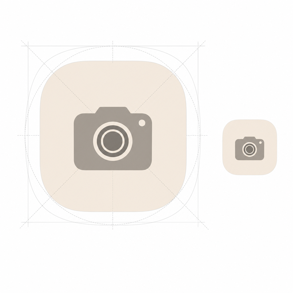
iPhone Home Screen icons render at 60 pt. On a @3x Super Retina display that’s 60 × 3 = 180 px, so your icon shows as 180 × 180 px. But you do not export a 180 px file: per Apple’s guidelines you design one 1024 × 1024 px master and let iOS scale it down to every size it needs, 180, 120, 80, 58 px and so on. Supply a square image and let the system apply the squircle mask; pre-rounding the corners yourself make edges look jagged and breaks the new Liquid Glass highlights. Export as PNG in RGB, not CMYK.
Folders are the one thing you can’t re-skin. iOS has no native option to put a custom picture on a Home Screen folder, so themers who want a fully custom grid skip folders entirely and replace them with Shortcuts tiles, or, on iOS 26, let folders inherit the clear/tinted Liquid Glass look. For a consistent set, decide your palette and icon shape before you download anything, and pull from one source where you can so the style hold together across every app.
Where iPhone Customization Is Headed: The Icon-Pack-to-Theme Migration
The biggest 2026 story isn’t a new pack; it’s that Apple is absorbing the simple version of what packs used to do, and demand is following. As the OS makes recoloring free and system-wide, the reason to hunt down a static “pack” shrinks, and the reason to install a coordinated theme of icons plus widgets plus wallpaper grows.
That shift is concrete. iOS 18 introduced native dark and tinted icons; iOS 26 added translucent Clear icons and automatic color-matching to your phone or case, what 9to5Mac describes as color theming that “carries across hardware and software.”
Our own search-demand data backs up the pivot. Over the trailing twelve months, searches for “icon packs iphone” were down about 61% year over year, whereas “iphone icon themes” were up around 184%, “iphone shortcuts icons” climbed by about 20 times, and “ios round icons” grew by close to three times. In other words, people are still customizing just as much as ever – home-screen personalization has been a mass habit since the iOS 14 boom of 2020, when the top customization apps amassed 13.7 million installs in one week – they’re just searching for “themes” and “how to change icons,” rather than “packs.” The takeaway for 2026: Don’t chase a one-off pack a system update could restyle. Instead, build a reusable theme, and then rely on an app to keep your look coherent as iOS updates underneath you. That’s exactly what iScreen’s icon packs and themes were designed to do.
Skip the per-app Shortcuts grind. Get a matching set of icons, widgets, and a wallpaper in one place.
Frequently Asked Questions
Q: What are the best free iPhone icon packs?
View Answer
Q: How do I change app icons on iPhone without Shortcuts?
View Answer
Q: Do custom app icons slow down your iPhone?
View Answer
Q: Why do my custom icons open the Shortcuts app first?
View Answer
Q: What size are iPhone app icons?
View Answer
Q: Do custom icons remove notification badges?
View Answer
Q: How do I keep custom icons after an app updates?
View Answer
Why We Wrote This Guide
We build iScreen, an iPhone and Android home-screen customization app with a library of 5,000+ app icons, so we spend our days watching how people actually apply icon packs, and where they get stuck. This guide reflects that, plus the real iOS 14.3, iOS 18, and iOS 26 behavior verified against Apple’s own documentation, so you get the trade-offs (like the Badge Blackout) that most icon-pack roundups leave out. Reviewed by the iScreen team.
References & Sources
- App Icons, Human Interface GuidelinesApple Developer
- Customize apps and widgets on the Home ScreenApple Support
- Add a shortcut to the Home ScreenApple Support (Shortcuts)
- Custom App Icons Simplified in iOS 14.3MacRumors
- iOS 15.4 shortcut notification bannersThe Verge
- iOS 26 Home Screen icon color-matching9to5Mac
- iOS 14 home-screen customization installsTechCrunch
