iPhone Icon Packs: Where to Find and Install (2026 Guide)
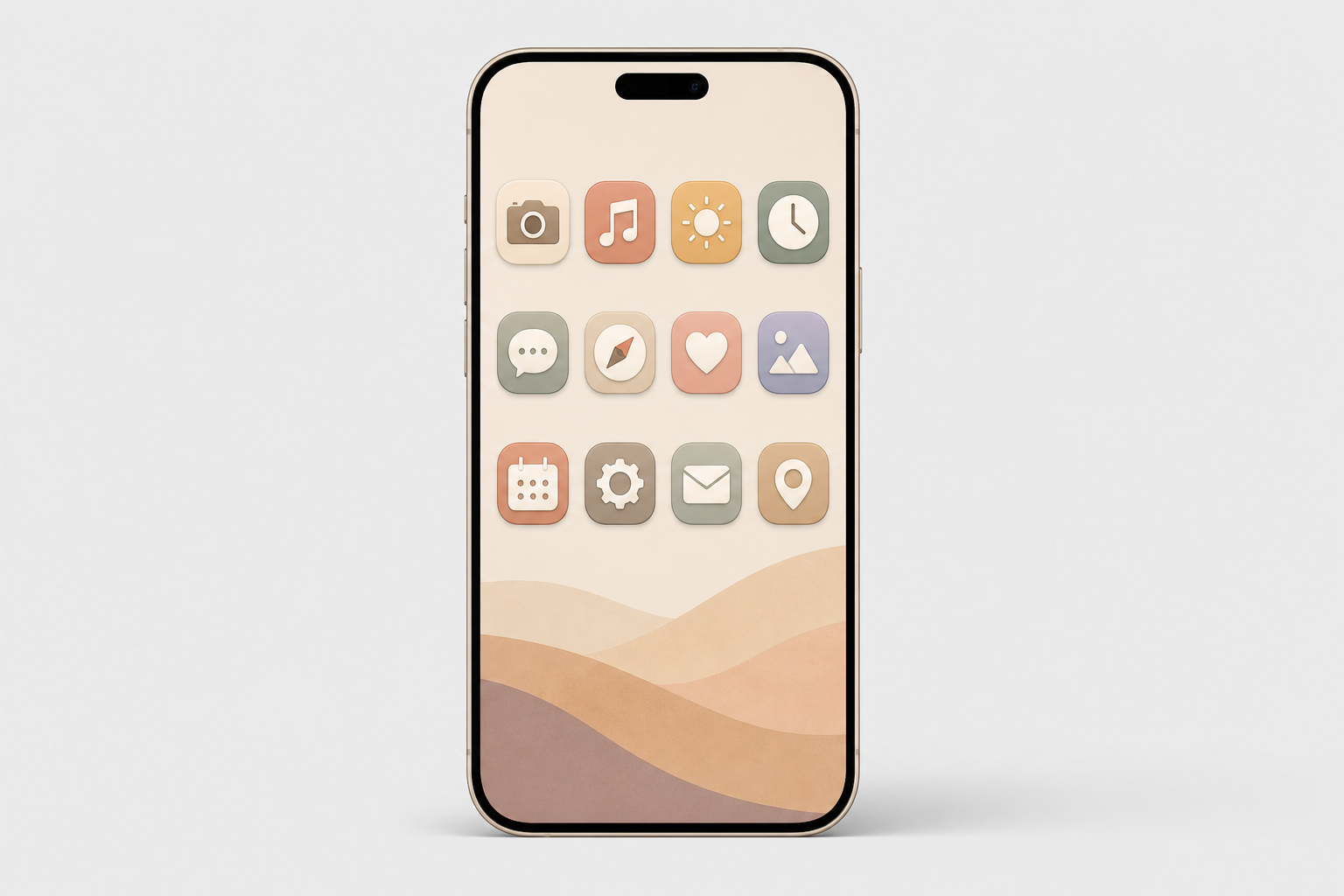
An iPhone home screen with a coordinated custom icon pack theme in a warm beige and pastel aesthetic

Updated July 2026.

iPhone icon packs are matching sets of custom app-icon images you swap onto your Home Screen so every app shares one look. They are how millions of people turn a stock iPhone into something that looks like theirs, and the way you find, install, and live with a pack has changed a lot since the iOS 14 craze of 2020, and in 2026, a few of the “rules” everyone repeats are simply wrong. This guide covers where to find icon packs (free and paid), the two ways to install custom app icons on your iPhone, the one trade-off that makes people quietly revert, and how iOS 18 and iOS 26 quietly changed the whole game.

Quick Specs

Home Screen icon size 180 × 180 px (60 pt @3x)
Design/source size 1024 × 1024 px master (system scales the rest)
Shape Squircle — supply a square, iOS applies the mask
Install methods 2 — Shortcuts app (free) or an icon app
Native option iOS 18 Dark/Tinted, iOS 26 Clear (no app needed)
Works on iPhone + iPad (many apps ship Android too)

What iPhone Icon Packs Actually Are (and Why “Packs” Are Becoming Themes)

An iPhone icon pack is a set of matching custom app-icon images you apply to your Home Screen so every app shares one look. In 2026 it comes in three forms: a downloadable image set you apply one icon at a time, a Shortcuts-applied set, and an app-based theme that installs icons, widgets, and a matching wallpaper together in a couple of taps.

Whether people search for iOS icon packs, iOS icons, or a whole homescreen theme, the goal is the same: one coherent look across every custom iOS app icon on the screen, a color, a shape language, or a mood.

Here’s the shift most tutorials miss: the word “pack” is fading. Across iOS 17, 18, and 26 Apple has folded more recoloring into the system itself, iOS 18 added dark and tinted icons and iOS 26 pushed further with translucent “Clear” icons. According to Apple’s Human Interface Guidelines, the Home Screen can now render icons in six variants, default, dark, clear light, clear dark, tinted light, and tinted dark, and the system generate any variant you don’t provide. You can even hide app labels for an icon-only grid. So the modern goal isn’t a one-off pack; it’s a coherent theme. That’s exactly what an all-in-one app like iScreen’s icon library is built to deliver.

Where to Find iPhone Icon Packs: The 4-Tier Icon Source Ladder

Every source falls onto one of four rungs, and the right rung depend on how much effort you want to spend. Tier 1 is free and native (iOS 18/26 tinting, plus free gallery sites). Tier 2 is marketplaces where independent designers sell packs (Etsy, Gumroad). Tier 3 is icon libraries you pull individual icons from (Icons8, Iconscout, Flaticon). Tier 4 is all-in-one customization apps that apply a whole themed set at once. The table below is the fast way to choose.

Ten places to find iPhone icon packs in 2026, from free iOS 26 tinting to full app themes.
Source Type Price Install Best for
iScreen All-in-one app Free + premium One-tap in app A full themed Home Screen fast
ScreenKit / Themify Icon + widget app Free + premium One-tap in app App-based bulk apply
Widgetsmith Widget-first app Free + premium In app + Shortcuts Widget-led layouts
Etsy shops Marketplace ~$1–$8 / pack Manual (Shortcuts) Unique indie designs
Gumroad creators Marketplace from ~$3 Manual (Shortcuts) Designer premium sets
Icons8 / Flaticon Icon library Free + paid Manual (Shortcuts) Pulling individual icons
Free designer packs Curated free Free Manual (Shortcuts) Minimalist free sets
Canva Design tool Free + Pro Manual (Shortcuts) Designing your own
iOS 18/26 built-in tint Native (Apple) Free Settings, no Shortcuts Keep badges, instant recolor
Pinterest / galleries Inspiration + free Free Manual Ideas and free downloads

Prices are reported ranges as of Q2 2026 and vary by seller. Native app-icon variant support per Apple HIG.

Are icon packs free on iPhone?

Yes, plenty are. iOS 18 and iOS 26 recolor every icon at once for free with no download at all, and libraries like Icons8, Flaticon, and curated designer sets give away free aesthetic app icon packs, typically 35 to 150 icons. Many of the best iOS icon packs are available at no cost.

What you pay for is completeness and convenience: a paid or app-delivered set covers all your apps in a matching style and applies in one tap, while free packs usually leave a few apps unmatched. A common real-world tip from customizers is to run one default pack and keep a second color pack on hand, because a single pack almost never covers every app you own.

How to Install Custom App Icons on iPhone (2 Methods)

Short answer: either build each icon by hand with the free Shortcuts app, or let an icon app apply a whole pack at once. Both are App Store-safe, reversible, and need no jailbreak.

Method 1, The Shortcuts app (free, manual). Per Apple’s Shortcuts guide:

  1. Open Shortcuts, create a new shortcut, and include the Open App action. Choose the app you wish to launch.
  2. Find your shortcut, press its “Options” button, then tap “Add to Home Screen“.
  3. Click on the icon photo, and select “Choose Photo” or “Choose File”. Now, select your custom icon image.
  4. Rename it to match the app, then tap Add.
  5. Long-press on the app to hide it and then select Remove from Home Screen, which won’t remove the app itself, but stash it into your App Library.
⚠️ Common mistake

create one for each app. if you re-use the same one and just change the app, each custom icon will open whichever app you last assigned. i tap kindle, and notes opens.

Method 2, An icon app (one-tap themes). Apps like iScreen skip the per-app grind: pick a themed set, tap apply, and install one profile, your device shows the standard privacy prompt, and your whole Home Screen updates on any modern smartphone in about a minute. It’s the low-effort route, and it’s why app-based packs have largely replaced hand-built ones. Once you land on a look you like, you can share the setup with friends or re-apply it after a reset. For a full step-by-step of every method, see our companion guide on how to customize iPhone app icons.

Do you need the Shortcuts app to change app icons?

No. Shortcuts is the most common route, but it is not the only one. On iOS 18 and iOS 26 you can recolor your icons natively with no Shortcuts at all, which we cover in the next section, and that route keeps your notification badges intact.

There is also a more technical Web Clip method: a small local-HTML file on your device can jump straight to an app’s URL scheme, opening the app quickly without bouncing through the Shortcuts app. And icon apps handle the whole thing for you. So “you must use Shortcuts” is another myth this guide puts to rest.

The Badge Blackout: The Real Cost of Shortcuts-Based Icons
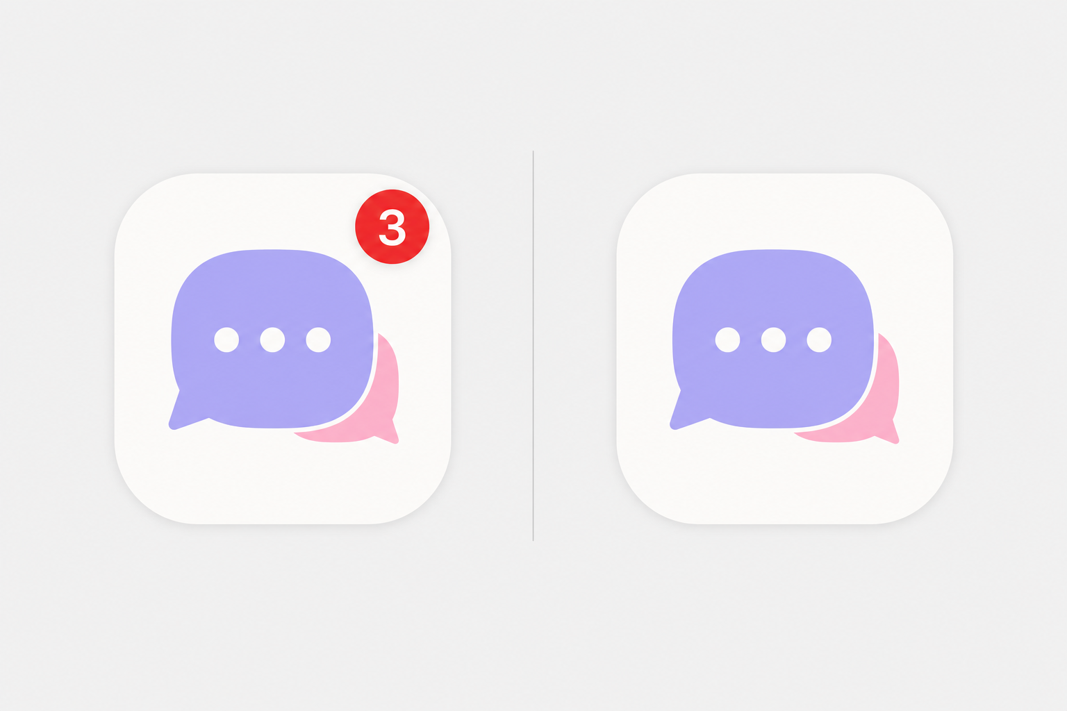
A custom app icon with a red notification badge versus a Shortcuts icon with no badge (the Badge Blackout)
The Badge Blackout: only a real app (left) shows the red notification badge; a Shortcuts custom icon (right) loses it.

This is the almost untold trade-off, the one which causes people to quietly turn back to their original. When you hide an app behind a Shortcuts image icon, you conceal the original app, and only original apps display notification badges. Apple’s own community forum is very clear that you can’t add the red badge to a shortcut icon.

We call this The Badge Blackout, and on r/iOSsetups it’s the most commonly cited reason that people abandon icons. “every time I use custom icons for a few days I go back to the stock icons because of the badges.”

The other half of the old complaint, the launch delay, is mostly history, and this is where the internet is out of date. In iOS 14 (September 2020), tapping a Shortcuts icon opened the Shortcuts app first, adding a second or two. According to MacRumors, iOS 14.3 (December 2020) cut that full redirect, leaving only a brief banner at the top. Contrary to a claim you’ll see every where, iOS 15 did not remove that banner: The Verge confirmed that the iOS 15.4 “notify when run” toggle silences automations only, not custom-icon shortcuts. So in 2026 the residual cost is a small banner plus the permanent Badge Blackout, not a slow phone.

✔ Shortcuts / image icons

  • Any custom picture you want
  • Fully free with the built-in app
  • Reversible anytime
  • ⚠ No notification badges (Badge Blackout)
  • ⚠ Brief banner on tap
✔ Native tint (iOS 18/26)

  • Keeps the real app + its badges
  • No banner, no delay
  • Recolors every icon in ~30 seconds
  • ⚠ Recolor only, no custom pictures
  • ⚠ Complex logos can look flat

A practical rule: if you can’t live without badge counts, use native tinting (or an icon app that keeps the app live); if you want fully custom artwork and can glance at a widget or the Lock Screen for alerts, the Shortcuts route is fine. Apple Community moderators give the same advice, customize the Home Screen natively when badges matter to you.

Choosing an Icon Style: Palettes, Dark, Minimalist & iOS 26 Round
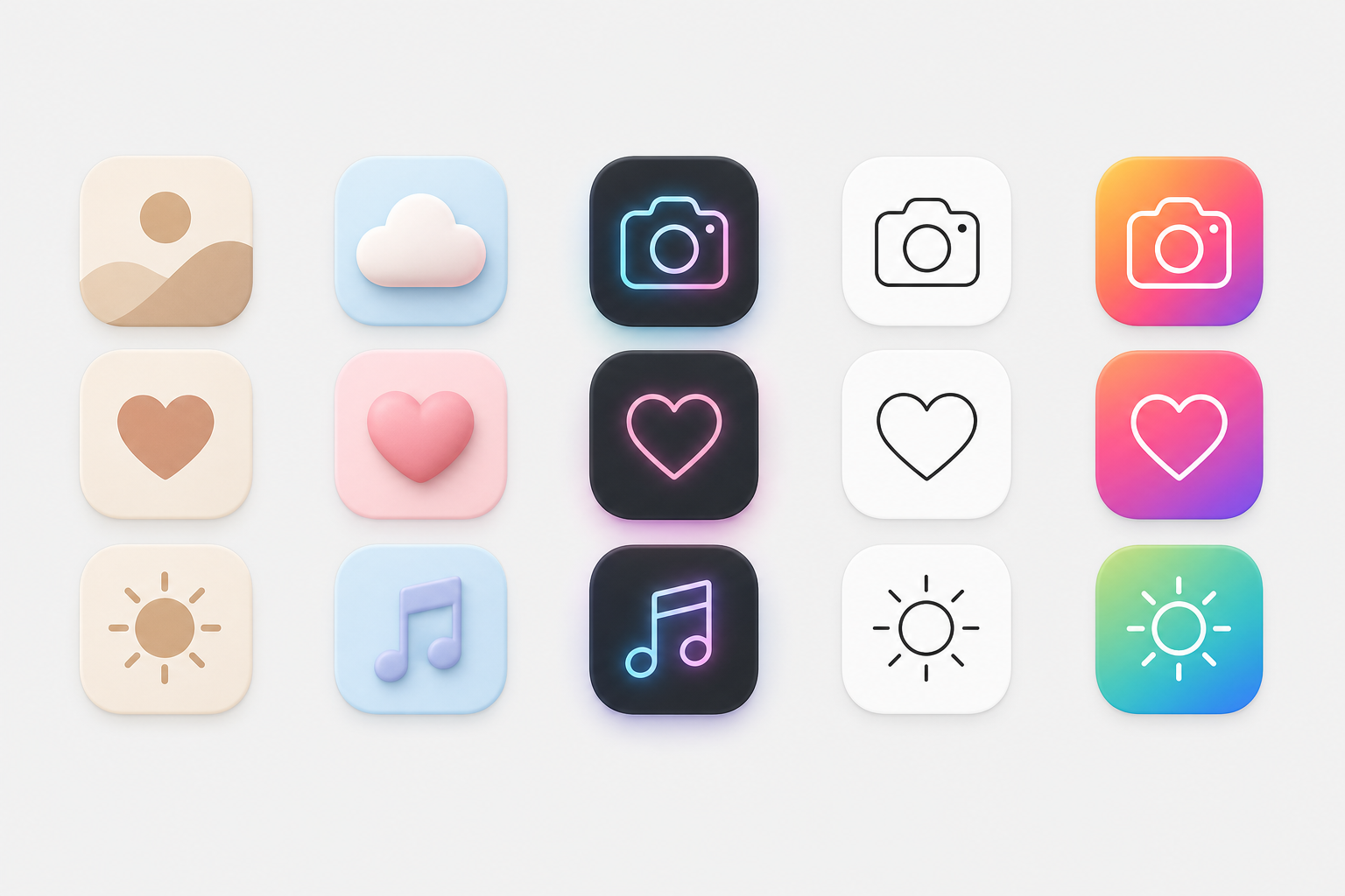
Five iPhone icon styles compared side by side
Popular iPhone icon styles, from warm beige to neon and minimalist line art.

A pack only look good when it agrees with your wallpaper and your Lock Screen. Pick a palette first, then a shape language. The table pairs each popular style with the background that flatters it. If you’re also updating your background, our guides on iPhone wallpaper aesthetics and live wallpapers pair well here, or browse ready-made kits on the iScreen theme gallery.

Ten iPhone icon styles and the wallpaper each pairs with, match your pack to your Home Screen.
Style Look Pairs with When to use
Beige / neutral Warm muted tones Cream / linen wallpaper Calm, minimal look
Pastel Soft pink / blue / lilac Gradient pastel Soft, cute vibe
Dark / black Black icons, dark base Dark / OLED wallpaper Sleek, battery-friendly
Neon Glowing accents Dark city wallpaper Bold, high-contrast
Minimalist line Thin monochrome outlines Solid / simple background Clean, distraction-free
Colorful gradient Vivid multi-color Abstract gradient Playful, energetic
Retro / Y2K Chrome, bubble, pixel Y2K collage Nostalgic
Native tint (iOS 18/26) System recolor of stock Any — auto color-matches Zero effort, keeps badges
Clay / 3D Soft rounded 3D Soft-shadow wallpaper Tactile, modern
Cute / kawaii Characters, sanrio Character wallpaper Fun, expressive

Color is where most people start. Warm neutrals, beige, brown, and muted orange, read calm; a purple, green, or yellow palette feels playful; and a neon icon glow against black looks bold and stylish. Whatever you pick, keep it consistent: a coherent set of aesthetic iOS app icon packs looks far more intentional than a cool-but-random mix. If you want to design your own, no real design skills are needed, a template tool handle the layout, and it’s worth scanning a pack’s screenshots before you commit.

iOS 26 adds a wrinkle worth knowing. Its “Clear” Liquid Glass icons are translucent, and the system can auto-tint every icon to match your iPhone’s color, or even your case color.

“This gets especially fun if you like to swap out cases based on what you’re wearing, as you can quickly get a Home Screen aesthetic that complements your outfit.”

Ryan Christoffel, 9to5Mac

One catch worth setting expectations on: case-color matching only works with Apple’s MagSafe cases and some third-party ones, and packs with busy logos may not separate cleanly from a dark or clear background.

Free vs Paid Icon Packs: What You Actually Pay For

Free packs are genuinely good now, so the honest question is what money buys. Indie digital sets on Etsy run roughly $1 to $8 and typically bundle 20 to 80 icons; premium designer sets on marketplaces have gone for around $6 for 35 icons up to $28 for an 80-icon set with light and dark versions and lifetime updates. App-based packs usually run a small subscription or one-time unlock.

What free really costs you is threefold: time (applying icons one at a time via Shortcuts), completeness (free packs rarely cover every app), and updates (a static free pack won’t add icons for new apps). Paying, especially for an app, buys full coverage, one-tap apply, and ongoing additions. Before you subscribe, check the app’s rating and recent reviews; scale is a decent signal, and the leading customization apps count users in the millions (ScreenKit alone lists ten million). If you just want a quick recolor and nothing custom, stay free with native tinting.

Icon Specs That Matter: Size, Shape, Folders & Consistency
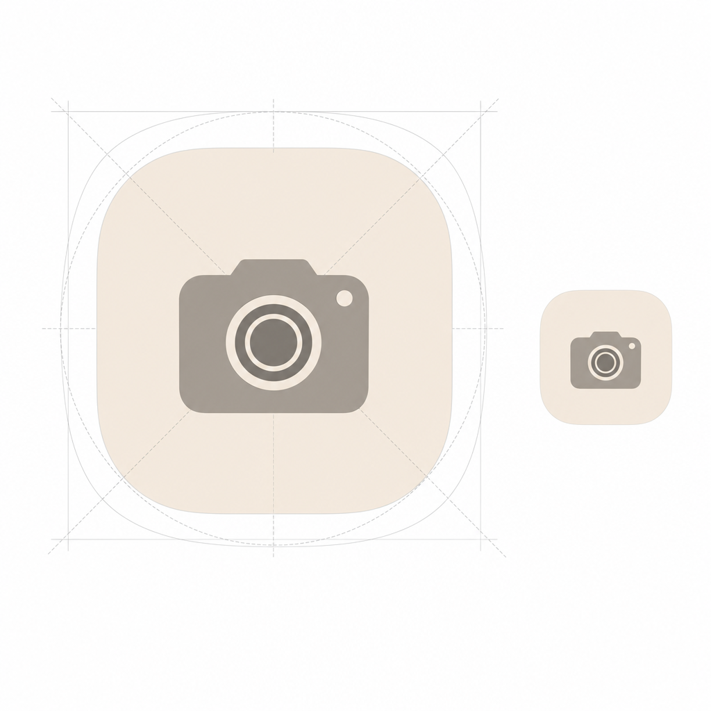
iPhone icon squircle shape and 1024 to 180 pixel scaling
iOS masks a square into a ‘squircle’ — design one 1024×1024 master and let it scale down to 180 px.

Getting the specs right is the difference between crisp icons and a blurry Home Screen. Two numbers matter, and one habit will save you.

📐 Engineering Note

iPhone Home Screen icons render at 60 pt. On a @3x Super Retina display that’s 60 × 3 = 180 px, so your icon shows as 180 × 180 px. But you do not export a 180 px file: per Apple’s guidelines you design one 1024 × 1024 px master and let iOS scale it down to every size it needs, 180, 120, 80, 58 px and so on. Supply a square image and let the system apply the squircle mask; pre-rounding the corners yourself make edges look jagged and breaks the new Liquid Glass highlights. Export as PNG in RGB, not CMYK.

Folders are the one thing you can’t re-skin. iOS has no native option to put a custom picture on a Home Screen folder, so themers who want a fully custom grid skip folders entirely and replace them with Shortcuts tiles, or, on iOS 26, let folders inherit the clear/tinted Liquid Glass look. For a consistent set, decide your palette and icon shape before you download anything, and pull from one source where you can so the style hold together across every app.

Where iPhone Customization Is Headed: The Icon-Pack-to-Theme Migration

The biggest 2026 story isn’t a new pack; it’s that Apple is absorbing the simple version of what packs used to do, and demand is following. As the OS makes recoloring free and system-wide, the reason to hunt down a static “pack” shrinks, and the reason to install a coordinated theme of icons plus widgets plus wallpaper grows.

That shift is concrete. iOS 18 introduced native dark and tinted icons; iOS 26 added translucent Clear icons and automatic color-matching to your phone or case, what 9to5Mac describes as color theming that “carries across hardware and software.”

Our own search-demand data backs up the pivot. Over the trailing twelve months, searches for “icon packs iphone” were down about 61% year over year, whereas “iphone icon themes” were up around 184%, “iphone shortcuts icons” climbed by about 20 times, and “ios round icons” grew by close to three times. In other words, people are still customizing just as much as ever – home-screen personalization has been a mass habit since the iOS 14 boom of 2020, when the top customization apps amassed 13.7 million installs in one week – they’re just searching for “themes” and “how to change icons,” rather than “packs.” The takeaway for 2026: Don’t chase a one-off pack a system update could restyle. Instead, build a reusable theme, and then rely on an app to keep your look coherent as iOS updates underneath you. That’s exactly what iScreen’s icon packs and themes were designed to do.

Skip the per-app Shortcuts grind. Get a matching set of icons, widgets, and a wallpaper in one place.

Explore iScreen Icon Packs →

Frequently Asked Questions

Q: What are the best free iPhone icon packs?

View Answer
The best free options split into two kinds. For zero effort, iOS 18 and iOS 26 recolor every icon natively at no cost and keep your notification badges. For custom artwork, free curated sets from designers and libraries like Icons8 and Flaticon give away packs of roughly 35 to 150 icons, and apps like iScreen offer a free tier before any premium unlock. Expect free packs to leave a few apps unmatched, which is the main reason people upgrade.

Q: How do I change app icons on iPhone without Shortcuts?

View Answer
You’ve two no-Shortcuts routes. The native one: touch and hold the Home Screen, tap Edit, then Customize, and choose Dark, Clear, or Tinted to recolor every icon, no app and no Shortcuts required, and your badges stay. The other route is an icon app that installs a themed set for you. A more technical Web Clip method also exists, but for most people native tinting or an app is simpler and keeps the real apps live.

Q: Do custom app icons slow down your iPhone?

View Answer
Not really, that claim is out of date. In iOS 14 a Shortcuts icon opened the Shortcuts app first, adding a second or two, but iOS 14.3 (December 2020) removed that full redirect. Today the only residual is a brief banner on tap, not a genuine slowdown, and native tinting has no delay at all. The real cost of the Shortcuts method is losing notification badges, not speed.

Q: Why do my custom icons open the Shortcuts app first?

View Answer
You’re on an old iOS version. The full redirect through the Shortcuts app was removed in iOS 14.3; on current iOS a shortcut icon opens the app directly, with at most a small banner. Update your iPhone to stop the bounce.

Q: What size are iPhone app icons?

View Answer
The Home Screen renders icons at 180 × 180 px (60 pt @3x). Design a 1024 × 1024 px master and let iOS scale it; keep the artwork square so the system can apply the squircle mask.

Q: Do custom icons remove notification badges?

View Answer
Shortcuts image icons do, that’s the Badge Blackout. Because you hide the real app, the red badge count disappears, and only real apps can show badges. Native tinting on iOS 18/26 avoids this entirely because it recolors the real app instead of replacing it, so your badges keep working.

Q: How do I keep custom icons after an app updates?

View Answer
A Shortcuts custom icon survives app updates because it points to the app, not to a version of it, an app update won’t reset it. What can change your look is a major iOS update: iOS 26, for example, may restyle icons toward the clear Liquid Glass appearance. If that happens, go to Edit, then Customize, and choose Default to restore your set.

Why We Wrote This Guide

We build iScreen, an iPhone and Android home-screen customization app with a library of 5,000+ app icons, so we spend our days watching how people actually apply icon packs, and where they get stuck. This guide reflects that, plus the real iOS 14.3, iOS 18, and iOS 26 behavior verified against Apple’s own documentation, so you get the trade-offs (like the Badge Blackout) that most icon-pack roundups leave out. Reviewed by the iScreen team.

Recent articles

Fall Wallpaper for iPhone: Cozy Autumn Lock Screen Ideas

Fall Wallpaper for iPhone: Cozy Autumn Lock Screen Ideas

2026/8/12 21:52
Updated August 2026 · Practical autumn wallpaper ideas for iPhone Lock and Home Screens Fall backgrounds for iPhone are vertical autumn images chosen and cropped for the Lock or Home Screen. They work best when the scene leaves room for the real interface: use a calm clock zone, move the main subject away from notifications, and preview it with the widgets you actually use. Even a cozy picture can look beautiful in a gallery and still feel crowded on a Lock Screen. The fast answer For a Lock Screen: use a detailed fall scene with open space behind the clock and room below for notifications. For a Home Screen: use the same palette with fewer edges behind app icons and widgets. Before saving: check the active screen, dimmed screen, clock style, widgets, and a sample notification. The configured phone is the decision surface. This guide gives you 12 composition ideas, a mood-to-screen-fit table, current iPhone setup steps, and a practical way to reject a wallpaper before it becomes annoying. These are design ideas rather than promises that all 12 files already exist in iScreen. For ready-to-use choices, you can browse iPhone wallpapers. The Clock-First Crop: A First-Pass Fall Wallpaper Check The Clock-First Crop is a quick first-pass check: preview the clock before judging the art, keep its immediate background relatively quiet, and move the main object away from the notification stack. It does not guarantee readability. Brightness, color, visual clutter, room lighting, widgets, notifications, and your chosen clock treatment can all change the final result. That screen-fit problem is why mood comes before placement, not instead of it. A rusty forest path can carry more edge detail than a cream flat lay, but the path’s vanishing point should not disappear under the time. Pink pumpkins can preserve a soft fall aesthetic if their strongest shapes sit in the lower half. The goal is not to make every iPhone background empty. It is to give the interface somewhere to live. Choose a fall mood by focal placement and screen tolerance Mood Palette Best focal placement Widget tolerance Home Screen companion Warm and cozy Amber, cream, walnut Lamp, mug, or book below center Medium Cream-to-amber blur Colorful leaves Rust, gold, red Canopy at edges; open sky above Low to medium One enlarged leaf Soft and cute Blush, peach, cinnamon One doodle group in lower third High Wide gingham or tiny corner motif Dark and moody Charcoal, brown, muted orange Porch or moon below the clock Medium Low-detail charcoal gradient Pumpkin harvest Pumpkin, oat, olive Still life across the bottom Medium Single pumpkin silhouette Minimal neutral Oat, cocoa, black Small line art off center High Paper texture or flat color Current search demand helped allocate space among cozy, cute, aesthetic, leaves, and holiday variations, but it does not prove a universal taste hierarchy. Use the table as a screen-fit decision, not a rule about which autumn style is “best.” 12 Cozy Fall Wallpaper Ideas for iPhone The 12 fall wallpaper ideas cover indoor warmth, outdoor color, texture, and minimal art. Each includes a clock-zone direction and a Home Screen pairing, so you can compare daily usability instead of choosing from mood alone. Keep the art original and generic: no copied commercial illustration, protected character, celebrity, team mark, or branded object is needed to make autumn recognizable. 12-Idea Screen-Fit Table Idea category Clock zone Widget tolerance Home Screen pair 1. Rainy window and warm lamp Keep the lamp low; use the dim window above. Medium Amber rain blur 2. Coffee, knit blanket, and book Place the flat lay below the clock. Low Close crop of cream knit 3. Amber candlelight still life Move flame away from the digits. Medium Brown-to-amber gradient 4. Rustic wood and dried leaves Leave a bare wood panel at top. High Wood grain with one corner leaf 5. Foggy cabin morning Use fog for time; cabin sits low. High Fog and pine color field 6. Cream and cinnamon flat lay Push spices to lower corners. High Warm cream paper texture 7. Golden-hour field Put the horizon below center. High Soft gold sky crop 8. Soft plaid texture Lower contrast behind the time. Medium Enlarged, quieter plaid 9. Fireplace glow Frame the fire below notifications. Low Charcoal wall with soft glow 10. Moonlit pumpkin porch Separate the moon from the clock. Medium Midnight blue with one leaf 11. Brown-paper autumn collage Build the collage around blank center space. Medium Plain kraft paper grain 12. Minimal acorn and leaf line art Place one motif below the time. High Matching micro-motif at one edge Autumn Leaves and Forest Backgrounds For leaf and forest fall backgrounds for iPhone, choose a composition with one stable region rather than equal detail everywhere. An open sky above red maples, fog above a golden aspen path, or dark water above a reflection gives the clock a usable field while keeping the scene unmistakably autumnal. A leaf close-up can work if the main vein runs beside the clock instead of through it. A falling-leaf pattern is more forgiving at the edges than in the center. Yellow autumn backgrounds—or iPhone wallpapers featuring autumn leaves—still need a stable clock zone. For a forest trail, place the brightest vanishing point below the time; otherwise the clock and path compete for the same focal role. Misty evergreens suit more widgets because fog reduces local edge detail, while a crisp red canopy needs a cleaner crop. The useful distinction is not “photo versus illustration.” It is edge distribution. Fine detail around the perimeter can frame the interface. Fine detail directly under digits and small widget text makes the phone harder to scan. Cute, Pink, and Soft Fall Backgrounds Cute fall wallpaper stays readable when one playful element gets priority. Try blush pumpkins below the clock, cream-and-peach leaf doodles around the border, a warm gingham field with one large bow, or a soft digital graphic of tiny acorns spaced widely around the edges. Keep the center quieter than the corners. Pink does not have to mean low contrast. A deep cinnamon clock over pale blush can be clearer than white digits over a busy orange photograph. Soft styles also adapt well to a matching Home Screen: enlarge the gingham, remove most doodles, or isolate one peach leaf in a corner. If the Lock Screen already has widgets, skip decorative phrases and let shape and color carry the theme. Pumpkin, Halloween, and Thanksgiving Styles Holiday-specific fall wallpaper works best when you decide how long it should stay on the phone. Neutral pumpkins, cranberries, dried leaves, harvest linen, and a late-autumn sky can run from September through November. Jack-o’-lantern faces, bats, or a dinner-table message create a shorter Halloween or Thanksgiving window. Build a curated shortlist of neutral harvest images and shorter-window holiday styles before saving one. For a versatile pumpkin Lock Screen, use three or fewer large forms across the bottom and leave the upper wall, sky, or paper field open. Pumpkin iPhone wallpapers can stay on your phone into November, while an early Christmas motif changes the seasonal message. For subtle spooky mood, try a moonlit porch, bare branch silhouette, or black cat-shaped shadow created as original art. A harvest table should be cropped low enough that dishes do not sit under notification banners. For a Home Screen companion, reduce the scene to one pumpkin or a broad linen texture so icons stay easy to find. Avoid copying protected characters or franchise-specific artwork; generic seasonal objects provide more freedom to coordinate the rest of the screen. Keep the Clock and Widgets Readable A readable fall Lock Screen needs local separation behind every foreground element, not merely a “light” or “dark” wallpaper label. Check the clock, each widget, the notification area, the focal subject, the active screen, and the dimmed screen. Recheck after changing clock color or widget load, because the same source image can behave differently in another configuration. W3C Technique G18 supports the general principle that text must remain distinguishable over solid, varying, and patterned backgrounds. Here, that principle is a practical design lens, not a claim that your iPhone wallpaper must meet a particular web-compliance ratio. Apple’s system editor is why The Clock-First Crop starts with the interface. Apple’s current Lock Screen guide documents photo repositioning, clock appearance, and widgets. “You can personalize your Lock Screen by choosing a wallpaper, showcasing a favorite photo, changing the font of the time.” Those controls mean a gallery thumbnail cannot prove final readability. Do Preview the actual clock color and font. Test with the widgets you really keep. Wake the screen in bright and dim surroundings. Recheck after a notification appears. Don’t Judge only from the uncropped gallery image. Assume dark automatically means readable. Place the brightest object behind the time. Treat The Clock-First Crop as a guarantee. How to Set and Crop a Fall Wallpaper on iPhone Save an original or properly licensed vertical image, open the iPhone wallpaper editor, position the subject around the clock and widgets, then choose whether the Home Screen uses the same image or a quieter companion. iScreen can help you discover wallpapers and coordinated themes; iOS controls the final system wallpaper setting. Save the source image — use the largest clean vertical version the creator or license legitimately offers. Open the wallpaper editor — use Settings > Wallpaper > Add New Wallpaper, or touch and hold the Lock Screen and choose the add control. Position the crop — pinch and drag until the subject clears the clock, widgets, and expected notification area. Configure the foreground — choose the clock treatment and add only widgets you will use. Choose the Home Screen — set a pair or select a separate, lower-detail companion. Test the real screen — wake the phone, check active and dimmed states, then revise the crop if scanning feels slow. Apple Support documents the current Settings path, photo selection, Wallpaper Pair option, and separate Home Screen customization. Menu wording and available effects can vary by system version, model, and selected image, so use the controls you see on your phone. There is no single pixel-perfect size for every iPhone. Apple lists the iPhone 16 Pro Max display at 2868 × 1320 pixels, while the iPhone 15 Pro Max is listed at 2796 × 1290 pixels; both are 460 ppi, but the resolutions differ. Files labeled HD may still crop poorly, and an Android-oriented crop may place its subject in the wrong zone. Use a high-resolution vertical image with room around its subject, then let the on-device crop settle the final composition. When a Beautiful Fall Wallpaper Fails on a Real Screen A beautiful image fails as fall wallpaper when the focal subject collides with the clock, the brightest edge breaks through the digits, fine detail sits behind widgets, or a landscape photograph needs an extreme vertical crop. Reverse-test those four failures before you keep the wallpaper for a full day. Clock collision: the cabin roof, leaf vein, lamp, or moon sits directly behind the time. Local contrast failure: most of the image is dark, but one bright patch cuts through two digits. Widget noise: plaid, twigs, or tiny leaves make small foreground labels slow to read. Crop exhaustion: there is no spare scenery around the subject, so every zoom cuts off something important. A 2022 Apple Community report described a Lock Screen whose time and date looked acceptable in preview but became difficult to read after application. That is one person’s experience, not current Apple policy, yet it illustrates the reason to test the configured screen rather than rely on the source image alone. Rights can fail too. “Free to download” does not automatically mean free to republish, sell, or edit. Search labels such as “free fall iPhone wallpapers” or “download free” are not licenses. Pinterest pins can help with visual discovery, but follow them to the original creator and terms before saving a file. The U.S. Copyright Office explains that permission is generally obtained from the owner and that changing another person’s work does not by itself create ownership. Creative Commons recommends identifying the creator, source, and license when attribution is required. Check the exact source terms; this is general information, not legal advice. Pair a Fall Lock Screen With a Quieter Home Screen Use the same palette on both screens, then reduce Home Screen detail until icons and widgets are easy to find. “Quieter” is a starting direction, not proof of usability: open the real app grid, locate three everyday apps, scan two widget labels, and check whether the wallpaper pulls your eye away from them. Three dependable pair recipes are amber and cream, rust and forest green, and blush and cinnamon. Pair a rainy amber Lock Screen with a cream-to-amber blur. Pair red leaves over forest green with one enlarged leaf along the Home Screen edge. Pair blush pumpkins with a cinnamon gingham that is broader and lower in contrast. Apple allows a separate Home Screen wallpaper, so the pair does not need to be the exact same crop. If you want a full coordinated look, explore matching iPhone themes and compare them with these iPhone Home Screen ideas. Keep this article’s role clear: it helps choose a fall image and make it fit; the gallery and theme pages own browsing. Browse More Fall Wallpapers in iScreen When you know the mood and screen fit you want, move from inspiration to selection. Browse iScreen’s wallpaper library, compare each phone wallpaper on your own Lock Screen, and use the clock, widget, and notification checks above before settling on the crop. A warm latte scene or cozy iPhone background still needs the same test. The goal is an autumn-themed iPhone that remains usable; iScreen is the discovery route, and the system editor completes the setup. For a broader visual baseline, compare this fall palette with the examples in our guide to aesthetic iPhone wallpaper, then return to the autumn-specific clock and crop checks here. Key takeaway Choose fall backgrounds for iPhone with one calm clock zone, one clear focal subject, and enough crop reserve to test the actual clock, widgets, notifications, and dimmed screen. Browse iPhone wallpapers in iScreen Frequently Asked Questions What are some good wallpapers for autumn? Good autumn wallpapers include cozy indoor scenes, colorful leaves and forests, and minimal harvest palettes, provided the main subject does not compete with the clock. Try a rainy window with a lamp below the time, a red-maple canopy with open sky above, or one pumpkin on a warm cream field. For a Lock Screen, protect the clock and notification area. For a Home Screen, reduce edge detail behind icons. The best choice is the one that keeps its mood after the real interface is applied. Where can I find free fall wallpaper images? Look for creator-owned collections, app-owned artwork, or stock images with a clear license, then verify on the original source page what “free” allows before downloading. A free personal download is not automatically permission to republish the image, sell it, or edit it into another product. Check the original creator, source page, and license conditions; include attribution when the license requires it. Anonymous repost boards and cropped search previews are weak ownership evidence. iScreen’s wallpaper library is a practical browsing route when you want ready-to-use choices. How do I make fall wallpaper readable on my iPhone Lock Screen? Use The Clock-First Crop as a first pass: protect a calm area behind the time, move the subject away from notifications, and preview the configured Lock Screen. Choose the clock style and color you intend to keep, add your actual widgets, then check the active and dimmed screen. Let one sample notification appear. If digits cross a bright leaf, lamp, moon, or roof edge, move the crop or choose a quieter image. Repeat the test after changing widgets because the source image alone cannot predict every foreground configuration. What size should a fall iPhone wallpaper be? Use a high-resolution vertical image at least as large as your device display, but do not rely on one universal iPhone wallpaper size or exact crop. Current iPhone models have different display resolutions, and iOS can reposition or crop the image. Extra room around the focal subject matters more than matching one published number perfectly. Download the largest clean version legitimately available and use the on-device preview to set the final crop. Is a dark fall wallpaper better for iPhone? A dark fall wallpaper is better only when it supports your mood and keeps the clock, widgets, and icons distinct; darkness alone does not guarantee readability. A charcoal porch or moonlit forest can give pale clock digits a stable field, but one bright moon or lamp behind the time can still break up individual digits. Dark leaf texture may hide dark widget labels, while saturated orange objects can pull attention away from notifications. Test the local patch behind the clock in a bright room, a dim room, and the display state you normally use. Then scan every widget and find three common apps on the paired Home Screen. Choose a dark wallpaper for mood and separation, not for an unsupported battery-saving promise; display type, brightness, screen activity, and the rest of the interface all affect power use. Should my fall Lock Screen and Home Screen use the same image? Usually, a complementary pair works better: keep the same colors and texture, then use a quieter crop or companion image behind Home Screen icons and widgets. The exact same image is fine when it has both a clock-safe upper area and a low-detail icon field. Otherwise, keep the detailed cabin, leaves, or pumpkin scene on the Lock Screen and use a gradient, enlarged texture, or isolated motif on the Home Screen. Check icon and widget recognition on the real app grid before deciding. About This Guide This guide combines current Apple wallpaper controls, two model-specific Apple display specifications, general foreground-background readability guidance, current fall-gallery format research, and image-rights sources. The 12 ideas and The Clock-First Crop are editorial tools used in this guide, not a claim that every composition has been device-tested or is already available in the iScreen library. References & Sources Create a custom iPhone Lock Screen — Apple Support Change your iPhone wallpaper — Apple Support iPhone 16 Pro Max technical specifications — Apple Support iPhone 15 Pro Max technical specifications — Apple Support Technique G18: foreground-background separation — W3C Fair Use and Permission FAQ — U.S. Copyright Office Recommended practices for attribution — Creative Commons
2026/8/12 21:52
Christmas Wallpaper for iPhone: 45 Festive Lock and Home Screen Ideas

Christmas Wallpaper for iPhone: 45 Festive Lock and Home Screen Ideas

2026/8/12 21:08
Updated August 2026 · 45 Christmas wallpaper composition ideas for iPhone Lock and Home Screens Christmas backgrounds for iPhone are festive vertical images chosen to sit behind the clock, notifications, widgets, or app icons without fighting them. Start with the screen. For a quick choice, use a detailed tree, doorway, or cocoa scene on the Lock Screen and a quieter crop, gradient, or repeating pattern on the Home Screen; the 45 ideas below are organized by mood and screen fit, with a recommended screen role and crop note, so you can choose a workable concept before saving random images that may look festive in a gallery but collapse under the iPhone interface. The fast answer For a Lock Screen: choose one clear focal point below or around the clock, with calm space in the upper third. For a Home Screen: choose low-detail color fields, small repeating motifs, or a soft blur behind icons. For a matching pair: keep the same palette and texture, then use the busier image for the Lock Screen and the quieter companion for the Home Screen. These are composition ideas, not a promise of 45 individually downloadable or device-tested files. If you want ready-to-use choices now, browse iPhone wallpapers in iScreen. If you are still choosing a broader visual direction, compare broader color and texture directions before choosing how the wallpaper, icons, and widgets should work together. Pick a Christmas Wallpaper That Still Works as a Screen The prettiest Christmas phone wallpaper is not automatically the easiest one to live with. A snowy village may look perfect in a gallery, then place a bright roof directly behind the time. A tiny candy-cane pattern can seem restrained until four rows of icons make it visually buzz. Decide which screen gets the image before deciding whether the image is “minimal” or “cute.” A vertical iPhone background also needs a different composition from a desktop image: the narrow crop gives a Christmas tree, doorway, or snow globe less horizontal breathing room. You do not need a large “Merry Christmas” message to make the screen festive; a clear seasonal object usually survives the interface more gracefully than decorative text. For a softer color-first alternative, see how soft palettes behave behind icons. Use three filters. First, identify the clock zone: the top third of the Lock Screen needs a relatively even patch of light or dark color. Second, identify the icon field: most of the Home Screen should not contain dozens of edges competing with app labels. Third, check the crop reserve: leave enough scenery around the subject to reposition it without cutting off the tree, bow, window, or animal. Apple’s Lock Screen guide confirms that the live screen can include the clock, widgets, and repositioned image. In a United States DataForSEO keyword estimate pulled for this article on August 12, 2026, the exact query had an estimated monthly search volume of 33,100; its historical rows estimated 201,000 for both November and December 2025. These are dated keyword-tool estimates, not measured traffic or a forecast, but the pattern supports a practical editorial choice: help readers make a fast visual decision when the holiday window arrives. This matrix shortens that decision; it does not argue that a bigger assortment is always better. Warm and Classic Christmas Wallpaper Ideas 1–15 Start here if you like traditional red, evergreen, candlelight, wood, and gold. These concepts feel unmistakably festive without relying on protected characters, logos, movie scenes, or celebrity imagery; the U.S. Copyright Office FAQ explains why changing someone else’s work does not by itself create ownership. For many people, the Christmas season is carried by Christmas lights, twinkling lights, a red-green holiday mood, familiar decor, and a little holiday cheer. If you want to get into the Christmas spirit without an iconic character, use pine, a bow, or a snowman as the main motif; that festive touch can bring the festive spirit with less clutter. Ideas 1–15: classic compositions and their best screen fit Idea category Best screen Screen-fit note 1. Candlelit evergreen doorway Lock Keep the wreath low and leave the dark doorway above it for the clock. 2. Red ribbon on pine Either One diagonal ribbon creates movement without filling every icon space. 3. Gold ornaments in a dark tree Lock Cluster ornaments near the bottom; keep the upper branches subdued. 4. Fireplace and hanging stockings Lock Frame the fireplace low enough that notifications do not cover the stockings. 5. Plaid ribbon flat lay Home Use one broad strip of tartan, not a full-screen micro-pattern. 6. Cocoa, cinnamon, and fir Lock A top-down mug scene works when the cup sits below the clock. 7. Vintage red sled in snow Lock Let an open snowy sky carry the time while the sled anchors the lower half. 8. Wrapped gifts under soft lights Lock Blur the lights and limit the stack to three boxes for a clean silhouette. 9. Gingerbread kitchen shelf Lock Reserve a plain wall above the shelf; tiny props belong below the clock. 10. Holly on warm cream Home Place two or three corner sprigs around a mostly empty center. 11. Nutcracker-inspired geometric guard Lock Use an original toy-soldier design and position it below the time. 12. Cranberry garland close-up Home A shallow-focus strand gives color without sharp detail behind icons. 13. Snowy church-window glow Lock Center the glow below the clock and keep surrounding snow evenly dark. 14. Old-paper botanical wreath Either A thin wreath leaves a quiet middle; avoid tiny decorative lettering. 15. Midnight tree with warm windows Lock Use a dark sky for the clock and one lit house as the focal point. Cute, Colorful, and Playful Ideas 16–30 A cute Christmas iPhone wallpaper can carry more color, but it still needs hierarchy. Pick one main character or object, one supporting pattern, and one quiet area. “Cute” becomes cluttered when every candy, star, snowflake, and bow has equal visual weight. Use an original figure instead of tracing a protected character; the U.S. Copyright Office distinguishes permission from simply changing a work. This group suits anyone searching for a cute Christmas wallpaper, Christmas collage wallpaper, holiday wallpaper, or playful phone background. Rather than chase holiday vibes with every object at once, choose one source of joy and let the color palette create the vibe. Ideas 16–30: playful compositions with controlled detail Idea category Best screen Screen-fit note 16. Pink gingerbread village Lock Build the village along the bottom and leave a pale sky for the clock. 17. Marshmallow snow friends Lock Use two original rounded figures, not a crowded cast. 18. Candy-cane bow on blush Home One oversized bow reads better behind icons than many tiny candies. 19. Pastel ornament mobile Either Hang ornaments around the sides and preserve the center column. 20. Tiny penguin gift delivery Lock Keep the penguin low and the snowy upper half simple. 21. Rainbow holiday lights Home Use a softly blurred strand rather than sharp bulbs under app labels. 22. Cherry-red mitten pattern Home Scale the mittens large and space them widely to reduce visual buzz. 23. Cozy cat beside a tiny tree Lock Place the original cat illustration in the lower third with empty wall above. 24. Kawaii cocoa cup Either A single smiling cup works; avoid text bubbles near the clock. 25. Peppermint checkerboard Home Lower the contrast and enlarge each square before placing icons. 26. Dancing ribbon tree Lock Let one ribbon form the tree silhouette without adding dozens of ornaments. 27. Blueberry-and-silver Christmas Either A cool palette feels playful while maintaining strong light-dark separation. 28. Sticker-style holiday doodles Lock Build a border of original doodles and keep the clock zone blank. 29. Lilac snow globe Lock Center the globe below the time; a plain lilac field carries notifications. 30. Citrus Christmas garland Home Use broad orange slices and greenery along one edge for a fresh, nontraditional look. Minimal, Elegant, and Winter Ideas 31–45 Choose this group if you want a Christmas lock screen that can stay through January. Snow, glass, linen, moonlight, and restrained metallic accents feel seasonal without turning every part of the screen into a decoration. A simple background can still feel like a winter wonderland: fog, snow, glass, and soft bokeh can create holiday magic without busy detail. These quieter wallpaper backgrounds help keep the holiday spirit after December 25 and make room for widgets throughout the holiday season. Ideas 31–45: quieter backgrounds for clocks, widgets, and icons Idea category Best screen Screen-fit note 31. Single fir branch on ivory Home Place the branch along the bottom edge and leave the icon field open. 32. Black velvet and one gold star Either One focal star creates elegance without fine metallic noise. 33. Misty snow-covered pines Lock Use a smooth fog gradient behind the clock and darker trees below. 34. Frosted window edge Home Keep frost around the perimeter and the center softly translucent. 35. Pearl ornament on stone Lock A single ornament below the time creates a calm editorial composition. 36. Moonlit cabin silhouette Lock Keep the moon away from the clock so both remain distinct. 37. Linen texture with a tiny red bow Home Use low-contrast fabric grain; make the bow a small corner accent. 38. White paper-cut forest Either Separate layers with broad shadows rather than intricate cut lines. 39. Emerald gradient with fine stars Home Concentrate small stars near the edges and protect app-label areas. 40. Champagne bokeh Home Large blurred circles create glow without hard edges under icons. 41. Nordic red house in white snow Lock One small house gives the eye a destination while the sky remains open. 42. Icy blue glass ornaments Lock Hang ornaments to one side so the clock uses a stable blue field. 43. Charcoal snowflake emboss Home Make the embossed pattern broad and faint to preserve icon clarity. 44. Quiet winter lake reflection Lock Put the horizon below center; the sky becomes the clock-safe zone. 45. Soft gray snowfall gradient Either Vary flake size gently and keep the center lower in contrast. Dark designs in this list are recommended for mood and contrast, not as a battery-saving promise. Purdue University’s report on dark-mode research found that power effects vary with display technology, brightness, and usage conditions, and the cited tests concerned Android app interfaces rather than static iPhone wallpaper. That evidence isn’t a basis for claiming that one black Christmas wallpaper will extend your iPhone battery. Use the 3-Layer Pairing Method For this guide, pair a Christmas Lock Screen and Home Screen with three visual layers: palette, texture, and detail level. Keep the first two consistent, then reduce detail on the Home Screen. This is a practical way to use the separate Lock and Home Screen options documented in Apple’s wallpaper guide. The method works whether you call the result Xmas wallpaper, Christmas aesthetic wallpaper, or wallpaper for your iPhone. You are not trying to add magic to your phone with more objects; you are using repetition to transform two separate screens into one coherent holiday mood. If the wallpaper is only one part of your redesign, plan the rest of the Home Screen grid around the image, widgets, and icons. Choose a palette. Examples include cranberry and pine, blush and peppermint, or midnight blue and champagne. Choose one shared texture. Snow grain, soft bokeh, linen, watercolor, or paper cutouts can connect the pair. Change the detail level. Put the complete scene on the Lock Screen. Use a crop, blur, gradient, or one isolated motif on the Home Screen. For example, pair idea 7’s red sled under an open snowy sky with a Home Screen showing only the same muted red on softly blurred snow. Or pair idea 29’s lilac snow globe with a lilac gradient carrying two faint stars. The screens feel designed together, but the app grid remains usable. Do not start by asking whether both screens should use the same image. Ask which details deserve attention when the phone is locked, then remove those details from the screen that carries your apps. Check Crop, Clock, and Widget Readability Screen fit has two separate parts. Geometric fit asks whether the subject survives the vertical crop. Perceptual fit asks whether the clock and controls remain readable over the exact pixels behind them. Passing one test doesn’t guarantee the other. Apple’s customization guide is the platform reference for repositioning the image and configuring the clock and widgets. Preview the Crop on Your Lock Screen Preview the image as a Lock Screen and place the subject below the clock. Pinch in and out once. If the composition only works at one extreme zoom, it lacks crop reserve. Check that notifications can appear without hiding the main ornament, face, doorway, animal, or gift. If you use widgets, repeat the preview with them visible. The clean space must include the widget row, not only the clock. Check Clock Readability at a Glance Lock the phone, wake it, and read the time once without searching for it. Then repeat in a dim room and near a bright window. Look at the local patch immediately behind every digit: a bright snowbank, branch edge, or light bulb can break up the clock even when the rest of the wallpaper is dark. General contrast guidance supports the principle of separating foreground text from its background, but this is a practical screen check, not a claim that an iPhone wallpaper must meet a particular web-compliance ratio. If the clock hesitates, try one change at a time: move the crop, choose a different clock color, reduce widgets, or select the quieter companion image. Avoid judging only from the photo in your camera roll; the actual Lock Screen is the relevant surface. How to Set a Christmas Wallpaper on iPhone Apple currently supports wallpaper changes through Settings and through the Lock Screen gallery. Menu names can vary slightly by system version and selected image. Save a legitimately offered image to Photos at its available full resolution. Open Settings > Wallpaper > Add New Wallpaper, or touch and hold your Lock Screen and choose the add control. Select Photos, choose the image, then pinch and drag to adjust the crop. Tap the clock or widget area if you want to change its appearance or add supported widgets. Choose Set as Wallpaper Pair to use the coordinated pair, or choose the Home Screen customization option to select a quieter companion, color, or blur. Wake the phone and check clock readability at a glance before you finish. Apple’s wallpaper guide documents the current Settings flow and the choice between a pair and separate Home Screen customization. Apple’s Lock Screen guide covers clock styling, widgets, repositioning, and other available effects. If you add complications around the clock, decide which widgets deserve clock space before filling the limited area. Frequently Asked Questions What are the best Christmas wallpapers for iPhone? For a Lock Screen, use a vertical scene with one focal point below the clock and calm space above. For a Home Screen, use a quiet gradient or low-contrast corner motif. For a pair, match palette and texture; reduce detail behind icons. Where can I find free Christmas backgrounds for iPhone? To get into the holiday spirit, use a source that states who created the image and what the download allows. “Free” may describe the price for personal downloading, not permission to republish, resell, edit into a commercial product, or upload somewhere else. Creative Commons explains that reuse depends on the specific license and its conditions. A perfect background is still the wrong choice when its origin is unclear. Save the original source page with the image for later review. Should my Christmas Lock Screen and Home Screen use the same image? Usually, a complementary pair is easier to read than the same image twice. The same image can work if it already has a calm icon field and clock-safe upper area. Otherwise, share color and texture across two separate images. Test both screens before deciding. Can I use any Christmas image I find online as wallpaper? Personal use on your own phone and republication are different questions. Check the source, license, and any stated restrictions before downloading, and obtain permission when your planned use requires it. The U.S. Copyright Office FAQ explains that changing someone else’s work doesn’t by itself create ownership. This is general information, not legal advice. What size should an iPhone Christmas wallpaper be? Use the largest clean vertical version legitimately available, then preview it on your own device. There is no universal pixel size because model, zoom, widgets, and crop all change the visible frame. A sharp source with crop reserve matters more than one supposedly universal number. Do dark Christmas wallpapers save battery? Don’t choose a dark wallpaper based on a guaranteed battery claim. Display technology, brightness, time on screen, and the rest of the interface all affect power use, and research on dark application interfaces isn’t the same as direct testing of one static iPhone wallpaper. Choose dark navy, black, or charcoal Christmas backgrounds for appearance and readable contrast, then treat any battery effect as unproven for that wallpaper. References & Sources Apple Support, Create a custom iPhone Lock Screen Apple Support, Change the wallpaper on iPhone Creative Commons, Frequently Asked Questions U.S. Copyright Office, Fair Use and Permission FAQ WebAIM, Contrast Checker and Explanation Purdue University, Context and limits of dark-mode power savings
2026/8/12 21:08
iScreen vs Widgetsmith vs Widgetable: Which Widget App Is Best in 2026?

iScreen vs Widgetsmith vs Widgetable: Which Widget App Is Best in 2026?

2026/8/9 15:17
Updated August 2026 · By Candy Publisher disclosure: iScreen publishes this article. That creates an obvious commercial interest, so the comparison names Widgetsmith and Widgetable as the better choices for two of the three jobs, links to each app’s official listing, and separates verified product facts from our decision framework. Widgetsmith is the best fit if you want to build widgets piece by piece. Widgetable is the best fit if the widget is really a shared space for a partner, friend or virtual pet. iScreen is the best fit if you want to start from a ready-made combination of widgets, wallpaper and icons instead of choosing each visual layer from scratch. iScreen vs Widgetsmith vs Widgetable is a three-way comparison of building, sharing and starting from a ready-made set. These apps overlap, but they don’t make you do the same kind of work. One gives you more design decisions. One gives you more relationship rituals. One gives you a prepared visual starting point. This page compares only these three brands; it is narrower than a broad ranking of widget apps for iPhone. This review compares current US availability in the App Store and Google Play. It uses official product pages and developer materials checked on August 9, 2026. It isn’t a hardware-style laboratory test, a battery benchmark, or a claim that storefront ratings determine the winner. Quick Verdict: The Best App Depends on the Job If you want one sentence, use this: choose Widgetsmith to build, Widgetable to share, and iScreen to start from a set. That’s the Build, Share, or Start from a Set choice. Use it before comparing feature counts, prices or storefront ratings and choosing your first app. The Build–Share–Set Fork: there isn’t one best widget app for every job. Decide whether you want to build the widget, share a small loop, or begin with a ready-made visual set. The conditional winners in this 2026 comparison Your main job Best fit Why Main tradeoff Build a widget from detailed visual and data choices Widgetsmith Precise control over fonts, colors, borders, artwork, data and schedules More choices to make Share a small daily ritual with someone Widgetable Couples, friends, moods, distance, sleep and co-parented pets are the product center Less suited to a fully custom information dashboard Begin with a ready-made screen set iScreen Widgets sit beside themes, wallpapers and icon treatments in one catalog A large catalog can still take time to browse None of those categories is exclusive. Widgetsmith offers themes and wallpapers. Widgetable includes aesthetic widgets and other visual choices. iScreen includes social and pet widgets. Each winner describes an app’s strongest workflow, not a claim that the other two can’t perform the job. At a Glance: iScreen vs Widgetsmith vs Widgetable For a fast comparison, ask what you’re building around. Widgetsmith starts with the widget. Widgetable starts with the relationship. iScreen starts with the screen. That starting point usually reveals which setup will feel natural and which one will feel like extra work. This matrix prevents a common mismatch because the official App Store and Google Play listings, checked on August 9, 2026, show different device support and product centers. That evidence supports a shortlist, not a universal quality score. Current product emphasis and public listing snapshot, checked August 9, 2026 Comparison type iScreen Widgetsmith Widgetable Primary emphasis Ready-made sets across widgets, themes, wallpaper and icons Granular widget construction and scheduling Shared social widgets, couples and pets Best for A quick, unified visual makeover A personal information or photo system A recurring interaction with another person Free download Yes, with in-app purchases Yes, with in-app purchases Yes, with in-app purchases Apple listing iPhone, iPad, iMessage iPhone, iPad, Apple Vision iPhone Android listing Yes No current public listing found Yes Scheduled display emphasis Available across varied widget types Explicit time-based widget scheduling Not the primary product emphasis Shared relationship depth Friends, couples, pets and plants available Personal photos and data, but not a relationship system Core product purpose Visual starting point A ready-made screen set A widget component and its rules A person, pet or shared state Who should skip it Someone who wants to hand-build every component Someone who wants a social pet loop first Someone building a dense custom dashboard Platform support matters more than it looks. An Android user can remove Widgetsmith from the shortlist immediately. An iPad user who wants the same construction system across Apple screens should examine Widgetsmith and iScreen before comparing pets or themes. Availability isn’t glamorous, but it prevents a lot of wasted comparison. Which App Gives You the Most Customization Control? For detailed, build-from-scratch control, Widgetsmith is the strongest choice. Its current App Store description foregrounds precise choices for colors, fonts, borders, artwork and themes. It also names photos, countdowns, music, a weather widget, Actions and connections to data such as calendars and reminders. Scheduled widgets can change at different times of day. Evidence boundaries matter because these are vendor-declared capabilities, not a controlled design contest. Widgetsmith’s developer-supplied App Store description states that these controls are offered; it doesn’t prove that every user needs them. Those options work especially well when your idea starts as a rule: show one photo set in the morning, a calendar widget later, and different widgets at night. Widgetsmith can display several kinds of information or schedule one type to change with the day. Its main drawback is decision load. Detailed control means choosing the content, its source, its visual treatment and sometimes its schedule. That’s the appeal for a builder, but it can feel like work when you only want a finished screen. Where iScreen differs iScreen offers customizable widgets too, including interactive, weather, battery, launcher and photo-oriented choices. Its difference is the surrounding catalog. Its official listing and iScreen widget gallery place widgets next to themes, wallpaper and icon packs. This catalog covers Home Screen widgets, Lock Screen widgets, StandBy and other surfaces. You still customize, but you can begin with a prepared visual direction rather than a blank component. That’s why iScreen wins the ready-made starting point rather than pure control. Where Widgetable differs Widgetable lets you choose a look, but its distinctive variables are shared with a person: a mood, distance, sleep status or pet. What matters isn’t border width. It’s what happened between the two people, which makes Widgetable expressive without turning it into a full dashboard builder. Which App Starts Closest to a Ready-Made Screen? iScreen is the strongest fit when you want a prepared screen direction rather than one custom widget. It places widget choices beside wallpaper, themes and icons, so you can begin with a set instead of sourcing every layer separately. For advice on making those layers match visually, use the site’s complete-screen styling guide. iScreen reduces sourcing steps by grouping those layers in one product catalog. You can choose a theme direction, then browse iScreen’s icon catalog for aesthetic icon packs that fit the same set. The benefit isn’t that every theme installs itself without choices. The benefit is that you can begin from a prepared family instead of translating one app’s beige, type style or illustration language into another app’s catalog. You can absolutely make a matching screen with Widgetsmith. It may produce the more personal result if you already know the exact font, colors, photo crop and data you want. Its official site also offers themes and wallpapers, so “Widgetsmith only makes widgets” is outdated. In practice, Widgetsmith helps you specify the parts while iScreen gives you a ready-made set to start from. Widgetable is the least direct choice for a total visual system. Pick it when the shared widget is the emotional center of the screen and decorate around that. Don’t pick it merely because you want every icon and wallpaper to share one visual language. The Build–Share–Set Fork Can you describe the exact widget you want, including its data and schedule? Start with Widgetsmith. Can you describe the overall look but not every component? Start with iScreen. Can you describe the person or pet you want to see, while the style is secondary? Start with Widgetable. If you’re still exploring apps like Widgetsmith, the site’s broader 12-app widget roundup covers more options. This page deliberately stays with the deeper three-brand decision. Which App Is Best for Friends, Couples and Pets? Widgetable is the obvious first app to test for friends, couples and shared virtual pets. Its Apple listing is filed under Social Networking and centers on co-parented pets, sleep, moods, distance, status, signals that say you miss someone, and plants. Those features create a loop. A widget changes because someone sent a state, because a shared pet needs attention, or because the relationship has a small ritual. You aren’t just viewing data you defined once. iScreen also offers friends, couples, pets and plant-style widgets, including on its Android listing. That makes it a stronger crossover option when you want a social widget inside a broader themed makeover. If the relationship mechanic itself matters most, Widgetable is more focused. Widgetsmith can display photos and personal data beautifully, but a photo widget isn’t automatically a shared relationship system. Choose it if the priority is how a memory is framed, scheduled and styled. Choose Widgetable when the exchange behind the frame matters most. There’s also a privacy question behind the fun. Distance, sleep and relationship features can involve more personal data than a decorative photo or clock. Widgetable’s Google Play listing indicates that some features use location or sleep-related data. Read each permission request and decline anything that doesn’t make sense for the feature you’re enabling. Permission mismatch is a practical risk: Widgetable’s developer-provided disclosure on Google Play describes the data context, but you still need to decide whether location or sleep access is reasonable for the exact feature you’ve selected. Free vs Paid: What Can You Use Before Subscribing? All three were free downloads with in-app purchases in the US Apple App Store on August 9, 2026. That doesn’t mean every desirable theme, data source or social feature is free. It means you can install each app before deciding whether its premium layer is worth the price. For current pricing, Widgetsmith publishes the clearest figure in an official support FAQ: Premium was listed at $1.99 per month or $19.99 per year with a seven-day trial. Premium examples include custom themes and weather data. Price comparison can fail when a weekly headline is set beside an annual plan. Because the official FAQ and storefront entries use different billing periods, compare the total for the period you expect to keep the app. iScreen’s US storefront showed several VIP purchase entries across different billing periods when checked. Some entries appear promotional, so listing every visible price would create false certainty about the offer a particular user will see. Widgetable also offers Premium purchases, but we didn’t verify one stable public price for a fair fixed comparison. The fairest way to compare price is in the storefront and region you’ll actually use: Install the free version first. Complete one free widget setup and confirm that the widget family or social feature you want exists. Open the paywall from that feature. Don’t assume the first general upgrade screen is the only offer. Check the billing period and renewal language. A low weekly price can cost more over a year than an annual plan. Ask what the subscription removes or unlocks. Ads, weather data, premium themes and relationship features provide different kinds of value. Set a reminder before the trial renews. Keep the plan only if the widget proves useful after a full week. Best free starting strategy: complete one full screen or one relationship loop before paying. A working free setup tells you more than a huge catalog of locked items. Device Support: iPhone, iPad and Android Device support can decide the comparison before features do. An appealing feature is useless on a device the app doesn’t support. Current official Apple and Google listings, checked in August 2026, establish the public platform shortlist below; they do not guarantee that every feature appears on every supported device. iScreen: the current Apple listing shows iPhone, iPad and iMessage. A separate Google Play listing covers Android phones and tablets. Widgetsmith: the current Apple listing shows iPhone, iPad and Apple Vision and is marked Designed for iPad. No current Android version was found in the official public listings used for this comparison. Widgetable: the Apple listing says “Only for iPhone,” while a separate Google Play app makes Widgetable available on Android. “Only for iPhone” therefore describes its Apple-device availability, not the entire product. If you use Android, your practical decision is iScreen vs Widgetable: a ready-made set or a shared connection. If you use an iPad and want a detailed construction system, Widgetsmith’s explicit iPad positioning deserves attention. If you’re styling both an iPhone and an Android device, confirm that the exact widget or theme you want exists on both platforms; the same app name doesn’t guarantee identical catalogs. Widgets also inherit operating-system limits documented in Apple’s WidgetKit guidance and Android’s app-widget overview. A tile that looks interactive may still open its app for a complex task. Our separate guide explains what an interactive widget tap actually does on iPhone; this comparison doesn’t repeat those mechanics. How to Choose in 60 Seconds Don’t count features. Complete this sentence instead: “I want the app so that I no longer have to ______.” The blank identifies the work you want to remove, which is more useful than comparing catalog size. If the answer is still vague, first customize your iPhone Home Screen around one concrete goal. A one-minute choice test Your answer Start here Your first trial …accept somebody else’s layout Widgetsmith Build one photo, calendar or countdown widget with your exact typography and data …open a chat just to share one small feeling or ritual Widgetable Invite one person and try one mood, distance or pet loop …hunt for separate wallpaper, icons and widgets that match iScreen Complete one Home Screen from a single visual direction …guess whether the app works on Android iScreen or Widgetable Verify the exact feature in Google Play before styling the screen …rebuild a detailed widget for my iPad Widgetsmith Test one information widget on both iPhone and iPad …remember to check on a shared virtual pet Widgetable Invite one person and care for one pet together …pay before I know whether the workflow fits All three Finish one useful free setup before opening the paywall …choose between a social tile and a practical dashboard Use two apps Keep each app only if its widget survives the seven-day test …start with a theme set and add one shared relationship widget iScreen + Widgetable Choose the ready-made set first, then add one social tile If two answers fit, using two apps is reasonable. For example, you might use functional widgets such as a calendar in Widgetsmith and keep a Widgetable pet on another page. Or use an iScreen theme as the visual system around a Widgetable social tile. Maintenance is the main downside: two catalogs, two permission sets and potentially two subscriptions. Before keeping both, use a seven-day usage review: Did I look at or interact with this widget without reminding myself? Did I change its setup more often than I benefited from it? Would I notice if it disappeared tomorrow? A widget that fails all three questions should leave the screen, even if it came from the app that won a comparison table. Use real checkpoints instead of an endless trial. Give each app 10 min for orientation and no more than 1 hour to complete one useful screen. Keep one candidate on your main screen for 3 days, correct anything necessary on day four, and decide after 7 days. If you pay, check again after 30 days. Compare an annual price over 12 months, not against one month’s headline. Spend no more than 15 min on permission, removal and restart checks before contacting support. This is a decision method, not a measured claim about any app. What the 2026 Evidence Does and Does Not Prove Overclaiming is the main risk because storefront evidence verifies listings, prices and declared features, not personal fit. Apple’s official pages provide the dated 2026 snapshots below; the decision framework stays separate. Those sources cannot determine a universal winner or predict which workflow you will keep using. Storefront numbers are useful context, but they’re a poor overall score. On August 9, 2026, the US App Store showed iScreen at 4.7 from 147K ratings, Widgetsmith at 4.6 from 764K ratings and Widgetable at 4.9 from 381K ratings. Those figures show that each app has accumulated a large review base. They don’t predict which screen you’ll prefer, whether a social loop will still feel useful after a month, or how long you’ll spend configuring the app. Rating populations aren’t controlled, versions change, and people judge different jobs. We also found no comparable, controlled test for setup time or battery use across these three apps. So this article doesn’t claim that iScreen is faster by a certain number of minutes, that Widgetsmith uses more power, or that Widgetable has a lower performance cost. “Faster” here means beginning from a prepared set instead of sourcing each visual layer separately, not a stopwatch result. Product convergence is the other important 2026 finding. Widgetsmith has expanded beyond a blank widget builder. iScreen includes social and pet options. Widgetable includes visual customization. That’s why a universal score would age badly. The job-based verdict is more durable: build, share or start from a set. In a five-year retrospective, Widgetsmith’s developer described the app’s origin around customizable and scheduleable widgets and discussed an iOS 26 redesign. That first-person history helps explain the product’s direction, but it isn’t independent market research. The ownership rule applies equally to iScreen claims on this page. Frequently Asked Questions Is iScreen better than Widgetsmith? iScreen is better for someone who wants to begin with a ready-made set of widgets, wallpaper and icons. Widgetsmith is better for someone who wants finer control over the widget itself, including fonts, colors, borders, data and schedules. Neither is universally better. Build one real screen before deciding: if you keep leaving the editor to hunt for matching visual layers, iScreen solves the more important problem. If a prebuilt direction keeps forcing compromises in data, typography or timing, Widgetsmith does. A person who enjoys designing may prefer that extra work because it’s also the source of control. Is Widgetable better than Widgetsmith? Widgetable is better for couples, close friends, shared pets, moods, distance and other relationship-centered widgets. Widgetsmith is better for building customized photo, calendar, countdown and weather widgets that show information at a glance. That is the core divide. If the widget represents an ongoing exchange with another person, start with Widgetable. If it represents information or a visual layout you control, start with Widgetsmith. Test the actual interaction you expect to repeat: invite one person to Widgetable, or build one useful data widget in Widgetsmith. A pretty preview alone won’t reveal which routine fits. Can I use iScreen, Widgetsmith and Widgetable together? Yes. iPhone and Android home screens can hold widgets from more than one app. Use one app for the visual system and another for a specific social or information job. Just remember that each app keeps its own permissions, catalog, updates and premium plan, so every extra app adds maintenance. Which widget app is best for Android? Between these three, Android users should compare iScreen and Widgetable because both have current Google Play listings. Pick iScreen for a broader styling kit and Widgetable for social, pet, distance or sleep-oriented widgets. Widgetsmith didn’t have a current public Android listing in the official sources checked for this article. Before subscribing, verify that the exact widget appears on your Android device; availability under the same app name doesn’t guarantee identical catalogs across operating systems. Start with one free screen or one shared loop, then keep the app only if it still feels useful after the seven-day test. Which app has the best free version? There isn’t a stable universal winner because free catalogs and paywalls can change. All three were free downloads with in-app purchases when checked. Complete one real setup before subscribing. A useful free version tests your workflow; a large locked catalog doesn’t. Why is my widget not showing or updating? Open the app once, confirm that the widget has been created, and check any photo, calendar or location permission that the selected widget needs. Remove and add the widget again, then restart the phone if it still won’t load. Widgetsmith’s official FAQ specifically recommends a reboot for loading problems and checking photo access for photo widgets. If only one feature fails, contact that app’s support instead of reinstalling all three. Also confirm that the chosen widget still exists in the app’s current catalog and that its data source can update. If another widget from the same app works, the problem is probably feature-specific rather than a reason to reset the entire screen. So which widget app should I download first? Download Widgetsmith first for an exact build, Widgetable for a specific person or shared pet, and iScreen for a ready-made screen set. Try one complete use case before paying. Let the first finished screen, not the download page, decide for you. References & Sources iScreen on the US App Store — features, platforms, rating and purchase snapshot. Widgetsmith on the US App Store — features, platforms and rating snapshot. Widgetable on the US App Store social features, platform and rating snapshot. iScreen on Google Play — Android availability and declared features. Widgetable on Google Play Android availability, declared features and data-use context. Widgetsmith FAQ Premium pricing, trial and troubleshooting snapshot. Widgetsmith official site current product positioning and feature families. Apple Support: add, edit and remove widgets — current iPhone widget setup and interaction guidance. Apple Developer: WidgetKit — platform framework and supported widget surfaces. Android Developers: app widgets overview — platform widget types, behavior and limitations. Widgetsmith at Five developer-authored product history, treated as first-party context. Storefront availability, ratings, prices and features can change. Snapshot checked August 9, 2026.
2026/8/9 15:17
Back to top