
Kawaii iPhone Theme Guide: Cute App Icons, Pastel Widgets, and Home Screen Ideas
A usable kawaii iPhone theme pairs kawaii pastel artwork with at least a 3:1 icon contrast ratio so everyday apps are quick to tap. Built-in iOS customization is free, while indie icon packs and theme apps expand your options for cute widgets and coordinated wallpapers.
Many viral setups make a phone cute in screenshots but slow down your daily tasks. When every phone icon has the same pale pink background, your eyes lose immediate color landmarks. In this tutorial, we’ll discuss readable palettes, setup trade-offs, and exact iPhone wallpaper pixel dimensions and provide clean reversal paths.
What Makes a Kawaii iPhone Theme Actually Usable Every Day?
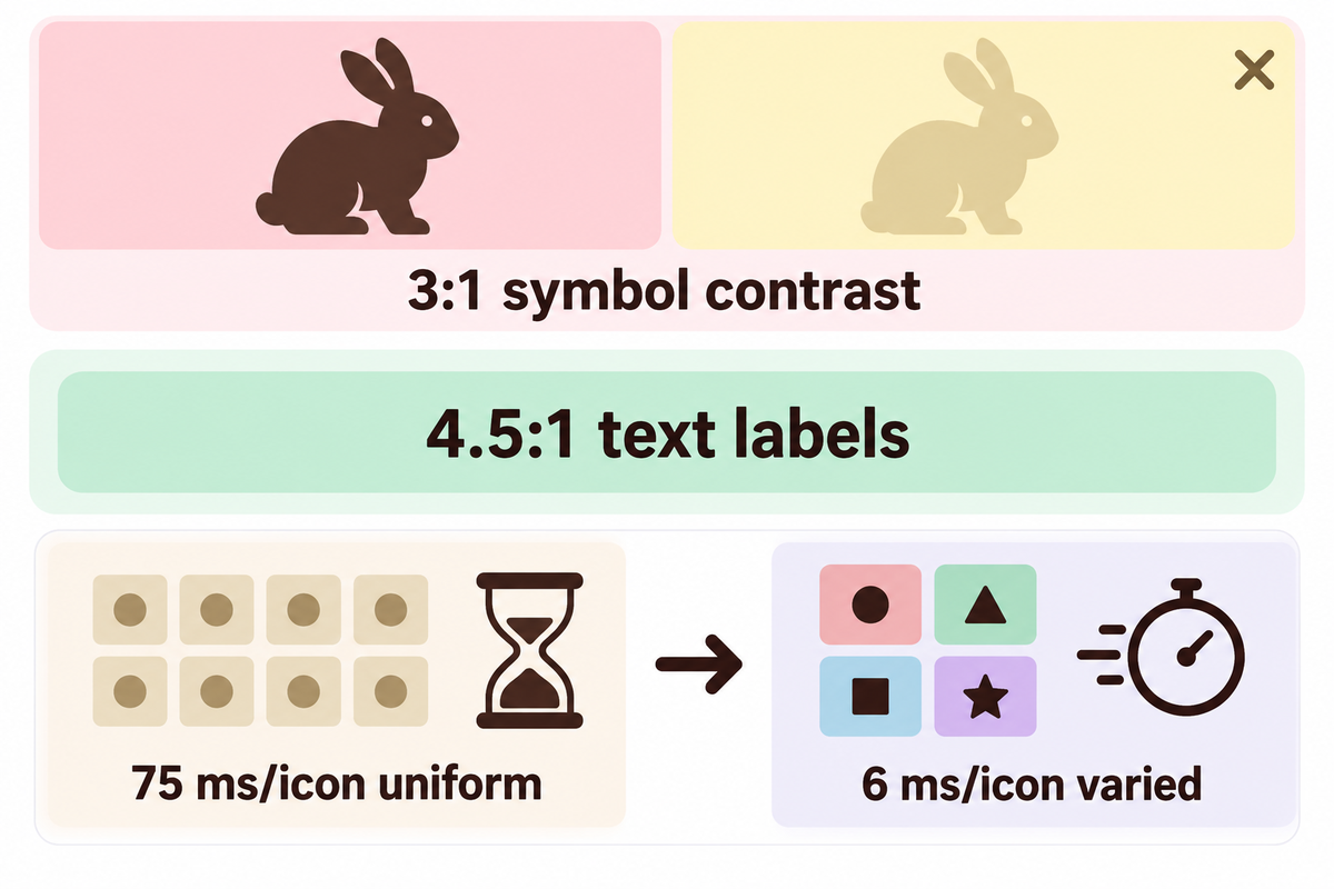
Every icon symbol needs at least 3:1 contrast against its pastel tile so everyday apps stay quick to tap. Pastel color variations throughout app categories maintain the theme. The icon silhouettes are easy to recognize and reduce search time when looking for apps. Keeping color groupings distinct cuts visual search time while keeping the cozy look of a coordinated iPhone home screen.
Think of your home screen like a pastel stationery box. Imagine all the pens, highlighters, and erasers wrapped in the same light cream paper. You would pause to look at each one every time you wanted to choose a tool. It’s faster to identify items separated in various pastel hues. So a soft pink, mint, butter yellow, or sky blue background is faster to scan and much cuter.
Accessibility standards provide a baseline. Under W3C WCAG 2.1 Technique G207 and Success Criterion 1.4.11, graphical symbols needed for recognition must have a minimum contrast ratio of 3:1 against adjacent colors. That threshold does not round up, so 2.999:1 falls short. Normal text labels and widget copy need 4.5:1 under Technique G18, while large display text needs 3:1.
“When choosing the colors for graphics, consider the color(s) adjacent to that graphic, and test that the contrast ratio is at least 3:1.”
Peer-reviewed ergonomics research shows why a monochrome app icon set slows down daily taps. In Study 1 by Trapp and Wienrich (2018) 18 mobile touch device users searched grids of 8, 16, and 24 icons. Search slopes were at 6 ms/icon and 13 ms/icon when the target icons were distinct by color. If all icons shared one color group, the slope jumped to 75 ms/icon, a 12.5x increase in time.
In Study 2 of Trapp and Wienrich (2018), 36 participants searched two swipeable 24-icon smartphone screens with visible app names. No participant appreciated adding an all-same color scheme to their smartphone. Out of 33 written comments, 24 called it confusing or exhausting. By contrast, 78% favored varied colors, and 65% of the 34 smartphone owners wanted icons color-coded by app category. Suppose you place 24 icons on page one using one uniform cream hue.
At a 75 ms/icon slope instead of 6 ms/icon, scanning an unfamiliar app adds 1.8 seconds of visual slope instead of 0.14 seconds. That comparison isolates visual search from muscle memory; pinned positions speed up familiar taps, yet occasional apps still trigger hesitation.
The 3-Layer Kawaii Legibility Rule
- Layer 1 (Symbol to Tile): Place crisp white or deep cocoa symbols against pastel tiles at a ratio of 3:1 or higher. Pale yellow (#FFF000) on white scores only 1.2:1 and washes out in daylight, per W3C SC 1.4.11 Figure 7.
- Layer 2 (Tile to Wallpaper): Test tile borders against the least contrasting area of a gradient or patterned background. Thin doodle strokes almost disappear against a screen due to anti-aliasing, so pick medium outlines.
- Layer 3 (Category Hue Coding): Assign 3 to 4 distinct pastel hues to functions such as messaging (pink), notes (mint), utilities (sky blue), and media (lavender).
If your icons look identical at arm’s length, switch monochrome tiles to category-coded pastels before adding widgets. Browse creative iPhone home screen ideas to compare balanced grids against crowded setups.
Can You Make a Kawaii iPhone Home Screen Without Hiding Every App Label?
You should keep your icon size set to Small in iOS Customize to have app names shown under pastel tiles. According to Apple Support, setting icon size to Large automatically removes app labels. Keeping Small icons gives you the cute app icons effect while enabling fast text scanning for utility, banking and travel apps.
Switch to Large label-free tiles only after you memorize every app position on page one. Hand-drawn or Chibi artwork can make two apps appear similar, making Small icons with visible text useful to avoid tapping the wrong app.
Original Kawaii iPhone Theme Palettes and Licensed-Safe Art Directions
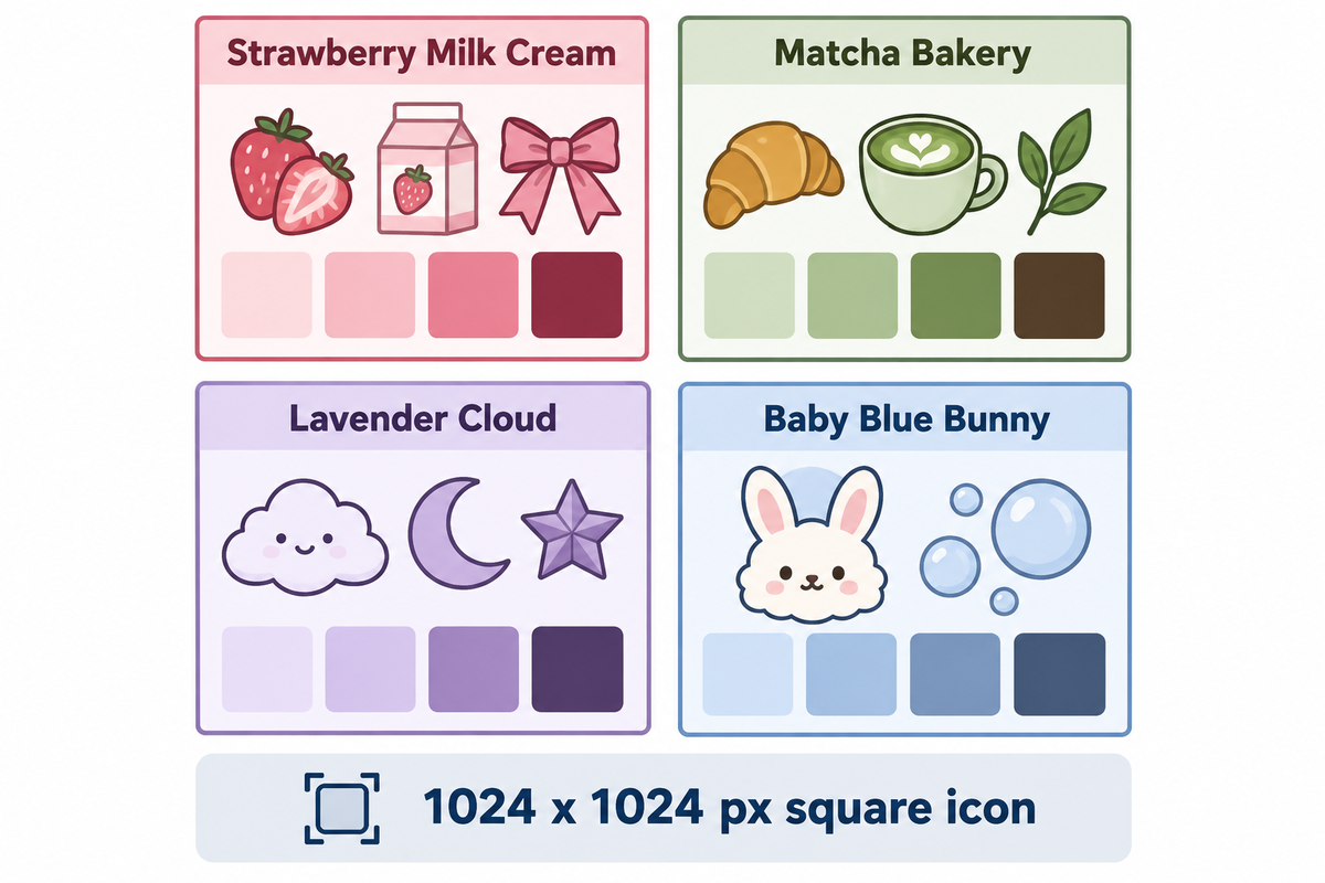
Choosing original pastel palettes built around bunnies, cats, clouds, strawberries, sakura petals, and bakery sweets creates a polished kawaii aesthetic without trademark takedowns. Matching two core colors, one darker accent for legibility (3:1), and one consistent illustration style prevents visual discord across your phone theme.
Unlicensed packs featuring protected cartoon characters often vanish from online shops without warning. Original kawaii icons stay available and let you style your smartphone with a cute aesthetic built from cherry blossom branches, woodland animals, or retro pixel trinket charms.
For crisp scaling on Retina displays, Apple Developer Human Interface Guidelines specify a 1024 x 1024 px square icon layout in sRGB or Display P3 color spaces. Skip pre-rounded PNG files with transparent corners. Because iOS applies its own rounded-rectangle mask, pre-masked borders can leave jagged edges around specular highlights.
| Style Direction | Original Motifs | Tile & Symbol Palette | Icon Art Style | Best iOS Mode |
|---|---|---|---|---|
| Strawberry Milk Cream | Strawberry slices, milk cartons, gingham ribbons | Cute pink tiles with deep berry or cocoa ink | Hand-drawn flat vector | Light Default |
| Matcha Bakery | Croissants, bakery cups, soft cream puffs | Sage green and warm beige with espresso outlines | Thick-stroke doodle | Light Default |
| Lavender Cloud | Smiling clouds, moons, paper stars | Kawaii purple tiles with plum or navy symbols | Soft 3D clay | Auto or Light |
| Baby Blue Bunny | Fluffy bunny faces, bows, soap bubbles | Powder blue and ivory with slate-blue ink | Rounded sticker art | Light or Clear Light |
| Butter Yellow Cafe | Toast, honey jars, sleepy kitty faces | Warm cream-yellow with chestnut brown outlines | Watercolor brush | Light Default |
| Soft Berry Dark Mode | Night clouds, glowing hearts, sleepy cats | Charcoal-plum tiles with rose-pink glyphs | Soft neon-pastel flat | Dark or Tinted Dark |
| Sakura Ribbon | Sakura blossoms, satin bows, tea cups | Blush rose and white with burgundy linework | Anime-inspired flat | Light Default |
| Woodland Cottagecore | Mushrooms, frogs, acorns, fern leaves | Oatmeal beige and moss with forest-green ink | Textured crayon | Light Default |
| Retro Pixel Trinket | Pixel hearts, mini consoles, cassette charms | Mint, lilac, and peach with crisp dark borders | 16-bit pixel art | Light or Dark |
Stick to one rendering family to keep your pink aesthetic iPhone theme clean and unified. Mixing glossy 3D clay widgets with thin black-and-white doodle icons breaks visual harmony even when colors match. Keeping an aesthetic kawaii look focused on one style holds every folder together.
For girly or pink phone layouts with warm pastel vibes and strong readability, pair blush tiles with symbols in deep cocoa or plum. Avoid white icons on pale yellow tiles. In W3C G207 Example 1, crisp orange (#E3660E) on white passes at 3.4:1, while pale yellow (#FFF000) on white fails at 1.2:1.
When you prefer pre-matched sets over piecing files together, you can find themes where widgets and icons are pre-matched to share identical line weights. Pair your palette with calm pastel iPhone wallpapers and background setups so icons stand out cleanly.
Shortcuts Icons vs. Native iOS Tinting vs. Configuration Profiles: Real Tradeoffs
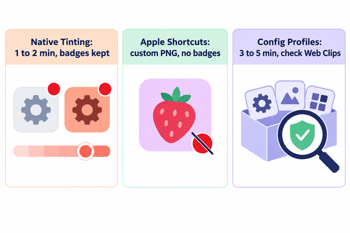
Native iOS controls recolor real app icons inside SpringBoard in under two minutes while keeping unread red badges intact. Apple Shortcuts and configuration profiles add custom launcher bookmarks to your Home Screen instead of replacing real app binaries, while your original apps stay safely inside the App Library.
Each customization route uses a distinct mechanism underneath. Instead, they add launcher bookmarks to your Home Screen while your real apps stay stored inside the App Library.
| Decision Factor | Native iOS Tinting & Clear | Apple Shortcuts Custom Icons | Configuration Profile Packs |
|---|---|---|---|
| Artwork Freedom | Recolors stock logos only | Any custom PNG or photo | Bundled pack images (Web Clips) |
| Unread Red Badges | Preserved (native) | Not supported | Not supported |
| Launch Speed & Banners | Instant native launch | Brief 1-second banner unless automated | Brief Web Clip handoff redirect |
| Setup Effort | 1 to 2 minutes (tinting only) | 30 to 60 minutes for 35+ icons | 3 to 5 minutes batch install |
| Icon Spec Limit | 1024 x 1024 px layered native | Square PNG from Photos or Files | 114 x 114 px iPhone / 144 x 144 px iPad (max 400 x 400 px, under 1 MB) |
| Security & Payload Risk | Zero external risk | Zero system risk (local action) | Requires checking profile contents |
| Reversibility | One tap back to Default | Delete tiles one by one | Delete profile in Settings once |
| iOS Update Resilience | High (Apple maintained) | High for Open App actions | Medium (broken URL schemes can fail) |
| Direct Cost | Free built-in | Free built-in; optional indie pack purchase | Free with In-App Purchases apps |
Use this 3-Route iOS Theme Tradeoff Matrix to choose your workflow. Pick native iOS Tinting if unread badges on Mail, Messages, and work chat matter most. Pick Apple Shortcuts for 8 to 12 hero apps if you want illustrated bunny or kitty app icons without system profiles. Pick a configuration profile pack only from a verified App Store developer after reviewing its payload.
Profile Safety Check Before Installing Any Batch Icon Pack
Configuration profiles for corporate Wi-Fi, VPNs, email and certificates have been detailed by Apple Support and Check Point mobile security research. Before hitting the Install button in Settings > General > VPN & Device Management, open More Details and confirm the profile holds only Web Clips.
Reject any themes asking for root certificates, VPN configs or device management. As Apple’s Web Clips payload specification states, if a profile states that clips are non-removable, deleting the profile will also remove all Web Clips.
iOS customizers on Reddit’s r/iOSsetups community often ask whether profile icons can access private data. Checking More Details before installation should allay those fears. You can also take a look at curated custom iPhone app icons to see if there are any differences between the PNGs and the profile bundles.
Do Custom Kawaii App Icons Show Red Notification Badges on iPhone?
Custom kawaii app icons made by Apple Shortcuts or Web Clip config profiles won’t show red unread notification badges on iPhone. Because those tiles act as launcher bookmarks rather than native app bundles, iOS keeps unread counts attached to the original apps inside your App Library. Leaving Phone, Messages, Mail, and calendar alerts on native icons prevents missed updates while custom icons handle music, notes, and reading.
As reported by How-To Geek, Shortcuts tiles also briefly display a top banner. To prevent that, use automation.
How to Build a Pastel Kawaii iPhone Home Screen Step by Step
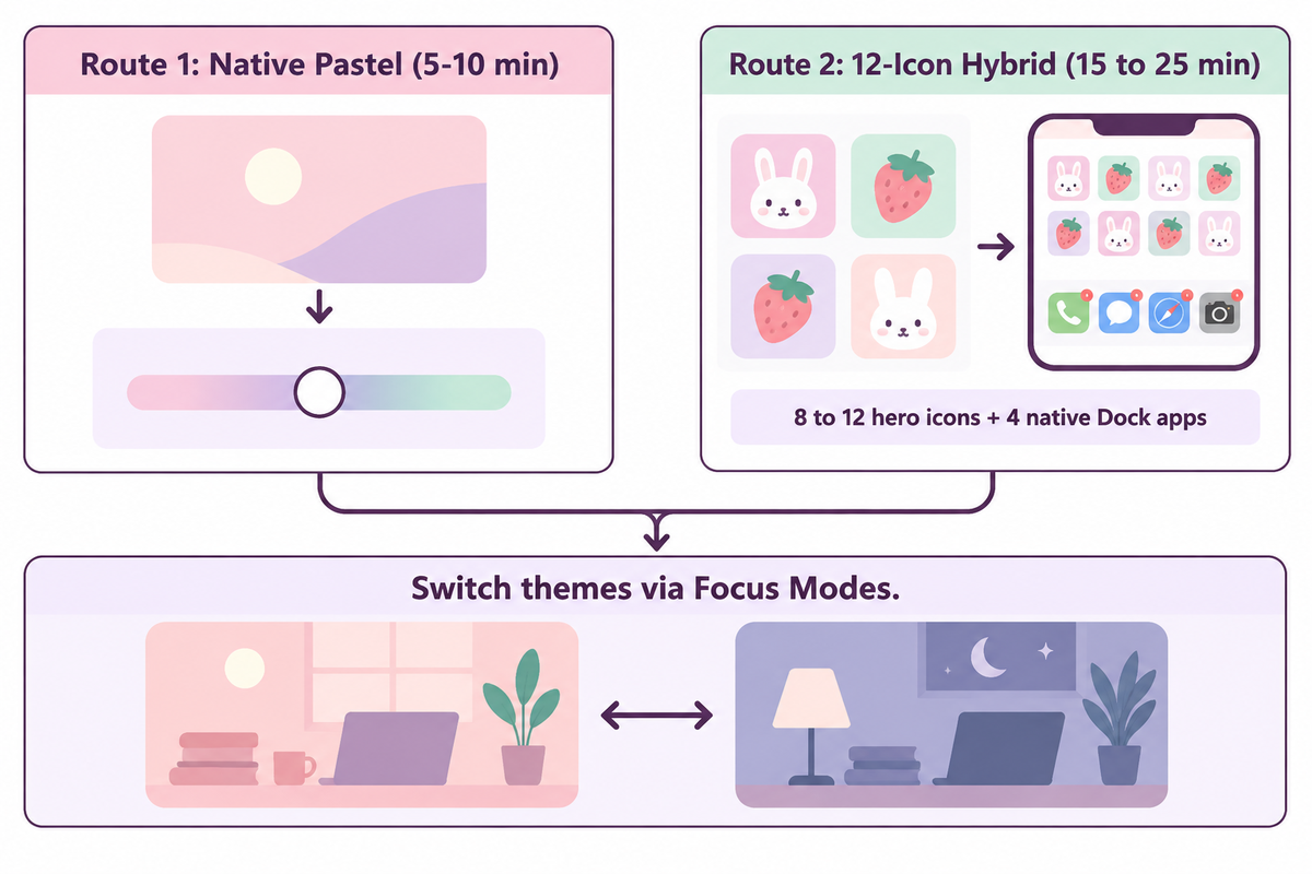
Building a cute pastel iPhone home screen takes 5 to 10 minutes with native iOS styling and wallpaper pairing, or 15 to 25 minutes using the 12-Icon Hybrid Kawaii Layout. Keeping the main screen focused on 8 to 12 custom hero icons, with two to three matching widgets, prevents second-screen visual fatigue.
In Study 2 of Trapp and Wienrich (2018), the search slowdown from high icon similarity grew significantly worse on the second screen than on the first screen (t(35) = -6.49, p < 0.001). Putting your primary kawaii home screen on page one lets the App Library hold rarely used utilities and cuts repetitive setup time.
Route 1: Native Pastel Styling (Free, 5-10 Minutes)
- Save a calm pastel wallpaper to Photos, and apply it to the Lock and Home Screens.
- Hold an empty spot on the Home Screen to make icons jiggle.
- Tap Edit in the top-left corner, then tap Customize.
- Select Tinted (or Clear on iOS 26 and newer), then drag the sliders or tap the eyedropper to pull a soft pink, mint, or lavender tone from your wallpaper.
- Pick Small to keep app names visible or Large for an icon-only grid, then tap outside the panel to save.
Route 2: The 12-Icon Hybrid Kawaii Layout (15 to 25 Minutes)
- Save your selected kawaii app icon pack PNGs to a new album or folder on your device.
- Open the Shortcuts app and tap the + in the upper right corner.
- Tap Add Action, choose Open App, and select one hero app such as Spotify, Notes, Photos, or Safari.
- Select Add to Home Screen from the share or title menu, and tap your placeholder icon to select your PNG.
- Repeat for 8 to 12 hero apps, and then long press each of the original apps and select Remove App > Remove from Home Screen to keep the original apps in your App Library.
- Leave 4 badge-critical apps (Messages, Phone, Mail, and Calendar) native in your Dock to keep the red badges visible.
To silence Shortcuts launch banners on iOS 15.4 and later, open the Automation tab in Shortcuts and create a Personal Automation triggered by App > Is Opened. Finally, turn off both Ask Before Running and Notify When Run. This is documented by GadgetHacks.
Pro Tip: Use Focus Modes to Easily Switch Between Kawaii Themes
Create two themed Home Screen pages (e.g., Matcha Bakery for Study Hours and Lavender Cloud for Evening Time). Go to Settings > Focus, pick a Focus Mode, and tap Customize Screens to link a paired Lock Screen and kawaii page. Switching Focus Mode changes your theme.
For more icon screenshots and other tips, see our article on customizing app icons with Apple Shortcuts.
Do Kawaii iPhone Themes Work on iOS 18 and Newer Versions?
Kawaii themes work with iOS 18, iOS 26, and iOS 27, and with older iOS 17 setups using Shortcuts. Starting with iOS 18, Apple added free grid placement, Dark mode icons, Tinted color sliders, and Large label-free icons directly in the Customize menu, while iOS 26 and iOS 27 added and then refined Clear Liquid Glass appearances.
Older ios17 icon packs saved as square PNG files work just fine in Apple Shortcuts as is. Keep delicate thin-line icons at a 3:1 or higher contrast ratio against adjacent background colors so they stay legible under translucent Clear styling in newer releases.
Pairing Cute Widgets and Wallpapers for a Clean Kawaii Layout
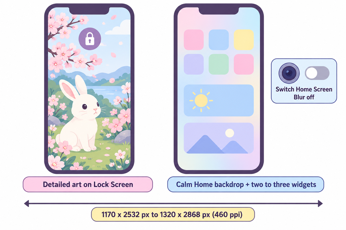
Match your wallpaper’s portrait dimensions to your exact iPhone display, 1170 x 2532 px on iPhone 13 and 14 up to 1320 x 2868 px on iPhone 16 Pro Max, and place two to three purposeful pastel widgets per page. Putting detailed art on the Lock Screen and a calmer background behind icons keeps labels crisp.
Horizontal desktop images cause iOS to crop aggressively, softening the edges of cute art and hiding the focal characters behind the clock. Checking Apple’s 460 ppi portrait specifications eliminates the need to stretch the image and preserves a clean home screen aesthetic.
| iPhone Model Group | Portrait Wallpaper Size | Pixel Density | Panel Type |
|---|---|---|---|
| iPhone 16 Pro Max (6.9-inch) | 1320 x 2868 px | 460 ppi | Super Retina XDR OLED |
| iPhone 16 Plus / 15 Pro Max / 14 Pro Max | 1290 x 2796 px | 460 ppi | Super Retina XDR OLED |
| iPhone 16 / 15 / 15 Pro / 14 Pro | 1179 x 2556 px | 460 ppi | Super Retina XDR OLED |
| iPhone 14 / 13 / 13 Pro | 1170 x 2532 px | 460 ppi | Super Retina XDR OLED |
Dimensions align with the official Apple iPhone Technical Specifications. The 6.9-inch Super Retina XDR OLED panel has 460 ppi sharpness, a typical contrast ratio of 2,000,000:1, and a max brightness of 1000 nits (2000 nits outdoor peak). To switch between sizes (small, medium, large), touch and hold any of the widgets. For a balanced aesthetic home screen, pair one medium calendar or weather widget with one small photo or battery widget.
Do: Clean Kawaii Spacing
- Keep detailed cute illustrations on your lockscreen and use a soft gradient or calm pattern on your homescreen.
- Leave one breathing row for wallpaper art to be visible between icon rows.
- Pair one utility widget (weather or calendar) with one or two decorative photo widgets.
Avoid: Visual Overload
- Never put busy white-background doodles directly behind white app icon labels.
- Avoid stacking four live GPS or moving widgets on page one. They add clutter and background refreshes.
- Don’t place square hard-bordered widgets next to transparent widgets on the same row.
Mix and match designs of soft pastels and iPhone widgets. Or try aesthetic wallpapers for iPhone. They’re tall and portrait oriented.
Why Does a Cute Kawaii Wallpaper Look Blurry Behind My App Icons?
Fuzziness in kawaii Home Screen wallpapers often comes from Apple’s Home Screen Blur toggle rather than a low-resolution file. Opening Customize Home Screen and switching Blur off brings back crisp artwork.
If you turn Home Screen Blur off and your wallpapers are still fuzzy, check the image dimensions. Often, files saved as compressed thumbnails from social media feeds measure under 700 px wide and will stretch noticeably to fit the 1179 px to 1320 px OLED screen.
How Much Does a Kawaii iPhone Theme Cost? Free DIY vs. Paid Packs
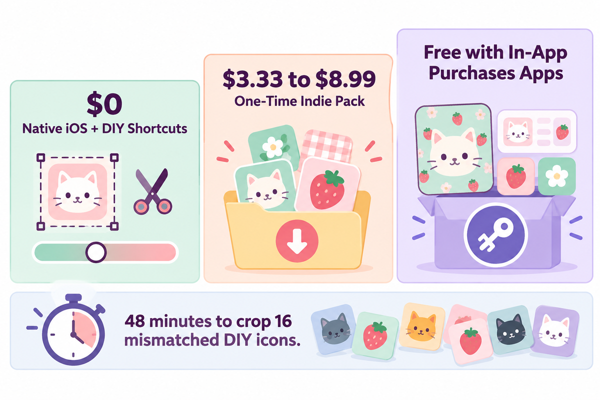
A full kawaii iPhone theme costs $0 using built-in iOS customization, Apple Shortcuts, and free wallpapers. One-time indie digital download icon packs, observed on Etsy in November 2026, sold for $3.33 to $8.99, based on the pack size and seller’s sales, while App Store theme apps list as Free with In-App Purchases.
Users on r/iOSsetups frequently report downloading “free” icon apps only to hit unexpected weekly paywalls. Separating Apple’s built-in no-cost tools from one-time artist packs and App Store subscriptions helps keep your costs predictable before downloading anything.
| Budget Tier | Pricing Model | What You Get | Hidden Time or Tradeoff |
|---|---|---|---|
| Native iOS + DIY Shortcuts | Free built-in | Tinted or Clear icons, Focus pages, custom photo widgets, DIY PNG icons | Hunting free icons on Pinterest often leaves missing utility apps and mismatched styles |
| One-Time Indie Pack (Etsy) | One-time digital download (varies by seller) | Coordinated PNG icon set, matching wallpapers, widget graphics | Manual Shortcuts install; check live shop listing for icon count and updates |
| All-in-One Theme App | Free with In-App Purchases | One-tap bundles combining wallpapers and widgets plus matching icon themes | Full theme libraries require optional paid tiers or subscriptions |
Suppose you want to customize 16 daily apps using free images collected from Pinterest boards where users find and save ideas. If you assume it takes 3 minutes to download and crop each mismatched PNG icon, fixing 16 inconsistent icons takes 48 minutes. Even then, a few niche apps may still lack matching artwork. For a small cost, you can buy a kawaii app icon pack from an indie seller or use a curated theme suite to get consistent line weight and matching wallpapers.
When buying icons from an indie seller, check how many app icons are included and if the seller gives pastel tiles for apps where artwork isn’t easily accessible.
Are Kawaii iPhone Themes Free to Download and Use?
Free options using built-in Apple features, Shortcuts and original wallpapers let users build a cute kawaii iPhone theme for free. Many App Store theme apps also provide free downloads with limited starter themes, but full libraries of matching kawaii widgets and icon packs usually sit behind optional in-app purchases.
If you want a strictly no-cost setup, combine native pastel Tinted icons on your main grid with two free photo widgets displaying original bunny or bakery illustrations. That approach looks cohesive, preserves every unread badge, and requires zero subscriptions.
Choosing Kawaii Theme and Widget Apps With Original Artwork
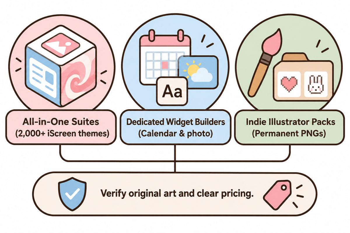
When assessing a kawaii app or icon shop, look at four main factors: original and non-copyrighted art pieces, a clear and direct way of installing icons and widgets, functionally useful widgets, and clear pricing prior to checkout. Compare theme suites, dedicated widget builders, and independent illustrator shops to identify bundles that take no effort and recycle the same art pieces.
All-in-one theme suites bundle icons, widgets, and wallpapers inside one catalog so you never match hex shades manually. Dedicated widget builders focus on custom calendar, weather, and photo widgets. Indie shops on Etsy excel at niche hand-drawn or cottagecore art styles sold as permanent PNG folders.
| Tool Category | Notable Examples | Best Strength | Watch-Out Before Installing |
|---|---|---|---|
| All-in-One Theme Suites | iScreen, Themify, WidgetClub, TopWidgets | Coordinated icons, matching widgets, and wallpapers in one tap | Confirm live IAP tiers and verify whether packs use Shortcuts or Web Clips |
| Dedicated Widget Builders | Widgetsmith, Color Widgets | Custom fonts, timed widgets, photo albums, granular color controls | Icon curation is lighter; pair with native tinting or indie PNG sets |
| Indie Illustrator Packs | Credited Etsy artists | One-time ownership of original hand-drawn or pixel app icon packs | Avoid uncredited trademarked character packs that risk removal |
For readers comparing verified libraries, iScreen’s theme library offers 2,000+ aesthetic iPhone themes with matched wallpapers, widgets, and icons. It’s notable for offering original non-IP kawaii packs such as Felt Pink Fluff, Cute iBunny, Blueberry Cat, Soft Bunny, ParfaitKitty, and iOS26 Cute Liquid Glass Cat. WidgetClub is more suited for users looking for a massive community grid (listing 3,656+ kawaii icon sets and 1,714+ templates). Indie Etsy artists ($3.33 to $8.99 one-time) are suited for users wanting to own PNG files. Standalone widget app makers like Widgetsmith, Color Widgets, Themify, and TopWidgets are popular among iOS app users. Most iOS apps, including iScreen, use a Free with In-App Purchases model.
For a quick visual walkthrough of pairing widgets, icons and Lock Screen elements together, follow our step-by-step iPhone customization guide.
Fixing Common Kawaii iPhone Theme Problems and Reversing Changes
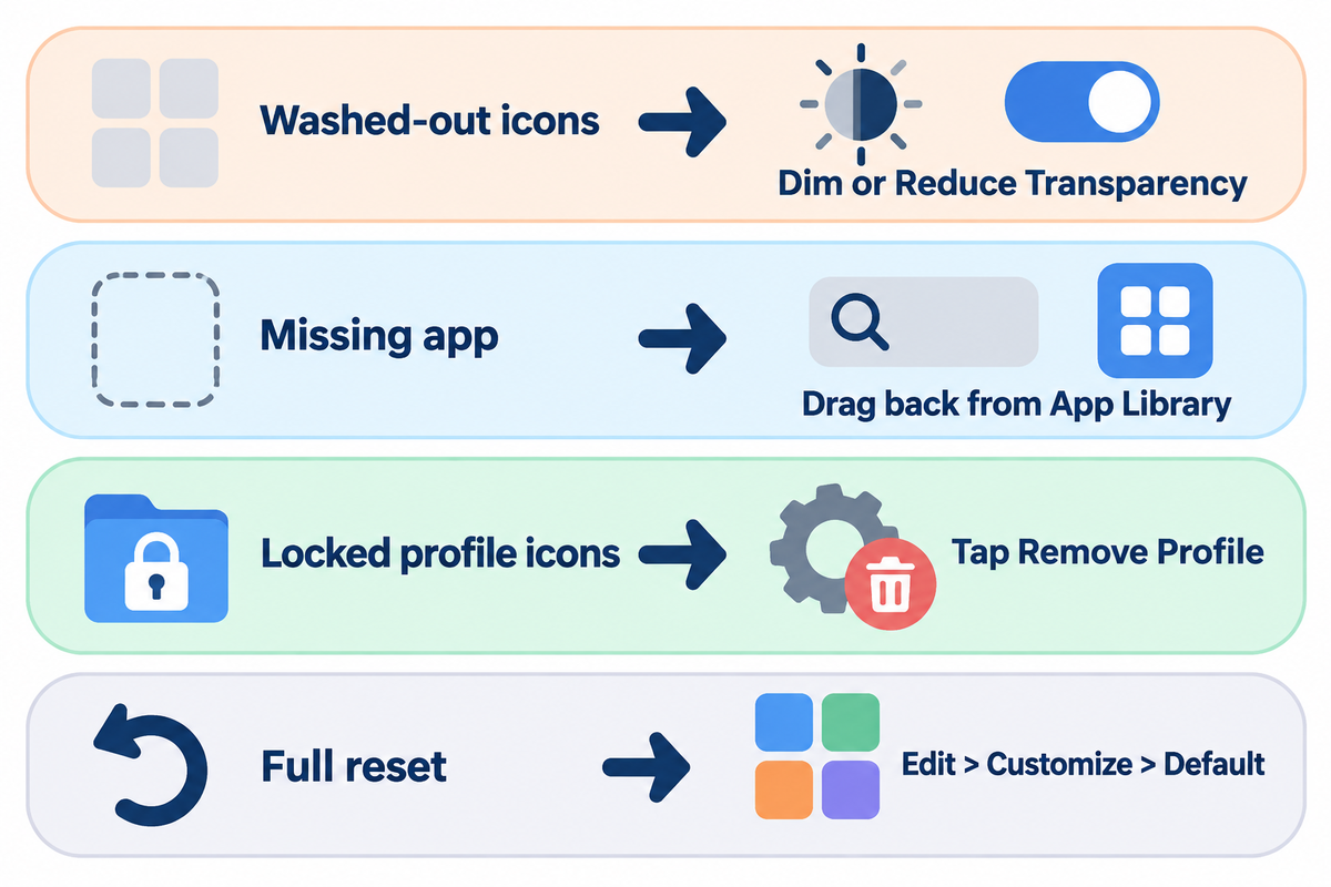
Each of the home screens can be customized and reverted to the default state at any time. You can clear widgets, adjust display transparency to dim the background, reset app placements to the App Library, or uninstall configuration profiles.
Users upgrading to iOS 26 and iOS 27 on Apple Support Communities often report that their custom Shortcuts icons (tiles) appear glossy or faint over bright pastel wallpapers. Instead of using a new wallpaper, adjust display transparency to dim the background.
| Common Symptom | Root Cause | Verified Fix |
|---|---|---|
| Clear or pastel icons look washed out | iOS 26/27 Liquid Glass translucency over bright backgrounds | Tap the sun icon in Edit > Customize to dim the wallpaper, or toggle Reduce Transparency and Increase Contrast under Settings > Accessibility > Display & Text Size. |
| Cute widget turns blank or freezes | Memory cap, paused background refresh, or deleted source photo | Open the host widget app once to force a refresh, check Background App Refresh, or remove and re-add the widget. |
| Original app seems missing | Moved out of Home Screen during Shortcuts cleanup | Swipe past your last page to the App Library, search the app name, and drag the icon back to your Home Screen. |
| Batch profile icons refuse to delete | Profile Web Clips configured as non-removable | Go to Settings > General > VPN & Device Management, open the theme profile, and tap Remove Profile. |
| Custom shortcut opens wrong app or fails | Target app was offloaded or renamed after shortcut creation | Re-download the target app from the App Store, open Shortcuts, and re-link the Open App action. |
To fully revert to stock iOS icons, go to the Home Screen and tap Edit, then Customize, then Default. This will remove the tints. Next, delete any Shortcuts tiles that you no longer want, as removing shortcuts doesn’t delete the app. Finally, delete any Web Clip profiles, under VPN and Device Management. See Apple Support’s configuration profile guide for full removal steps.
How Native iOS Customization and Liquid Glass Are Reshaping Kawaii Themes
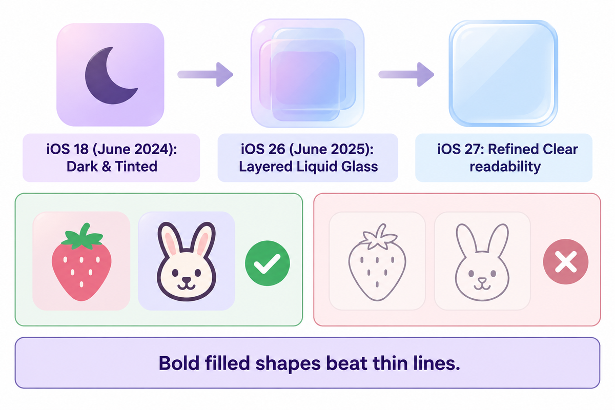
Apple’s shift toward layered Liquid Glass icons, built-in Tinted and Clear appearances, and free grid placement is moving kawaii iPhone themes away from fragile 40-shortcut overhauls toward durable hybrid layouts. Modern iOS releases favor bold, filled pastel illustrations over ultra thin line drawings.
Apple updated its official App Icons Human Interface Guidelines four times between June 10, 2024 and October 28, 2026. First, Apple added Dark and Tinted modes for iOS 18 in June 2024. Next, Apple introduced layered Liquid Glass icons in June 2025 for iOS 26, refined readability in June 2026, and expanded icon format guidance in October 2026.
As reported by MacRumors in September 2026, iOS 26 added Clear app icons and widgets throughout the system. Apple then refined readability in iOS 27 after touch device users pushed back against faint glass icons. 9to5Mac also talked about iOS 26’s Tinted matching setting for calibrating icon hues with iPhone hardware or case finishes.
“When the system segments your icon, it applies Liquid Glass effects to foreground layers that feature large simple shapes. It doesn’t automatically apply Liquid Glass effects to smaller, more complex elements in an icon like text and thin lines.”
This is important when you pick or create cute icons and a home screen theme to maximize sharp edges. Fine-line pastel sketches packed with tiny text often look flat or fuzzy under automatic glass segmentation. Chunky filled illustrations, like thick-outline strawberries, solid bunny silhouettes, or soft 3D clay shapes, hold sharp edges across Light, Dark, Clear, and Tinted modes.
To future-proof your setup for 2026 and upcoming updates, build a hybrid grid instead of replacing every system app with static bookmarks. Pair native Tinted or Clear styling on your utility Dock with 8 to 12 bold-outline hero Shortcuts icons and two to three matching widgets so your kawaii theme survives every annual refresh.
Frequently Asked Questions
Q: How long does it take to set up a full kawaii iPhone theme?
Native iOS tinting with a pastel wallpaper and two widgets takes 5 to 10 minutes, while a 12-Icon Hybrid Kawaii Layout takes 15 to 25 minutes.
Setting up 35 to 40 icons manually with Apple Shortcuts takes 30 to 60 minutes if your wallpapers and PNG icons are already saved in the Photos app.
Q: Can you switch between multiple kawaii themes on one iPhone without starting over?
Yes, you can create multiple themed Home Screen pages and link each one to its own Focus mode and paired Lock Screen in iOS Settings.
Switching Focus modes automatically shows your matching pastel Home Screen page and wallpaper while hiding every other page, letting you change your study or seasonal setups with one tap.
Q: Does removing original apps from the Home Screen delete my app data?
No, tapping Remove from Home Screen on an app icon only moves the original icon into the App Library and keeps the installed app intact. The app, logins, and saved data aren’t deleted.
When hiding duplicate icons behind custom Shortcuts, you should always choose Remove from Home Screen rather than Delete App, and you can swipe over to drag apps back anytime. You can move the app back from the app library at any time.
Q: Do cute widgets and custom kawaii themes drain iPhone battery fast?
No, static pastel wallpapers, Shortcuts icons, and lightweight cute widgets add virtually zero battery drain.
Only live GPS weather or animated widgets draw extra power, so two static widgets keep battery steady. Static widgets don’t affect battery drain.
Q: Which kawaii iPhone theme motifs are safe to use without copyright headaches?
Original pastel artwork, such as smiling clouds, bunnies, cats, frogs, bakery sweets, strawberries, cherry blossoms, ribbons, and pixel hearts, avoids third-party character trademark takedowns completely.
When purchasing icon packs on Etsy or using other theme apps, look for packs created by independent illustrators, and avoid bundles that include protected cartoon characters. Make sure the packs have pastel blank tiles and essential icons for Wallet, Notes, Mail, Calendar, and Maps. This keeps the Home Screen and app set up clean and aligned.
Q: Can I use kawaii iPhone icon packs on an iPad or Android phone too?
Yes, icons work with Shortcuts on iPadOS and with Nova and/or Good Lock on Android.
Only iOS configuration profiles and widget templates stay Apple-only.
Q: How do you remove a custom kawaii theme and return to default iPhone icons?
To unstyle your Home Screen, go to Edit > Customize > Default and delete all custom Shortcuts tiles. Go to Settings > General > VPN & Device Management and delete any Web Clip Profiles.
Reversing a kawaii theme takes only a few minutes and never harms your installed apps, logins, or personal files. All real apps stay untouched in your App Library. Swipe right, search any app name, and drag the standard stock icon back onto page one whenever you want a fresh start.
Interested in Decorating your Home Screen with Original Pastel Art?
Instead of searching for random downloads, take a look at iScreen’s original aesthetic iPhone themes, from Cute iBunny and Blueberry Cat to Felt Pink Fluff and Soft Bunny, to give your iPhone a readable kawaii look in minutes.
References & Sources
- W3C Web Accessibility Initiative, Technique G207: Ensuring a contrast ratio of 3:1 is provided for icons (WCAG 2.1)
- W3C Web Accessibility Initiative, Understanding Success Criterion 1.4.11 Non-text Contrast (Level AA)
- Trapp, A. K., & Wienrich, C. (2018). App icon similarity and its impact on visual search efficiency on mobile touch devices. Cognitive Research: Principles and Implications, 3:39 (PMC6191407)
- Apple Support – Customize apps and widgets on the iPhone Home Screen (iOS 18/26/27)
- Apple Developer Documentation – Human Interface Guidelines: App icons (October 28, 2026)
- Apple Support – Install or remove configuration profiles on iPhone
- Apple Platform Deployment – Web Clips device management payload settings for Apple devices
- Apple Support — iPhone 16 Pro Max Technical Specifications
- MacRumors (September 16, 2026) – Get Clear App Icons on your iPhone Home Screen
- 9to5Mac (April 14, 2026) — iOS 26 has a new Home Screen setting for app icons
- Check Point Blog – Are Malicious Configuration Profiles iOS’ Achilles Heel?
- GadgetHacks — How to Stop Notification Banners from Popping Up for Custom App Icon Shortcuts on Your Home Screen
About This Guide: The kawaii iPhone theme guide was written by the iScreen team, based on official Apple documentation and supported by non-text W3C contrast standards, peer-reviewed icon usability studies, and pastel app icons and cute widgets catalog comparisons. It was reviewed for accuracy by the iScreen team, including the Home Screen workflows of iOS 18, 26, and 27, as well as original licensed-safe artwork.