Lock Screen Widgets Guide: Best Widgets for Your iPhone Lock Screen

Lock screen widgets turn the screen you glance at most into a quick dashboard for weather, your calendar, battery levels, and more, without unlocking your iPhone. They’ve been part of iOS since iOS 16, and they’re easily one of the most useful customization features Apple has shipped. Yet most people add two or three widgets, never touch them again, and miss what these tiny tiles can actually do.

This guide covers what lock screen widgets are, how to add and edit them on iPhone, which ones earn a spot, the apps that unlock custom design, and what changed in iOS 26. We’ll also share a simple rule for deciding what to keep, because the lock screen give you far fewer slots than you think.

Quick Facts

  • Lock screen widgets require iOS 16 or later.
  • You get a small inline slot above the clock plus one widget row that holds up to four small widgets (fewer if you pick larger ones).
  • They’re glance-first: tap one and it open the app, they aren’t the tap-to-toggle interactive widgets you may know from the Home Screen.
  • iOS 26 lets you place widgets at the top or bottom of the screen and redesigns the clock with Liquid Glass.

What Are Lock Screen Widgets?

What Are Lock Screen Widgets?

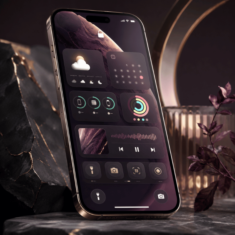
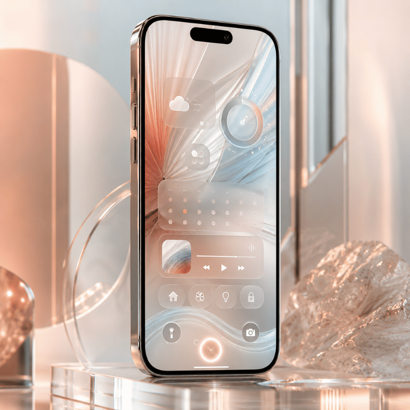
Lock screen widgets are small, glanceable tiles that sit on your iPhone’s Lock Screen and show timely information from your apps, temperature, air quality, battery level, upcoming calendar events, and similar at-a-glance data. Apple introduced them with iOS 16 in 2022, and they live in the strip directly below the clock, plus a single inline slot in the date line above it.

It helps to separate three things people lump together. Lock Screen widgets appear on the screen you see before unlocking. Home Screen widgets sit among your app icons and come in small, medium, and large sizes. Today View widgets appear when you swipe right from either screen. They draw from the same apps, but they’re configured separately, adding a weather widget to your Home Screen doesn’t put one on your Lock Screen. If you’re building a complete look, our guide to iPhone home screen ideas pairs naturally with this one.

One detail trips people up: lock screen widgets are designed for reading, not doing. Tap one and it open the related app (after Face ID or your passcode). That’s different from the interactive Home Screen widgets Apple expanded in iOS 18, which can toggle a setting or check off a reminder without opening anything. On the Lock Screen, the job is information at a glance, which, as we’ll see, should shape every widget you choose.

How to Add Lock Screen Widgets on iPhone

How to Add Lock Screen Widgets on iPhone

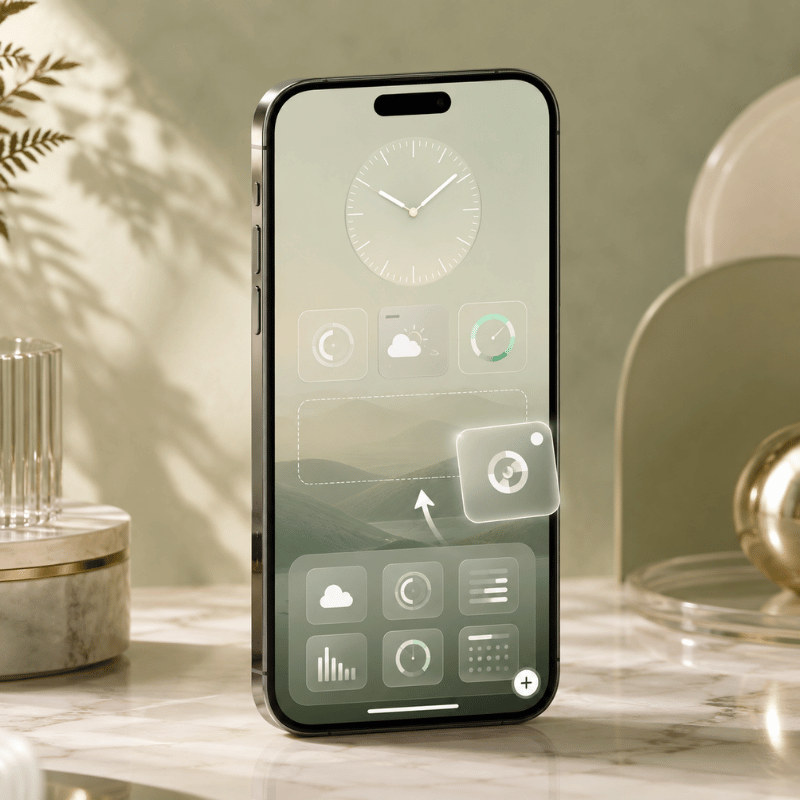
Adding widgets takes about thirty seconds once you know where Apple hid the controls. Your entry point is the Customize button, which only appears when you long-press the Lock Screen itself.

  1. Wake your iPhone and touch and hold the Lock Screen until the Customize button appears, then tap Customize.
  2. Tap Lock Screen (the left preview), then tap the widget area just below the clock.
  3. Tap Add Widgets.
  4. Tap or drag the widgets you want into the row.
  5. Tap the close button, then tap Done.

These steps follow Apple’s official walkthrough for adding and editing widgets on iPhone. To edit a widget after placing it, say, point the Weather widget at a different city, long-press it during customization and choose the option you want. To swap one out, remove it first, which brings us to the question almost everyone asks next.

Q: Can I add widgets to my lock screen?

Yes, as long as your iPhone runs iOS 16 or later, that covers the iPhone 8 and newer. If you don’t see a Customize button when you long-press the Lock Screen, your iPhone is on an older version of iOS, or you’re pressing the Home Screen by mistake. Open Settings, go to General, then Software Update, and install the latest version. Once you’re on iOS 16 or higher, the widget row appears in the Lock Screen editor exactly as described above.

💡 Pro Tip

You can build a different Lock Screen for each Focus mode — one for Work with your calendar, one for Personal with your activity rings. Long-press, swipe to a blank Lock Screen, tap the plus, and link it to a Focus. Each one keeps its own set of widgets.

The 4-Slot Rule: Budgeting Your Lock Screen

The 4-Slot Rule: Budgeting Your Lock Screen

Here’s the part most guides skip. The Lock Screen doesn’t give you unlimited room. Apple’s own instructions admit it plainly: “If there’s not enough room for a new widget, you can tap the Remove button to remove a widget and make room for the one you want to add.” In practice you get one small inline slot above the clock and a single row below it that fits about four small widgets, and a larger rectangular widget eats two of those slots. iPhone users have complained about this for years; one popular thread on Reddit pointed out that “some widgets are twice the size leaving room for only two widgets.”

So treat those slots like a budget. We call it the 4-Slot Rule: you’ve roughly four units of space, and every widget should earn its place by answering one questiondoes this save me an unlock? A weather tile that stops you opening the app is worth a slot, while a widget that only look nice but tells you nothing you would actually check is a slot wasted. And because the Lock Screen can’t stack widgets the way the Home Screen can (widget stacks are a Home Screen and Today View feature only), you can’t cheat the budget, what you place is what you get.

Most people decorate instead of decide. People fill all four slots with widgets they already check obsessively, the same apps they open first thing anyway, and gain nothing. The Reddit crowd that obsesses over setups keeps asking each other a sharper question: “what widgets do you actually tap every day?” That’s the right filter. Spend your four slots on glance-value, not vanity.

If your day revolves around… Spend your slots on Why it earns the spot
Commuting Weather, Calendar, a transit or Maps widget Answers “do I need a coat and am I late?” before you leave
Parenting / family Calendar, Reminders, a shared countdown Keeps pickups, chores, and events one glance away
Fitness Activity rings, Battery, World Clock Tracks progress and device readiness mid-workout
A minimalist look One Weather tile, nothing else Maximum calm; the wallpaper stays the star

Best Lock Screen Widgets Worth a Slot

Best Lock Screen Widgets Worth a Slot

With four slots to spend, these are the widgets that consistently earn their keep. Apple’s built-in options cover most needs, and tech reviewers repeatedly land on the same shortlist of genuinely useful tiles.

Q: What are good widgets to have on a lock screen?

Good lock screen widgets replace an unlock with a glance. Weather and temperature top almost every list because checking the forecast is the single most common reason people wake their phone. Calendar comes next, your next event, right there. Battery (including connected AirPods and Apple Watch) saves a trip into Settings. A World Clock tile is invaluable if you work across time zones, and Activity rings keep fitness goals visible. Spot the pattern: pick widgets that answer a question you ask many times a day.
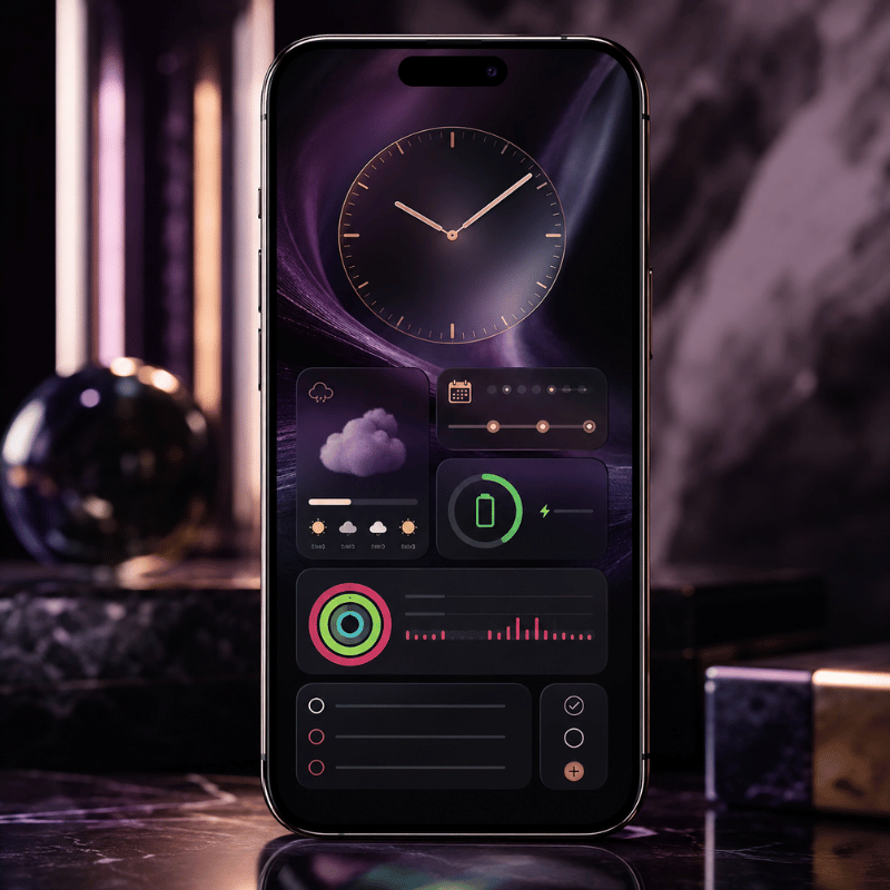
  • Weathertemperature, conditions, or precipitation; the highest-value glance for most people.
  • Calendaryour next event or the date; long-press to choose which calendar it shows.
  • BatteryiPhone plus connected AirPods and Apple Watch in one tile.
  • World Clocka second time zone for remote teams and travel.
  • Activity / Fitnessyour rings, so closing them stays top of mind.
  • Remindersthe next due task without opening the app.

Want something more personal than a battery readout? A date countdown is a favorite for trips, birthdays, and launches, we go deep on that in our countdown widget guide, and a tailored weather widget can look far better than the stock one. Couples often add a shared status tile too; if that’s you, our couple widgets are built for exactly that.

Best Lock Screen Widget Apps for iPhone

Best Lock Screen Widget Apps for iPhone

Apple’s built-in widgets are functional but plain. If you want custom fonts, photo tiles, color-matched designs, or data the stock widgets don’t offer, a third-party app fills the gap. These apps add their own widgets to the same Lock Screen widget gallery, once installed, they show up alongside Apple’s options when you tap Add Widgets.

Q: What apps have lock screen widgets?

Plenty of apps offer them, and the category has grown crowded since iOS 16. When you’re evaluating one, look past the screenshots and check three things: does it offer the specific widget you want (countdown, photo, quote, health), can you actually match it to your wallpaper, and does it run without nagging you to upgrade every time you open it? A good widget app should feel like part of iOS, not a billboard.

That design-first standard is exactly what we built iScreen’s iPhone widget app around, color-matched widgets, photo and text tiles, and themes that span your Lock Screen, Home Screen, and StandBy mode so the whole device look intentional. If you would rather start from a finished look than build one tile at a time, our lock screen customization templates give you a coordinated set in a couple of taps.

“The widgets people keep are never the flashiest ones, they are the ones that answer a question fast. We design around that: a tile should read clearly in the half-second before you unlock, or it does not deserve the slot.”

The iScreen Design Team

How to Customize and Style Your Lock Screen Widgets

How to Customize and Style Your Lock Screen Widgets

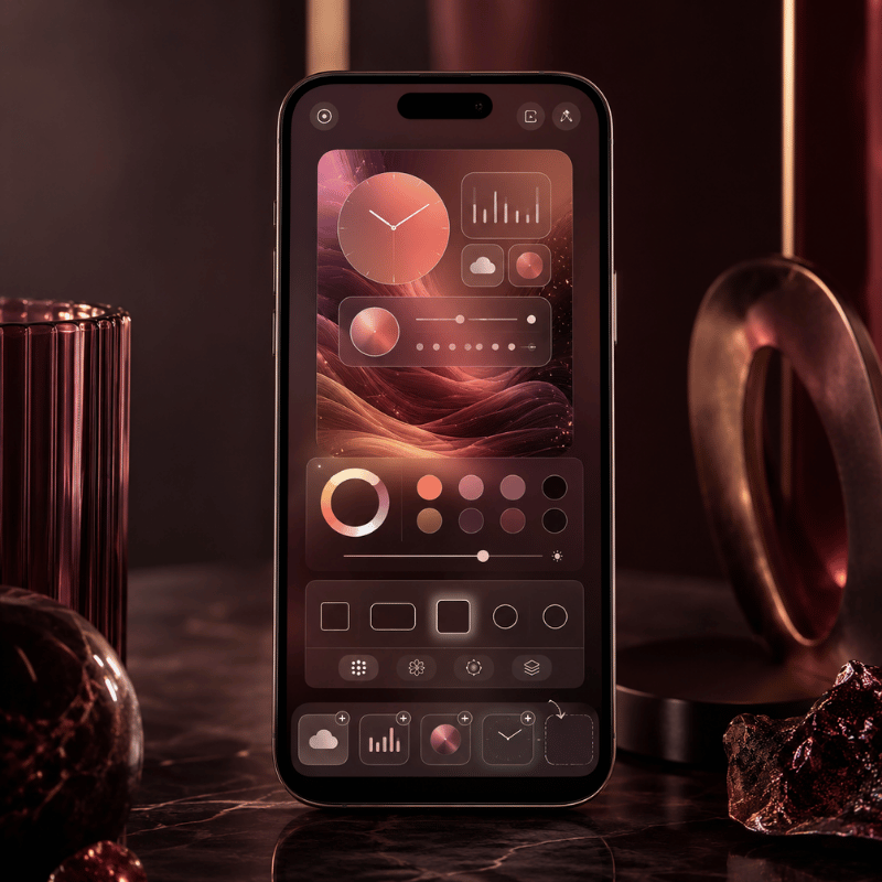
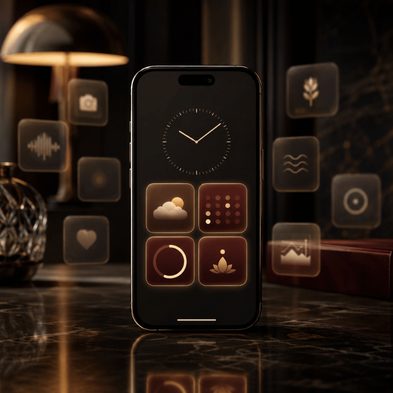
A great Lock Screen isn’t just useful widgets, it’s widgets that look like they belong with your wallpaper. Treat the whole screen as one composition. Start with the wallpaper, pull two or three colors from it, and choose widgets and a clock tint that echo those colors. A cohesive palette read as “designed,” while a clash of stock blues and greens reads as default.

One discipline keep it tidy: pick a single accent color and let everything support it. If your wallpaper is a warm sunset, a single amber clock tint plus neutral widget tiles looks deliberate; five different widget colors looks like noise. Photo wallpapers also support a depth effect, where the subject can rise in front of the clock for a layered look. When you want to go further than tinting native tiles, a custom widget app lets you set fonts and backgrounds directly, our walkthrough on how to customize your iPhone covers the full workflow.

💡 Pro Tip

Build the wallpaper and widgets as a matched set, then duplicate that Lock Screen and tweak the copy for a season or mood. You keep your layout and only change the look — far faster than rebuilding from scratch.

Lock Screen Widgets on Android

Lock Screen Widgets on Android

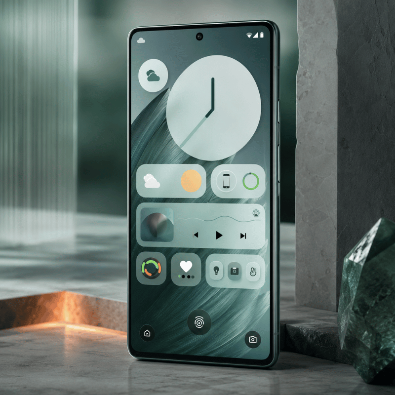
If you’re on Android, the path is less consistent than on iPhone. For years, true lock screen widgets came and went depending on your manufacturer and Android version, and many phones offered only an “At a Glance” strip plus clock styles rather than a full widget picker. Google has been bringing dedicated lock screen widgets back with recent Android releases, starting on tablets and expanding from there, so the exact steps depend on your device and software version. Check your phone’s Settings under Lock Screen or Wallpaper & style for a widgets option; if it’s missing, a third-party lock screen app from the Play Store can add similar tiles. Either way, the same 4-Slot Rule applies, limited space, so spend it on glances that matter.

Troubleshooting: Widgets Not Showing or Won’t Change

Troubleshooting: Widgets Not Showing or Won't Change

When lock screen widgets misbehave, the cause is almost always one of a short list. Run through these before assuming anything is broken.

⚠️ Common Fixes
  • No Customize button: you’re on iOS 15 or earlier, or pressing the Home Screen, update iOS and long-press the Lock Screen.
  • A widget is missing from the list: its app isn’t installed, or the app doesn’t offer a Lock Screen widget. Install or update the app first.
  • “Not enough room”: the row is full, remove a widget (or swap a large one for two small ones) to make space.
  • A widget shows stale data: open the app once so it can refresh, and confirm Background App Refresh is on in Settings.
  • Changes won’t stick: make sure you tapped Done after Customize; restart the iPhone if the editor froze.

On Android, the equivalent first step is to long-press the lock screen or open Settings to find the widget or “At a Glance” controls; if there’s no option at all, your version simply doesn’t support it natively and a Play Store app is the workaround.

What’s New and What’s Next: iOS 26 and the Lock Screen

What's New and What's Next: iOS 26 and the Lock Screen

The Lock Screen got its biggest visual update in years in 2025. Apple introduced its Liquid Glass design in June 2025, and the Lock Screen is where you notice it first. The control buttons and clock take on a floating, frosted-glass appearance, and when you tilt the iPhone, light glints across the glass. Notifications adopt the same translucent look so your wallpaper shows through, and the design carries into Control Center too.

For widgets specifically, the change that matter is placement. According to MacRumors’ rundown of iOS 26 Lock Screen features, widgets can now sit at the top of the display under the time or at the bottom, in earlier versions they could only go up top. With the new adaptive clock, which you can drag to resize, widgets also shift automatically so the subject of a photo wallpaper stays visible. Spatial Scenes turn ordinary 2D photos into layered 3D wallpapers that move as you tilt the phone, giving your widgets a more dynamic backdrop.

The practical takeaway: if you upgrade to iOS 26, revisit your Lock Screen. Try moving your widget row to the bottom if a photo subject keep getting covered, and experiment with the resizable Glass clock to free up space. The 4-Slot Rule still holds, you don’t get more widgets, you get more control over where they live. For 2026, expect Apple to keep investing in glanceable surfaces across the Lock Screen, StandBy, and Dynamic Island, so a tidy widget setup now will only pay off more later.

Frequently Asked Questions

Q: How many widgets can you have on the lock screen?

View Answer
Plan for about four. You get one small inline slot above the clock plus a single widget row below it that holds roughly four small widgets. Pick a larger rectangular widget and it eats the space of two small ones, so the practical ceiling is four small tiles or two large ones. And because there are no widget stacks on the Lock Screen the way there are on the Home Screen, you cannot rotate extras through a single slot to expand past that limit.

Q: Are lock screen widgets interactive?

View Answer
Mostly no. They display information, and tapping one just opens the related app. Unlike the interactive Home Screen widgets in iOS 18, they will not toggle a setting in place — so choose them for what they show.

Q: Why can’t I add widgets to my lock screen?

View Answer
The most common reasons are an older iOS version (you need iOS 16 or later), pressing the Home Screen instead of the Lock Screen, or a full widget row. Update iOS in Settings, long-press the Lock Screen until Customize appears, and remove a widget if there is no room for a new one.

Q: Do lock screen widgets drain the battery?

View Answer
Barely. Widgets refresh on a schedule rather than constantly, so the battery cost is tiny next to screen brightness or an always-on display.

Q: How do I change widgets on an Android lock screen?

View Answer
It depends on your phone. Long-press the lock screen or open Settings and look under Lock Screen or Wallpaper & style for a widgets or “At a Glance” option. If your device and Android version support it, you can add and reorder tiles there; if not, a third-party lock screen app from the Play Store is the usual workaround.

Q: What iOS version do I need for lock screen widgets?

View Answer
iOS 16 or later, which covers the iPhone 8 and newer.
Build a Lock Screen You’ll Actually Use

Color-matched widgets, photo tiles, and full themes for your Lock Screen, Home Screen, and StandBy, designed to read in a glance.

Get iScreen →

Just browsing? See lock screen ideas first.

Why We Wrote This

We build iPhone customization tools, so we spend our days watching which lock screen widgets people keep and which they quietly delete. The 4-Slot Rule in this guide come from that pattern: the tiles that survive are the ones that save an unlock. Every step here was checked against Apple’s current documentation and the iOS 26 changes shipped in 2025.

最近の記事

Best Weather Widgets for iPhone: Beautiful & Functional Options

Best Weather Widgets for iPhone: Beautiful & Functional Options

2026/6/4 16:54
A weather widget on your iPhone turns a quick glance into a full read on the day: temperature, the next hour of rain, sunset, and what to wear before you even open an app. Most guides stop at “touch and hold the Home Screen.” This one go further. You’ll set weather up across all three surfaces of your phone, pick a widget that actually fit how you live, fix the one that mysteriously vanished after an update, and understand why it suddenly looks like frosted glass in iOS 26. Here’s the idea worth stealing: stop thinking of “the weather widget” as one thing. On a modern iPhone you’ve three places to show weather, and each answers a different question. We call it the 3-Surface Weather Setup, and it’s the backbone of this guide. 📐 The 3-Surface Weather Setup Home Screenthe daily dashboard (forecast at a glance, multiple cities) Lock Screenthe zero-tap check you see 80+ times a day StandBythe bedside or desk view while your iPhone charges on its side How to Add a Weather Widget to Your iPhone Home Screen This is the part everyone searches for first, so let’s make it foolproof. The native Weather app already includes Home Screen widgets, so you don’t need to download anything to get started. Touch and hold an empty area of your Home Screen until the apps start to jiggle. Tap the Edit button (or the +) in the top corner, then tap Add Widget. Search for Weather in the widget gallery. Swipe through the sizes, then tap Add Widget on the one you want. Drag it where you want it and tap Done. To change the city it show, touch and hold the widget, tap Edit “Weather” (or Edit Stack if it’s in a group), choose My Location or search for a city, then tap outside the widget to finish. Want both your home city and a trip destination? Apple lets you add more than one Weather widget, so you can watch two forecasts side by side. 💡 Pro Tip Drop the Weather widget into a Smart Stack and turn on Smart Rotate and Widget Suggestions. iOS then surfaces the forecast right when you tend to check it (your morning commute, say) and tucks it away the rest of the day. Weather Widget Sizes Explained: What Each One Shows Picking a size is really picking how much information you want without tapping in. Bigger isn’t always better; a small widget you actually read beats a large one that crowds out your apps. Here’s what each native Weather widget surfaces. Widget size What it shows Best for Small (2×2) Current temperature, conditions, high/low A clean home screen where weather is one tile among many Medium (4×2) Current conditions plus an hourly forecast strip Knowing when rain starts or stops today Large (4×4) Hourly plus a multi-day outlook, often with precipitation, feels-like, and more detail Planning the week without opening the app Lock Screen (inline / circular) Temperature, conditions, or a single metric like UV or air quality A zero-tap glance every time you wake the phone Rule of thumb: if you check weather to decide what to wear, a small or medium widget is plenty. If you check it to decide what to plan, go large. Many third-party apps add extra fields here, wind, humidity, sunrise and sunset, air quality, which is exactly where the “best widget” question gets interesting. Add Weather to Your Lock Screen and StandBy Almost everyone sets up the Home Screen widget. Yet the other two surfaces are where the real payoff live, because you see your iPhone Lock Screen dozens of times a day without ever unlocking. Lock Screen weather (the zero-tap check) Touch and hold your Lock Screen, then tap Customize (tap + to make a new one). Tap the widget area beneath the clock. Choose Weather and add the temperature, conditions, or a detail like UV index. Tap Done. StandBy weather (the nightstand view) When you turn your iPhone on its side while it charges, StandBy mode turns it into a small smart display. Swipe to the widget face, touch and hold, and add a Weather widget so the forecast greets you in the morning before you’ve picked up the phone. It’s the most underused weather surface on iOS, and it costs nothing to set up. ⚠️ Important All three surfaces pull from the same Location Services permission. If one shows the wrong city or goes blank, the fix is almost always location — more on that below. The Best Weather Widgets for iPhone in 2026 Apple’s native widget is reliable and free, but it’s deliberately minimal. If you want richer data, smarter layouts, or just more personality, a third-party app is the move. Here’s an honest read on the names that keep coming up among iPhone users. App What it’s good at Cost Apple Weather (native) A free, accurate starting point, now richer after Apple folded in Dark Sky data. Keep it if you mainly want temperature and rain. Free CARROT Weather The power user’s pick: deeply customizable widgets, radar, and a snarky personality you can dial up or off. Reddit’s r/ios crowd keeps calling it “the best by far.” Free + paid tiers Hello Weather Clean, calm, and glanceable, with a choice of forecast data sources. A 2025 review crowned its widgets for design. Freemium The Weather Channel / WeatherBug Built for severe-weather alerts and radar when storm tracking matters more than aesthetics. Free (ad-supported) “The No. 1 reason Hello Weather tops my list is its clean, concise, glanceable design, whether in-app or through its widgets.” Yahoo Tech review, 2025 ⚠️ Common mistake Don’t choose a weather widget on looks alone. Two widgets can look identical and pull from different forecast models, refresh on different schedules, and disagree by several degrees. Check the data source and how often it updates before you commit. Free vs Paid Weather Widgets: What You Actually Get Most of these apps are free to install, then ask for a subscription to unlock the good widgets. Before you pay, it helps to know what the money actually buy, and to clear up a pricing point that confuses a lot of people. Feature Free tier Paid subscription Basic widget sizes Yes Yes Extra layouts & customization Limited Full Radar, alerts, longer forecasts Often locked Unlocked Ads removed No Usually yes The pricing confusion is worth flagging. CARROT Weather, for example, has more than one paid tier: an entry-level premium plan reported at around $4.99/year by The Sweet Setup, and a higher “ultra” tier that costs roughly ten times that. People who quote “$50 a year” are usually looking at the top plan, not the one most users need. (Prices were accurate as of early 2026 and change often, so confirm in the App Store before subscribing.) The honest answer: if the free native widget covers your needs, keep it. Pay only when you want a specific thing the free tier won’t give you, better radar, a custom layout, or a look that matches your aesthetic. How to Make an Aesthetic Custom Weather Widget Here’s the gap the big weather apps leave open: they give you their design, not yours. If you’ve built a coordinated theme and the stock weather widget clashes with it, a customization app let you style the widget to match. That’s where custom iPhone widgets come in. In iScreen’s widget library, an aesthetic weather widget is less about more data and more about fit: you pick the background color, the font, and how minimal the layout is, so the forecast read like part of your wallpaper instead of a sticker on top of it. A few combinations our users reach for again and again: ✔Minimal monoa single temperature number on a flat background, paired with a clean wallpaper. ✔Pastel matchwidget tint pulled from your wallpaper’s palette so nothing fights for attention. ✔Small-and-stackeda tiny weather tile beside a clock or a countdown widget in a tidy two-up layout. The principle is the same one behind any good home screen ideas: pick one accent color and let the weather widget echo it, rather than introducing a new one. A widget that belongs to your theme always looks more deliberate than the default. Weather Widget Not Working? Fixes for the “Disappeared” Widget If your weather widget went blank, froze on yesterday’s forecast, or vanished after an update, take a breath: this is common and almost always fixable in a couple of minutes. Where Did My Weather Widget Go? Most of the time, it didn’t get deleted, an iOS update reset it. Major updates can rearrange the Home Screen, clear a widget’s saved location, or pause the permission it need to refresh. So the widget isn’t gone; it’s sitting there without the location access it needs to draw a forecast, which makes it look blank or stuck. That’s why re-adding it or re-granting location usually brings it straight back, no app reinstall required. ✔Check Location Services. Settings > Privacy & Security > Location Services > Weather. Set it to While Using the App (or Always) and turn on Precise Location. ✔Turn on Background App Refresh. Settings > General > Background App Refresh, so the widget can update when you’re not looking at it. ✔Re-add the widget. Remove it, then add it again from the widget gallery to force a fresh start. ✔For a blank Lock Screen weather wallpaper: touch and hold the Lock Screen, tap Customize, and re-accept the location prompt. iPhone users report this single step fixes the missing-location look. ✔Restart, then update. A quick restart clears most glitches; installing the latest iOS clears the rest. Work down that list in order and you’ll catch the cause well before the last step. To rebuild the widget exactly how you like it afterward, the same steps you used to customize your iPhone apply. What iOS 26’s Liquid Glass Means for Your Weather Widget If your weather widget suddenly looks translucent, refracting the wallpaper behind it, that’s Liquid Glassthe headline design change in iOS 26. Widgets, icons, and the Lock Screen now use a glassy material that bends light and adapts to whatever sits behind it. The weather widget is one of the most-cited examples because its background change with conditions. You’re not stuck with one look. To change how widgets and icons render, touch and hold the Home Screen, tap Edit, and switch the appearance between Default, Clear, and Tinted to suit your wallpaper. And if the glass effect ever hurts readability, you can tone it right down under Settings > Accessibility > Display & Text Size > Reduce Transparency. The practical takeaway for 2026: a weather widget’s legibility now depends on your wallpaper as much as the widget itself. If yours is hard to read on a busy background, switch to Tinted or turn on Reduce Transparency, and if you want a glass look that still read cleanly, a custom widget with a solid backing plate sidesteps the problem entirely. Liquid Glass made aesthetic widget choices matter more, not less. Frequently Asked Questions Q: Does the iPhone have a built-in weather widget? View Answer Yes — and it’s free. The built-in Weather app covers Home Screen, Lock Screen, and StandBy in several sizes. Q: Why is my iPhone weather widget not updating? View Answer Usually it’s a permission. Open Settings > Privacy & Security > Location Services > Weather and allow access, then turn on Background App Refresh. If it’s still stuck, remove and re-add the widget, then restart your phone. Q: Can I add a weather widget to my iPhone Lock Screen? View Answer Yes, and it’s one of the most useful places to put it. Touch and hold the Lock Screen, tap Customize, then tap the widget area beneath the clock and choose Weather. You can show the temperature, current conditions, or a single detail like UV index — whatever you want to read without ever unlocking the phone. Because you wake your screen dozens of times a day, this becomes your real weather check. Q: What is the best free weather widget for iPhone? View Answer For most people, Apple’s own widget wins on value — accurate and built in. CARROT and Hello Weather also have free tiers worth trying. Q: How do I get a bigger weather widget on my iPhone? View Answer You can’t stretch an existing widget, so add a fresh one in the size you want. Touch and hold the Home Screen, tap Add Widget, search for Weather, then swipe through the previews until you reach the large (4×4) option and tap Add Widget. The large size packs in an hourly strip plus a multi-day outlook, so you get the whole picture without opening the app. Drag it into place and tap Done. Q: How do I change the location on my weather widget? View Answer Touch and hold the widget, tap Edit “Weather” (or Edit Stack), tap My Location, then search for and pick the city you want. Tap outside the widget to save. You can also add a second Weather widget for a different city. Why We Wrote This Guide iScreen builds iPhone customization tools, so we spend our days watching how people set up widgets, including where the weather widget breaks. This guide pull together Apple’s official steps, real fixes iPhone users shared for the “disappeared” widget, and what iOS 26’s Liquid Glass changes, so you can set weather up once across all three surfaces and stop fiddling with it. Want a weather widget that matches your wallpaper instead of fighting it? Build your own with iScreen → References & Sources Use Weather widgets on iPhoneApple Support Add, edit, and remove widgets on iPhoneApple Support Create a custom Lock Screen on iPhoneApple Support How to customize your iPhone Home Screen for iOS 26’s Liquid GlassTechCrunch iOS 26 setting to customize the Liquid Glass design (Reduce Transparency)CNET Related Articles How to Add a Countdown Widget on iPhone iPhone Home Screen Ideas StandBy Mode Widgets for iPhone Dynamic Island Widgets & Animations
2026/6/4 16:54
Best Countdown Widget Apps for iPhone: Track Events on Your Home Screen

Best Countdown Widget Apps for iPhone: Track Events on Your Home Screen

2026/6/3 16:39
Want a countdown widget for iPhone that shows the days until a trip, a birthday, or a deadline right on your screen? Here’s the part most guides skip: iOS doesn’t ship a real “days-until” countdown widget of its own. Good news: adding one takes about a minute once you know where to look. This guide show you how to put a countdown on your Home Screen, Lock Screen, and even StandBy mode, which apps are worth installing, what you can get for free, and how to make the whole thing match the rest of your setup. The short version — the 3-Surface Countdown Setup Home Screen, a medium widget you glance at while planning your day. Lock Screen, a small widget under the clock for a no-unlock peek (iOS 16 and later). StandBy, a full-screen countdown on your bedside charger (iOS 17 and later). Pick a countdown app, set your date once, then drop the same event onto whichever of these three surfaces you actually look at. Does the iPhone Have a Built-In Countdown Widget? Not really, and this trips a lot of people up. Apple’s stock Clock app has a Timer, but a timer count down minutes and seconds for a single session, it can’t tell you “42 days until the wedding.” The Calendar widget shows your next few events with their dates, and the Reminders widget lists tasks that are due, yet neither one displays a running day counter on your screen. Apple’s own widget gallery, documented in the iPhone User Guide, simply doesn’t include a “days until” widget. So when people ask why the old standalone “Countdown” idea seems to have vanished, the answer is that it was never a permanent native feature to begin with. The countdown experience on iOS has always lived in third-party apps, and that’s by design, Apple opens the widget system to developers and lets them fill the gaps. That’s why every genuinely good iPhone countdown lives inside an app you install, not in a hidden Settings toggle. 💡 Pro Tip If all you need is the next calendar event, the native Calendar widget is fine. If you want a big “12 days to go” number staring back at you, you need a dedicated countdown app — keep reading. How to Add a Countdown Widget to Your Home Screen (Step by Step) Adding a countdown widget to your iPhone Home Screen works the same way as any other widget. Your only extra step is configuring the event inside the app first, because the widget pulls its date from there. Install a countdown app from the App Store (see the picks below) and open it once. Create your event inside the app, name it, set the target date, and pick a color or photo if the app allow. Long-press an empty spot on the Home Screen until the icons start to jiggle. Tap the + button in the top-left corner to open the widget gallery. Find the app you just installed and tap it. Choose a size, small, medium, or large, then tap Add Widget. Long-press the new widget and tap Edit Widget to pick which countdown it shows. Drag it into place and tap Done. Step 7 is the one people miss. A freshly added widget often shows a blank or default countdown until you open Edit Widget and choose the specific event, without that, it sits there looking broken. That single tap is why a setup someone called “impossible” usually takes ten more seconds to finish. ⚠️ Common Mistake If the widget won’t update, check Low Power Mode. It throttles background refresh, so a day-counter can lag behind by a day until you open the app. Turning Low Power Mode off, or opening the app each morning, fixes it. If you want the cleanest possible result, set up your countdown alongside the rest of your layout. Our walkthrough on building an aesthetic iPhone home screen covers spacing and theming so the counter doesn’t clash with everything around it. How to Add a Countdown Widget to Your Lock Screen Yes, you can put a countdown on your Lock Screen, and it’s genuinely useful because you see it every time you pick up your phone, no unlock required. This needs iOS 16 or later, which is when Apple added Lock Screen customization and widgets. Can I have a countdown on my iPhone Lock Screen? You can. Touch and hold the Lock Screen, tap Customize, then choose Lock Screen. Tap the widget area below the clock (or the slot above it for the inline date row), pick your countdown app from the list, and add its widget. Lock Screen widgets are small by nature, so they show a tight number like “9 days” rather than a full label. Tap Done and the countdown rides along on every wake. One honest caveat from real users: Lock Screen widgets don’t always refresh the instant the day rolls over. On the r/ios forum, people have noted that clock and weather widgets sometimes wait until the next unlock to update. A countdown can behave the same way, so if it looks a day off first thing in the morning, a quick tap to wake-and-unlock usually syncs it. If you want a deeper walkthrough of styling that screen, see our guide to the iPhone Lock Screen widget setup. Countdowns on StandBy and the Dynamic Island This is the surface almost every “best countdown widget” article forgets. StandBy turns your iPhone into a bedside display while it charges on its side, and a countdown is one of the things it can show full-screen. It needs iOS 17 or later. Per Apple’s StandBy guide, you turn it on in Settings, connect a charger, set the phone on its side, and press the side button, then swipe to the widgets view and pick your countdown. Why bother? Because a countdown you’ve to dig for is a countdown you forget. On a nightstand charger, a “5 days until vacation” panel is the last thing you see at night and the first thing in the morning. StandBy even has a Night Mode that tints the screen red in low light so it isn’t glaring at 3 a.m. On iPhones with an Always-On display, the panel just stays put; on other models, a tap or a nudge of the table wakes it. “We tell people to stop thinking of a countdown as one widget and start thinking of it as one event shown on three surfaces. The Home Screen is for planning, the Lock Screen is for a quick glance, and StandBy is for ambient awareness while you charge. Set the date once, place it three times.” The iScreen design team, on building widgets across iOS surfaces Live Activities and the Dynamic Island handle the short-term end of things, an event happening today or in the next few hours can ride in the Dynamic Island. For multi-day or multi-week countdowns, the widget surfaces above are the right home. Best Countdown Widget Apps for iPhone (2026) There are dozens of countdown apps, and most do the basics fine. Where they actually differ is how much you can customize, which surfaces they support, and what hides behind a paywall. Here’s an honest comparison of common picks. App Free tier Surfaces Best for iScreen Yes Home, Lock, StandBy Matching the countdown to a full themed setup Pretty Progress Limited Home, Lock Progress-bar style countdowns Widgetsmith Yes (ads) Home, Lock All-purpose widgets, not just countdowns Countdown Widget & Counter Limited Home, Lock Minimalist single-event counters Pick based on what you actually want: a plain number, a progress bar, or a counter that blends into a designed Home Screen. If aesthetics matter to you, an app that also handle wallpaper, icons, and themes saves you juggling three separate tools. You can see how the pieces fit together with the iScreen iPhone widget app. Are There Free Countdown Widgets? Plenty of countdown widgets are free, and a free one is enough for most people tracking a single event. A trade-off show up when you want more: many apps cap the number of countdowns, lock the nicer fonts and backgrounds, or show ads until you upgrade. None of that stops you from getting a working “days until” widget on your screen at no cost. Usually free vs. usually paid Free: one or two countdowns, basic sizes, a handful of colors, Home and Lock Screen widgets. Paid: unlimited countdowns, custom fonts, photo backgrounds, ad removal, and extras like Apple Watch or StandBy styling. A reasonable plan: start free, live with it for a week, and only pay if you hit a wall, usually that’s wanting a third or fourth countdown, or wanting the widget to match a specific palette. How to Customize a Countdown Widget to Match Your Aesthetic A countdown widget that clashes with your wallpaper looks worse than no widget at all. Fixing that means treating the counter as one element of a single design, not a sticker slapped on top. Most apps let you change four things: the background (solid, gradient, or your own photo), the font, the text color, and what units show (days only, or days plus hours). A simple rule keep it clean: borrow your two main colors from the wallpaper and let the countdown number be the one accent that pops. If your wallpaper is muted, a single bold number reads instantly; if it’s busy, a semi-transparent background behind the number stop it from disappearing. For couples syncing the same date, a trip or an anniversary, paired widgets keep both phones in step; our couple widgets setup is built for exactly that. Once the countdown look right, it’s worth carrying the same palette across your icons and theme. The iScreen customize your iPhone home screen guide and our theme tools handle that part so the whole screen feel intentional. Popular Countdown Types: Vacations, Weddings, Holidays and Exams The way you set up a countdown depend on what you’re counting toward. A few patterns cover most cases: ✔ A vacation is a single one-time event, and the most common reason people search for a countdown widget at all. A photo of the destination as the background makes it hit harder. ✔ Weddings and anniversaries work best set to repeat yearly, so the anniversary version resets on its own after the date passes. ✔ Holidays like Christmas, New Year, and Halloween drive huge seasonal spikes; a recurring holiday countdown saves you re-creating it every year. ✔ Exams and deadlines deserve a stark days-left number on the Lock Screen as a quiet motivator, no app to open, just a reminder every time you reach for your phone. One decision matter most here: one-time versus recurring. Get that wrong and a holiday counter show “−14 days” in January instead of resetting. Most apps put a “repeat yearly” toggle right next to the date field. How to Choose the Right Countdown Widget Setup Instead of asking “which app is best,” ask “where do I actually look, and what am I counting?” Match your answer to the table below. Your situation Surface Widget size Why One big event you obsess over Lock Screen + StandBy Small Maximum glances, zero effort Several events at once Home Screen Medium or large Room to list multiple dates Aesthetic-first home screen Home Screen Medium Blends into a themed layout Bedside / charging routine StandBy Full screen Ambient, last-thing-you-see If you’re not sure, default to the Lock Screen. It costs nothing in Home Screen real estate, you see it constantly, and you can always add the Home Screen or StandBy version later. Need ideas for the rest of the layout? Our iPhone home screen ideas are a good starting point. What iOS 26 Changes for Countdown Widgets iOS 26 shipped in September 2025 with the biggest visual change in years: a translucent “Liquid Glass” design that runs across the Lock Screen, Home Screen, and widgets, described in Apple’s iOS 26 announcement and the official iOS 26 feature list. For countdowns, that means your widget now picks up the same glassy, tinted look as the rest of the system, so the “match your aesthetic” advice above matters more than it used to, because a counter that ignores the new styling stand out for the wrong reasons. Under the hood, Apple’s developer session “What’s new in widgets” from WWDC25 extended WidgetKit and Live Activities to more places, CarPlay, the Mac, watchOS, and visionOS, and improved how widgets push updates. Practically, that points one way: a countdown you set on your iPhone is going to follow you onto more screens, and it’ll refresh more reliably than the older “wait for the next unlock” behavior some Lock Screen widgets still show. If you’re setting up a countdown in 2026, two moves future-proof it. First, choose an app that already support StandBy and Lock Screen widgets, not just the Home Screen, that’s where Apple keeps adding room. Second, lean into the Liquid Glass look rather than fighting it, so your counter ages well as the rest of your screen adopts the same style. Frequently Asked Questions Why was the Countdown app removed? View Answer There was never a permanent native “Countdown” app or widget built into iOS — countdowns have always come from third-party apps. Individual apps do get pulled or renamed in the App Store over time, but the day-counter feature itself was never an Apple stock feature that could be “removed.” So if an app you relied on disappeared, the answer isn’t a missing iOS setting; it’s installing one of the current countdown apps and rebuilding your event there. Your other widgets stay exactly as they were. Does the iPhone Clock app have a countdown widget? View Answer No — its Timer counts down a single session in minutes and seconds, never “days until” a future date. How do I edit or change a countdown widget after adding it? View Answer Long-press the widget on your Home Screen and tap Edit Widget to switch which event it shows or change its style. To change the date itself, open the app and edit the event there — the widget updates automatically. Can I put a countdown widget on Android too? View Answer Yes, Android has its own countdown widgets through Google Play apps, and the long-press-to-add flow is similar. The steps in this guide are specific to iPhone, including the Lock Screen and StandBy parts, which Android handles differently. Do countdown widgets drain iPhone battery? View Answer Barely — a day-counter refreshes once a day, so its battery cost is tiny. Low Power Mode actually slows that refresh, which is why a counter can look a day behind. How many countdowns can I add to one widget? View Answer A small widget usually shows one event, while medium and large sizes can list several at once. Total countdowns you can create is often where free apps draw the line and ask you to upgrade. Build a countdown that matches your whole screen iScreen puts countdown widgets on your Home Screen, Lock Screen, and StandBy, and styles them to match your wallpaper, icons, and theme. Try the iScreen widget app → How We Put This Guide Together The setup steps here were checked against Apple’s own iPhone User Guide for widgets, Lock Screen customization, and StandBy, then cross-referenced with real iPhone owners describing quirks like Lock Screen widgets that don’t refresh until the next unlock. We build iScreen, so we test countdown widgets across Home Screen, Lock Screen, and StandBy on current iOS 26, which is why the “three surfaces” framing runs through the whole article. References & Sources Add, edit, and remove widgets on iPhoneApple Support, iPhone User Guide Customize the iPhone Lock ScreenApple Support, iPhone User Guide Use StandBy on iPhoneApple Support, iPhone User Guide Apple elevates the iPhone experience with iOS 26Apple Newsroom New features available with iOS 26Apple What’s new in widgets (WWDC25)Apple Developer Related Reading iPhone widget app iPhone Lock Screen widgets StandBy mode widgets Aesthetic iPhone home screen ideas Couple widgets for iPhone
2026/6/3 16:39
Aesthetic iPhone Home Screen: The Ultimate Design Guide

Aesthetic iPhone Home Screen: The Ultimate Design Guide

2026/6/3 16:08
An aesthetic iPhone home screen isn’t about adding more stuff. It’s about three things agreeing with each other: the wallpaper, the app icons, and the widgets. Get those three to share one mood and a tight color story, and almost any layout looks intentional. This guide walks you through eight aesthetic styles, shows you how to assemble each one, and then covers the new iOS 26 icon looks that landed in 2026. Most of the “aesthetic home screen” tutorials still floating around were shot on iOS 14 back in 2020. Buttons moved, icon options changed, and Apple now lets you recolor icons without a single workaround. So we rebuilt the whole process for the current iPhone, kept what still works, and flagged the parts that quietly broke. What you’ll set up in this guide A wallpaper that anchors your color palette App icons that match (the native iOS 26 way and the custom-image way) Two or three widgets that look good without crowding the grid A layout with breathing room instead of clutter What Actually Makes a Home Screen Look “Aesthetic”? A home screen reads as aesthetic when every element look like it was chosen by the same person on the same afternoon. There are only four levers you control: the wallpaper (your background), the app icons, the widgets, and the layout. Everything else is noise. So why do some setups look styled and yours looks busy? Usually it’s color. Our eyes read a cohesive palette as “designed” and a rainbow of default icons as “default.” That single insight is doing most of the work in every Pinterest screenshot you’ve ever saved. 💡 The 3-Color Rule Pick no more than three colors for the entire home screen — usually one background tone and two accents. Your wallpaper, icons, and widgets all pull from that set. Once a fourth bright color sneaks in, the screen starts to look cluttered instead of curated. It is the fastest fix for a screen that feels “off” but you can’t say why. Here’s the trap nobody mentions: chasing looks at the expense of use. A popular sentiment in the iPhone setup community sums it up well. “Functionality beats aesthetics. People clutter the home screen with custom icons and widgets, then can’t find the app they actually open twenty times a day.” A widely upvoted post in r/iOSsetups Takeaway: beauty and usability aren’t enemies. Decide your three colors first, keep the apps you use daily on page one, and let the design serve the way you already use your phone. 8 Aesthetic Styles to Choose From (Find Your Vibe) Before you touch a single setting, choose one vibe and commit to it. A minimalist home screen and a Y2K home screen pull from opposite ends of the design world, and mixing them is exactly what makes a screen look unfinished. Explore the eight styles below, each consistently look good on iPhone, with the palette and wallpaper type that defines it. Aesthetic Core palette Wallpaper type Best if you want… Minimalist Off-white, grey, black Solid or soft gradient A calm, clutter-free phone Pastel / soft Cream, blush, sage Gradient or watercolor A cute, gentle look Y2K Hot pink, lime, chrome Glossy, sticker-style A bold, nostalgic 2000s feel Preppy Bright multicolor, white Pattern or collage A fun, energetic grid Dark / moody Charcoal, deep blue, plum Dark photo or solid black An OLED-friendly, sleek look Coquette Pink, ivory, red bows Soft, ribbon motifs A romantic, girly theme Cottagecore / natural Moss, tan, terracotta Nature photo or illustration A warm, earthy mood Cyberpunk / neon Black, neon cyan, magenta Dark city or glow art A high-contrast, techy edge If you can’t decide, default to minimalist. It’s the most forgiving aesthetic on iPhone because a neutral palette hides mismatched icons better than a loud one, and it ages well when the trend cycle move on. Whatever you pick, write your three colors down before the next step, they’re the rule everything else follows. Need more inspiration first? Our roundup of iPhone home screen ideas shows full setups for each of these styles. Start With the Wallpaper (Your Aesthetic Foundation) Pick the wallpaper first, then build everything else to match it. Your background covers the most screen area, so it sets the palette your icons and widgets have to live inside. Choosing icons before the wallpaper is the most common reason a setup feel disjointed halfway through. For a clean, minimalist look, a solid color or a soft gradient keep icons readable and never fights with your widgets. For pastel, Y2K, or coquette, a patterned aesthetic wallpaper carries more of the personality, just keep the busiest part of the image away from the top two rows where your widgets and clock sit. iScreen’s aesthetic iPhone wallpapers are sorted by exactly these styles, including 4K and depth-effect backgrounds. Can you have multiple home screen wallpapers on an iPhone? Yes. Each Lock Screen you create can be paired with its own Home Screen background, and you can switch between them by long-pressing the Lock Screen and swiping. That means you can keep a pastel setup for daytime and a dark, moody one for night, and flip between them in two seconds. On iOS 26, the Lock Screen also moves the clock so it never hides the subject of your photo, and tilting the phone give the image a subtle 3D depth effect. Apple’s Lock Screen guide covers the setup. Customize App Icons to Match App icons are where a home screen go from “nice wallpaper” to “fully themed.” There are two routes, and picking the right one for your style saves a lot of frustration. Route one is native and fast; route two is unlimited but fussier. Route 1, native iOS 26 tinting (fast, no apps). On iOS 26, Apple added a real icon makeover: you can tint every icon a single color, or switch the whole grid to light, dark, or clear. The clear, color-matched icons are the signature 2026 look. To do it, long-press an empty spot to enter edit mode, tap Edit then Customize, and select Light, Dark, Tinted, or Clear. According to Apple’s official guide to customizing apps and widgets, the change apply to your whole layout at once. It’s the cleanest way to get a cohesive grid in under a minute. Route 2, custom image icons (unlimited, via Shortcuts). Here’s the catch most guides skip: iOS 26 tinting recolors Apple’s icons, but it can’t replace them with a custom picture. If you want hand-drawn or themed icons, you still build them through the Shortcuts app, create a shortcut that open the app, then assign your own image. iScreen’s aesthetic app icons packs do this assembly for you so you don’t make each one by hand. ⚠️ Know this before you commit to custom icons Shortcut-based icons come with three real trade-offs that users report constantly: a brief loading flash when you tap one (the screen flickers before the app opens), the loss of red notification badges, and occasional style inconsistency under iOS 26. If badges and instant launching matter to you, the native tinted or clear icons are the safer choice. Can you change the font on an iPhone home screen? Not the app-label font directly, iOS uses the system typeface for icon names and doesn’t expose a font picker for them. What you can change is the font inside your widgets. Widget apps let you choose typefaces for clock, date, and text widgets, so you get a custom-font feel up top even though the labels below stay standard. A common workaround for a true text-free look is to rename Shortcut icons with a single blank space, which hides the label entirely. Add Aesthetic Widgets (Beauty Plus Function) Widgets are the fastest way to make a home screen feel personal, and the easiest way to wreck it if you overdo them. Aim for one or two widgets that earn their space, something useful that also happens to match your palette. A wall of decorative widgets is just clutter with rounded corners. The aesthetic widgets that actually get used tend to fall into a few buckets: a photo widget for a favorite picture, a clock or weather widget styled in your accent color, a Smart Stack that rotates through a few at once to save space. Dedicated widget apps like Widgetsmith and iScreen make these stylish, color-matched widgets without any design skill, and the fun ones, distance widgets for couples or a desktop pet that lives on your screen. iScreen’s custom iPhone widgets include all of these, and the couple distance widgets are a popular starting point. ✔ Match the widget’s accent color to one of your three palette colors. ✔ Use one large widget as a focal point, not three competing for attention. ✔ A Smart Stack lets you keep several widgets in one slot and swipe between them, pin your favorite to the top. Takeaway: aim for a rhythm of sizes, one medium or large widget paired with a tidy grid of icons reads far better than widgets stacked top to bottom. Nail the Layout (Grid, Spacing, and Blank Space) Layout is the difference between “themed apps” and a home screen that actually look designed. It borrows a principle interior designers lean on: empty space is a feature, not wasted room. A few open slots make the icons you do keep feel deliberate. Build it around one idea per page. Page one is your daily drivers, the six to eight apps you open without thinking, plus a widget. Push everything else to a second page or, better, into the App Library by removing it from the home screen (long-press the app, tap Remove from Home Screen, and it stays installed, just hidden). This is the single biggest fix for a cluttered phone, and it directly answers the complaint behind half the “help, my screen is a mess” posts online. ✔ Do Leave a blank row or column for breathing room Keep one aesthetic per page Use the dock for your four most-used apps ✘ Avoid Filling every grid slot More than two widgets per page A fourth accent color sneaking in For more arrangement patterns, split layouts, single-app pages, and dock-only setups, our guide to aesthetic iPhone home screen layout ideas goes deeper on the grid itself. Put It All Together: Step-by-Step Setup Here’s the full sequence from a default iPhone to a finished aesthetic home screen. Following this order matters, each step set up the next, and doing it backward is why so many people give up halfway. How to make your iPhone aesthetic, step by step Pick a vibe from the eight styles above and lock in your three colors. Set the wallpaper that anchors that palette (Settings > Wallpaper, or long-press the Lock Screen). Style the iconstint or clear them in iOS 26, or apply a custom icon pack via Shortcuts. Add one or two widgets in a matching accent color. Clean the layoutdaily apps on page one, the rest to the App Library, a blank row for space. Review at arm’s lengthif anything jumps out as a clashing color, fix that one thing. Done manually, this takes most people thirty to sixty minutes the first time, mostly spent finding and assigning matching icons. The shortcut, if you would rather not build every icon by hand, is a one-tap theme kit. Apps like iScreen package a matching wallpaper, icon set, and widgets as a single theme, so step three through five collapse into one tap. iScreen lists more than 10,000 themes, 5,000 app icons, and 500 widgets across iPhone and iPad, which is what makes the assembled-kit route practical on any device instead of a weekend project. You can browse the full aesthetic iPhone theme library or follow the in-app how to customize your iPhone walkthrough. Skip the manual work, apply a full aesthetic theme in one tap. Download iScreen on the App Store → Get it on Google Play → What’s New and Trending for 2026 (iOS 26 and Beyond) This year’s biggest shift in aesthetic home screens came straight from Apple. the iOS 26 update, released in late 2025, rebuilt how icons look and pushed customization that used to need third-party apps into the operating system itself. If your reference photos are from 2023, they’re already a generation behind. Three iOS 26 changes are driving the 2026 look. First, icon tinting and the new clear, “Liquid Glass” icons, a translucent, color-matched grid is now the most-requested aesthetic, and Pinterest searches for “iOS 26 aesthetic” have climbed into the tens of thousands. Second, the smarter Lock Screen, where the clock repositions itself around your photo’s subject and tilts into a 3D effect. Third, beyond the home screen, the Dynamic Island and StandBy mode have become design surfaces of their own. The trend itself is splitting in two directions. One camp is going ultra-minimal, clear icons, a single solid wallpaper, no widgets at all. The other is going maximalist with animated Dynamic Island pets and a styled StandBy mode nightstand clock. Both are valid; pick the one that matches how you actually use your phone. Engadget’s iOS 26 customization walkthrough is a solid reference for the new icon control. If you’re refreshing your setup in 2026: start with the native iOS 26 clear or tinted icons before reaching for custom packs. It costs nothing, takes a minute, and gives you a current look you can build on later. Frequently Asked Questions How do you get an aesthetic iPhone home screen? View Answer Start by choosing one style and locking in three colors. Set a matching wallpaper, then recolor your icons — tint or clear them in iOS 26, or apply a custom icon pack through Shortcuts. Add one or two widgets in a matching accent color, and finish by cleaning up the layout: keep daily apps on page one and push the rest into the App Library. Cohesion comes from limiting your palette, not from piling on more icons and widgets until the screen looks busy. Can you change the font on an iPhone home screen? View Answer You cannot change the font on app labels — iOS keeps the system typeface there. You can change fonts inside widgets, so a custom clock or date widget gives you that styled-font look at the top of the screen. Do custom icons slow down or drain my iPhone? View Answer Shortcut-based custom icons don’t drain battery in any meaningful way, but they do add a brief loading flash when you tap one, and they hide the red notification badge. Apple’s native iOS 26 tint and clear icons have neither problem, because they restyle Apple’s own icons instead of routing through a shortcut. How do I reset my iPhone home screen? View Answer Open Settings, go to General, then Transfer or Reset iPhone, choose Reset, and tap Reset Home Screen Layout. This returns icons to the default Apple arrangement without deleting any apps or data. It’s the quickest way to start a new aesthetic from a clean slate. How do I add an app back to my home screen? View Answer Swipe left past your last page to open the App Library, find the app, then long-press it and choose Add to Home Screen — or just drag it out of the App Library onto the page you want. Is iScreen free to use? View Answer iScreen has a free tier with themes, icons, wallpapers, and widgets. A premium subscription unlocks the full library and works on both iPhone and Android. Why We Wrote This Guide We rebuilt this aesthetic iPhone home screen walkthrough specifically for iOS 26, because most tutorials still demonstrate the old iOS 14 steps where icon tinting and clear icons didn’t exist yet. Every setting path here was checked against the current iPhone, and the trade-offs of custom icons come from real iScreen users and the wider iPhone setup community, not a sales pitch. References & Sources What’s new in iOS 26Apple Support Customize apps and widgets on the Home ScreenApple Support Create a custom iPhone Lock ScreenApple Support How to customize your iPhone home screen with iOS 26Engadget Related Articles 20 Best iPhone Home Screen Ideas for 2026 Aesthetic iPhone Home Screen Layout Ideas Aesthetic iPhone Wallpaper Picks How to Change Your iPhone Home Screen Browse Aesthetic iPhone Themes
2026/6/3 16:08
トップに戻る