Cyberpunk iPhone Aesthetic: Wallpapers, Widgets & Neon Icon Packs

A cyberpunk wallpaper for iPhone only works as an aesthetic if the widgets on top are still readable and the icons around it stop clashing. Most “cyberpunk wallpaper” pages just hand you a folder of neon city renders and stop there, and you can’t really tell if the widget and icon layer will trial and error its way to work. This guide covers the visual grammar that actually makes a screen read as cyberpunk, the three visual families worth choosing between, and the one technical problem – widget legibility on a dark, glowing background – that every other guide skips.

Cyberpunk wallpaper iPhone setups are a dark base wallpaper, one or two bright neon accent colors, and a chrome or glitch-style texture – not just any dark wallpaper will do. The look breaks down fastest at the widget layer, where low contrast between neon backgrounds and Apple’s default widget text makes calendar and weather data unreadable at a glance. Matching wallpaper darkness, widget opacity, and icon pack saturation to the same one or two accent colors is how to get this right.

Quick Specs: Cyberpunk iPhone Aesthetic

Common resolutions 1170×2532px (standard), 1179×2556px (Pro), 1284×2778px (Pro Max)
Physical body size Roughly 147mm tall × 71mm wide on standard models, up to 163mm × 78mm on Pro Max
Format support Static (all iOS versions), Live/Depth Effect (iOS 16+), 3D Lock screen photo (iOS 26)
Typical price range Free – $6 per wallpaper; $9.99+ for bundled wallpaper + widget packs
Visual family count 3 (2077-game, Edgerunners-anime, genre-atmospheric)
Live wallpaper refresh Up to 120Hz on ProMotion-equipped Pro models

What Makes an iPhone Look “Cyberpunk” (Not Just Dark)?
What Makes an iPhone Look

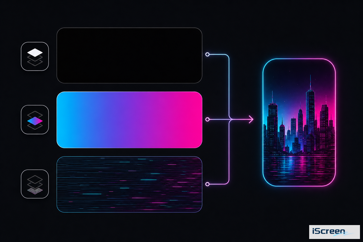
Dark base color layered with one or two saturated neon accents and a chrome, glitch, or scan-line texture, applied consistently across wallpaper, widgets, and icons – that’s what a cyberpunk aesthetic actually is. Any black wallpaper just doesn’t produce the look on its own, since a simple black photo reads as minimalist, not cyberpunk, once it’s missing the accent color and texture layer that signal the genre.

Apple’s own Human Interface Guidelines for materials make a similar point for interface design: legibility depends on using vibrant colors intentionally on dark backgrounds, not just lowering brightness across the board.

This is where most “cyberpunk wallpaper” collections simply don’t deliver. A quick scan of the top six wallpaper pages for this term show from ten to twenty generic neon-city renders with no visual framework attached – readers are left to guess which images will actually look coherent once icons and widgets sit on top. 9to5mac’s coverage of 2026 accessory design details a “retro cyberpunk aesthetic” the same way: a specific, identifiable visual language, not a synonym for “dark.” A folder of renders can inspire the mood, but it takes the visual grammar above to turn that inspiration into a home screen that actually reads as cyberpunk once icons and widgets are sitting on top of it.

💡 Pro Tip

Before downloading any wallpaper, choose your one accent color first – cyan, magenta, or amber are the three most common – and force everything else (widgets, icons, even your keyboard theme) to match that one color. Mixing two or three accent colors across the wallpaper and widgets is the top reason a cyberpunk setup looks busy, rather than integrated.

2077, Edgerunners, or Neither? The 3 Cyberpunk Visual Families
2077, Edgerunners, or Neither? The 3 Cyberpunk Visual Families — iScreen

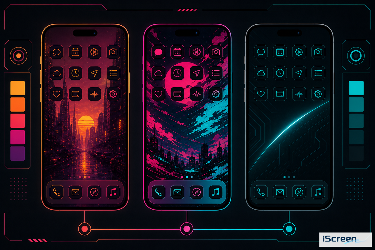
Cyberpunk iPhone wallpapers, including searches like Cyberpunk Edgerunners iPhone Wallpaper 4K or Cyberpunk 2077 Wallpaper Phone, fall into three visual families – 2077-game-native, Edgerunners-anime, or genre-atmospheric – and selecting one before downloading saves the trial and error most people experience after downloading twelve mismatched images. Each family has a unique color palette, theme subject matter, and source pool, so the “best” one depends purely on which visual language you want to communicate across your entire home screen, not just the wallpaper.

Palette, subject, and source for each of the 3 Cyberpunk Visual Families for iPhone wallpaper
Family Palette Typical subject Best fit for
2077-game-native Yellow/amber warning tones + magenta, gritty texture Night City skylines, corporate logos, game characters Readers who want the specific Night City look
Edgerunners-anime Hot pink + cyan, higher contrast, anime line art David/Lucy/Rebecca character art, chrome body-mod motifs Readers coming from the Netflix anime, not the game
Genre-atmospheric Any single accent (cyan/magenta/green) on near-black Rain-slick streets, glitch texture, no named characters or logos Readers who want the mood without game/franchise branding

What’s the difference between Cyberpunk 2077 and Cyberpunk Edgerunners style?

Cyberpunk 2077 wallpaper relies on the game’s yellow-and-magenta corporate aesthetic and the distinct cityscape of Night City, while Cyberpunk Edgerunners art taps into the series’ higher-contrast pink-and-cyan color palette and the character-focused linework that defined the original 2022 Netflix anime series.

A user on r/cyberpunkgame made their own custom cyberpunk icon set for an iPhone, using Widgetsmith and Apple Shortcuts instead of ready-made downloads from either franchise – a good example of why the genre-atmospheric family (family three) tends to be a useful entry point if you don’t want to strictly adhere to a specific franchise’s colors.

Cyberpunk Edgerunners is especially worth your attention in the coming months, given that CD Projekt Red confirmed a large Cyberpunk: Edgerunners 2 panel for Anime Expo 2026, with the season expected to premiere in the fall of 2026. This timeframe aligns with renewed search interest in Edgerunners-specific wallpapers in June 2026, after a lull during the spring – typically, a new season results in an influx of new anime-style wallpapers and icons being created and requested. So, if you’re setting up an Edgerunners family theme now, you can expect more visual resources to become available throughout the rest of the year.

Best Cyberpunk Wallpaper Types for iPhone, The 9-Style Cyberpunk Wallpaper Grid
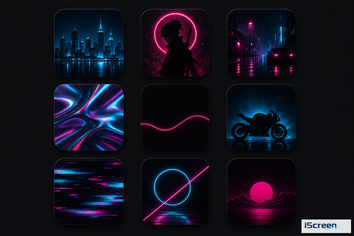
Best Cyberpunk Wallpaper Types for iPhone, The 9-Style Cyberpunk Wallpaper Grid — iScreen

With nine styles to choose from, the wallpapers cover most content under the “cyberpunk” umbrella and vary in terms of battery usage and how easy they’re to pair with other widgets and icons. Selecting a style from this grid prior to searching is essential for quickly narrowing down a folder of hundreds of images to a select few that will integrate well with the rest of your setup.

Format support, OLED impact, and icon-pairing difficulty across the 9-Style Cyberpunk Wallpaper Grid
Wallpaper Type Static/Live OLED battery impact Icon-pairing difficulty Not suitable for
City/skyline scene Both High Medium Small-icon-heavy layouts (skyline detail gets lost)
2077-style character art Static High Hard Widget-dense Home Screens (busy subject clashes)
Edgerunners character art Static High Hard Same as above; best on Lock screen only
Glitch/abstract neon Both Medium Easy Readers who want a specific franchise look
Chrome/holographic UI mockup Static Medium Easy Low-vision users (chrome text has low natural contrast)
Rain-soaked street Both Medium-high Medium Battery-conscious users (bright reflections raise brightness)
Neon-lit vehicle/motorcycle Static Medium Medium Portrait-orientation crops (vehicles are usually landscape source art)
Minimal neon-line on black Static Low Easiest Readers who want a busy, detailed scene
Named game character (e.g. Johnny Silverhand) Static High Hard Commercial/public-facing use (fan art licensing varies by artist)

If you’re new to building a cyberpunk setup, minimal neon-line wallpaper is a great starting point: its largely black appearance means it consumes the least amount of OLED battery life, in line with the pattern Lifehacker’s battery testing found for darker always-on images, and the single accent line provides the maximum amount of open space for your widgets and icons to be placed without competing for visual attention. While character-based wallpapers, from both 2077 and Edgerunners, are striking on their own, they’re generally the most challenging to incorporate into a cohesive setup because of the clutter that can obscure your widget’s legibility, which we’ll address next.

Where to Find Cyberpunk Wallpapers That Actually Fit Your Screen
Where to Find Cyberpunk Wallpapers That Actually Fit Your Screen — iScreen

Match the wallpaper source to your iPhone’s exact resolution before downloading — a wallpaper sized for a generic “1080×1920” phone will crop unpredictably on a modern iPhone’s 1170×2532 to 1284×2778 range. Free galleries mostly list phone wallpapers by tags like “4K” or “HD” rather than model, so download the largest file and let Apple’s official Lock Screen editor crop it for you, or explore iScreen’s wallpaper library for pre-sized options instead.

Most searches for cyberpunk wallpaper iPhone free or Cyberpunk iPhone Wallpaper 4K return more than enough free options that a paid bundle is optional rather than required — the same applies whether you are hunting for an iPhone neon wallpaper specifically or a broader dark neon wallpaper to crop yourself. Most listings let you download for free straight to your phone, though a handful of desktop-first gallery sites still require opening the page on a computer first before the mobile-sized file becomes available. If a page only offers a generic cyberpunk phone background rather than an iPhone-tagged one, double-check the aspect ratio before committing to it, and if you specifically want cyberpunk 2077 iPhone wallpapers rather than the anime-derived look, search that exact phrase to filter out results that are Edgerunners only.

Individual wallpapers paired with corresponding widgets (like for iphone-specific bundles) will cost around $2-$6 for a single wallpaper, or a little bundle of four wallpapers and widgets (approx. $9.99). The latter price can act as an indicator when looking on independent markets for that exact configuration – though it will cost you more than cobbling together a set from free items. Whichever source you choose, always review the license for character-based art (like Johnny Silverhand, Lucy, Rebecca), most fan-created material can only be used on your own device.

Setting Up Static vs. Live Cyberpunk Wallpapers on iOS 17, 18, and 26
Setting Up Static vs. Live Cyberpunk Wallpapers on iOS 17, 18, and 26 — iScreen

Apply static wallpapers in under a minute by navigating to Settings > Wallpaper > Customize in any recent iOS version. Live-style or depth-effect versions require a Live Photo file and iOS 16 or newer. According to Apple’s iOS 26 update notes, moving your iPhone now triggers a new 3D parallax effect on the Lock screen photo, which complements the layered design of cyberpunk wallpaper art.

  • Follow the steps from Apple’s official Lock screen guide to touch and hold until Customize appears.
  • Touch and hold the Lock screen.
  • Select the Photo icon, then tap on your cyberpunk wallpaper.
  • For a live Photo file, long-press the shutter icon when you tap to set to include motion (iOS 16+ required).
  • Add widgets using Apple’s widget setup guide: tap “Add Widgets” then drag the item onto your Lock screen.

Matching Widgets to a Cyberpunk Home Screen — The Neon-on-Black Legibility Threshold
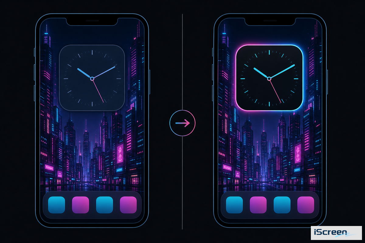
Matching Widgets to a Cyberpunk Home Screen — The Neon-on-Black Legibility Threshold — iScreen

If glass widgets appear too faded against a vibrant neon wallpaper, try toggling off the transparency settings under Settings > Accessibility > Display & Text Size > Reduce Transparency in iOS 26.

When the bright, saturated hues of the background sit near the colors of a widget’s icons and text, they become hard to read – and it’s something even Apple identifies as an issue they designed their widgets to address. In the Apple Human Interface Guidelines for widgets, the company states, “Offer enough contrast to ensure legibility,” and for bright and vivid images, “The stronger the background’s light or saturation, the greater the intensity of the background blur”. The reality for iOS 26 is that the newly introduced “glass” widgets – described in CNET’s coverage of the Liquid Glass settings – are even more prone to these legibility problems, leading Apple to add the “Reduce Transparency” option. This is not a hypothetical problem — it shows up in real complaints on Apple’s own support channels.

“Widgets (like calendar) are now a low contrast grey instead of ‘dark’ in dark mode. I have just updated to the iOS 26 on my iPad Pro…”

Key Factors to Consider

  1. Position widgets on the darkest, least busy area of the wallpaper – typically near the top or bottom edge on a city-skyline image, never on the brightest neon sign
  2. On iOS 26, enable Reduce Transparency if widgets appear washed out; it trades a bit of the glass-like polish for actual readability on high-contrast wallpapers
  3. Use widget apps that offer solid or semi-opaque background tints (matching your singular accent color) rather than entirely transparent widgets against a neon image
  4. Check readability from arm’s length in direct sunlight, not just in indoor lighting – a low-contrast combination that looks fine on a desk can fall apart outside

Community threads confirm this from the inverse angle: on r/widgy, users posting cyberpunk-themed widget arrangements will often rework someone else’s shared layout specifically to correct for contrast before resharing-the legibility issue is common enough that “remixing for readability” has become a standard workflow step there, not an exception.

Neon Icon Packs for a Cyberpunk Setup: Sourcing, Installing, Staying Consistent
Neon Icon Packs for a Cyberpunk Setup: Sourcing, Installing, Staying Consistent — iScreen

A neon icon pack completes a cyberpunk setup, but only if every icon in the pack uses the same accent color and line weight as the wallpaper and widgets-mixing icon packs from various sources is the quickest way to break the look. Most cyberpunk app icons customization on iPhone follows one of two routes: either a dedicated icon app such as iScreen’s icon pack collection with a carefully selected cyberpunk-style library, or Apple’s built-in Shortcuts method, which allows you to manually designate any custom image as an app icon.

Setting up icons with Shortcuts takes more time (several minutes per icon versus nearly instant with an app), but guarantees precise color matching, as you source each icon image yourself rather than choosing from a premade set. On r/cyberpunkgame, one user shared that they created a full custom icon set with Widgetsmith and Apple Shortcuts instead of downloading a premade pack, precisely to ensure consistent color palettes across all their app icons.

⚠️ Common Mistake

downloading two or three “neon icon pack” sets from different sources and mixing and matching the ones you like best. Different designers use different accent colors, stroke widths, and glow intensities-even two packs labeled “cyberpunk” seldom match perfectly, and these differences are far more obvious in a 4×6 icon grid than when viewed in isolation.

Allocate 15-20 minutes for the first time you create a complete icon set, whether with an app or through Shortcuts-the bulk of this time will be spent renaming icons afterward, as Shortcuts custom icons display a generic label unless you go back and rename each shortcut individually.

Will a Cyberpunk Wallpaper Drain Your Battery or Slow Down Your iPhone?
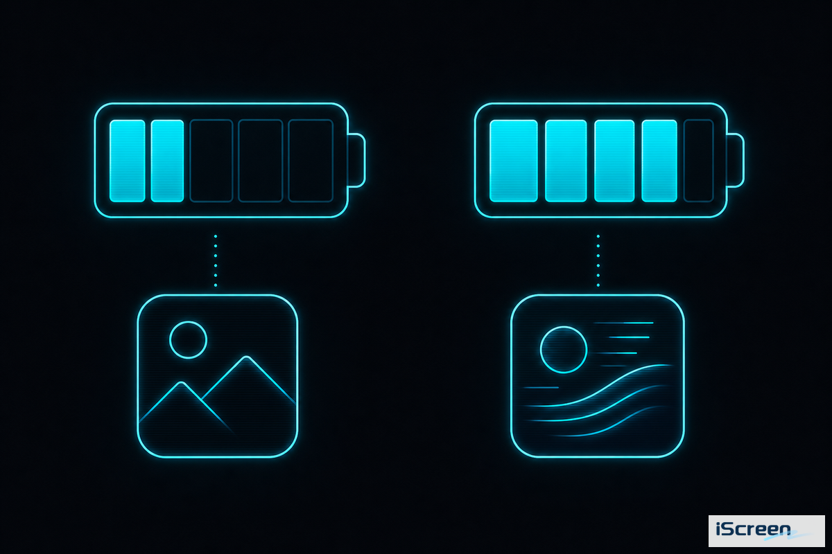
Will a Cyberpunk Wallpaper Drain Your Battery or Slow Down Your iPhone? — iScreen

A static cyberpunk wallpaper itself has zero battery cost, but a live or Always-On Display one has some, and the impact is much smaller than you’d imagine. The much-cited Lifehacker 24-hour iPhone 14 Pro test found an AOD wallpaper device ended the day at 80% battery compared to the same device at 84% with an AOD showing text only — not exactly the night-and-day drain many fear.

Estimates from the r/apple community suggest an AOD, regardless of wallpaper, consumes 15-25% more power than with it disabled — implying that most of the drain comes from the underlying display technology rather than a preference for neon imagery over plain text.

The other side of that coin is dark themes: OLED displays only illuminate pixels that are currently active, meaning a mostly black cyberpunk wallpaper (e.g. the minimal neon line art from the above grid) consumes less energy than its brighter counterparts – and in keeping with other research on the power savings of OLED dark mode at moderate brightness levels (30-50%), those gains could be between 3-9%. Live wallpapers add their own costs on top of those factors: their rendering is continuous, and the higher peak brightness many animations need also consumes additional power beyond the presence or absence of an AOD.

✔ Lower battery impact

  • Static, minimal neon-line wallpaper (mostly black)
  • Standard Home Screen use (no Always-On)
  • Solid or semi-opaque widget backgrounds
⚠ Higher battery impact

  • Live or Depth Effect wallpaper on Always-On Display
  • Bright city-skyline or character-art styles at full brightness
  • Fully transparent glass-style widgets on iOS 26
The Wallpaper + Widget + Icon Cohesion Checklist

  1. Pick one visual family (2077-game, Edgerunners-anime, or genre-atmospheric) before downloading anything
  2. Lock in a single accent color and check every wallpaper, widget, and icon against it
  3. Place widgets over the darkest, least busy part of the wallpaper, and toggle Reduce Transparency on iOS 26 if needed
  4. Source icons from one pack (or build your own via Shortcuts) instead of mixing packs from different designers
  5. Weigh static vs. live/Always-On against your actual battery tolerance before committing to the animated version

Frequently Asked Questions

Q: What’s the difference between Cyberpunk 2077 wallpaper and Cyberpunk Edgerunners wallpaper?

Cyberpunk 2077 wallpaper art uses the game’s yellow-magenta corporate palette and Night City architecture, while Edgerunners wallpaper art uses the 2022 Netflix anime’s higher-contrast pink-cyan palette and named characters like David and Lucy.
The two sets of image pools are also distinct, in terms of searchability, though they draw from the same general universe: a search for “cyberpunk 2077 wallpaper” is unlikely to yield the same results as a search for “cyberpunk edgerunners wallpaper”-a slight bummer if you’re not particularly invested in the specifics of each color scheme. The “genre-atmospheric” family (which provides a single accent color on an otherwise dark background without any specific characters or game logos) is another safe choice for color matching.

Q: Does a cyberpunk live wallpaper drain my iPhone’s battery faster than a static one?

Yes — live wallpapers use more battery than static ones because they render continuously and typically run at higher peak brightness, though the difference is smaller than most people assume.
In a 24-hour Always-On Display test, there was only a 4-percentage-point difference in battery between a wallpaper AOD and an AOD showing text only; it seems the real energy hog is the display technology itself rather than the image being displayed. If the display performance is more of a concern than the moving effects, a minimal neon-line wallpaper with a primarily dark background, from the grid above, would likely provide the best experience.

Q: Can I use Cyberpunk 2077 or Edgerunners wallpaper without violating copyright?

Personal device wallpaper use of fan-made or officially licensed cyberpunk art is generally treated as personal use, but redistribution, resale, or public-facing use of character-specific fan art is usually restricted by the original artist’s license.
The specific terms of use are almost always specified for individual wallpaper or icon packs, with the standard disclaimer in place for paid products being “for personal use only, no resale or redistribution”. If you’re planning to display your wallpaper in anything more extensive than your own Lock screen – whether as a livestream overlay, a shared background on social media, or for professional use on a work device – you need to check the terms associated with that specific source first, as the terms of service won’t always extend beyond private use.

Q: How do I stop my widgets from disappearing into a dark cyberpunk wallpaper?

Place widgets over the darkest, least busy part of the wallpaper, and turn on Reduce Transparency in iOS 26 if the new glass-style widget background washes out against a bright neon area.
According to multiple threads on Apple’s community forum discussing widget contrasts following recent iOS updates, this is by far the most common mistake users make. By selecting a widget app that offers the option to fill the element with a solid or partially transparent background of your preferred color, you will solve this problem more effectively than by merely adjusting the brightness of the wallpaper itself.

Q: Where can I get 4K cyberpunk wallpapers for iPhone?

iScreen’s wallpaper library includes cyberpunk and neon-styled options sized for current iPhone resolutions, alongside free general wallpaper galleries like Pinterest and WallpaperCave and paid marketplace bundles on sites like Etsy.
Regardless of your source, aim to find the largest possible resolution for your wallpaper, and let the iOS editor perform the crop to your specific device, instead of relying on a pre-cut file labeled with the name of the model for your device from an unknown source.

Q: Is cyberpunk wallpaper free to use on my iPhone?

Yes, most cyberpunk wallpapers for personal device use are free, with paid options ($2–$6 per image, or bundles from roughly $9.99) mainly for higher-resolution or wallpaper-plus-widget sets.
Resources abound for this specific look due to its high search volume across the wallpaper galleries.

About This Analysis

This guide draws on Apple’s own Human Interface Guidelines for widget and dark-mode contrast, a real 24-hour Always-On Display battery test, and current iPhone community discussions of cyberpunk home screen setups, rather than treating “cyberpunk wallpaper” as a single downloadable image category. iScreen’s own wallpaper, widget, and icon libraries were cross-checked against the visual families and style grid described above. Reviewed by the iScreen team.

Related Articles

最近の記事

4K iPhone Wallpaper: What Resolution You Need and Where Detail Matters

4K iPhone Wallpaper: What Resolution You Need and Where Detail Matters

2026/8/24 15:59
Updated August 2026 · Checked against current iOS 26 guidance iPhone wallpaper 4K refers to a wallpaper source labeled 4K, not one universal iPhone display grid. It tells you the source file may contain plenty of pixels, but it doesn’t promise that the image will look sharp after a portrait crop, survive repeated exports, or leave the clock and icons readable. The dependable choice is a clean original that still has enough real pixels after cropping, plus a final check on your own Lock Screen and Home Screen. Quick Verdict: What Should You Download? Source type Likely result Best next move Original portrait photo Best starting point Keep extra room around the subject Original landscape UHD 4K photo Can work, but crop loss may be large Run the Pixel Sufficiency Check Original digital art Usually clean if exported once Use a portrait canvas and protect quiet zones Upscaled small image Large dimensions, limited real detail Find the original instead of enlarging again Social-media save May contain resize or compression damage Download from the creator or source page Messaging-app export Quality depends on the send mode Transfer as a file or use the original link Screenshot Already limited to the captured screen Avoid unless no original exists Minimal gradient Forgiving of modest detail Check banding and icon contrast Live or depth-effect design Static resolution is only one requirement Use the format-specific guide and preview If you want to browse and download a style first, use iScreen’s wallpaper collection. Return to this guide when you need to decide between two files, fix a blurry result, or plan a crop around the interface. Does an iPhone Actually Display Wallpaper in 4K? Not in the simple way the filename suggests. In this guide, UHD 4K means a landscape raster of 3840 × 2160 pixels. Other professional “4K” conventions exist, so the label isn’t one universal grid. More importantly, an iPhone uses its own display resolution and a tall portrait shape. The phone shows a crop of the source, not a miniature certificate proving that every one of those 8.3 million source pixels survived. The International Telecommunication Union’s consumer UHD reference supplies the 3840 × 2160 definition. Apple lists the iPhone 17 display at 2622 × 1206 pixels and 460 pixels per inch. Those numbers describe two different things: a landscape source convention and a device display. They’re useful inputs, not a universal wallpaper prescription. According to those source dimensions, an iPhone wallpaper resolution check prevents a common failure: choosing a landscape file by its headline label while ignoring the pixels left after the portrait crop. Even a portrait source that’s only moderately larger than your screen can beat a landscape file with a bigger headline number. It wastes fewer pixels outside the final crop. Carefully made minimal backgrounds may also look cleaner than detailed 4K images that have been enlarged, sharpened, and exported several times. Treat “4K” as a useful source-size clue. Treat the final portrait crop as the actual file you are asking the phone to display. The Pixel Sufficiency Check The Pixel Sufficiency Check is a three-step editorial test. First, note the source width and height. Second, estimate the portrait crop you’ll keep. Third, compare the retained width and height with your iPhone display. It isn’t an Apple certification and it can’t measure artistic quality. It simply prevents the uncropped dimensions from hiding a severe crop loss. Record the original. Use the true downloaded file, not the dimensions written in a post caption. Sketch the intended portrait crop. Keep the focal subject and enough breathing room for interface elements. Compare both retained dimensions. If either side falls below the target display, expect less freedom to zoom or reposition. Then verify on the phone. Worked example. Start with a 3840 × 2160 landscape UHD source. To match the tall shape of an iPhone 17 while keeping all 2160 source pixels of height, the crop retains about 994 pixels of width: 2160 × 1206 ÷ 2622 ≈ 994. The resulting 994 × 2160 crop is below the phone’s 1206 × 2622 display grid in both dimensions. That doesn’t guarantee visible blur, but it proves the original 4K label didn’t survive the portrait crop intact. Worked-example audit trail Source width: 3,840 pixels Source height: 2,160 pixels Target width: 1,206 pixels Target height: 2,622 pixels Display density: 460 pixels per inch Retained width: about 994 pixels Retained height: 2,160 pixels Width shortfall: about 212 pixels Height shortfall: 462 pixels Retained source width: about 25.9% Retained crop area: about 2.15 megapixels Target display area: about 3.16 megapixels What the same crop means in percentage terms (rounded to 0.1%) Checkpoint Result Original width retained 25.9% Original width removed 74.1% Original height retained 100% Original pixel area retained 25.9% Target width covered 82.4% Target height covered 82.4% Target pixel area covered 67.9% Target width deficit 17.6% Target height deficit 17.6% Nine outcomes from the Pixel Sufficiency Check Check result What it means Action Both sides well above target Good crop flexibility Reframe gently; still inspect real detail Width just above target Limited horizontal movement Avoid extra zoom Height just above target Limited vertical movement Place the subject before adding overlays Width below target Potential softness after scaling Find a wider or portrait original Height below target Potential softness and no zoom margin Use a taller source Both sides below target File relies on enlargement Replace it rather than sharpen harder Dimensions pass, edges look smeared Pixel count hides weak provenance Locate the original export Dimensions pass, blocks or halos appear Compression or oversharpening damage Use a cleaner export Everything passes on paper Still not a rendering guarantee Complete the actual phone preview Crop estimates are most useful when choosing between files. They do not replace your eyes. Viewing distance, system rendering, antialiasing, and the image’s processing history can change the final impression even when the retained grid looks adequate. Why a 4K Wallpaper Can Still Look Blurry Dimensions describe the container, not the history of the picture inside it. A small image can be enlarged to 3840 pixels wide without gaining new leaf texture, hair detail, or clean type edges. A screenshot starts with the limits of the screen it captured. A file sent through social or messaging services may be resized or encoded again. Aggressive sharpening can create bright halos that look crisp in a thumbnail and brittle on the phone. The Library of Congress describes JPEG lossy compression as variable and notes that typical settings may reduce file size by roughly 10:1 to 20:1. That range concerns file-size reduction; it isn’t a threshold for acceptable wallpaper quality. Visible damage depends on the encoder, settings, content, and prior exports. Nine blur and quality symptoms, checked in a useful order Symptom Likely cause First repair Fine detail is smooth everywhere Upscaled or blurred original Find the source capture Block patterns around gradients Heavy JPEG compression Use a cleaner export Bright outlines around edges Oversharpening Return to an unsharpened original Image looks fine until portrait crop Too few retained pixels Choose a portrait source Only the top appears extended or soft Crop/interface behavior Reposition or use a taller composition Text in the art looks fuzzy Raster type or repeated export Re-export from the design file One copy is worse than another Different transfer path Compare file size and dimensions Lock Screen is fine, Home Screen is muddy Separate appearance or blur treatment Customize the Home Screen separately Only close inspection reveals softness Normal display/perception limit Judge at normal viewing distance Diagnose in this order: original file, retained crop, processing or transfer path, and final device preview. That sequence avoids wasting time on repeated sharpening when the real problem is a screenshot or narrow crop. The Crop-Safe 3-Zone Map The Crop-Safe 3-Zone Map is a composition checklist, not a set of fixed pixel bands. Current iPhone layouts can change with widgets, controls, notifications, wallpaper mode, clock treatment, and the position you choose. Use the zones to ask where visual pressure will occur, then test the exact configuration on your device. Top pressure area, clock and date. Keep faces, type, horizon lines, and high-contrast detail away from the clock’s likely footprint. If the clock adapts or moves, recheck rather than treating the first preview as permanent. Middle focal area, subject and depth. Protect the main face, object, or abstract focal point. Leave enough room to drag the image without cutting through the subject when the crop changes. Bottom pressure area, notifications, controls, icons, and widgets. Avoid small text and essential detail here. A quieter Home Screen version often works better behind app icons. Apple’s current iOS 26 Lock Screen guide documents pinch-to-zoom and two-finger drag for photo positioning, alongside configurable clocks, widgets, notifications, and eligible depth or spatial effects. That flexibility is why the map uses pressure areas. The cited Apple guide doesn’t provide one fixed “safe-zone” template for every user layout. Three practical scenarios show how to apply it: Portrait photo: keep the eyes and face in the middle, with clean space above the hair and below the shoulders. Mountain or city scene: place the horizon away from the clock and keep the brightest lights out from behind Home Screen icons. Minimal gradient: use a smooth tonal field at the top and bottom; inspect for banding before you save. For a composition that interacts with the system’s subject treatment, see iScreen’s depth-effect wallpaper guide. If your design needs motion rather than a static crop, the live wallpaper guide covers that separate format. When Extra Resolution Helps, and When It Does Not Extra source pixels help when they’re genuine. They provide room to reframe a landscape photograph, reuse an original across different models, make a moderate zoom, or preserve fine lines in original artwork. They’re most valuable before you make the final portrait crop. They don’t reverse damage already in the picture. An 8K export of a soft 900-pixel social save still contains the same weak evidence, only distributed across more pixels. The same applies to motion blur, missed focus, repeated JPEG encoding, sharpening halos, or a subject placed where the clock must go. Use more resolution when… the original camera or design file contains real fine detail; you need significant portrait reframing; one source must support several display shapes; you want modest zoom freedom without immediate enlargement. Do not expect it to fix… blur in the capture; a screenshot or tiny download; compression blocks or color banding; a composition that fights the clock, icons, or widgets. A dark background can improve the appearance of bright text and icons in some layouts, but this article doesn’t treat wallpaper color as a battery-saving guarantee. Choose dark, light, abstract, nature, or minimal art for readability and style; verify power claims separately for the exact device and display behavior. The 100% Preview Test Before You Save The 100% Preview Test has two distinct stages. On a computer or image viewer, 100% means one image pixel is shown as one preview pixel. Use that view to find baked-in defects: smeared texture, block boundaries, banding, jagged type, or sharpening halos. Return to 100% before judging those baked-in defects. Don’t treat it as a simulation of how the wallpaper will look on an iPhone. The decisive stage happens on the phone. Set the candidate, look at the Lock Screen from a normal distance, unlock to the Home Screen, and check the exact arrangement of icons and widgets. If the Home Screen is too busy, use a separate treatment instead of forcing one image to do two jobs. Inspect genuine fine edges at 100% file view. Reject obvious capture blur, export blocks, banding, or halos. Apply the intended portrait crop without unnecessary zoom. Preview the Lock Screen with your clock and widgets. Preview the Home Screen with the real icon pages you use. Fix in order: stronger original → safer crop → less zoom → quieter overlays → separate Home Screen. This order matters. Repeated resizing and sharpening can make a problem harder to diagnose. When a cleaner original fixes the result, stop there. When the source is clean but the focal point is covered, change the composition rather than the pixel count. How to Set a 4K Wallpaper on iPhone As checked in Apple’s iPhone User Guide for iOS 26 in August 2026, open Settings → Wallpaper → Add New Wallpaper. Choose the photo, position it, and review the available appearance controls. You can then choose Set as Wallpaper Pair or Customize Home Screen. Download the original image rather than a screenshot of the gallery. Open Settings and select Wallpaper. Choose Add New Wallpaper and select the photo. Pinch to zoom only as much as the composition requires, then drag to position. Check the clock, widgets, subject, and lower interface area. Set a pair, or customize the Home Screen with a separate photo, color, or blur treatment. Complete the 100% Preview Test on both final surfaces. Interface labels and effects can change in later iOS releases, so use Apple’s current guide when your screen differs. For a broader walkthrough, open iScreen’s iPhone customization guide. For visual inspiration after the technical check, compare an aesthetic wallpaper layout or a more detailed cyberpunk wallpaper composition. Frequently Asked Questions Is 4K good for iPhone wallpaper? Yes, when the source is clean and the portrait crop retains enough real detail. A genuine 4K source also gives you more room to reframe landscape photography or make a modest zoom. The label alone isn’t a sharpness guarantee, so compare the retained crop with your display and confirm the result on the phone. What resolution should an iPhone wallpaper be? Use a source that meets or exceeds your iPhone display dimensions after the intended crop. There’s no one pixel size for every model because both resolution and shape vary. A portrait image with breathing room around the subject is often easier to position than a tightly framed landscape image with a larger uncropped resolution. If two files pass the pixel check, choose the cleaner original and the composition that needs less zoom. The iPhone 17 display is 1206 px wide. Why does my 4K wallpaper look blurry on iPhone? The file may be upscaled, out of focus, repeatedly compressed, or cropped too narrowly. A large filename cannot restore detail lost in a screenshot or an earlier export. Start with the original, estimate the pixels left after the portrait crop, reduce unnecessary zoom, and inspect the actual Lock Screen and Home Screen. Is 8K better than 4K for iPhone wallpaper? Only when the extra pixels contain genuine detail or give you useful crop freedom. An 8K filename can’t restore texture removed before export, repair missed focus, or undo repeated compression. Compare the originals at 100% file view, estimate the same portrait crop for both, and then preview each candidate on the device. When both exceed the retained pixels you need, prefer the cleaner composition instead of the larger number. That extra room matters most before a portrait crop or zoom. Can I use different wallpapers for the Lock Screen and Home Screen? Yes. Apple guidance supports a wallpaper pair or a separately customized Home Screen. Use a quieter second treatment on the Home Screen to keep app icons readable. Preview both surfaces because the clock, widgets, and icon overlays create different readability pressures. Where can I download free 4K iPhone wallpapers? Browse iScreen’s current collection for available wallpaper options. Before saving, open the original item rather than taking a screenshot; check the displayed dimensions, format, source quality, and any reuse terms shown with it. After download, run the crop and preview checks in this article. The collection page remains the place to browse styles, while this technical guide helps you reject a weak file before it becomes your background. Use the collection page to compare styles and available formats. Choose the File, Then Prove the Crop A reliable 4K wallpaper decision comes down to three questions: Are enough genuine pixels left after the portrait crop? Is the source free from baked-in blur and export damage? Do the clock, subject, notifications, icons, and widgets remain readable on the final device? Use the Pixel Sufficiency Check to compare files, the Crop-Safe 3-Zone Map to place the composition, and the 100% Preview Test to separate source defects from phone layout issues. Then find matching Lock Screen wallpapers and apply the checks to the style you actually want. References & Sources International Telecommunication Union, Recommendation BT.2020-2 International Telecommunication Union, Report BT.2246-8 Apple, iPhone 17 Technical Specifications Apple, Change the Wallpaper on iPhone Apple, Create a Custom Lock Screen Library of Congress, JPEG Image Encoding Family
2026/8/24 15:59
How to Change Wallpaper on iPhone

How to Change Wallpaper on iPhone

2026/8/24 15:06
By the iScreen editorial team · Reviewed against Apple Support and the iOS 26 iPhone User Guide · Updated August 24, 2026 How to change wallpaper on iPhone is simple: open Settings, tap Wallpaper, tap Add New Wallpaper, choose a photo or built-in category, and tap Add. Then choose Set as Wallpaper Pair to use the selection on both screens, or Customize Home Screen to create a different Home Screen background. That’s the complete current route; the choices after Add decide whether one screen or both screens change. 6-Step Wallpaper Rule Open Settings. Tap Wallpaper. Tap Add New Wallpaper. Choose Photos, Photo Shuffle, Weather & Astronomy, Emoji, or Color. Adjust the preview, then tap Add. Choose Set as Wallpaper Pair or Customize Home Screen. Need an image first? You can browse iPhone wallpapers, save one you like, and then return to the steps above. iScreen helps with discovery; iOS performs the final system setting. Change Your iPhone Wallpaper in Six Steps There are two current entry routes. Settings is the clearest route when you’re adding something new, while the Lock Screen gallery is better for saved sets because it opens the existing wallpaper collection. Think of this as the 2-Route Wallpaper Map: Settings is a straightforward route for creating a wallpaper. The Lock Screen gallery can switch or edit saved sets and can also add a new one. Routes documented by Apple Support; route recommendation by iScreen editors. Route Best for Start point Finish Settings Adding a new photo or built-in wallpaper Settings → Wallpaper Add → Pair or Customize Home Screen Lock Screen gallery Switching or editing a saved set Wake the Lock Screen, then touch and hold Select, Customize, Add, or Done as shown The labels matter. A new-wallpaper flow uses Add. An editing flow may use Done. If a tutorial tells you to tap a button that isn’t on your screen, check which route it started from before assuming your iPhone is different. Change Wallpaper Through Settings Open the Settings app and tap Wallpaper. Tap Add New Wallpaper. Choose Photos or Photo Shuffle for your own images. You can also choose a built-in category such as Weather & Astronomy, Emoji, or Color. Reposition the photo, try available styles, and adjust the clock or widgets if needed. Tap Add. Choose Set as Wallpaper Pair, or tap Customize Home Screen for a separate background. According to Apple Support, these labels match the current Change your iPhone wallpaper instructions. The route matters because older guides may say “Choose a New Wallpaper,” “Dynamic,” or “Stills.” Those labels describe older interfaces and shouldn’t replace what your current iOS 26 screen shows. As you scroll through the current wallpaper options, you may see categories like Weather & Astronomy, Emoji, and Color. Select a wallpaper, select a photo, or select multiple photos for Photo Shuffle; then try a filter or different styles before you tap Add. This is Apple’s current customization flow, even when an older guide is titled for “iOS 16 or later.” Change Wallpaper From the Lock Screen Apple’s official support page documents this route. Wake the iPhone, touch and hold the screen, and authenticate with Face ID or your passcode if the gallery does not open. Swipe left or right through saved Lock Screens. Tap a set to switch to it, tap Customize to edit it, or use the Add button to create another one. This route is especially useful when you already have several wallpaper sets. Apple also lets you link a Lock Screen to a Focus, so changing to that saved screen can match a work, personal, or sleep setup. The control is optional; a wallpaper does not need a Focus link to work. To customize your Lock Screen, you can also tap the time to change its font, move the foreground subject within the available crop, or link a Focus. When you edit an existing set, the screen may ask you to tap Done; when you create a new one, it normally asks you to tap Add. If touch-and-hold seems to do nothing, check three things before troubleshooting the image: the Lock Screen must be awake, the press must be held rather than tapped, and authentication may still be required. Set the Same Wallpaper or Use a Separate Home Screen After you tap Add, the next choice controls the relationship between the two screens. Set as Wallpaper Pair gives the Lock Screen and Home Screen a coordinated version of the same selection. Customize Home Screen lets you choose a separate photo, color, gradient, or blur treatment. In other words, tap Set as Wallpaper Pair when you want the Home Screen and Lock Screen to stay coordinated. Choose the separate route when the iPhone’s app area needs less visual detail than the Lock Screen. Apple’s wallpaper preview lets you alter the Home Screen without replacing the Lock Screen image. Lock Screen and Home Screen Assignment Options Same image on both: fastest and visually consistent. Detailed Lock Screen + quieter Home Screen: keeps app names and icons readable. Photo Lock Screen + color or gradient Home Screen: preserves the subject without placing it behind icons. Photo Shuffle Lock Screen + stable Home Screen: adds variety without making the app area change constantly. No single pairing works for all situations. A setup succeeds when the clock, widgets, notifications, icons, and labels remain clear on the screen where they belong. Crop, Reposition, Add Widgets, and Use Photo Shuffle According to Apple’s Lock Screen guide, you can pinch and drag during preview because iOS crops the source to the current screen layout. The visible crop depends on the iPhone model, the source image’s shape, and the elements placed over it. No single pixel size guarantees the same crop across every current iPhone model, so a good source image can still need a different crop on another model. On the Lock Screen, you can adjust the clock treatment, add widgets, change controls, and try available styles. Keep the main subject away from the clock and widget area. More widgets aren’t always better if they cover the part of the photo you chose the image for. For layout, icons, and widgets beyond this wallpaper-pair decision, use the complete iPhone Home Screen customization guide. For automatic changes, choose Photo Shuffle. Apple’s current frequency choices are On Tap, On Lock, Hourly, and Daily. Pick a stable Home Screen separately if rotating photos make icons harder to read. On iPhone 12 or later with iOS 26, an eligible photo may support Spatial Scene for a 3D effect, as described in Apple’s wallpaper instructions. This isn’t guaranteed for every photo. If the option doesn’t appear, the image may not qualify even when the phone and operating system do. Live wallpapers, animation, and other dynamic wallpaper formats are separate behaviors from Photo Shuffle. This guide covers the current system wallpaper controls; it doesn’t imply that every downloaded animated image will play as a dynamic wallpaper. Find a Wallpaper Before You Change It Already have a photo? Continue with Settings or the Lock Screen gallery. Otherwise, browse 4K iPhone wallpapers and save the image you want to Photos. For style ideas before you choose, explore iPhone themes or see this visual iPhone wallpaper lookbook. Don’t confuse downloading with applying. A wallpaper app or website supplies the image; Apple’s Wallpaper controls decide the Lock Screen, Home Screen, crop, widgets, and pair. Fix Common Wallpaper Problems Problem category What to check Shortest fix Wallpaper gallery will not open Screen is awake; press is held; authentication is complete Wake the Lock Screen, touch and hold again, then authenticate Photo looks zoomed or cropped Image shape and selected crop Pinch and drag; choose an image with more space around the subject if needed Home Screen looks blurry Blur may be enabled under Customize Home Screen Open the Home Screen preview and turn Blur off Home Screen changed unexpectedly Set as Wallpaper Pair was selected Return to Wallpaper and choose Customize Home Screen Clock or icons are hard to read Bright detail sits behind interface text Reposition the photo or use a quieter Home Screen color or gradient Spatial Scene does not appear iPhone model, iOS version, and photo eligibility Use iPhone 12 or later with iOS 26 and try another eligible photo Old wallpaper seems missing It may be saved elsewhere in the Lock Screen gallery Wake, touch and hold, authenticate, then swipe through saved sets Wallpaper controls are unavailable The iPhone may be managed by work or school Ask the organization that manages the device about its restriction Wrong screen changed The pair choice or selected preview did not match the intended screen Return to Wallpaper and edit the Lock Screen or Home Screen preview directly On a work- or school-managed iPhone, unavailable Wallpaper controls can mean an administrator has restricted changes. Apple’s device-management restrictions guide documents a supervised-device control that can prevent users from modifying Lock Screen or Home Screen wallpaper. In that case, ordinary crop or restart advice won’t restore the option; contact the organization that manages the device. Deleting is also a separate task. In the saved Lock Screen gallery, Apple’s Lock Screen guide directs users to swipe up on a set and tap the Trash button. Do that only when you intend to remove the saved set, not when you merely want to switch back to another one. Final Preview Before You Finish Apple’s official customization guidance matters here because the finished screens include more than the source photo. Check clock contrast, widgets, notification previews, app labels, and whether the subject remains visible in both bright and dimmed appearances. Treat Lock Screen widgets and notifications as privacy surfaces too: a beautiful setup isn’t worth exposing information you would rather keep out of view. When the Lock Screen works but the Home Screen feels busy, keep the Lock Screen photo and change only the Home Screen to a color, gradient, or blurred version. This small split often solves readability without discarding the image. Frequently Asked Questions How do I change just my Home Screen wallpaper on iPhone? View answer Open Settings, tap Wallpaper, and select the current pair or add a new Lock Screen wallpaper. When the Home Screen preview appears, tap Customize Home Screen. Choose a separate photo, color, gradient, or blur setting. This changes the Home Screen treatment without requiring you to replace the Lock Screen image you want to keep. Before you finish, check the result behind your app icons and labels. A detailed photo that looks excellent on the Lock Screen may need a calmer crop, color, or gradient on the Home Screen. How do I switch back to an old wallpaper? View answer Wake the Lock Screen, touch and hold it, and authenticate if requested. Swipe left or right through your saved Lock Screens, then tap the one you want to use. If the old wallpaper set was deleted rather than merely replaced, it will not appear in the gallery; add the source photo again through Settings instead. Why does my iPhone wallpaper look zoomed in? View answer The source image’s aspect ratio may not match the visible Lock Screen or Home Screen area, so iOS crops it to fill the display. Pinch to adjust the crop and drag to reposition the subject. No single pixel size guarantees the same crop across every current iPhone model, so leave extra space around important subjects when choosing an image. Can I use a different wallpaper for the Lock Screen and Home Screen? View answer Yes. After adding the Lock Screen wallpaper, choose Customize Home Screen instead of Set as Wallpaper Pair. You can then use another photo, a solid color, a gradient, or a blurred version for the Home Screen. How do I make my iPhone wallpaper change automatically? View answer Choose Photo Shuffle when you add a new wallpaper, select the photos or album, and set a frequency. Apple’s current choices are On Tap, On Lock, Hourly, and Daily. You can still customize the paired Home Screen separately if you want the Lock Screen to rotate while app icons stay over a stable background. Why can’t I use the 3D wallpaper effect? View answer Spatial Scene requires iPhone 12 or later with iOS 26, and the selected photo must be eligible. Not every portrait or landscape photo qualifies. If your device and software meet the requirements but the option is absent, try another photo with a clear subject and background separation. References & Sources Change your iPhone wallpaper — Apple Support, updated February 2, 2026. Change the wallpaper on iPhone — Apple iPhone User Guide. Create a custom iPhone Lock Screen — Apple iPhone User Guide. What’s new in iOS 26 — Apple iPhone User Guide. Review device management restrictions for Apple devices — Apple Platform Deployment. Compare iPhone models — Apple. About this guide This guide was prepared by the iScreen editorial team using current Apple documentation and a live review of the United States search results. iScreen’s catalog descriptions are first-party product information; Apple documentation controls the operating-system steps and eligibility boundaries.
2026/8/24 15:06
Fall Wallpaper for iPhone: Cozy Autumn Lock Screen Ideas

Fall Wallpaper for iPhone: Cozy Autumn Lock Screen Ideas

2026/8/12 21:52
Updated August 2026 · Practical autumn wallpaper ideas for iPhone Lock and Home Screens Fall backgrounds for iPhone are vertical autumn images chosen and cropped for the Lock or Home Screen. They work best when the scene leaves room for the real interface: use a calm clock zone, move the main subject away from notifications, and preview it with the widgets you actually use. Even a cozy picture can look beautiful in a gallery and still feel crowded on a Lock Screen. The fast answer For a Lock Screen: use a detailed fall scene with open space behind the clock and room below for notifications. For a Home Screen: use the same palette with fewer edges behind app icons and widgets. Before saving: check the active screen, dimmed screen, clock style, widgets, and a sample notification. The configured phone is the decision surface. This guide gives you 12 composition ideas, a mood-to-screen-fit table, current iPhone setup steps, and a practical way to reject a wallpaper before it becomes annoying. These are design ideas rather than promises that all 12 files already exist in iScreen. For ready-to-use choices, you can browse iPhone wallpapers. The Clock-First Crop: A First-Pass Fall Wallpaper Check The Clock-First Crop is a quick first-pass check: preview the clock before judging the art, keep its immediate background relatively quiet, and move the main object away from the notification stack. It does not guarantee readability. Brightness, color, visual clutter, room lighting, widgets, notifications, and your chosen clock treatment can all change the final result. That screen-fit problem is why mood comes before placement, not instead of it. A rusty forest path can carry more edge detail than a cream flat lay, but the path’s vanishing point should not disappear under the time. Pink pumpkins can preserve a soft fall aesthetic if their strongest shapes sit in the lower half. The goal is not to make every iPhone background empty. It is to give the interface somewhere to live. Choose a fall mood by focal placement and screen tolerance Mood Palette Best focal placement Widget tolerance Home Screen companion Warm and cozy Amber, cream, walnut Lamp, mug, or book below center Medium Cream-to-amber blur Colorful leaves Rust, gold, red Canopy at edges; open sky above Low to medium One enlarged leaf Soft and cute Blush, peach, cinnamon One doodle group in lower third High Wide gingham or tiny corner motif Dark and moody Charcoal, brown, muted orange Porch or moon below the clock Medium Low-detail charcoal gradient Pumpkin harvest Pumpkin, oat, olive Still life across the bottom Medium Single pumpkin silhouette Minimal neutral Oat, cocoa, black Small line art off center High Paper texture or flat color Current search demand helped allocate space among cozy, cute, aesthetic, leaves, and holiday variations, but it does not prove a universal taste hierarchy. Use the table as a screen-fit decision, not a rule about which autumn style is “best.” 12 Cozy Fall Wallpaper Ideas for iPhone The 12 fall wallpaper ideas cover indoor warmth, outdoor color, texture, and minimal art. Each includes a clock-zone direction and a Home Screen pairing, so you can compare daily usability instead of choosing from mood alone. Keep the art original and generic: no copied commercial illustration, protected character, celebrity, team mark, or branded object is needed to make autumn recognizable. 12-Idea Screen-Fit Table Idea category Clock zone Widget tolerance Home Screen pair 1. Rainy window and warm lamp Keep the lamp low; use the dim window above. Medium Amber rain blur 2. Coffee, knit blanket, and book Place the flat lay below the clock. Low Close crop of cream knit 3. Amber candlelight still life Move flame away from the digits. Medium Brown-to-amber gradient 4. Rustic wood and dried leaves Leave a bare wood panel at top. High Wood grain with one corner leaf 5. Foggy cabin morning Use fog for time; cabin sits low. High Fog and pine color field 6. Cream and cinnamon flat lay Push spices to lower corners. High Warm cream paper texture 7. Golden-hour field Put the horizon below center. High Soft gold sky crop 8. Soft plaid texture Lower contrast behind the time. Medium Enlarged, quieter plaid 9. Fireplace glow Frame the fire below notifications. Low Charcoal wall with soft glow 10. Moonlit pumpkin porch Separate the moon from the clock. Medium Midnight blue with one leaf 11. Brown-paper autumn collage Build the collage around blank center space. Medium Plain kraft paper grain 12. Minimal acorn and leaf line art Place one motif below the time. High Matching micro-motif at one edge Autumn Leaves and Forest Backgrounds For leaf and forest fall backgrounds for iPhone, choose a composition with one stable region rather than equal detail everywhere. An open sky above red maples, fog above a golden aspen path, or dark water above a reflection gives the clock a usable field while keeping the scene unmistakably autumnal. A leaf close-up can work if the main vein runs beside the clock instead of through it. A falling-leaf pattern is more forgiving at the edges than in the center. Yellow autumn backgrounds—or iPhone wallpapers featuring autumn leaves—still need a stable clock zone. For a forest trail, place the brightest vanishing point below the time; otherwise the clock and path compete for the same focal role. Misty evergreens suit more widgets because fog reduces local edge detail, while a crisp red canopy needs a cleaner crop. The useful distinction is not “photo versus illustration.” It is edge distribution. Fine detail around the perimeter can frame the interface. Fine detail directly under digits and small widget text makes the phone harder to scan. Cute, Pink, and Soft Fall Backgrounds Cute fall wallpaper stays readable when one playful element gets priority. Try blush pumpkins below the clock, cream-and-peach leaf doodles around the border, a warm gingham field with one large bow, or a soft digital graphic of tiny acorns spaced widely around the edges. Keep the center quieter than the corners. Pink does not have to mean low contrast. A deep cinnamon clock over pale blush can be clearer than white digits over a busy orange photograph. Soft styles also adapt well to a matching Home Screen: enlarge the gingham, remove most doodles, or isolate one peach leaf in a corner. If the Lock Screen already has widgets, skip decorative phrases and let shape and color carry the theme. Pumpkin, Halloween, and Thanksgiving Styles Holiday-specific fall wallpaper works best when you decide how long it should stay on the phone. Neutral pumpkins, cranberries, dried leaves, harvest linen, and a late-autumn sky can run from September through November. Jack-o’-lantern faces, bats, or a dinner-table message create a shorter Halloween or Thanksgiving window. Build a curated shortlist of neutral harvest images and shorter-window holiday styles before saving one. For a versatile pumpkin Lock Screen, use three or fewer large forms across the bottom and leave the upper wall, sky, or paper field open. Pumpkin iPhone wallpapers can stay on your phone into November, while an early Christmas motif changes the seasonal message. For subtle spooky mood, try a moonlit porch, bare branch silhouette, or black cat-shaped shadow created as original art. A harvest table should be cropped low enough that dishes do not sit under notification banners. For a Home Screen companion, reduce the scene to one pumpkin or a broad linen texture so icons stay easy to find. Avoid copying protected characters or franchise-specific artwork; generic seasonal objects provide more freedom to coordinate the rest of the screen. Keep the Clock and Widgets Readable A readable fall Lock Screen needs local separation behind every foreground element, not merely a “light” or “dark” wallpaper label. Check the clock, each widget, the notification area, the focal subject, the active screen, and the dimmed screen. Recheck after changing clock color or widget load, because the same source image can behave differently in another configuration. W3C Technique G18 supports the general principle that text must remain distinguishable over solid, varying, and patterned backgrounds. Here, that principle is a practical design lens, not a claim that your iPhone wallpaper must meet a particular web-compliance ratio. Apple’s system editor is why The Clock-First Crop starts with the interface. Apple’s current Lock Screen guide documents photo repositioning, clock appearance, and widgets. “You can personalize your Lock Screen by choosing a wallpaper, showcasing a favorite photo, changing the font of the time.” Those controls mean a gallery thumbnail cannot prove final readability. Do Preview the actual clock color and font. Test with the widgets you really keep. Wake the screen in bright and dim surroundings. Recheck after a notification appears. Don’t Judge only from the uncropped gallery image. Assume dark automatically means readable. Place the brightest object behind the time. Treat The Clock-First Crop as a guarantee. How to Set and Crop a Fall Wallpaper on iPhone Save an original or properly licensed vertical image, open the iPhone wallpaper editor, position the subject around the clock and widgets, then choose whether the Home Screen uses the same image or a quieter companion. iScreen can help you discover wallpapers and coordinated themes; iOS controls the final system wallpaper setting. Save the source image — use the largest clean vertical version the creator or license legitimately offers. Open the wallpaper editor — use Settings > Wallpaper > Add New Wallpaper, or touch and hold the Lock Screen and choose the add control. Position the crop — pinch and drag until the subject clears the clock, widgets, and expected notification area. Configure the foreground — choose the clock treatment and add only widgets you will use. Choose the Home Screen — set a pair or select a separate, lower-detail companion. Test the real screen — wake the phone, check active and dimmed states, then revise the crop if scanning feels slow. Apple Support documents the current Settings path, photo selection, Wallpaper Pair option, and separate Home Screen customization. Menu wording and available effects can vary by system version, model, and selected image, so use the controls you see on your phone. There is no single pixel-perfect size for every iPhone. Apple lists the iPhone 16 Pro Max display at 2868 × 1320 pixels, while the iPhone 15 Pro Max is listed at 2796 × 1290 pixels; both are 460 ppi, but the resolutions differ. Files labeled HD may still crop poorly, and an Android-oriented crop may place its subject in the wrong zone. Use a high-resolution vertical image with room around its subject, then let the on-device crop settle the final composition. When a Beautiful Fall Wallpaper Fails on a Real Screen A beautiful image fails as fall wallpaper when the focal subject collides with the clock, the brightest edge breaks through the digits, fine detail sits behind widgets, or a landscape photograph needs an extreme vertical crop. Reverse-test those four failures before you keep the wallpaper for a full day. Clock collision: the cabin roof, leaf vein, lamp, or moon sits directly behind the time. Local contrast failure: most of the image is dark, but one bright patch cuts through two digits. Widget noise: plaid, twigs, or tiny leaves make small foreground labels slow to read. Crop exhaustion: there is no spare scenery around the subject, so every zoom cuts off something important. A 2022 Apple Community report described a Lock Screen whose time and date looked acceptable in preview but became difficult to read after application. That is one person’s experience, not current Apple policy, yet it illustrates the reason to test the configured screen rather than rely on the source image alone. Rights can fail too. “Free to download” does not automatically mean free to republish, sell, or edit. Search labels such as “free fall iPhone wallpapers” or “download free” are not licenses. Pinterest pins can help with visual discovery, but follow them to the original creator and terms before saving a file. The U.S. Copyright Office explains that permission is generally obtained from the owner and that changing another person’s work does not by itself create ownership. Creative Commons recommends identifying the creator, source, and license when attribution is required. Check the exact source terms; this is general information, not legal advice. Pair a Fall Lock Screen With a Quieter Home Screen Use the same palette on both screens, then reduce Home Screen detail until icons and widgets are easy to find. “Quieter” is a starting direction, not proof of usability: open the real app grid, locate three everyday apps, scan two widget labels, and check whether the wallpaper pulls your eye away from them. Three dependable pair recipes are amber and cream, rust and forest green, and blush and cinnamon. Pair a rainy amber Lock Screen with a cream-to-amber blur. Pair red leaves over forest green with one enlarged leaf along the Home Screen edge. Pair blush pumpkins with a cinnamon gingham that is broader and lower in contrast. Apple allows a separate Home Screen wallpaper, so the pair does not need to be the exact same crop. If you want a full coordinated look, explore matching iPhone themes and compare them with these iPhone Home Screen ideas. Keep this article’s role clear: it helps choose a fall image and make it fit; the gallery and theme pages own browsing. Browse More Fall Wallpapers in iScreen When you know the mood and screen fit you want, move from inspiration to selection. Browse iScreen’s wallpaper library, compare each phone wallpaper on your own Lock Screen, and use the clock, widget, and notification checks above before settling on the crop. A warm latte scene or cozy iPhone background still needs the same test. The goal is an autumn-themed iPhone that remains usable; iScreen is the discovery route, and the system editor completes the setup. For a broader visual baseline, compare this fall palette with the examples in our guide to aesthetic iPhone wallpaper, then return to the autumn-specific clock and crop checks here. Key takeaway Choose fall backgrounds for iPhone with one calm clock zone, one clear focal subject, and enough crop reserve to test the actual clock, widgets, notifications, and dimmed screen. Browse iPhone wallpapers in iScreen Frequently Asked Questions What are some good wallpapers for autumn? Good autumn wallpapers include cozy indoor scenes, colorful leaves and forests, and minimal harvest palettes, provided the main subject does not compete with the clock. Try a rainy window with a lamp below the time, a red-maple canopy with open sky above, or one pumpkin on a warm cream field. For a Lock Screen, protect the clock and notification area. For a Home Screen, reduce edge detail behind icons. The best choice is the one that keeps its mood after the real interface is applied. Where can I find free fall wallpaper images? Look for creator-owned collections, app-owned artwork, or stock images with a clear license, then verify on the original source page what “free” allows before downloading. A free personal download is not automatically permission to republish the image, sell it, or edit it into another product. Check the original creator, source page, and license conditions; include attribution when the license requires it. Anonymous repost boards and cropped search previews are weak ownership evidence. iScreen’s wallpaper library is a practical browsing route when you want ready-to-use choices. How do I make fall wallpaper readable on my iPhone Lock Screen? Use The Clock-First Crop as a first pass: protect a calm area behind the time, move the subject away from notifications, and preview the configured Lock Screen. Choose the clock style and color you intend to keep, add your actual widgets, then check the active and dimmed screen. Let one sample notification appear. If digits cross a bright leaf, lamp, moon, or roof edge, move the crop or choose a quieter image. Repeat the test after changing widgets because the source image alone cannot predict every foreground configuration. What size should a fall iPhone wallpaper be? Use a high-resolution vertical image at least as large as your device display, but do not rely on one universal iPhone wallpaper size or exact crop. Current iPhone models have different display resolutions, and iOS can reposition or crop the image. Extra room around the focal subject matters more than matching one published number perfectly. Download the largest clean version legitimately available and use the on-device preview to set the final crop. Is a dark fall wallpaper better for iPhone? A dark fall wallpaper is better only when it supports your mood and keeps the clock, widgets, and icons distinct; darkness alone does not guarantee readability. A charcoal porch or moonlit forest can give pale clock digits a stable field, but one bright moon or lamp behind the time can still break up individual digits. Dark leaf texture may hide dark widget labels, while saturated orange objects can pull attention away from notifications. Test the local patch behind the clock in a bright room, a dim room, and the display state you normally use. Then scan every widget and find three common apps on the paired Home Screen. Choose a dark wallpaper for mood and separation, not for an unsupported battery-saving promise; display type, brightness, screen activity, and the rest of the interface all affect power use. Should my fall Lock Screen and Home Screen use the same image? Usually, a complementary pair works better: keep the same colors and texture, then use a quieter crop or companion image behind Home Screen icons and widgets. The exact same image is fine when it has both a clock-safe upper area and a low-detail icon field. Otherwise, keep the detailed cabin, leaves, or pumpkin scene on the Lock Screen and use a gradient, enlarged texture, or isolated motif on the Home Screen. Check icon and widget recognition on the real app grid before deciding. About This Guide This guide combines current Apple wallpaper controls, two model-specific Apple display specifications, general foreground-background readability guidance, current fall-gallery format research, and image-rights sources. The 12 ideas and The Clock-First Crop are editorial tools used in this guide, not a claim that every composition has been device-tested or is already available in the iScreen library. References & Sources Create a custom iPhone Lock Screen — Apple Support Change your iPhone wallpaper — Apple Support iPhone 16 Pro Max technical specifications — Apple Support iPhone 15 Pro Max technical specifications — Apple Support Technique G18: foreground-background separation — W3C Fair Use and Permission FAQ — U.S. Copyright Office Recommended practices for attribution — Creative Commons
2026/8/12 21:52
トップに戻る