
.png)
Minimalist iPhone Home Screen: Create a Clean, Distraction-Free Setup
A minimalist iPhone home screen should feel calm when you unlock your phone, but it still has to help you open the right app fast.
Most minimalist setups fail for one of two reasons: they hide everything so well that daily tasks slow down, or they keep adding aesthetic widgets until the screen is busy again. Better path: fewer visible choices, enough contrast to read at a glance, and a layout you can keep for weeks.
Quick Specs
- Best for: cleaner first page, fewer taps, less visual noise.
- Core rule: keep the first page to 8-12 visible app, widget, or shortcut slots.
- Best setup path: native iOS first, then Shortcuts, a launcher, or iScreen if you want themed icons, widgets, and wallpapers.
- Accessibility check: use readable text/icon contrast before choosing a color theme.
- Internal companion: browse iScreen’s 500+ home screen ideas when you want more visual examples.
What Makes a Minimalist iPhone Home Screen Work?
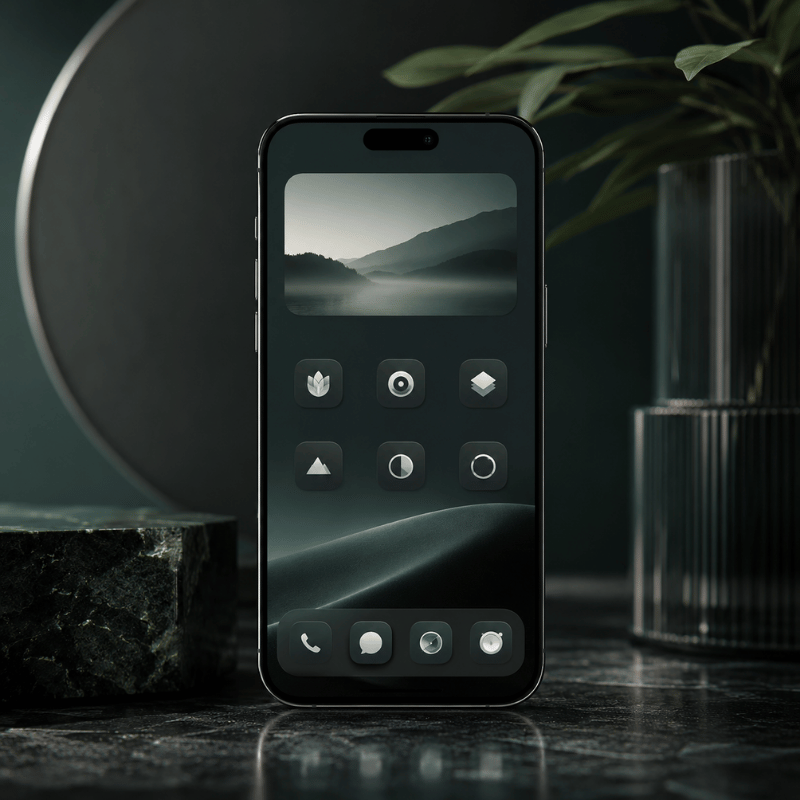
Minimalist home screens are not just empty screens. Think of the first page as a small decision surface. When you unlock your iPhone, the first page should answer one question: what is worth doing now?
Research on smartphone use is careful, not absolute. In a 2022 PLOS ONE study, smartphone notification sounds were linked with slower responses in its task, and a 2017 Frontiers in Psychology review connects phone habits with attention, memory, and distractibility limits. That does not prove a clean layout will fix screen time. Safer takeaway: fewer visual triggers and fewer notification cues are practical design goals.
Wilmer, Sherman, and Chein’s useful lesson is restraint: the phone is a capable tool, but the way it is arranged can pull attention before you make a choice. Treat the Home Screen as a filter, not a gallery.
Design the first page for action, not admiration. If a visual element does not help you choose, move it off the first page.
Strong setups usually have four traits: one clear wallpaper, a limited icon set, 0-2 useful widgets, and a second place for everything else. That second place can be App Library, hidden Home Screen pages, Focus pages, Shortcuts, or a themed tool such as iScreen.
Choose a Layout With the 12-Slot Minimalist Grid
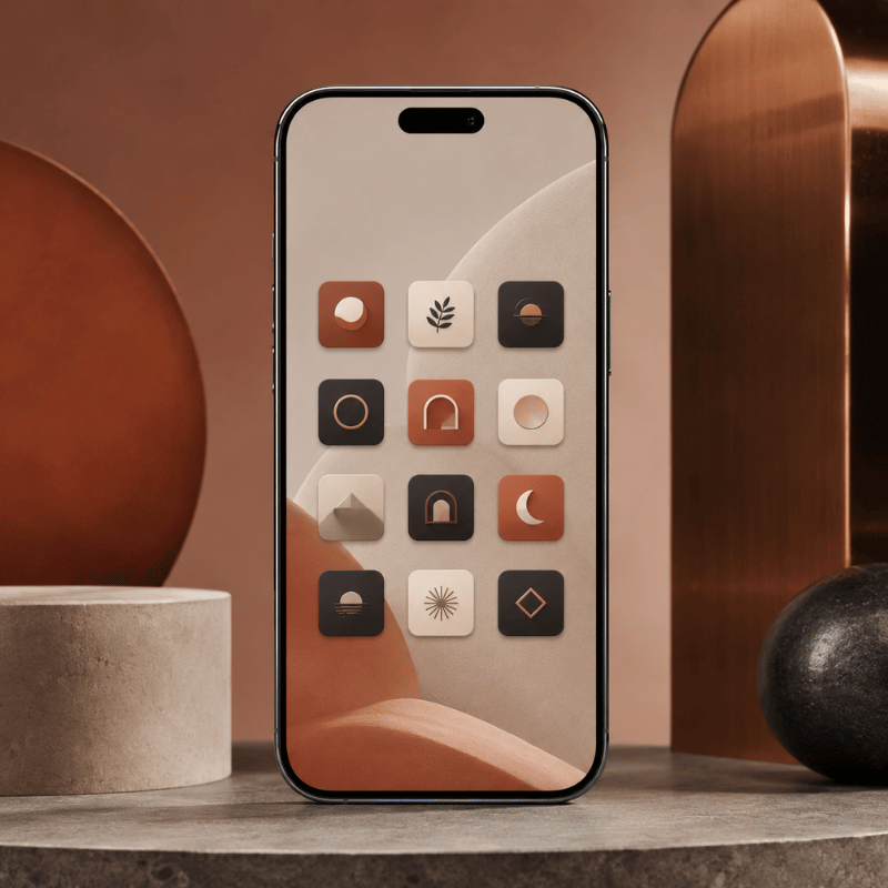
The 12-Slot Minimalist Grid is a simple test: count every visible icon, shortcut, widget, and folder on your first page. If the number is above 12, the screen is no longer minimal in practice, even if the colors are muted.
Apple lets you move apps and widgets around the Home Screen, hide pages, and reset the Home Screen layout if the setup gets messy. Start with one of these nine layouts.
| Layout | Slots | Best use | Risk |
|---|---|---|---|
| 4-icon dock only | 4 | Phone, messages, browser, camera | Too many hidden taps |
| Dock plus one row | 8 | Simple daily phone | Can become a dumping row |
| One medium widget plus dock | 6-8 | Calendar, weather, battery, or tasks | Widget becomes decoration |
| Two small widgets plus dock | 8-10 | At-a-glance day planning | Crowded top half |
| Text launcher plus dock | 5-9 | Users who prefer verbs over app logos | Extra app dependency |
| Focus page | 4-12 | Work, study, travel, sleep prep | Forgotten Focus settings |
| Single folder hub | 5 | Neat look with backup access | Folder becomes a junk drawer |
| Wallpaper-first grid | 4-8 | Visual calm and lock-screen pairing | Low contrast icons |
| Theme set with matching icons | 8-12 | Aesthetic setup without a manual rebuild | Theme looks better than it works |
If you want inspiration before you place anything, use iScreen’s home screen ideas as a gallery, then copy only the structure that fits your daily apps.
Use Blank Space Without Breaking Navigation
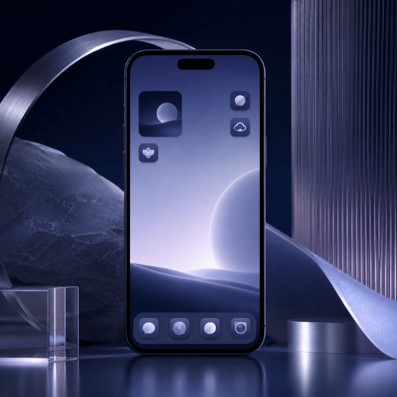
Blank space works when it creates pause. Blank space fails when it turns every normal task into a hunt.
Apple’s App Library organizes apps into categories and can sit closer to the first page when you hide extra Home Screen pages. You can also choose whether new apps land on the Home Screen or go to App Library only. That gives you a clean native pattern: first page for essentials, App Library for the rest.
Use this three-zone rule:
- Top zone: empty space, one widget, or one visual anchor.
- Thumb zone: the 4-8 actions you open many times per day.
- Hidden zone: App Library, Focus page, or search for rare apps.
Scenario: For a student, the thumb zone might hold Calendar, Notes, Camera, and a study playlist. Social apps can stay in App Library so they remain available without sitting in the first unlock view.
Scenario: For a designer, the first page might keep Camera, Photos, Notes, and one inspiration widget, while icon-heavy reference apps sit on a second page tied to a Work Focus.
Scenario: For a parent, a minimalist setup may still need Messages, Maps, Weather, and Photos up front. Minimal does not mean hiding the apps that reduce friction in real life.
Keep Only Widgets That Earn Their Space
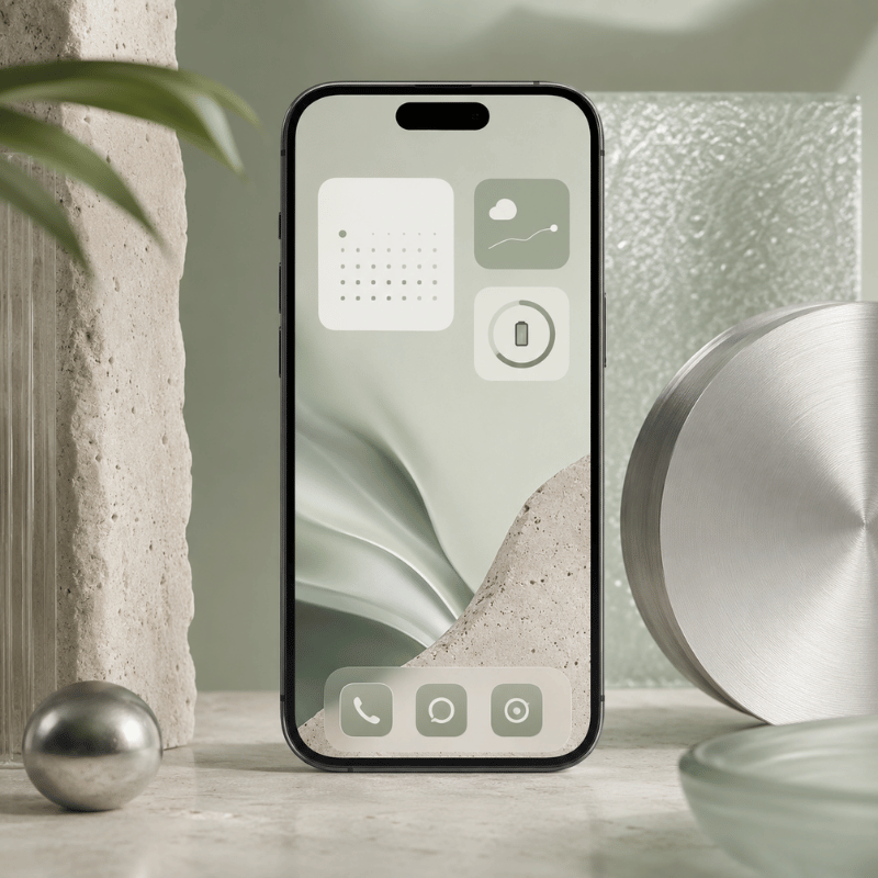
Widgets are the easiest way to ruin a clean screen while believing you made it more useful. Apple describes widgets as a way to show current information and quick focused interactions. Apple HIG widget guidance also says a useful widget should show timely, glanceable content and avoid acting like a duplicate app icon.
For a minimalist iphone setup, every widget needs a job. If the job is only “looks nice,” move it to a Lock Screen, second page, or themed gallery.
| Widget type | Keep when | Remove when |
|---|---|---|
| Calendar | It changes your next action today. | You check Calendar from notifications anyway. |
| Weather | You leave home often and need conditions fast. | Only fills a visual gap. |
| Battery | You use AirPods, watch, or other devices daily. | You only need phone battery. |
| Tasks | Shows the next 1-3 actions. | Shows a long guilt list. |
| Photo | Has emotional value and does not compete with icons. | Lowers icon readability. |
| Launcher | Replaces several app icons with clear actions. | Duplicates the dock. |
| Smart Stack | It rotates between truly relevant widgets. | You swipe it without acting. |
| Screen Time | Seeing screen time stats changes your behavior. | Becomes background noise. |
| Music | Audio is a daily control need. | Pulls you into browsing. |
As a practical rule, use one medium widget or two small widgets. Apple lists many iPhone widget sizes by device, with examples such as small 170 x 170 pt and medium 364 x 170 pt on larger iPhone displays. That is a real budget, not free space.
Browse iScreen widgets when you want themed options, but choose by purpose first: calendar, weather, battery, tasks, or a small launcher.
Match Wallpaper, Icons, and Contrast Before Color
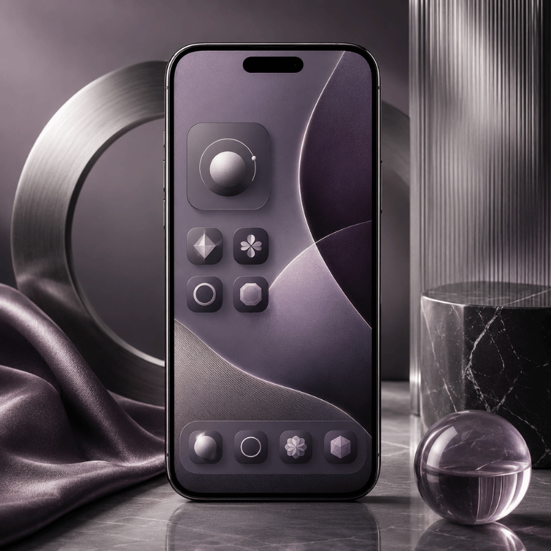
Minimalist app icons iphone users often start with color. Start with contrast instead. Pale wallpaper with pale icons may look good in a screenshot and fail in sunlight.
WCAG 2.2 sets a 4.5:1 minimum contrast ratio for normal text and a 7:1 enhanced contrast ratio. W3C’s non-text contrast guidance uses 3:1 for user interface components and graphical objects. Your Home Screen is not a website, but these ratios are a useful guardrail for labels, glyphs, and widget text.
Apple HIG’s app icon guidance also favors simple, recognizable icons and warns that text inside icons is often too small to read. That matters when using grayscale icons or clear icon styles.
Engineering Note: Use 4.5:1 text contrast, 3:1 icon/UI contrast, a 1024 px icon source when making custom icons, and the 170 pt / 364 pt widget examples as hard space budgets. Check the same layout for 7 days before adding new widgets.
| Wallpaper | Icon style | Label style | Verdict |
|---|---|---|---|
| White or cream | Black line icons | Dark labels | Safe and readable |
| White or cream | Pastel icons | Light labels | Usually too soft |
| Black | White icons | White labels | Strong minimalist look |
| Black | Gray icons | Dim labels | Test in daylight |
| Photo | Solid icon tiles | Default labels | Best if photo has quiet areas |
| Photo | Transparent icons | Hidden labels | Clean but fragile |
| Gradient | Monochrome icons | Short labels | Works when gradient is subtle |
| Pattern | Large glyph icons | No labels or high contrast labels | Use carefully |
| Single color | Matching theme pack | System labels | Fastest to keep neat |
iScreen offers 10,000+ aesthetic themes, 5,000+ icons, and 500+ interactive widgets across iOS and Android, so you can test theme families without building every shortcut manually. For this article, the key is to choose fewer assets, not every matching asset.
Try iScreen icons and iScreen wallpapers as paired sets. Then check the first page outside, at night, and in Focus mode before calling the setup done.
Pick the Right Setup Path: Native iOS, Shortcuts, Launcher, or iScreen
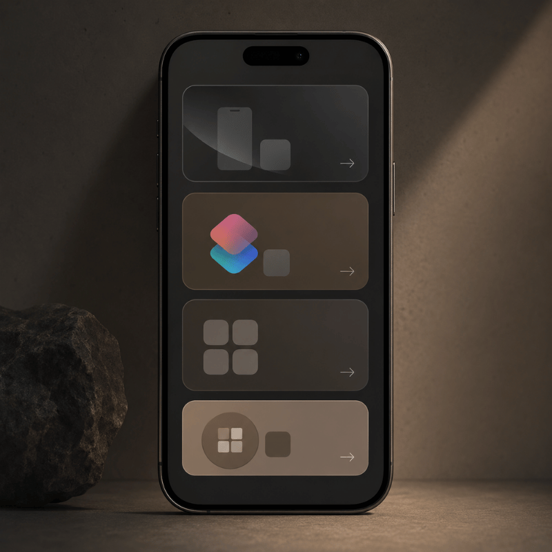
There is no single best way to customize a minimalist iphone home screen. Your right path depends on how much control you want and how much upkeep you can tolerate.
Native iOS handles more than many people expect: App Library, hidden pages, widget editing, Focus pages, and Home Screen placement. Shortcuts add custom Home Screen icons and names from photos or files. Launcher apps can replace icons with text actions. iScreen is the path when you want themes, widgets, icons, and wallpapers from one place.
| Path | Use when | Best feature | Watch out for |
|---|---|---|---|
| Native iOS only | You want the least upkeep. | App Library, hidden pages, Focus pages | Limited visual style control |
| Shortcuts | You want custom icons for a few apps. | Custom Home Screen name and image | Manual setup work |
| Minimalist launcher | You want action labels instead of logos. | Text-based launcher behavior | Another app to manage |
| iScreen theme path | You want a matching wallpaper, icon, and widget set. | Theme, icon, widget, wallpaper library | Choosing too many pieces |
Start with native iOS, then add one layer only if you know why you need it. If you simply want a clean visual set, browse iScreen themes. If the issue is too many apps, use App Library and the Tap-Value Filter first.
Remove Apps With the Tap-Value Filter
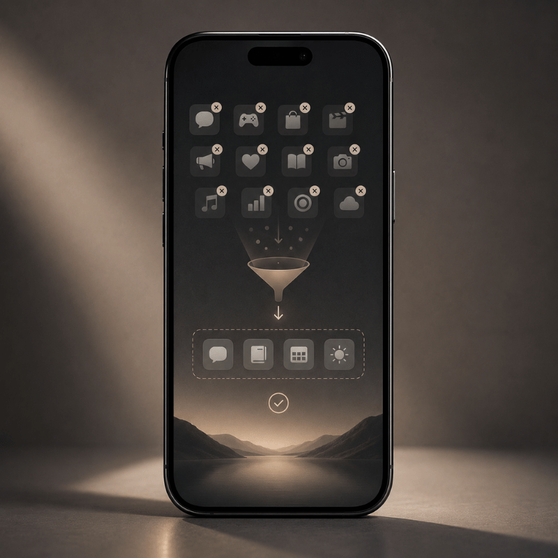
The Tap-Value Filter is a quick way to decide what stays visible. For every icon, widget, shortcut, and folder on page one, ask two questions:
- Does this save a tap, reduce a search, or prevent a mistake at least once a day?
- Would I still want this visible if the icon were plain gray?
If the answer to both is no, move it off the first page.
This is where screen time goals become concrete. Screen Time widgets can be useful if they change behavior. Placing a social app icon in the thumb zone is often the opposite: it lowers the cost of checking without asking whether you meant to open it.
Apple’s Focus system can show a chosen Home Screen page while that Focus is on, and it can turn on by time, location, or app. Put work apps on a Work Focus page, travel apps on a Travel page, and entertainment apps outside the default unlock view.
Run the Tap-Value Filter as a 7-day test. On day 1, move any app that fails both questions. On day 3, restore only the apps you searched for twice. On day 7, keep the final page unchanged for another week. This gives the layout time to prove whether it reduces friction or only looks cleaner.
For rare apps, trust search and App Library. Clean iPhone home screen design is not a promise that every app disappears. Its real promise is that your first page stops acting like an app store.
Fix the 5 Mistakes That Make Minimalist Setups Annoying
1. Hiding essential apps too deeply
If an app solves a daily problem, hiding it three gestures away is not minimal. Keep it in the dock, a Focus page, or a reliable launcher.
2. Using low-contrast themes
Grayscale can look calm, but grayscale plus a pale wallpaper can make labels and icons hard to read. Use the contrast matrix before finalizing dark and light wallpapers.
3. Keeping widgets for symmetry
Apple’s widget guidance favors essential, glanceable content. Widgets that only balance the grid are decoration, not function.
4. Copying a screenshot without copying the routine
A setup can look ideal on Pinterest or Reddit and still be wrong for your day. Match the layout to actual unlock moments: commuting, studying, work, errands, sleep prep.
5. Rebuilding too often
Changing your setup every weekend can become another distraction. Choose one layout, use it for seven days, then move only the apps that caused real friction.
What Is Changing in Minimalist iPhone Setups in 2026?
Minimalist iPhone setup trends are moving away from one blank page and toward context-aware pages. Practically, that means fewer default choices and better switching, not more decoration.
Expect more use of Focus pages, Smart Stacks, clear icon styles, tinted icon sets, and launcher-style text actions. Apple HIG’s app icon guidance now discusses multiple icon appearances such as default, dark, clear, and tinted variants, while still asking icons to remain recognizable.
Keyword data also shows growing interest around minimalist iphone theme, while minimalist iphone widgets has lower current search volume. For this post, the lesson is simple: themes bring people in, but usability keeps the setup on the phone.
Use iScreen’s customization guide if you want the step-by-step build path after choosing a layout.
FAQ
What is the best minimalist iPhone home screen layout?
Dock plus one row is the best starting point: 4 dock apps and 4 apps above it. This gives you a calm first page, but it still leaves room for the actions most people need many times per day. If eight visible slots feel too tight, add one small widget or one extra row before you try a blank-screen setup.
How many apps should be on a minimalist home screen?
Keep 8-12 visible slots on page one. Count icons, widgets, shortcuts, and folders.
Can I make a minimalist iPhone setup without third-party apps?
Yes. You can use App Library, hidden Home Screen pages, widgets, Focus pages, and Shortcuts. Third-party tools help when you want themed icons, wallpapers, widgets, or a transparent text-based launcher, but the native path is enough for many clean setups.
Are blank home screens useful?
They can be, but only when you still know where key actions live. Blank pages with no navigation plan usually create friction. Blank top zones with a useful dock are easier to keep.
What should I do with distracting apps?
Move them out of the thumb zone first. Then put them in App Library, a folder on a later page, or a Focus-specific page. If that still fails, remove notifications before changing the layout again. Layout changes help most when they raise the effort of checking, not when they only make the icon less colorful.
Build the Setup Faster With iScreen
If you already know the layout you want, iScreen can help you pair the wallpaper, icons, and widgets without starting from scratch. The current iScreen library includes 10,000+ themes, 5,000+ icons, and 500+ widgets, with iOS and Android support.
Browse themes, match icons, or start from 500+ home screen ideas.
Related iScreen Guides
References and Sources
- Apple Support: Move apps and widgets on the iPhone Home Screen
- Apple Support: Add, edit, and remove widgets
- Apple Support: Find and use your apps in App Library
- Apple Support: Add a shortcut to the Home Screen
- Apple Support: Set up a Focus on iPhone
- Apple Human Interface Guidelines: Widgets
- Apple Human Interface Guidelines: App icons
- W3C WCAG 2.2
- W3C Understanding SC 1.4.11: Non-text Contrast
- Upshaw et al. 2022: Smartphone notifications and cognitive control
- Wilmer, Sherman, and Chein 2017: Smartphones and cognition review
- iScreen homepage
- iScreen home screen ideas
