
.png)
Cyberpunk iPhone Aesthetic: Wallpapers, Widgets & Neon Icon Packs
A cyberpunk wallpaper for iPhone only works as an aesthetic if the widgets on top are still readable and the icons around it stop clashing. Most “cyberpunk wallpaper” pages just hand you a folder of neon city renders and stop there, and you can’t really tell if the widget and icon layer will trial and error its way to work. This guide covers the visual grammar that actually makes a screen read as cyberpunk, the three visual families worth choosing between, and the one technical problem – widget legibility on a dark, glowing background – that every other guide skips.
Cyberpunk wallpaper iPhone setups are a dark base wallpaper, one or two bright neon accent colors, and a chrome or glitch-style texture – not just any dark wallpaper will do. The look breaks down fastest at the widget layer, where low contrast between neon backgrounds and Apple’s default widget text makes calendar and weather data unreadable at a glance. Matching wallpaper darkness, widget opacity, and icon pack saturation to the same one or two accent colors is how to get this right.
Quick Specs: Cyberpunk iPhone Aesthetic
| Common resolutions | 1170×2532px (standard), 1179×2556px (Pro), 1284×2778px (Pro Max) |
| Physical body size | Roughly 147mm tall × 71mm wide on standard models, up to 163mm × 78mm on Pro Max |
| Format support | Static (all iOS versions), Live/Depth Effect (iOS 16+), 3D Lock screen photo (iOS 26) |
| Typical price range | Free – $6 per wallpaper; $9.99+ for bundled wallpaper + widget packs |
| Visual family count | 3 (2077-game, Edgerunners-anime, genre-atmospheric) |
| Live wallpaper refresh | Up to 120Hz on ProMotion-equipped Pro models |
What Makes an iPhone Look “Cyberpunk” (Not Just Dark)?
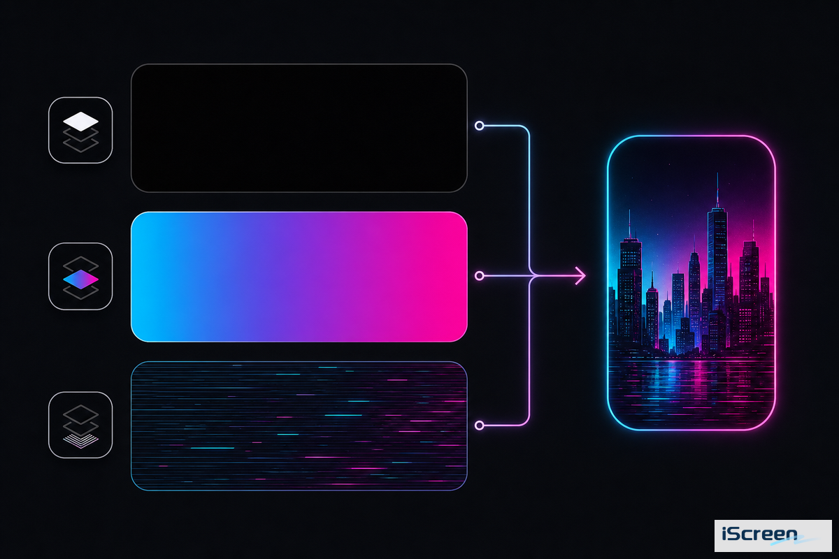
Dark base color layered with one or two saturated neon accents and a chrome, glitch, or scan-line texture, applied consistently across wallpaper, widgets, and icons – that’s what a cyberpunk aesthetic actually is. Any black wallpaper just doesn’t produce the look on its own, since a simple black photo reads as minimalist, not cyberpunk, once it’s missing the accent color and texture layer that signal the genre.
Apple’s own Human Interface Guidelines for materials make a similar point for interface design: legibility depends on using vibrant colors intentionally on dark backgrounds, not just lowering brightness across the board.
This is where most “cyberpunk wallpaper” collections simply don’t deliver. A quick scan of the top six wallpaper pages for this term show from ten to twenty generic neon-city renders with no visual framework attached – readers are left to guess which images will actually look coherent once icons and widgets sit on top. 9to5mac’s coverage of 2026 accessory design details a “retro cyberpunk aesthetic” the same way: a specific, identifiable visual language, not a synonym for “dark.” A folder of renders can inspire the mood, but it takes the visual grammar above to turn that inspiration into a home screen that actually reads as cyberpunk once icons and widgets are sitting on top of it.
Before downloading any wallpaper, choose your one accent color first – cyan, magenta, or amber are the three most common – and force everything else (widgets, icons, even your keyboard theme) to match that one color. Mixing two or three accent colors across the wallpaper and widgets is the top reason a cyberpunk setup looks busy, rather than integrated.
2077, Edgerunners, or Neither? The 3 Cyberpunk Visual Families
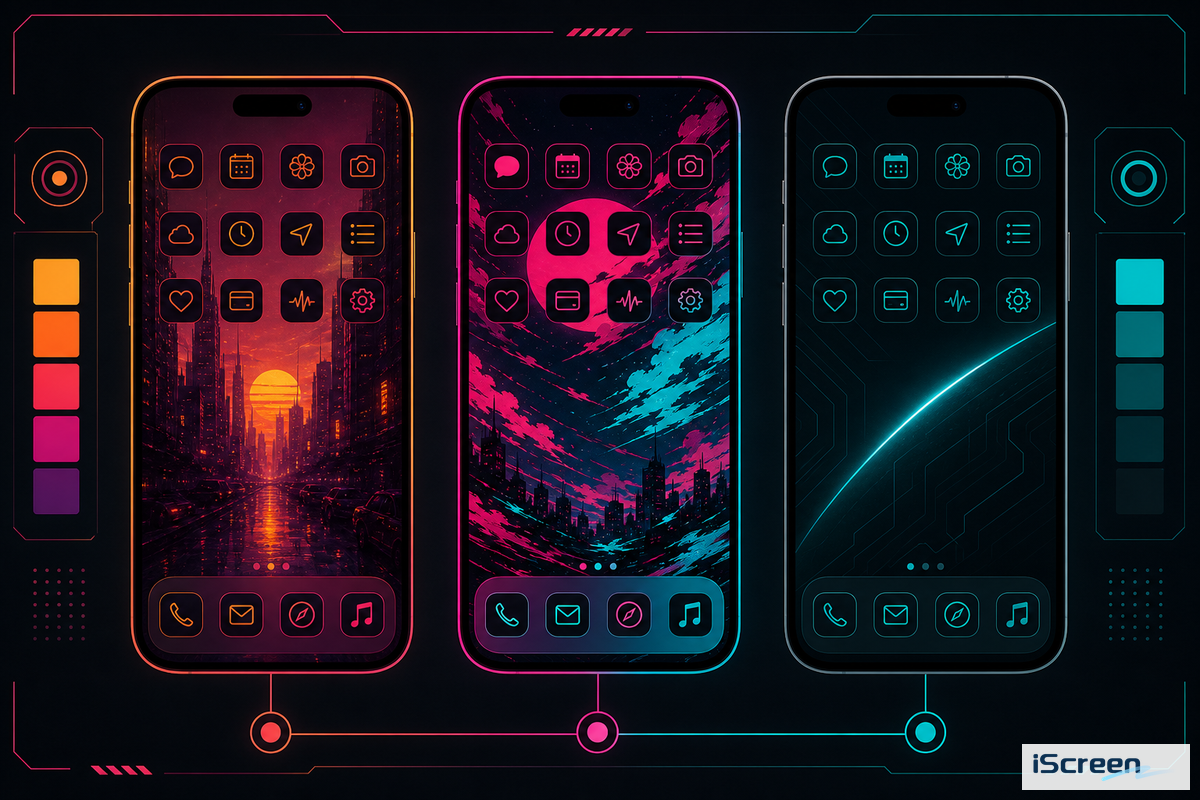
Cyberpunk iPhone wallpapers, including searches like Cyberpunk Edgerunners iPhone Wallpaper 4K or Cyberpunk 2077 Wallpaper Phone, fall into three visual families – 2077-game-native, Edgerunners-anime, or genre-atmospheric – and selecting one before downloading saves the trial and error most people experience after downloading twelve mismatched images. Each family has a unique color palette, theme subject matter, and source pool, so the “best” one depends purely on which visual language you want to communicate across your entire home screen, not just the wallpaper.
| Family | Palette | Typical subject | Best fit for |
|---|---|---|---|
| 2077-game-native | Yellow/amber warning tones + magenta, gritty texture | Night City skylines, corporate logos, game characters | Readers who want the specific Night City look |
| Edgerunners-anime | Hot pink + cyan, higher contrast, anime line art | David/Lucy/Rebecca character art, chrome body-mod motifs | Readers coming from the Netflix anime, not the game |
| Genre-atmospheric | Any single accent (cyan/magenta/green) on near-black | Rain-slick streets, glitch texture, no named characters or logos | Readers who want the mood without game/franchise branding |
What’s the difference between Cyberpunk 2077 and Cyberpunk Edgerunners style?
Cyberpunk 2077 wallpaper relies on the game’s yellow-and-magenta corporate aesthetic and the distinct cityscape of Night City, while Cyberpunk Edgerunners art taps into the series’ higher-contrast pink-and-cyan color palette and the character-focused linework that defined the original 2022 Netflix anime series.
A user on r/cyberpunkgame made their own custom cyberpunk icon set for an iPhone, using Widgetsmith and Apple Shortcuts instead of ready-made downloads from either franchise – a good example of why the genre-atmospheric family (family three) tends to be a useful entry point if you don’t want to strictly adhere to a specific franchise’s colors.
Cyberpunk Edgerunners is especially worth your attention in the coming months, given that CD Projekt Red confirmed a large Cyberpunk: Edgerunners 2 panel for Anime Expo 2026, with the season expected to premiere in the fall of 2026. This timeframe aligns with renewed search interest in Edgerunners-specific wallpapers in June 2026, after a lull during the spring – typically, a new season results in an influx of new anime-style wallpapers and icons being created and requested. So, if you’re setting up an Edgerunners family theme now, you can expect more visual resources to become available throughout the rest of the year.
Best Cyberpunk Wallpaper Types for iPhone, The 9-Style Cyberpunk Wallpaper Grid
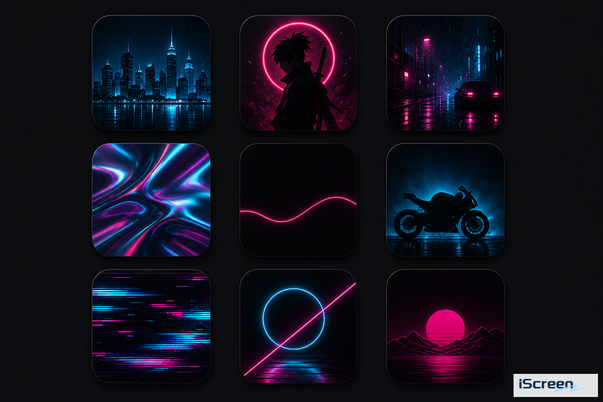
With nine styles to choose from, the wallpapers cover most content under the “cyberpunk” umbrella and vary in terms of battery usage and how easy they’re to pair with other widgets and icons. Selecting a style from this grid prior to searching is essential for quickly narrowing down a folder of hundreds of images to a select few that will integrate well with the rest of your setup.
| Wallpaper Type | Static/Live | OLED battery impact | Icon-pairing difficulty | Not suitable for |
|---|---|---|---|---|
| City/skyline scene | Both | High | Medium | Small-icon-heavy layouts (skyline detail gets lost) |
| 2077-style character art | Static | High | Hard | Widget-dense Home Screens (busy subject clashes) |
| Edgerunners character art | Static | High | Hard | Same as above; best on Lock screen only |
| Glitch/abstract neon | Both | Medium | Easy | Readers who want a specific franchise look |
| Chrome/holographic UI mockup | Static | Medium | Easy | Low-vision users (chrome text has low natural contrast) |
| Rain-soaked street | Both | Medium-high | Medium | Battery-conscious users (bright reflections raise brightness) |
| Neon-lit vehicle/motorcycle | Static | Medium | Medium | Portrait-orientation crops (vehicles are usually landscape source art) |
| Minimal neon-line on black | Static | Low | Easiest | Readers who want a busy, detailed scene |
| Named game character (e.g. Johnny Silverhand) | Static | High | Hard | Commercial/public-facing use (fan art licensing varies by artist) |
If you’re new to building a cyberpunk setup, minimal neon-line wallpaper is a great starting point: its largely black appearance means it consumes the least amount of OLED battery life, in line with the pattern Lifehacker’s battery testing found for darker always-on images, and the single accent line provides the maximum amount of open space for your widgets and icons to be placed without competing for visual attention. While character-based wallpapers, from both 2077 and Edgerunners, are striking on their own, they’re generally the most challenging to incorporate into a cohesive setup because of the clutter that can obscure your widget’s legibility, which we’ll address next.
Where to Find Cyberpunk Wallpapers That Actually Fit Your Screen
Match the wallpaper source to your iPhone’s exact resolution before downloading — a wallpaper sized for a generic “1080×1920” phone will crop unpredictably on a modern iPhone’s 1170×2532 to 1284×2778 range. Free galleries mostly list phone wallpapers by tags like “4K” or “HD” rather than model, so download the largest file and let Apple’s official Lock Screen editor crop it for you, or explore iScreen’s wallpaper library for pre-sized options instead.
Most searches for cyberpunk wallpaper iPhone free or Cyberpunk iPhone Wallpaper 4K return more than enough free options that a paid bundle is optional rather than required — the same applies whether you are hunting for an iPhone neon wallpaper specifically or a broader dark neon wallpaper to crop yourself. Most listings let you download for free straight to your phone, though a handful of desktop-first gallery sites still require opening the page on a computer first before the mobile-sized file becomes available. If a page only offers a generic cyberpunk phone background rather than an iPhone-tagged one, double-check the aspect ratio before committing to it, and if you specifically want cyberpunk 2077 iPhone wallpapers rather than the anime-derived look, search that exact phrase to filter out results that are Edgerunners only.
Individual wallpapers paired with corresponding widgets (like for iphone-specific bundles) will cost around $2-$6 for a single wallpaper, or a little bundle of four wallpapers and widgets (approx. $9.99). The latter price can act as an indicator when looking on independent markets for that exact configuration – though it will cost you more than cobbling together a set from free items. Whichever source you choose, always review the license for character-based art (like Johnny Silverhand, Lucy, Rebecca), most fan-created material can only be used on your own device.
Setting Up Static vs. Live Cyberpunk Wallpapers on iOS 17, 18, and 26
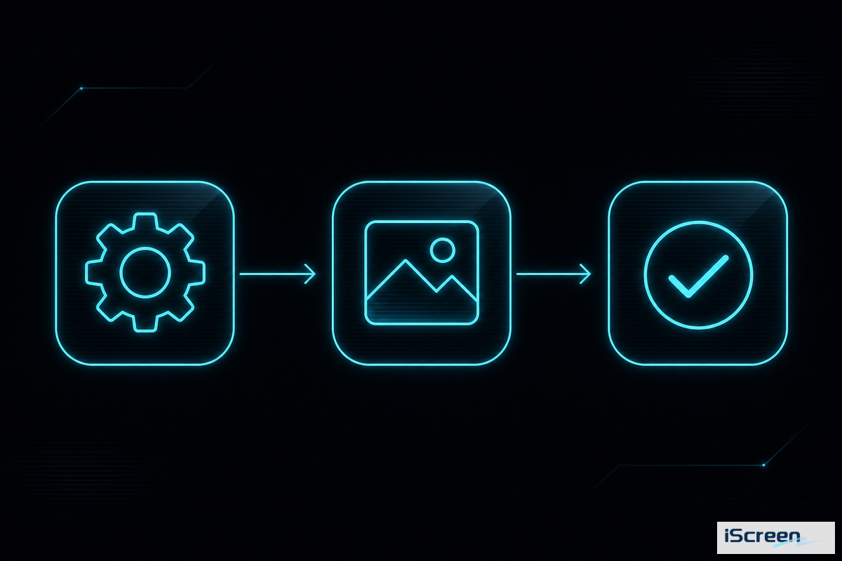
Apply static wallpapers in under a minute by navigating to Settings > Wallpaper > Customize in any recent iOS version. Live-style or depth-effect versions require a Live Photo file and iOS 16 or newer. According to Apple’s iOS 26 update notes, moving your iPhone now triggers a new 3D parallax effect on the Lock screen photo, which complements the layered design of cyberpunk wallpaper art.
- Follow the steps from Apple’s official Lock screen guide to touch and hold until Customize appears.
- Touch and hold the Lock screen.
- Select the Photo icon, then tap on your cyberpunk wallpaper.
- For a live Photo file, long-press the shutter icon when you tap to set to include motion (iOS 16+ required).
- Add widgets using Apple’s widget setup guide: tap “Add Widgets” then drag the item onto your Lock screen.
Matching Widgets to a Cyberpunk Home Screen — The Neon-on-Black Legibility Threshold
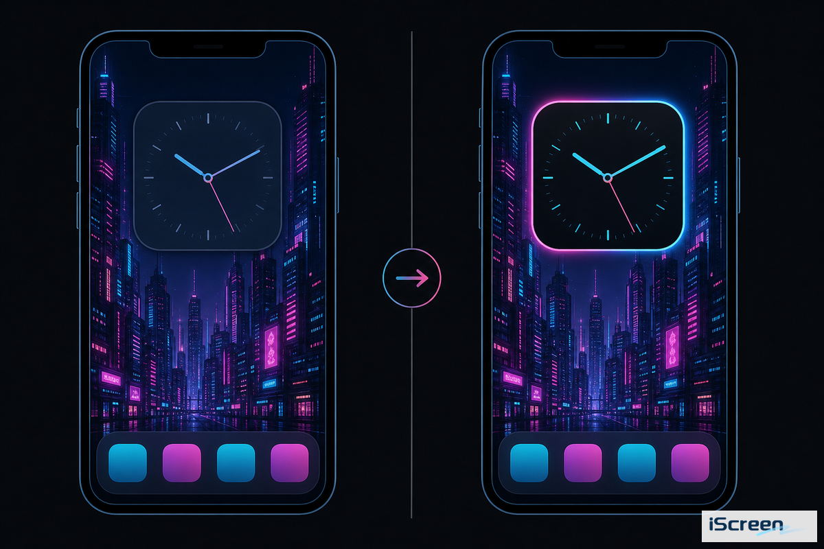
If glass widgets appear too faded against a vibrant neon wallpaper, try toggling off the transparency settings under Settings > Accessibility > Display & Text Size > Reduce Transparency in iOS 26.
When the bright, saturated hues of the background sit near the colors of a widget’s icons and text, they become hard to read – and it’s something even Apple identifies as an issue they designed their widgets to address. In the Apple Human Interface Guidelines for widgets, the company states, “Offer enough contrast to ensure legibility,” and for bright and vivid images, “The stronger the background’s light or saturation, the greater the intensity of the background blur”. The reality for iOS 26 is that the newly introduced “glass” widgets – described in CNET’s coverage of the Liquid Glass settings – are even more prone to these legibility problems, leading Apple to add the “Reduce Transparency” option. This is not a hypothetical problem — it shows up in real complaints on Apple’s own support channels.
“Widgets (like calendar) are now a low contrast grey instead of ‘dark’ in dark mode. I have just updated to the iOS 26 on my iPad Pro…”
- Position widgets on the darkest, least busy area of the wallpaper – typically near the top or bottom edge on a city-skyline image, never on the brightest neon sign
- On iOS 26, enable Reduce Transparency if widgets appear washed out; it trades a bit of the glass-like polish for actual readability on high-contrast wallpapers
- Use widget apps that offer solid or semi-opaque background tints (matching your singular accent color) rather than entirely transparent widgets against a neon image
- Check readability from arm’s length in direct sunlight, not just in indoor lighting – a low-contrast combination that looks fine on a desk can fall apart outside
Community threads confirm this from the inverse angle: on r/widgy, users posting cyberpunk-themed widget arrangements will often rework someone else’s shared layout specifically to correct for contrast before resharing-the legibility issue is common enough that “remixing for readability” has become a standard workflow step there, not an exception.
Neon Icon Packs for a Cyberpunk Setup: Sourcing, Installing, Staying Consistent
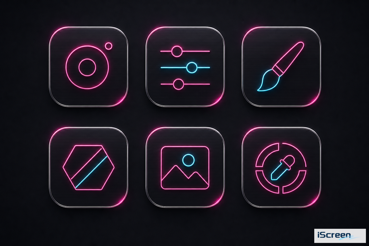
A neon icon pack completes a cyberpunk setup, but only if every icon in the pack uses the same accent color and line weight as the wallpaper and widgets-mixing icon packs from various sources is the quickest way to break the look. Most cyberpunk app icons customization on iPhone follows one of two routes: either a dedicated icon app such as iScreen’s icon pack collection with a carefully selected cyberpunk-style library, or Apple’s built-in Shortcuts method, which allows you to manually designate any custom image as an app icon.
Setting up icons with Shortcuts takes more time (several minutes per icon versus nearly instant with an app), but guarantees precise color matching, as you source each icon image yourself rather than choosing from a premade set. On r/cyberpunkgame, one user shared that they created a full custom icon set with Widgetsmith and Apple Shortcuts instead of downloading a premade pack, precisely to ensure consistent color palettes across all their app icons.
downloading two or three “neon icon pack” sets from different sources and mixing and matching the ones you like best. Different designers use different accent colors, stroke widths, and glow intensities-even two packs labeled “cyberpunk” seldom match perfectly, and these differences are far more obvious in a 4×6 icon grid than when viewed in isolation.
Allocate 15-20 minutes for the first time you create a complete icon set, whether with an app or through Shortcuts-the bulk of this time will be spent renaming icons afterward, as Shortcuts custom icons display a generic label unless you go back and rename each shortcut individually.
Will a Cyberpunk Wallpaper Drain Your Battery or Slow Down Your iPhone?
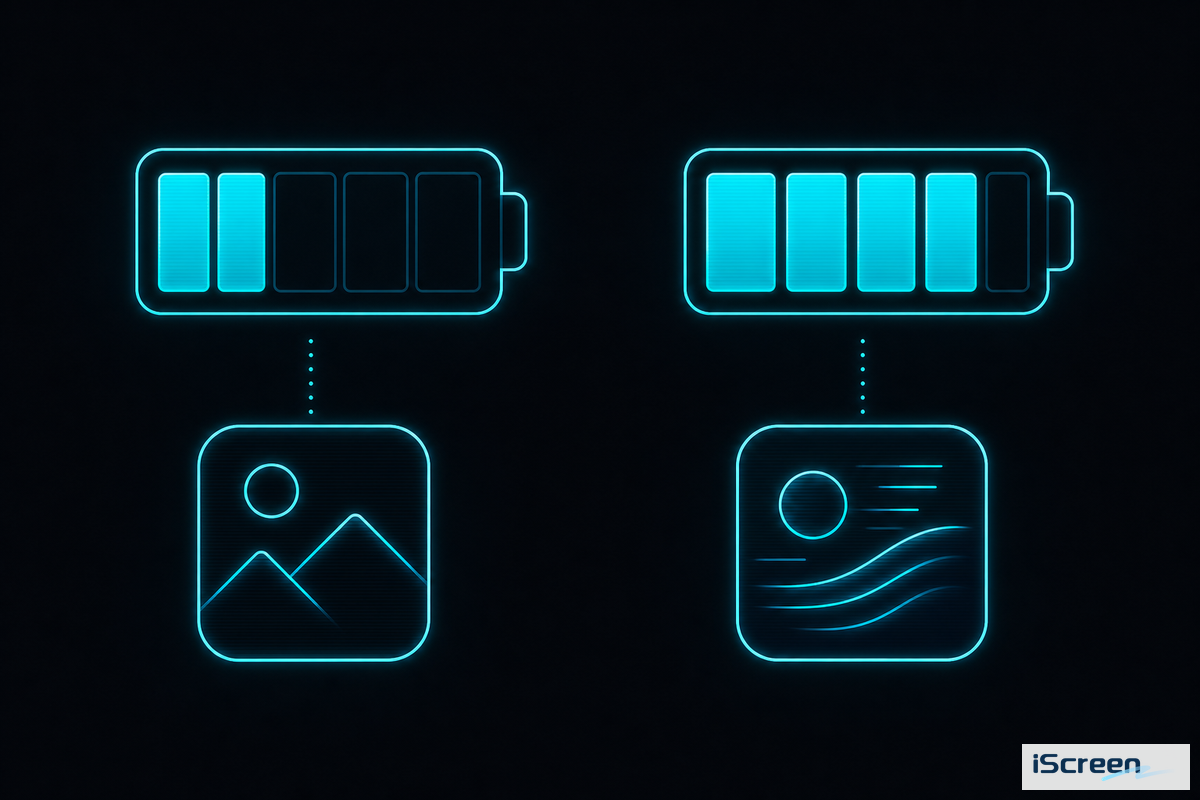
A static cyberpunk wallpaper itself has zero battery cost, but a live or Always-On Display one has some, and the impact is much smaller than you’d imagine. The much-cited Lifehacker 24-hour iPhone 14 Pro test found an AOD wallpaper device ended the day at 80% battery compared to the same device at 84% with an AOD showing text only — not exactly the night-and-day drain many fear.
Estimates from the r/apple community suggest an AOD, regardless of wallpaper, consumes 15-25% more power than with it disabled — implying that most of the drain comes from the underlying display technology rather than a preference for neon imagery over plain text.
The other side of that coin is dark themes: OLED displays only illuminate pixels that are currently active, meaning a mostly black cyberpunk wallpaper (e.g. the minimal neon line art from the above grid) consumes less energy than its brighter counterparts – and in keeping with other research on the power savings of OLED dark mode at moderate brightness levels (30-50%), those gains could be between 3-9%. Live wallpapers add their own costs on top of those factors: their rendering is continuous, and the higher peak brightness many animations need also consumes additional power beyond the presence or absence of an AOD.
- Static, minimal neon-line wallpaper (mostly black)
- Standard Home Screen use (no Always-On)
- Solid or semi-opaque widget backgrounds
- Live or Depth Effect wallpaper on Always-On Display
- Bright city-skyline or character-art styles at full brightness
- Fully transparent glass-style widgets on iOS 26
- Pick one visual family (2077-game, Edgerunners-anime, or genre-atmospheric) before downloading anything
- Lock in a single accent color and check every wallpaper, widget, and icon against it
- Place widgets over the darkest, least busy part of the wallpaper, and toggle Reduce Transparency on iOS 26 if needed
- Source icons from one pack (or build your own via Shortcuts) instead of mixing packs from different designers
- Weigh static vs. live/Always-On against your actual battery tolerance before committing to the animated version
Frequently Asked Questions
Q: What’s the difference between Cyberpunk 2077 wallpaper and Cyberpunk Edgerunners wallpaper?
Cyberpunk 2077 wallpaper art uses the game’s yellow-magenta corporate palette and Night City architecture, while Edgerunners wallpaper art uses the 2022 Netflix anime’s higher-contrast pink-cyan palette and named characters like David and Lucy.
Q: Does a cyberpunk live wallpaper drain my iPhone’s battery faster than a static one?
Yes — live wallpapers use more battery than static ones because they render continuously and typically run at higher peak brightness, though the difference is smaller than most people assume.
Q: Can I use Cyberpunk 2077 or Edgerunners wallpaper without violating copyright?
Personal device wallpaper use of fan-made or officially licensed cyberpunk art is generally treated as personal use, but redistribution, resale, or public-facing use of character-specific fan art is usually restricted by the original artist’s license.
Q: How do I stop my widgets from disappearing into a dark cyberpunk wallpaper?
Place widgets over the darkest, least busy part of the wallpaper, and turn on Reduce Transparency in iOS 26 if the new glass-style widget background washes out against a bright neon area.
Q: Where can I get 4K cyberpunk wallpapers for iPhone?
iScreen’s wallpaper library includes cyberpunk and neon-styled options sized for current iPhone resolutions, alongside free general wallpaper galleries like Pinterest and WallpaperCave and paid marketplace bundles on sites like Etsy.
Q: Is cyberpunk wallpaper free to use on my iPhone?
Yes, most cyberpunk wallpapers for personal device use are free, with paid options ($2–$6 per image, or bundles from roughly $9.99) mainly for higher-resolution or wallpaper-plus-widget sets.
About This Analysis
This guide draws on Apple’s own Human Interface Guidelines for widget and dark-mode contrast, a real 24-hour Always-On Display battery test, and current iPhone community discussions of cyberpunk home screen setups, rather than treating “cyberpunk wallpaper” as a single downloadable image category. iScreen’s own wallpaper, widget, and icon libraries were cross-checked against the visual families and style grid described above. Reviewed by the iScreen team.
References & Sources
- Widgets, Apple Human Interface Guidelines — Apple Inc.
- Materials, Apple Human Interface Guidelines — Apple Inc.
- Create a custom iPhone Lock screen — Apple Support
- What’s new in iOS 26 — Apple Support
- How to add and edit widgets on your iPhone — Apple Support
- You’re Wrong About Your iPhone’s Always-On Wallpaper Drain — Lifehacker
- iOS 26 Setting to Customize Liquid Glass Design — CNET
- Do live wallpapers cause noticeable battery drain? — Computerworld
- Cyberpunk: Edgerunners 2 Getting Major Update at Anime Expo 2026 — What’s on Netflix
- Favorite Apple charging accessories of 2026 — 9to5Mac
Related Articles
- iPhone Wallpaper Aesthetic: The 12 Aesthetic Vocabularies of 2026 — where cyberpunk sits among the broader aesthetic landscape
- Studio Ghibli Wallpaper iPhone Guide — the same single-aesthetic deep-dive approach, opposite end of the mood spectrum
- Cute Aesthetic Widgets Guide — cross-element wallpaper/widget/icon coordination for a very different visual language
- Aesthetic App Icons for iPhone — more on sourcing and organizing custom icon packs
- Best Widgets for Your iPhone Lock screen — widget picks and setup beyond the cyberpunk-specific legibility fixes above
