
.png)
How to Customize Liquid Glass in iOS 27
Updated September 16, 2026 · Apple’s current iOS 27 controls checked
iOS 27 Liquid Glass is no longer a one-look interface. You can move the system effect from clearer to more tinted, then adjust your Home Screen icons and widgets separately. The easiest way to do this is to go to Settings → Appearance → Liquid Glass and, for a more tinted appearance, slide to the right. For a more clear effect, slide the slider to the left; remember that the slider is only the first layer.
This slider is the first layer, and it is only one part of the setup. A striking setting over one wallpaper can make it harder to recognize controls over another. This guide outlines the three layers, system glass, Home Screen appearance, and accessibility, without suggesting one slider position is best for everyone.
Liquid Glass is a visual layer: tune it in context, then protect readability with accessibility settings.
The 30-second answer
-
- Open Settings → Appearance → Liquid Glass.
- Move right for more tint and left for a clearer surface.
- Test control Center, a busy app, and your Home Screen after making the change so you can decide if you want to keep it.
Version scope and test card: This guide covers the iOS 27 Liquid Glass effect and its new slider. If you searched for “customize liquid glass iPhone,” “liquid glass transparency iPhone,” or “iOS 27 appearance settings,” the setting path and screen checks below answer that intent. It is not an iOS 26 or iOS 26.1 guide; iPadOS 27 may use related Liquid Glass design language, but this iPhone Liquid Glass interface and Settings app path are the scope here. Note the 2 accessibility settings, the 1 slider, and the 3 layers separately. Mode and opacity are practical descriptions here, not Apple calibration values.
What changed with Liquid Glass in iOS 27?
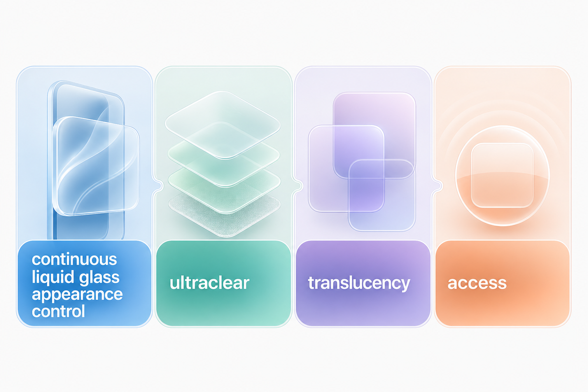
Apple introduced a continuous Liquid Glass appearance control in iOS 27. Rather than selecting between two appearances, you can change the appearance along a spectrum. Apple calls the spectrum from completely ultraclear to completely tinted. The control adjusts the translucency of system surfaces. It doesn’t alter your wallpaper, icons, or widgets.
The adjustment arrived with the public iOS 27 release on September 14, 2026, according to Apple’s software availability announcement. If you saw beta screenshots or older instructions with only Clear and Tinted choices, the final release gives you more room between those ends.
These redesigns of the update are unrelated to AI or Siri. The user controls alter looks and accessibility features. They don’t change how services respond.
Think of the slider as a material control, not an “off” switch. Adjusting tinted adds color and visual weight to glass surface elements. Moving in the direction of becoming clear allows more of the content behind them to become visible. Liquid Glass is still part of the interface at both ends.
Customize iOS 27 Liquid Glass in three steps
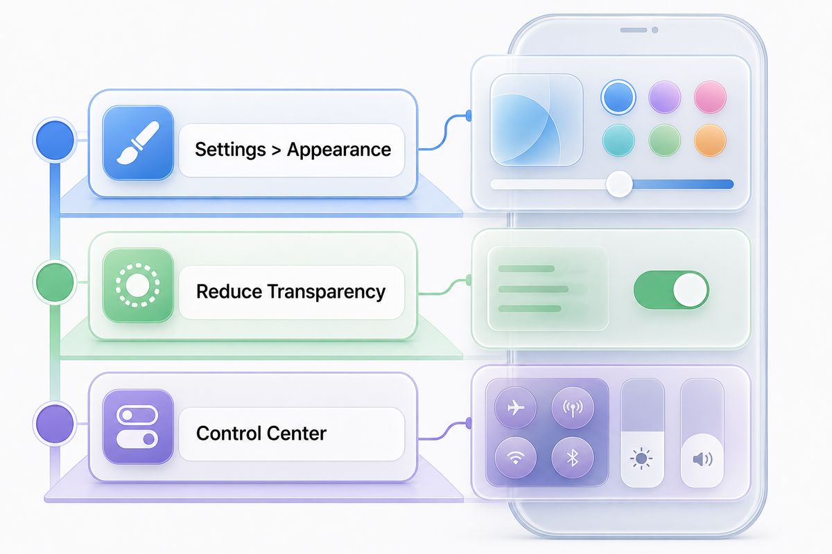
1. Open the Liquid Glass appearance control
Open Settings, tap Appearance, and choose liquid glass. Apple documents this path in its iPhone display and text settings guide.
When controls are unavailable, please don’t assume the update has malfunctioned. Two accessibility settings can cause this. Go to Settings → Accessibility → Display & Text Size and check whether Reduce Transparency or Increase Contrast is on. Apple indicates both should be off before you change the appearance of Liquid Glass. Only turn them off if you’re comfortable giving up their readability benefits.
2. Move from clear toward tinted
In order to achieve more tint, drag the slider to the right. To get a clearer effect, drag the slider to the left; drag it right for more tint. Keep in mind that a small change in Settings may affect what you see on real screens, so leave Settings and inspect real screens. There’s no recommended percentage that Apple has suggested, nor is there a “best” position that can be achieved. For wallpaper with bright highlights, more tint can help controls feel separated from the background.
A dark wallpaper with less tint may give a clearer look without making labels disappear. These aren’t fail-proof formulas; use the slider as a material control rather than an off switch. It will still depend on the wallpaper, content of the application, brightness, and your vision.
3. Check the result where you actually use it
When evaluating the setting, don’t rely solely on the Appearance preview. Open Control Center, Safari or another content-heavy app, and your Home Screen. Look for text that blends into the surface, icons that lose their edges, and controls that become difficult to identify. It’s also important to do the test at your normal brightness and not at the maximum brightness level. When you evaluate the Liquid Glass update, compare the transparency slider over Control Center, a content-heavy app, a folder, and your customizable Home Screen at the brightness you normally use; the same position can look calm over a dark wallpaper and crowded over a bright illustration, so the screen context matters more than another person’s screenshot.
When a surface looks good but reading it takes effort, move the slider slightly towards tinted and test again. If the interface feels heavy or colored, move towards the clear side. This is more reliable than copying a slider position from someone’s screenshot.
Use the Clear–Tint–Access Ladder
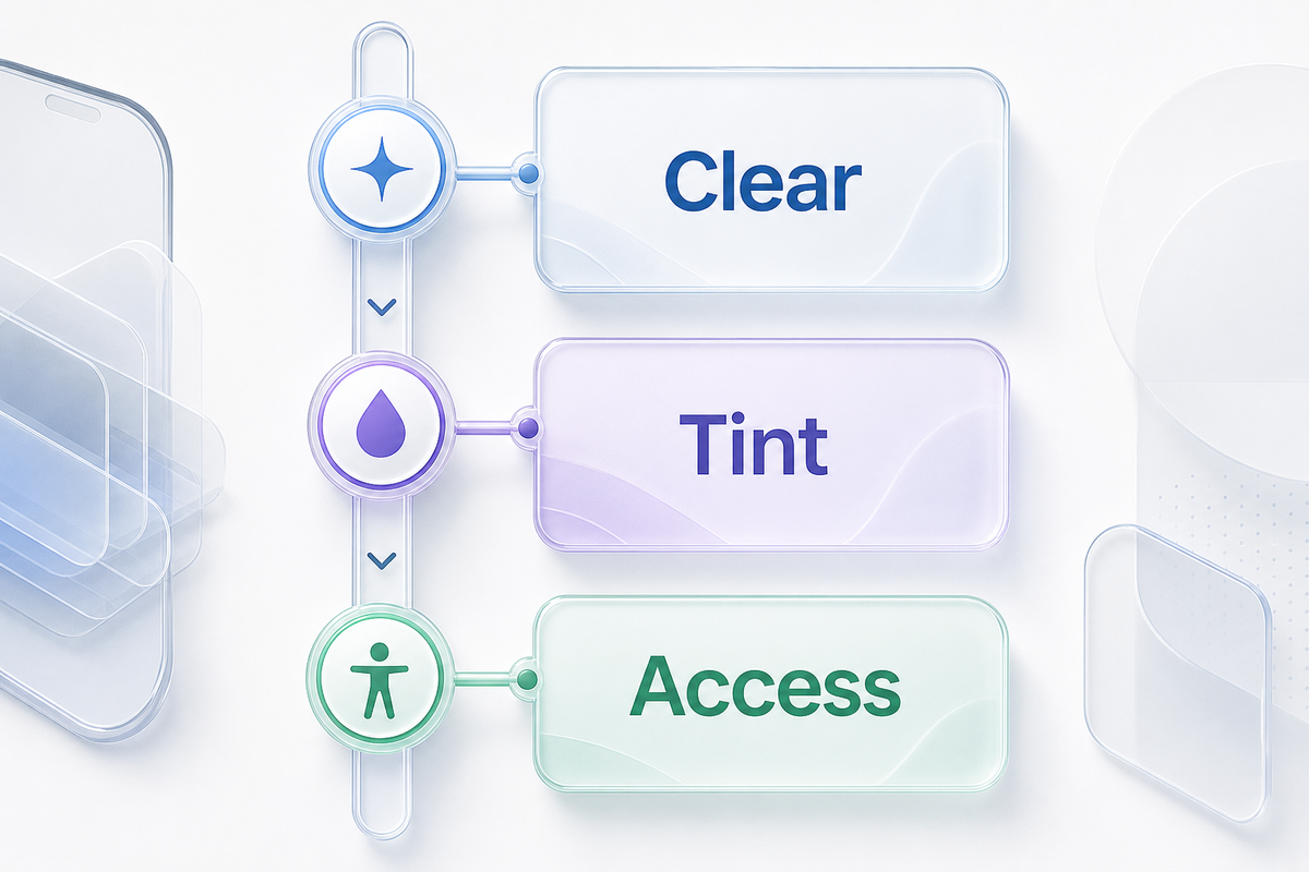
The Clear–Tint–Access Ladder is our editorial way to make the options easier to compare. The Clear-tint-Access Ladder is our way of simplifying the options, and it does not imply a apple feature, a scientific calibration, or that anyone would be able to read a specific level. For the platform-level controls behind this editorial ladder, see Apple’s iPhone display and text settings guide.
| Rung | What to change | What to inspect |
|---|---|---|
| Clear | Start left of center for a lighter, more transparent material. | Busy wallpaper areas, small labels, Control Center buttons. |
| Tint | Move right until controls separate comfortably from what sits behind them. | Whether tint helps recognition without making the interface feel muddy. |
| Access | Use Reduce Transparency, Increase Contrast, text size, or bold text when appearance tuning is not enough. | Reading comfort and control recognition during normal use. |
First, choose your preferred visual direction. After that, check it in context. If visual styling conflicts with comfort, accessibility settings take priority over preserving the glass effect. If you turn on Reduce transparency or Increase Contrast, then the slider of liquid glass will be unavailable.
Match Liquid Glass with icons, widgets, and wallpaper
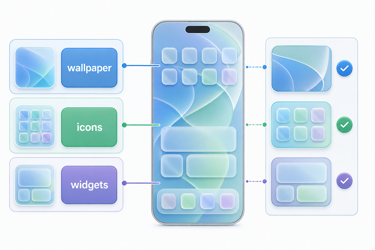
Apple has dedicated controls for app icons and widgets. A third-party widget developer controls how that widget is drawn, while iOS controls the system glass around it, which is why a coordinated palette can look consistent without producing an identical material effect; check information hierarchy, text contrast, and spacing on your own wallpaper before deciding that the visual match is comfortable. To open the editor, touch and hold an empty area of the Home Screen, tap Edit, then tap Customize. Depending on the iOS 27 settings, users can select preferred icon sizes, compare light, dark, clear, and tinted styles. Apple’s Home Screen customization guide separates these options.
Keep the roles separate:
- Liquid Glass slider: changes supported system glass surfaces.
- Home Screen Customize controls: change the appearance and size of icons and widgets.
- Wallpaper editor: alters the image and cropping, and can add blur and pair screens.
Align the wallpaper and liquid glass, and then tune the icons and widgets. This avoids wasting time optimizing a translucent interface for a background you later replace.
Three combinations worth trying
Clear glass + restrained wallpaper. You should start with a low-detail or softly graduated background. Use light or clear icons and simple widget surfaces. Go to the iScreen wallpaper library if your photo has details on faces or high contrast lines under controls.
More tint + colorful wallpaper. A stronger tint can help separate system controls from wallpaper with bright, defined shapes. Avoid matching every single widget, icon, and glass surface to the same saturated color. It’s important to include a neutral element to balance the colorful design.
Dark appearance + focused information. Use dark icons and place only 1 or 2 widgets. For a very organized, step-by-step layout, check the iPhone themes guide to see how wallpaper, widgets, and icons work as separate pieces. It shows how wallpaper, widgets, and icons can be arranged separately.
The following steps will help you format the Home Screen in a consistent way, one part at a time. Read our guide for customizing iphone app icons and another for ios 27 wallpaper. You can use the latter to change and crop the background, while changing all three layers at once makes it harder to see which choice caused the problem. It’s easier to look for the error if you don’t do all of these changes together; a clearer surface is not automatically harder to read, and more tint is not automatically accessible.
Choose a look, then verify readability on your screen
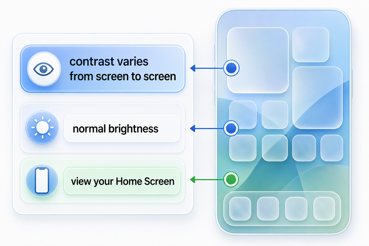
A clear surface doesn’t automatically mean it’s harder to read. More tint doesn’t automatically mean it’s more accessible. The level of contrast varies from screen to screen. The same setting may look comfortable over a dark photo and crowded over a bright illustration.
Use this quick check:
- Set your normal brightness and clear any temporary test changes.
- Open Control Center controls over a bright background, then a darker one.
- Read small labels without having to lean in or pause to decode.
- Check the primary buttons in one app you use daily.
- Repeat after changing the slider by a small amount.
| Test type | Quick setup | Decision |
|---|---|---|
| Bright wallpaper | Inspect for 30 sec at about 50% brightness. | Add tint if labels merge with highlights. |
| Dark wallpaper | Inspect for 30 sec at about 25% brightness. | Keep clear only if controls retain distinct edges. |
| Control Center | Check 2 backgrounds for 1 min each. | Make primary controls recognizable at a glance. |
| Text-heavy app | Read for 2 min at normal brightness. | Change text settings if reading effort rises. |
| Home Screen | Scan 2 pages for 1 min. | Adjust icons separately from system glass. |
| Lock Screen | Check for 30 sec at your normal brightness. | Reposition the wallpaper if it crowds controls. |
| Motion | Open and close apps for 2 min. | Use Reduce Motion if movement, not tint, causes discomfort. |
| Outdoor check | Use the phone for 1 min in safe daylight. | Do not preserve a subtle effect that slows recognition. |
| Daily-use check | Keep the setup for 24 hours or 1 day. | Retain it only if it stays comfortable across contexts. |
If clarity is inconsistent across apps, accessibility controls may be the better solution. In Settings → Accessibility → Display & Text Size, Reduce Transparency replaces some translucent backgrounds with more opaque backgrounds, and Increase Contrast strengthens the distinction between foreground and background. Text in a larger size and Bold Text manage a different problem and can be used without treating tint as the only variable.
Motion is separate again. In Settings → Accessibility → Motion → Reduce Motion, certain screen movements are limited and some transitions are changed. Apple explains these options in its onscreen motion guide. Reduce Motion doesn’t serve as another position on the clear-to-tinted slider.
Fix common Liquid Glass customization problems
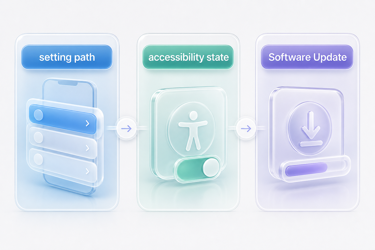
| Problem type | Likely explanation | What to try |
|---|---|---|
| Liquid Glass control is missing or disabled | Reduce Transparency or Increase Contrast is enabled, or the device is not on the current iOS 27 release. | Check Display & Text Size and Software Update. Keep accessibility settings on if you rely on them. |
| Slider does not turn the effect off | It adjusts the Liquid Glass range rather than removing the material. | Use Reduce Transparency if the translucent effect itself is the problem. |
| Home Screen icons did not change | Icons use separate Home Screen customization controls. | Long-press the Home Screen, then open Edit → Customize. |
| Controls look washed out over one wallpaper | The wallpaper and glass surface lack separation in that area. | Add a little tint, adjust the wallpaper crop, or choose a quieter Home Screen background. |
| Interface movement is uncomfortable | The issue concerns animation, not only transparency. | Review Accessibility → Motion → Reduce Motion. |
| Text feels too small | Tint does not change text size. | Increase Text Size or turn on Bold Text. |
| Only one app looks unclear | Its own content and surfaces create a local contrast problem. | Test another app before changing the entire theme. |
| Custom widget does not match system glass | Third-party widgets and Apple surfaces use different rendering. | Match palette and spacing instead of expecting identical material. |
Restarting the phone shouldn’t be the first response to a design preference. Confirm the setting path and the accessibility state first. If an option is genuinely absent after an iOS update, check Settings → General → Software Update and compare the installed version with Apple’s current release information. For the maintained update path, use Apple’s official iPhone software update guide. Apple’s display and text settings guide is the reference point for the setting path and accessibility checks above.
Build a setup you can keep
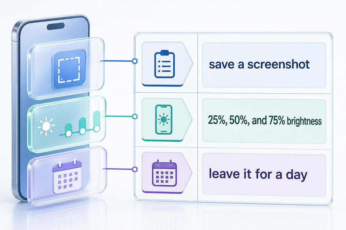
When you find a comfort level with a certain degree of tint, save a screenshot of your Home Screen and note if your icons are light, dark, clear, or tinted. There’s no numeric recipe for the Liquid Glass slider in iOS, so a screenshot provides a useful reference if you experiment later.
For a repeatable visual check, spend about 5 min comparing the screen near 25%, 50%, and 75% brightness, then revisit the choice 1 day later. Those test points are part of an editorial routine; they are not Apple thresholds, and your usual conditions matter more than the numbers.
Test the pattern and leave it for a day before filling every blank. Different apps, low evening brightness, and morning sunlight can show you issues that a 5 second check misses. If only one screen is problematic, use it through a normal morning and evening session before changing the whole theme, because brightness, wallpaper detail, and app density can hide the cause; then adjust that screen’s wallpaper or widget placement first, repeat the check at the brightness you normally use, and avoid treating the system-wide slider as the only available fix. If you need to revisit the system controls later, keep Apple’s display and text settings guide with your notes.
Results don’t need to be identical. System glass, third-party widgets, and custom icons are rendered differently. Aim for a harmonious palette and readable ordering rather than trying to make every surface equal in transparency.
Frequently asked questions
Where is the Liquid Glass setting in iOS 27?
To adjust the effect, go to Settings → Appearance → Liquid Glass and drag right for more tint or left for a clearer effect. If this isn’t available, check Reduce transparency and Increase Contrast under Accessibility, Display & Text Size.
Can I completely disable Liquid Glass?
Changes made to the appearance slider still affect the same levels; the slider is not a complete off switch. If transparency is most annoying, try using Reduce Transparency in Accessibility. That setting changes supported translucent backgrounds and can disable the Liquid Glass appearance slider.
What is the best Liquid Glass slider position?
There’s no universal best position. See how your choices look over wallpaper, in Control Center, and in an app with a busy interface at normal brightness. Choose tinted if some important controls start to disappear behind them; use accessibility settings if you need to preserve visual comfort.
Why did my app icons stay the same?
Liquid Glass and the appearance of your Home Screen are separate. Touch and hold the Home Screen, choose Edit and then Customize to change icon size and light, dark, clear, or tinted appearance. You can save a screenshot of the Home Screen and note whether your icons are light or dark, clear or tinted. The appearance is dependent on the software and layout, while the appearance slider adjusts the effect and is not a complete off switch.
Does Reduce Motion change Liquid Glass transparency?
No. Reduce Motion and Reduce transparency address separate issues. Reduce Motion changes the animations, while the other option alters the transparency of the surfaces.
Can iScreen widgets match the iOS 27 look?
You can adjust spacing and colors to coordinate with your wallpaper and icons, but an identical visual match between a third-party widget and Apple’s system surfaces is not guaranteed. Check out the iScreen widgets. Decide which information you want the most and see how it looks on your wallpaper.
References & sources
- Apple Support: Liquid Glass, display, contrast, transparency, and text settings.
- Apple Support: Home Screen icon and widget appearance controls.
- Apple Support: motion and transition accessibility options.
- Apple Newsroom: iOS 27 availability and the ultraclear-to-tinted control range.
- Engadget and MacRumors: published walkthroughs used to cross-check the public setting path and common “off switch” misconception.
