iPhone Themes: How to Apply Aesthetic Themes to Your Entire Home Screen

iPhone themes are how you give your whole phone a single, coordinated look, matching wallpaper, app icons, widgets, and accent colors instead of the stock grid everyone else has. Here’s the part most guides skip: iOS has no single “apply theme” button. A theme on iPhone is something you assemble, and once you understand the four layers it’s built from, the whole process stop feeling random. This guide walks through what a theme really is, the three real ways to change it (including what’s built into iOS 26), the best theme apps, the icon and keyboard layers, free options, the jailbreak question, and where Apple is heading next.

💡 The short version

An iPhone theme is a coordinated set of four layers — wallpaper, app icons, widgets, and keyboard/accent color. You build it three ways: iOS 26’s built-in icon appearances, free custom icons through the Shortcuts app, or an all-in-one theme app like iScreen.

What Is an iPhone Theme? The 4-Layer Theme Stack
What Is an iPhone Theme? The 4-Layer Theme Stack

An iPhone theme, sometimes searched as iOS themes, is a coordinated visual style applied across your Home Screen and Lock Screen, not a single downloadable file. Android phones, Samsung’s One UI launcher especially, had true “theme engines” that swapped the whole UI at once. iPhone doesn’t. According to Apple’s own Home Screen documentation, the built-in tools only recolor and resize icons; and as Engadget notes in its iOS 26 walkthrough, iOS “still doesn’t allow… third-party icon packs without shortcuts,” so the look you want is built from parts rather than toggled on.

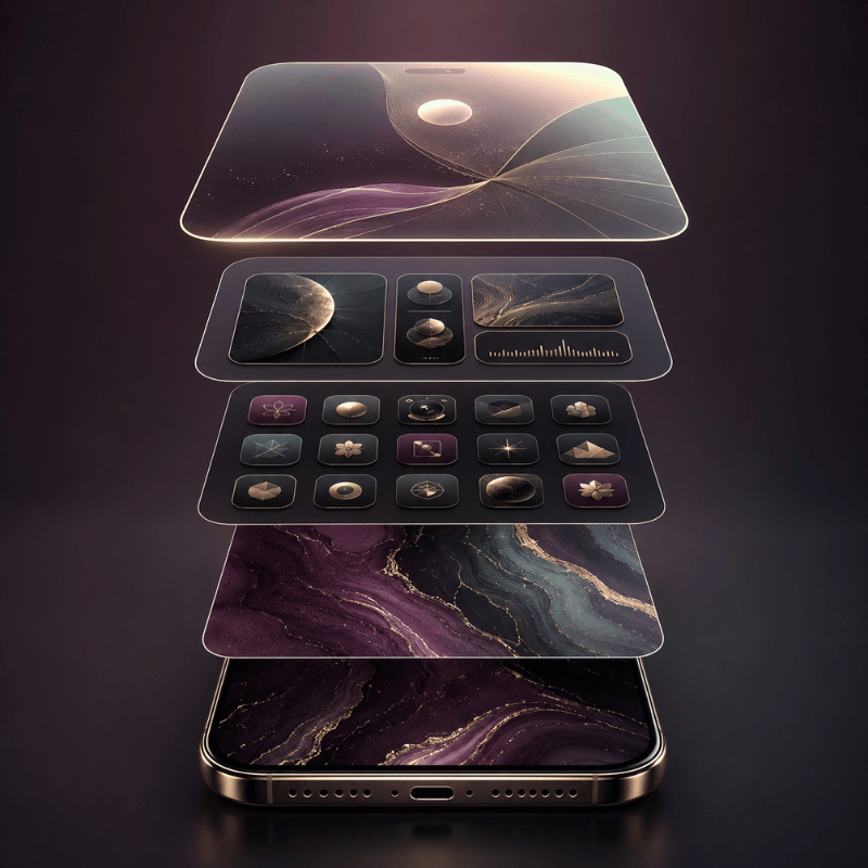
Once you stop hunting for a magic button, theming gets simple. Every good-looking iPhone is the same four layers working together. We call it the 4-Layer Theme Stack, and it’s the order we use when building any setup:

Layer What it sets Effort
1. Wallpaper The base mood and palette everything else borrows from Low
2. App icons The single biggest visual change — tint, dark, clear, or custom Low–Medium
3. Widgets Personality and function — clock, weather, photos, pets Medium
4. Keyboard / accents The finishing layer most people forget — keyboard, Dynamic Island, Lock Screen clock Medium

When a Home Screen looks “off,” it’s almost always one layer fighting the others, a soft pastel wallpaper under loud, default-colored icons, for example. Match the layers to one palette and even a few minutes of work reads as a finished theme. In our own theme kits, we bundle the wallpaper, icon pack, and widgets together for exactly this reason, the layers are designed to share one color story instead of being collected piece by piece.

“Nine out of ten ‘messy’ Home Screens we see are not missing apps or widgets, they are one layer off-palette. Match the wallpaper to the icons first, and the whole screen snaps into place.”

iScreen design team

Bottom line: Stop looking for an “apply theme” button. Build the four layers, wallpaper, icons, widgets, keyboard, around one palette.

How to Change Your iPhone Theme: 3 Methods
How to Change Your iPhone Theme: 3 Methods

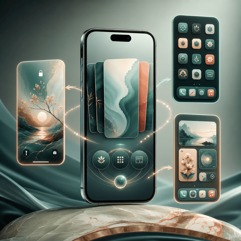
There are exactly three ways to change your iPhone theme: use the built-in icon appearances in iOS 26, make free custom icons with the Shortcuts app, or install a theme app. They differ in effort and how much they actually change, so pick by how far you want to go. We rank them as the 3-Method Theme Setup Ladder:

Method Effort What it changes Best for Cost
iOS 26 icon appearance 2 minutes Tints or darkens every icon at once A fast, clean refresh Free
Shortcuts custom icons 20–60 minutes Replaces individual icons with your own art A specific, hand-built look Free
Theme app 5–15 minutes Applies a matched icon + widget + wallpaper kit A full coordinated theme, fast Free / premium

How do I change my theme on my iPhone?

To change your theme the built-in way, touch and hold an empty part of the Home Screen until the icons jiggle, tap Edit in the top corner, then choose Customize. Say you want a calmer screen for the evening: according to Apple’s guide you can tap Dark, and your icons and widgets shift to a darker appearance in seconds. From Apple’s Home Screen customization menu you can resize icons, switch them to Dark, give them a Clear glass look, or add a color Tint with the sliders. For a hand-built theme, you swap individual icons with the Shortcuts app (next section), and for a one-tap coordinated look you apply a kit from a theme app. If you’re brand new to this, our step-by-step customization guide covers each tap with screenshots.

In short: Most people start with the free iOS 26 appearance menu, then graduate to Shortcuts or a theme app when they want more control.

App Icon Themes: The Biggest Visual Lever
App Icon Themes: The Biggest Visual Lever

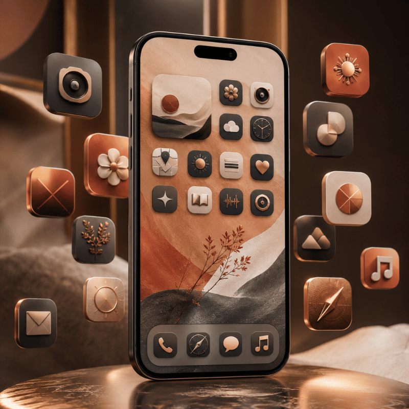
App icons are the layer that changes how a theme read more than any other, which is why “icon themes” and “iPhone themes and icons” are searched so often together. You’ve two honest routes: the system appearance options, or fully custom icons.

System appearances (free, fast). In the iOS 26 Customize menu, the top row offer Default, Dark, Clear, and Tinted, the four iOS icons looks Apple and its developers support. Tinted applies one color scheme across every supported icon and widget; there’s even an eyedropper to pull a color straight from your wallpaper. It’s the quickest way to make a mismatched grid feel intentional.

Custom icons (free, manual). For a specific look, a single pastel set, a retro pack, anime art, you replace icons one by one using the Shortcuts app. Apple’s guides for modifying a shortcut’s icon and adding it to the Home Screen let you point any photo at any app. According to Apple’s Shortcuts documentation, the photo you pick becomes the Home Screen tile, so yes, you can import your own PNG art this way, a lot of people make icon sets in Canva, use AI-generated art, or grab free packs and apply them via the Shortcuts app. The trade-off is time: a full set of custom icons is a real sit-down project, not a two-minute job.

If you want the custom-icon look without the manual labor, an icon pack from a dedicated icon library does the matching for you, handy when you’re pairing icons to a wallpaper and want them to share one tone.

Key takeaway: Use Tinted for a fast system-wide refresh; use Shortcuts custom icons when you need a very specific set and have the patience.

Keyboard Themes: The Most Overlooked Layer
Keyboard Themes: The Most Overlooked Layer

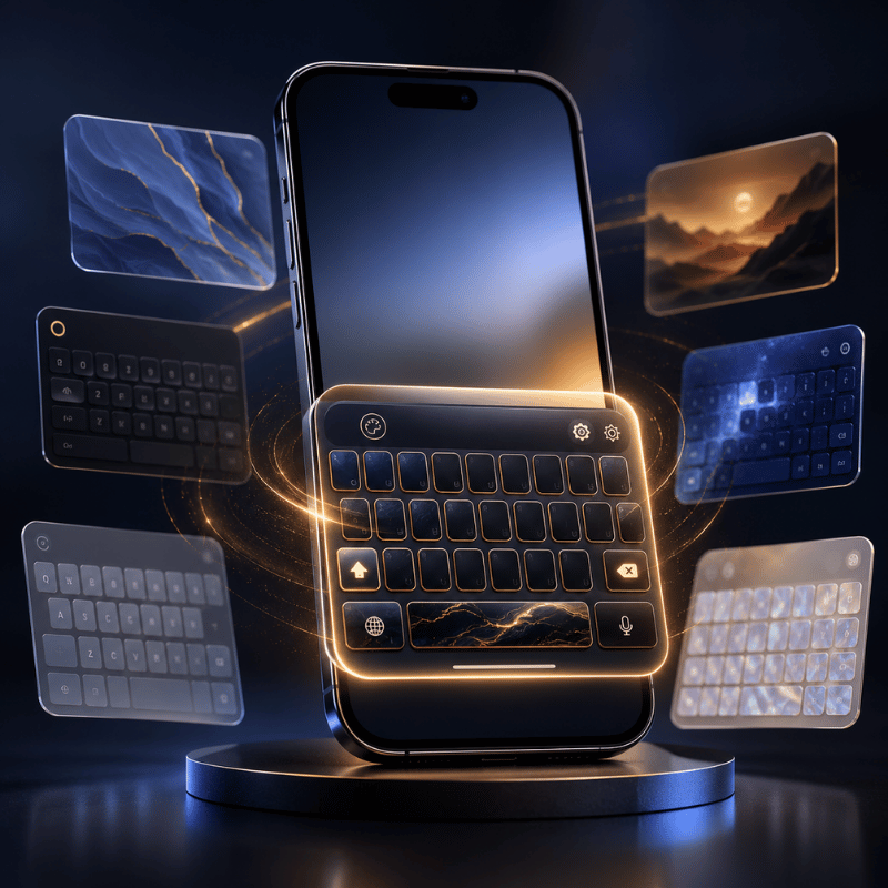
The keyboard is the layer almost every theme guide ignores, even though it’s on screen constantly. Here’s the honest answer: iPhone has no built-in keyboard themes the way Android does. There’s no native gallery of keyboard skins, so a fully “themed” keyboard is the one place iOS genuinely limits you.

What you can do still helps the overall look. Turn on system Dark Mode (Settings → Display & Brightness) and the stock keyboard go dark to match a dark theme. For colors and custom key art, you install a third-party keyboard app from the App Store and switch to it in Settings → General → Keyboard, then set it as your themed keyboard in the same place you manage other keyboards. It’s worth knowing the limits before you download one: third-party keyboards on iPhone can feel slightly slower to load than the stock keyboard, they may ask for “Full Access,” and some apps still bring you back to the default keyboard in secure fields like passwords.

Because the keyboard fights you the most, our advice is to treat it as an accent rather than a centerpiece: a dark keyboard under a dark theme, or a single muted third-party keyboard that matches your palette, looks more cohesive than a loud animated one that clashes with everything else.

Worth knowing: There are no native iPhone keyboard themes, use Dark Mode to match, and add a third-party keyboard only if it fits your palette.

Dark Themes & True-Black Setups
Dark Themes & True-Black Setups

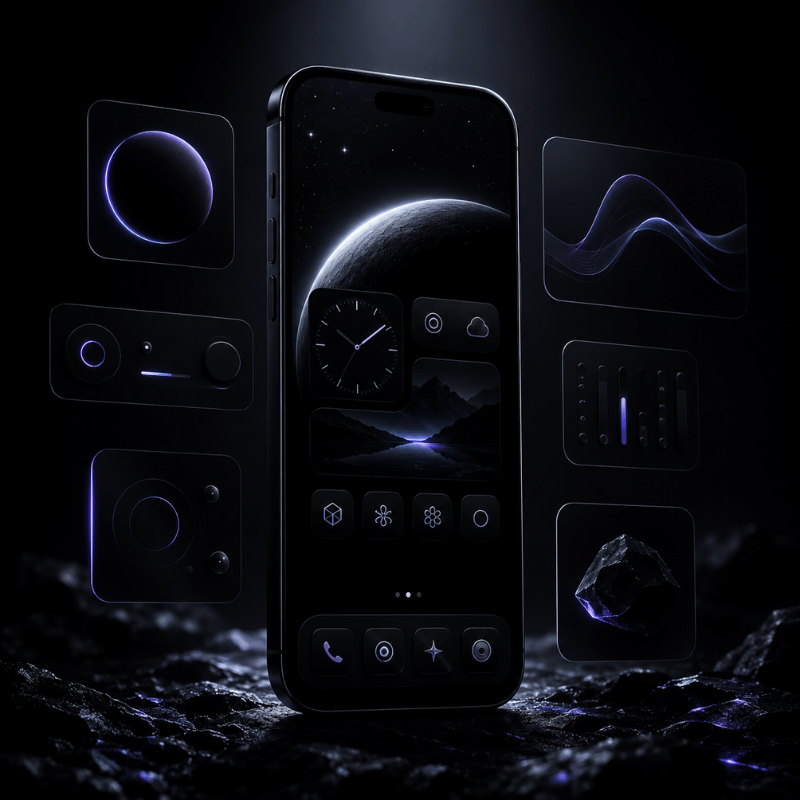
Say you want an all-black look that’s easy on the eyes at night: a dark iPhone theme is one of the most requested look — “dark theme iphone” and “dark background for iphone” together pull tens of thousands of searches a month, and it’s also one of the easiest to get right because every layer has a dark option. Stack them in order:

  • ✔ Turn on system Dark Mode so apps, menus, and the keyboard go dark.
  • ✔ Set a true-black or deep-tone 4K wallpaper that fills the phone screen, black saves a little battery on the OLED screens in modern iPhones.
  • ✔ In the iOS 26 Customize menu, set icons to Dark (or Tinted with a low-saturation cool color).
  • ✔ Keep widgets monochrome, a single accent color reads cleaner than rainbow blocks on black.

The most common dark-theme mistake is mixing one or two brightly colored default icons into an otherwise black grid. Either give those apps the Tinted treatment or move them to a second page so the front screen stays uniform. A minimalist, low-contrast dark layout almost always looks more expensive than a busy one.

Key takeaway: Dark Mode + a black wallpaper + Dark or Tinted icons + monochrome widgets is the reliable recipe for a true-black setup.

Best iPhone Theme Apps in 2026
Best iPhone Theme Apps in 2026

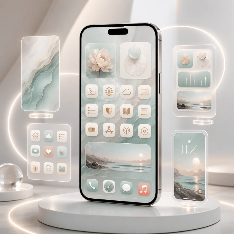
The best iPhone theme app is the one that matches how much you want to do yourself. Some apps only make widgets, some only make icons, and some give you the full kit, wallpaper, icons, and widgets that already share a palette. For a coordinated theme with the least effort, an all-in-one app save you from collecting parts that don’t match.

App type What it does best Pick it when
All-in-one theme kit Matched wallpaper + icons + widgets in one tap You want a finished theme fast
Widget-only app Deeply customizable single widgets You only need a better clock or weather block
Icon-only app Large icon packs to apply via Shortcuts Your wallpaper and widgets are already set

What is the best iPhone theme app?

We build iScreen as an all-in-one option, with a huge variety of themes and wallpapers, more than 10,000 themes, 5,000 app icons, and 500 widgets, including cute widgets, a countdown, and Lock Screen widgets, all designed as matched sets rather than loose pieces, plus Dynamic Island styles for that last accent layer. There are also strong single-purpose apps: widget-focused tools are great if you only want a better clock or weather block, and icon-pack apps pair well with a wallpaper you already love. Before you commit to any paid theme app, try its free tier and check three things: do the icons, widgets, and wallpaper actually match; how many themes are behind the paywall; and does it support the iOS 26 features you want. For widgets specifically, our roundup of the best iPhone widgets goes deeper than we can here.

The upshot: Match the app to your goal, all-in-one for a full theme, widget or icon apps for a single layer, and always test the free tier first.

Free iPhone Themes: What You Actually Get
Free iPhone Themes: What You Actually Get

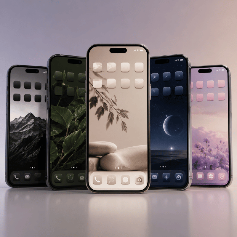
Yes, you can theme an iPhone entirely for free, but it helps to know what “free” really means so you aren’t surprised later. Three things cost nothing: the iOS 26 icon appearance options (Dark, Clear, Tinted), custom icons through the Shortcuts app, and the free tiers of most theme apps, including the free iScreen theme library. That combination alone is enough for a genuinely good-looking setup.

Say you find a “free theme” board on Pinterest and download it, what you actually get is usually a folder of images. Where people get caught out is the difference between a free image pack and a free theme. Many “free iPhone themes” you find on Pinterest or stock sites are just sets of wallpapers and icon images. They look finished in the preview, but you still have to apply each icon yourself through Shortcuts, the labor is the cost. Inside theme apps, the free tier usually unlocks a sample of themes and widgets, with the larger libraries and premium packs behind a subscription. Neither approach is wrong; just budget your time if you go the fully-free, hand-applied route.

Key takeaway: Free theming is real, but a free “theme” is often an image pack you apply manually, time is the hidden price.

Do You Still Need to Jailbreak for Themes?
Do You Still Need to Jailbreak for Themes?

No, you don’t need to jailbreak a modern iPhone to theme it, and for almost everyone you shouldn’t. This question is a leftover from an earlier era. Years ago, tools like WinterBoard and Dreamboard let jailbroken iPhones swap entire system themes, which is where the idea that “real” theming requires a jailbreak came from.

That era is effectively over. Those theming tools were tied to old iOS versions, according to community reports on forums like Reddit, those tools were battery-draining and prone to lag, and current iPhones are difficult to jailbreak at all. More importantly, you no longer need to: between iOS 26’s icon appearances, free Shortcuts custom icons, widget apps, and theme kits, you can get a deeply personalized look, see our no-jailbreak customization walkthroughwith zero risk to your security, your warranty, or your stability. Jailbreaking today trades all of those away for a capability the App Store has largely replaced.

Bottom line: Jailbreak theming is a dead end on modern iPhones, the no-jailbreak toolkit now does the same job safely.

iPhone Theme Ideas & Styles to Try
iPhone Theme Ideas & Styles to Try

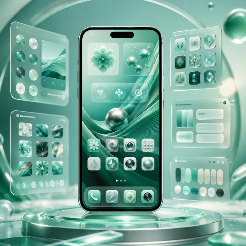
If you’ve the method down and just want direction, here are aesthetic themes and styles that hold up well on iOS, each a stylish way to give your grid a fresh feel, with or without a little animation. Pick one palette, say a warm cream and brown, and let the four layers follow it:

Six theme directions

  1. Minimalist monoone neutral wallpaper, Tinted icons, a single clock widget.
  2. True dark, black wallpaper, Dark icons, monochrome widgets.
  3. Soft pastelmuted wallpaper with low-saturation Tinted icons.
  4. Retro / Y2K, playful custom icon pack plus a chunky photo widget.
  5. Anime / charactera hero wallpaper with a matching icon set.
  6. Cozy / seasonal, warm tones you refresh a few times a year.

If aesthetics are your main interest, we go much deeper into building a look in our guides on the aesthetic iPhone Home Screen and broader Home Screen ideas, both pair naturally with the theme stack here. For matching decorative widgets, our cute aesthetic widgets roundup is a good next stop.

Remember: Choose one palette first; the style names matter less than keeping all four layers in the same color story.

What iOS 26 Changes for iPhone Themes
What iOS 26 Changes for iPhone Themes

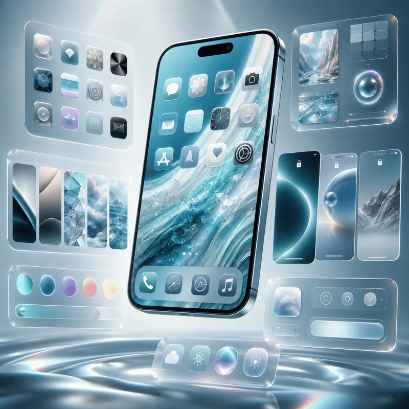
iOS 26 doesn’t have a one-tap theme gallery, but it’s the closest Apple has come to system-wide theming, the real story for anyone deciding whether to lean on built-in tools or apps. So does iOS 26 have themes? Almost: the appearance menu now recolors your whole grid. The driver here’s simple: Apple keeps absorbing the customization people used to need workarounds for with each set of new features, which means the free, built-in layer of your theme stack, across your Home and Lock Screen, gets stronger every release. Some of these options also tie into Apple’s accessibility settings, so a cleaner homescreen can be an easier-to-read one too.

According to Apple’s Newsroom, with its Liquid Glass design, Apple introduced app icons that come in light, dark, clear, and tinted appearances. In practice that gives you a system-wide color wash across icons and widgets, the thing a “theme” mostly means to most people, without any app at all. For users, the takeaway is that the iOS 26 appearance menu now does the heavy lifting on the icon layer, so theme apps are increasingly about the widget, wallpaper, and matched-kit layers rather than basic recoloring.

What iOS 26 still won’t do is just as important when you plan a theme: there’s no per-app icon color, no custom icon packs without Shortcuts, and no freeform icon placement off the grid. So the smart 2026 approach is a hybrid, let iOS 26 handle the quick tint, and reach for Shortcuts or a theme app when you want a specific, coordinated look the built-in tools can’t reach.

Key takeaway: iOS 26 makes the free icon layer stronger; apps now earn their keep on widgets, wallpapers, and matched kits.

Frequently Asked Questions

Can you get free themes for iPhone?

View Answer
Yes. You can theme an iPhone for free using the iOS 26 icon appearance options (Dark, Clear, Tinted), free custom icons made through the Shortcuts app, and the free tiers of most theme apps. The catch is that many “free theme” packs online are really just wallpaper and icon images that you still have to apply one by one, so the real cost is your time rather than money.

Do custom app icons open apps slower?

View Answer
Not anymore, in most cases. This is an outdated worry: early custom icons routed through the Shortcuts app and showed a brief banner first, but Apple changed that in iOS 14.3 so custom icons open the target app directly. A short delay can still appear in edge cases — some users saw one when swiftly swiping pages on early iOS 26 builds — but for everyday tapping, a custom icon now opens its app just like a normal one.

Can you import your own PNG images as app icons?

View Answer
Yes. Using the Shortcuts app, you can choose any photo from your library as a Home Screen icon, which means your own PNG artwork works fine. Many people design icon sets in a tool like Canva or download a free pack, save the images to Photos, and then apply each one through Shortcuts. It is a manual, one-icon-at-a-time process, so set aside time if you are doing a full set.

Do iPhone themes drain battery or slow your phone?

View Answer
Normal theming has little impact, and a true-black wallpaper with Dark icons can even save a small amount of battery on OLED iPhones. Heavy animated widgets are the main thing to watch if battery matters to you.

Will my theme survive an iOS update?

View Answer
Mostly yes. Your wallpaper, custom icons, widgets, and arrangement carry over through a standard iOS update, because they live in your Home Screen settings rather than in a system file that gets replaced. After a big release like iOS 26, you may want to revisit the icon appearance menu, since new options (such as Clear and Tinted) can change how your existing setup looks and give you a chance to refine it. If a theme app added widgets, just reopen the app once after updating so its widgets refresh.

Do you need to jailbreak to theme an iPhone?

View Answer
No. Jailbreaking is no longer needed for theming and is not recommended on modern iPhones. The built-in iOS 26 tools, Shortcuts custom icons, and theme apps cover what old jailbreak themers like WinterBoard once did, without the security and stability risks.

Want a matched theme without building all four layers yourself?

Browse iScreen Theme Kits →

How We Test These Themes

This guide is built from hands-on setup work across the iScreen theme library, 10,000+ themes, 5,000+ icons, and 500+ widgets, plus repeated testing of the iOS 26 icon appearance menu and the Shortcuts custom-icon flow we use to make your phone and iPhone feel like yours on current iPhones. Where we describe an Apple feature, we link Apple’s own documentation so you can confirm the steps on your device.

Artículos recientes

Summer Backgrounds for iPhone: 12 Fresh Wallpaper Ideas

Summer Backgrounds for iPhone: 12 Fresh Wallpaper Ideas

2026/9/26 14:16
Summer backgrounds for iPhone are seasonal wallpapers with vibrant designs that evoke warm feelings and sweet summer memories. Explore this selection of portrait designs. Pair your favorite with a calm Home screen to create a beautiful accent. This collection of summer iPhone backgrounds changes the mood of your screen. To save a design to your device, simply add it to the Photos app. This collection uses original, AI-created designs; iScreen’s app catalog employs a separate download flow. Preview your Home Screen and device widgets before choosing a design. A few choices make the whole setup feel finished: Pick one motif first: water, palms, fruit, flowers or a soft gradient. Keep important details away from the area occupied by your clock. Repeat one accent color across both screens; the pictures can differ. Save the actual portrait file, then adjust its crop on your phone. Beach and Ocean Summer Backgrounds Because you can personalize your wallpapers, consider displaying a scene or carrying its colors onto your Home Screen. Each design represents a distinct artistic style. 1. Quiet horizon and blue skies Open skies give this calm and serene seascape a tranquil basis for the design. Try cool aqua tones with sandy shades of brown for a lovely, easy and beachy color scheme. Leave space in your design to give the lower portion of the composition a calming effect. The screen uses empty space as part of the design for relaxed summer vibes. Leave spaces on your Home Screen rather than adding stickers and quotes. 2. An overhead ocean wave “White surf crossing turquoise water” makes for good scene division. Pick the wave and keep the rest of the elements simple. Preview the small white foam details and move the brightest splash away from small white labels. An ocean wave iPhone wallpaper partners well with dazzling teals. For the same picture on both screens, experiment with the Home Screen’s Blur feature and evaluate the result against the unaltered wave. 3. A striped umbrella on sand A coral-and-cream striped umbrella against the ocean adds a playful resort touch to an already pleasant scene. Placing the subject near the bottom of the image leaves the top of the image empty. You can use a coral or orange widget accent and a sand-colored Home Screen companion. Keep coastal items simple. Tropical Palm Trees and Poolside Wallpaper A warm afternoon can be represented with a few palm fronds or water ripples. For a more abstract summer aesthetic, use water ripples or surf reflections; a palm frond gives the design a clear shape. 4. A palm tree against apricot light For an easy, yet pleasing division of the design, use fronds from one side of a palm tree. Keep the center empty for the clock and use Apricot or Terra Cotta to add warm colors to the adjacent screen, checking contrast between the text and background in your preview. 5. Poolside ripples in aqua Water with sunlight reflection creates an abstract backdrop. Look for larger, smoother reflections, and avoid the busy effect of lots of thin, bright lines. Cool-toned colors of water make for pretty, colorful abstract designs. Keep patterns pretty much the same across both screens if you prefer a matching pair. A plain aqua design remains relaxing when vibrant reflections feel busy behind a folder. 6. Botanical greenery at the edges Softer and more muted tropical designs leave more cream space if you want to incorporate more foliage. For this style, arrange leaves around the border space. Leaf shapes repeat across the design, but when you fill the entire space with many leaves the design quickly becomes more busy. Once again, warm cream fills the void between the leaves. Cute Citrus, Fruit and Floral Wallpaper When doing cute summer wallpapers, use larger shapes to represent flowers and fruits. One large fruit or flower represents a graphic design, and many small fruits or flowers create a repeating pattern. 7. Lemon and citrus on cream Lively shades of lemon give this classic citrus design a pop against the warm, ivory background. In this wallpaper, the lemon can be positioned towards the bottom to draw more attention to it beside a simple widget. For a matching Home Screen wallpaper, cream pairs with the yellow lemon. To achieve this, you can choose the cream color, rather than selecting a bright yellow for each of the icons. For a more vibrant look, choose bright yellow for one widget and select muted colors for the other widgets. 8. Watermelon with a pink background The watermelon wallpaper offers a combination of pink, red and green to echo in a widget. To make a setup more summery, select a complementary color from its existing pink, red and green palette. For a more muted color scheme, choose a dusty pink and dark green to accessorize. If a more playful look is desired, choose the watermelon wallpaper with a matching widget. Another option is to use a flamingo design. Preview larger simpler designs and busier more detailed designs to achieve the kind of variation you want. 9. Daisy and wildflower details Flowers tend to work best when they’re not crowded, like the cottagecore floral phone designs here. A sunflower is more bold than a daisy. Cherry blossom art is bold and beautiful, but yellow flowers can add a nice touch of seasonal beauty as well. Regardless of which you choose, they look best if they’re located below or to the side of the clock; check text-to-background contrast in your preview. Pink Sunsets, Pastels and Minimal Summer Colors An aesthetic summer design requires no motif, but an aesthetic iPhone arrangement can flourish with the aid of color. Various hues of the spectrum can be employed for broad strokes to provide an aesthetic wallpaper that soothes. This is especially useful to provide an aesthetic wallpaper when paired with photos or widgets. 10. Pink sunset over the sea A broad, horizontal wash of pink light above a low horizon gives the pastel scene a sun-kissed finish. Peach can act as a background bridge. Clock color choices should be checked against the lightest clouds as a readability guide. 11. Pastel aqua and lilac Aqua transitioning to lilac provides a comfortable, soft pastel summer palette. Keep the width of the transition broad. This can be utilized to create a pastel summer phone background. If your widgets contain photographs, this design would be particularly suitable to use. 12. A peach aura gradient Peach fading into cream feels warm without depending on a beach or flower. Try a deeper outer edge if a very pale version makes the clock difficult to see. Minimal artwork still needs a readability check: the W3C’s contrast guidance explains why text and icons need enough contrast against the background immediately behind them. One Accent, Two Moods: Match Your Home Screen One Accent, Two Moods is a straightforward way to create a coordinated set. Let a Lock screen with a horizontally calm background set the tone and serve as the star of the set, and then choose a companion that features the same color as the Lock screen. Check the companions against your actual clocks, labels and open folders. Keep in mind that the elements you choose may not always work well with others. Nine summer palette pairings to try Lock Screen motif Shared accent Quieter Home Screen Preview check Quiet horizon Sky blue Warm sand Clock against the sky Ocean wave Turquoise Deep teal White foam behind labels Striped umbrella Coral Soft cream Stripes behind widgets Palm silhouette Apricot Muted terracotta Fronds beside the clock Pool ripples Aqua Plain pale blue Reflections inside folders Leaf border Olive Warm cream Leaves near edge icons Lemon illustration Yellow Light sage Pale labels on yellow Watermelon Dusty pink Muted green Red around app badges Pink sunset Peach Soft plum Clock on bright clouds Beach recipe: To create a calm horizon, find a sand-colored companion, and a blue widget. Citrus recipe: To create a citrus design, look for a lemon and a cream companion, and a green widget. Evening recipe: To create a design for an evening horizon, look for a plum companion, a peach widget, and a picture of a pink, orange, or red sky. Should I use the same wallpaper on both screens? You can use the same wallpaper on both screens if its composition works with your icons. Matching doesn’t require two different pictures. If the scene becomes distracting behind apps, try a separate color, a different photo or Blur through Customize Home Screen. Apple documents those choices in its wallpaper guide. Where to Find Summer Wallpapers to Download If you need a starting point, refer to the twelve examples in this article. Open the image and save its file for your phone screen before closing the app. Keep the picture in the Photos app so you can crop it later. For more choices, browse iScreen’s wallpaper collection. Its summer-tagged green landscape is an example of a catalog item with an app-based download route: the page directs visitors to iScreen to unlock HD. Check the app’s current item details for access terms. That catalog route is separate from saving an illustration displayed here. The creator’s page is a better source to start than a search result page. If you found an image via a Pinterest page, it’s best practice to check the original page to see if there are higher quality or alternate versions of the image. Phone wallpapers, tablet layouts and desktop artwork sometimes use different crops. What works best on a tablet or as computer desktop wallpaper may not work well on a narrow phone screen. Set and Crop Your Summer iPhone Wallpaper Save your chosen summer wallpaper for iPhone to Photos first. You don’t need specialist tech tools: open the saved file through Wallpaper in Settings, position it around your clock, then decide whether to repeat it on both screens. Apple’s current wallpaper instructions use this path: Open Settings, then Wallpaper. Tap Add New Wallpaper, choose Photos, and select the saved picture. Adjust its position in the preview. Keep your main subject visible and check the clock area. Tap Add, then choose Set as Wallpaper Pair or Customize Home Screen. Starting with a high-quality file helps, but resolution doesn’t fix an awkward crop. Apple lists different pixel dimensions for different models: iPhone 15 is 2556 by 1179 pixels, while iPhone 13 is 2532 by 1170 pixels. Those are display specifications, not one required download size for every model. Leaving a little extra space around your subject will give you more options when cropping. If you crop too closely you could end up losing important details about the subject. Make sure you’re happy with your crop before removing other versions of the photo. The menu options may vary between iOS devices. You can find more information about adjusting iPhone wallpaper in our iPhone wallpaper guide. Keep a Summer Look Beyond the Peak Season Your summer wallpaper can be used outside of the holiday season. One way to update the palette would be to choose a deeper or lighter tone of the existing colors. For example, holiday colors like yellow could be updated to a quieter cream companion. This could be done using the existing colors in the image. Playing around with different companion colors can be a fun way to adjust the mood of the image. Another option is to move from a motif to its swatch. A lemon can be a yellow-sage combo. A seaside scene can become a blue-to-white gradient. If the rest of the setup follows along, explore iScreen themes or use a few cute aesthetic widgets. Start with an element and let it serve the rest of the design. FAQs: Summer Background Questions Where can I find free summer backgrounds? For free summer iPhone designs, start with a creator’s clearly marked downloads or an app’s free collection. Check the individual item’s access terms before saving the original file. Open the original file rather than saving a small search thumbnail. Check whether that particular item downloads free or requires an account or subscription. Pictures shown in a gallery aren’t automatically free downloads, and an HD label doesn’t tell you its price or access terms. Save any instructions supplied with the file, especially if you plan to use it somewhere beyond your own phone. If the download button takes you into an app, inspect the individual item’s terms there before choosing it. Where can I get good iPhone backgrounds? Choose a source that lets you inspect the full picture before saving it. Look for a sharp portrait composition with enough room around the subject to adjust the crop. Look for a sharp portrait file, room around the subject and a calm area where the clock will sit. Quality depends on the crop as well as resolution. Even a beautiful wide landscape can lose its main subject when it fills a narrow phone display, even if the original is detailed. Where can I find minimalist summer wallpapers? Look for simple ocean gradients, single palm silhouettes, pale citrus illustrations or uncluttered sunsets in a wallpaper collection. Search by mood and color, then preview the result with your icons. Try a creator’s collection or a wallpaper app, and search by both mood and palette, such as soft blue beach or peach summer gradient. Preview the result with your actual icons; minimalist artwork can still clash with a crowded layout or make pale labels difficult to read. A plain companion color is another option when you like the original art but want less detail behind apps. What are the best summer wallpaper colors? Aqua, sky blue, sand, coral and lemon yellow all suggest summer. Choose a shade you enjoy and check the clock against its local background, especially over bright clouds or reflections. Try a favorite shade, then check the clock and icons. Palette names alone don’t guarantee readability. What size should a summer iPhone wallpaper be? Use a sharp portrait image and check it in your device’s wallpaper preview. Display dimensions vary across models, and a high-resolution label alone does not guarantee that the subject will fit. There’s no universal exact size. Check actual dimensions, even when a file is labeled 4K. References & Sources Apple Support: Change your iPhone wallpaper offers details regarding your setup and wallpaper pairing. Apple iPhone User Guide: Change wallpaper covers Home Screen settings and options for photo and Blur. Apple: iPhone 15 technical specifications and iPhone 13 technical specifications model-specific display resolutions. W3C Web Accessibility Initiative: Colors with Good Contrast provides information about the contrast between text, icons, and other controls.
2026/9/26 14:16
iScreen Reaches No. 1 in Graphics & Design Across 94 Markets Following iOS 27 Update

iScreen Reaches No. 1 in Graphics & Design Across 94 Markets Following iOS 27 Update

2026/9/20 12:00
iScreen has now reached No. 1 in Graphics & Design across 94 countries and regions, highlighting the growing global interest in mobile personalization tools. iScreen Reaches No. 1 in Graphics & Design Across 94 Markets The latest release introduces a new generation of Home Screen customization experiences designed around iOS 27, including extra-large widgets, iOS 27-inspired themes, layouts optimized for new screen proportions, and AI-assisted design tools. Together, these updates expand the ways users can personalize their devices while making Home Screen design more flexible, expressive, and easier to manage. A New Generation of Extra-Large Widgets iScreen creative features for iOS 27, including themed Home Screen layouts, widgets, icons, and customization tools. One of the biggest changes in the latest update is support for extra-large widgets built specifically for the larger widget canvas available in iOS 27. Rather than simply enlarging existing widgets, iScreen has created layouts designed to make better use of the additional space. The new collection includes: Photo widgets Album widgets Music widgets Calendar widgets Interactive Refrigerator widgets Quick Launch widgets Users can customize content, layouts, and visual styles, allowing each widget to function as both a practical tool and a visual part of the Home Screen. The larger format also creates more room for information, interaction, and visual storytelling. A photo widget, for example, can display more content at once, while calendar and quick-launch widgets can offer a clearer and more accessible layout. For users who enjoy building highly personalized setups, the expanded widget size provides more freedom to experiment with different combinations of functionality and design. iScreen introduces extra-large widgets, iPhone Duo-optimized themes, and AI-assisted Home Screen design for iOS 27. iOS 27-Inspired Themes for More Cohesive Home Screens Alongside the new widget formats, iScreen has introduced a collection of iOS 27-inspired themes designed to create a more unified Home Screen experience. Each theme combines coordinated wallpapers, transparent-style widgets, icons, and other visual elements into a complete setup. Instead of selecting individual elements one by one, users can apply a more consistent visual direction across their device. This helps simplify the customization process while still allowing users to adjust individual details based on their preferences. The new themes are designed to reflect the visual direction of iOS 27 while giving users additional creative control over how their Home Screen looks and feels. iOS 27-Inspired Themes Optimized Theme Support for iPhone Duo iScreen has also expanded its layout work to support iPhone Duo, with selected themes optimized for the device’s screen proportions and display dimensions. Wallpapers, widgets, and icons have been adjusted to better fit the new format, helping maintain a balanced and cohesive visual experience across the screen. This type of adaptation is becoming increasingly important as device formats continue to evolve. A layout that works well on one screen size may not translate perfectly to another, especially when widgets, wallpapers, and icon spacing are involved. By optimizing theme resources for different screen proportions, iScreen aims to make customization more consistent across a wider range of device formats. AI-Assisted Home Screen Design The update also includes the continued testing of AI Home Screen Designer, a feature currently available to a limited group of users. The tool generates coordinated design suggestions based on user preferences such as style, color, visual elements, and overall aesthetic direction. It then combines wallpapers, widgets, and icons into a unified Home Screen setup. The goal is to reduce the time required to search for and manually match individual customization elements. Instead of starting from a blank screen, users can begin with an AI-generated direction and continue adjusting the layout to match their own preferences. “The latest iOS update has opened up new possibilities for mobile personalization,” said the iScreen team. “We want to turn those capabilities into practical and creative experiences that make Home Screen design easier and more expressive.” iScreen Reaches No. 1 Across 94 Markets The latest iOS 27 update arrives alongside continued international growth for iScreen. iScreen has now reached No. 1 in the Graphics & Design category across 94 countries and regions, highlighting the growing global interest in mobile personalization tools. With more than 100 million users worldwide, iScreen continues to expand its collection of widgets, wallpapers, themes, and Home Screen customization experiences for users across different markets and device types. The app has also previously been featured by Apple Editorial in 128 countries for five consecutive days, further increasing its visibility among users looking for new ways to personalize their devices. Explore the Latest iOS 27 Features in iScreen The latest update brings together several of iScreen’s newest customization experiences, from extra-large widgets and iOS 27-inspired themes to iPhone Duo-optimized layouts and AI-assisted Home Screen design. Users who want to try the latest features can download iScreen and search “S27” in the app to enter the dedicated iOS 27 collection. There, users can explore the newest widgets, themes, layouts, and customization tools in one place. Download iScreen for iPhone Get iScreen for Android About iScreen iScreen is a mobile customization app offering widgets, wallpapers, themes, app icons, and Home Screen customization tools for iOS and Android devices. With more than 100 million users worldwide, iScreen has reached No. 1 in Graphics & Design across 94 countries and regions and has been featured by Apple Editorial in 128 countries for five consecutive days.
2026/9/20 12:00
How to Customize Liquid Glass in iOS 27

How to Customize Liquid Glass in iOS 27

2026/9/19 15:42
Updated September 16, 2026 · Apple’s current iOS 27 controls checked iOS 27 Liquid Glass is no longer a one-look interface. You can move the system effect from clearer to more tinted, then adjust your Home Screen icons and widgets separately. The easiest way to do this is to go to Settings → Appearance → Liquid Glass and, for a more tinted appearance, slide to the right. For a more clear effect, slide the slider to the left; remember that the slider is only the first layer. This slider is the first layer, and it is only one part of the setup. A striking setting over one wallpaper can make it harder to recognize controls over another. This guide outlines the three layers, system glass, Home Screen appearance, and accessibility, without suggesting one slider position is best for everyone. Liquid Glass is a visual layer: tune it in context, then protect readability with accessibility settings. The 30-second answer Open Settings → Appearance → Liquid Glass. Move right for more tint and left for a clearer surface. Test control Center, a busy app, and your Home Screen after making the change so you can decide if you want to keep it. Version scope and test card: This guide covers the iOS 27 Liquid Glass effect and its new slider. If you searched for “customize liquid glass iPhone,” “liquid glass transparency iPhone,” or “iOS 27 appearance settings,” the setting path and screen checks below answer that intent. It is not an iOS 26 or iOS 26.1 guide; iPadOS 27 may use related Liquid Glass design language, but this iPhone Liquid Glass interface and Settings app path are the scope here. Note the 2 accessibility settings, the 1 slider, and the 3 layers separately. Mode and opacity are practical descriptions here, not Apple calibration values. What changed with Liquid Glass in iOS 27? Apple introduced a continuous Liquid Glass appearance control in iOS 27. Rather than selecting between two appearances, you can change the appearance along a spectrum. Apple calls the spectrum from completely ultraclear to completely tinted. The control adjusts the translucency of system surfaces. It doesn’t alter your wallpaper, icons, or widgets. The adjustment arrived with the public iOS 27 release on September 14, 2026, according to Apple’s software availability announcement. If you saw beta screenshots or older instructions with only Clear and Tinted choices, the final release gives you more room between those ends. These redesigns of the update are unrelated to AI or Siri. The user controls alter looks and accessibility features. They don’t change how services respond. Think of the slider as a material control, not an “off” switch. Adjusting tinted adds color and visual weight to glass surface elements. Moving in the direction of becoming clear allows more of the content behind them to become visible. Liquid Glass is still part of the interface at both ends. Customize iOS 27 Liquid Glass in three steps 1. Open the Liquid Glass appearance control Open Settings, tap Appearance, and choose liquid glass. Apple documents this path in its iPhone display and text settings guide. When controls are unavailable, please don’t assume the update has malfunctioned. Two accessibility settings can cause this. Go to Settings → Accessibility → Display & Text Size and check whether Reduce Transparency or Increase Contrast is on. Apple indicates both should be off before you change the appearance of Liquid Glass. Only turn them off if you’re comfortable giving up their readability benefits. 2. Move from clear toward tinted In order to achieve more tint, drag the slider to the right. To get a clearer effect, drag the slider to the left; drag it right for more tint. Keep in mind that a small change in Settings may affect what you see on real screens, so leave Settings and inspect real screens. There’s no recommended percentage that Apple has suggested, nor is there a “best” position that can be achieved. For wallpaper with bright highlights, more tint can help controls feel separated from the background. A dark wallpaper with less tint may give a clearer look without making labels disappear. These aren’t fail-proof formulas; use the slider as a material control rather than an off switch. It will still depend on the wallpaper, content of the application, brightness, and your vision. 3. Check the result where you actually use it When evaluating the setting, don’t rely solely on the Appearance preview. Open Control Center, Safari or another content-heavy app, and your Home Screen. Look for text that blends into the surface, icons that lose their edges, and controls that become difficult to identify. It’s also important to do the test at your normal brightness and not at the maximum brightness level. When you evaluate the Liquid Glass update, compare the transparency slider over Control Center, a content-heavy app, a folder, and your customizable Home Screen at the brightness you normally use; the same position can look calm over a dark wallpaper and crowded over a bright illustration, so the screen context matters more than another person’s screenshot. When a surface looks good but reading it takes effort, move the slider slightly towards tinted and test again. If the interface feels heavy or colored, move towards the clear side. This is more reliable than copying a slider position from someone’s screenshot. Use the Clear–Tint–Access Ladder The Clear–Tint–Access Ladder is our editorial way to make the options easier to compare. The Clear-tint-Access Ladder is our way of simplifying the options, and it does not imply a apple feature, a scientific calibration, or that anyone would be able to read a specific level. For the platform-level controls behind this editorial ladder, see Apple’s iPhone display and text settings guide. A practical order for tuning Liquid Glass Rung What to change What to inspect Clear Start left of center for a lighter, more transparent material. Busy wallpaper areas, small labels, Control Center buttons. Tint Move right until controls separate comfortably from what sits behind them. Whether tint helps recognition without making the interface feel muddy. Access Use Reduce Transparency, Increase Contrast, text size, or bold text when appearance tuning is not enough. Reading comfort and control recognition during normal use. First, choose your preferred visual direction. After that, check it in context. If visual styling conflicts with comfort, accessibility settings take priority over preserving the glass effect. If you turn on Reduce transparency or Increase Contrast, then the slider of liquid glass will be unavailable. Match Liquid Glass with icons, widgets, and wallpaper Apple has dedicated controls for app icons and widgets. A third-party widget developer controls how that widget is drawn, while iOS controls the system glass around it, which is why a coordinated palette can look consistent without producing an identical material effect; check information hierarchy, text contrast, and spacing on your own wallpaper before deciding that the visual match is comfortable. To open the editor, touch and hold an empty area of the Home Screen, tap Edit, then tap Customize. Depending on the iOS 27 settings, users can select preferred icon sizes, compare light, dark, clear, and tinted styles. Apple’s Home Screen customization guide separates these options. Keep the roles separate: Liquid Glass slider: changes supported system glass surfaces. Home Screen Customize controls: change the appearance and size of icons and widgets. Wallpaper editor: alters the image and cropping, and can add blur and pair screens. Align the wallpaper and liquid glass, and then tune the icons and widgets. This avoids wasting time optimizing a translucent interface for a background you later replace. Three combinations worth trying Clear glass + restrained wallpaper. You should start with a low-detail or softly graduated background. Use light or clear icons and simple widget surfaces. Go to the iScreen wallpaper library if your photo has details on faces or high contrast lines under controls. More tint + colorful wallpaper. A stronger tint can help separate system controls from wallpaper with bright, defined shapes. Avoid matching every single widget, icon, and glass surface to the same saturated color. It’s important to include a neutral element to balance the colorful design. Dark appearance + focused information. Use dark icons and place only 1 or 2 widgets. For a very organized, step-by-step layout, check the iPhone themes guide to see how wallpaper, widgets, and icons work as separate pieces. It shows how wallpaper, widgets, and icons can be arranged separately. The following steps will help you format the Home Screen in a consistent way, one part at a time. Read our guide for customizing iphone app icons and another for ios 27 wallpaper. You can use the latter to change and crop the background, while changing all three layers at once makes it harder to see which choice caused the problem. It’s easier to look for the error if you don’t do all of these changes together; a clearer surface is not automatically harder to read, and more tint is not automatically accessible. Choose a look, then verify readability on your screen A clear surface doesn’t automatically mean it’s harder to read. More tint doesn’t automatically mean it’s more accessible. The level of contrast varies from screen to screen. The same setting may look comfortable over a dark photo and crowded over a bright illustration. Use this quick check: Set your normal brightness and clear any temporary test changes. Open Control Center controls over a bright background, then a darker one. Read small labels without having to lean in or pause to decode. Check the primary buttons in one app you use daily. Repeat after changing the slider by a small amount. A 9-point context check (editorial test, not an Apple calibration) Test type Quick setup Decision Bright wallpaper Inspect for 30 sec at about 50% brightness. Add tint if labels merge with highlights. Dark wallpaper Inspect for 30 sec at about 25% brightness. Keep clear only if controls retain distinct edges. Control Center Check 2 backgrounds for 1 min each. Make primary controls recognizable at a glance. Text-heavy app Read for 2 min at normal brightness. Change text settings if reading effort rises. Home Screen Scan 2 pages for 1 min. Adjust icons separately from system glass. Lock Screen Check for 30 sec at your normal brightness. Reposition the wallpaper if it crowds controls. Motion Open and close apps for 2 min. Use Reduce Motion if movement, not tint, causes discomfort. Outdoor check Use the phone for 1 min in safe daylight. Do not preserve a subtle effect that slows recognition. Daily-use check Keep the setup for 24 hours or 1 day. Retain it only if it stays comfortable across contexts. If clarity is inconsistent across apps, accessibility controls may be the better solution. In Settings → Accessibility → Display & Text Size, Reduce Transparency replaces some translucent backgrounds with more opaque backgrounds, and Increase Contrast strengthens the distinction between foreground and background. Text in a larger size and Bold Text manage a different problem and can be used without treating tint as the only variable. Motion is separate again. In Settings → Accessibility → Motion → Reduce Motion, certain screen movements are limited and some transitions are changed. Apple explains these options in its onscreen motion guide. Reduce Motion doesn’t serve as another position on the clear-to-tinted slider. Fix common Liquid Glass customization problems Problem type Likely explanation What to try Liquid Glass control is missing or disabled Reduce Transparency or Increase Contrast is enabled, or the device is not on the current iOS 27 release. Check Display & Text Size and Software Update. Keep accessibility settings on if you rely on them. Slider does not turn the effect off It adjusts the Liquid Glass range rather than removing the material. Use Reduce Transparency if the translucent effect itself is the problem. Home Screen icons did not change Icons use separate Home Screen customization controls. Long-press the Home Screen, then open Edit → Customize. Controls look washed out over one wallpaper The wallpaper and glass surface lack separation in that area. Add a little tint, adjust the wallpaper crop, or choose a quieter Home Screen background. Interface movement is uncomfortable The issue concerns animation, not only transparency. Review Accessibility → Motion → Reduce Motion. Text feels too small Tint does not change text size. Increase Text Size or turn on Bold Text. Only one app looks unclear Its own content and surfaces create a local contrast problem. Test another app before changing the entire theme. Custom widget does not match system glass Third-party widgets and Apple surfaces use different rendering. Match palette and spacing instead of expecting identical material. Restarting the phone shouldn’t be the first response to a design preference. Confirm the setting path and the accessibility state first. If an option is genuinely absent after an iOS update, check Settings → General → Software Update and compare the installed version with Apple’s current release information. For the maintained update path, use Apple’s official iPhone software update guide. Apple’s display and text settings guide is the reference point for the setting path and accessibility checks above. Build a setup you can keep When you find a comfort level with a certain degree of tint, save a screenshot of your Home Screen and note if your icons are light, dark, clear, or tinted. There’s no numeric recipe for the Liquid Glass slider in iOS, so a screenshot provides a useful reference if you experiment later. For a repeatable visual check, spend about 5 min comparing the screen near 25%, 50%, and 75% brightness, then revisit the choice 1 day later. Those test points are part of an editorial routine; they are not Apple thresholds, and your usual conditions matter more than the numbers. Test the pattern and leave it for a day before filling every blank. Different apps, low evening brightness, and morning sunlight can show you issues that a 5 second check misses. If only one screen is problematic, use it through a normal morning and evening session before changing the whole theme, because brightness, wallpaper detail, and app density can hide the cause; then adjust that screen’s wallpaper or widget placement first, repeat the check at the brightness you normally use, and avoid treating the system-wide slider as the only available fix. If you need to revisit the system controls later, keep Apple’s display and text settings guide with your notes. Results don’t need to be identical. System glass, third-party widgets, and custom icons are rendered differently. Aim for a harmonious palette and readable ordering rather than trying to make every surface equal in transparency. Frequently asked questions Where is the Liquid Glass setting in iOS 27? To adjust the effect, go to Settings → Appearance → Liquid Glass and drag right for more tint or left for a clearer effect. If this isn’t available, check Reduce transparency and Increase Contrast under Accessibility, Display & Text Size. Can I completely disable Liquid Glass? Changes made to the appearance slider still affect the same levels; the slider is not a complete off switch. If transparency is most annoying, try using Reduce Transparency in Accessibility. That setting changes supported translucent backgrounds and can disable the Liquid Glass appearance slider. What is the best Liquid Glass slider position? There’s no universal best position. See how your choices look over wallpaper, in Control Center, and in an app with a busy interface at normal brightness. Choose tinted if some important controls start to disappear behind them; use accessibility settings if you need to preserve visual comfort. Why did my app icons stay the same? Liquid Glass and the appearance of your Home Screen are separate. Touch and hold the Home Screen, choose Edit and then Customize to change icon size and light, dark, clear, or tinted appearance. You can save a screenshot of the Home Screen and note whether your icons are light or dark, clear or tinted. The appearance is dependent on the software and layout, while the appearance slider adjusts the effect and is not a complete off switch. Does Reduce Motion change Liquid Glass transparency? No. Reduce Motion and Reduce transparency address separate issues. Reduce Motion changes the animations, while the other option alters the transparency of the surfaces. Can iScreen widgets match the iOS 27 look? You can adjust spacing and colors to coordinate with your wallpaper and icons, but an identical visual match between a third-party widget and Apple’s system surfaces is not guaranteed. Check out the iScreen widgets. Decide which information you want the most and see how it looks on your wallpaper. References & sources Apple Support: Liquid Glass, display, contrast, transparency, and text settings. Apple Support: Home Screen icon and widget appearance controls. Apple Support: motion and transition accessibility options. Apple Newsroom: iOS 27 availability and the ultraclear-to-tinted control range. Engadget and MacRumors: published walkthroughs used to cross-check the public setting path and common “off switch” misconception.
2026/9/19 15:42
Volver arriba