.png)
iPhone Themes: How to Apply Aesthetic Themes to Your Entire Home Screen
iPhone themes are how you give your whole phone a single, coordinated look, matching wallpaper, app icons, widgets, and accent colors instead of the stock grid everyone else has. Here’s the part most guides skip: iOS has no single “apply theme” button. A theme on iPhone is something you assemble, and once you understand the four layers it’s built from, the whole process stop feeling random. This guide walks through what a theme really is, the three real ways to change it (including what’s built into iOS 26), the best theme apps, the icon and keyboard layers, free options, the jailbreak question, and where Apple is heading next.
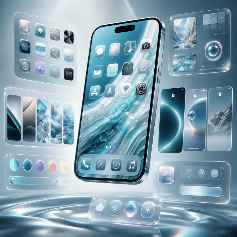
An iPhone theme is a coordinated set of four layers — wallpaper, app icons, widgets, and keyboard/accent color. You build it three ways: iOS 26’s built-in icon appearances, free custom icons through the Shortcuts app, or an all-in-one theme app like iScreen.
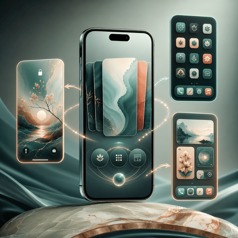
What Is an iPhone Theme? The 4-Layer Theme Stack
An iPhone theme, sometimes searched as iOS themes, is a coordinated visual style applied across your Home Screen and Lock Screen, not a single downloadable file. Android phones, Samsung’s One UI launcher especially, had true “theme engines” that swapped the whole UI at once. iPhone doesn’t. According to Apple’s own Home Screen documentation, the built-in tools only recolor and resize icons; and as Engadget notes in its iOS 26 walkthrough, iOS “still doesn’t allow… third-party icon packs without shortcuts,” so the look you want is built from parts rather than toggled on.
Once you stop hunting for a magic button, theming gets simple. Every good-looking iPhone is the same four layers working together. We call it the 4-Layer Theme Stack, and it’s the order we use when building any setup:
| Layer | What it sets | Effort |
|---|---|---|
| 1. Wallpaper | The base mood and palette everything else borrows from | Low |
| 2. App icons | The single biggest visual change — tint, dark, clear, or custom | Low–Medium |
| 3. Widgets | Personality and function — clock, weather, photos, pets | Medium |
| 4. Keyboard / accents | The finishing layer most people forget — keyboard, Dynamic Island, Lock Screen clock | Medium |
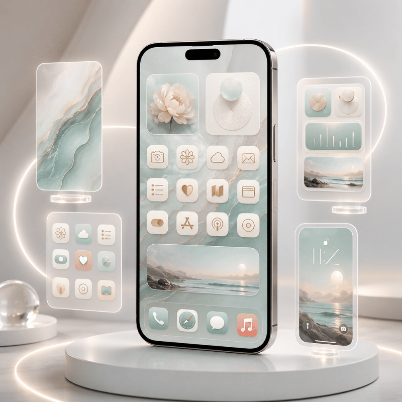
When a Home Screen looks “off,” it’s almost always one layer fighting the others, a soft pastel wallpaper under loud, default-colored icons, for example. Match the layers to one palette and even a few minutes of work reads as a finished theme. In our own theme kits, we bundle the wallpaper, icon pack, and widgets together for exactly this reason, the layers are designed to share one color story instead of being collected piece by piece.
“Nine out of ten ‘messy’ Home Screens we see are not missing apps or widgets, they are one layer off-palette. Match the wallpaper to the icons first, and the whole screen snaps into place.”
iScreen design team
Bottom line: Stop looking for an “apply theme” button. Build the four layers, wallpaper, icons, widgets, keyboard, around one palette.
How to Change Your iPhone Theme: 3 Methods
There are exactly three ways to change your iPhone theme: use the built-in icon appearances in iOS 26, make free custom icons with the Shortcuts app, or install a theme app. They differ in effort and how much they actually change, so pick by how far you want to go. We rank them as the 3-Method Theme Setup Ladder:
| Method | Effort | What it changes | Best for | Cost |
|---|---|---|---|---|
| iOS 26 icon appearance | 2 minutes | Tints or darkens every icon at once | A fast, clean refresh | Free |
| Shortcuts custom icons | 20–60 minutes | Replaces individual icons with your own art | A specific, hand-built look | Free |
| Theme app | 5–15 minutes | Applies a matched icon + widget + wallpaper kit | A full coordinated theme, fast | Free / premium |
How do I change my theme on my iPhone?
To change your theme the built-in way, touch and hold an empty part of the Home Screen until the icons jiggle, tap Edit in the top corner, then choose Customize. Say you want a calmer screen for the evening: according to Apple’s guide you can tap Dark, and your icons and widgets shift to a darker appearance in seconds. From Apple’s Home Screen customization menu you can resize icons, switch them to Dark, give them a Clear glass look, or add a color Tint with the sliders. For a hand-built theme, you swap individual icons with the Shortcuts app (next section), and for a one-tap coordinated look you apply a kit from a theme app. If you’re brand new to this, our step-by-step customization guide covers each tap with screenshots.
In short: Most people start with the free iOS 26 appearance menu, then graduate to Shortcuts or a theme app when they want more control.
App Icon Themes: The Biggest Visual Lever
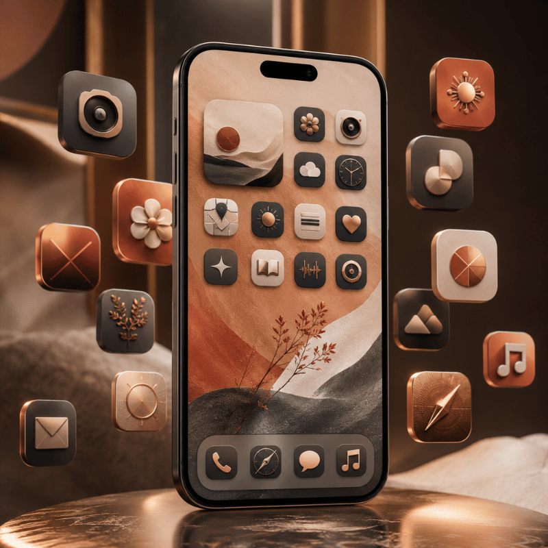
App icons are the layer that changes how a theme read more than any other, which is why “icon themes” and “iPhone themes and icons” are searched so often together. You’ve two honest routes: the system appearance options, or fully custom icons.
System appearances (free, fast). In the iOS 26 Customize menu, the top row offer Default, Dark, Clear, and Tinted, the four iOS icons looks Apple and its developers support. Tinted applies one color scheme across every supported icon and widget; there’s even an eyedropper to pull a color straight from your wallpaper. It’s the quickest way to make a mismatched grid feel intentional.
Custom icons (free, manual). For a specific look, a single pastel set, a retro pack, anime art, you replace icons one by one using the Shortcuts app. Apple’s guides for modifying a shortcut’s icon and adding it to the Home Screen let you point any photo at any app. According to Apple’s Shortcuts documentation, the photo you pick becomes the Home Screen tile, so yes, you can import your own PNG art this way, a lot of people make icon sets in Canva, use AI-generated art, or grab free packs and apply them via the Shortcuts app. The trade-off is time: a full set of custom icons is a real sit-down project, not a two-minute job.
If you want the custom-icon look without the manual labor, an icon pack from a dedicated icon library does the matching for you, handy when you’re pairing icons to a wallpaper and want them to share one tone.
Key takeaway: Use Tinted for a fast system-wide refresh; use Shortcuts custom icons when you need a very specific set and have the patience.
Keyboard Themes: The Most Overlooked Layer
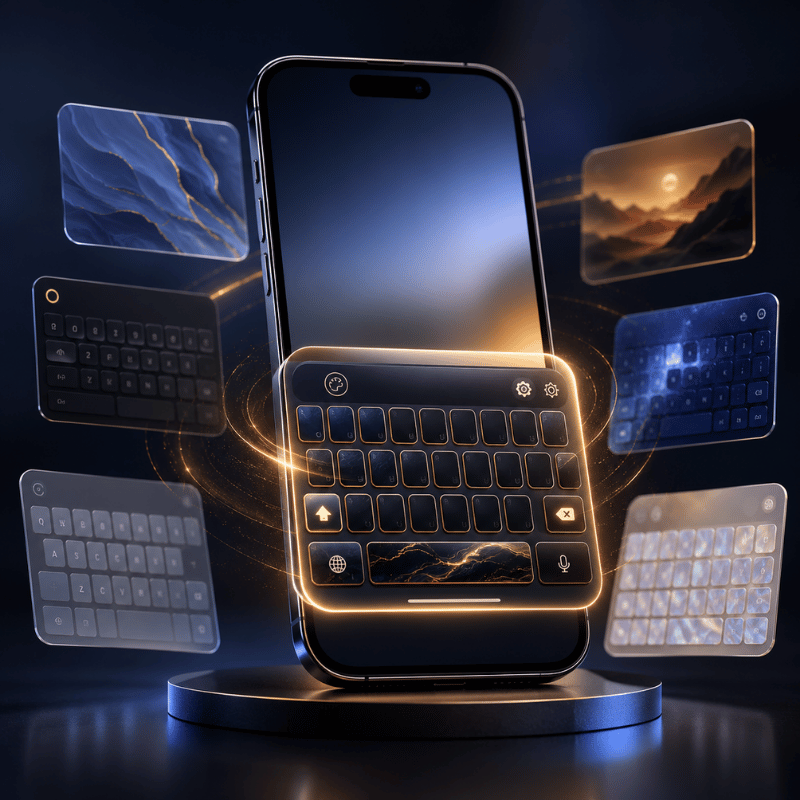
The keyboard is the layer almost every theme guide ignores, even though it’s on screen constantly. Here’s the honest answer: iPhone has no built-in keyboard themes the way Android does. There’s no native gallery of keyboard skins, so a fully “themed” keyboard is the one place iOS genuinely limits you.
What you can do still helps the overall look. Turn on system Dark Mode (Settings → Display & Brightness) and the stock keyboard go dark to match a dark theme. For colors and custom key art, you install a third-party keyboard app from the App Store and switch to it in Settings → General → Keyboard, then set it as your themed keyboard in the same place you manage other keyboards. It’s worth knowing the limits before you download one: third-party keyboards on iPhone can feel slightly slower to load than the stock keyboard, they may ask for “Full Access,” and some apps still bring you back to the default keyboard in secure fields like passwords.
Because the keyboard fights you the most, our advice is to treat it as an accent rather than a centerpiece: a dark keyboard under a dark theme, or a single muted third-party keyboard that matches your palette, looks more cohesive than a loud animated one that clashes with everything else.
Worth knowing: There are no native iPhone keyboard themes, use Dark Mode to match, and add a third-party keyboard only if it fits your palette.
Dark Themes & True-Black Setups
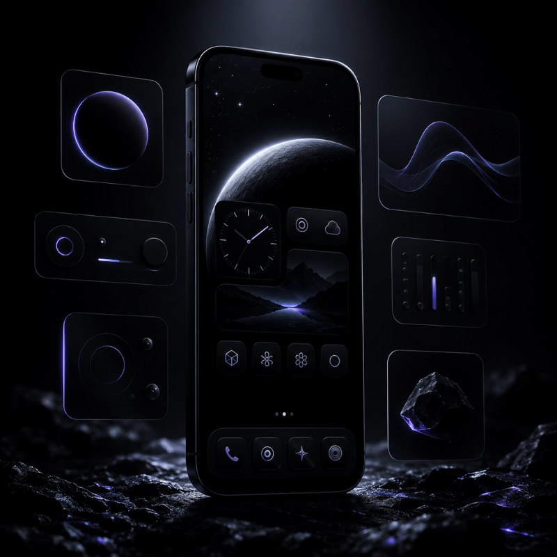
Say you want an all-black look that’s easy on the eyes at night: a dark iPhone theme is one of the most requested look — “dark theme iphone” and “dark background for iphone” together pull tens of thousands of searches a month, and it’s also one of the easiest to get right because every layer has a dark option. Stack them in order:
- ✔ Turn on system Dark Mode so apps, menus, and the keyboard go dark.
- ✔ Set a true-black or deep-tone 4K wallpaper that fills the phone screen, black saves a little battery on the OLED screens in modern iPhones.
- ✔ In the iOS 26 Customize menu, set icons to Dark (or Tinted with a low-saturation cool color).
- ✔ Keep widgets monochrome, a single accent color reads cleaner than rainbow blocks on black.
The most common dark-theme mistake is mixing one or two brightly colored default icons into an otherwise black grid. Either give those apps the Tinted treatment or move them to a second page so the front screen stays uniform. A minimalist, low-contrast dark layout almost always looks more expensive than a busy one.
Key takeaway: Dark Mode + a black wallpaper + Dark or Tinted icons + monochrome widgets is the reliable recipe for a true-black setup.
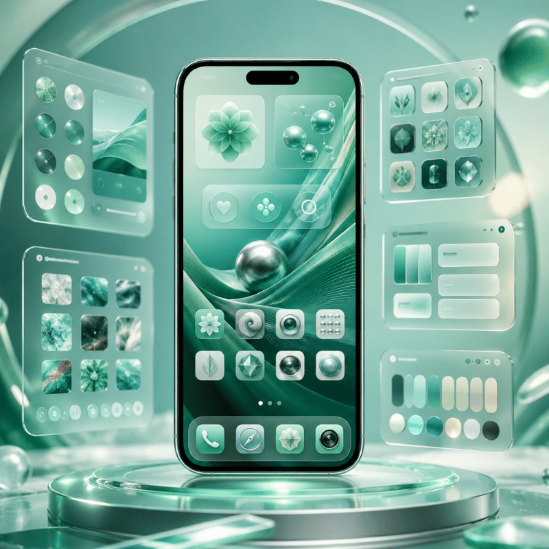
Best iPhone Theme Apps in 2026
The best iPhone theme app is the one that matches how much you want to do yourself. Some apps only make widgets, some only make icons, and some give you the full kit, wallpaper, icons, and widgets that already share a palette. For a coordinated theme with the least effort, an all-in-one app save you from collecting parts that don’t match.
| App type | What it does best | Pick it when |
|---|---|---|
| All-in-one theme kit | Matched wallpaper + icons + widgets in one tap | You want a finished theme fast |
| Widget-only app | Deeply customizable single widgets | You only need a better clock or weather block |
| Icon-only app | Large icon packs to apply via Shortcuts | Your wallpaper and widgets are already set |
What is the best iPhone theme app?
We build iScreen as an all-in-one option, with a huge variety of themes and wallpapers, more than 10,000 themes, 5,000 app icons, and 500 widgets, including cute widgets, a countdown, and Lock Screen widgets, all designed as matched sets rather than loose pieces, plus Dynamic Island styles for that last accent layer. There are also strong single-purpose apps: widget-focused tools are great if you only want a better clock or weather block, and icon-pack apps pair well with a wallpaper you already love. Before you commit to any paid theme app, try its free tier and check three things: do the icons, widgets, and wallpaper actually match; how many themes are behind the paywall; and does it support the iOS 26 features you want. For widgets specifically, our roundup of the best iPhone widgets goes deeper than we can here.
The upshot: Match the app to your goal, all-in-one for a full theme, widget or icon apps for a single layer, and always test the free tier first.
Free iPhone Themes: What You Actually Get
Yes, you can theme an iPhone entirely for free, but it helps to know what “free” really means so you aren’t surprised later. Three things cost nothing: the iOS 26 icon appearance options (Dark, Clear, Tinted), custom icons through the Shortcuts app, and the free tiers of most theme apps, including the free iScreen theme library. That combination alone is enough for a genuinely good-looking setup.
Say you find a “free theme” board on Pinterest and download it, what you actually get is usually a folder of images. Where people get caught out is the difference between a free image pack and a free theme. Many “free iPhone themes” you find on Pinterest or stock sites are just sets of wallpapers and icon images. They look finished in the preview, but you still have to apply each icon yourself through Shortcuts, the labor is the cost. Inside theme apps, the free tier usually unlocks a sample of themes and widgets, with the larger libraries and premium packs behind a subscription. Neither approach is wrong; just budget your time if you go the fully-free, hand-applied route.
Key takeaway: Free theming is real, but a free “theme” is often an image pack you apply manually, time is the hidden price.
Do You Still Need to Jailbreak for Themes?
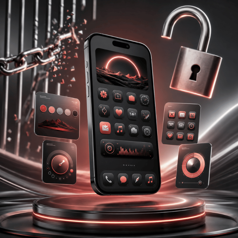
No, you don’t need to jailbreak a modern iPhone to theme it, and for almost everyone you shouldn’t. This question is a leftover from an earlier era. Years ago, tools like WinterBoard and Dreamboard let jailbroken iPhones swap entire system themes, which is where the idea that “real” theming requires a jailbreak came from.
That era is effectively over. Those theming tools were tied to old iOS versions, according to community reports on forums like Reddit, those tools were battery-draining and prone to lag, and current iPhones are difficult to jailbreak at all. More importantly, you no longer need to: between iOS 26’s icon appearances, free Shortcuts custom icons, widget apps, and theme kits, you can get a deeply personalized look, see our no-jailbreak customization walkthroughwith zero risk to your security, your warranty, or your stability. Jailbreaking today trades all of those away for a capability the App Store has largely replaced.
Bottom line: Jailbreak theming is a dead end on modern iPhones, the no-jailbreak toolkit now does the same job safely.
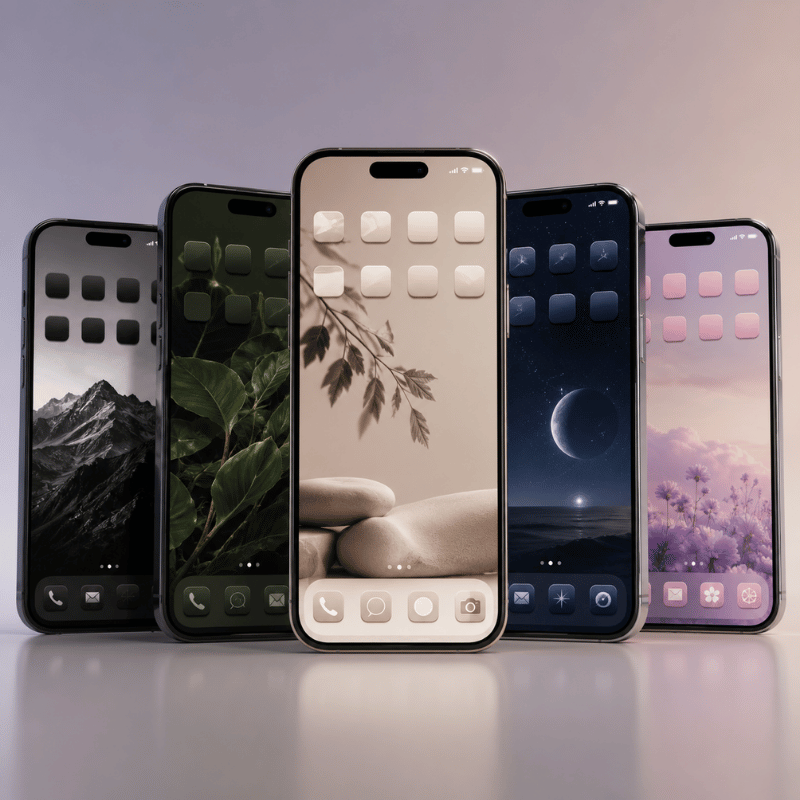
iPhone Theme Ideas & Styles to Try
If you’ve the method down and just want direction, here are aesthetic themes and styles that hold up well on iOS, each a stylish way to give your grid a fresh feel, with or without a little animation. Pick one palette, say a warm cream and brown, and let the four layers follow it:
Six theme directions
- Minimalist monoone neutral wallpaper, Tinted icons, a single clock widget.
- True dark, black wallpaper, Dark icons, monochrome widgets.
- Soft pastelmuted wallpaper with low-saturation Tinted icons.
- Retro / Y2K, playful custom icon pack plus a chunky photo widget.
- Anime / charactera hero wallpaper with a matching icon set.
- Cozy / seasonal, warm tones you refresh a few times a year.
If aesthetics are your main interest, we go much deeper into building a look in our guides on the aesthetic iPhone Home Screen and broader Home Screen ideas, both pair naturally with the theme stack here. For matching decorative widgets, our cute aesthetic widgets roundup is a good next stop.
Remember: Choose one palette first; the style names matter less than keeping all four layers in the same color story.
What iOS 26 Changes for iPhone Themes
iOS 26 doesn’t have a one-tap theme gallery, but it’s the closest Apple has come to system-wide theming, the real story for anyone deciding whether to lean on built-in tools or apps. So does iOS 26 have themes? Almost: the appearance menu now recolors your whole grid. The driver here’s simple: Apple keeps absorbing the customization people used to need workarounds for with each set of new features, which means the free, built-in layer of your theme stack, across your Home and Lock Screen, gets stronger every release. Some of these options also tie into Apple’s accessibility settings, so a cleaner homescreen can be an easier-to-read one too.
According to Apple’s Newsroom, with its Liquid Glass design, Apple introduced app icons that come in light, dark, clear, and tinted appearances. In practice that gives you a system-wide color wash across icons and widgets, the thing a “theme” mostly means to most people, without any app at all. For users, the takeaway is that the iOS 26 appearance menu now does the heavy lifting on the icon layer, so theme apps are increasingly about the widget, wallpaper, and matched-kit layers rather than basic recoloring.
What iOS 26 still won’t do is just as important when you plan a theme: there’s no per-app icon color, no custom icon packs without Shortcuts, and no freeform icon placement off the grid. So the smart 2026 approach is a hybrid, let iOS 26 handle the quick tint, and reach for Shortcuts or a theme app when you want a specific, coordinated look the built-in tools can’t reach.
Key takeaway: iOS 26 makes the free icon layer stronger; apps now earn their keep on widgets, wallpapers, and matched kits.
Frequently Asked Questions
Can you get free themes for iPhone?
View Answer
Do custom app icons open apps slower?
View Answer
Can you import your own PNG images as app icons?
View Answer
Do iPhone themes drain battery or slow your phone?
View Answer
Will my theme survive an iOS update?
View Answer
Do you need to jailbreak to theme an iPhone?
View Answer
Want a matched theme without building all four layers yourself?
How We Test These Themes
This guide is built from hands-on setup work across the iScreen theme library, 10,000+ themes, 5,000+ icons, and 500+ widgets, plus repeated testing of the iOS 26 icon appearance menu and the Shortcuts custom-icon flow we use to make your phone and iPhone feel like yours on current iPhones. Where we describe an Apple feature, we link Apple’s own documentation so you can confirm the steps on your device.
Related Articles