
iScreen vs Widgetsmith vs Widgetable: Which Widget App Is Best in 2026?

Updated August 2026 · By Candy

Publisher disclosure: iScreen publishes this article. That creates an obvious commercial interest, so the comparison names Widgetsmith and Widgetable as the better choices for two of the three jobs, links to each app’s official listing, and separates verified product facts from our decision framework.

Widgetsmith is the best fit if you want to build widgets piece by piece. Widgetable is the best fit if the widget is really a shared space for a partner, friend or virtual pet. iScreen is the best fit if you want to start from a ready-made combination of widgets, wallpaper and icons instead of choosing each visual layer from scratch.

iScreen vs Widgetsmith vs Widgetable is a three-way comparison of building, sharing and starting from a ready-made set. These apps overlap, but they don’t make you do the same kind of work. One gives you more design decisions. One gives you more relationship rituals. One gives you a prepared visual starting point. This page compares only these three brands; it is narrower than a broad ranking of widget apps for iPhone.

This review compares current US availability in the App Store and Google Play. It uses official product pages and developer materials checked on August 9, 2026. It isn’t a hardware-style laboratory test, a battery benchmark, or a claim that storefront ratings determine the winner.

Quick Verdict: The Best App Depends on the Job
Quick Verdict: The Best App Depends on the Job — iScreen

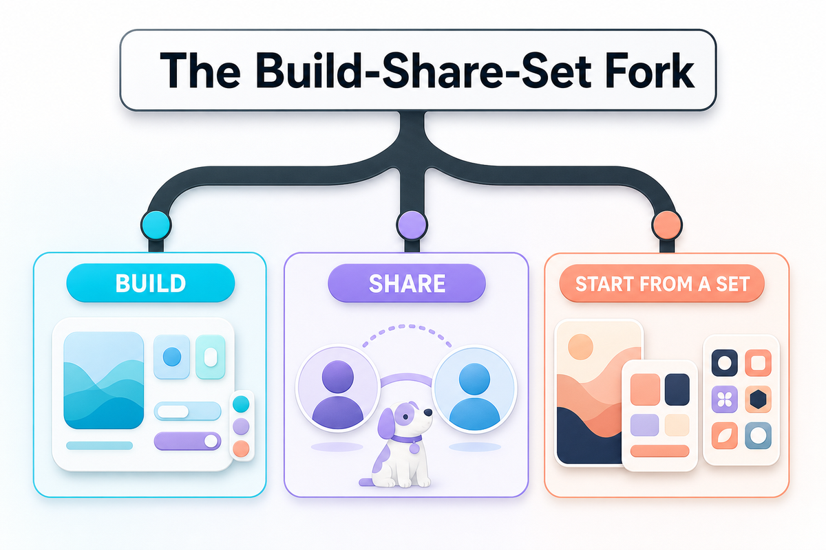
If you want one sentence, use this: choose Widgetsmith to build, Widgetable to share, and iScreen to start from a set. That’s the Build, Share, or Start from a Set choice. Use it before comparing feature counts, prices or storefront ratings and choosing your first app.

The Build–Share–Set Fork: there isn’t one best widget app for every job. Decide whether you want to build the widget, share a small loop, or begin with a ready-made visual set.

The conditional winners in this 2026 comparison
Your main job Best fit Why Main tradeoff
Build a widget from detailed visual and data choices Widgetsmith Precise control over fonts, colors, borders, artwork, data and schedules More choices to make
Share a small daily ritual with someone Widgetable Couples, friends, moods, distance, sleep and co-parented pets are the product center Less suited to a fully custom information dashboard
Begin with a ready-made screen set iScreen Widgets sit beside themes, wallpapers and icon treatments in one catalog A large catalog can still take time to browse

None of those categories is exclusive. Widgetsmith offers themes and wallpapers. Widgetable includes aesthetic widgets and other visual choices. iScreen includes social and pet widgets. Each winner describes an app’s strongest workflow, not a claim that the other two can’t perform the job.

At a Glance: iScreen vs Widgetsmith vs Widgetable
At a Glance: iScreen vs Widgetsmith vs Widgetable — iScreen

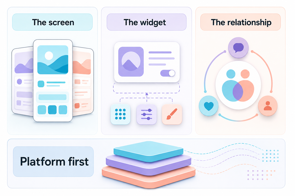
For a fast comparison, ask what you’re building around. Widgetsmith starts with the widget. Widgetable starts with the relationship. iScreen starts with the screen. That starting point usually reveals which setup will feel natural and which one will feel like extra work.

This matrix prevents a common mismatch because the official App Store and Google Play listings, checked on August 9, 2026, show different device support and product centers. That evidence supports a shortlist, not a universal quality score.

Current product emphasis and public listing snapshot, checked August 9, 2026
Comparison type iScreen Widgetsmith Widgetable
Primary emphasis Ready-made sets across widgets, themes, wallpaper and icons Granular widget construction and scheduling Shared social widgets, couples and pets
Best for A quick, unified visual makeover A personal information or photo system A recurring interaction with another person
Free download Yes, with in-app purchases Yes, with in-app purchases Yes, with in-app purchases
Apple listing iPhone, iPad, iMessage iPhone, iPad, Apple Vision iPhone
Android listing Yes No current public listing found Yes
Scheduled display emphasis Available across varied widget types Explicit time-based widget scheduling Not the primary product emphasis
Shared relationship depth Friends, couples, pets and plants available Personal photos and data, but not a relationship system Core product purpose
Visual starting point A ready-made screen set A widget component and its rules A person, pet or shared state
Who should skip it Someone who wants to hand-build every component Someone who wants a social pet loop first Someone building a dense custom dashboard

Platform support matters more than it looks. An Android user can remove Widgetsmith from the shortlist immediately. An iPad user who wants the same construction system across Apple screens should examine Widgetsmith and iScreen before comparing pets or themes. Availability isn’t glamorous, but it prevents a lot of wasted comparison.

Which App Gives You the Most Customization Control?
Which App Gives You the Most Customization Control? — iScreen

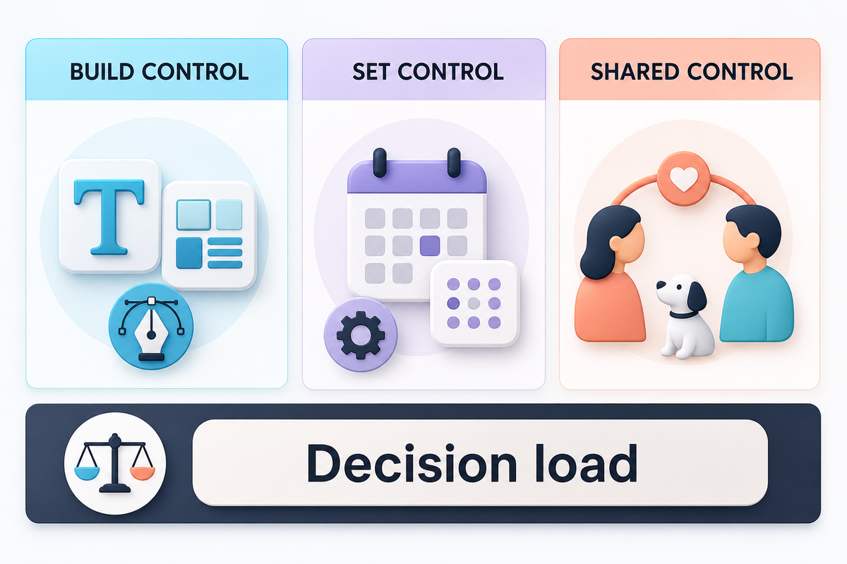
For detailed, build-from-scratch control, Widgetsmith is the strongest choice. Its current App Store description foregrounds precise choices for colors, fonts, borders, artwork and themes. It also names photos, countdowns, music, a weather widget, Actions and connections to data such as calendars and reminders. Scheduled widgets can change at different times of day.

Evidence boundaries matter because these are vendor-declared capabilities, not a controlled design contest. Widgetsmith’s developer-supplied App Store description states that these controls are offered; it doesn’t prove that every user needs them.

Those options work especially well when your idea starts as a rule: show one photo set in the morning, a calendar widget later, and different widgets at night. Widgetsmith can display several kinds of information or schedule one type to change with the day.

Its main drawback is decision load. Detailed control means choosing the content, its source, its visual treatment and sometimes its schedule. That’s the appeal for a builder, but it can feel like work when you only want a finished screen.

Where iScreen differs

iScreen offers customizable widgets too, including interactive, weather, battery, launcher and photo-oriented choices. Its difference is the surrounding catalog. Its official listing and iScreen widget gallery place widgets next to themes, wallpaper and icon packs. This catalog covers Home Screen widgets, Lock Screen widgets, StandBy and other surfaces.

You still customize, but you can begin with a prepared visual direction rather than a blank component. That’s why iScreen wins the ready-made starting point rather than pure control.

Where Widgetable differs

Widgetable lets you choose a look, but its distinctive variables are shared with a person: a mood, distance, sleep status or pet. What matters isn’t border width. It’s what happened between the two people, which makes Widgetable expressive without turning it into a full dashboard builder.

Which App Starts Closest to a Ready-Made Screen?
Which App Starts Closest to a Ready-Made Screen? — iScreen

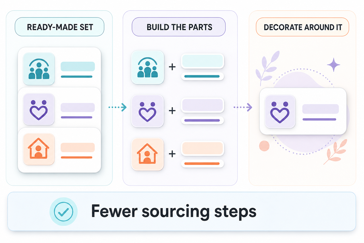
iScreen is the strongest fit when you want a prepared screen direction rather than one custom widget. It places widget choices beside wallpaper, themes and icons, so you can begin with a set instead of sourcing every layer separately. For advice on making those layers match visually, use the site’s complete-screen styling guide.

iScreen reduces sourcing steps by grouping those layers in one product catalog. You can choose a theme direction, then browse iScreen’s icon catalog for aesthetic icon packs that fit the same set. The benefit isn’t that every theme installs itself without choices. The benefit is that you can begin from a prepared family instead of translating one app’s beige, type style or illustration language into another app’s catalog.

You can absolutely make a matching screen with Widgetsmith. It may produce the more personal result if you already know the exact font, colors, photo crop and data you want. Its official site also offers themes and wallpapers, so “Widgetsmith only makes widgets” is outdated. In practice, Widgetsmith helps you specify the parts while iScreen gives you a ready-made set to start from.

Widgetable is the least direct choice for a total visual system. Pick it when the shared widget is the emotional center of the screen and decorate around that. Don’t pick it merely because you want every icon and wallpaper to share one visual language.

The Build–Share–Set Fork

  1. Can you describe the exact widget you want, including its data and schedule? Start with Widgetsmith.
  2. Can you describe the overall look but not every component? Start with iScreen.
  3. Can you describe the person or pet you want to see, while the style is secondary? Start with Widgetable.

If you’re still exploring apps like Widgetsmith, the site’s broader 12-app widget roundup covers more options. This page deliberately stays with the deeper three-brand decision.

Which App Is Best for Friends, Couples and Pets?
Which App Is Best for Friends, Couples and Pets? — iScreen

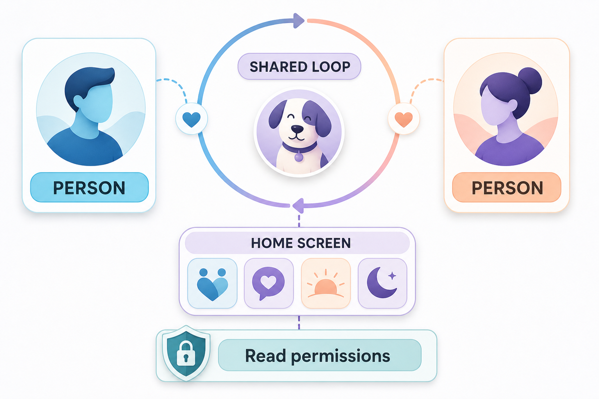
Widgetable is the obvious first app to test for friends, couples and shared virtual pets. Its Apple listing is filed under Social Networking and centers on co-parented pets, sleep, moods, distance, status, signals that say you miss someone, and plants.

Those features create a loop. A widget changes because someone sent a state, because a shared pet needs attention, or because the relationship has a small ritual. You aren’t just viewing data you defined once.

iScreen also offers friends, couples, pets and plant-style widgets, including on its Android listing. That makes it a stronger crossover option when you want a social widget inside a broader themed makeover. If the relationship mechanic itself matters most, Widgetable is more focused.

Widgetsmith can display photos and personal data beautifully, but a photo widget isn’t automatically a shared relationship system. Choose it if the priority is how a memory is framed, scheduled and styled. Choose Widgetable when the exchange behind the frame matters most.

There’s also a privacy question behind the fun. Distance, sleep and relationship features can involve more personal data than a decorative photo or clock. Widgetable’s Google Play listing indicates that some features use location or sleep-related data. Read each permission request and decline anything that doesn’t make sense for the feature you’re enabling.

Permission mismatch is a practical risk: Widgetable’s developer-provided disclosure on Google Play describes the data context, but you still need to decide whether location or sleep access is reasonable for the exact feature you’ve selected.

Free vs Paid: What Can You Use Before Subscribing?
Free vs Paid: What Can You Use Before Subscribing? — iScreen

All three were free downloads with in-app purchases in the US Apple App Store on August 9, 2026. That doesn’t mean every desirable theme, data source or social feature is free. It means you can install each app before deciding whether its premium layer is worth the price.

For current pricing, Widgetsmith publishes the clearest figure in an official support FAQ: Premium was listed at $1.99 per month or $19.99 per year with a seven-day trial. Premium examples include custom themes and weather data.

Price comparison can fail when a weekly headline is set beside an annual plan. Because the official FAQ and storefront entries use different billing periods, compare the total for the period you expect to keep the app.

iScreen’s US storefront showed several VIP purchase entries across different billing periods when checked. Some entries appear promotional, so listing every visible price would create false certainty about the offer a particular user will see. Widgetable also offers Premium purchases, but we didn’t verify one stable public price for a fair fixed comparison.

The fairest way to compare price is in the storefront and region you’ll actually use:

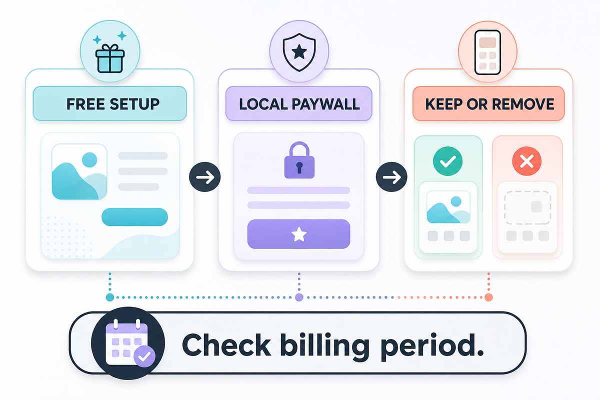
  1. Install the free version first. Complete one free widget setup and confirm that the widget family or social feature you want exists.
  2. Open the paywall from that feature. Don’t assume the first general upgrade screen is the only offer.
  3. Check the billing period and renewal language. A low weekly price can cost more over a year than an annual plan.
  4. Ask what the subscription removes or unlocks. Ads, weather data, premium themes and relationship features provide different kinds of value.
  5. Set a reminder before the trial renews. Keep the plan only if the widget proves useful after a full week.

Best free starting strategy: complete one full screen or one relationship loop before paying. A working free setup tells you more than a huge catalog of locked items.

Device Support: iPhone, iPad and Android
Device Support: iPhone, iPad and Android — iScreen

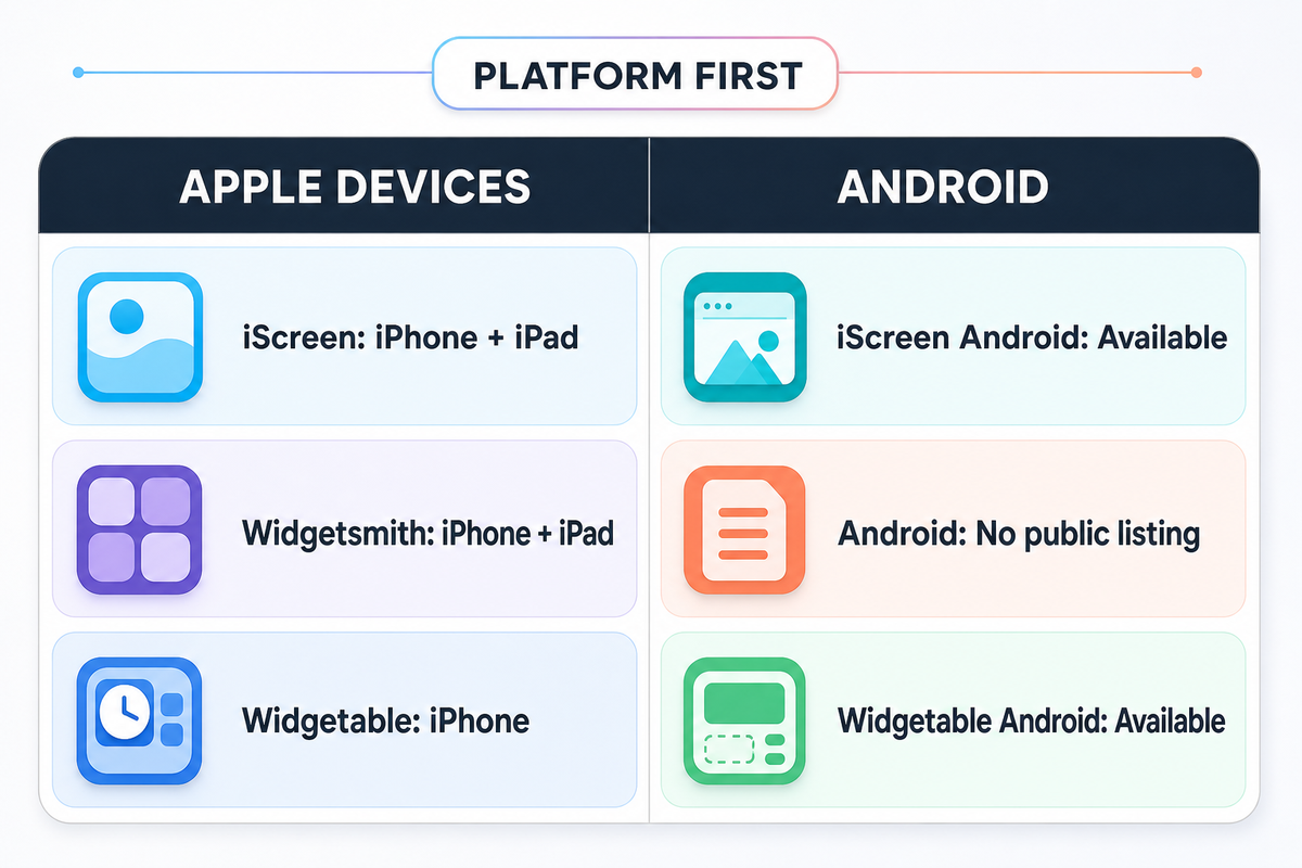
Device support can decide the comparison before features do. An appealing feature is useless on a device the app doesn’t support. Current official Apple and Google listings, checked in August 2026, establish the public platform shortlist below; they do not guarantee that every feature appears on every supported device.

  • iScreen: the current Apple listing shows iPhone, iPad and iMessage. A separate Google Play listing covers Android phones and tablets.
  • Widgetsmith: the current Apple listing shows iPhone, iPad and Apple Vision and is marked Designed for iPad. No current Android version was found in the official public listings used for this comparison.
  • Widgetable: the Apple listing says “Only for iPhone,” while a separate Google Play app makes Widgetable available on Android. “Only for iPhone” therefore describes its Apple-device availability, not the entire product.

If you use Android, your practical decision is iScreen vs Widgetable: a ready-made set or a shared connection. If you use an iPad and want a detailed construction system, Widgetsmith’s explicit iPad positioning deserves attention. If you’re styling both an iPhone and an Android device, confirm that the exact widget or theme you want exists on both platforms; the same app name doesn’t guarantee identical catalogs.

Widgets also inherit operating-system limits documented in Apple’s WidgetKit guidance and Android’s app-widget overview. A tile that looks interactive may still open its app for a complex task. Our separate guide explains what an interactive widget tap actually does on iPhone; this comparison doesn’t repeat those mechanics.

How to Choose in 60 Seconds
How to Choose in 60 Seconds — iScreen

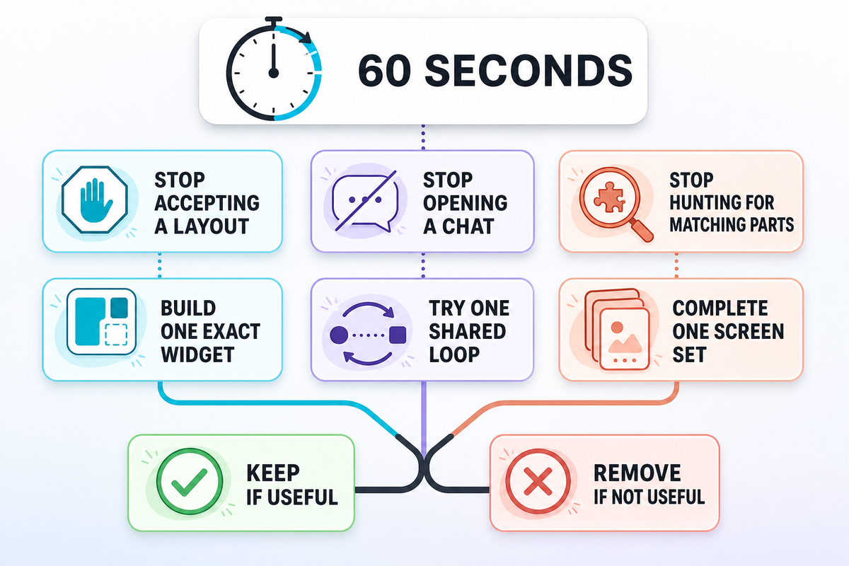
Don’t count features. Complete this sentence instead: “I want the app so that I no longer have to ______.” The blank identifies the work you want to remove, which is more useful than comparing catalog size. If the answer is still vague, first customize your iPhone Home Screen around one concrete goal.

A one-minute choice test
Your answer Start here Your first trial
…accept somebody else’s layout Widgetsmith Build one photo, calendar or countdown widget with your exact typography and data
…open a chat just to share one small feeling or ritual Widgetable Invite one person and try one mood, distance or pet loop
…hunt for separate wallpaper, icons and widgets that match iScreen Complete one Home Screen from a single visual direction
…guess whether the app works on Android iScreen or Widgetable Verify the exact feature in Google Play before styling the screen
…rebuild a detailed widget for my iPad Widgetsmith Test one information widget on both iPhone and iPad
…remember to check on a shared virtual pet Widgetable Invite one person and care for one pet together
…pay before I know whether the workflow fits All three Finish one useful free setup before opening the paywall
…choose between a social tile and a practical dashboard Use two apps Keep each app only if its widget survives the seven-day test
…start with a theme set and add one shared relationship widget iScreen + Widgetable Choose the ready-made set first, then add one social tile

If two answers fit, using two apps is reasonable. For example, you might use functional widgets such as a calendar in Widgetsmith and keep a Widgetable pet on another page. Or use an iScreen theme as the visual system around a Widgetable social tile. Maintenance is the main downside: two catalogs, two permission sets and potentially two subscriptions.

Before keeping both, use a seven-day usage review:

  • Did I look at or interact with this widget without reminding myself?
  • Did I change its setup more often than I benefited from it?
  • Would I notice if it disappeared tomorrow?

A widget that fails all three questions should leave the screen, even if it came from the app that won a comparison table.

Use real checkpoints instead of an endless trial. Give each app 10 min for orientation and no more than 1 hour to complete one useful screen. Keep one candidate on your main screen for 3 days, correct anything necessary on day four, and decide after 7 days. If you pay, check again after 30 days. Compare an annual price over 12 months, not against one month’s headline. Spend no more than 15 min on permission, removal and restart checks before contacting support. This is a decision method, not a measured claim about any app.

What the 2026 Evidence Does and Does Not Prove
What the 2026 Evidence Does and Does Not Prove — iScreen

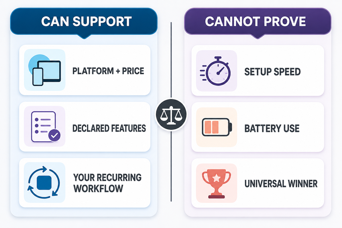
Overclaiming is the main risk because storefront evidence verifies listings, prices and declared features, not personal fit. Apple’s official pages provide the dated 2026 snapshots below; the decision framework stays separate. Those sources cannot determine a universal winner or predict which workflow you will keep using.

Storefront numbers are useful context, but they’re a poor overall score. On August 9, 2026, the US App Store showed iScreen at 4.7 from 147K ratings, Widgetsmith at 4.6 from 764K ratings and Widgetable at 4.9 from 381K ratings.

Those figures show that each app has accumulated a large review base. They don’t predict which screen you’ll prefer, whether a social loop will still feel useful after a month, or how long you’ll spend configuring the app. Rating populations aren’t controlled, versions change, and people judge different jobs.

We also found no comparable, controlled test for setup time or battery use across these three apps. So this article doesn’t claim that iScreen is faster by a certain number of minutes, that Widgetsmith uses more power, or that Widgetable has a lower performance cost. “Faster” here means beginning from a prepared set instead of sourcing each visual layer separately, not a stopwatch result.

Product convergence is the other important 2026 finding. Widgetsmith has expanded beyond a blank widget builder. iScreen includes social and pet options. Widgetable includes visual customization. That’s why a universal score would age badly. The job-based verdict is more durable: build, share or start from a set.

In a five-year retrospective, Widgetsmith’s developer described the app’s origin around customizable and scheduleable widgets and discussed an iOS 26 redesign. That first-person history helps explain the product’s direction, but it isn’t independent market research. The ownership rule applies equally to iScreen claims on this page.

Frequently Asked Questions

Is iScreen better than Widgetsmith?

iScreen is better for someone who wants to begin with a ready-made set of widgets, wallpaper and icons. Widgetsmith is better for someone who wants finer control over the widget itself, including fonts, colors, borders, data and schedules. Neither is universally better.

Build one real screen before deciding: if you keep leaving the editor to hunt for matching visual layers, iScreen solves the more important problem. If a prebuilt direction keeps forcing compromises in data, typography or timing, Widgetsmith does. A person who enjoys designing may prefer that extra work because it’s also the source of control.

Is Widgetable better than Widgetsmith?

Widgetable is better for couples, close friends, shared pets, moods, distance and other relationship-centered widgets. Widgetsmith is better for building customized photo, calendar, countdown and weather widgets that show information at a glance. That is the core divide. If the widget represents an ongoing exchange with another person, start with Widgetable. If it represents information or a visual layout you control, start with Widgetsmith.

Test the actual interaction you expect to repeat: invite one person to Widgetable, or build one useful data widget in Widgetsmith. A pretty preview alone won’t reveal which routine fits.

Can I use iScreen, Widgetsmith and Widgetable together?

Yes. iPhone and Android home screens can hold widgets from more than one app. Use one app for the visual system and another for a specific social or information job. Just remember that each app keeps its own permissions, catalog, updates and premium plan, so every extra app adds maintenance.

Which widget app is best for Android?

Between these three, Android users should compare iScreen and Widgetable because both have current Google Play listings. Pick iScreen for a broader styling kit and Widgetable for social, pet, distance or sleep-oriented widgets. Widgetsmith didn’t have a current public Android listing in the official sources checked for this article. Before subscribing, verify that the exact widget appears on your Android device; availability under the same app name doesn’t guarantee identical catalogs across operating systems.

Start with one free screen or one shared loop, then keep the app only if it still feels useful after the seven-day test.

Which app has the best free version?

There isn’t a stable universal winner because free catalogs and paywalls can change. All three were free downloads with in-app purchases when checked. Complete one real setup before subscribing. A useful free version tests your workflow; a large locked catalog doesn’t.

Why is my widget not showing or updating?

Open the app once, confirm that the widget has been created, and check any photo, calendar or location permission that the selected widget needs. Remove and add the widget again, then restart the phone if it still won’t load. Widgetsmith’s official FAQ specifically recommends a reboot for loading problems and checking photo access for photo widgets. If only one feature fails, contact that app’s support instead of reinstalling all three.

Also confirm that the chosen widget still exists in the app’s current catalog and that its data source can update. If another widget from the same app works, the problem is probably feature-specific rather than a reason to reset the entire screen.

So which widget app should I download first?

Download Widgetsmith first for an exact build, Widgetable for a specific person or shared pet, and iScreen for a ready-made screen set. Try one complete use case before paying. Let the first finished screen, not the download page, decide for you.

References & Sources

  1. iScreen on the US App Store — features, platforms, rating and purchase snapshot.
  2. Widgetsmith on the US App Store — features, platforms and rating snapshot.
  3. Widgetable on the US App Store social features, platform and rating snapshot.
  4. iScreen on Google Play — Android availability and declared features.
  5. Widgetable on Google Play Android availability, declared features and data-use context.
  6. Widgetsmith FAQ Premium pricing, trial and troubleshooting snapshot.
  7. Widgetsmith official site current product positioning and feature families.
  8. Apple Support: add, edit and remove widgets — current iPhone widget setup and interaction guidance.
  9. Apple Developer: WidgetKit — platform framework and supported widget surfaces.
  10. Android Developers: app widgets overview — platform widget types, behavior and limitations.
  11. Widgetsmith at Five developer-authored product history, treated as first-party context.

Storefront availability, ratings, prices and features can change. Snapshot checked August 9, 2026.

最新文章

Interactive Widgets on iPhone: What a Tap Actually Does

Interactive Widgets on iPhone: What a Tap Actually Does

2026/8/2 02:32
Updated August 2026 · Fact-checked against Apple’s widget documentation Interactive widgets on iPhone are Home Screen tiles that run an app action in place — ticking off a reminder, playing a podcast, feeding a pixel cat — without opening the app behind them. Everything else on the tile is still a launcher. Apple puts it plainly in its design guidance: “When people interact with your widget in areas that aren’t buttons or toggles, the interaction launches your app.” That one sentence explains most of what confuses people about interactive widgets on the iPhone, including the complaint that tops every forum thread on the subject: you tap the thing, and it just opens the app. This guide covers what a tap does, which iOS release changed what, where the playable widgets — desktop pets, small games, live scores — actually live, and how to decide whether any of it earns a slot on your Home Screen. It’s a narrower promise than most round-ups make, and deliberately so. Plenty of guides will hand you a list of the best interactive widgets, or the best apps that ship them. Very few will tell you why the one you already installed does nothing when you press it, which is the question people are actually asking. Most of what still ranks targeted interactive widgets for iOS 17, and nobody has gone back to it since. One of the top-scoring guides on this query hasn’t been editorially touched in 30 months, which is a long time in this part of the iPhone experience. 40–70 refreshes a day, Apple’s stated budget 2 control types that act in place +164% year-on-year search growth for widget games What Makes a Widget Interactive (and What Only Looks Like It) A widget qualifies as interactive when it contains a button or a toggle wired to an app action. Apple’s developer reference on widget interactivity is exact about the scope: “Include buttons or toggles in a widget or Live Activity to offer app functionality without launching the app.” Those two controls are the whole in-place surface for widgets in iOS. Tap anywhere else on the tile and you’re using a launcher. In practice a widget can complete one small job without opening an app, and that job has to be expressible as a single press. Anything richer than that leaves your iPhone’s home screen and continues inside the app. The reason is architectural rather than cosmetic. A widget isn’t a small running app. Apple describes the rendering model directly: “WidgetKit renders the views on your behalf in a separate process. As a result, your widget extension is not continually active, even if the widget is onscreen.” — Apple, WidgetKit developer reference What you see is a stored picture of your widget, replayed. It can’t run the app’s code while you’re looking at it, which is exactly why buttons and toggles had to be added as a separate mechanism rather than simply falling out of the design. This also explains the widgets that look alive but are not. A countdown timer keeps counting down while nothing is running, because the system draws the changing number itself. Glanceable is not the same as interactive, and neither is animated. The 4 Tap Behaviours: every widget on your Home Screen falls into one of four behaviour types when you touch it, and only one type is real interactivity. Widget example What a tap does Behaviour type Reminders Ticks the task off where you tapped In-widget action Podcasts Starts the episode playing In-widget action Home accessory Flips the light or plug Control toggle Weather widget Opens Weather Deep link only Photo widgets Opens the photo in its app Deep link only Countdown widget Opens the app; the number moves on its own Live refresh, no input Calendar widget Opens the day you tapped Deep link only Live score widget Opens the app; the score updates on a schedule Live refresh, no input Smart Stacks Scrolls between tiles, then behaves like whichever one is showing Container, inherits Any blank area of any widget Opens the app Deep link only Behaviour classification derived from Apple’s Human Interface Guidelines: Widgets and its WidgetKit interactivity reference, read 1 August 2026. What widgets are actually live and interactive? Only the ones whose developer built a button or a toggle into the tile, which is a small minority of what most people have installed. There’s no setting that turns interactivity on, and no iOS version retroactively grants it to widgets that were never built for it. Practically, the reliable ones are Apple’s own Reminders and Apple’s Podcasts widgets, Home accessory controls, and a modest set of third-party to-do, habit and media apps that did the work. Everything else on your iPhone home screen, however modern it looks, is a picture with a link under it. If you want to test one, tap directly on a control-looking element rather than the middle of the tile. If the app opens, there was no control there. Among the third-party names people ask about most: Widgetsmith remains the reference customization app for building tiles from scratch, Todoist and similar to-do list apps expose completion controls, Carrot Weather is a popular widget for the glance case even though weather has nothing to tap, and Pomodoro timer widgets are one of the few categories where a start and stop control genuinely belongs on the tile. Many third-party developers still ship display-only widgets, which isn’t laziness so much as a judgement that their app has nothing worth doing in a two-inch square. Which iOS Version Actually Shipped What Interactive widgets arrived with iOS 17, not with the release you’re running now. Apple’s own sample code makes the boundary unambiguous: the in-widget button in its reference project is wrapped in if #available(iOS 17.0, *), and the accompanying text tells developers to “note how the sample checks for the presence of iOS 17 before adding the button.” Everything since has extended where widgets appear, not what a tap can do. This matters because a lot of current coverage gets it backwards. Video titles and round-ups routinely imply that the newest release introduced interactive widgets. It didn’t. Interactive widgets on iPhone shipped in iOS 17; every release since has changed placement or appearance rather than the interaction model. Release What changed for widgets Does it change what a tap does? iOS 16 Lock screen widgets arrive as glanceable tiles No iOS 17 Buttons and toggles inside widgets; StandBy mode Yes — this is the one iOS 18 Control Centre controls, a parallel surface with its own configuration Not in widgets iOS 26 Clear glass and tinted presentation; widgets reach more places No — appearance only iOS 26.4 Ambient Music promoted from a Control Centre control to a Home Screen widget No iOS 27 (autumn 2026) A fourth size: extra-large, a 4×6 canvas No — more room, same controls Release capabilities from Apple’s WWDC 2025 widgets session and WidgetKit interactivity reference; the iOS 26.4 and iOS 27 rows follow MacRumors and 9to5Mac reporting, read 1 August 2026. Call the current release what it is: The Paint-Job Release. Apple’s own summary of what the iOS 26 cycle brought widgets lists new styling options, tips for using the existing accented rendering mode, new places to put them, and Live Activities reaching CarPlay and Mac. There’s no new interaction model on that list. If you upgraded and your widgets didn’t suddenly become tappable, nothing is broken. To check what you’re running, open Settings, then General, then Software Update. If you want the walkthrough for building the screen itself, we cover that separately in our guide to how to customize your iPhone Home Screen. The Interactive Widgets You Already Own Before installing anything, two built-in widgets already act in place, and Apple names both in the iPhone User Guide: “tap an item in the Reminders widget to check it off, or tap the Play button in the Podcasts widget to play an episode.” Add the Home widget and you can flip a light or a plug from the same screen. Apple’s Podcasts widget is the clearest example of the shape: the play control acts directly from the widget, and everything else about the episode lives in the app. Set expectations at the right level, though. What Apple exposes is a tap, not a dial. There is no slider, no drag, no swipe and no keyboard inside a widget, so a Home widget can switch an accessory on but cannot carry a brightness slider or a colour picker. A media widget can start and stop; anything richer sends you into the app. This is a ceiling on the whole category, not a gap in any one app. How to customize which built-in widget action you get Press and hold a widget and choose Edit Widget. On a configurable widget this is where you pick which list, which accessory or which calendar it points at — and that choice determines what the in-place control does. A Reminders widget aimed at a list you never use will tick off tasks you never see. Editing widgets is the difference between a control that saves you a trip into the app and one that just sits there looking capable. Adding and customizing everything else runs on that same tapping and holding gesture. Adding widgets starts from an empty area of the screen; from there you can drop in a new widget, resize it, or create a Smart Stack by dragging one tile onto another so they share a slot. It’s worth doing this deliberately rather than by accident, because the size you land on decides whether controls are even possible — a point the next-but-one section returns to. Custom app icons are a separate customization layer that sits alongside widgets rather than inside them. Widget Pets: The Companion Widgets People Keep Desktop pets are the most-wanted thing in this category and the least honestly described. Search demand for pet widgets sits an order of magnitude above the demand for the technical term “interactive widgets iphone”, and it’s still climbing. What the apps actually do on your iPhone’s home screen is more modest than the marketing suggests. Take the mechanics the vendors themselves publish. Widgetable’s own community wiki describes a care loop that runs in the app, not in the tile: you hatch an egg from the Pets tab, it takes 24 hours on its own, and “you can add the widget to your phone, and it will clear up 6 hours.” Skip feeding and the pet “will actually run away to find food.” Skip bedtime and it wakes up tired. The widget is where you see the consequence; the app is where you do the caring, and adding the widget functions as a time bonus. Locket, the friend-photo widget, is split down the middle in the same way. Photos your friends send appear on the tile automatically. To send one back, its own instructions say to “tap into the widget, take a pic with the camera, and then hit send” — receiving is in place, sending is a launcher. Vendors do describe pet widgets as interactive, and the tech press has relayed that: TechCrunch’s iOS 17 launch round-up reported that one developer’s set “will be available, including Tamagotchi widgets”, though it was quoting the company and didn’t state which care actions run inside the tile. That’s the honest position: where a vendor documents its own flow, the caring happens in the app. Treat “interactive” on a store listing as a claim about the category, not a promise about the tile. None of which makes them a bad thing to own — it just changes what you’re buying. If you want a creature on your screen, judge it on how good the glance is, because the glance is the part that lives on your Home Screen. Our Dynamic Island pets guide covers the other surface, which runs on a different system entirely, and iScreen’s interactive widget packs include a DIY Button and a Mood Calendar alongside the decorative sets. Widget Games and Live-Score Widgets Playable widgets are real but small by design. A genuine one is built out of button taps and re-renders: TechCrunch’s launch coverage described Widgle as “a puzzle in a widget form”, and that’s about the right shape — turn-based, low-input, one tap at a time. Think tic tac toe rather than a platformer. What you can’t build is anything needing a swipe, a drag, a keyboard or a custom animation, because none of those exist as widget inputs. A “game widget” that needs any of them is a launcher with artwork on it. Live scores run into a different ceiling. Apple caps how often a tile can redraw: “your timeline provider should create timeline entries that are at least about 5 minutes apart”, and the system may bunch reloads across widgets so the exact moment drifts. Server push helps but doesn’t escape it: Apple states that push updates are budgeted in the same way. A widget can tell you a match is happening. It can’t be a ticker. So a puzzle you can genuinely play right on your home screen is possible; a live scoreboard sitting there is not, however much it looks like one. Which is why the genuinely minute-by-minute score experiences you see on the Lock Screen use Live Activities rather than widgets. Same phone, different system, different rules, and Apple limits in-activity buttons to the expanded and Lock Screen presentations. If you want the tile itself to be the thing you look at, a countdown widget or a couple widget app is a better fit than a scoreboard. Why Your Widget Just Opens the App A tap that opens the app instead of acting is the most common complaint about interactive widgets, and it usually has nothing to do with your phone. Of the eight distinct causes below — assembled from Apple’s documentation, not published by Apple as a list — four are decisions only the developer can change, three are yours, and one is nobody’s. Work down the list before assuming anything is broken. Eight reasons a tap opens the app instead of acting, and which three you can actually fix. Cause Who can fix it What to do No control was ever built into the tile Developer Find an app that did build one You tapped a blank area, not a control You Aim at the button, not the tile Your iPhone is locked You Authenticate first — see the next section The widget size you chose cannot hold controls You Switch to a supported size The developer routed the action into the app on purpose Developer Nothing — it is working as configured The toggle flipped, then snapped back Developer A sync failed; check the app for the real state The action ran but the tile redrew before the data landed Developer Wait for the next refresh, then re-check You are tapping an iPhone widget mirrored on a Mac Neither Expect a delay; the tap round-trips to the phone Causes assembled from Apple’s WidgetKit interactivity reference and widget refresh documentation. Apple does not publish this as an eight-item list; the grouping is ours. Two of those deserve expanding, because they’re the ones that make a working widget look faulty. A toggle inside a widget updates its appearance the instant you touch it: Apple’s reference states it “updates its appearance optimistically and indicates its new state immediately, without waiting for the result of the performed action.” If the write then fails, the tile reverts. And the developer can deliberately send the tap into the app; that’s a supported configuration, not a bug, which is why some widgets will never act in place no matter what you try. Quality rule: a widget that visibly changed has not necessarily done anything, and a widget that looks unchanged has not necessarily failed. The tile is a picture of the state, redrawn on a schedule — check the app before you decide which one happened. Why do my widgets just redirect me to the app when I tap them? Because that’s the default behaviour of every part of a widget that isn’t a button or a toggle, and because most of the widgets people actually have installed predate those controls entirely and nobody has gone back to update them since. Before iOS 17 a small widget had exactly one touch target, and it always opened the app, which is why complaints written years ago read identically to complaints written this week. Start by checking whether the widget has anything that looks like a control. If it doesn’t, no amount of restarting, re-adding or toggling Background App Refresh will change the outcome. There’s one genuinely useful fix almost nobody mentions. Apple throttles widgets you never look at: “if a widget is on a Home Screen page that the user rarely visits, WidgetKit may reduce the frequency of reloads for that widget.” If your widget is stale rather than unresponsive, move it to a page you actually swipe to. How to tell before you download You cannot test a widget from a listing, but you can read one better than most people do. An App Store page that promises to transform your home screen is selling the outcome; the screenshots are where the mechanism shows. Look for a picture of the tile with something that reads as a control on it — a plus, a tick, a play button — rather than a beautifully typeset display. Listings for apps like the big customization suites will often show both, and the control shots are the ones that matter. Read the version history too: an app that has not shipped an update since before 2023 predates in-widget controls entirely, so whatever it offers is display only. Two more things worth a glance before you download interactive widgets from anyone. The App Privacy section tells you what a tile that sits permanently on your screen is collecting, which matters more for a widget than for an app you open twice a week — and the developer’s privacy policy is linked from the same place. And if the app charges, check whether the paid tier buys features or just cosmetics, because in this category it is very often the latter. Where a Tap Works: Home Screen, Lock Screen, StandBy and CarPlay The same widget doesn’t behave the same way everywhere you put it, and the lock screen case is the one that catches people out. Apple’s consumer guide says you can interact with widgets on the Lock Screen and the Home Screen to perform tasks. Apple’s developer notes say that “on a locked device, buttons and toggles are inactive and the system doesn’t perform actions unless a person authenticates and unlocks their device.” Both are true, and the missing word is authentication. Lock screen widgets can hold controls, but those controls do nothing for exactly as long as the phone is locked. Glance at your lock screen and tap a toggle without Face ID landing first, and nothing happens — which reads as a broken widget rather than a security boundary. Size matters here too. Apple lists the widget families that may contain buttons and toggles, and the thin inline accessory strip is not among them. If you have parked a control-looking widget in that slot, it can never act. A second lock screen question is worth separating from the first: whether a control fires is not the same as whether the content should be on display at all. Anything on that screen is readable by whoever can see the phone, however locked it is. A shared to-do list or a mood tracker is a different privacy decision from a weather tile. Two more surfaces behave differently again. Today View, reached by swiping right from your Home Screen, holds the same tiles and follows the same rules as the Home Screen itself. Apple Watch complications and macOS are separate builds of the same widget rather than the same widget in another place, which is why a control you rely on may simply not be there. CarPlay is the one surface Apple makes fully deterministic: in a vehicle with a touchscreen, buttons and toggles work; in one without, they don’t, and where an app has no CarPlay integration the system dims the widget so a dead tap is visible before you make it. StandBy is less clear-cut. Apple documents that StandBy reuses the small widget and refreshes it “at a system-defined rate that doesn’t count against its budget”, but says nothing either way about whether its buttons fire, so treat StandBy as a display surface until you’ve tested your particular widget. Our guides to lock screen widgets and StandBy mode cover choosing and arranging them; this section is only about whether the tap lands. How many widgets can you have on an iPhone? Apple publishes no fixed ceiling, and in practice the limit that bites is attention rather than storage. Every extra tile is one more thing to skim past, and every acting widget you add is another allowance the system has to schedule. A screen with three widgets you use beats a screen with nine you scroll past, which is the same conclusion our best widgets for iPhone round-up reaches from the curation side. What an Acting Widget Costs You Widgets aren’t free to run, and Apple says so directly: “reloading widgets consumes system resources and causes battery drain due to additional networking and processing.” What Apple doesn’t publish is a number, and neither does anyone else. We looked, and no credible controlled measurement of iPhone widget battery cost exists in public. Anyone quoting you a percentage is guessing. Rationing is real and documented, though. A frequently viewed widget gets a daily budget of typically 40 to 70 refreshes, spread over a 24 hour window that WidgetKit tunes to your own habits rather than resetting at midnight. Apple glosses that rate as a reload roughly every 15 to 60 minutes, and each widget you place gets its own separate budget. Taps themselves sit outside that accounting: Apple lists performing an app intent among the cases that don’t count against the budget. That’s an accounting exemption rather than a promise that interacting is energy-free, but it does mean the passive waiting, not your tapping, is what the system rations. Then there’s money. Searches for free interactive widgets iphone run well ahead of paid ones, and the pattern behind that is consistent: free at the tile, paid at the feature. Pet apps gate remedies and cosmetics behind a subscription tier, photo-sharing widgets gate the gallery, and score widgets gate the multi-game views. iScreen is free to download with in-app purchases available for additional features, which is the standard shape of the category. The One-Tap Payback Rule: a widget earns its slot only when one tap replaces a multi-step trip into the app that you make at least once a day. Run the arithmetic on a real one. Ticking a task off in the Reminders app takes four moves — unlock, find the app, open the list, tap the circle. Doing it from the widget takes two: unlock, tap. That is two moves saved, and if you tick something off twice a day, over 30 days that is roughly 120 moves saved by one tile. Now run it on a widget you tap once a week and the same arithmetic over 30 days returns about 8 — which is a decoration, and should be judged as one. ✔ Worth a slot A control you use daily A glance that stops you opening an app A pet or photo you genuinely enjoy seeing ⚠ Not worth a slot A control you tap once a week A live figure that updates slower than you check it A duplicate of something already on the screen The Two-Speed Widget Market Something is changing in what people want widgets for, and it’s checkable rather than anecdotal. On 1 August 2026 we queried Google’s own reported keyword volumes for the widget category, via the DataForSEO API — United States, English, every term in a single batch so the figures are directly comparable. The volumes are Google’s, banded as Google reports them; what’s ours is the date, the batch and the comparison. They move in two directions at once. Demand for playable widgets grew up to 164% year on year while demand for setting widgets up fell by as much as 56%, according to Google keyword volumes for the United States retrieved through the DataForSEO API in one batch on 1 August 2026. Search term Monthly searches Year on year widget games 1,300 +164% soccer widgets 590 +126% dino widget 140 +91% widget pet app 320 +86% widget pet 1,900 +85% steve widget game 110 +56% add widgets to iphone 5,400 −18% iphone widgets 2,400 −21% best widgets for iphone 1,000 −32% add widget to lock screen 2,900 −56% Every figure in this table is a United States monthly keyword volume with its year-on-year change, according to Google data retrieved through the DataForSEO keywords API in a single batch on 1 August 2026. Volumes are banded as Google reports them; no figure here is a market forecast or an estimate by us. Falling demand here isn’t a category in decline; it’s a category that has been learned. People stopped searching how to add widgets to iphone because they already know. What they’re searching for now is something to put there that does something back. That’s a shift in what a Home Screen is for, and it’s the reason a pet with a 24 hour hatch timer outdraws the technical term for the feature that makes it possible. The head term itself tells the same story from the other end. According to the same DataForSEO history, covering 53 months, searches for the phrase “interactive widgets iphone” are down 62.5% against their peak, but that peak was the iOS 17 launch, when the capability was news. What faded was the novelty of the term, not the use of the feature, which is exactly why the sub-categories built on top of it are climbing while the label for it drifts down. For the same reason, treat the arrival of the extra-large 4×6 size in iOS 27 as more canvas rather than more capability, and note that at announcement only a handful of Apple’s own widgets supported it, so third-party support will arrive gradually. Controls stay the same two Apple allows inside a widget. What changes is how much you can see around them, which favours exactly the companion and glance-first widgets the demand data is pointing at. Frequently Asked Questions Q: Why do my widgets just open the app instead of doing something? Because everything on a widget except a button or a toggle is a link into the app, and most widgets were shipped without one, so the tap falls through to the launcher. Apple’s design guidance is explicit that interacting with a widget anywhere other than a button or toggle launches the app. Interactivity is opt-in work a developer has to do, so a widget built before iOS 17, or built without controls since, will always behave as a launcher. Check whether the tile has a control-looking element before troubleshooting anything else, and if your iPhone is locked, authenticate first, because controls are inactive until you do. Q: What widgets are actually live and interactive? Only widgets whose developer deliberately built in a button or a toggle. Among Apple’s own, that reliably means Reminders, Podcasts and Home; beyond those it is a modest set of third-party apps. Apple’s user guide names Reminders check-off and Podcasts play by name, and Home accessory controls work the same way. The third-party set is small and skews towards to-do, habit and media apps. Widgets that merely change on their own, like a countdown or a live score, are being redrawn by the system rather than responding to you, which is a different thing from interactivity. Q: How many widgets can I have on my iPhone? Apple publishes no fixed limit, so the real constraint is how many you will genuinely look at. Refresh scheduling is what scales with quantity, because every widget carries its own daily allowance. There is no documented count you can hit. What does scale with quantity is refresh scheduling: each widget you place carries its own daily allowance, and a widget sitting on a page you rarely visit gets deliberately throttled. Practically, a small number on pages you actually swipe to will stay fresher and be more useful than a large number spread thin. Q: Did iOS 26 add interactive widgets? No. Interactivity shipped in iOS 17, Control Centre controls arrived with the iOS 18 cycle, and iOS 26 changed how widgets look rather than what a tap does inside one. This one is worth being precise about because a lot of coverage implies otherwise. Apple’s own reference sample gates the in-widget button behind an iOS 17 availability check, which puts the capability firmly in that release. The iOS 18 cycle added Control Centre controls, which are a parallel surface with their own configuration rather than an upgrade to widgets. Apple’s summary of what the iOS 26 cycle brought widgets lists new styling and new places to put them; a clear glass or tinted presentation is a visual change. If you updated and nothing became tappable, that is the expected outcome, and the fix is finding widgets that were built with controls rather than changing a setting. Q: Are widget pets and widget games free? Usually free to install, with the parts you will actually want gated behind in-app purchases or a subscription tier. Assume the tile costs nothing and the depth behind it does. Widgetable’s own wiki, for instance, limits one of its sleep remedies to subscribers. Assume the tile is free and the depth is not. Q: Do interactive widgets drain the battery? Refreshing them costs power, which is precisely why Apple rations how often a widget may reload. No credible public measurement of the size of that cost exists, so any percentage you see quoted is unsourced. Apple states that reloading widgets causes battery drain through additional networking and processing, and the whole refresh budget exists to protect all-day battery life. It publishes no figure, and we found no controlled public test that isolates widget cost from everything else a phone does. Treat any specific percentage you see quoted as unsourced. Q: Do interactive widgets work on iPad and Mac? Yes, with one caveat worth knowing before you rely on it: an iPhone widget shown on a Mac sends your tap back to the phone, runs the action there, and returns an updated tile. Apple notes that the interaction travels to the iPhone, runs there, and returns an updated tile, so expect visible lag on that route. People searching for interactive widgets Mac are usually looking for exactly this arrangement rather than a separate Mac build. Android is a different platform with its own widget system, so interactive widgets Android behaves by Android’s rules, not these ones — an app can ship on both stores and still offer different controls on each. Where to Start If you take one thing from this, take this: interactivity is a property of the particular widget you installed, not of the iPhone you own or the version it runs. Check what you already have — Reminders, Podcasts, Home — before you go shopping for anything. Then add one thing you’ll actually touch daily, put it on a page you actually visit, and give it 14 days before deciding whether it earned the space. That single habit does more for your mobile experience than any list of installs. Browse cute aesthetic widgets if you’re optimising the look, or the weather widget guide for the classic glance tile that never needed a control in the first place. References & Sources Adding interactivity to widgets and Live Activities — Apple Developer Documentation Keeping a widget up to date — Apple Developer Documentation Human Interface Guidelines: Widgets — Apple Developer Documentation iPhone User Guide: interacting with widgets — Apple Support Adding StandBy and CarPlay support to your widget — Apple Developer Documentation What’s new in widgets, WWDC 2025 session 278 — Apple iOS 27 adds extra large widgets — 9to5Mac, June 2026 These iOS 17 apps bring interactive widgets to your iPhone Home Screen — TechCrunch, September 2023 How We Checked This Every capability claim here was read directly from Apple’s own widget references rather than borrowed from other guides, because most of the pages currently ranking for interactive widgets were written during the iOS 17 cycle and have never been revisited since. The demand figures are Google’s own reported United States keyword volumes, which we queried through the DataForSEO API in one batch on 1 August 2026 so the year-on-year comparisons are like for like; the volumes are banded as Google reports them, and other markets will differ. Where we couldn’t verify something, the battery cost of a widget, and whether controls fire in StandBy, we’ve said so instead of estimating. Published by iScreen.
2026/8/2 02:32
Aesthetic Clock Widgets for iPhone: Best Designs & How to Set Up

Aesthetic Clock Widgets for iPhone: Best Designs & How to Set Up

2026/7/22 12:23
Updated July 2026 · Current iPhone, iOS 26, and iOS 18 guidance Aesthetic clock widgets for iPhone are visual time displays designed to coordinate with a wallpaper, icon set, and placement surface. They look best when the typeface, color, and amount of information match the wallpaper, not when the clock is simply the most decorative option in the gallery. Start with a minimalist digital clock for a busy background, a flip or pixel clock for a quiet retro layout, or an analog face for a classic screen. Then check that the design is actually available for the Home Screen, Lock Screen, or StandBy surface where you want to use it. Quick Picks Best clean layout Minimalist digital clock with medium-weight numerals Best retro look Flip clock or pixel clock on a plain gradient Best classic look Round analog clock with a simple face Best cute look Pastel clock paired with a low-detail wallpaper Best transparent effect Glass-style clock tested in both light and dark appearance Best information-rich option Time-and-date dashboard with one extra datum, not a crowded mini control panel What Makes a Clock Widget Aesthetic and Easy to Read? An attractive clock needs four things working together: a numeral shape that suits the mood, enough weight to survive the wallpaper, clear separation between foreground and background, and a sensible amount of information. Thin serif numerals can look elegant in a preview and then vanish over clouds, faces, or bright highlights. Heavy digital numerals stay readable, but they can dominate a soft layout if the widget is too large. Use the wallpaper’s focal point as your boundary. When the subject sits in the upper half, move the clock lower or choose a compact size. For an already detailed background, use fewer colors and less ornament. Apple provides display controls such as Increase Contrast and Reduce Transparency because appearance and readability don’t always move in the same direction. Apple’s display and text guide is worth checking if a pale, glass, or low-contrast design looks different on your phone than it did in the preview. Practical rule: a clock should either improve at-a-distance readability, add useful time-and-date context, or deliberately anchor the composition. Without one of those roles, the status-bar time may be the cleaner choice. Best Aesthetic Clock Widget Designs for iPhone There’s no universal winner. This table treats each clock as part of a full screen, not an isolated product thumbnail. iScreen’s current widget library includes digital and Lock Screen clock options, while the App Store listing shows the wider customization scope, ratings and reviews, version history, in-app purchases, and app privacy information in one place. Review the privacy policy and App Store privacy label for any widget app before you decide that visual style is the only tradeoff. Before downloading apps like these, check three details: whether the design is completely free or part of an in-app purchase, whether the “What’s New” notes show recent bug fixes, and whether the supported devices match yours. Reviews describing the exact clock and iOS version are more useful than a generic “great app” comment. App Store distribution also doesn’t mean every marketing statement is verified by Apple. This guide focuses on iPhone; some WidgetKit families also work on iPad, but a design shown for iPhone and iPad still may not support every iPhone surface. Nine clock types compared by wallpaper, placement, size, and limitation Clock type Best wallpaper match Best surface Useful size Watch for Minimalist digital Photos, gradients, or quiet textures Home Screen Small or medium Ultra-thin numerals can disappear Retro flip clock Solid, film-grain, or muted gradient Home Screen or StandBy Medium or full screen The panels become noisy over busy photos; some listings spell the style “FlipClock” Classic analog clock Neutral, architectural, or editorial Home Screen Small or medium Tiny hands are harder to read at a glance Transparent or Liquid Glass Low-detail wallpaper with a stable color field Home Screen Medium Tint, clear mode, and accessibility settings can change the effect Pixel clock Game, cyber, or monochrome retro art Home Screen Small Mixed icon styles break the illusion quickly Pastel or cute clock Soft illustration or plain pastel Home Screen or Lock Screen slot Small Low contrast can turn cute into hard to read Information dashboard Plain dark or light background Home Screen or StandBy Medium A countdown can help you keep track of time, but too many fields compete with the main display World clock Plain map, travel, or neutral background Home Screen or StandBy Medium Extra zones need clear city labels Timer clock Minimal work or study layout Home Screen Small or medium A task timer is not the same as a continuously updating wall clock Our July 2026 US DataForSEO Google Ads batch recorded 1,600 estimated monthly searches for both “iPhone clock widget” and “clock widget for iPhone,” compared with 30 for “analog clock widget iPhone”; the same batch put “add widgets to iPhone” at 5,400. These are directional search estimates from one current batch, not traffic forecasts. They don’t make analog clocks unattractive; they explain why a digital clock widget is the most useful default and analog appears as a deliberate style choice. For a broader list of screen widgets beyond clocks, see our best widgets for iPhone guide. A first-party 90-day review of 939 query-by-page rows found established visibility for generic widget, Home Screen, and Lock Screen pages, but no strong clock-specific owner. That is why this guide connects clock design and setup to those broader resources instead of duplicating them. The 4-Input Clock Style Fit Matrix The 4-Input Clock Style Fit Matrix starts with what’s already on the screen: wallpaper complexity, visual goal, information density, and placement surface. It doesn’t guarantee that one custom clock widget is offered in every location: Apple’s WidgetKit guidance distinguishes system widgets from accessory widgets, and the UI rendering can change by context. Apple’s widget-background guidance also explains that the system can remove or alter a widget background in contexts such as StandBy and accessory placements. Choose the desired surface first, then confirm that iScreen offers that design and widget family there. Community user tips can suggest a look, but the availability check belongs inside the app. The Clock Style Fit Matrix, choose by wallpaper, goal, information density, and surface Your screen Recommended Avoid first Availability check Busy photo + time only + Home Screen Bold minimalist digital Transparent glass or detailed analog face Small or medium system widget Quiet gradient + decorative goal + Home Screen Flip, pixel, or analog Dense information dashboard Matching saved size in iScreen Portrait wallpaper + compact Lock Screen area Simple accessory clock or date A design intended only for a medium Home Screen tile Lock Screen accessory family Nightstand + at-a-distance viewing + StandBy Large digital or restrained flip clock Fine analog hands or multi-panel dashboard StandBy-compatible clock or small widget For a cute layout, apply the same logic before choosing illustrations. Our cute aesthetic widgets guide covers full theme pairing; here, the clock-specific rule is simpler: one clear time display, one visual motif, and no competing decorative panel beside it. The One-Glance Contrast Test The One-Glance Contrast Test takes less than a minute after you place the widget: Hold the phone at arm’s length. Needing longer than a glance to read the time means the numerals are too light, too small, or too close to the wallpaper color. Move the widget across the wallpaper’s brightest area. Any design that only works in one dark corner is fragile; decide whether moving it harms the composition. Check both light and dark appearance. Also check tint or clear mode and any enabled Increase Contrast, Reduce Transparency, Color Filters, Bold Text, or Display Zoom setting; Apple documents these controls in its display and text settings guide. Adjust in this order: move the position, change the widget size, add a quiet backdrop, then switch the numeral weight or style. This preserves the chosen aesthetic before replacing it. Transparent clock backgrounds can look integrated in one appearance and mismatched in another, so test the placed widget, not just its in-app preview. Do not force a large clock into every layout If the status-bar time is already enough and the clock adds no useful date, time zones, or distance readability, leave the space open. Negative space can make the rest of the Home Screen feel more intentional. How to Add an iScreen Clock Widget to the Home Screen First, open iScreen, browse or search for the clock you want, customize its color or content, and save it to My Widgets. Then follow Apple’s current Home Screen widget flow. Touch and hold the Home Screen background until the items begin to move. Tap Edit, then Add Widget. Search for iScreen and open it. Choose the same size as the clock you saved, then tap Add Widget. Move the tile into position and tap Done. If the wrong saved design appears, touch and hold it, choose Edit Widget, and select the current widget. iScreen shows the exact assignment step in the full customization guide. When you’re adding several home screen widgets, the broader iPhone widget roundup can help you decide what earns the second slot. The Three-Zone Clock Layout Divide the screen into a time zone, an app zone, and breathing room. Put the clock in the quietest zone, keep one supporting widget at most, and let the wallpaper remain visible somewhere. If the clock needs to stay visible, don’t place it inside a Smart Stack: iOS can rotate the visible widget based on time, location, and activity. Today View is another supported location, but access from a locked phone depends on your Allow Access When Locked settings, so avoid exposing sensitive calendar or location data there. How to Add or Style a Clock on the Lock Screen There are two different clocks here. The large built-in Lock Screen clock is part of Apple’s system editor; a third-party Lock Screen widget occupies an available widget area and does not replace that large system clock. That distinction prevents the most common expectation mismatch. Style Apple’s main clock Touch and hold the Lock Screen, then unlock the iPhone if asked. Tap Customize, choose the Lock Screen, and tap the clock. Adjust the available font, size, color, or transparency controls, then tap Done. Add an iScreen accessory widget Save a compatible design in iScreen first. In the Lock Screen editor, tap Add Widgets or the widget area, choose iScreen, then add a supported accessory size. That same Home Screen design may not exist in this smaller format, and iOS can render Lock Screen widgets with a different vibrant treatment. Some listings use “Lockscreen” as one word, but the platform distinction is the same. For more placement options, use our dedicated Lock Screen widgets guide; its cute widget combinations also offer theme ideas. Use StandBy for a Full-Screen Aesthetic Clock StandBy mode, introduced in iOS 17 and refined since, is the best fit when the clock needs to work as a nightstand display, desk clock, or full-screen screensaver-style view. It’s a system surface, not simply a large copy of every Home Screen clock. Designs advertised for “Home Screen and StandBy” still need the app’s supported-family check. Open Settings > StandBy and turn it on. Connect the iPhone to a charger, place it on its side, and keep it stationary. Press the side button if needed, then swipe between widgets, photos, and clocks. Choose a restrained clock for distance viewing and test Night Mode in the room where you’ll use it. Apple’s current StandBy guide notes that supported Always-On models can keep the view visible. On other iPhones, StandBy can sleep and require a tap, a nudge to the surface, or Siri to wake it, so don’t judge a clock app as broken just because the full-screen view doesn’t remain on. Our complete iPhone StandBy guide covers the deeper settings. Fix a Clock Widget That Is Missing, Blank, or Not Updating Start with the symptom. Stale time can come from the saved-widget assignment, the widget family’s supported context, iOS scheduling, or an app-specific bug. Apple Developer documentation also shows that supported dynamic date and time views can continue updating while visible even when the widget extension isn’t running, so “iOS refresh delay” isn’t a complete diagnosis. Symptom-to-fix guide for iPhone clock widgets Symptom Check first Next fix iScreen is missing from the gallery Open iScreen once and confirm the widget was saved Search again, then restart the iPhone if it remains missing The wrong clock appears Confirm the placed size matches the saved size Touch and hold > Edit Widget > choose the saved clock The clock is blank Open iScreen and verify the design still loads in-app Remove and re-add the widget; check version history for recent bug fixes The time looks stale Open the app and check whether that design supports a dynamic time display on this surface Reassign or re-add it; update iOS and the app before treating it as a defect A transparent clock no longer matches Check light/dark, tint/clear, and accessibility display settings Recreate the background or switch to a solid/outlined clock The iScreen setup and troubleshooting page covers opening the app to refresh, re-adding a widget, and restarting when an item is missing. No third-party developer should promise that every widget behaves like the Clock app or updates second by second in every context. Frequently Asked Questions How do you get aesthetic widgets on iPhone? Install a widget app, save a design that matches your wallpaper, then add its matching size from the Home Screen editor and place it in a quiet area. With iScreen, choose and customize a clock, save it to My Widgets, touch and hold the Home Screen, and select Edit > Add Widget > iScreen. Pick the matching size, place it, and use Edit Widget if the wrong saved design appears. Coordination comes from matching the clock’s visual weight to the wallpaper, icons, and any second widget, not from adding lots of options at once. Can you customize the clock widget on an iPhone? Yes. Customize Apple’s main clock in the Lock Screen editor, or configure a third-party clock in its app before adding a supported widget size to the screen. Apple’s main Lock Screen clock is customized in the Lock Screen editor. Configure a customisable or customizable third-party clock in its source app, then add it as a Home Screen or supported Lock Screen widget. That face may not be available in every size or surface, so customise the saved design only after choosing where it will live. How do you add a cute clock widget? Choose a pastel or illustrated clock, save it in the widget app, add the matching size, and place it over a quiet part of the wallpaper. In iScreen, save the pastel or playful design to My Widgets. Enter Home Screen edit mode, choose Add Widget, select iScreen, and add the matching size. When the wrong design appears, use Edit Widget to select the saved clock. Keep the numerals darker than the lightest wallpaper area, especially with cute illustrated backgrounds. Do clock widgets drain battery? Normal clock widgets use iOS-scheduled updates rather than running continuously, but the specific widget, update behavior, and time the display remains on can still affect battery use. WidgetKit uses timelines and system-controlled updates, while supported dynamic date views can update onscreen without continually running the extension. More often, the relevant battery consideration is how long the display remains active, especially with StandBy or Always-On, not the clock artwork alone. When battery use changes sharply, compare the app and display battery entries instead of assuming every clock widget has the same cost. How do you display different clocks on iPhone? Save a different design for each placed widget. Assign each saved clock through Edit Widget, or use one world clock for multiple time zones. Test every screen after unlocking. Choose the surface before the style A clock is easiest to live with when it solves the job of its surface: quick glance on the Home Screen, compact context on the Lock Screen, or distance viewing in StandBy. That functional fit decides whether an elaborate design is worth paying for. Use the Fit Matrix, run the One-Glance Test, and then browse iScreen’s clock and widget designs for an option available in the size you need. Dynamic Island is a separate iPhone surface and isn’t a substitute for a clock widget. For a complete setup walkthrough, continue with how to customize iPhone widgets. When the Lock Screen is your priority, the Lock Screen widget guide goes deeper; for a bedside or desk setup, use the StandBy mode tutorial. References & Sources Add, edit, and remove widgets on iPhone Apple iPhone User Guide. Personalize your iPhone Lock Screen Apple iPhone User Guide. Use StandBy on iPhone Apple iPhone User Guide. Displaying dynamic dates in widgets Apple Developer Documentation. Developing a WidgetKit strategy Apple Developer Documentation. Displaying the right widget background Apple Developer Documentation. Keeping a widget up to date Apple Developer Documentation. How to install iScreen desktop widgets iScreen Support.
2026/7/22 12:23
iPhone Lock Screen Ideas: Aesthetic Customization Tips for iOS 18

iPhone Lock Screen Ideas: Aesthetic Customization Tips for iOS 18

2026/7/22 12:22
iPhone lock screen ideas are practical visual setups for an iOS Lock Screen: choose wallpaper first, then the clock style, then only the widgets that deserve space. Use them to personalize your Lock Screen without sacrificing readability; aesthetic lock screen ideas should still pass a quick glance test before you tap Customize, add emoji details, try a 3D-style image, or test a newer Spatial Scene effect on supported iOS versions. 2026 Version Note This guide is intentionally scoped to iOS 18 because that’s the search topic. Apple now tells iPhone users to check Settings > General > Software Update for the latest iOS version, and Apple’s own update guide shows iOS 26 as an upgrade option. If your phone is already on a newer iOS release, keep the same wallpaper, contrast, privacy, and widget rules, then check your device for newer Lock Screen effects. Quick Setup Card Start with a clean wallpaper, then add widgets only when they improve the screen. Use an iOS 18-paired color palette between the Lock Screen theme and an iPhone home screen icon tint. Aim for an average widget count: use no more than 2 widgets on visually-focused screens or 3-4 only for more functionally-driven screens. Look through available iPhone lock screen widget settings and then the broader range of personalization options available before completing with iPhone wallpaper for visual cohesion. Quick Answer: The Best iPhone Lock Screen Ideas for iOS 18 Effective iPhone Lock Screen setups are built around a single theme, whether that is minimalist photography, subtle pastels, dramatic dark mode, vibrant anime, practical calendar management, Photo Shuffle, the Depth Effect, or a complete alignment of wallpapers and icons. As Apple’s Lock Screen guide notes, customization extends to wallpaper, cherished photos, clock appearance, widgets, multiple screens, and Focus integration, so the strongest configuration harmonizes all these elements. Simplify with a guideline: the more detailed your wallpaper, the fewer widgets you should include; conversely, a plain background can benefit from one or two widgets for character. Often, a stunning Lock Screen falls apart when every widget clamors for attention. Choose a Lock Screen Style Before Choosing Widgets Many users start with widgets due to their perceived utility. However, a cleaner approach begins by establishing the desired mood and then selecting the minimum number of widgets to support that atmosphere. Apple’s own customization flow starts with the wallpaper and Lock Screen canvas before widget decisions, which supports a visual-first setup for aesthetic screens. Setup Type Wallpaper Choice Widget Rule 10-Second Check Minimal One subject, lots of empty space 0-1 widget Readable after a 10 sec glance Dark aesthetic Low-brightness photo or black gradient Battery or weather only Comfortable for 12 hours of night use Cute pastel Soft illustration, plush, flowers, or sky One photo or memo widget Still clear at 30% brightness Utility Plain color or blurred photo Calendar, weather, reminders Useful in the first 5 sec Photo Shuffle 5-10 photos with the same color tone 0-2 widgets Works for 7 days without feeling random Focus mode Separate work, sleep, and weekend wallpapers 1 practical widget per Focus Reset in under 2 min when routines change 4K wallpaper High-resolution image with a clear subject Skip widgets while cropping No blur at 100% preview size Pattern background Repeating shapes, grid, fabric, or texture Use thicker clock text Readable after 24 hours of normal use Widget-first Solid color, blur, or very simple gradient 3-4 widgets only when utility matters Review every 30 days and remove dead widgets Consider every lock screen choice a draft rather than a final product. Treat a saved Lock Screen as provisional: it should pass a 5 sec glance test, a 20 sec edit check, a review after 24 hours, another after 7 days, and a cleanup after 30 days if widgets stop earning space. Consistent elements can appear sophisticated, but they require greater clock contrast than a simple photograph, and a high-resolution wallpaper needs to be cropped to match the iPhone’s narrower aspect ratio. 10 Aesthetic iPhone Lock Screen Ideas Use these as starting points, then test each one against Apple’s documented options for photos, Photo Shuffle, widgets, Focus linking, and clock styling. A minimal portrait lock screen features a single subject (person, pet, flower) positioned behind the clock, without any widget row. Dark photo: use a black, navy, or charcoal image with white clock text and one compact weather widget. Pastel calendar: combine soft wallpaper, a delicate clock font, and a calendar widget for a tidy and focused workspace. An anime or illustration lock screen places the character clear of the clock and notification areas. Clean gradient: use a smooth, unadorned gradient background with no widgets for a serene daily experience. Photo Shuffle works best when the selected photos share similar color tones. Focus screens allow you to personalize one Lock Screen for work, another for sleep, and a separate one for weekends. Depth Effect: select a clear subject and leave open background around the clock so the subject can overlap the time without covering it. Matching icons: pair the Lock Screen with a compatible theme so the Home Screen does not feel like a different phone. Widget-first functionality: Choose simple wallpaper and use your calendar, battery and reminder widget to do the talking. How to Customize Your iPhone Lock Screen in iOS 18 Apple’s current instructions say to touch and hold the Lock Screen, create a new Lock Screen or customize the current one, then change the wallpaper, clock display, widgets, and related controls. Depending on the wallpaper you choose, some additional controls may also be customizable. Press and hold the Lock Screen, then tap and choose a wallpaper you’ll be able to read with just one glance. Tap on the clock and choose font style, color, and weight so the time remains visible over the image. Add widgets only after the wallpaper and clock look good without them. Save the matched Home Screen, then adjust icon size, spacing, and widget placement for the final design. Best Widget Types for an Aesthetic Lock Screen Apple says Lock Screen widgets can display glanceable information like weather, air quality, battery level, calendar events, and more. Its guide also notes that users may need to remove a widget when there isn’t enough room for a new one. That’s the right way to view Lock Screen widgets: not decorative items, but answers to things you check frequently. For an in-depth list, check out the iScreen Lock Screen Widget Guide. In short, the best Lock Screen widgets for iPhone usually fall into a few useful categories: weather for day planning, calendar for schedule management, battery for Apple devices, and personal photo or memo widgets for a warmer touch. Design Note If the primary subject of your wallpaper happens to land in the same vertical space as the clock, then skip placing widgets. Subjects at the bottom of your frame can typically hold a row of widgets without issues. If your wallpaper has a lot of text, it’s generally better to forgo the widgets altogether or switch to an image with a more muted background. Make the Lock Screen and Home Screen Match iOS 18 Home Screen coverage shows that Home Screen design belongs in the same aesthetic plan, with flexible layout options, customizable icon size, icon tinting, and Lock Screen button swaps. Since Apple’s current Home Screen guide now includes Dark, Clear, and Tinted appearances, newer versions of iOS may display more appearance labels than the initial iOS 18 release. This makes your Lock Screen part of a larger visual pair, not a standalone design choice. A soft pink rose wallpaper will feel unfinished beside a blue icon system on the Home Screen. Instead, aim for a unified aesthetic by using consistent themes, icons, and widgets across both screens. Run the Contrast, Privacy, and Attention Check Before Saving While Wallpaper First is the theme of the day, readability can’t take a back seat. Taking cues from WCAG 2.2 contrast and perceivable-text guidance, the Lock Screen isn’t complete if the clock, date, or widgets disappear into the background image. A lockscreen that fails the 5 sec readability test is not aesthetic yet; it is only a good wallpaper waiting for a better crop. Contrast check: at arm’s length, read the time and next widget within five seconds. If there’s hesitation, consider using a bold font for the clock, a darker image crop, or a background with less distracting detail for your date. Privacy check: On phones that will be used face-up in public, omit any widgets related to your calendar, reminders, Home app, Wallet app, or Messages. Attention check: research on phone notifications has shown that alerts can pull people away from tasks that require concentration even when no one picks up the device. For a work, school, or sleep screen, a setup with fewer widgets plus the Focus feature generally feels less stressful than a full house of icons. Common Mistakes That Make a Lock Screen Look Messy Mistake number one is assuming every customizable slot must be filled. Because Apple’s Lock Screen editor combines the clock, date, widgets, controls, notifications, wallpaper image, and sometimes the Depth Effect, every added element has to earn its place during the first glance. Avoid a busy photo behind a thin clock font. When one widget is useful, there’s no need to include the other four. Keep important wallpaper details away from notification areas. Only use the Depth Effect when the image keeps the time and widgets legible. FAQ How do I make my iPhone Lock Screen aesthetic? Start with one clean wallpaper, choose a readable clock color, then add no more than one or two widgets unless the screen is meant for utility. Aesthetic Lock Screens often work by having a singular subject, color scheme, and purpose. Start with a wallpaper that can be identified despite notifications popping up, adjust clock color, then work on widgets. When the subject matter is very detailed, the need for more widgets is minimal, as the image alone sets the mood. Plain colored, blurred, or gradient wallpapers can accommodate a single calendar, weather, battery, or photo widget without appearing busy, especially if the widget’s color harmonizes with the clock’s. Spend 20 seconds examining the lock screen in its current state; read the time, locate the wallpaper’s subject, and understand the widgets’ functionality without moving the device. Review the setup in 24 hours, then again after a week; the lock screen will survive daily use if it feels serene both times. What are the best widgets for an iPhone Lock Screen? Weather, calendar, battery, reminders, and simple photo or memo widgets are usually best because they give quick value without pulling attention away from the wallpaper. For a sleek look, opt for just one practical and one personalized widget. Productivity Screens can function with the Calendar and Reminders widgets, while Cute and Visual Screens might only need a photo widget. Select a widget that you use frequently enough to justify its inclusion on the screen. iScreen’s lock screen widget guide offers more specific ideas for widgets. Why is Depth Effect not working on my iPhone Lock Screen? Depth Effect often fails when the subject is not clearly separated, the crop does not overlap the clock correctly, or widgets take up the area that the effect needs. Try using a photograph with a clear main element. Crop the image so the subject’s upper edge is positioned near the bottom of the clock, and disable widgets during testing. Depth Effect works best with simple-edged images, not with hair, text, or a complicated backdrop. More visual examples are available in iScreen’s guide to the Depth Effect wallpaper. iScreen Editorial Framing Lock Screen ideas, wallpaper, widgets, and customization for iOS 18 make up the basis of this tutorial because a GSC 28-day pull for https://www.iscreenapp.com/ showed existing clicks around best widgets for iPhone, best iPhone widgets, and home screen idea terms, while direct lock-screen idea coverage was thin. A site inventory also showed iScreen already has /lock-screen, /blog/lock-screen-widgets, and /blog/depth-effect-wallpaper-iphone; all three pages already exist, giving this article a defined support-content role. That role lets the internal link route send style/setup readers to /lock-screen, wallpaper readers to /wallpaper, widget readers to the blog guide, and Depth Effect readers to the dedicated article. Related iScreen Guides iPhone lock screen widgets and customization Aesthetic iPhone wallpapers Best lock screen widgets for iPhone Depth Effect wallpapers Matching iPhone themes References & Sources Create a custom iPhone Lock Screen – Apple Support How to add and edit widgets on your iPhone – Apple Support Customize apps and widgets on the iPhone Home Screen – Apple Support iOS 18: 10 New Home Screen and Lock Screen Features – MacRumors iOS and iPadOS 18 Review – MacStories iOS 18 Home Screen icon color guide – Macworld Update your iPhone or iPad – Apple Support Web Content Accessibility Guidelines 2.2 – W3C The attentional cost of receiving a cell phone notification – PubMed
2026/7/22 12:22
回到頂部