
.png)
Cute Aesthetic Widgets for iPhone: Soft, Pastel & Kawaii Designs
Cute aesthetic widgets are small Home Screen and Lock Screen tiles styled to match one chosen vibe, pastel pink, cutecore, coquette, kawaii, or soft beige, instead of Apple’s plain default look. The trick most people miss is that “cute” isn’t about adding more decorations; it’s about three things agreeing with each other: your wallpaper, your widgets, and your app icons. Get that match right and even a single photo widget looks intentional. Get it wrong and ten cute stickers still read as clutter.
- Pick one named aesthetic (pastel, cutecore, coquette, kawaii, beige).
- Set a matching wallpaper first, it’s the base color.
- Add 2–3 widgets in that palette (long-press → +).
- Tint or replace app icons to the same colors.
- Leave empty space. Stop while it still looks calm.
This guide give you 25+ concrete ideas sorted by style, the widget sizes Apple actually offers, a step-by-step setup with our 60-30-10 Widget Palette rule, the best aesthetic widgets apps, and where cute widgets are heading on iOS 26.
What Makes a Widget “Cute Aesthetic” (Not Just Cute)?
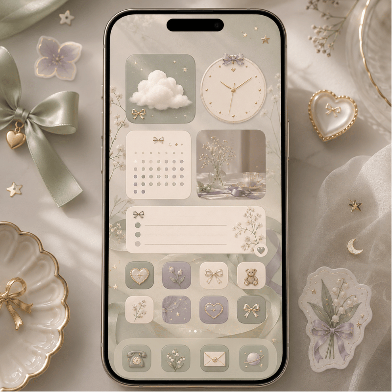
A cute aesthetic widget is one whose colors, font, and imagery belong to a single named look, so it reads as part of a designed screen rather than a random add-on. The word doing the heavy lifting is aesthetic: searchers using this phrase usually have a specific micro-style in mind, not a generic “make it pretty.” That’s why a pastel-pink clock can feel cute while the exact same clock in default blue feels like nothing.
A cute screen come from three things sharing one palette: wallpaper + widgets + icons. Miss any corner and the look breaks, that’s the real reason most “cute” attempts fail.
This matters because the most common mistake is treating cuteness as quantity. People stack widget after widget and wonder why it looks busy. In practice the opposite work: iPhone owners refining their setups consistently report that switching to a couple of small widget stacks instead of several large mismatched ones is what finally makes a screen look “done,” and that the stock wallpaper is usually the first thing holding them back. The reason is visual load, every extra color and shape competes for attention, so a screen reads as cute only when a few elements clearly agree. So before you pick a single widget, pick the aesthetic.
Here’s the vocabulary worth knowing, because the named aesthetics are what people actually search for:
- ✔Pastel / pink: the biggest cute bucket by far, soft pink, lilac, baby blue, butter yellow.
- ✔Cutecore: maximal childlike cute, bows, hearts, stickers, toy-box colors.
- ✔Coquette: soft, romantic, ribbon-and-lace pink with a vintage-girly tilt.
- ✔Kawaii: Japanese-cute characters, bears, cats, blushy faces.
- ✔Beige / neutral: the “quiet cute” — cream, tan, soft brown for a calmer look.
Pick one and the rest of this guide gets easy. A strong home screen aesthetic is just one of these styles applied consistently across the Cohesion Triangle, a clear aesthetic home screen theme gives you matching widgets, wallpaper, and icons in a single download instead of hunting for pieces.
25 Cute Aesthetic Widget Ideas by Style
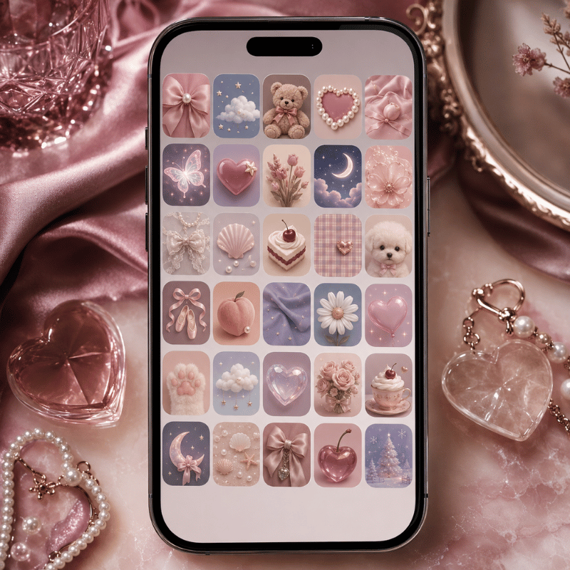
Below are 25+ ideas grouped by nine cute style types. Each row pairs a palette with the cute widgets that suit it and the wallpaper or icon move that ties it together. Match a row top to bottom and you already have a cohesive screen.
| Style type | Palette | Best cute widgets | Tie it together with |
|---|---|---|---|
| Pastel pink | Soft pink, lilac, cream | Pink analog clock, photo panel, weather, quote of the day, battery ring | Blurred pink wallpaper + pink tinted icons |
| Cutecore | Candy red, sky blue, white | Sticker-style date, heart battery, desktop pet, mini game widget, music card | Bow/heart wallpaper + playful icon pack |
| Coquette | Blush, ribbon pink, ivory | Ribbon clock, soft photo frame, quote widget, calendar, countdown to a date | Lace/bow wallpaper + serif-font icons |
| Kawaii | Pastel + bright accents | Bear/cat character widget, animated pet, weather with a face, step counter | Character wallpaper + matching mascot icons |
| Beige neutral | Cream, tan, soft brown | Minimal clock, single-photo frame, simple calendar, to-do list, moon phase | Texture wallpaper + beige tinted icons |
| Cottagecore | Sage, butter, dusty rose | Floral clock, weather, moon phase, plant-care reminder, photo of nature | Meadow wallpaper + hand-drawn icons |
| Y2K | Hot pink, chrome, lime | Glossy clock, music card, star/heart battery, sticker date, mini game | Chrome/butterfly wallpaper + glossy icons |
| Preppy | Hot pink, green, white | Bold clock, calendar, quote widget, weather, bright photo frame | Smiley/checkerboard wallpaper + bold icons |
| Danish pastel | Mixed muted pastels | Checkerboard clock, photo panel, calendar, weather, simple to-do | Pastel-collage wallpaper + soft mixed icons |
A few combinations punch above their weight. A rotating photo panel in your palette is the easiest “instant cute” win because it personalizes the screen without adding a new color. A distance widget shared with a partner or best friend, the kind of distance widgets for couples that show how far apart you’re, reads as cute and meaningful. And a single desktop pet that wanders your screen does more charm-per-pixel than any static sticker.
Build one style per Home Screen page. If you love two aesthetics, give each its own page rather than mixing pastel and cutecore on the same screen.
Which Widget Types Look Cutest? (Photo, Weather, Clock, Calendar, Music)
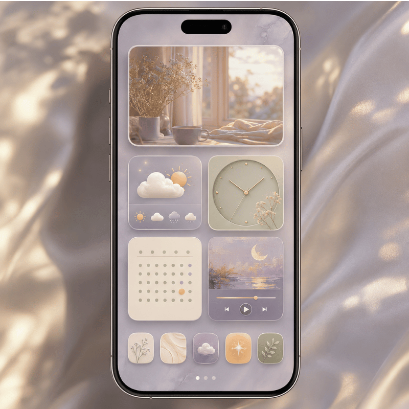
The cutest widgets are the ones you actually glance at, styled to your palette: a photo panel, a clock or date, a weather widget, and a calendar widget carry a look without becoming dead weight. A music card such as a Spotify widget and an animated Dynamic Island pet add personality too, as long as you customize them to the same colors.
Before you place them, it helps to know the canvas, because size decides how much “cute” fits.
On the Home Screen, Apple offers three widget footprints, and the Lock Screen adds its own small slots, per Apple’s guide to adding and editing widgets:
- Small (2×2): one job, a clock, a single photo, a battery ring.
- Medium (4×2): weather, a few calendar events, a music card.
- Large (4×4): photo galleries, full month calendars, multi-stat dashboards.
- Lock Screen: one inline slot above the clock plus a row of small below-time widgets.
What cool things can iOS widgets actually do?
Modern iOS widgets do more than display, many are interactive, meaning you can tap to check off a reminder, start a timer, or play music without opening the app. Apple expanded this with interactive widgets and Live Activities, detailed at WWDC25’s “What’s new in widgets” session.
For a cute setup that means your pretty widgets can also be useful: a pastel to-do widget you tick off, a kawaii music card you tap to skip a track, or a photo widget that rotates through an album on its own. Cute and functional are no longer a trade-off.
A cute widget you never look at is just clutter. Run every candidate through one test: would you glance at this on a normal day? If not, it is decoration competing for space — cut it.
Pair this with the right backdrop. A calmer aesthetic wallpaper lets a photo or clock widget stand out; a busy one fights it. Key takeaway: choose widget types by what you check daily, then style those few to your palette.
How to Make Your iPhone Widgets Aesthetic (Step-by-Step)
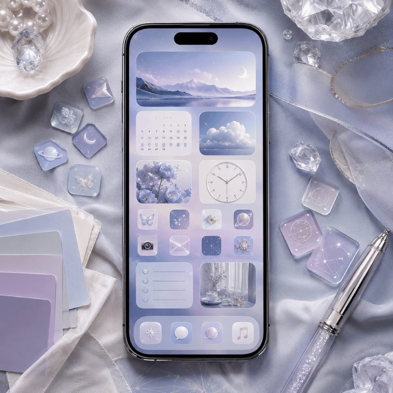
To make your iPhone widgets aesthetic, set a matching wallpaper first, add 2–3 widgets in the same palette, then tint your app icons to match, cohesion, not quantity, is what makes it look designed. Here’s the order that work, and why it’s an order and not a pile.
- Choose the aesthetic and palette first, decide pastel, cutecore, coquette, kawaii, or beige before touching anything.
- Set the wallpaper next, since it’s the largest color block on screen and sets the rules. Replace the stock wallpaper; it rarely matches a cute look.
- Add widgets by long-pressing an empty area, tapping + (or Edit), choosing a widget app, and picking a size. Place 2–3, not eight.
- Match the app icons with a custom icon set or iOS 26 tinted icons, so custom app icons share the widget palette.
- Arrange and breathe: group related widgets, leave a blank row, and stop while it still looks calm.
Borrowed from interior design and tuned for a Home Screen, this is the simplest rule for a screen that look intentional:
- 60% base: your wallpaper tone (e.g., soft pink).
- 30% secondary: your widget backgrounds (e.g., cream or white cards).
- 10% accent: one pop, a red heart battery, a character pet, a bright icon.
Worked example: a coquette screen runs ~60% blush wallpaper, ~30% ivory widget cards (clock, photo, calendar), and ~10% ribbon-red accent on a single countdown widget. Three colors, one mood, zero clutter.
Picture a student in her dorm rebuilding her Home Screen for a coquette look. She starts with a blush wallpaper (the 60% base), adds three ivory widget cards, a ribbon clock, a photo panel of her friends, and a small calendar (the 30%) — then drops in one ribbon-red countdown to winter break as the 10% accent. Total time: about ten minutes, three colors, zero clutter. A week later she swaps only the wallpaper and the accent widget to refresh it for the holidays, and the rest still matches. That’s the whole point of working in a fixed ratio: the screen stays cohesive even as you change pieces.
Do this once and you can rebuild any screen in minutes. If you want a full walkthrough of the whole layout, not just widgets, our guide to building an aesthetic iPhone home screen covers icons, wallpaper, and spacing together.
Best Apps for Cute Aesthetic Widgets (Free & Paid)
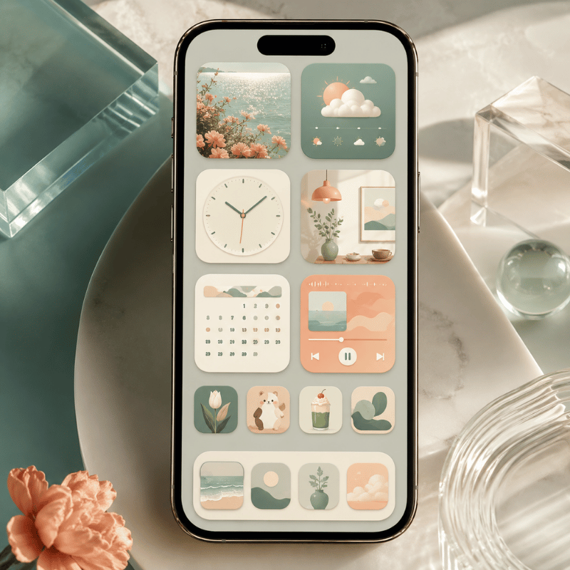
What apps offer aesthetic widgets?
Several apps offer cute aesthetic widgets, and most have a free tier with a paid upgrade for premium packs, a pattern tech outlets like CNET note in their aesthetic home-screen roundups. The right pick depend on whether you want a huge ready-made cute library or a build-it-yourself editor. The table below compares the common options by what they do best for a cute look.
| App | Cute strength | Free / Paid | Standout |
|---|---|---|---|
| iScreen | All-in-one: themes + widgets + icons + wallpaper | Free with premium | 500+ widgets incl. desktop pets, couple widgets, photo panels — one palette across the whole screen |
| Widgetsmith (builder-style) | Custom clock/date/photo widgets | Free with paid tier | Fine control over fonts and colors if you like to design from scratch |
| Color-template app | Pre-made color packs | Free with paid packs | Quick if you just want a palette and go |
| Photo-widget app | Shared photo / friend widgets | Free with paid tier | Good for couple/friend photo widgets specifically |
Why does an all-in-one app matter for cute screens? It comes back to the Cohesion Triangle: if your widgets come from one app but your icons and wallpaper come from somewhere else, the palettes drift. iScreen bundles 10,000+ themes, 500+ widgets, and 5,000+ icons so the three corners share one look by default, starting from a matched set of cute aesthetic widgets beats assembling mismatched parts.
“The screens that read as ‘cute’ aren’t the ones with the most widgets, they’re the ones where every element shares a palette. We see the same pattern across thousands of saved themes: restraint plus one strong accent beats a wall of stickers.”
Cute Widgets for Your Lock Screen, StandBy & iPad
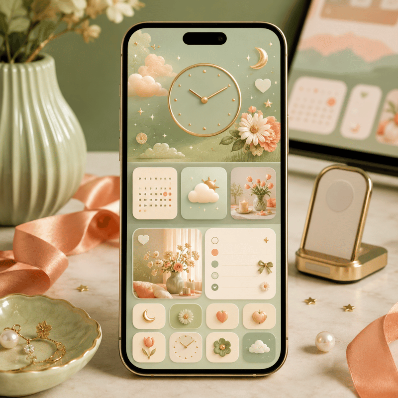
Cute widgets aren’t just a Home Screen thing, the Lock Screen, StandBy, and iPad each have their own slots, and styling all of them is what makes a setup feel complete. Each surface has a different shape, so the cute move change slightly.
On the Lock Screen, you get one inline widget beside the time and a row of small widgets below it. Per Apple’s Lock Screen customization guide, you add them by long-pressing the Lock Screen and tapping the widget area. A cute date, a tiny weather face, or a step ring work well here. One honest expectation: most Lock Screen widgets are glance-and-tap-to-open, not the full interactive type, so treat them as pretty shortcuts, not mini apps. Our deeper walkthrough of Lock Screen widgets covers which ones earn a slot.
Say your phone lives in your bag all day and you mostly see the Lock Screen. A beige-neutral setup work well here: a cream date widget in the inline slot, a tiny moon-phase and a step ring below the time, over a soft tan wallpaper. Three small widgets, one palette, and every glance feel calm rather than busy. Compare that to the common version, six bright mismatched widgets fighting a stock photo, and you can see why restraint reads as cute.
StandBy (your phone charging on its side) turns the screen into a little nightstand display. A cute clock or photo widget shines here because you see it across the room; configure it from the StandBy view. On iPad, the bigger grid means a large photo widget or a full pastel calendar can anchor the whole screen, cute scales up nicely when you’ve the room. Key takeaway: match the same palette across every surface so your phone feels like one designed set.
Seasonal Refreshes & What iOS 26 Changes for Cute Widgets
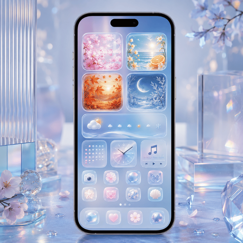
If you want your cute screen to stay fresh, plan a small seasonal refresh and lean into the two shifts reshaping cute widgets right now: iOS 26’s new look and the move toward named micro-aesthetics. Both change what counts as cute, not just how you arrange it.
Right now the biggest driver is iOS 26’s Liquid Glass design. Apple’s widget guidance for Liquid Glass describes widgets that turn translucent and pick up the wallpaper behind them, which means a new “glassy pastel” look is now possible, soft, see-through cards instead of solid stickers. For a cute setup that’s a gift: a frosted pink clock floating over a matching wallpaper is the cleanest cohesion you can get. Pair that with interactive widgets and tinted icons (also new this cycle) and your cute screen can be glassy, matched, and tappable at once.
Beyond hardware, a second shift is cultural: people increasingly search for a named aesthetic, cutecore, coquette, pastel, preppy, rather than plain “cute.” Designing to a named look give you a clearer palette and a shareable identity. The practical move: pick the named aesthetic that fits your season.
That’s where seasonal refreshes come in. Cute-widget interest reliably spikes around the holidays, cozy fall palettes, then a wave of Christmas reds and pinks, so a quarterly swap keep your screen feeling current. If you’re planning a 2026 refresh, the easiest cadence is: warm neutrals in fall, festive pinks and reds for the December holidays, soft pastels in spring, and brighter tones for summer. You only need to change the wallpaper and one accent widget; the Cohesion Triangle does the rest.
Frequently Asked Questions
How do I get a cute aesthetic widget on my iPhone?
View Answer
What is the cutecore aesthetic?
View Answer
Are cute aesthetic widget apps free?
View Answer
How do I make my widgets match my wallpaper and icons?
View Answer
Can I add cute interactive widgets on iOS 26?
View Answer
Why do my cute widgets look messy or cluttered?
View Answer
Want a matched set instead of mismatched parts?
Why We Wrote This
iScreen builds an iPhone customization app with 500+ widgets, 10,000+ themes, and 5,000+ icons, so we see which cute setups people actually keep. This guide reflects that pattern, cohesion over quantity, rather than a list of every widget you could possibly add. Reviewed by the iScreen team.
References & Sources
- How to add and edit widgets on your iPhoneApple Support
- Create a custom iPhone Lock ScreenApple Support
- What’s new in widgets (WWDC25)Apple Developer
- Optimizing your widget for accented rendering mode and Liquid GlassApple Developer
- New features available with iOS 26Apple
- Customize Your iPhone Home Screen: Tips to Get That Aesthetic LookCNET
Related Articles
- Aesthetic iPhone Home Screen: styles & setupthe full screen, not just widgets
- Best Widgets for iPhonetop picks across every category
- Lock Screen Widgetswhich ones earn a slot
- Aesthetic iPhone Wallpaper ideasthe base of the Cohesion Triangle
