.png)
Couple Widget Apps: Best Ways to Stay Connected on Your iPhone
A couple widget app puts a small, shared panel on you and your partner’s iPhone Home Screen or Lock Screen, showing how far apart you’re, how many days you’ve been together, a live photo, or a quick mood. This guide breaks down the four types, names the apps worth downloading, and shows you exactly how to add one (on both phones).
Short answer: A couple widget app is a third-party app, iPhone has no built-in couple widget, that shows shared info like distance, days together, or a photo on both partners’ screens. The best one depend on your situation: distance for long-distance, a days-together counter for milestones, or a photo widget for daily connection.
- There’s no native iPhone couple widget, every option need a third-party app, and both partners must install and pair it.
- Distance widgets refresh on a schedule, not live, and they need Location permission to work.
- Four widget types cover almost every couple: distance, days-together/countdown, photo/doodle, and status/mood.
- iOS 26’s redesigned Lock Screen makes a couple widget glanceable without unlocking, a real reason to move it off the Home Screen.
Couple Widget Apps at a Glance
| What it shows | Distance apart, days together, live photos, or mood/status |
| Where it lives | Home Screen, Lock Screen, StandBy, or Today View |
| Both partners needed? | Yes — install + pair on each phone |
| Platforms | iOS and Android (cross-platform pairing varies by app) |
| Free tier? | Usually yes; premium unlocks extra styles and removes ads |
What Is a Couple Widget App?
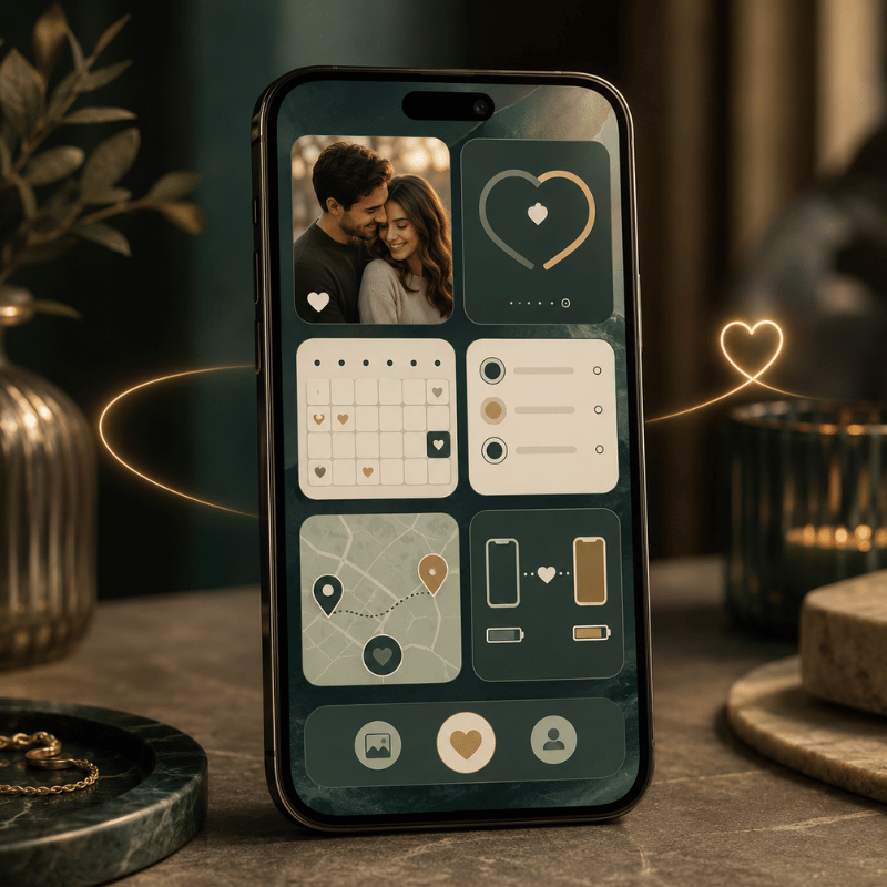
A couple widget app is a relationship app whose main feature is a widget, a glanceable tile on your iPhone, that mirrors a piece of shared information between two partners. Instead of opening a chat, you see the thing itself: the miles between you, your running “days together” count, the photo your partner just sent, or a one-tap mood. Apple’s own widgets pull live data from apps onto your iPhone Lock Screen and Home Screen; a couple app simply supplies a widget built for two people who are linked.
The important detail most people miss, and the most common mistake when they start, is that iPhone doesn’t ship with a couple or distance widget. According to Apple’s widget documentation, widgets come from the apps you install, so a couple widget always means downloading a third-party app and connecting it to your partner. The reason that matter is expectation: people search the built-in widget gallery for 10 minutes, find nothing, and assume their phone can’t do it. In practice it can, you just start from the App Store, not from Settings. That’s not a flaw, it’s the model, and it shapes everything below.
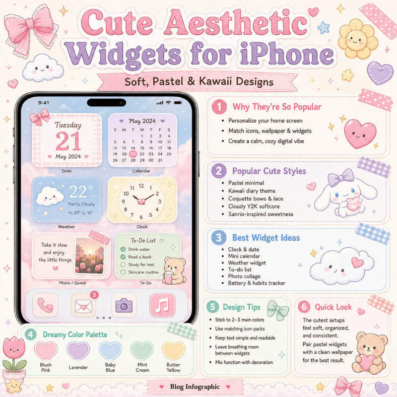
The 4 Types of Couple Widgets (and Which Fits Your Relationship)
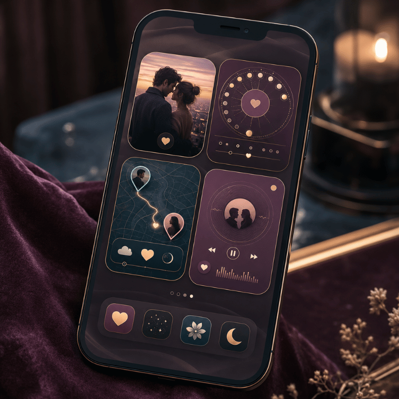
Couple widgets look endless in the App Store, but they collapse into four jobs. We call this the 4-Type Couple Widget Matrix: four widget styles, each mapped to a relationship situation. Pick the row that sounds like you, and you’ve narrowed the field before downloading anything.
| Type | What it shows | Best for | Best placement |
|---|---|---|---|
| Distance | Miles/km between you, plus each time zone | Long-distance couples | Lock Screen |
| Days-Together / Countdown | Days as a couple; anniversary countdowns | Milestone-trackers | Home Screen |
| Photo / Doodle | A live photo or sketch your partner sends | Daily-connection couples | Home Screen |
| Status / Mood | A mood emoji, a “miss you” note, or a love widget heart | At-a-glance reassurance | Lock Screen |
Widget types compiled from current couple-app feature sets; placement reflects each type’s glance frequency.
The matrix matter because the apps don’t compete head-to-head, they specialize. A long-distance couple want the distance row; a pair tracking their first year wants the days-together row. Many people end up with two widgets: one functional (distance) and one emotional (a photo). If you want all four in a single app, couple widgets in an all-in-one customization app save you from juggling several downloads.
How to Add a Couple Widget on iPhone (Step by Step)
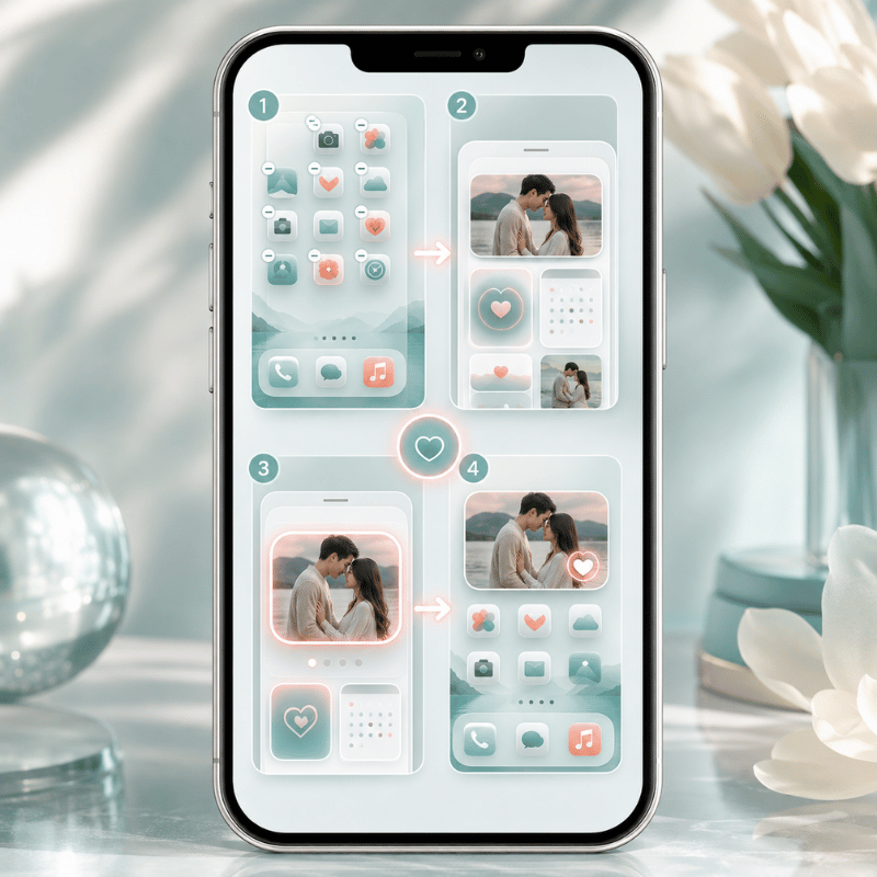
The steps to add a widget are the easy part; getting it to actually show your partner is where people stumble. Here’s the full flow, based on Apple’s official steps for adding and editing widgets.
- Both of you download the same couple widget app from the App Store.
- In the app, one partner generate a pairing code or invite link; the other enters it. You’re now linked.
- Touch and hold an empty area of the Home Screen until the apps jiggle, tap Edit in the upper-left, then tap Add Widget.
- Find the couple app, choose a widget size, tap Add Widget, then Done.
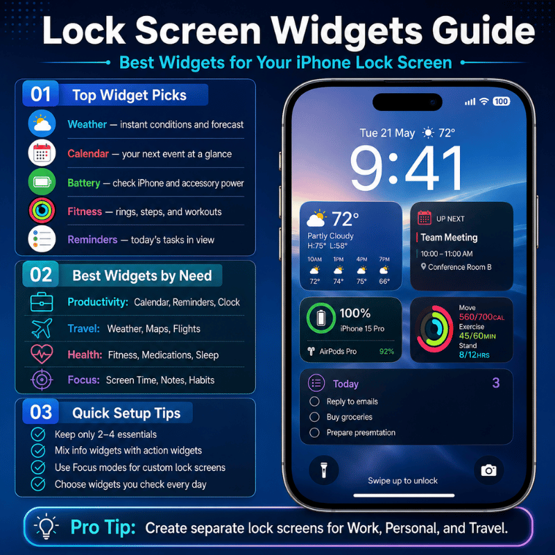
- To put it on the Lock Screen, touch and hold the Lock Screen, tap Customize, then Add Widgets and pick the couple widget.
Lock Screen widgets arrived in iOS 16 and sit in a single row under the clock. There’s room for a limited set, so a couple widget competes with weather and battery for that space. If it won’t fit, remove one to make room, Apple lets you swap, not stack, Lock Screen widgets.
A couple widget only works if both partners install and pair the same app, and distance widgets also need Location permission. One person setting it up alone gets a blank tile.
The single most common mistake, repeated across long-distance forums, is one partner setting everything up and wondering why the widget stays empty. It’s empty because the other phone hasn’t joined yet. Treat setup as a two-person, five-minute job done together over a video call.
Is there a widget that shows how long a couple has been together?
Yes. A days-together widget count up automatically from a start date you set once, the day you became official, your first date, whatever you choose. After that it ticks over every day with no input, and most apps layer anniversary reminders on top (100 days, one year). It’s the most “set it and forget it” couple widget, which is why apps like Couple Widget and Paired lead with it. You enter the date during pairing, drop the widget on your Home Screen, and the number take care of itself from then on.
Best Couple Widget Apps in 2026
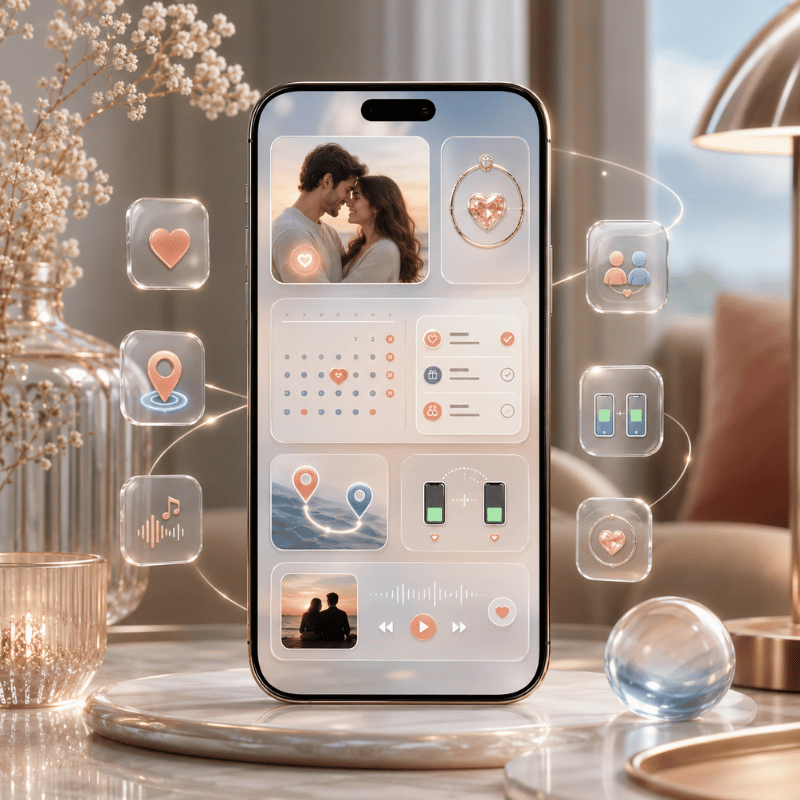
There’s no single winner, the right app is the one that nails the widget type you want, and the common mistake is grabbing whatever ranks first instead of matching the app to your need. The reason that backfires is mismatch: a photo-only app is useless to a couple who wanted distance, so you uninstall it within a day and start over. Here’s how the most-recommended options actually behave in practice, based on their App Store descriptions and what long-distance couples report using across years of threads.
| App | Best for | Widget types | Free tier |
|---|---|---|---|
| iScreen | All four types in one app | Distance, days-together, photo, mood | Yes |
| Couple Widget: Love Countdown | Days together + anniversaries | Days-together, countdown | Yes |
| Couple Joy | Mood + distance together | Status/mood, distance, stickers | Yes |
| Locket | Photo sharing (friends & couples) | Photo | Yes |
| noteit | Live notes/doodles | Doodle/note | Limited (sub ~$6/yr) |
| Cozy Couples | Notes, mood & distance together | Status/mood, distance | Yes |
| Widgetable | Cross-platform iPhone + Android | Mixed (pet, mood, photo) | Yes |
| Paired | Days together + daily questions | Days-together | Limited (premium) |
| Between | Private shared timeline | Photo, days-together | Yes |
Features per each app’s App Store / Google Play listing; pricing as listed at time of writing and subject to change.
If you only want one job done, a photo on your screen, a focused app like Locket is hard to beat. If you want the distance, the day count, and a daily photo without installing three apps, an all-in-one tool that bundles interactive widgets for couples is the simpler path.
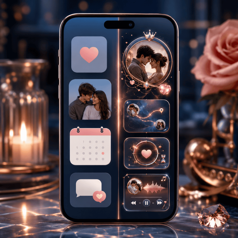
Distance Widgets for Long-Distance Couples
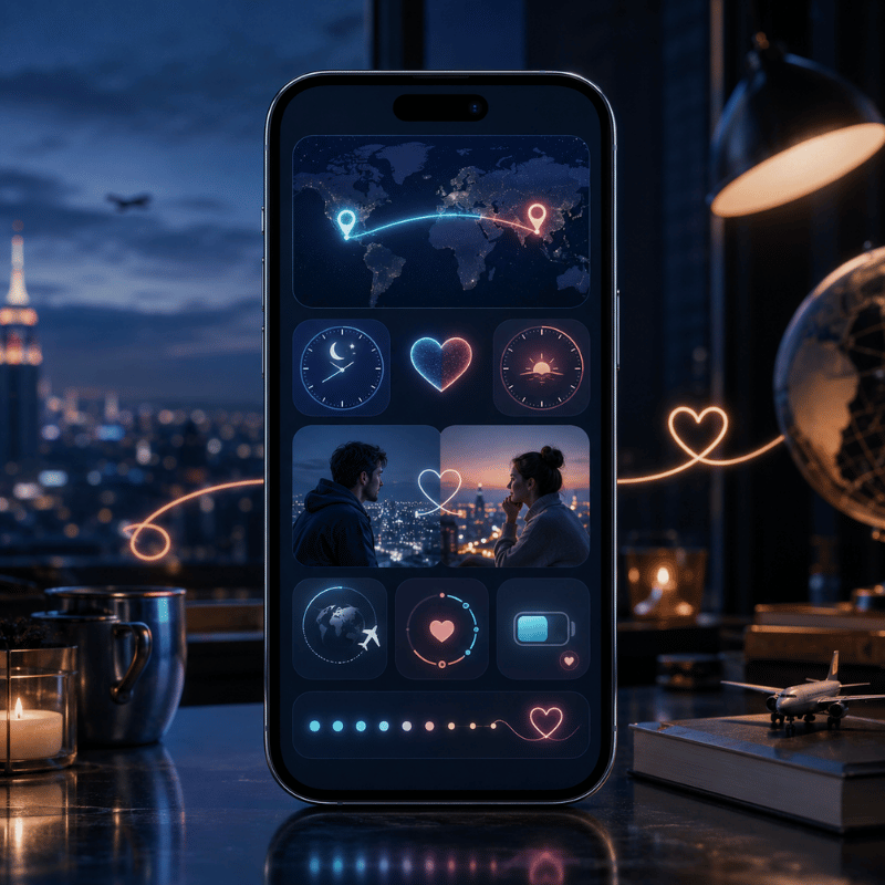
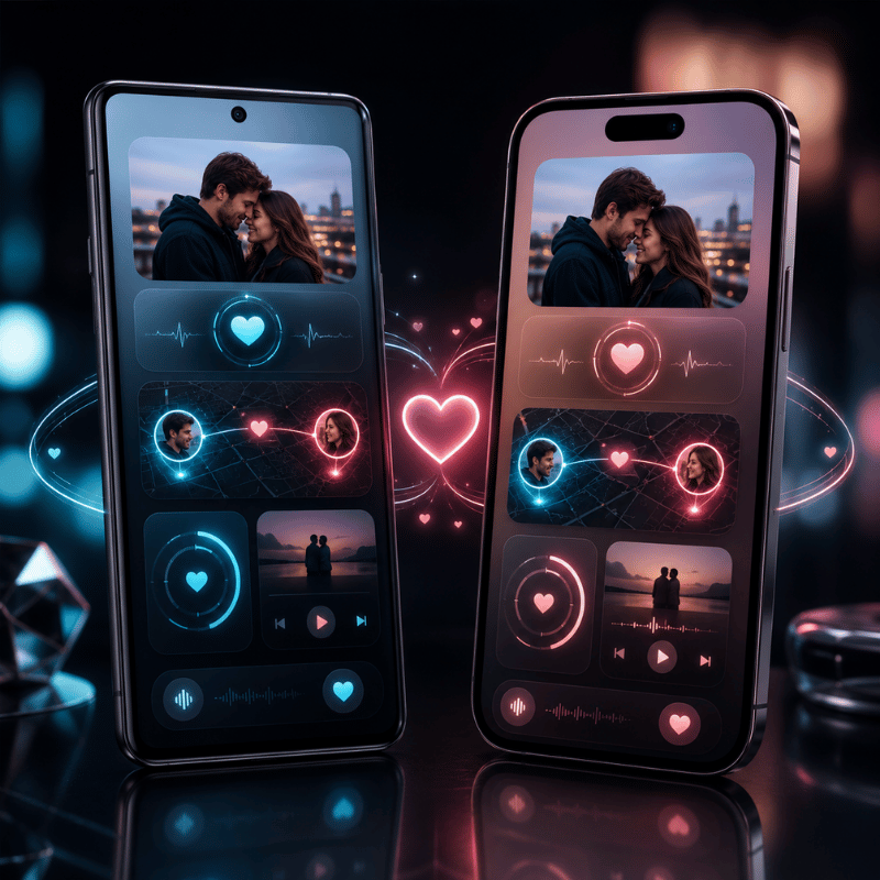
A distance widget is the signature long-distance feature: a tile that show how many miles separate you, often with each partner’s local time. It needs Location sharing permission on both phones, then it calculates the distance between your two locations and refreshes it periodically. That “periodically” matters, widgets update on a schedule the system control, so the number you see is recent, not a live GPS readout. Don’t expect it to move as your partner walks down the street. Some apps pair it with a status widget that adds battery share, so a glance also tell you whether your partner’s phone is about to die mid-conversation.
Picture a couple six time zones apart: she’s in Toronto, he’s studying in Lisbon. Her Lock Screen shows “5,400 km · 4:12 PM there,” so a glance tells her he’s mid-afternoon and probably between classes, useful context before she texts. That small ambient signal is exactly what long-distance couples say helps most, and the reason it work is psychological: university counseling resources on long-distance relationships note that consistent, low-pressure contact beats constant messaging, because it sustains connection without the risk of one partner feeling crowded.
“On average people in long-distance relationships are at least as satisfied, and maybe more satisfied, than couples living close by.”
A distance widget run on constant location sharing, and that’s worth a thought. Huntington cautions couples against permanently sharing locations, because it “opens up the temptation to monitor your partner.” A distance tile is sweet as ambient reassurance; it’s not a tracking tool, and treating it like one can backfire. If either of you feels watched, turn it into a days-together or photo widget instead.
Days-Together & Anniversary Countdown Widgets
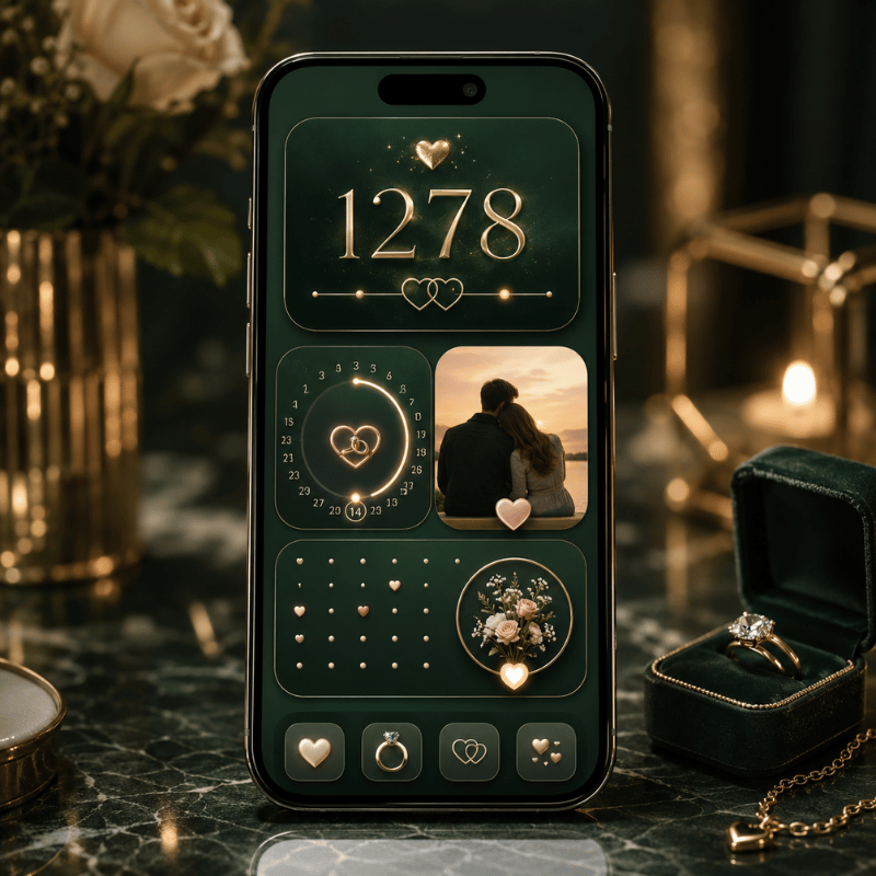
The days-together widget is the emotional anchor of the category, the love countdown many couples check first. You set a start date, and it counts up forever; pair it with a love countdown to your next anniversary and you get both the history and the horizon on one screen. Match it with a shared couple wallpaper and the whole Lock Screen becomes a small tribute to the relationship. Couple Widget built its whole identity on “Days Together at a glance” with automatic anniversary reminders, and forum regulars mention sticking with apps like Paired for years precisely because the running count become part of the relationship’s story. The common problem this solves is the forgotten anniversary: the reason a counter beats a calendar reminder is that it’s always visible, so a milestone like 100 days or 1 year never sneaks up on you. In practice, couples who set it on day 1 report checking it far more than they expected.
Where you place it changes how it feels. In iScreen, the days-together widget can sit as a big Home Screen counter you scroll past, a small Lock Screen version you glance at before you even unlock, or a StandBy display that turns your charging phone into a bedside countdown. If milestones are your thing, a dedicated countdown widget can sit alongside the couple count for trips and reunions.
Photo & Doodle Widgets (Locket-Style)
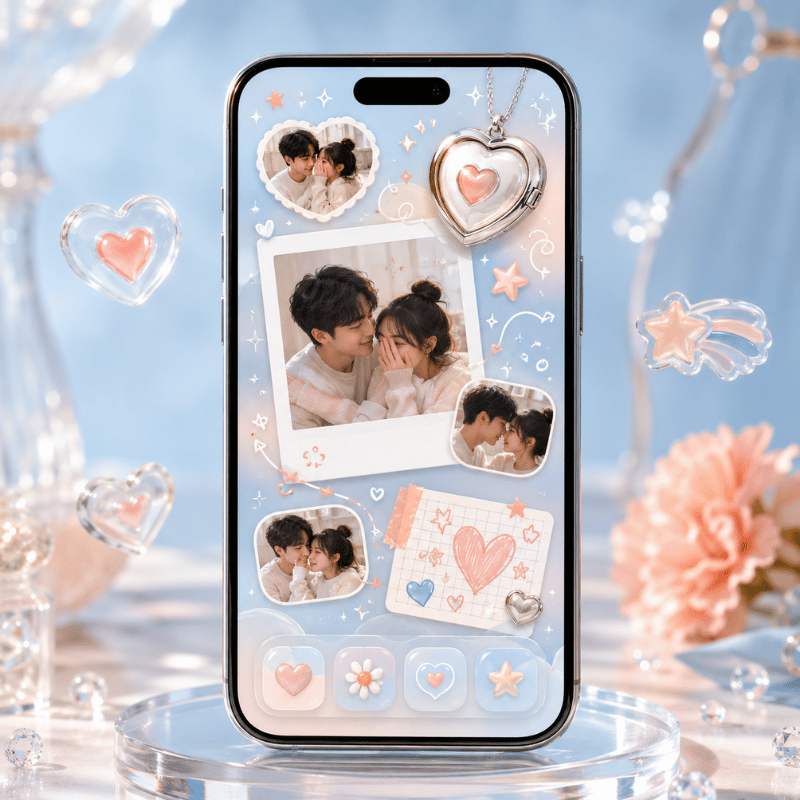
Photo widgets turn your Home Screen into a tiny shared frame. Your partner snaps a photo in the app, and it appears on your widget in real-time, no notification to open, just their face waiting there next time you glance down. The reason this one lands emotionally is timing: because the photo arrives on the home screen instead of buried in a chat, you see it within seconds, not whenever you next open a messaging app. A drawing widget work the same way with sketches and short messages: noteit pushes a quick doodle or a “miss you” note straight to your partner’s screen for around $6 a year. The one real risk is over-sending, in practice, a photo every few hours stays special, while a constant stream turn the widget into noise. It’s the most spontaneous couple widget, and the one people describe as feeling closest to a peek into each other’s day. The reason it lands is well-studied: research from the Rochester Relationship Lab finds that intimacy grows when partners share personally meaningful moments, and a photo widget turn that sharing into a low-effort daily habit. In iScreen, the photo widget sits beside the distance and days-together tiles, so a single app cover the spontaneous and the steady at once.
Is the Locket app for couples?
Locket is built for “live photos from your best friends,” so it’s a friends app first, but couples use it constantly, and it’s one of the most-recommended photo widgets on long-distance forums. The difference from a dedicated couple app is focus: Locket is one feed of photos, while a couple-specific app pairs the photo widget with distance, a day count, and moods. If a shared photo on your screen is all you want, Locket nails it; if you want that photo plus the rest of the 4-Type matrix, a couple app cover more ground. Either way, both partners install and add the widget.
Free vs Paid Couple Widget Apps
Almost every couple widget app is free to start, with a premium tier that unlocks more widget styles, removes ads, or adds features like extra themes and history. noteit, for example, is free to use with a subscription around $6 a year for its full feature set. The reason the free-versus-paid line matter is a common mistake: couples pay on day 1 for a widget they abandon by week 2, because the novelty fades faster than the subscription. In practice, the free tier is enough to test whether the widget earns a permanent spot, only the risk of a wasted $6 to $30 a year separates trying from committing. Before paying, it’s worth knowing what the free tier actually gives you versus what’s gated.
- One pairing with your partner
- The core widget (distance, days, or photo)
- Basic widget sizes for Home and Lock Screen
- Extra widget themes and animations
- Ad removal
- Multiple widgets or richer customization
For most couples the free tier is genuinely enough, pay only once you know you’ll keep the widget around. If you like customizing more than the widget, browsing the best widgets for iPhone shows how a couple tile fit a wider setup.
Couple Widgets on Android (and Cross-Platform Pairing)
If one of you is on Android, check cross-platform support before you both commit, because this is where mixed-phone couples most often hit a problem: an iOS-only app leave the Android partner with nothing to pair to. The reason it matter is that roughly half of couples aren’t on matching phones, so the app you pick has to publish on both stores. In practice, apps like iScreen, noteit, and Widgetable explicitly pair an iPhone with an Android phone, and the shared data syncs the same way once you’re linked. The widget mechanics differ, Android places widgets through a long-press on the home screen and its own widget picker, but the risk is only the setup step, not the daily use. The safe move: confirm the app lists both platforms, then have the Android partner install first and send the pairing invite within the first 5 minutes. This matters because cross-device communication is what sustains a relationship across distanceCornell University counseling resources note that consistent contact, not the specific device, is what keeps long-distance couples connected, so a mismatched-phone pair lose nothing as long as the widget syncs both ways.
What iOS 26 Changes for Couple Widgets in 2026

The biggest 2026 shift isn’t a new couple feature, it’s where your couple widget belongs. iOS 26’s redesigned, more glanceable Lock Screen (part of Apple’s Liquid Glass update) makes a couple widget readable without unlocking, which is a concrete reason to move a daily-connection widget off the Home Screen and onto the Lock Screen. The reason this matters in practice is a friction problem: because the average person checks their phone around 100 times a day, a widget that’s visible the instant the screen lights up gets noticed far more than one buried behind a passcode, and the risk of an out-of-sight Home Screen widget is that it quietly stop being part of your day. For a long-distance pair, seeing the distance or a day count the moment you wake the phone change how often you notice it.
On the platform side, interactive widgets (introduced through Apple’s WidgetKit) let some tiles respond to a tap, so a “thinking of you” widget can become a button, not just a display. Apple’s Live Activities and the Dynamic Island can also surface a couple app’s real-time updates at the top of the screen. iOS 26, released September 2025, carries that forward alongside the Lock Screen refresh that Apple documents in its iOS 26 feature list and trade coverage detailed at launch. If you’re setting up a couple widget in 2026, build it for the StandBy mode and Lock Screen first, that’s where the platform is heading. (Search interest in couple and distance widgets is seasonal, peaking over the summer when more couples separate for travel or study; treat that as background, not a buying signal.)
Frequently Asked Questions
Do both partners need to install the same couple widget app?
View Answer
Is there a free couple widget app?
View Answer
What is the 2-2-2-2 rule for couples?
View Answer
How accurate is a distance widget?
View Answer
Can couple widgets work between iPhone and Android?
View Answer
Why isn’t my couple widget updating?
View Answer
iScreen bundles distance, days-together, photo, and mood widgets for couples, free to start, on iOS and Android.
How We Picked These Couple Widgets
We build couple, distance, and days-together widgets ourselves, so this guide leans on how these widgets actually behave on a paired pair of phones, including the parts that frustrate people, like the Two-Phone Rule and refresh lag. App descriptions and long-distance community reports were cross-checked against Apple’s widget documentation. Reviewed by the iScreen team.
References & Sources
- How to add and edit widgets on your iPhoneApple Support
- Create a custom iPhone Lock ScreenApple Support
- Use StandBy on iPhoneApple Support
- New features available with iOS 26Apple
- Long Distance Romantic RelationshipsCornell University FSAP
- Research-backed tips for making a long-distance relationship workPsyche (Charlie Huntington)
- Relationship research on intimacy and sharingUniversity of Rochester Relationship Lab
- iOS 26 Available Now With These New FeaturesMacRumors